Category Archives: sculpture

Painting in the 1980s: Elizabeth Murray

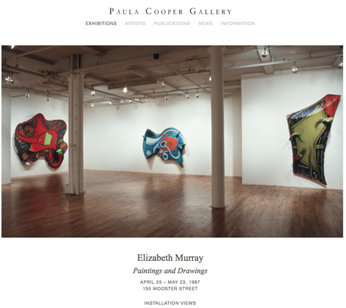
Elizabeth Murray: Painting in the 80s at Pace Gallery arrives at an interesting moment in terms of the abrupt shift of stylistic currents and tropes that characterize art history and it offers an opportunity to revisit the situation of women painters in the 1980s.

Brief study prompt: Painting in the 1980s–you weren’t supposed to do it–that is, if you were a woman, and especially a woman interested in discourse on gender politics. Different story if you were an American, Italian, or German man.

Or you could do it, although particularly if you were a male artist, but certainly not sincerely, there had to be an ironic twist. An appropriational basis in photography and language helped.

The title of the show implies the aesthetic tensions of that moment, that is, the title is not Elizabeth Murray: Paintings of the 80s, which would place the focus on her work alone during a certain time period of her working life, but Painting in the 80s, that is, her activity of painting in the 80s and, beyond that, the activity and the discipline of painting at a particular moment in Western art history.

Starting in the early 1980s, the art market experienced a huge surge after a decade of relative recession which had been, not coincidentally, marked by creative and political experimentation and which was, notably, the decade of Murray’s first fully mature work. In the new market boom, large Neo-Expressionist and appropriational painting, largely by male artists, was the dominant medium and of course the favored market commodity, with women gravitating (and being pushed, by both external and internal forces) towards photography and photobased media (with correspondingly lesser market value). While the language of the heroic history of painting could still be applied to the former, along with newer modes of criticism influenced by postmodern theory, or, even, one might say, despite the dominance of the anti-essentialism of such theory, the other–work by women artists including those peripherally or explicitly interested in gender–was drawn to and delimited by the same theory with an emphasis on an anti-essentialism that particularly targeted painting.

A so-to-speak mantraic recap of that period might be, Lacan, Foucault, Derrida, Lacan, Foucault Derrida, and, when it came to women artists, Cindy Sherman, Barbara Kruger, Jenny Holzer, Cindy Sherman, Barbara Kruger, Jenny Holzer…not forgetting Baudrillard and Mary Kelly, and more, but you get the idea.

Of course there were powerful women painters during that time period, including in addition to Murray, artists such as Susan Rothenberg and Ida Applebroog. But international exhibitions and biennials of contemporary art usually included very few women and of these the three mentioned above were ubiquitous.

And at that time, as I have observed elsewhere, it was useful for such painters to do work that could be parsed for their representational depiction of ideas about the female body, femininity, gender and feminism. Abstract artists–including women painters and sculptors whose work had been so influential and notable within feminist art discourse in the 70s–often felt left out of major exhibitions and texts devoted to women artists and feminism. In that moment Elizabeth Murray’s work was a beacon. To walk into Paula Cooper Gallery in the 80s or into Murray’s first major museum retrospective, at the Whitney, in April 1988, was a thrill and inspiration. To walk into Pace Gallery today is to experience that thrill anew.
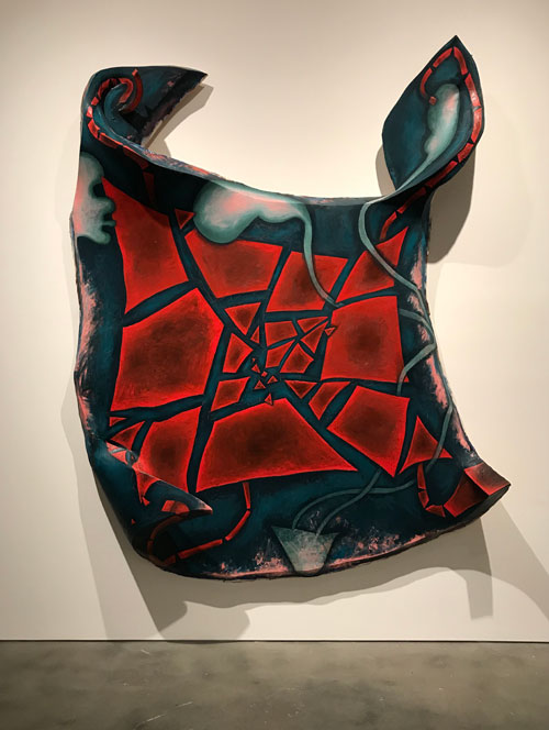
Elizabeth Murray, “Making It Up,” 1986. Oil on canvas, 10′ 4 1/8″x7′ 11 1/8″ Image used by permission © The Murray-Holman Family Trust / Artists Rights Society (ARS), New York


The paintings from that period, now as when they were first created and exhibited, are bold, confident, powerful, intensely physical, courageous in their assertion of space on and off the wall, massive, inspiring in their use of color and paint texture and application.

But at some level the paintings operated and still operate beyond discursiveness. At a time when representation and enculturation of female identity was the issue at hand, feminist criticism couldn’t quite get a grip on a large twisted broken shield or heart like a shield working at a monumental scale, leaping out at you from the gallery wall, where you couldn’t directly address a feminist narrative by which I mean the narrow interpretation of what a feminist narrative might be where representation, figuration, and appropriation would allow you to speak of psychoanalysis, for example. Not that Murray wasn’t widely admired but the important feminist criticism of the day was focused on artists whose work could be discussed in relation to Freud, Lacan, Foucault, Derrida, Kristeva, and there were clear specifications of what work was part of that discourse and which wasn’t.

These theoretical references were also the lodestars of a dominant anti-essentialist discourse on how the female and the feminine were socially constructed and you couldn’t address Murray’s work without dealing with how engaged she was with the basic components of painting—figure and ground, oil on canvas and support, and this was in the dangerous territory of the essentialism of painting itself. And while in fact Murray’s work demolished Greenbergian tenets, at the same time her painterly ambition both embraced and reinvigorated the great tradition of New York School painting of which his philosophy were an important component.
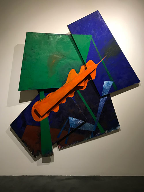
Elizabeth Murray, “Like A Leaf,” 1983. Oil on canvas (6 parts) 98″x90″x9″ Image used by permission © The Murray-Holman Family Trust / Artists Rights Society (ARS), New York


And, finally, as I try to give a sense of what being an artist in the1980s was like, Murray did not use “the language,” as someone once used the term to me, “those of us who have the language.” Her references could be literary and philosophical, what she said about her work was deep but different than an academic discourse, as much rooted in daily visual experience as in popular culture and in direct transmutation into paint of such experience. In discussing her work she did not use what later became known at International Art English. Very much like Philip Guston, she was very eloquent about becoming an artist, the personal and cultural sources for her imagery and style, and about studio process.

I have a history of constructing vivid but sometimes revealed to be false memories of favorite paintings by artists I love: a painting will be a lodestar in my mind, and I will remember not just it, but the wall of the museum or gallery that it hung on, and perhaps at the core of my memory is my memory of myself at the instant of seeing it. It is the moment of the coup de foudre, love at first sight, but, more than that, of when an imperative and a challenge is revealed to you in one glance. As time passes, I try to find the work again, but often can’t find any trace. Sometimes it is eventually proven to me that it never existed as I had remembered. For example, for the longest time there was a Guston painting of cherries that I had seen at McKee Gallery. There are many wonderful paintings of cherries by Philip Guston and though I love them all, somehow that one painting was in my mind the best one. I remembered where it was installed the gallery, on the back side of the back dividing wall. But no reproduction matched my memory. Finally I asked about it at David McKee Gallery, Guston’s dealer for four decades, and they figured out the year of the show I was talking about and were able to show me the layout of the show and the images, and evidently I had constructed the painting. Strangely, once my memory was proven to be false, the image began to fade in favor of verifiable works, though the ideal persisted.

Another such painting that stood out in my memory in my personal archive of works particularly significant to me–was a large multi-part question mark I had seen at Murray’s retrospective Elizabeth Murray, Paintings and Drawings, which opened at the Whitney in 1988. I never forgot the work, or more specifically, its subject, its materiality, its scale. And, again, more specifically, I remembered myself seeing it, being struck by it: it was there and I saw it, in that way you remember seeing across the street or across a large room a person who you will later meet and fall in love with, but you already did at the first instant of vision. Over the years I always wanted to see it again, and I looked for images of that painting, without success. After the Guston cherries episode I understood that I was capable of inventing archetypal paintings by other artists. Had I made up Elizabeth Murray’s monumental question mark?

Lurking in the back of my mind when I went to see the current show at Pace Gallery was the hope that it would be there. Without seeing it I walked purposefully towards finding it. And, in the back wall of the back room, there was the painting, Cracked Question. Apart from being more askew than I remembered, less vertical, more horizontal, it looked like the painting I fell in love with but doubt set in when examination of the Whitney exhibition catalogue did not include it. Detective work and pestering of friends ensued and mention of the painting was found in a review of the show written by Rob Storr,

Like an interrogative sentence in Spanish, Murray’s show both began and ended with the same punctuation mark, but one whose significance vastly exceeded its simple editorial or grammatical function. Looming just beyond the brightly hued paintings of the 1970s that created one at the entrance, Cracked Question (1987), a mammoth multi panel, multi-faceted picture that dominated the central room of the Whitney installation, was at once the first image on which one’s eye’s fell and a tense conclusion to the chronological sequence of intervening works. (Storr, “Shape Shifter,” Art in America (April 1989), p. 275)

Storr’s description of the pivotal position of the work in the show filled in my memory of seeing myself seeing it. [Because such stories interest me, I think the solution of the mystery is that the show originated in 1987 in Dallas at the Dallas Museum of Art, and was surely planned before that. Cracked Question dates from 1987 and the Whitney show opened in the spring of 1988 so it must have been a late, but, as Storr indicates, central addition.
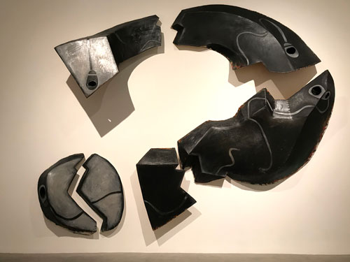
Elizabeth Murray, “Cracked Question,” 1987. Oil on canvas (6 parts), 13′ 5 1/2″x16′ 2″x23 1/2″ Image used by permission © The Murray-Holman Family Trust / Artists Rights Society (ARS), New York


The work is massive, sober, architectural, dramatic. In my notes I wrote that it is dispositive, it feel instinctively that it solves a problem, a conflict, although its subject stays at the moment of the question. It is sculptural and would be seen as such under any circumstances, but the dark grey and metallic silver paint emphasizes the segmented painting’s relation to steel and stone. Each part is as powerful as the whole, yet the whole embodies its existence as language–speaking of Murray’s relation to “the language,” Cracked Question is language. It doesn’t represent a punctuation mark, it is a punctuation mark. It does not only pose but it is a philosophical question and a philosophical text, that takes place in the languages of form and color and space and matter.

A friend spoke to me of the “ferocity” of Murray’s work. Cracked Question embodies and exemplifies that ferocity.

This show arrives at a moment when, after several years of the dominance of abstraction–much of it a variant of what has been termed “zombie formalism”—that is, constructions and deconstructions of established tropes of abstraction, usually very elegant, and often disconcerting, particularly for those viewers who lived through the “original” phases being sampled or replicated, because of the works’ lack of the historical content and the crucial trace of struggle for form and content that had characterized those earlier movements–there are suddenly dozens of exhibitions of figurative painting ranging in style from Alice Neel-like realism to a poetic fantastic that emerges from surrealism and can sometimes border on millennial pathos. So, right now, figuration is in, not in all cases with a overt political message, unless in terms of the racial or gender identity of the artist and the figures represented in the paintings.

So is this a case of bad timing or of good timing for this presentation of Murray’s great works from the 1980s? It is always fascinating to think about how sometimes museum retrospectives, though planned years in advance, open just at the moment when that artist’s work or that artist’s most controversial works look presciently fresh to a new generation. Often such works are revived precisely to give contemporary artists the historical buttress that will burnish their reputations: thus late figurative works by Picabia, previously seen as kitschy aberrations were first restored to critical favor in the 1980s at a time when it seemed to retrospectively offer an important patrilineage for and contribute to the historical buttressing of the work of a then emerging David Salle. Last year’s extensive Alice Neel exhibition at David Zwirner seemed perfectly keyed to the work of emerging art stars like Jordan Casteel. So what will young artists experiencing this moment’s stylistic Zeitgeist make of Elizabeth Murray’s greatest works, seen at this moment?
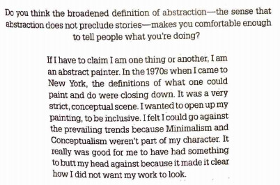
Elizabeth Murray, Interview with Sue Graze and Kathy Halbreich, “Elizabeth Murray, Paintings and Drawings,” exhibition catalogue, H. N. Abrams, 1987, p.131.

It should be noted that while the overall effect of Murray’s work is one of abstraction, and the artist described herself as an abstract painter in an interview included in the 1987 catalogue, there are many representational elements and references in her paintings, in a stylized style emerging from cartoons, comics, and graffiti as well as from pop artists like Claes Oldenburg: works are shaped like shoes or cups and contains stylized abstracted but identifiable figuration and still-life imagery. But her relation to representation is not in the realm of narrative or allegory, the thing itself is the important thing, the painting as an object that projects into our space carrying pigment on its surface. The importance of three-dimensionality is apparent when one compares her oil paintings from this period to related drawings: even when these are on several pieces of paper creating a shape or a broken field, they operate in a more conventional relation to form. The objectness of the shaped paintings from this period makes them always more than the working out of abstracted, biomorphic or geometric forms on a flat surface, since the form of the support itself is a biomorphic or geometric abstraction.
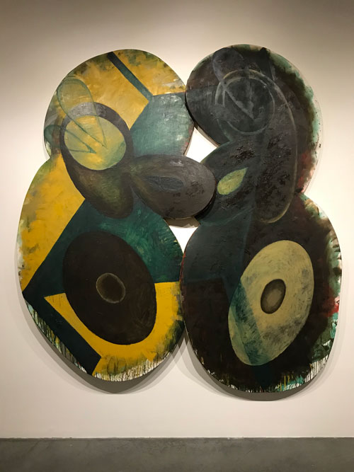
Elizabeth Murray, “Table Turning,” 1982-82. oil on canvas (2 parts) 8′ 10 1/4″x8′ 2 1/4″x4 2/4″ Image used by permission © The Murray-Holman Family Trust / Artists Rights Society (ARS), New York


That places them in yet another situation of appearing to be beyond language: how she declares space is different than Barnett Newman’s declaration of the equivalence between figure and ground: what is painted as form and shapes on the large shaped works may be securely within the realm of figure, but on the other hand the whole object itself is figure on the ground of the wall in a way that conventional easel paintings, even Murray’s own earlier works, are not. Thus, again, if the works can’t be incorporated or tamed into discourse of gender representation, nor to the terms of the new critical language of gender, racial identity, national identity politics, they also can’t be reduced to the purely formal terms of the earlier discourse that had characterized painting from the late 1940s to the 1970s.
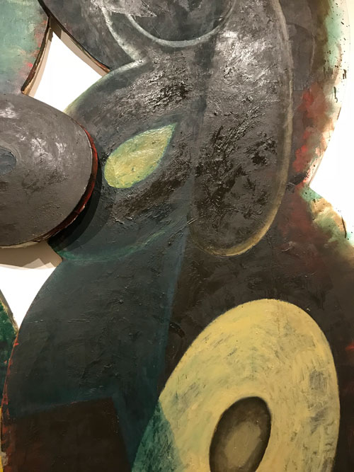
 

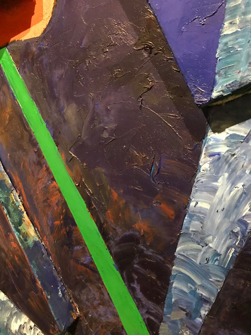
The sculptural nature of the works emphasizes the sculptural nature of oil paint itself. One of the things I have always found the most inspiring about these works is how the three dimensional support allows me to really experience the physicality of pigment. This is one of the things that painters live for, the moments when paint comes alive in a generative fashion, so for me, how Murray allowed oil paint to dry unevenly–an area of color will be matte and then shiny, which in itself becomes sculptural. And it is never enough to look them frontally, you have to experience the surface from the side to really see the color and the brushstrokes.
 

A year after Murray’s show at the Whitney, which included, in addition to Cracked Question, a number of the works in the current exhibition at Pace, I wrote the essay  “Figure/Ground,” in which I confronted the critique of painting I have indicated as dominant in the 1980s with other discourses that were not usually brought to bear on it, including those of feminism and of feminist studies of the gendered, misogynist aspects and roots of fascism. In one of the last paragraphs of the essay, I wrote about some of what I love about painting:

For a painter there is certainly tremendous pleasure in working out a thought in paint. I tis a complete process in terms of brain function: an intellectual activity joining memory, verbal knowledge, and retinal information, is a given visible existence through a physical act. But the value of painting cannot rest of any individual artist’s private pleasure. Painting is a communicative process in which information flows through the eye from one brain, one consciousness, to another, as telemetric data speeds from satellite to computer, without slowing for verbal communication. Incident of paint linger in the working mind of the painter as continuous thrills, as possibilities, like words you may soon use in a sentence, and–in a manner that seems to exist outside of spoken language—as beacons of hope to any human being for whom visuality is the site of questions and answers about existence. The black outline of a rock in a Marsden Hartley landscape, the scumbled white shawl in a portrait by Goya, the glaze of a donor’s veil in the Portinari Altarpiece, the translucent eyelid of Leonardo’s Ginevra di Benci, the pulsing red underpainting of a slave’s toe in a Delacroix, the shift from shiny to matte in a passage of indigo blue by Elizabeth Murray, are only a few of a storehouse of details that are of more than professional interest to me.
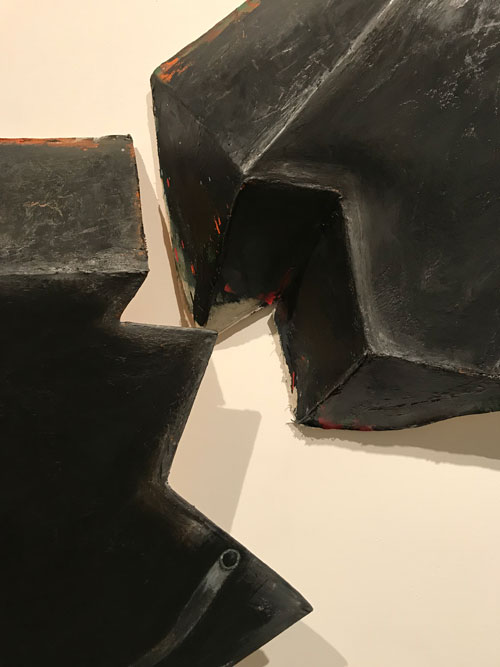
 

Images used by permission © The Murray-Holman Family Trust / Artists Rights Society (ARS), New York

 

FacebooktwittermailFacebooktwittermail

Pier 92

I usually start my annual obligatory (imposed on me by the society I occupy, would not necessarily go otherwise) visit to the Armory Show at Pier 92 (the more intimately scaled “classic” side) before venturing into the maze of the more vast and high-ceilinged contemporary side of Pier 94. However yesterday by chance I started on Pier 94. Early in my journey I was standing with my friend Susanna Heller at a booth of a respected gallery telling her about seeing a show last year where the paintings in reality were so boring and empty that I could not find even the most banal compliment to offer to the gallerist. There was simply nothing to say about the work except that there was nothing to say about it. Upon which Susanna say, “Mira, do you remember anything about what we were just looking at?”

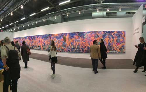
Ghastly huge work, all 689 inches wide of it: AIDA Makoto, “Jumble of 100 Flowers” 2017-2017. Acrylic on canvas, 79 x 689 inches.

As a living artist I have to admit that I would like to see my work well presented and represented at such an art fair, but by the end of my rather incomplete tour of Pier 94, my friends and I felt terribly tired, and further and more dangerously, dispirited about the whole idea of being artists.

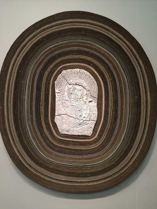
Handsome paper mixed media work by Peter Linde Busk, “Everything, Everyone, Everywhere. Ends,” 2016, at Josh Lilley. In a way a perfect fair work: large and visible, eye catching, handsome, done with quality, hip and very effective mix of materials from low, cardboard, to craft, ceramic, but presented without context.

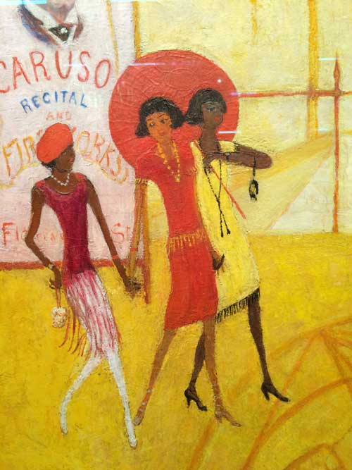
Florine Stettheimer, Asbury Park South, 1920, detail

Florine Stettheimer, Asbury Park South, 1920, detail

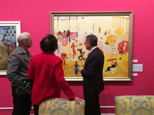
Only one work shone out of the blur–Florine Stettheimer’s masterpiece, Asbury Park South from 1920 (a painting scandalously deaccessioned by Fisk University in 2012) in a group exhibition organized by Jeffrey Deitch that orbited and created a lot of visual noise around it in a manner both consistent with Stettheimer’s aesthetic of excess and disruptive of the ability to properly view her painting. Many artists, including myself, have been influenced by Stettheimer, for various aspects or characteristics of her work, the narrative, the etiolated figuration, the gay sensibility in both senses of that word, the beautiful color, but in addition the works are so beautifully crafted and patented, the most beautiful colors, the most extraordinary surfaces, scumbled, dry, sculpted. This painting gave us a lift but we were still oppressed and depressed by the whole situation. Or at least I was.

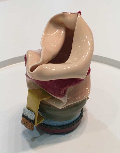
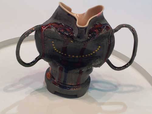
Then we left selfie land and we made our way up the stairs to Pier 92. First we came upon Kathy Butterly’s works, beautifully installed at Tibor de Nagy Gallery with Shoshanna Wayne Gallery. I envy Kathy, I love ceramics and porcelain and glazes and the way color works in such media, and thus I envy her because she makes beautiful things using these elements, things that give pleasure, that people want, which is something my parents who made beautiful jewelry also did, which I can’t say that I do–my work, critical, political, and intellectual,dreamy and personal, it appears that so far it is an acquired taste! I also relate to these works because they are modest in scale and invite the viewer into a relationship that is more intimate than most of the large shiny works typical of art fairs.

Kathy Butterly, Shoshanna Wayne Gallery and Tibor de Nagy Gallery

Kathy Butterly

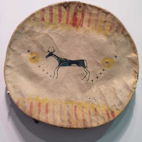
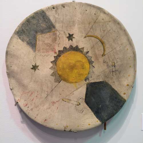
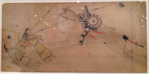
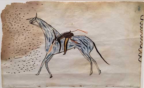
Next we were drawn to a Native American painting on animal hide and discovered the most beautiful and engaging group of drawings by mostly 19th century and early 20th century Plains Indians, at Donald Ellis Gallery. The inventiveness of these drawings in the artists’ efforts to depict using very reduced means (am referring to the works on paper with pencil and sometimes ink, materials which appear to be what was available to them on reservations) what they were seeing and experiencing was absolutely inspiring.

SHield and cover, Crow, Northern Plains, c.1870, buffalo hide and paint, Donald Ellis Gallery

Shield and Cover, Mescalero Apache, Southern Plains c.1880, buffalo hide and paint, Donald Ellis Gallery

Plains Indians, drawing, Donald Elllis Gallery

Plains Indians, late 19th century, Donald Ellis Gallery

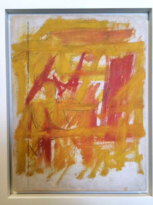
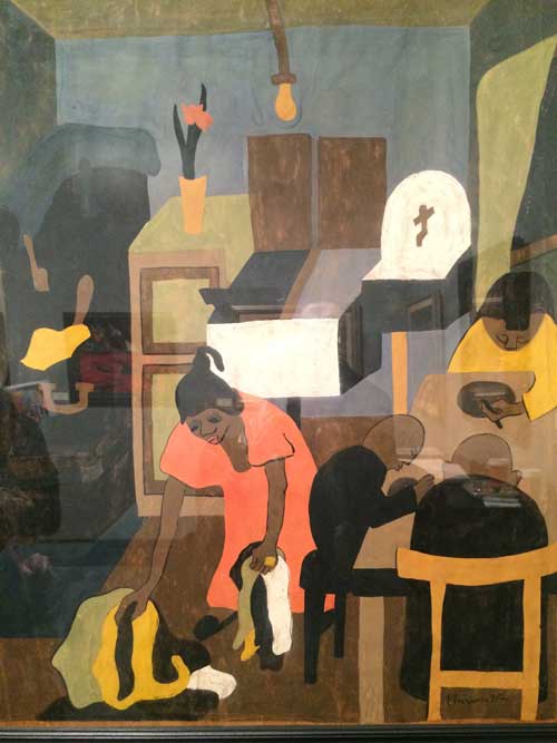
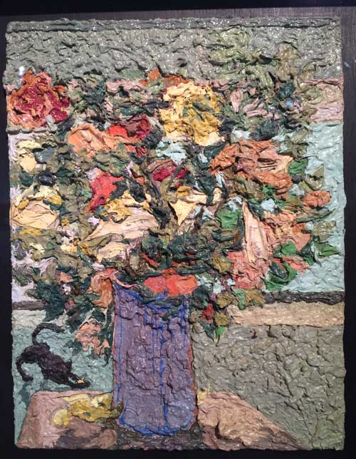
I discovered a few Jack Tworkov works in a couple of galley booths: his poetic elegance and measure always sing out to me. Next an exhibition at Jonathan Boos of Jacob Lawrence works from the 30s,40s, and 50s, beautiful color, tenderly observed details, jagged forms. A small richly impasto Jess vase of flowers on a thin panel, an intense Ossorio.

Jack Tworkov, oil sketch, Hollis Taggart Gallery

Jacob Lawrence, Interior (Family), 1937. Tempera on paper, 30 3/8 x 25 1/5 inches, Jonathan Boos Gallery

Jess (Collins), Petals of Paint, 1964. Oil on plywood, 16 x 12.25 inches.

Clearly when you see older work now, it is the product of a system of filtration and of intensification, the dross of the time period has been filtered out and the richness of meaning has intensified over time as more historical information has been pressed into the work by the passing of time, but I also thought that my friends and I are perhaps the last generation that can really understand this work in a living way rather than an archeological way: we were brought up with the values of materiality, form, style, process, search for truth (belief in some kind of truth or honesty), with the analogue, the handmade, the personally developed (not as recipes that are copied and reconfigured endlessly but without the struggle that went into the initial works, as in zombie formalism) — at time when artists sought within the work rather than researched before the execution of the work. It often feels that our knowledge sets us apart–in a bad way: we can’t put our knowledge forward in the current mode of the sampled and reprocessed–often done very very proficiently–because we absorbed the initial relation to making of these older works, made by our parents, teachers, older friends. [I should add that often I am led to rethinking this impression, because at the same time there is so much art being made by young artists all over the world, with after all as much desire and imagination as any other previous generations brought to their work, yet, as Susanna pointed out, that may be truer when you see the work online, then one sees the work in person (as opposed to on Instagram, for which so much work is now both unconsciously and consciously created) and its potentially alienating synthetic nature often reasserts itself.

I have often quoted my mother’s words upon seeing a show at the Whitney on Picasso’s influence on American art. She was then 95 and, as it turns out, only a few weeks from her death, and she found it hard to stand for a long time, but in the taxi home she said, “it’s the kind of work that makes you want to go home and work.”

I should say that over my life as an artist (and I include in this my work as a writer about art) I have often gotten as much energy from work I “hated” as from work I loved, because the antagonism pushed and liberated me to move forward and live in my own time: such a relation may still be operative, but I suspect that the depression my friends and I felt comes from seeing now in a lot of art fairs work we just saw five minutes ago in our MFA student critiques, and from the fact that even those significant challenges to our world view are by now kind of old as well, though they may not feel that way to the people doing them or the collectors fawning over what seems to be the latest thing, really just by the latest person.

So Pier 94 made us want to give up on art making, with a few exceptions (some contemporary + Stettheimer, who died in 1944), Pier 92 made it possible to want to go home and work in the studio.

FacebooktwittermailFacebooktwittermail

One Art Work in a Spinning World

In attempting to capture the impact of one modest artwork, seen in a museum outside a major metropolis, it is first necessary to fight one’s way through the tidal wave of images of art works that circulate daily, on Instagram, Facebook and dozens of major and local websites devoted to art and to the art market. It is overwhelming and impossible to try to come to grips with the sheer volume of works and of images of works, many of which look “good”–at least as images. The fact that many look and may even in actual physical space be “good”–and good here is meant to cover a wide range of possibilities of success, from aesthetically pleasing, formally clever to intelligent, even possibly intellectually challenging, or emotionally charged and weighted–is as disconcerting as the many that are just outright bad, the glittery flotsam seen at fairs, and also the temporal toys and copies, attractive but intellectually and emotionally empty product, what my mother, with the rolling rrs of her rich Eastern European accent, would dismiss with a sniff as “merrrchendise.” This is so partly because aesthetic criteria have gone underground, more a factor of subterranean custom and multiple, group-specific agreements, less the subject of intellectual debate and argument. As an example, this is what the “zombie” in “zombie formalism” is about, the sense that works that at first glance look like mid-twentieth century abstract art, c. 1949-1979, were not arrived at through the aesthetic and existential struggles of the earlier models they resemble but are more emotionally remote, seamless simulacral replicants, merely shifting around signs from those earlier forms of abstract art.

From this phantasmagoric swirl of images, I walk into a room and discover a work, unassuming yet riveting, nearly anonymous in its style and fakture yet unique and uncannily specific.

YEAR-TAUBER-ARP-IMG_6436

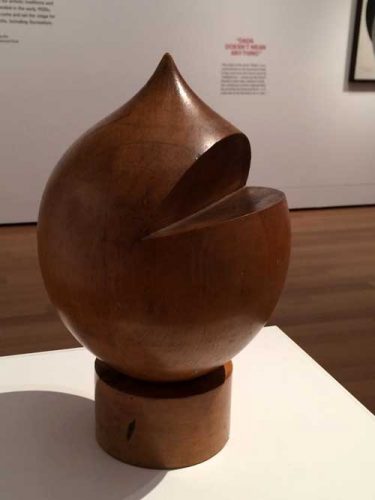
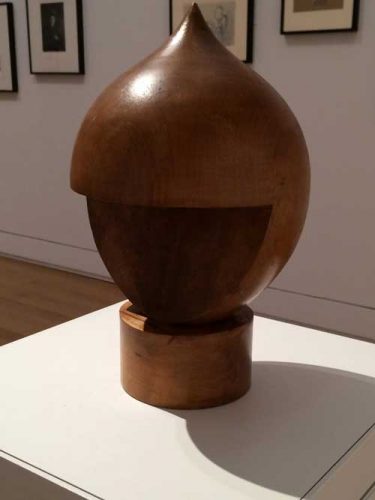
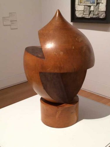
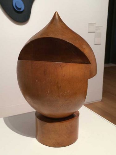
This is an untitled turned wood sculpture by the Swiss-born artist Sophie Taeuber-Arp (1889-1943), included in Everything Is Dada at the Yale University Art Gallery. The exhibition is curated from the Gallery’s collection, notably from the works that were gifts of the Collection Société Anonyme, an art group founded in 1929 by Katherine Dreier, Marcel Duchamp, and Man Ray. Included in the exhibition are works by the most iconic artists of the movement such as Kurt Schwitters, Marcel Duchamp, Man Ray, Max Ernst, Francis Picabia, but also very interesting works by lesser known (or, rather, previously unknown to me or forgotten by me) artists such as Morton Livingston Schamberg, Georges Ribemont-Dessaignes, and John Covert.  I came upon Taeuber-Arp’s object in the last room of the exhibition, in the company of works by her husband Jean (Hans) Arp and also a number of works by other women artists from the period including Chef d’oeuvre accordéon, or Accordion Masterpiece, 1921, a bold painting by Suzanne Duchamp that is focused around a silver-leaf oval head-like shape, cut in by collaged elements that relate to aspects of Taeuber-Arp’s work.

Taueber-Arp’s wooden object has a humorous, cartoon-like appearance–a contemporary resemblance may be found to the way the character of the pre-schooler Ike is drawn on South Park, with a slit for a mouth–and, in fact, it is said to be in part based on the peaked cap wearing German puppet-theater character Kasperle, or “Kaspar,” about whom Jean Arp wrote a poem, “Kaspar is Dead” –“oh god our Kaspar is dead/and now there’s no-one to steal away with the burning flag/snap it everyday in the dark cloud’s braided hair.”

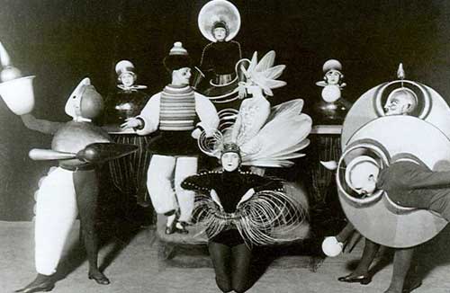
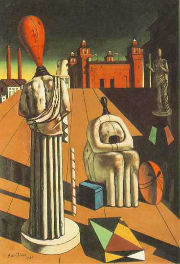
Yet the object has an anonymous aspect to its form, it resembles and I believe it references the shape of nineteenth-century machine tooled hat molds that informed the works of many of the Dada artists who looked to industrial forms and techniques at the same time as they appreciated, in the manner of their contemporary and colleague Walter Benjamin, earlier objects of popular culture and practice from the late 19th century. The use of turned or lathed wood creates a network of connection between early instances of mechanized craft, the colder more mechanized aspects of industrially produced objects in the 20th century, and the Bauhaus interest in linking these two strains together via craft. Other works by Taeuber-Arp also reference machine-tooled mannequins, forms and subjects that appear in works by contemporaries including de Chirico’s The Disquieting Muses (1917) or in dance costumes by fellow Dada artists Oscar Schlemmer.

YEAR-Tauber-Arp-Schlemmer-1919-bauhaus4

YEAR-TAUBER-ARP-DE-CHIRICO-The_Disquieting_Muses

Taeuber-Arp’s piece raises questions of anonymity versus signature style–a painted wood bas-relief work by her husband that is hung on the wall behind her freestanding piece points to the importance of a signature style in fixing an artist in history: Arp’s plain, flatly colored simple biomorphic forms are instantly recognizable, while Taeuber-Arp’s works are more part of a general stylistic school, with some works similar to works by Annie Albers, others to Oskar Schlemmer, others still to Paul Klee, and so forth, yet all in their way excellently crafted intelligent examples of the genre. I remember being deeply moved by an exhibition of Taeuber-Arp’s work at MoMA in 1981–which according to the catalogue included the Yale turned wood object though I don’t specifically remember seeing it then–in part because it was at the time a very rare almost unique example of an exhibition devoted to a woman artist. I vaguely remember feeling a sense of unfairness, in fact I altered the memory and placed the show in the summer, a fallow time in the museum’s schedule. But that memory was inaccurate and merely symbolized my sense that Taeuber-Arp had been both honored and yet vaguely disrespected. Or perhaps simply I felt the sadness of seeing excellent work by a woman artist who nevertheless did not have a signature style and was not that widely known and and who had died tragically in mid-life. One might here compared her trajectory to that of Sonia Delaunay, a pioneer of abstraction, with a signature style, nevertheless sharing many material interests and formal elements with Taeuber-Arp, and who enjoyed a long, prolific, and successful career that took her so much closer to the feminist art history agenda of the 70s, which then helped maintain her in the mainstream history of twentieth-century modernism.

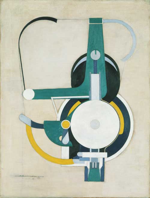
But the question of anonymity of style is particularly pertinent to a work from the Dada period. In the exhibition there are a number of groupings that seem to address and toy with the viewer’s expectation of uniqueness or signature style. Thus three works in sequence that each appear to be works by Picabia, with the signature appearance of machine tooled forms and text.

YEAR-TAUBER-ARP-SCHAMBURG 1916

Well, no, perhaps a bit too tame and regular–this is by Painting, formerly Machine, (1916), by Morton Schamberg. So maybe this one is by Picabia,

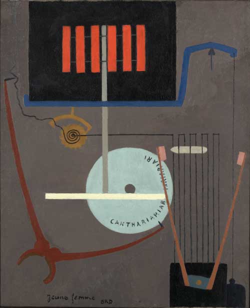
YEAR-TAUBER-ARP-RIBEMONT-DESSAIGNES-1919

No, this is Young Woman,by Ribemont-Dessainges.

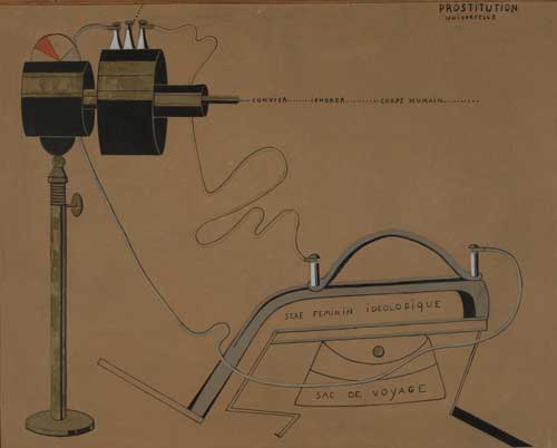
Finally, the sequence of this part of the installation ends with Picabia’s Prostitution Universel, 1916-17.

YEAR-TAUBER-ARP-PICABIA-1916-17

The question of anonymity versus signature style as it is articulated in these works and others in the exhibition is representative of the dual views of technology of that era, where critical awareness of the destructive aspects of modernity and dehumanizing aspects of industrialization in the Post World War I period was matched with a continued fetishization of machine forms and technology innovations.

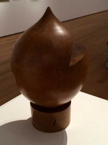
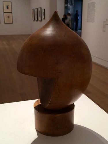
Returning to Taeuber-Arp’s sculpture: its size and shape are not identical to the functional objects that it recalls and the incisions that Taeuber-Arp has made into the shape serve no discernible human purpose of functionality or representation. Despite its nineteenth-century quaintness, the object has a bit of a science fiction quality to it, a depiction by some being of some being that is not human. The interventions into the form, the cuts at different angles creating completely different identities depending on one’s placement in relation to it, are what send the viewer into orbit around it: it is one of the most totally three dimensional objects I have encountered, because it is not just that it looks interesting from more than one vantage point, but that one is spun around it to try to experience and then re-experience these points of view. Yet, however much you try, you can never find yourself in exactly the same relation to it as you walk around it, so you must go round again.

Having taken the first picture (above) of my first view of the work, I took one other, having moved a few degrees to the east of it. The deeper cut at this longitude alters the cartoon head reference, and the finish of the incised planes of wood appear less golden, their surfaces are rougher as they cut into the grain of the wood.

YEAR-Tauber-Arp-IMG_6437

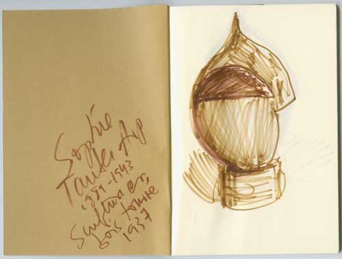
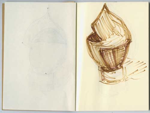
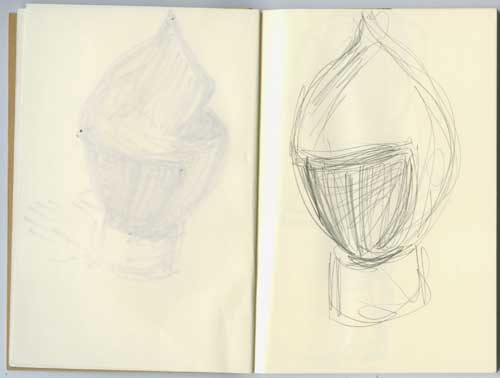
I decided that I should draw several views from my orbit because I always feel that drawing embeds an aesthetic experience in the body, but my juggling of colored pens and notebook caught the attention of a guard who helpfully brought over one of those ineffectual little pencil stubs that you use to take multiple choice tests.

YEAR-Tauber-Arp-Mira-sketch-1

YEAR-Tauber-Arp-Mira-sketch-2

YEAR-Tauber-Arp-Mira-sketch-3

Frustrated in my drawing trajectory, my reluctance at returning to photography seemed to influence my camera which could not return to the correct light but I continued my orbit around the work.

YEAR-Tauber-Arp-IMG_6442

YEAR-Tauber-Arp-IMG_6441

YEAR-Tauber-Arp-IMG_6440

YEAR-Tauber-Arp-IMG_6439

YEAR-Tauber-Arp-IMG_6437

YEAR-TAUBER-ARP-IMG_6436

An object that forces another entity into orbit around it has a force of gravity, it has a density of matter and content that can hold its own against the phantasmagoric multiplicity of art objects that swirl around us, it proposes the possibility of an antidote. And that is something to reckon with, even after one must regretfully leave the room.

Now that Kaspar is dead, as Jean Arp concludes his poem, “no-one to teach us monograms in the stairs/his bust will adorn all truly noble firesides but there is/no snuff & comfort for a dead head.”

*

The first post on A Year of Positive Thinking, “Looking for art to love in all the right places,” appeared April 28, 2010. This is a slightly belated anniversary post, after a long hiatus.

FacebooktwittermailFacebooktwittermail

“Abstract Marriage: Sculpture by Ilya Schor and Resia Schor”-Lecture by Mira Schor

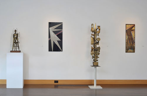
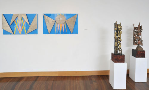
On the occasion of my mother Resia Schor‘s birthday today (b. December 5, 1910 near Lublin, Poland), I’d like to share a lecture I gave at the Provincetown Art Association and Museum August 20, 2013, in conjunction with the exhibition “Abstract Marriage: Sculpture by Ilya Schor and Resia Schor” at PAAM, August 16 – September 29, 2013

I take the liberty of sharing this video not just because I am proud of my parents’ extraordinary works-which I am!–but also because some of the histories, diverse traditions, and diverse methods of making that infuse their work are worth recalling now, and suggest models of art practice of interest and value even though they may belong to a very different era and philosophy of craft and art.

NOTE: comments during the lecture about the quality of the slide projections refer to issues that have been corrected in this version of the video.

The catalogue of exhibition available here

Selected installation images:

ilya_resia_schor__02

ilya_resia_schor__10

ilya_resia_schor__13

Resia Schor, Lockerbie, 1990, and Ilya Schor, Lovers, c.1958

FacebooktwittermailFacebooktwittermail

Thanks for the Memories: The Whitney and The Breuer Building Years

Today the Whitney Museum is ending its 48 years in its Marcel Breuer building on 75th and Madison with a 36 hours marathon. The building was open through the night last night and will close tonight October 19 at 11PM.

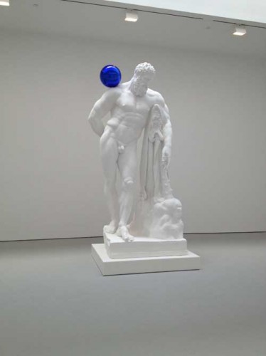
I had thought about going at midnight but decided that I had said my goodbyes earlier in the month when I was one of the last people in the New York art world to see the Jeff Koons show.
Perhaps it is an exaggeration to say that every New York artist has a deep relationship of a kind of ownership of the Whitney in that building, which is the only place where most of us knew the Whitney Museum. Perhaps because it felt like family, we often have been angry at it, the Biennials rather like Thanksgiving dinners, something where you’re disappointed by some of the food, you have a lot of resentment about who was there, you feel it’s gone downhill but you’ve learned a lot from it, and you look forward to the next one. There have been so many exhibitions of note in this building and it has been such a quirky idiosyncratic but intimate place to experience art! I have not yet seen the new building, all the way on the west side, huge, filled, we are told, with the requisite large performance spaces for a more spectacular culture, and not near any public transportation, which marks it as another kind of place entirely than the cosmopolitan urban space and the kind of urban life that marked the New York of the modernist era.
On my last visit, ostensibly to see the Jeff Koons show, I also felt I was saying goodbye to the building, even though that is irrational since the building will remain as a space in which contemporary art will be exhibited. The Metropolitan Museum has deep pockets and takes good care of its properties, and also they have a limited multiyear lease only, until 2023, not ownership, but the Met, as much as I dearly love it, also has a tendency to tart things up with little extra luxuries that might be in the wrong taste in Breuer’s austere though warm building, so a lot depends on how much of the building’s interior is landmarked and how much the Met is interested in respecting the building’s interior as a modernist art work. The size and proportion of the rooms, the elegant brut nature of the stone floors and concrete ceilings, the inset lightbulb fixtures, and the relaxed configuration of the small lobby, the quiet of the stairwell, are as much part of the experience as the art seen, and confer dignity to the visitor to the museum. The art’s adaptation to that space, and the fact that the museum was just not that big also contributed to the possibility of an intimate experience, something that is now considered undesirable by most museums because it relies on art and the individual experience of the viewer with the artwork, rather than on a contemporary social network experience writ large and targeted for iPhone documentation rather than contemplation and private thought.

YESR-Whitney-Koons-IMG_9374YEAR-Whitney-KOONS-Zwirner-IMG_9843

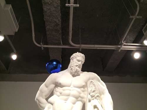
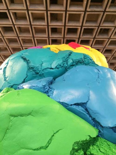
Even the Koons exhibition benefited from its interaction with this space. I had seen the blue balls works at Zwirner a couple of years ago and the chill of the white plaster in the large white space, clean bright white on clean bright white–which I somehow imagine will be the temperature of style of the new Whitney’s interior–was synergistically antipathetic to the human whereas at the Breuer Whitney, the concrete ceiling with its service ducts bare, created a useful counterpoint to the chill of these particular works by Koons, just as the sculptural ceiling of the 4th floor provided a counterpoint of some helpful gravitas to Koons’ Play-Doh  sculpture.

YER-Whitney-Koons_c_IMG_9311

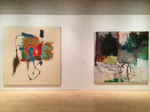
I started my last visit at the top on the 5th floor, where some of the museum’s permanent collection was on view arranged along the theme of gifts to the museum. I was particularly struck and moved by the fortuitous juxtaposition of two large square paintings, one by Helen Frankenthaler, the other by Grace Hartigan. Hartigan has never struck me as the strongest of the three major women artists of the Abstract Expressionist New York School era, the third being Joan Mitchell, and Frankenthaler’s mid-late career works could get very rote and boring, but this was a very strong Frankenthaler and a complex Hartigan which seemed to gain strength from its neighbor’s bold clarity.
Year-Whitney-Frankenthaler-Hartigan-IMG_9292

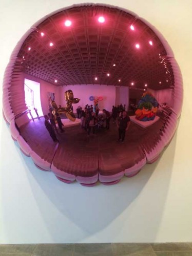
Like everyone else I took lots of pictures of Koons’ shiny objects. I happen to like some of Koons work very much, while despising other works and the show was equally distributed among the ghastly vulgar sexist, and the sublimely mirrored iconic. I particularly enjoyed taking a picture of myself in the purple balloon tondo that reflected the entire room it was exhibited in, including the great asymmetrical window.
Year-Whitney-Koons-IMG_9320

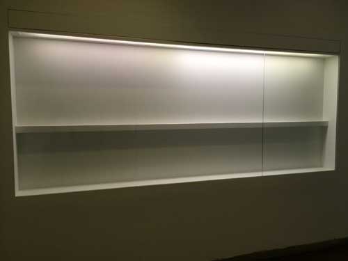
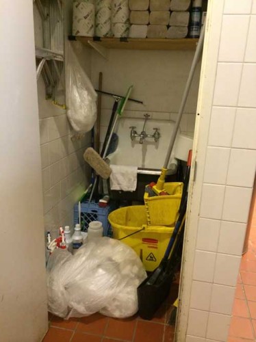
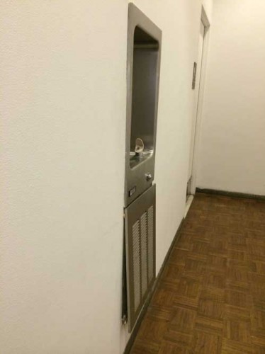
I also noted on a trip to the ladies’ room on the second floor that the Whitney was acting like anyone who is moving out of a place: there were empty shelves where exhibition displays normally would be, the utility closet was gaping open in the bathroom, and why repair loose fixtures, let the next tenant take care of it.

Year-Whitney-MG_9369

YEAR-Whitney-IMG_9367

YEAR-Whitney-IMG_9368

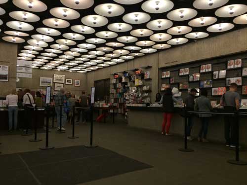
Finally I sat in the lobby. The museum bookstore, in recent days reduced to last bits and pieces, was once one of the really useful art bookstores of New York, it had no special room, just shelving in a smallish area near the coat check–hey guys I know many of your faces and you’ve been nice and I hope you all keep your jobs– and in addition to the requisite museum-branded chatchkes, there was a great selection of art books including art theory and criticism, selected by people who cared about books (I was honored to have my books there, or maybe just Wet, not sure now but anyway, honored because the selection was thoughtful and the space limited). In recent years there were fewer books and a less diverse and critical selection. The Met has a talent for proliferating gift shops, I don’t mind so long as they leave that open casual feeling that made the lobby of the building seem like a living room of a family you knew.

YEAR-Whitney-IMG_9380

I thought of all the exhibitions I had seen in this building through the years. I decided to look back through the Museum’s website of past exhibitions to recall some great shows but their current website only goes back to 2006. I won’t go hunting through my notes over the years, but will just select a few from over the years that have stayed in my memory.

Starting from the top of my head, some of the memories have not been substantiated by factual research: I distinctly remember a work by Richard Tuttle that was simply a white wall that one gradually realized had inset into its flat surface a rotating disk, white on white. The wall turned. I think I did see such a piece but I don’t think or haven’t been able to prove that it was a Tuttle, so I did see this but now I’m not sure whose work it was (this goes back to the 1970s I think). An early reader of this post tells me it was most likely Rotating Circle by Charles Ray from 1988, must be, and most likely then in a Biennial from that era, interesting how the memory shifts information from one place to another.
In a Biennial before 1974 or 75, or in a group show at any rate, I noticed little oval steelwool-like pads installed in spaces that normally would not contain art–above a red exit sign, outside the building–but that called attention to themselves with a strange intensity that marked them as art. Some time later later Richard Artschwager gave a lecture at the Nova Scotia College of Art and Design and I discovered that these mysterious piece were his blps which also appeared in other media in other exhibition/non-exhibition spaces over the years.

In a Marsden Hartley retrospective at the Museum in 1980 curated by Barbara Haskell, an early Hartley painting of Mount Katahdin in Maine, from the early 20th century, its forms abstracted and the surface painted in a late pointillist Signac-inspired manner, was hung at the beginning of the exhibition in a large room to the right side of the elevator, and as you stood in front of it, you could see from across the floor to the last room, to the left of the elevator, one of his last group of paintings of the same subject, from the early 1940s, the forms even more abstracted with a flatter surface, with bolder, less sugary colors, and a more extreme sense of emotional definition. Thus one could see embodied the meaning of a lifetime of work as an artist.

In a Biennial in the early 1980s, from across a very large space, I spot a very small painting, the first time I recall seeing a painting by Bill Jensen, when his surfaces were thick, scraped, much more intense and dense than his most recent work. In that period I was beginning to consider painting with oil and both Jensen’s scraped, palette knifed surfaces and the surfaces of Hartley’s late works, painterly and sculptural also, even when relatively thin, were both helpful mentors in my transition to this difficult rich medium.

An mid-career retrospective of Elizabeth Murray: at the opening I seem to remember that Elizabeth is carrying one of her young daughters in her arms, a powerful image for people to see. A painting I have never been able to see or find an image of since remains in my memory: a large work though made of relatively small shaped fragmented parts arranged in the shape like a giant abstracted question mark. Did I see this? Have I reshaped it in memory the way I did the Tuttle? Possibly.

More recently, at the 2013 exhibition Jay DeFeo: A Retrospective, sitting alone in a room, trying to outwit the guards by just getting my iPhone enough out of my bag to surreptitiously snap a picture of works by DeFeo from the early eighties which I had never seen and whose greatness left me feeling crushed because I had never seen them before, because they needed to be in the history of American painting from their period, not an addition after the fact.

YEAR-Whitney-Jay-DefeoIMG_8447

Some more personal memories: of the night my mother dressed up to go to the opening public reception for the 1966 inauguration of the new Breuer building as the guest of a friend who taught architecture at Harvard and I think was friends with Breuer. She fussed over the right dress and to find the best dress she could afford, and then I remember hearing about the crush of people. The last art exhibition I took her to see was Picasso and American Art, in the fall of 2006, forty years later. The rooms were very crowded, she felt unwell and had to sit down while I looked at the second half of the show. In a further concession to the frailty of her great age, we took a cab home across the park instead of the bus as we once would have done. Nevertheless, sitting in the cab, she said firmly, “it’s the kind of exhibition that makes you want to go home and work.” I should add that my mother Resia Schor was an artist. She was 94 and died a few weeks later, just before her 95th birthday.

Another memory: someone gave me an invitation they couldn’t use, to the opening of Jasper Johns’ retrospective at the Whitney in October 1977. I floated around, young and solitary. At that point in my life, at 27, despite personal ambition, I could look at art world events and careers with a sense of impersonal distance, or rather, I had ambitions certainly but no expectations in that moment, I could watch the scene with interest but not personal jealousy. At one point I found myself in a small room off  the main hall, from which I could see Jasper Johns, surrounded by admirers, magnetically elegant in an impeccable tuxedo. I happened to be alone in the room with Richard Serra, who, surly and probably sweltering in the heavy wool brown tweed jacket he was wearing, seemed like a working class character at an upper-class gathering in a 1920s British novel. I didn’t know him of course, but I did know it was him. I was struck by the discomfort of his jacket, and I sensed his fury at being at an event glorifying another artist–Why not him? When him?–and why was that artist such a James Bond like character, damn him, so handsome and so beautifully dressed!

The 2005 exhibition of Edward Ruscha’s series of paintings, Course of Empire, his contribution to the 51st Venice Bienale, was one of the most unusual exhibitions at the museum in recent years and the most strikingly effective uses of the space. This exhibition as I recall was an opportunistic event, arranged in a relatively short time frame, and taking advantage of all the walls from a recent Biennial (or perhaps some other major exhibition) having just been taken down to create an unusually broad open space for a very interesting installation of the paintings in a kind of foreshortened vista, an avenue bordered by paintings with a small room to the side a few versions or the complete cycle of The Course of Empire by the nineteenth century American artist Thomas Cole. The contrast between Ruscha’s flat portrayals of American commercial architecture and Cole’s bizarre imaginings of the rise and fall of ancient Rome was very curious and thought provoking. When I saw this show I was practically alone with the work and the space, one of my favorite experiences.

YEAR-Whitney-IMG_9382

Many many more memories of so much art, thanks for the memories, and goodbye Whitney Museum of American Art at the Marcel Breuer Building, it’s been swell, and I hope the Whitney comes to regret its decision to leave it, and returns when the Met’s lease is up, to have a second, more intimate and experimental space for its collection and special exhibitions.


FacebooktwittermailFacebooktwittermail