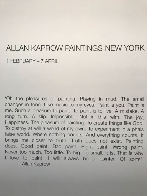
‘OH THE PLEASURES OF PAINTING . PLAYING IN MUD . THE SMALL CHANGES IN TONE . LIKE MUSIC TO MY EYES . PAINT IS YOU . PAINT IS ME . SUCH A PLEASURE TO PAINT . TO PAINT IS TO LIVE . A MISTAKE . A RONG TURN . A SLIP. IMPOSSIBLE . NOT IN THIS RELM . THE JOY . HAPPINESS . THE PLEASURE OF PAINTING . TO CREATE THINGS LIKE GOD . TO DISTROY AT WILL A WORLD OF MY OWN. TO EXPERIMENT IN A PHALS FALSE WORLD . WHERE NOTHING COUNTS . AND EVERYTHING COUNTS . IT BRINGS ME CLOSER TO TRUTH . TRUTH DOES NOT EXIST . PAINTING DOES . GOOD PAINT . BAD PAINT . RIGHT PAINT . WRONG PAINT . NEVER TOO MUCH . TOO LITTLE . TO BIG . TO SMALL . IT IS . THAT IS WHY I LOVE TO PAINT . I WILL ALWAYS BE A PAINTER . OF SORTS’
Artists who leave painting behind, for sculpture, as in the case of Eva Hesse, or for Happenings, performance, conceptual art, and “un-art,” as in the case of Allan Kaprow, occupy a special category, one that hits painters who stuck with the ancient medium like a cream pie in the face: they were so so good at it, but felt it was insufficient for them to grow as an artist, so what does that say for the rest of us?
It turns out Allan Kaprow could paint, really well. The current show at Hauser & Wirth, “Allan Kaprow Paintings New York” is a joy, a pie in the face of painters, and a lesson in the history of Western Art at a particular moment of transformation and intense seriousness of purpose–before fashion and commodity culture totally won the day.
That this exhibition of paintings comes as a surprise is due to the fact that Kaprow is best known for his conceptual performance pieces and as a theoretician of post-studio art and non-art, or “un-art,” and, in the late 50s and early 60s, Happenings, one of which, YARD, coincidentally, was staged in 1961 at the same location as the current exhibition, when it was the back yard of the Martha Jackson Gallery–and restaged by William Pope.L at the same location in 2009, now indoors in the structure where the yard used to be, when Hauser & Wirth opened at the same address. The gallery site is like a Roman excavation of post-War art in New York.
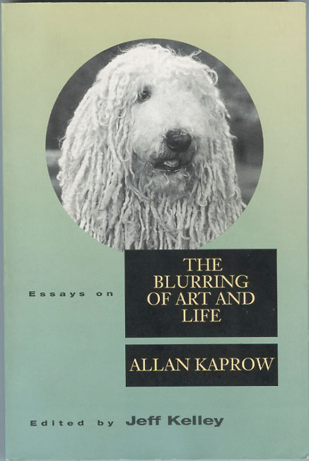
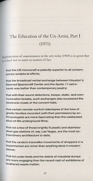
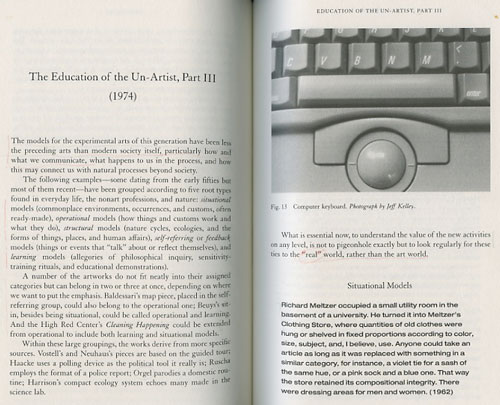
In his Acknowledgements to Essays on The Blurring of Art and Life: Allan Kaprow, editor Jeff Kelley notes the irony of curating a “retrospective ‘exhibition'” of Kaprow’s Happenings especially “if no objects remain from that career.” The “remains” of Kaprow’s career, over the past decades, during his lifetime and since his death in 2006, have mainly been the captivating ephemera of performances and happenings, a few artist’s books documenting via austere photography and bold sans serif typeface rigorously controlled instructions for interpersonal actions, an occasional recreation of a major performance event, such as 18 Happenings in 6 Parts, from 1959, recreated in New York in April 1988, and, also, Kaprow’s writings. In one of the best, most cohesive collections of essays by an artist, Kaprow leads from the front in his writings and his own practice, tracing the development of art from, in “The Legacy of Jackson Pollock,” published in 1958, the moment when Jackson Pollock’s ‘s performativity, as captured in photos by Hans Namuth and Rudy Burckhardt, takes the body of the painter beyond the surface of the painting and into the real, to a moment when what Kaprow considers the compromised nature of art in a capitalist society is transcended into life itself. “The Education of the Un-Artist,” I, II, and III (1971- 74) articulate prescient ideas which are still being explored in contemporary art of social practice as well as in explorations of art and technology, ideas which at many levels of the international artmarket are ever more radical at a time when the commodification of art has intensified exponentially.
Kaprow’s worked increasingly through gestures of anonymity. In Paul McCarthy’s contribution to Artforum‘s Passages for Kaprow, he begins with a recollection that encapsulates what Kaprow sought, as a–“un”–artist:
IF YOU TALKED TO ALLAN, he would say he wasn’t an artist. But he still maintained a kind of presence in the art world. I once did a gallery show in the early ’90s and asked him to contribute. After a while he came back and said, “Yeah, I want to do something. Could you ask the dealer to take a garden hose and water the sidewalk every day before the gallery opens?” The piece essentially went unnoticed. It wasn’t announced; there were no photographs or indication by the gallery that anything had happened. And yet it was a kind of participation.
In the same Passages, Lucas Samaras, Kaprow’s former student, shares his recollection of a similarly anonymous gallery-based non event.
Lucas Samaras, “Matters of Fact,” Artforum, Summer 2006
https://www.artforum.com/print/200606/allan-kaprow-life-like-art-11037
The paintings in the exhibition were done in a short period of time, from 1954 to 1956 when Kaprow was in his late twenties, having studied art since his teens as a student at the High School of Music and Art in New York City–he later received an MA in art history from Columbia. In his twenties he also studied with Hans Hofmann, John Cage, and Meyer Schapiro, while being involved with the founding of the Hansa and Reuben Galleries, and the Fluxus group. By the late ’50s he had moved towards his first Happenings and had also begun writing about art. So his movement through the medium of painting took place during a relatively brief period but it is clear from the paintings that he had absorbed and learned to deploy the practice with genuine capability from which a painting career could have continued, as it did for many of his contemporaries.
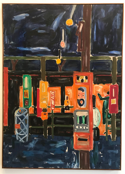
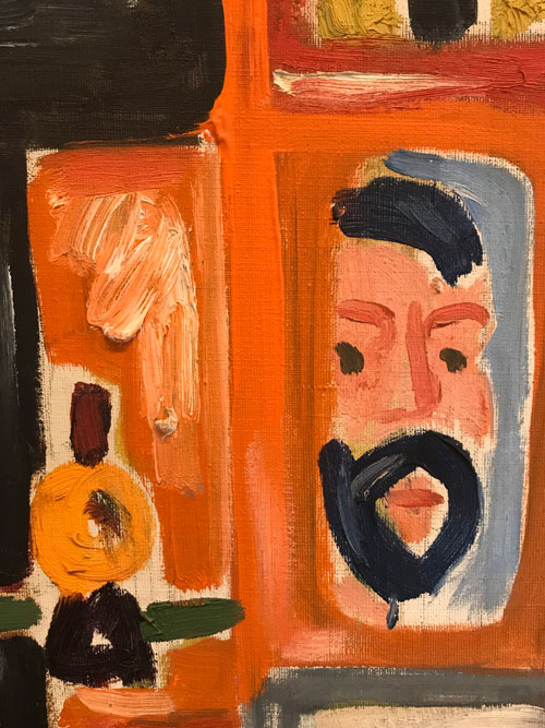
Alan Kaprow, “Subway with Self-Portrait,” 1956. Oil on canvas 50×36″ Hauser & Wirth
When you walk into the first floor of the gallery, you are confronted with a vibrantly composed painterly painting, with a self-portrait jumping out at you from the complex and jazzy composition of New York City.When you turn around to proceed into the main part of the first floor you read on the wall the statement on the pleasures of painting quoted above.
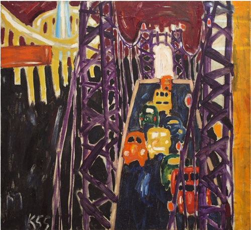
Allan Kaprow, “George Washington Bridge, with Cars,” 1955. Oil on canvas, 42 x 50 inches, © Allan Kaprow Estate
The paintings on the first floor explore New York City. These city paintings, many of them of the city’s main bridges, share commonalities with the funky return to representation and figuration via a meld of loose abstract expressionist brush strokes and paint application–lots of scumbling and blobs of paint–and a sort of ecstatic folk primitivism adopted by his contemporary and friends in New York in the mid to late 50s, such as Red Grooms, Robert Beauchamp, Gandy Brodie, Mimi Gross, Jan Müller, and Claes Oldenburg (with Eva Hesse picking up the tradition in the mid-60s). Paintings like Kaprow’s George Washington Bridge, with cars have the feel of Joseph Stella run through Ruckus Manhattan. These are very joyful paintings.
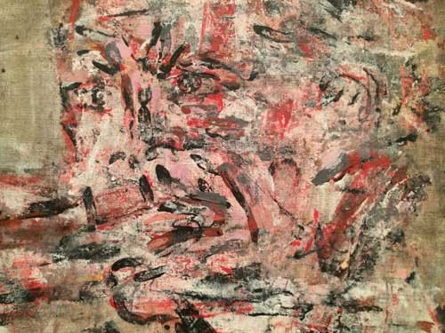
In the back room of the first floor are more experimental works that leave representation behind for a collage approach that might jive with Cobra or with more recent European abstraction by artists like Raoul de Keyser and others. This painting represents another direction–philosophically as well as stylistically–within painting that Kaprow tried on and also discarded, although the representations of language –HA HA–point towards his later works.
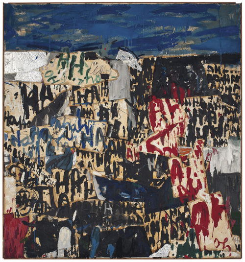
Allan Kaprow, “Hysteria,” 1956. Oil, silver foil & fabric collage, 72 1/8 x 67 1/4
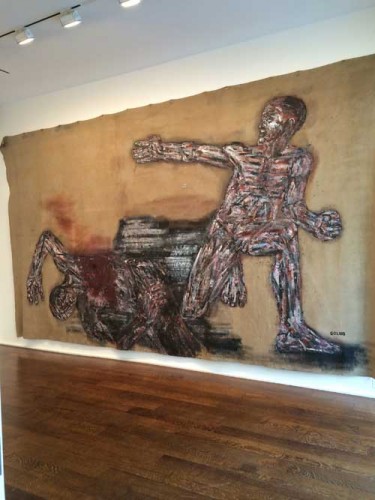
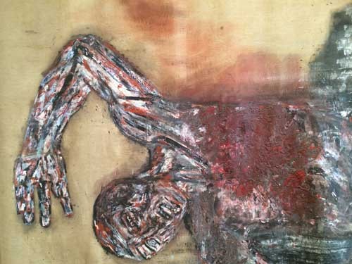
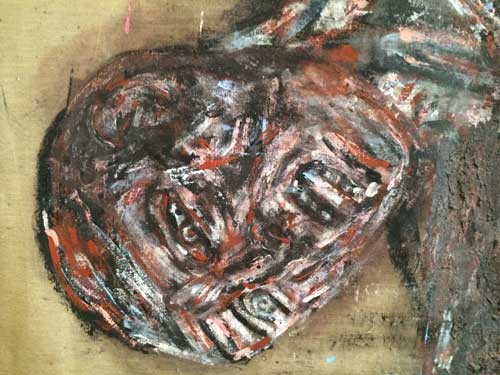
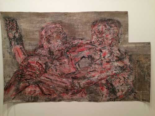
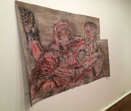
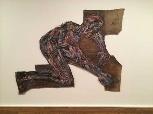
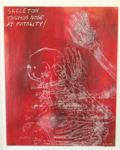
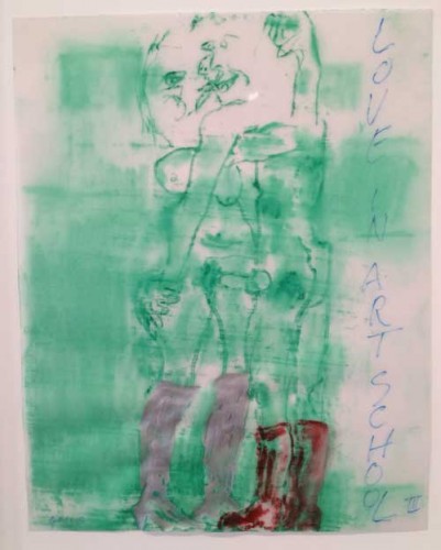
On the second floor are figurative paintings, with their roots above all in German Expressionism–you see Ernst Kirchner in the jagged outlines of nude figures and in the vibrant reds and greens that dominated his palette. One painting of artists including Kaprow painting from the nude places him within a culture of painting which, as it happens, didn’t end just because Kaprow left it behind. This season in New York city galleries and the global art world, the tide seems to have turned abruptly from the flood of zombie formalism to the tsunami of figuration in every possible permutation of styles, a return to order not unlike the one observed in the moment after Cubism, after World War I, not unlike the return of figuration by German, Italian, and American Neo-Expressionists in the 1980s. That this show opens now, and that these paintings by Kaprow represent a phase that he quickly and radically moved past, is quite interesting and ironic. But whereas there is often a large dose of what I’ve taken to calling millennial pathos (as well as postmodern genericity) in a lot of the often very capable paintings of this new wave of figuration, Kaprow’s paintings retain a living rather than a mournful or sentimental connection to all their antecedents.
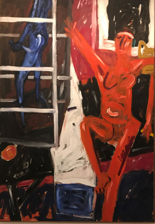
Allan Kaprow, “Red Figure with Cage,” 1956. Oil on canvas, 69 1/4 x 47 5/3″
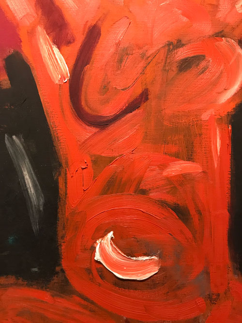
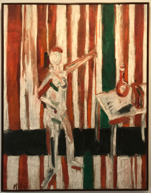
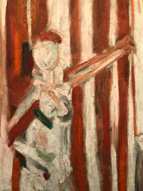
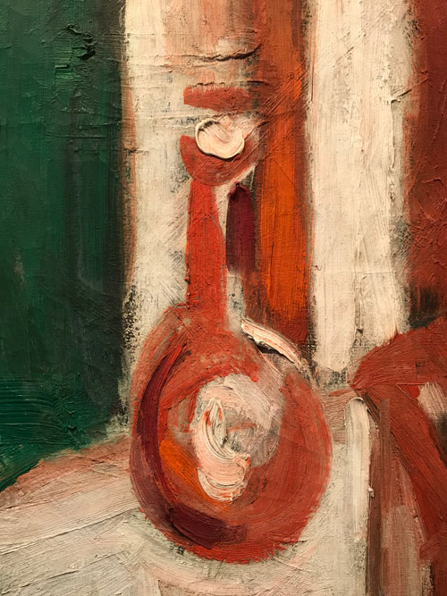
When I went to see the show I sat down on the one bench in the gallery, which happened to be in front of my favorite of these works, Standing Nude Against Red and White Stripes (1955). The painting’s use of stripes give a bold sense of overall surface, within which the figure disappears so that the painting is at once figurative and an abstraction, while still-life details establish Kaprow’s mastery of the medium at perhaps the last point in modern art history when painterliness could be deployed without quotation or irony. The blob of white paint which establishes the reflection and three-dimensionality of a vase has its roots in Chardin and many others from the Grand Tradition of Western painting while having the independent physicality that marks it as a paint thing on a ground, separate from its role as representation.
Kaprow’s ecstatic declaration of his love of painting was discovered written on the interior of the stretchers for this painting when it was being restored. And yet perhaps it was just at this moment of glorying in the act of painting that Kaprow felt a growing awareness of the potential for inauthenticity within the seemingly authentic.
On the third floor, Kaprow’s more familiar art historical profile is reestablished and then again ever so slightly destabilized.
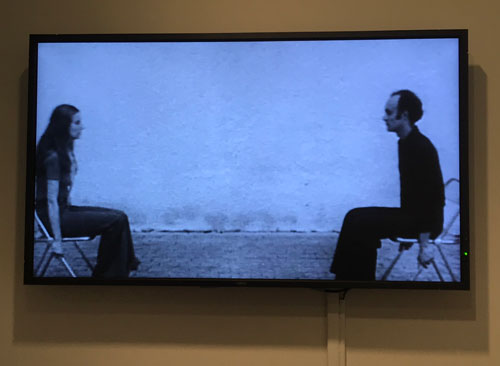
In a small room you can watch videos from the 1970s. That the room which contains that part of Kaprow’s work for which he is known is so small makes sense: Happenings, video performances, books, occupy space and time in a flexible way which hardly needs more than the wall space for some ephemera–posters and books–and a video monitor.
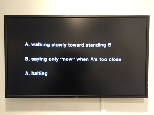
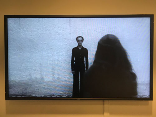
A black and white 16mm film transferred to video such as Comfort Zone (1975), part of a group described as Video Scores for Activities, presents a man and a woman engaged in simple patterns of action, attraction/repulsion, controlled by instructions set by the artist. These scenes are minimalist, psychological by their un-emotive qualities–formally they recall his significant contemporaries, Jean-Luc Godard and Ingmar Bergman, via a 1960s corporate instructions manual.
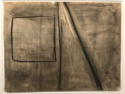
But then Kaprow–or rather the curators of the exhibition–throw us a curveball: two rooms of impeccably achieved, beautifully framed, abstract charcoal drawings from 1975. These drawings look an awful lot like “art.” I think to myself, “Allan was holding out on us,” and in a sense he was. I somehow doubt these drawings (and indeed the paintings even) would have been exhibited in his lifetime, if he had anything to say about it. But then the drawings throw another curve: although they look like so many other drawings from the 70s and even the 80s–one can well imagine these as the drawings of a well established conventional abstract sculptor or painter–they are in fact the trace of breathing, Drawing based upon the breath, each formally impeccable work may be the indexical trace of an exhalation.
breath
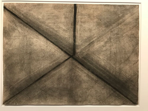
Yet, he kept these drawings and he kept the paintings. And in them we see the recognizable and intact trace of his teacher Hans Hofmann, whose life drawing classes he attended in Provincetown, MA and whose ideas about form and figure/ground he absorbed before discarding. And even the method of meditative indexicality seems slightly troubled by what seem to be traces of erasure, therefore of intentionality and composition.
Looking at the videos, you can understand that Kaprow found the “un-art” he could do that suited his moral and intellectual aims and made a contribution to the development of [art] thought and practice that continues to resonate. But one may reasonably doubt that in these mature works he felt the pure happiness he experienced painting, as he wrote on the stretcher bars, except when he reflexively applied the lessons of his youth to the composition.
About a decade ago, when I taught a contemporary art seminar which traced the development of art making and ideology from modernism to postmodernism, I showed students an interview with Kaprow recorded by The Video Data Bank, contrasting it with the PBS documentary on John Cage, I have Nothing to Say and I am saying it. My own view included something perhaps only I could think of, given my personal background, which is that listening to John Cage is to see in part the privilege of being white and Protestant in American in the 20th Century, while to watch Kaprow is to consider what it means to be an asthmatic Jewish kid trying to enter into that zone of privilege, of art, while being repelled by his own pleasure and virtuosity in it. [I should say that the brief film clip in the Video Data Bank’s online catalogue does not contain whatever caused my interpretation]. That is my very subjective interpretation of the difference of their tone, except that I feel certain that what gave Kaprow’s desire to escape the condition of “art” so much weight is that this struggle was very real and went to the core of his being. It wasn’t an art game, even though he often structured events very rigorously, like games with many rules, however arbitrary
So one wonders, upon seeing this show, if, for Kaprow, painting embodied the egoism he so wanted to transcend. And yet another painter might have worked through youthful virtuosity towards as much rigor and truth as they could achieve within painting.
There is no value judgment here. I deeply enjoy the paintings because they are part of the family of art into which I was born. But I value even more the challenge to my ideas of about what could be [art] posed by Kaprow and other artists who did move from painting to performance, or film, or concept. During the years I taught his writings, and reading them again now, I think his collected essays would in fact be enough of a mark.
‘OH THE PLEASURES OF PAINTING . PLAYING IN MUD . THE SMALL CHANGES IN TONE . LIKE MUSIC TO MY EYES . PAINT IS YOU . PAINT IS ME . SUCH A PLEASURE TO PAINT . TO PAINT IS TO LIVE . A MISTAKE . A RONG TURN . A SLIP. IMPOSSIBLE . NOT IN THIS RELM . THE JOY . HAPPINESS . THE PLEASURE OF PAINTING . TO CREATE THINGS LIKE GOD . TO DISTROY AT WILL A WORLD OF MY OWN. TO EXPERIMENT IN A PHALS FALSE WORLD . WHERE NOTHING COUNTS . AND EVERYTHING COUNTS . IT BRINGS ME CLOSER TO TRUTH . TRUTH DOES NOT EXIST . PAINTING DOES . GOOD PAINT . BAD PAINT . RIGHT PAINT . WRONG PAINT . NEVER TOO MUCH . TOO LITTLE . TO BIG . TO SMALL . IT IS . THAT IS WHY I LOVE TO PAINT . I WILL ALWAYS BE A PAINTER . OF SORTS’
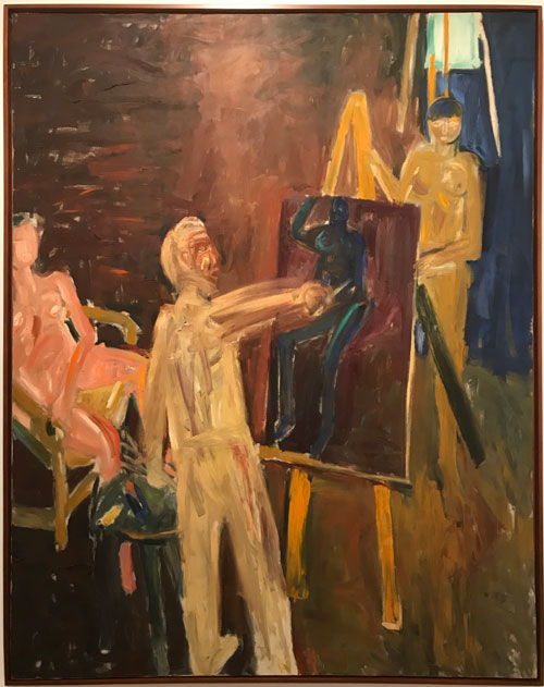
Allan Kaprow, “The Artist in Studio,” 1956. Oil on canvas, 60 1/8 x 47″