Tag Archives: Jasper Johns

Thanks for the Memories: The Whitney and The Breuer Building Years

Today the Whitney Museum is ending its 48 years in its Marcel Breuer building on 75th and Madison with a 36 hours marathon. The building was open through the night last night and will close tonight October 19 at 11PM.

I had thought about going at midnight but decided that I had said my goodbyes earlier in the month when I was one of the last people in the New York art world to see the Jeff Koons show.

Perhaps it is an exaggeration to say that every New York artist has a deep relationship of a kind of ownership of the Whitney in that building, which is the only place where most of us knew the Whitney Museum. Perhaps because it felt like family, we often have been angry at it, the Biennials rather like Thanksgiving dinners, something where you’re disappointed by some of the food, you have a lot of resentment about who was there, you feel it’s gone downhill but you’ve learned a lot from it, and you look forward to the next one. There have been so many exhibitions of note in this building and it has been such a quirky idiosyncratic but intimate place to experience art! I have not yet seen the new building, all the way on the west side, huge, filled, we are told, with the requisite large performance spaces for a more spectacular culture, and not near any public transportation, which marks it as another kind of place entirely than the cosmopolitan urban space and the kind of urban life that marked the New York of the modernist era.

On my last visit, ostensibly to see the Jeff Koons show, I also felt I was saying goodbye to the building, even though that is irrational since the building will remain as a space in which contemporary art will be exhibited. The Metropolitan Museum has deep pockets and takes good care of its properties, and also they have a limited multiyear lease only, until 2023, not ownership, but the Met, as much as I dearly love it, also has a tendency to tart things up with little extra luxuries that might be in the wrong taste in Breuer’s austere though warm building, so a lot depends on how much of the building’s interior is landmarked and how much the Met is interested in respecting the building’s interior as a modernist art work. The size and proportion of the rooms, the elegant brut nature of the stone floors and concrete ceilings, the inset lightbulb fixtures, and the relaxed configuration of the small lobby, the quiet of the stairwell, are as much part of the experience as the art seen, and confer dignity to the visitor to the museum. The art’s adaptation to that space, and the fact that the museum was just not that big also contributed to the possibility of an intimate experience, something that is now considered undesirable by most museums because it relies on art and the individual experience of the viewer with the artwork, rather than on a contemporary social network experience writ large and targeted for iPhone documentation rather than contemplation and private thought.

YESR-Whitney-Koons-IMG_9374YEAR-Whitney-KOONS-Zwirner-IMG_9843

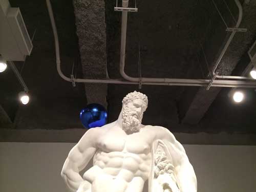
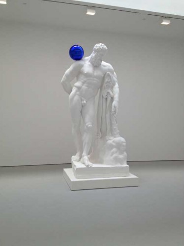
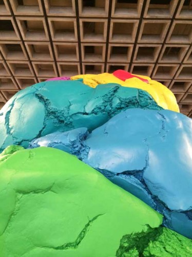
Even the Koons exhibition benefited from its interaction with this space. I had seen the blue balls works at Zwirner a couple of years ago and the chill of the white plaster in the large white space, clean bright white on clean bright white–which I somehow imagine will be the temperature of style of the new Whitney’s interior–was synergistically antipathetic to the human whereas at the Breuer Whitney, the concrete ceiling with its service ducts bare, created a useful counterpoint to the chill of these particular works by Koons, just as the sculptural ceiling of the 4th floor provided a counterpoint of some helpful gravitas to Koons’ Play-Doh  sculpture.

YER-Whitney-Koons_c_IMG_9311

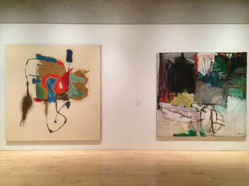
I started my last visit at the top on the 5th floor, where some of the museum’s permanent collection was on view arranged along the theme of gifts to the museum. I was particularly struck and moved by the fortuitous juxtaposition of two large square paintings, one by Helen Frankenthaler, the other by Grace Hartigan. Hartigan has never struck me as the strongest of the three major women artists of the Abstract Expressionist New York School era, the third being Joan Mitchell, and Frankenthaler’s mid-late career works could get very rote and boring, but this was a very strong Frankenthaler and a complex Hartigan which seemed to gain strength from its neighbor’s bold clarity.

Year-Whitney-Frankenthaler-Hartigan-IMG_9292

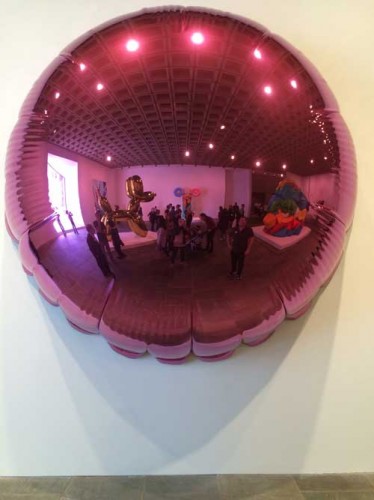
Like everyone else I took lots of pictures of Koons’ shiny objects. I happen to like some of Koons work very much, while despising other works and the show was equally distributed among the ghastly vulgar sexist, and the sublimely mirrored iconic. I particularly enjoyed taking a picture of myself in the purple balloon tondo that reflected the entire room it was exhibited in, including the great asymmetrical window.

Year-Whitney-Koons-IMG_9320

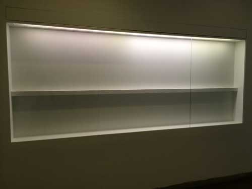
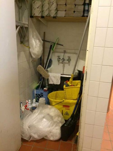
I also noted on a trip to the ladies’ room on the second floor that the Whitney was acting like anyone who is moving out of a place: there were empty shelves where exhibition displays normally would be, the utility closet was gaping open in the bathroom, and why repair loose fixtures, let the next tenant take care of it.

Year-Whitney-MG_9369

YEAR-Whitney-IMG_9367

YEAR-Whitney-IMG_9368

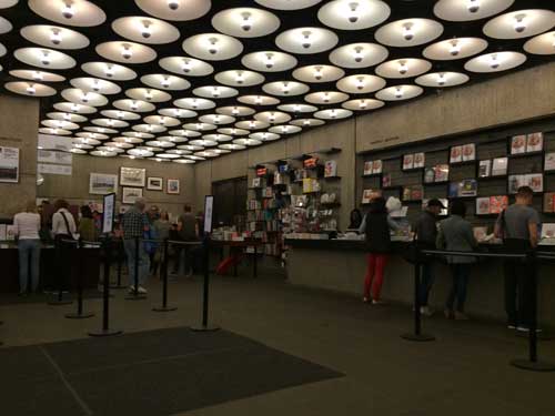
Finally I sat in the lobby. The museum bookstore, in recent days reduced to last bits and pieces, was once one of the really useful art bookstores of New York, it had no special room, just shelving in a smallish area near the coat check–hey guys I know many of your faces and you’ve been nice and I hope you all keep your jobs– and in addition to the requisite museum-branded chatchkes, there was a great selection of art books including art theory and criticism, selected by people who cared about books (I was honored to have my books there, or maybe just Wet, not sure now but anyway, honored because the selection was thoughtful and the space limited). In recent years there were fewer books and a less diverse and critical selection. The Met has a talent for proliferating gift shops, I don’t mind so long as they leave that open casual feeling that made the lobby of the building seem like a living room of a family you knew.

YEAR-Whitney-IMG_9380

I thought of all the exhibitions I had seen in this building through the years. I decided to look back through the Museum’s website of past exhibitions to recall some great shows but their current website only goes back to 2006. I won’t go hunting through my notes over the years, but will just select a few from over the years that have stayed in my memory.

Starting from the top of my head, some of the memories have not been substantiated by factual research: I distinctly remember a work by Richard Tuttle that was simply a white wall that one gradually realized had inset into its flat surface a rotating disk, white on white. The wall turned. I think I did see such a piece but I don’t think or haven’t been able to prove that it was a Tuttle, so I did see this but now I’m not sure whose work it was (this goes back to the 1970s I think). An early reader of this post tells me it was most likely Rotating Circle by Charles Ray from 1988, must be, and most likely then in a Biennial from that era, interesting how the memory shifts information from one place to another.

In a Biennial before 1974 or 75, or in a group show at any rate, I noticed little oval steelwool-like pads installed in spaces that normally would not contain art–above a red exit sign, outside the building–but that called attention to themselves with a strange intensity that marked them as art. Some time later later Richard Artschwager gave a lecture at the Nova Scotia College of Art and Design and I discovered that these mysterious piece were his blps which also appeared in other media in other exhibition/non-exhibition spaces over the years.

In a Marsden Hartley retrospective at the Museum in 1980 curated by Barbara Haskell, an early Hartley painting of Mount Katahdin in Maine, from the early 20th century, its forms abstracted and the surface painted in a late pointillist Signac-inspired manner, was hung at the beginning of the exhibition in a large room to the right side of the elevator, and as you stood in front of it, you could see from across the floor to the last room, to the left of the elevator, one of his last group of paintings of the same subject, from the early 1940s, the forms even more abstracted with a flatter surface, with bolder, less sugary colors, and a more extreme sense of emotional definition. Thus one could see embodied the meaning of a lifetime of work as an artist.

In a Biennial in the early 1980s, from across a very large space, I spot a very small painting, the first time I recall seeing a painting by Bill Jensen, when his surfaces were thick, scraped, much more intense and dense than his most recent work. In that period I was beginning to consider painting with oil and both Jensen’s scraped, palette knifed surfaces and the surfaces of Hartley’s late works, painterly and sculptural also, even when relatively thin, were both helpful mentors in my transition to this difficult rich medium.

An mid-career retrospective of Elizabeth Murray: at the opening I seem to remember that Elizabeth is carrying one of her young daughters in her arms, a powerful image for people to see. A painting I have never been able to see or find an image of since remains in my memory: a large work though made of relatively small shaped fragmented parts arranged in the shape like a giant abstracted question mark. Did I see this? Have I reshaped it in memory the way I did the Tuttle? Possibly.

More recently, at the 2013 exhibition Jay DeFeo: A Retrospective, sitting alone in a room, trying to outwit the guards by just getting my iPhone enough out of my bag to surreptitiously snap a picture of works by DeFeo from the early eighties which I had never seen and whose greatness left me feeling crushed because I had never seen them before, because they needed to be in the history of American painting from their period, not an addition after the fact.

YEAR-Whitney-Jay-DefeoIMG_8447

Some more personal memories: of the night my mother dressed up to go to the opening public reception for the 1966 inauguration of the new Breuer building as the guest of a friend who taught architecture at Harvard and I think was friends with Breuer. She fussed over the right dress and to find the best dress she could afford, and then I remember hearing about the crush of people. The last art exhibition I took her to see was Picasso and American Art, in the fall of 2006, forty years later. The rooms were very crowded, she felt unwell and had to sit down while I looked at the second half of the show. In a further concession to the frailty of her great age, we took a cab home across the park instead of the bus as we once would have done. Nevertheless, sitting in the cab, she said firmly, “it’s the kind of exhibition that makes you want to go home and work.” I should add that my mother Resia Schor was an artist. She was 94 and died a few weeks later, just before her 95th birthday.

Another memory: someone gave me an invitation they couldn’t use, to the opening of Jasper Johns’ retrospective at the Whitney in October 1977. I floated around, young and solitary. At that point in my life, at 27, despite personal ambition, I could look at art world events and careers with a sense of impersonal distance, or rather, I had ambitions certainly but no expectations in that moment, I could watch the scene with interest but not personal jealousy. At one point I found myself in a small room off  the main hall, from which I could see Jasper Johns, surrounded by admirers, magnetically elegant in an impeccable tuxedo. I happened to be alone in the room with Richard Serra, who, surly and probably sweltering in the heavy wool brown tweed jacket he was wearing, seemed like a working class character at an upper-class gathering in a 1920s British novel. I didn’t know him of course, but I did know it was him. I was struck by the discomfort of his jacket, and I sensed his fury at being at an event glorifying another artist–Why not him? When him?–and why was that artist such a James Bond like character, damn him, so handsome and so beautifully dressed!

The 2005 exhibition of Edward Ruscha’s series of paintings, Course of Empire, his contribution to the 51st Venice Bienale, was one of the most unusual exhibitions at the museum in recent years and the most strikingly effective uses of the space. This exhibition as I recall was an opportunistic event, arranged in a relatively short time frame, and taking advantage of all the walls from a recent Biennial (or perhaps some other major exhibition) having just been taken down to create an unusually broad open space for a very interesting installation of the paintings in a kind of foreshortened vista, an avenue bordered by paintings with a small room to the side a few versions or the complete cycle of The Course of Empire by the nineteenth century American artist Thomas Cole. The contrast between Ruscha’s flat portrayals of American commercial architecture and Cole’s bizarre imaginings of the rise and fall of ancient Rome was very curious and thought provoking. When I saw this show I was practically alone with the work and the space, one of my favorite experiences.

YEAR-Whitney-IMG_9382

Many many more memories of so much art, thanks for the memories, and goodbye Whitney Museum of American Art at the Marcel Breuer Building, it’s been swell, and I hope the Whitney comes to regret its decision to leave it, and returns when the Met’s lease is up, to have a second, more intimate and experimental space for its collection and special exhibitions.


FacebooktwittermailFacebooktwittermail

Craft and Process: Jasper Johns / Regrets

I am interested in the capacity of material experimentation and serial practices to bring an artist to the expression of, the performance of, the actualization of content the artist had intended or desired but might not have arrived at if trust had not been put into process and materiality at some point or another. Such practices at times may seem to be unrelated to language-based theoretical structures, in particular if they involve manual processes and techniques although I am careful here to say “process” rather than “studio practice” because the latter might summon up traditional media and object-based art that in some quarters can be easily dismissed as irrelevant to contemporary issues, whereas material or methodological experimentation and serial practices can take place in any medium, including video, film, and photobased work, as well as in writing and conceptual art.

Because of my interest in process in the broader sense and because of my love of the expressive material qualities of traditional media such as ink, paper, pencil, oil, gouache, linen, wood, wax, stone, lead, copper, bronze, and more, I wanted to see Jasper Johns: Regrets, currently at MoMA even though I had a feeling I might be disappointed, despite my admiration for Johns’ earlier work and for the rigorous and rigorously private studio practice that he maintains at what is considered an advanced age for an artist, 83. Daily studio practice and engagement with craft by older artists was, literally, my matrix, and it’s my hope for my own future.

The work exhibited in Jasper Johns: Regrets  is exemplary of work process in which an image is repeated and reworked using a range of techniques and materials. Johns has applied his own, oft-quoted prescription for the empty studio and the blank piece of paper or canvas, “Take an object/Do something to it/ Do something else to it/ [Repeat]” from 1964, to the crumpled, torn print of a photograph of a young Lucian Freud, commissioned by Francis Bacon for his own work process on a portrait of Freud. In the past year Johns has produced an impressive and instructive series of drawings and prints and two paintings on canvas that use this photograph as the initiatory form.

A slight pause to observe the awe-inspiring, nearly absurd monumentality of what it means that an artist can call MoMA and say something to the effect of, “I have some new work in the studio and I want to show it–at MoMA–now,” and they make it so. I had to research whether Johns even has gallery representation in New York; he does (Matthew Marks) but the call to MoMA denotes an artist who is hors combat, beyond value, who has droit de seigneur, and justly so, and it suggests an almost quaint familial intimacy with roots in another time with the institution MoMA.

The drawings are mostly small and they take place within the strict boundary of a smaller rectangular area set on a larger piece of paper, effectively setting each drawing into an optical frame, and giving each drawing a formal quality that goes somewhat against the grain of the theme of material and subjective experimentation: Johns never draws outside the lines and there are no accidental smudges or other stereotypical indications of “work” in progress or changes of mind within an individual, except for notes to himself at the bottom of some works, in a careful, small capital letters only print in pencil: “GOYA? BATS? DREAMS?” There is a quality of carefulness and diligence in each work, with each drawing fulfilling a specific set of material specifications and formal analysis of the image. Each is a finished work, enclosed, specific, and private.

The drawings are done with pencil, acrylic, and water-color, in some cases with a Seurat-like dissolution of the figure created by the pebbly effect of rubbing a pencil over a pebbly-surfaced watercolor paper, in other cases a watery smooth print like effect is achieved through ink on a smooth and water repellent vellum like surface.

In most of the works, the pathos embodied in the photograph of Freud–a young man, his face obscured by his hand and by falling strands of hair, seated on a bed–is transferred emotively to the shape of the negative space created by the torn off bottom left hand corner of the print.  In the many iterations of the image in which Johns has doubled the picture in a mirror or Rorschach-test format, the human figure is a recessive, barely legible form while the negative shape becomes an important sculptural shape, like a mesa or a tombstone.

The two paintings in the exhibition have a sober, reflective quality with the monumental tombstone form of the negative space in the center framed by intimations of the recalcitrant figure. The group of work as a whole, the whole gift of a limited invitation into his studio functions as a counter-movement to mortality and knowing the age of the artist it is easy to read into the work a reflection on mortality, which is his subject I think.

Yet the work also has a funereally static quality of which the worst effect is a kind of conservatism instead of the sublime monumentality or contingent fragility that one imagines it will contain.

The problem is twofold: it is fascinating to see how the artist has taken an unprepossessing photographic scrap and rung so many changes on it yet the image upon which this edifice of studio practice is based is perhaps not all that resonant, either absolutely, or in the way he has chosen to interpret it by enhancing abstraction and deflecting figuration. Or his pressing of the appropriated image through layers of visual analysis does not actually push experimentation with materials far enough in order to get at the core of the content by his deconstruction of the given picture.

Photograph of Lucian Freud by John Deakin ©Dublin City Gallery The Hugh Lane/The Estate of Francis Bacon

But, now I think, perhaps I am wrong. As I write, in my mind the work becomes more interesting, the fact that the figure is so obscured and the very disciplined and precise thoroughness of the visual analysis of the appropriated image is fascinating in its rigor and in the emotional reticence. Maybe. And yet…

The most important moment for me was while standing to the left of the larger painting, Regrets, trying to get as close as I could to the painting surface, in the area where the seated figure is both represented and camouflaged through a web of paint marks which are neither minimal nor especially sensual: the paint quality is curiously dry with unexpected but frustrating flicks of a more sensual or at least thicker slightly less dry paint. I wish I could photograph that moment of vision, being as close to the painting as one is allowed, looking at it from one side, my vision raking it from a sharp angle to the picture plane, trying to decipher the figure, trying decode the various types of paint strokes and degrees of lubricity or aridity of the paint. It is the crux of the experience of this painting and this series of works, that the most interesting thing, the most complex, is also the least visible and, for some viewers, the most disappointing. If one thinks of this painting in relation to the characteristics of the “old age style” first perceived in late works by artists such as Michelangelo, Titian, Rembrandt, as well in late Cézanne, where the high finish of youth yields to a rougher, often more “unfinished” and therefore more modern to our eyes loose, direct, unvarnished representation, this painting both adheres to some of the characteristics of of that stylistic determination and yet goes against its grain: it is sometimes loose, but also tight, obscure, and recalcitrant. Instead it is in earlier work that one finds the characteristics of what had once been called the old age style, where the artist has no time for the niceties and goes for the gut, as in Painting Bitten by a Man, 1961, from the collection of MoMA, which was in a small but resonant two-person exhibition at Craig F. Starr Gallery last spring,Body Double: Jasper Johns/Bruce Nauman. Here is rich surface, base materialism, a mark that goes beyond indexicality to something like both cannibalism and lovemaking with the matter of paint itself.

Jasper Johns, Painting Bitten by a Man, 1961. Encaustic on canvas mounted on type plate, 9 1/2 x 6 7/8″ (24.1 x 17.5 cm),Gift of Jasper Johns in memory of Kirk Varnedoe, Chief Curator of the Department of Painting and Sculpture, 1989-2001 Copyright:© 2014 Jasper Johns / Licensed by VAGA, New York

Compared to Painting Bitten by a Man, the paintings in Regrets yield their meaning parsimoniously. I know that to compare these new works by Johns to his remarkable earlier work is to commit the unpardonable of holding a great artist to the standard of his greatest works, which came in his youth, all the more so because I respect all the work intensely, I mean not just the great early works, but the way he continues to work and to be in the world, the discipline of work no matter what stage of life’s work he is in. But I have a feeling I’m not the only person who is painting late Johns paintings in my head that are different than the ones he is actually painting.

A hint of what those might be is contained in 0-9, , one other series of works on paper in the MoMA exhibition, also done in 2013 but unrelated to the Regrets series. Nine monoprints on small pieces of rice paper represent the numbers 0 through 9, in the stencil style Johns has used many times addressing this subject. The work is done through a complex process, according to the wall text: “using stencils, rubber stamps, and textured materials–including mesh screens, rags, strings, and coins…Johns assembled each composition on an aluminum plate. He then covered these assemblages in white ink and printed them on sheets of paper. Finally he immersed the prints in a bath of black india ink, which dyed the paper but not the oil based white ink.” If one of the features of work that I love is that I want to turn on my heel and go back to my studio and work, in terms of the inspiration provided by process, he had me at “a bath of black india ink, which dyed the paper but not the oil based white ink.” By that I mean, just reading those words–“bath of black india ink”–made my pupils dilate and set my pulse racing slightly, separate even from the work achieved through that technique. But on top of that, these works themselves are delicate, simple, and there is a resonance between the method and the subject: the numbers 0 to 9 are images and concepts we recognize immediately, we know deeply, a subject that combines familiarity and neutrality so that, like the target or the flag, we can appreciate what it is that Johns is doing to them with his craft, when he takes an object, does something to it, and then does something else to it, and repeats, whereas the wrecked photo of Lucien Freud is foreign to us. Thus, although it is a resonant and mysterious image, it is also an arcane, individual, and private one, so that there is perhaps too great a conceptual and cognitive distance between the appropriated image and the material explorations of the series. I admire the work, the artifice, and even the recalcitrance of the works in Regrets, but, although I really want to, I don’t love them, I regret to say. But I will go back and stick my nose as close to the big canvas as I can and think about it some more.


FacebooktwittermailFacebooktwittermail

Looking for art to love, day two: uptown

Uptown, at the Met, April 22

I arrived at the Met late in the afternoon, having stopped first at Acquavella Gallery to see Robert & Ethel Scull: Portrait of a Collection. I feel like I knew the Sculls personally because I show Emile de Antonio’s 1973 great documentary film Painters Painting whenever I teach about the New York School, which means often. The Scull’s appearance is a highlight of a film full of highlights: I love the scene where Ethel, with a vivacious enthusiasm that seems at once genuinely innocent and rapaciously disingenuous, describes Andy Warhol, armed with bags of coins, creating her portrait by taking her to Times Square to have her picture taken in photobooths in a tacky arcade. So it is great to see the painting in the show:

Andy Warhol, detail, "Ethel Scull 36 Times," 1963, acrylic and silkscreen on canvas, 100"x144"

I also feel like I know the Sculls because of Jack Tworkov’s description of them in a diary entry + note scribbled on the back of an American Airlines ticket envelope, returning from a trip to Buffalo for the opening of a new wing at the Albright-Knox Art Gallery:

Friday, January 19, 1962

Took plane with Leo for Buffalo. Sat with Sculls. New People, like cheap bright aluminum pots. For whom is “Avant-Garde” art intended, for them obviously. They never say art without the prefix Avant-Garde.

*Vulgar people—I don’t mean not nice people. They can even be pleasant—nevertheless they can be embarrassing. They are unsure still of their accent, their reading matter, their pleasures, their vacation places. They use all these things for self-improvement which is itself vulgar and I speak as one who has suffered all the self-improvement I can stand. They [are] embarrassed with their own status, eager to acquire through culture what has been denied to them because of family background, race, religion or the unaccustomed uses of recently acquired wealth. Since they are fundamentally embarrassed people they are essentially unaware and make little use of their fundamental strength—what is peculiarly their own (as the elite knows so well how to do) and make a great show of borrowing clothing of what is after all mere social disguises. These people are really new people as new as an aluminum pot. It is for them essentially that avant-art is made. They are the mass market for what chic initiates.

(The Extreme of the Middle: Writings of Jack Tworkov, 130)

All the more amusing then that the show is installed in such elegant upper East side mansion style rooms with ornate moldings, parquet floors, French windows, and gilt-framed mirrors. Nouveau Riche meets Edith Wharton New York. Two excellent early Rosenquist paintings were a nice surprise, both very restrained in color, both working from the photographic but not yet based on commodity or military spectacle: the flat color and use of disappearance and deletion within the appropriated photographic image in Untitled (Blue Sky), 1962, reminded me of much more recent works by John Baldessari . Another surprise: Jasper Johns did paint some bad paintings back in the day! Johns’ Double Flag from 1962 is in my opinion a rare stinker from that period, I’m not sure whether this is because of the particularly pedestrian use of realistic color in this work or the rather slack paint surface quality (the gallery web site perhaps wisely does not include an image of this work).

James Rosenquist, "Untitled (Blue Sky)," oil on canvas, 84"x72," 1962

At the Met, with only forty-five minutes before closing time, I decided to just look at the The Art of Illumination: The Limbourg Brothers and the Belles Heures of Jean de France, duc de Berry. An amazing show which required more time than I could give it since each miniature painting necessitates careful examination with one of the magnifying glasses supplied by the museum in order to fully experience its monumentality, but the surprise for me were a group of astounding and curious sculptures I encountered unexpectedly in passing as I was speeding back through the Medieval Sculpture Hall towards The Art of Illumination, which is in the Lehman Wing: in the center of the hall, on a simple platform, stands an eerie procession of thirty-six small alabaster figurines, lined up two by two, led by two even smaller figures. These are The Mourners, Tomb Sculptures carved by Jean de La Huerta and Antoine Le Moiturier between 1443 and 1456 to adorn the tomb of Duke John the Fearless and Margaret of Bavaria. They’re usually set into Gothic architectural niches so this exhibition offers an unusual opportunity to see them in the round.

I have a weakness for representations of drapery in painting and sculpture. Here the style of representation is realistic though with a trace of Gothic elegance, caught in time between the massive sculptural rendering of drapery on many figures in the work of Giotto of the early fourteenth century and that of Zurbaran’s more naturalistic and yet also more dramatic depiction of similarly garbed and hooded monks, from the early to mid-1600s. These figures were once polychrome: this and much more historical context for these figures can be found in a recent book review by Anthony Grafton of The Mourners and the catalogue of The Art of Illumination.

Mourner with drawn hood, alabaster, 16 1/2"x 6 1/8" x 5 1/8," Jean de la Huerta and Antoine Le Moiturier, 1443-1456

There is a weird resemblance to Obi-Wan Kenobi in the exquisitely rendered drapery of the monks’ robes with cowls often completely obscuring their faces (though if one peers into the shadow of the cowl, their features are as delicately carved as the most expensive nineteeth-century porcelain doll): of course the train of influence runs in the other direction but you can’t help but think of Star Wars for a minute, until you experience the specific features and accoutrements of each mourner. Because of the dominance of drapery these sculptures are as abstract as they are figurative, and as monumental as they are doll-like. They are really fascinating little figures, mourners but poker-faced. Despite the drama of their depicted grief, they have a precise kind of calm in their form.

Mourner, Jean de la Huerta and Antoine Le Moiturier, 1443-1456

Mira Schor, sketch of what I think is the figure above, seen from the side

I was particularly interested in the figures holding open books, since this is an image I have recently been working with, a figure — myself — who, among other things, is a mourner reading the book of the past while walking into the future. Despite the fact that I am in fact drawing such figures in my work, I was irritated that photography was not permitted at the Met (and annoyed at the vigor which the guard applied to her enforcement of this rule) so that I had to make do with some quick sketches, which proved particularly ineffective: usually my sketches of artworks recall the work in a more vivid and embodied way for me than any pictures I take at the same time, but even when looking at the special website for this exhibition, which allows you to rotate the figures 360 degrees and look at them from three vantage points (from above, eye level, and from below), I still can’t be sure I recognize one of the figures I drew, attracted by the Gothic elegance of a slightly slouching slim pose.

I feel there is something very useful to me about these sculptures, individually and their grouping, here particularly the idea of the isolation and privacy of individual mourning in relation to the rituals of collective mourning. Because they’re resonant of some aspects of work I am doing, they suggest something about what I might do, as yet unknown to me .

Mourner with drawn hood, reading a book, Jean de la Huerta and Antoine Le Moiturier, 1443-1456

Mira Schor, 38th spread, Grey Summer Notebook, ink and gesso on paper, 9 7/8”x14”, 2009

FacebooktwittermailFacebooktwittermail