Tag Archives: Abstraction

Painting in the 1980s: Elizabeth Murray

Elizabeth Murray: Painting in the 80s at Pace Gallery arrives at an interesting moment in terms of the abrupt shift of stylistic currents and tropes that characterize art history and it offers an opportunity to revisit the situation of women painters in the 1980s.

Brief study prompt: Painting in the 1980s–you weren’t supposed to do it–that is, if you were a woman, and especially a woman interested in discourse on gender politics. Different story if you were an American, Italian, or German man.

Or you could do it, although particularly if you were a male artist, but certainly not sincerely, there had to be an ironic twist. An appropriational basis in photography and language helped.

The title of the show implies the aesthetic tensions of that moment, that is, the title is not Elizabeth Murray: Paintings of the 80s, which would place the focus on her work alone during a certain time period of her working life, but Painting in the 80s, that is, her activity of painting in the 80s and, beyond that, the activity and the discipline of painting at a particular moment in Western art history.

Starting in the early 1980s, the art market experienced a huge surge after a decade of relative recession which had been, not coincidentally, marked by creative and political experimentation and which was, notably, the decade of Murray’s first fully mature work. In the new market boom, large Neo-Expressionist and appropriational painting, largely by male artists, was the dominant medium and of course the favored market commodity, with women gravitating (and being pushed, by both external and internal forces) towards photography and photobased media (with correspondingly lesser market value). While the language of the heroic history of painting could still be applied to the former, along with newer modes of criticism influenced by postmodern theory, or, even, one might say, despite the dominance of the anti-essentialism of such theory, the other–work by women artists including those peripherally or explicitly interested in gender–was drawn to and delimited by the same theory with an emphasis on an anti-essentialism that particularly targeted painting.

A so-to-speak mantraic recap of that period might be, Lacan, Foucault, Derrida, Lacan, Foucault Derrida, and, when it came to women artists, Cindy Sherman, Barbara Kruger, Jenny Holzer, Cindy Sherman, Barbara Kruger, Jenny Holzer…not forgetting Baudrillard and Mary Kelly, and more, but you get the idea.

Of course there were powerful women painters during that time period, including in addition to Murray, artists such as Susan Rothenberg and Ida Applebroog. But international exhibitions and biennials of contemporary art usually included very few women and of these the three mentioned above were ubiquitous.

And at that time, as I have observed elsewhere, it was useful for such painters to do work that could be parsed for their representational depiction of ideas about the female body, femininity, gender and feminism. Abstract artists–including women painters and sculptors whose work had been so influential and notable within feminist art discourse in the 70s–often felt left out of major exhibitions and texts devoted to women artists and feminism. In that moment Elizabeth Murray’s work was a beacon. To walk into Paula Cooper Gallery in the 80s or into Murray’s first major museum retrospective, at the Whitney, in April 1988, was a thrill and inspiration. To walk into Pace Gallery today is to experience that thrill anew.

Elizabeth Murray, “Making It Up,” 1986. Oil on canvas, 10′ 4 1/8″x7′ 11 1/8″ Image used by permission © The Murray-Holman Family Trust / Artists Rights Society (ARS), New York


The paintings from that period, now as when they were first created and exhibited, are bold, confident, powerful, intensely physical, courageous in their assertion of space on and off the wall, massive, inspiring in their use of color and paint texture and application.

But at some level the paintings operated and still operate beyond discursiveness. At a time when representation and enculturation of female identity was the issue at hand, feminist criticism couldn’t quite get a grip on a large twisted broken shield or heart like a shield working at a monumental scale, leaping out at you from the gallery wall, where you couldn’t directly address a feminist narrative by which I mean the narrow interpretation of what a feminist narrative might be where representation, figuration, and appropriation would allow you to speak of psychoanalysis, for example. Not that Murray wasn’t widely admired but the important feminist criticism of the day was focused on artists whose work could be discussed in relation to Freud, Lacan, Foucault, Derrida, Kristeva, and there were clear specifications of what work was part of that discourse and which wasn’t.

These theoretical references were also the lodestars of a dominant anti-essentialist discourse on how the female and the feminine were socially constructed and you couldn’t address Murray’s work without dealing with how engaged she was with the basic components of painting—figure and ground, oil on canvas and support, and this was in the dangerous territory of the essentialism of painting itself. And while in fact Murray’s work demolished Greenbergian tenets, at the same time her painterly ambition both embraced and reinvigorated the great tradition of New York School painting of which his philosophy were an important component.

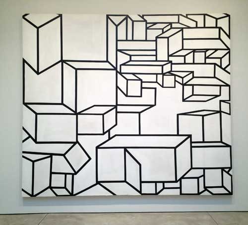
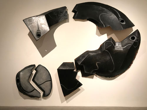
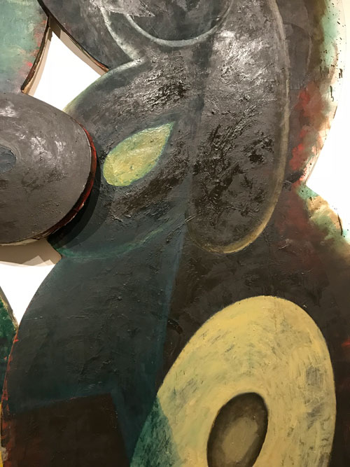
Elizabeth Murray, “Like A Leaf,” 1983. Oil on canvas (6 parts) 98″x90″x9″ Image used by permission © The Murray-Holman Family Trust / Artists Rights Society (ARS), New York


And, finally, as I try to give a sense of what being an artist in the1980s was like, Murray did not use “the language,” as someone once used the term to me, “those of us who have the language.” Her references could be literary and philosophical, what she said about her work was deep but different than an academic discourse, as much rooted in daily visual experience as in popular culture and in direct transmutation into paint of such experience. In discussing her work she did not use what later became known at International Art English. Very much like Philip Guston, she was very eloquent about becoming an artist, the personal and cultural sources for her imagery and style, and about studio process.

I have a history of constructing vivid but sometimes revealed to be false memories of favorite paintings by artists I love: a painting will be a lodestar in my mind, and I will remember not just it, but the wall of the museum or gallery that it hung on, and perhaps at the core of my memory is my memory of myself at the instant of seeing it. It is the moment of the coup de foudre, love at first sight, but, more than that, of when an imperative and a challenge is revealed to you in one glance. As time passes, I try to find the work again, but often can’t find any trace. Sometimes it is eventually proven to me that it never existed as I had remembered. For example, for the longest time there was a Guston painting of cherries that I had seen at McKee Gallery. There are many wonderful paintings of cherries by Philip Guston and though I love them all, somehow that one painting was in my mind the best one. I remembered where it was installed the gallery, on the back side of the back dividing wall. But no reproduction matched my memory. Finally I asked about it at David McKee Gallery, Guston’s dealer for four decades, and they figured out the year of the show I was talking about and were able to show me the layout of the show and the images, and evidently I had constructed the painting. Strangely, once my memory was proven to be false, the image began to fade in favor of verifiable works, though the ideal persisted.

Another such painting that stood out in my memory in my personal archive of works particularly significant to me–was a large multi-part question mark I had seen at Murray’s retrospective Elizabeth Murray, Paintings and Drawings, which opened at the Whitney in 1988. I never forgot the work, or more specifically, its subject, its materiality, its scale. And, again, more specifically, I remembered myself seeing it, being struck by it: it was there and I saw it, in that way you remember seeing across the street or across a large room a person who you will later meet and fall in love with, but you already did at the first instant of vision. Over the years I always wanted to see it again, and I looked for images of that painting, without success. After the Guston cherries episode I understood that I was capable of inventing archetypal paintings by other artists. Had I made up Elizabeth Murray’s monumental question mark?

Lurking in the back of my mind when I went to see the current show at Pace Gallery was the hope that it would be there. Without seeing it I walked purposefully towards finding it. And, in the back wall of the back room, there was the painting, Cracked Question. Apart from being more askew than I remembered, less vertical, more horizontal, it looked like the painting I fell in love with but doubt set in when examination of the Whitney exhibition catalogue did not include it. Detective work and pestering of friends ensued and mention of the painting was found in a review of the show written by Rob Storr,

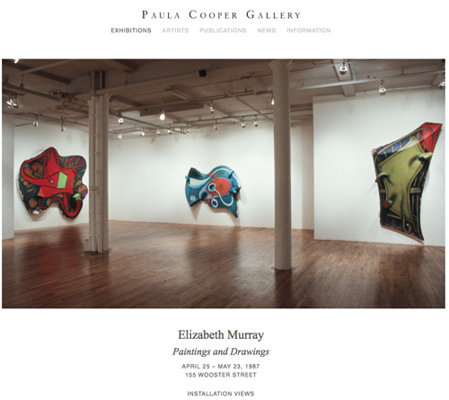
Like an interrogative sentence in Spanish, Murray’s show both began and ended with the same punctuation mark, but one whose significance vastly exceeded its simple editorial or grammatical function. Looming just beyond the brightly hued paintings of the 1970s that created one at the entrance, Cracked Question (1987), a mammoth multi panel, multi-faceted picture that dominated the central room of the Whitney installation, was at once the first image on which one’s eye’s fell and a tense conclusion to the chronological sequence of intervening works. (Storr, “Shape Shifter,” Art in America (April 1989), p. 275)

Storr’s description of the pivotal position of the work in the show filled in my memory of seeing myself seeing it. [Because such stories interest me, I think the solution of the mystery is that the show originated in 1987 in Dallas at the Dallas Museum of Art, and was surely planned before that. Cracked Question dates from 1987 and the Whitney show opened in the spring of 1988 so it must have been a late, but, as Storr indicates, central addition.

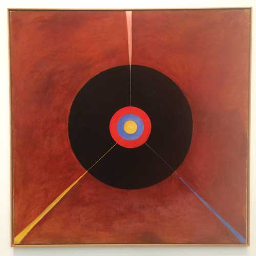
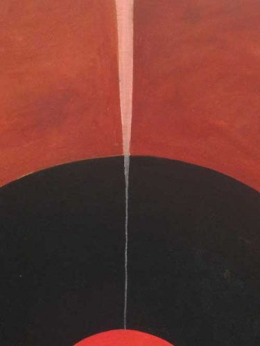
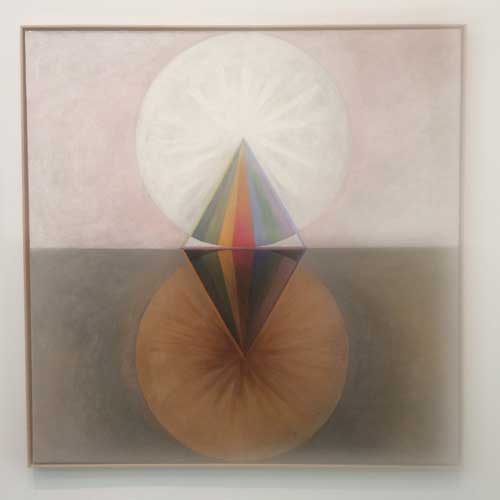
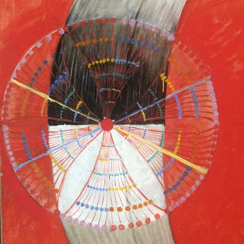
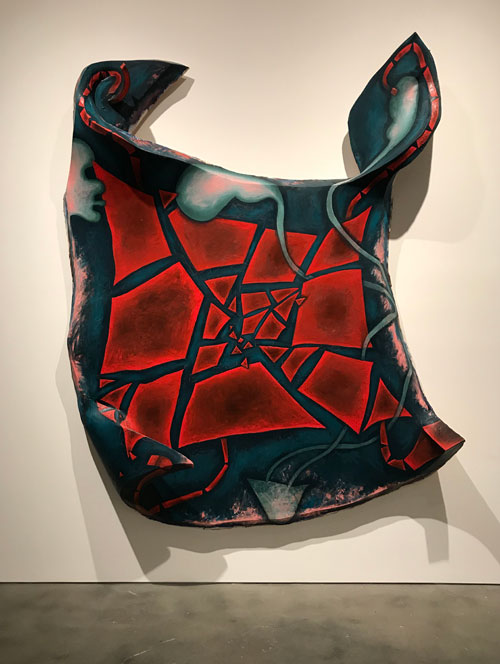
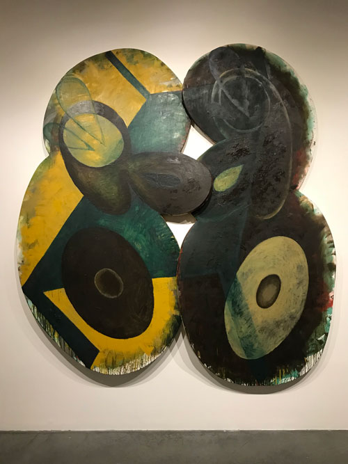
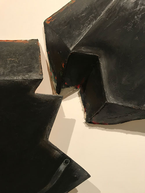
Elizabeth Murray, “Cracked Question,” 1987. Oil on canvas (6 parts), 13′ 5 1/2″x16′ 2″x23 1/2″ Image used by permission © The Murray-Holman Family Trust / Artists Rights Society (ARS), New York


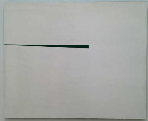
The work is massive, sober, architectural, dramatic. In my notes I wrote that it is dispositive, it feel instinctively that it solves a problem, a conflict, although its subject stays at the moment of the question. It is sculptural and would be seen as such under any circumstances, but the dark grey and metallic silver paint emphasizes the segmented painting’s relation to steel and stone. Each part is as powerful as the whole, yet the whole embodies its existence as language–speaking of Murray’s relation to “the language,” Cracked Question is language. It doesn’t represent a punctuation mark, it is a punctuation mark. It does not only pose but it is a philosophical question and a philosophical text, that takes place in the languages of form and color and space and matter.

A friend spoke to me of the “ferocity” of Murray’s work. Cracked Question embodies and exemplifies that ferocity.

This show arrives at a moment when, after several years of the dominance of abstraction–much of it a variant of what has been termed “zombie formalism”—that is, constructions and deconstructions of established tropes of abstraction, usually very elegant, and often disconcerting, particularly for those viewers who lived through the “original” phases being sampled or replicated, because of the works’ lack of the historical content and the crucial trace of struggle for form and content that had characterized those earlier movements–there are suddenly dozens of exhibitions of figurative painting ranging in style from Alice Neel-like realism to a poetic fantastic that emerges from surrealism and can sometimes border on millennial pathos. So, right now, figuration is in, not in all cases with a overt political message, unless in terms of the racial or gender identity of the artist and the figures represented in the paintings.

So is this a case of bad timing or of good timing for this presentation of Murray’s great works from the 1980s? It is always fascinating to think about how sometimes museum retrospectives, though planned years in advance, open just at the moment when that artist’s work or that artist’s most controversial works look presciently fresh to a new generation. Often such works are revived precisely to give contemporary artists the historical buttress that will burnish their reputations: thus late figurative works by Picabia, previously seen as kitschy aberrations were first restored to critical favor in the 1980s at a time when it seemed to retrospectively offer an important patrilineage for and contribute to the historical buttressing of the work of a then emerging David Salle. Last year’s extensive Alice Neel exhibition at David Zwirner seemed perfectly keyed to the work of emerging art stars like Jordan Casteel. So what will young artists experiencing this moment’s stylistic Zeitgeist make of Elizabeth Murray’s greatest works, seen at this moment?

Elizabeth Murray, Interview with Sue Graze and Kathy Halbreich, “Elizabeth Murray, Paintings and Drawings,” exhibition catalogue, H. N. Abrams, 1987, p.131.

It should be noted that while the overall effect of Murray’s work is one of abstraction, and the artist described herself as an abstract painter in an interview included in the 1987 catalogue, there are many representational elements and references in her paintings, in a stylized style emerging from cartoons, comics, and graffiti as well as from pop artists like Claes Oldenburg: works are shaped like shoes or cups and contains stylized abstracted but identifiable figuration and still-life imagery. But her relation to representation is not in the realm of narrative or allegory, the thing itself is the important thing, the painting as an object that projects into our space carrying pigment on its surface. The importance of three-dimensionality is apparent when one compares her oil paintings from this period to related drawings: even when these are on several pieces of paper creating a shape or a broken field, they operate in a more conventional relation to form. The objectness of the shaped paintings from this period makes them always more than the working out of abstracted, biomorphic or geometric forms on a flat surface, since the form of the support itself is a biomorphic or geometric abstraction.

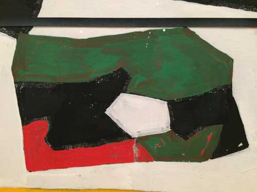
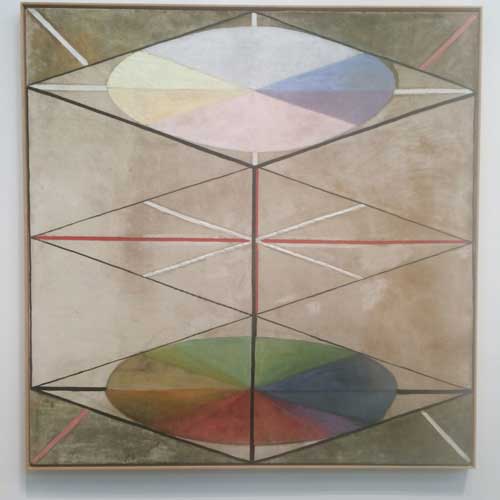
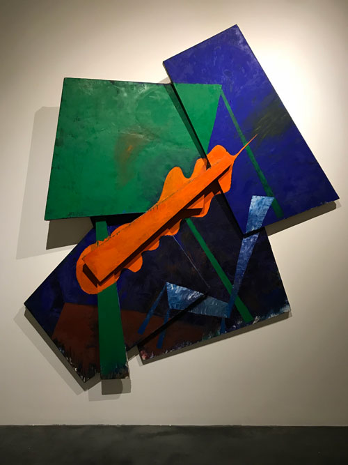
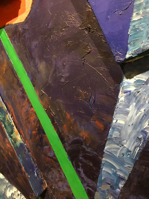
Elizabeth Murray, “Table Turning,” 1982-82. oil on canvas (2 parts) 8′ 10 1/4″x8′ 2 1/4″x4 2/4″ Image used by permission © The Murray-Holman Family Trust / Artists Rights Society (ARS), New York


That places them in yet another situation of appearing to be beyond language: how she declares space is different than Barnett Newman’s declaration of the equivalence between figure and ground: what is painted as form and shapes on the large shaped works may be securely within the realm of figure, but on the other hand the whole object itself is figure on the ground of the wall in a way that conventional easel paintings, even Murray’s own earlier works, are not. Thus, again, if the works can’t be incorporated or tamed into discourse of gender representation, nor to the terms of the new critical language of gender, racial identity, national identity politics, they also can’t be reduced to the purely formal terms of the earlier discourse that had characterized painting from the late 1940s to the 1970s.


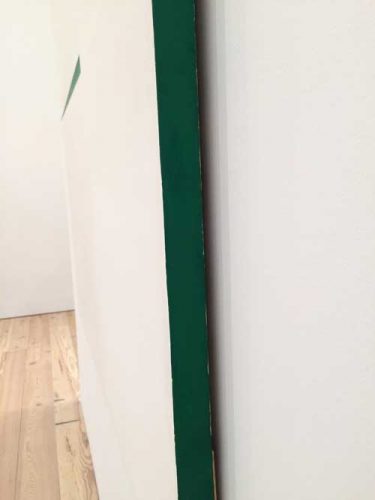
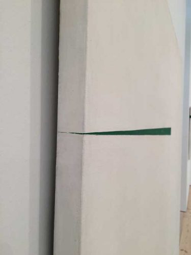
The sculptural nature of the works emphasizes the sculptural nature of oil paint itself. One of the things I have always found the most inspiring about these works is how the three dimensional support allows me to really experience the physicality of pigment. This is one of the things that painters live for, the moments when paint comes alive in a generative fashion, so for me, how Murray allowed oil paint to dry unevenly–an area of color will be matte and then shiny, which in itself becomes sculptural. And it is never enough to look them frontally, you have to experience the surface from the side to really see the color and the brushstrokes.


A year after Murray’s show at the Whitney, which included, in addition to Cracked Question, a number of the works in the current exhibition at Pace, I wrote the essay  “Figure/Ground,” in which I confronted the critique of painting I have indicated as dominant in the 1980s with other discourses that were not usually brought to bear on it, including those of feminism and of feminist studies of the gendered, misogynist aspects and roots of fascism. In one of the last paragraphs of the essay, I wrote about some of what I love about painting:

For a painter there is certainly tremendous pleasure in working out a thought in paint. I tis a complete process in terms of brain function: an intellectual activity joining memory, verbal knowledge, and retinal information, is a given visible existence through a physical act. But the value of painting cannot rest of any individual artist’s private pleasure. Painting is a communicative process in which information flows through the eye from one brain, one consciousness, to another, as telemetric data speeds from satellite to computer, without slowing for verbal communication. Incident of paint linger in the working mind of the painter as continuous thrills, as possibilities, like words you may soon use in a sentence, and–in a manner that seems to exist outside of spoken language—as beacons of hope to any human being for whom visuality is the site of questions and answers about existence. The black outline of a rock in a Marsden Hartley landscape, the scumbled white shawl in a portrait by Goya, the glaze of a donor’s veil in the Portinari Altarpiece, the translucent eyelid of Leonardo’s Ginevra di Benci, the pulsing red underpainting of a slave’s toe in a Delacroix, the shift from shiny to matte in a passage of indigo blue by Elizabeth Murray, are only a few of a storehouse of details that are of more than professional interest to me.


Images used by permission © The Murray-Holman Family Trust / Artists Rights Society (ARS), New York


FacebooktwittermailFacebooktwittermail

M/E/A/N/I/N/G: The Final Issue on A Year of Positive Thinking-10

The first issue of M/E/A/N/I/N/G: A Journal of Contemporary Art Issues, was published in December 1986. M/E/A/N/I/N/G is a collaboration between two artists, Susan Bee and Mira Schor, both painters with expanded interests in writing and politics, and an extended community of artists, art critics, historians, theorists, and poets, whom we sought to engage in discourse and to give a voice to.

For our 30th anniversary and final issue, we asked some long-time contributors and some new friends to create images and write about where they place meaning today. As ever, we have encouraged artists and writers to feel free to speak to the concerns that have the most meaning to them right now.

We began on December 5 and every other day since we have posted a grouping of contributions on A Year of Positive Thinking. We thank our contributors and readers for living through this time with all of us in a spirit of impromptu improvisation and passionate care for our futures.

This is the last post of the final issue.

Susan Bee and Mira Schor

***

Susan Bee

This final issue of M/E/A/N/I/N/G brings back memories of our first issue, which came out in December 1986. At that time, I was a young artist and a new mother, working at freelance jobs as an editor and graphic designer. I had a baby at home and was full of optimism. Emma was born in May of 1985 and tragically she died 23 years later in 2008. I was 33 when she was born and Mira and I started to think of starting our own arts publication.

Susan Bee, "Non Finito," 2016. Oil on linen, 24" x 30".

Susan Bee, “Non Finito,” 2016. Oil on linen, 24″ x 30″.

In 1992, I had my first solo painting show, when I was 40-years-old. Now, I’m almost 65 and nearing the traditional retirement age with a 24-year-old son, Felix, and a 40-year marriage to the poet Charles Bernstein. I have been a member of the vibrant all-women artist’s collective, A.I.R. Gallery, for 20 years and will have a solo show of new paintings there in March 2017. I have been teaching, publishing artist’s books, and showing my art for many years.

This election has sent me into a tailspin. I hoped to be greeting a woman president in my lifetime, and now the possibility seems remote and I am heartbroken to be facing the next four years of this administration. As a secular Jewish feminist, artist, and professor, the future in this country that my immigrant artist parents, refugees from Berlin and Palestine, came to in 1947, looks bleaker than it did just a short time ago on Election Day. Since that day, I have been taking refuge in viewing art. Through the contemplation of art and poetry, I have been trying to escape the isolation and desolation of the present moment. I know that we need to fight on and that I need to work with my community to create a strong push back to the hatred and bigotry that surrounds us. My optimism is being sorely tested by the hatred that has been empowered in this country.

Susan Bee, "Afraid to Talk," 2016. Oil, enamel, and sand on linen, 24" x 30".

Susan Bee, “Afraid to Talk,” 2016. Oil, enamel, and sand on linen, 24″ x 30″.

Now, my 30-year editorial partnership with Mira is coming to an end. However, I have no plans to retire from art and life. I am grateful that we had the opportunity to publish over a hundred critics, poets, and artists. Hopefully, the artists, writers, and other creative spirits, who have nourished our project, M/E/A/N/I/N/G, for all these years, will continue to lead the way forward and point us to a future that will enrich us all.

November 2016

Susan Bee, "Pow," 2014. Oil, enamel, and sand on canvas, 30" x 24"

Susan Bee, “Pow,” 2014. Oil, enamel, and sand on canvas, 30″ x 24″

*

Mira Schor

Written during the Preoccupation: Activism, Heroism, and Art.

A week after the election, a cold heavy rain struck New York in a kind of climatic embodiment of our political shock and misery. Wearing the depressing New York winter uniform of black down coat for the first time of the season, huddled in the small doorway of a fortune teller’s establishment on Lexington Avenue, I waited for a bus and I thought about what I would write about for this final issue of M/E/A/N/I/N/G.

My first instinct was to consider the role of activism in relation to being an artist but immediately my mind made a leap from activism to heroism. In the seconds between these two words, I was in tears as two stories I had been told by my mother since my childhood sprang to mind, one of political bravery, the other of personal bravery.

Please bear with me as I retell these stories, because they frame my ideas about the role of activism and the role of art and the artist in a moment of political necessity for activism.

To begin with, the story of personal bravery: my mother was very proud of her friendship with one of the most important Jewish families in pre-war Poland, that of Rabbi Moses Schorr, a religious leader, a historian, and the first Jewish member of the Polish Senate. The Schorrs (no relation) were kind, wealthy, generous, noble in bearing and behavior. At the outbreak of WWII Rabbi Schorr fled Poland towards the East where he was captured, imprisoned, and tortured by the Russians, dying in a Russian labor camp in 1941 (for more on the relation of Russia with Germany at that time, with interesting echoes in recent weeks, see here). Rabbi Schorr’s daughters survived the war, and I knew one of them well, Fela, a beautiful, kind, imperious, and broken woman, all at once. The story I was told by my mother though I never spoke of it with Fela herself, was that Fela and her mother along with Fela’s two small sons and her small nephew, all children under the age of 10, were imprisoned by the Gestapo in France. It was announced that children who were orphans would not be deported to Auschwitz so Fela and her elderly mother determined to commit suicide. Her mother took poison and died, Fela jumped out a window but survived and was saved and sheltered by doctors until the end of the war a few months later. She and the three children in her care survived the war.

The circumstances of the story were hard to believe, because it made no sense that orphans would be spared deportation and because of the cruelty of the promise, but the randomness of genocide was embedded in my consciousness as well as the emblem of maternal courage. [This story is true, you can read more here.]

The story of political bravery was embodied for me in the name Bartoszek. Franciszek Bartoszek was a friend of my parents from the Warsaw Academy of Fine Arts. He was a painter. And he was Polish. That is to say, he was not Jewish. This was central to the story, because that was a primary distinction my mother always made, a paradox at the center of her own patriotism. If she described someone simply as Polish she also was indicating that they were not Jewish, and it meant that Bartoszek’s bravery was motivated by more than personal survival. When my mother showed me the picture of him she always told me that he was a hero. She would tell me that he would risk his life just to bring a poor woman some small amount of butter. Her admiration for him was such that I have never been able to say his name without being overcome with tears, the emotional outlet of my more fierce and stoic mother. When I was able to research him online, the story was verified: Bartoszek was a renowned Polish patriot and hero of the Polish resistance, who died in a military action in Warsaw in 1943.

From l. to r., Ilya Schor, unknown woman, Franciszek Bartoszek, Paris, 1937.

From l. to r., Ilya Schor, unknown woman, Franciszek Bartoszek, Paris, 1937.

I have photographs of him with my father. They are in a park in Paris sometime shortly before the war, most likely in 1937. The photos are very small, so I blew up a detail of one to try to decipher if one could see the courage to come in the face of the man in the time approaching the crisis. When I sent this picture to Luka Rayski, a Polish artist who translated for me a stele erected in Poland in Bartoszek’s honor, he wrote back that it was “so hard to imagine, those last pre-war years.” But I thought no, it is not hard to imagine that time. Not, I hasten to add, that I think another Holocaust is coming, yet we are in such a time, a time I call the Preoccupation.

Photo detail, Bartoszek, Paris, c. 1937; Stele installed in Czarnow in 1964: Franciszek Bartoszek, “Jacek” [code name “Jack”] Born October 27, 1910 in Pieranie, spent his youth in Czarnow, Painter, Ardent Patriot, Colonel of People’s Guard, Died fighting Hitlerist occupiers, May 15, 1943 in Warsaw.

Photo detail, Bartoszek, Paris, c. 1937; Stele installed in Czarnow in 1964: Franciszek Bartoszek, “Jacek” [code name “Jack”] Born October 27, 1910 in Pieranie, spent his youth in Czarnow, Painter, Ardent Patriot, Colonel of People’s Guard, Died fighting Hitlerist occupiers, May 15, 1943 in Warsaw.

Years ago a non-Jewish friend of mine told me that she often wondered whether people would have saved her if she was a Jew during WWII. I found this strange since she was not Jewish and did not have my family’s history of the Shoah. More importantly, I had never really asked myself that question, not only because I couldn’t bear to contemplate the answer, but mostly because I was so consumed by its corollary opposite, that is, would I have the courage to risk my life in order to save someone else or in defense of a cause? From a very early age I was totally aware that if that was the test, I would fail.

The sine qua non of resistance is that you have to be prepared to die for freedom, even though of course there is a big gap between marching on Trump Tower holding “Pussy Power” signs and prison or death.

If heroism is summoned as the ultimate necessity for freedom, nevertheless practically speaking most of us who care about what is going on are considering activism. It is quite striking how many people at all levels of society are mobilizing, from the political leaders of the state of California to artists in New York City mobilizing to provide imagery and objects for the Women’s March on D.C. and beyond.

Susan and I decided to start M/E/A/N/I/N/G in 1986, during the Reagan administration. I remember the precise moment—standing near the corner of West Broadway and Canal Street in December 1980, a month after Reagan had been elected and a few days after John Lennon had been killed—when I had realized that a switch had been flipped. Something was over. If I didn’t grasp the full import of the switch in terms of where we have arrived now, I experienced that every value I had been imbued with had just been turned upside down, including in art. The 1980s was a very contentious decade, highly polemic and divisive but perhaps because of that it was also a bracing and inspiring time during which there was a lot of activism, including responses by artists to the AIDS crisis, to urban gentrification, and to the backlash against second wave feminism. The Guerrilla Girls’ first poster appeared overnight in Soho and Tribeca in 1985, we published the first issue of M/E/A/N/I/N/G in December 1986. But despite the political polarization, looking back, no matter what happened in politics in the ’80s, I didn’t feel that the end of the world as I had known it was upon us and like Susan I had the optimism that comes from the energy of youthful mid-life and from doing something constructive. I was 36 when we started the magazine. I had been out of art school for 13 years, I had had a full-time teaching job in Canada and had given it up to move back to New York, I had had gallery representation and my first one-person shows in New York and had lost that. M/E/A/N/I/N/G opened up my community and gave me a sense of place in the art world. It has been the only sustained collaboration I have been involved with and the many things Susan and I have in common and the differences between us, as well as the small scale of our operation–two people, two issues a year during our hard copy days–all worked for me. And when we ended our print run in 1996, if anything I felt more optimistic and confident about my own life than I had when we started.

Mira Schor, "Patriotism on the Blood of Women," 1989. Oil on canvas, 16 x 20 inches.

Mira Schor, “Patriotism on the Blood of Women,” 1989. Oil on canvas, 16 x 20 inches.

The word of the day in the ’80s was intervention, actions specific to a moment and which did not necessarily seek to become an institution, though inevitably many cultural interventions did. I saw editing M/E/A/N/I/N/G as a kind of activism that I was able to engage in. In that spirit, our final issue is one of many artistic responses to the election and one which, as we have always tried to accomplish in M/E/A/N/I/N/G, is an open format, non-didactic environment for artists, writers, poets, art historians and critics to express their views in any cultural or personal register that means something to them, unrelated to market concerns. As we bring our project to an end after thirty years, we feel it provides one model for long-term activism within an art community. It is small potatoes in terms of major resistance to oppression but it is something that we could do then and now. It did enlarge our community and I think it meant something to the individuals we published, whether professionally or just because they were given the opportunity to think about something and express their views or tell about their work.

Mira Schor," The Self, The work, The World," 2012. Oil and ink on gesso on linen, 18"x30"

Mira Schor,” The Self, The Work, The World,” 2012. Oil and ink on gesso on linen, 18″x30″

My sense of necessity to understand the changes in culture in the ’80s led me to my critical writings and changed the course of my work as an artist, though my work has from the start had a political underpinning, primarily feminist.  Some of my recent works have been visceral responses to the news.  But I also think that other aspects of my artistic heritage and inclinations have political valence, though they might seem to be the opposite of political, that is, that the intimate, the modest, the private, though apparently recessive in a time of spectacle, can be construed as political acts. The artist is a filter between the world and the work, as I tried to indicate in a painting I did in early 2012 right after Occupy Wall Street as I was trying to diagram the place of the private artist during a political upheaval.

MIra Schor, "'Power' Figure: No Dead Enough, 2016. Ink and gesso on tracing paper, 17"x 22 1/2"

Mira Schor, “‘Power’ Figure: Not Dead Enough,” 2016. Ink and gesso on tracing paper, 17″x 22 1/2″

Since the election I’ve noticed the pleasure, indeed the gratitude people have expressed if someone shares a beautiful work of art on social media, not necessarily an outwardly political one. We recognize and value the works that use representation, figuration, and language to openly announce their political intentions, but a painting of a flower, a small abstraction, or an ancient vase can evoke as much humanity as anything more overt and the importance of such works as heroic human activity can be intense.

Susan Bee, A Not So Still Life, 2016. Oil, sand, and enamel on linen, 30" x 24"

Susan Bee, “A Not So Still Life,” 2016. Oil, sand, and enamel on linen, 30″ x 24″

We conceived of this final issue a few days before I stood in that cold rain, during a visit right after the election to the Guggenheim museum to see the Agnes Martin exhibition. I was particularly interested in one small early painting of narrow vertical black and white lines of uneven length. In the face of the impulse, in response to the political atmosphere, for artists to start churning out Guernicas, the smallest of Martin’s abstract paintings packs as much of a punch about human endeavor and heroism as anything that would will itself to make a political statement. Though small, the painting has great tension and drama. To me it represents as much of the power of the universe as a model of the atom and it is heroic in the way that artworks can be, evidence of one individual artist’s search for perfection in a realm that seemingly has no specific utility to daily life.

Agnes Martin, Untitled, 1960.Oil on canvas, 12 x 12 inches. Museum of Art, Rhode Island School of Design, Providence, Gift of the Bayard and Harriet K. Ewing Collection

Agnes Martin, Untitled, 1960. Oil on canvas, 12 x 12 inches. Museum of Art, Rhode Island School of Design, Providence, Gift of the Bayard and Harriet K. Ewing Collection

On our way up the ramp, we slipped through the keyhole-shaped door into the study library to watch two short films of interviews with Martin, filmed late in her life. It was very intimate to listen to her words in a small room. She spoke about her desire not to work from negativity, her efforts to empty her mind entirely when working, and about the role of inspiration.

mira-agnes-martin-img_3094

mira-agnes-martin-img_3095

In one film she is shown carefully applying a thin reddish pink wash to the canvas. The soothing concentration on this simple activity generated enough calm and clarity for me that suddenly the puzzle of how to celebrate the 30th anniversary of M/E/A/N/I/N/G which had eluded us earlier in the year was solved: I have a blog, we could use my blog as an initial platform for a spontaneous, short deadline, final issue. I looked at Susan and mouthed, I have an idea. So we end as we began, with a Mickey Rooney and Judy Garland “let’s put on a show” production. It is the small activism of giving a few people a place for their voice, and we are grateful to all the artists and writers who found the time to respond to our call.

***

meaning-two-covers

Susan Bee and Mira Schor, M/E/A/N/I/N/G, December 1986-December 2016

***

We would like to thank our many wonderful contributors to the final issue: Alexandria Smith, Altoon Sultan, Ann McCoy, Aviva Rahmani, Aziz+Cucher, Bailey Doogan, Beverly Naidus, Bradley Rubenstein, Charles Bernstein, Christen Clifford, Deborah Kass, Elaine Angelopoulos, Erica Hunt, Erik Moskowitz + Amanda Trager, Faith Wilding, Felix Bernstein and Gabe Rubin, Hermine Ford, Jennifer Bartlett, Jenny Perlin, Johanna Drucker, Joseph Nechvatal, Joy Garnett and Bill Jones, Joyce Kozloff, Judith Linhares, Julie Harrison, Kate Gilmore, Legacy Russell, Lenore Malen, LigoranoReese, Mary D. Garrard, Martha Wilson, Matthew Weinstein, Maureen Connor, Michelle Jaffé, Mimi Gross, Myrel Chernick, Nancy K. Miller, Noah Dillon, Noah Fischer, Peter Rostovsky, Rachel Owens, Rit Premnath, Robert C. Morgan, Robin Mitchell, Roger Denson, Sharon Louden, Sheila Pepe, Shirley Kaneda, Susanna Heller, Suzy Spence, Tamara Gonzalez and Chris Martin, Tatiana Istomina, Toni Simon, William Villalongo.

M/E/A/N/I/N/G: A History
We published 20 print issues biannually over ten years from 1986-1996. In 2000, M/E/A/N/I/N/G: An Anthology of Artists’ Writings, Theory, and Criticism was published by Duke University Press. In 2002 we began to publish M/E/A/N/I/N/G Online and have published six online issues. Issue #6 is a link to the digital reissue of all of the original twenty hard copy issues of the journal. The M/E/A/N/I/N/G archive from 1986 to 2002 is in the collection of the Beinecke Library at Yale University.

All of the installments of M/E/A/N/I/N/G: The Final Issue on A Year of Positive Thinking can be accessed by hitting the “older” button at the bottom of this post and they will be made available as a PDF on M/E/A/N/I/N/G Online.

FacebooktwittermailFacebooktwittermail

Tangible Visuality: Stuart Davis, Carmen Herrera, and Hilma af Klint

Three exhibitions currently on view in New York City–Stuart Davis: In Full Swing, Carmen Herrera: Lines of Sight, and the Hilma af Klint exhibition that is secreted within The Keeper exhibition at the New Museum–provide object lessons on the necessity of seeing “in person” artworks that in reproduction appear flat and graphic in a way that stays fixed at the level of an image with no scale so that when looking at the images most people, particularly those brought up entirely within the regime of Instagram would not see why they should see the works and, further, might not be able to see the work when in front of it because many people now see exclusively through the lens of their smart phone.

The Stuart Davis show and the Hilma af Klint show close this weekend. Sunday September 25th is the last day of each show. I hope that my readers in New York City will make a point of seeing both shows. It would be a shame to miss them.

As usual and in the case of all three exhibitions I will leave it to museum wall text, Wikipedia, and other reviewers to go into the historical background of the artist, and will focus on my experience in front of some of the key works in the exhibitions, beginning with the shows at the Whitney.

Stuart Davis: In Full Swing is an exuberant and joyful survey of the work of an original American modernist artist whose work demonstrated how an artist can be of his time and yet be original and predictive, anticipatory of works that followed him. I was immediately struck by how different the works are in person than in reproduction, where they appear so flatly graphic. This flatness may diminish their interest for people who see them in pictures as representatives of a style, or for people (like me) who see the works as part of a family of artists from Fernand Leger to Raoul Dufy, Miro and Matisse to Lichtenstein and Warhol–these particular associations actually might not be a positive recommendation because of over-familiarity or dislike in some cases. A Google image search of his work may in fact appear noisy to the point of being nauseating, an impression erased when in the presence of the works and also by examining the works close up so that you can focus on details, each work offering paintings within paintings, and on the way they are painted.

year-stuart-davis-image-search

When you see them “in person” their physicality and painterliness as well as their scale creates a different and vivid impression, often more intimate than you might imagine, in some of the early works, such as the Lucky Strike paintings from the early 1920s, which have a tremendous sense of delicacy and intimacy in the details of what seem like works about advertising and commercial signage.

year-stuart-davis-luckystrike-1921-img_1383

If such early works have a precisionist care in how they are painted that recalls early Renaissance painters like Pietro Lorenzetti or Domenico Veneziano, as much as they do product advertisements and packaging design from the 1920s, later works offer a bolder more sculptural approach, and suggests a whole other range of range of artists who followed Davis, including Elizabeth Murray and Al Held.

Among these are Memo and Memo#2 from 1956 in which the color is pared down to red, green, white and black, each with a quadrant of the painting a diagrammatic drawing in black and white, in contrast to more brightly hued and often more representational or symbolic areas, with fragments of objects and language on the bottom left of the work. While responding to the boldness, simplicity, and clarity of the composition of these Memo paintings, I was struck by a relation that they suggested to black and white works by Myron Stout such as Number 3, 1954 from 1954 (in the collection of MoMA). Stout’s work is incomprehensible or, rather, radically misunderstood if you see it in reproduction only, since its intensity and action comes from the indecision betrayed in the pentimenti at the edges, the borderlines between black “ground” and white “figure,” a borderline that Stout in some cases may have spent a decade battling over.

year-stuart-davis-memo2-img_1441

year-stuart-davis-memo2-detail-img_1443

year-held-bwx1-1968-img_5436

year-stout-1954

Davis’ paintings betray no such hesitancy yet he did use masking tape to determine shape and placement before deciding on the final configuration and composition. This process is most poignantly evident in his final work, left “unfinished” the night he died. This painting would have made a perfect companion to the unfinished work by Mondrian included in the Met’s recent excellent exhibition Unfinished: Thoughts Left Visible. It was exciting and incredibly contemporary to see the tape and the push pin marks left on and in the surface where Mondrian had perhaps temporarily placed bits of colored paper. To see traces of Mondrian’s process again emphasized the handmade quality of works whose familiarity as images is so ubiquitous that fashion accessories and regularly copied from them.

In Davis’ painting, Fin, dried out strips of tan masking tape create a grid pattern over one section of the work while lines of black tape are used to rehearse placement of black lines to be painted onto the composition. The painting surface is very dry and often sketchy. The medium is casein rather than oil, a dry surfaced medium which it is possible that Davis used for underpainting, to be covered by oil at a later stage of the work. The surface and the bright colors make this look like the first layer for a 1940s movie poster, yet it is completely finished, as Davis perhaps intuited when he wrote the word “fin,” end, which he had just seen on TV at the end of a French movie–he died later that same night. The work is vibrant both in color and in composition, a restless vivacity, and a tremendous sense of optimism.

year-stuart-davis-fin-cropped-img_1433

year-stuart-davis-fin-detail-img_1451

year-stuart-davis-fin-detail-img_1448

At the bottom of the paining is a green, red, black and white parallelogram that reads like the future of painting: ten years later the character and form of this detail would reappear  freshly conceived in works by artist such as David Reed, Mary Heilmann, and Elizabeth Murray, and other artists from the movement that is the focus of the exhibition catalogue High Times, Hard Times: New York Painting 1967-1975. You see in its the beginning of Murray’s work, or Thomas Nozkowski‘s, and the abstractions–paintings and collages–of Richard Tuttle.

year-stuart-davis-fin-detail-img_1449

In my notebook at the exhibition I wrote of this last work, “one of the most inspiring paintings I have seen in some time.” While it may seem that I am fetishizing incidents of painterliness rather than focusing on a dryer analysis of the role in which Davis is fixed as a somewhat maverick American modernist addressing commodity culture and language, I am responding to the aliveness of these incidents within the painting and to the expanding family of painters that individually and together give me the sense of optimism about artmaking that is essential to its continued practice.

*

I have in recent months expressed exasperation at the recent phenomenon in the artworld of finally giving old, very old women artists–100 is the new 70–“their due,” with the current exhibition of Carmen Herrera’s work a prime example. I don’t think I am alone in not having heard of Herrera’s work until her work became an instance of this phenomenon and, seeing her work in reproduction with no previous experience of it, the flatness of the work combined with the formal reductiveness did not appeal to me. However “The Blanco Y Verde Series, 1959-1971, a group of nine white and green paintings, handsomely installed in the central room of the show, offers yet another proof of the necessity of seeing in person abstract work which may appear so flat and graphic in reproduction that it does not convey the need to see the actual work. This is one of the works from the series, as reproduced on the museums website. Here are two pictures of it I took, one close up.

year-herrera-img_1463

year-herrera-detail-img_1464

Herrera’s work is indeed extremely flat and for the most part without surface incident that would betray the trace of a hand. Only if, out of professional curiosity, you look very closely you can see in rare instances some traces of how the paint was applied. Yet in some of the work, notably the Blanco Y Verde series, a group of nine large easel size canvases with flat white surfaces crossed by delicate green darts or shards meeting at sharp finally balanced points of tension, there is a weight that comes from the totality of the surface of each work as well as the group of paintings as a sculptural installation.  Something  happens at the sharp points where green and white intersect and abut that interacts with the viewer’s scale, and the surfaces’ very dryness creates a kind of blank haze that the thin green darts punctuate. As is so often the case with paintings that involve a flatly applied geometric design, reproduction leaves out the objectness of the canvas, something that Herrara has carefully considered: the paintings are not framed or edged with wood as was the convention in that time period, and one painting has one side or edge of the stretcher painted green (the other edges are white).

year-herrera-1967-front-view-img_1455

year-herrera-detail-green-edge-img_1472 year-herrera-detail-white-edge-img_1473

*

The question of objectness, presence, and facticity is also relevant to the rare and amazing installation of paintings by Swedish early 20th century artist Hilma af Klint now on view as part of The Keeper exhibition. Sunday September 25th is the last day. RUN to see it if you are in New York, otherwise plan a trip to the Moderna Museet in Sweden.

A friend, artist but not painter, warned me that I might be disappointed by Hilma af Klint’s paintings because they were not very well painted. Having seen her work before I wasn’t too concerned. But upon walking into the exhibition my friend’s response was intriguing and important: not well painted in relation to what? according to what standard?

Klint’s surfaces are generally very dry and mostly flat though each painting may have large or small areas that are brushy or have a clearly demarcated section of impasto. I recommend walking around and around the installation, trying to not look at the sculptures by Carol Bove and others that are for some unfathomable reason plopped in front of the continuous row of paintings that are hung on three walls of the fourth floor. Perfectly fine sculptures in a range of materials from steel to plastic, they nevertheless seem placed there to deliberately test the viewer’s ability to not look at them so that they can concentrate on the paintings they obscure. Luckily the paintings sing out and overpower any such artworld interference.

year-hilma-and-sculptures-img_1564

My first round began to the right of the elevators. I stopped at  Swann#18, a series of uneven concentric circle of deep black, red, blue and yellow hover on a red earth ground, brushy and uneven. Three dart like shapes pierce through the ovum of the black circle, and while everything is very precise, the edges of the forms and lines are uneven, but the brushy patchy earth red ground and the slight imperfections of the lines don’t give an impression of weakness or failure or lack of interest on the part of the artist. Each surface, each transparency or opacity is considered and is part of the meaning of the work. This is not decorative or about painterliness or figure/ground, they are “about” a space and a theory which is real to her and it then operates effectively to create space. At the same time the contrast between the dense blackness and the light filled thin red ground serves to give the work a very contemporary feeling. In fact it blows out of the water similar works that came after in the conventional timeline of  modernism. Look at Swann#18 and think about Kenneth Noland. No difference in surface or scale. [Trigger warning, his website has music, it is kind of hilarious and fun.]

These works were done between 1914-1915. Think of the abstractions being done around Europe at that time, many of them small and even clumsy and half-hearted or half-assed in their approach to pure abstraction–I’m talking about you Robert Delaunay–and I am bringing this up because when MoMA organized their 2012 survey exhibition, Inventing Abstraction: 1910-1925, they included Delaunay, but not Klint, of which exclusion more later.

year-hilma-swann16-right-wall-img_1571

year-hilma-detail18-img_1620

I went round and round the room, focusing on how the works were painted, looking at the whole work, at the room, slowing down my tour, and shifting from a clockwise to a counterclockwise direction so that as many small details and incidents of painting as possible would spring into focus. I looked closely at the surfaces, taking great joy out the myriad shifts of application and scale within the work while enjoying their size: scale plays a great role in the work, because the works themselves are large and they address the viewer’s body as an equal, they have a declarative confidence.

year-hilma-swan23-detail-img_1539

But within the larger field, marks and grounds are painted as needs be, thick and thin, delicate and contingent, abstract and narrative. This makes them so much fun, they are not dour at all, and they are not constrained by Greenbergian rules eliminating the incidental representational vignette or the diagram which flows with the flatness of the painting field while interrupting it and creating some illusion of depth. They do not suffer from dogmatism.

year-hilma-swan23-detail-img_1597

year-hilma-swan23-detail-img_1599

There is a relationship to radiance and to the impact of dry white impasto that af Klint shares with her contemporary Florrine Stettheimer who followed a similar path from traditional academic training and familiarity with a contemporary artistic milieu and an unconventional deeply personal path–Steittheimer is the queen of white and pale pink impasto, creating an uncanny sense of ethereal materiality–as well as with later abstract artists whose work was both of and beyond their time, such as Jay deFeo, whose The Rose is sister to Hilma af Klint’s radiant white orbs.

year-hilma-swann12-img_1523

year-hilma-swan12-img_1529

year-defeo-rose-img_6204

year-hilma-swan-flower-detail-img_1574

year-florine-flower-img_3567

I ran into many friends while at the exhibition and we all seemed to be in a state of joyfulness. Finally I ran into a friend who had her two and half year old daughter in her stroller. Unaccountably instead of napping as planned, the child became electrified by the atmosphere in the room. We took a milk and snacks break downstairs and then returned for one more tour. The break, the false departure, and the temporary return to the presence of the works allowed me to feel more strongly than ever the relationship between the dry surfaces and the relation that the works establish between the ethereal and memory. I took many pictures with my poor little phone camera, but the works’ presence is a necessary ingredient to their further life in my mind.

I thought we would just walk around and around, as in a park, and so the mother might get a bit of a chance to spend some more time with the painting and the child might be soothed by the movement but she sang louder and louder, repeating a sentence that I could not decipher, which was just about the moment when I was able to concentrate on the detail of the origin of these works that most likely caused MoMA to not include her in Inventing Abstraction: 1910-1925, namely that af Klint, although an academically trained and skilled artist in a more conventional representational mode, did these extraordinary works under the influence of spiritual visions–the tour guide at the New Museum said that she painted landscapes during the day, and these glorious abstract paintings at night when perhaps she could communicate with less interference with the otherwordly non-dimensional spirits who dictated her forms to her–that is that, precisely during this key historical period, she claimed to paint as a medium. Like  Mondrian, she was interested in Theosophism, but apparently for MoMA and the art historical establishment there was a difference in how Mondrian could be absorbed into the grand narrative of modernist abstraction and how she did. The whiff of the outsider or crazy artist was too much to bear and my own inculcation into the values of high modernism are such that I had been trying to block  that aspect of her inspiration until the child sang and I finally read the wall text which included the word “medium.” I decided that the otherwordly force or being directing her painting was a damn good artist that any other modern artist would have wanted on their side, and, anyway,who knows where greatness comes from.

year-hilma-dove-img_1549

year-hilma-dove-detail-img_1610

At the center of the central silver sphere of Dove#12 there is a tiny globe within which two angels do battle, black sword and red sword clashing in an X mark at the center of the painting. There is a relationship between the symbolic and the celestial in keeping with a medieval world view, yes, perhaps that doesn’t fit into Alfred Barr Jr.‘s philosophy.

year-hilma-img_1520

But the uncategorizable is not nevertheless less great, that someone with traditional training having arrived at something so sophisticated with such command of visual language, painterly articulation, and spacial authority is way beyond an outsider artist [casting no criticism on great outsider artists]. She was not by any accounts crazy, just non-conforming. And, wisely, she knew that the category of “101-year old woman artist getting her due,” was not for her should she live. She left instructions that her work should not be exhibited until twenty years after her death, which came in 1944. It has taken another four decades since then for her due to begin to dawn on people, though the doubt and suspicion of Otherness that kept her out of MoMA’s survey of 20th century vanguard abstraction may still linger. But, still, perhaps, according to my view that women artists are trapped between two paradigms, of  “still too young” and “not dead enough,” perhaps she is finally dead enough.

Or is she? during the run of this show, which ends tomorrow, you could not find the presence of Hilma af Klint’s work on the Whitney Museum’s website if you ran a search for her name.

year-hilma-whitney-search-field-hilma

Let her have the last word, her heart and her inspired vision of a double helix,

or,

I

year-hilma-heart-img_1604

Hilma

**

for more images of and information on Hilma af Klint’s work, here is a good video, from Hilma af Klint: Painting the Unseen, the much more comprehensive exhibition of her work, held at the Serpentine Galleries in London in Spring 2016 (please note that the video will not play in your email program, only on the blog itself viewed on a browser).

FacebooktwittermailFacebooktwittermail

“Abstract Marriage: Sculpture by Ilya Schor and Resia Schor”-Lecture by Mira Schor

On the occasion of my mother Resia Schor‘s birthday today (b. December 5, 1910 near Lublin, Poland), I’d like to share a lecture I gave at the Provincetown Art Association and Museum August 20, 2013, in conjunction with the exhibition “Abstract Marriage: Sculpture by Ilya Schor and Resia Schor” at PAAM, August 16 – September 29, 2013

I take the liberty of sharing this video not just because I am proud of my parents’ extraordinary works-which I am!–but also because some of the histories, diverse traditions, and diverse methods of making that infuse their work are worth recalling now, and suggest models of art practice of interest and value even though they may belong to a very different era and philosophy of craft and art.

NOTE: comments during the lecture about the quality of the slide projections refer to issues that have been corrected in this version of the video.

The catalogue of exhibition available here

Selected installation images:

ilya_resia_schor__02

ilya_resia_schor__10

ilya_resia_schor__13

Resia Schor, Lockerbie, 1990, and Ilya Schor, Lovers, c.1958

FacebooktwittermailFacebooktwittermail