Tag Archives: Willem de Kooning

Youthfulness in Old Age

Two painting exhibitions currently across the street from each other on West 25th street challenge any notions one might still harbor about the greater value of being “younger than Jesus.” By some fortuitous coincidence just a few steps separate “Joan Mitchell: The Last Paintings” at Cheim & Read from “Matta: A Centennial Celebration” at Pace Gallery and each show explosively refutes any notion of youthfulness being the province of the young while giving new life to the phenomenon known as “old age style”–used to distinguish formal characteristic of late works by Titian, Rembrandt, or Cézanne, where the artist just wants to get to the heart of the matter and sloughs off all the fine finish he had needed to impress his audience in earlier years.

Before I go any further, I should say that for some reason, when I was a very young artist, before I went to art school, one of my term papers as an art history major at NYU was on old age style, in the works of Renaissance and other artists. At the time in my own early paintings, I was influenced by Northern Renaissance paintings, by surrealism, by Indian miniatures, so for the most part the paintings I loved had a tightness and perfection to them. So I can only wonder why I was in this very early stage of my own work life so taken by the characteristics of work done at the other end of the bracket of a life of art making, when tightness of line and surface would yield to the pressure of working without concern for perfection or control. Indeed ever since then, I always seem to challenge myself to move towards a looser, wilder, more entropic approach to artmaking.

The phenomenon of old age style seemed almost inversely applicable when considering expressionist painting. Take the phases of Willem de Kooning’s work: in the current exhibition at MoMA there is an early still-life drawing, of a type that, according to the wall-text, a friend recalled might take him a year to execute, building up the realistic rendering practically one atom of matter at a time, then there is the Ingres-like delicacy of representational execution of the Portrait of Elaine, followed by the early mature work of the figures of men and women just turning from representation to abstraction as if a giant delicate hand were shifting the outlines like sand, to the great abstractions of the late 1940s, Excavation and Attic, still controlled, calibrated, worked, to the explosive expressionistic paint application of the Woman series–but, with the notion of old age style in mind, then what? If at an earlier time, that loose approach would have marked an old age style, de Kooning had much farther to go, to return, in his old age, to his own contribution to such a style–abstraction and surface somehow scoured of incident and even gravity, smoothed, clarified, almost bleached by time.

I’ve always felt that Joan Mitchell‘s paintings from the 1950s are among the best abstract paintings of that period. Although there is a clear relation to nature in the forms and colors, at the same time those paintings, including Ladybug (1957) at MoMA, have a bold confidence in the sculptural individuality of each stroke of paint in a manner which anticipates the post-minimalist approach of painters such Joan Snyder. The unpredictable, rich yet uningratiating dimensional materiality of the paint strokes in these paintings, and the density of mark making has generally been of greater interest to me than the late paintings, some of which were on view in Mitchell’s 2002 retrospective at the Whitney Museum–I saw these as too big, too empty, too facile, without tension.

Joan Mitchell (1925-1992), Ladybug, 1957. Oil on canvas, 6' 5 7/8" x 9' (197.9 x 274 cm). Purchase. © Estate of Joan Mitchell

Joan Snyder, Summer Orange, 1970 oil, acrylic, and spray enamel on canvas 42" x 96"

Perhaps the temper of the time has changed–sometimes one needs certain things from art which didn’t appeal earlier. But the paintings in the current show at Cheim & Read are a pleasure. The paintings, often diptychs, feature often large gestural strokes, they are speedy, speeding, they flow freely, yet with an important density, which I had missed in the later works at the Whitney. A painting such as Beauvais (1986) is a beauty, as is River (1989): the marks are loose and quick but orchestrated with a complex relation of similarity but dissymmetry between the two panels of the diptych.  The painting appears loose but not lax, with small, sharper, deep red strokes interrupting the idyllic rural atmosphere with a more foreboding intimations of mortality.

Put another way, if you associate youth with vibrancy, color, energy, and brightness, then the earlier works by Mitchell, done when she was young, are more complex, perhaps more tortuous, and more encrusted, in a sense dirtier, they look “older” (and not just because they are older physically), whereas, by the same criteria, the last paintings up at Cheim & Read look “younger.” The palette is both the same and yet brighter, the white ground bigger and whiter–the emptied out quality thus being a marker both of youth and of age, depending on how you look at it, but certainly one could make the case that she was so much older then, and then was younger than that at the end.
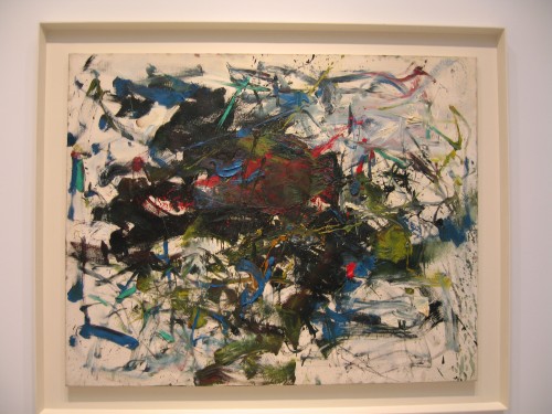
Joan Mitchell, from the series "Fremicourt Paintings 1960-62," exhibition at Cheim & Read, 2005

Joan Mitchell (1925 - 1992) River, 1989, Oil on canvas diptych 110 x 157 1/2 inches each panel: 110 x 78 3/4 inches

One of the most remarkable paintings is Untitled (1992), the year of Mitchell’s death: again a diptych, this painting has an unusual composition, with all the action taking place in a horizontal band calligraphically rushing and tumbling across the middle of the two canvases’ white field, with a dominant ultramarine theme, bold gestures underscored by more delicately calligraphic lines, including again the thin deep red lines.
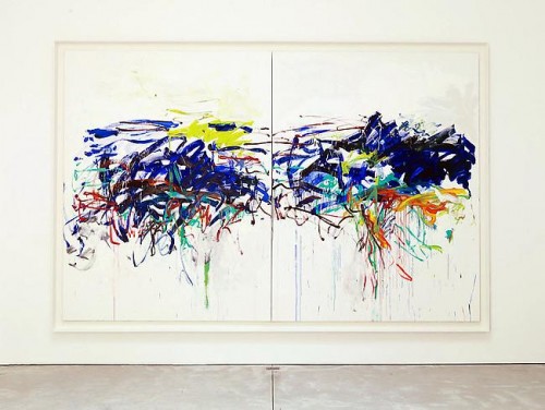
Joan Mitchell (1925 - 1992) Untitled, 1992, Oil on canvas diptych 102 3/8 x 157 1/2 inches

These paintings, from the year of her death, are expressions of freedom, clarity, and insistence or necessity.They are curiously joyous, considering that the artist was in poor health, suffering from cancer and other crippling afflictions.
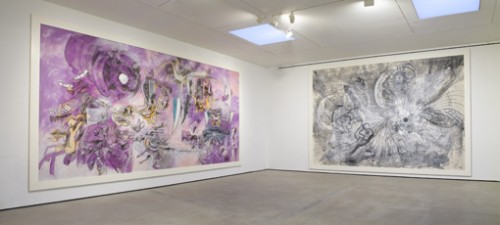
Across the street, again, joyfulness, in the expansive, enormous late paintings by Matta (Roberto Matta Echaurren, 1911-2002). These works are representative of the artist’s characteristic forms, figurative, mechanistic, biomorphic. For young artists, impressed by spectacle and influenced by graffiti, the Matta show is also an important object lesson in what age can bring.For example Architecture du Temps (un point sait tout), done in 1999 when the artist was eighty-eight years old, is a fantastic huge black and white painting which relies mainly on an open framework of thin black lines within white paint and thin black washes. In French the expression “un point, c’est tout” is kind of verbal super punctuation, literally, one point is all, which is to say, that is it, there is nothing more to be said; “un point sait tout” sounds the same but means one point knows everything, which, as the subtitle of Architecture of Time, is a very telling pun and a sharp commentary on the making of art in old age, as well as on the power of line, the power of a point in space.
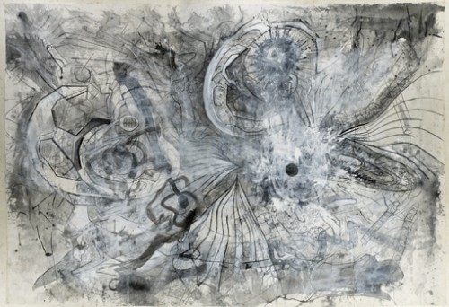
Roberto Matta, Architecture du temps (un point sait tout), 1999 oil on canvas 14' 11-1/2" x 21' 9-1/4"

Roberto Matta, L'homme descend du signe, 1975 oil on canvas 13' 5-3/4" x 27' 4"

Matta’s confidence in art is expressed in another even more contemporary-looking and even more enormous, twenty-seven foot wide, painting, L’Homme Descend du Signe (from 1975, when the artist was just a baby at age sixty-four). Another pun: “Man Descends from the Sign” (instead of “Descend du Singe,” man descends from the monkey). The painting is positively gaudy, with acid purple the main ground for sharp dagger like forms, which could easily be transposed to become tags. It is a great bridge between museum-scaled surrealist painting, architecturally-scaled mural painting, and city-scaled graffiti. The Fall (Autoritratto d’ognuno) from 1991 is another beautiful painting, again, an opening up of Matta’s earlier characteristic surrealistic web of drawing based biomorphic shapes. The painting is graced by a lovely spray of color, orange, the color of fall, a kind of ecstatic naturalism. (The largest paintings, oil and acrylic on unstretched canvas, are mounted on the wall framed by a thick white wood border, a very successful presentation).

If you associate energy and size with the brash ambition of youth, then these later and late paintings by Matta are also “younger” works than his earlier paintings from the surrealist period, which were tighter, more intricate and complex. At the same time the looseness and freedom of materiality in the later work is emblematic of old age style. At the very least, these works all confound one’s traditional expectations regarding age and the artist.
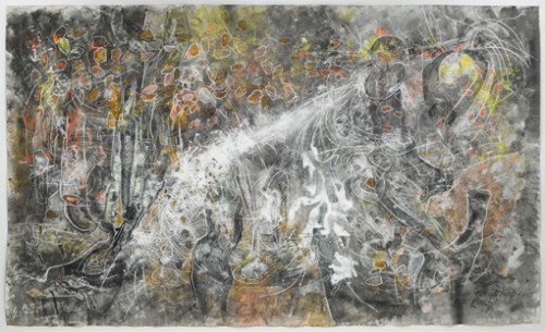
Roberto Matta The Fall (Autoritratto d'ognuno), 1991, oil and acrylic on canvas 10' 3-1/2" x 17' 1-5/8"

The images don’t do justice to the works, paler (in the case of Matta) and without the impact of either scale or surface. Go see the two shows.

Also seen the same day, down the block from Pace Gallery, in the show at Lennon-Weinberg Gallery, “H.C. Westermann: The Human Condition, Selected Works, 1961-1973,” some early drawings by H.C Westermann (1922-1981), done (as I overheard the gallerist explaining) when the artist was in the hospital being treated  for testicular cancer–which he survived: his wife had brought him some crayons and paper, and he worked on a group of small drawings, some in the artist’s characteristic graphic, cartoon-related style, some in a more abstract and less over-determined mode–after he recovered, these were packed away and never shown until now. I recommend the drawing entitled Sun Coming Up Over New York, (1961), incredibly delicate, nearly abstract.

Although this was not an old age style work, it made me think about what it means to make art when you are very ill, or at the end of a long life. No matter your degree of success, if you are still making art at age 88, or ill from cancer, you cannot only be making art for show, for ambition, competition, legacy. You are making art, as Jack Tworkov noted about painting, “to save your life.” It’s great to see such art, when we are often confronted by art whose motivation is not necessarily based in that kind of internal necessity.
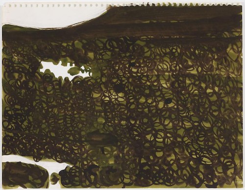
Richard Artschwager Untitled ca. 1950 watercolor and graphite on paper 10 7/8 x 13 7/8 inches
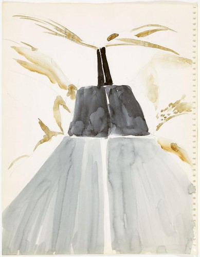
Richard Artschwager Untitled ca. 1950 watercolor and graphite on paper 13 7/8 x 10 7/8 inches

Earlier the same day in Chelsea, I saw Richard Artschwager’s show at David Nolan (show closed December 4). In this show, small abstracted landscape works on paper, all done in 1950, were shown along with new similar but larger works, paper mounted on soundboard, in which the artist returns to the Western landscape of the earlier series. One tends not to think of Artschwager in the same breath as Charles Burchfield, but the 1950s works participate in the great tradition of American ecstatic landscape, filtered through a calmer structure that is characteristic of Artschwager; some of these works are also reminiscent of Georgia O’Keefe’s earliest abstract landscape watercolors as well as of Agnes Martin’s early works on paper. In these earlyworks there is a lyricism, a tenderness of touch, of surface, and content, while the more recent work of the same subject matter is tougher, sharper, bolder and more imposing materially, thus proposing another kind of youthfulness in older age though the return to landscape or nature as a thematic seems to bracket the period of cooler irony of Artschwager’s most noted works, emerging in the era of Pop Art and continuing through the era of appropriation art.

Richard Artschwager Landscape with Median 2011 acrylic, charcoal and laminate on handmade paper on soundboard 35 1/2 x 49 3/4 inches

Unlike both Mitchell and Matta, Artschwager is a master of reticence and modesty, combined with a subtle but wicked deadpan. In these returns to landscape, the deadpan turns to a subtle meditation on the progress of life: in Landscape with Median, from 2011 (Artschwager was born in 1923), the yellow double lines on the road end mid-picture: these lines are very bold, hard-edged, bright colored, and sharply sculptural, set into a much softer ground: maybe there is just a dip in the road ahead, or maybe the road comes to an end–in a 1950 watercolor, the road continues like a fragmented ladder though land that is barely indicated. These works, early and late, state that the artist who stays alive in his or her mind and studio is always caught mid-path.

 

FacebooktwittermailFacebooktwittermail

The fault is not in our stars, but in our brand: Abstract Expressionism at MoMA

The necessity of being perceived as having a brand at first glance seems to be specific to our time: in politics you’ll hear that President Obama can’t do such and such because it would go against “The Brand.” Brand Obama or Brand Brad Pitt can’t be altered without entering into a Bermuda triangle of non-recognition by the media. A few years ago the New School University advertised a symposium called “The Brand Called You,” highlighting the current necessity of self-cultivating the contemporary version of the Homeric epithet, the one high concept identity feature which defines you and to which all your actions and products must conform to, since the audience, political and cultural, cannot appreciate contradiction, variety, subtlety or change. [And see where that has gotten us.]

This has always existed, by any other name, for does not Cassius ask in Julius Caesar:

Men at some time are masters of their fates:(145)
The fault, dear Brutus, is not in our stars,
But in ourselves, that we are underlings.
Brutus, and Caesar: what should be in that Caesar?
Why should that name be sounded more than yours?
Write them together, yours is as fair a name;(150)

To have a “fair name” has always involved a recognizable style (+ some kind of compelling persona – being a self-destructive alcoholic or drug-addict is way up there in that department). But “Brand” suggests a more comprehensive and more restrictive commodity, whether applied to a politician or an artist.

Abstract Expressionism/the New York School is a movement whose history and ideologies began to self-consciously and deliberately create a canon to define it in contradiction to European art, and this canon has become canonical and has acquired generations of canonical texts and institutions, of which MoMA is central. Because it was for decades the canon that dominated art discourse and education, it’s also a movement whose beliefs have been seriously challenged from many subsequent ideological positions which, in some parts of the art world and academia today even make referring to this period in teaching seem like contraband (dead white men, America, New York, painting, aura).

But like all canons, it has also proven impervious to major revision, particularly to the reinsertion or reappraisal of artists considered lesser at the time because of gender or certain aesthetic characteristics. Nevertheless established reputations have risen and fallen over time.

Abstract Expressionist New York at MoMA doesn’t do much to alter one’s understanding of the canon, its canon, significantly in terms of including in the master narrative so-called “minor” participants: I’ve just assigned a group of students the transcript of Artists’ Sessions at Studio 35 as the script of a play in which each person will take on the roles of two or three of the artists who attended those historic sessions, and now they must also experience vicariously something they may well experience in their own lives as artists: the vagaries of inclusion and exclusion from a movement of which you are an active participant; the reduction of a vibrant cultural field to a few branded individuals and images; the continuation of critical and institutional favoritisms that extend long past the life of the original participants.

[Note: several of the artists who participated in the Studio 35 sessions are sculptors, including Louise Bourgeois, David Hare, Herbert Ferber, and Richard Lippold, whose work is included in a subsidiary exhibition at MoMA, Abstract Expressionist New York: Rock, Paper, Scissors. This is in itself a curatorial decision that maintains the canon rather than transforming it by recreating the complexity of an art movement: the artists around the table at Studio 35 questioned whether they were in fact part of a community, and there was an uncomfortable silence around the dominance of painting, but sculptors and painters, as well as future stars and so-called “minor artists,” before history had fixed that determination, were around the table. Now they have been separated—on what ground we can’t know, since one sculptor at least, David Smith, is in the main show (though that show significantly is subtitled “The Big Picture”). If one, why not others?

For a much livelier, intimate, and challenging revision of the New York School, look to Action Abstraction: Pollock, de Kooning, and American Art, 1940-1976, the excellent catalogue of an excellent show, held at the Jewish Museum in 2008, curated by Norman Kleeblatt where the aesthetic programs and critical approaches of Clement Greenberg and Harold Rosenberg were used to frame the intellectual and aesthetic ferment of a period and a place. In an appropriately more intimate space were great examples of many of the same artists now in the two MoMA exhibitions, sculpture and painting together, with ephemera presented with greater moment, and critical text, so important to the period, used as the fulcrum]

What the MoMA exhibition does do is engage in some significant acts of what looks like retribution: as I walked through the show I couldn’t help but take notice not just of who was in it, but how each artist was placed and represented.

This led me to think about the work through the lens of the Brand. At first this seems to contradict approaches to art-making that are characteristic of the period, such as the picture plane as the arena of existential search. But of course most of the artists in the first two generations of Abstract Expressionism became known for a particular stylistic brand: drip (Pollock), zip (Newman), stroke (de Kooning), chroma (Rothko).

Here then are some major case histories from the main exhibition.

Case History I: Barnett Newman
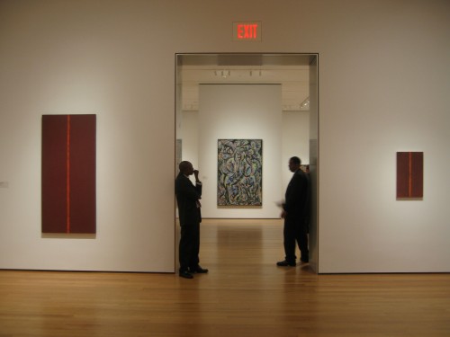
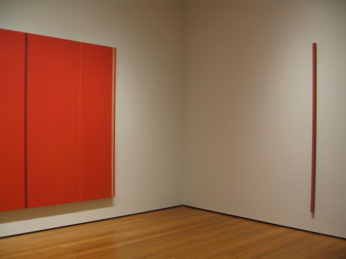
The most glorious room in the exhibition devoted to an individual artist contains the paintings of Barnett Newman. At the threshold you are confronted with Vir Heroicus Sublimis (1950-51), a huge painting seen, as I think it should be, on a wall that does not dwarf it but rather allows the viewer to experience her own scale. Newman wrote: “I don’t manipulate or play with space. I declare it,” and “One thing that I am involved in about painting is that the painting should give man a sense of place: that he knows he’s there, so he’s aware of himself. In that sense he relates to me when I made the painting because in that sense I was there. And one of the nicest things that anybody ever said about my work is…that standing in front of my paintings [you] had sense of your own scale.” To enhance this experience the Museum has placed The Wild (1950) on the next wall, to the right of Vir. One isolated vertical paint stroke, only one and half inch wide but the same height as Vir, The Wild is the opposite of all-over painting as espoused by one of Newman’s champions, Clement Greenberg: it is sculptural, it is even theatrical, but the two works create a pincer movement that assert or challenge the viewer’s sense of proportion, dimensionality, and measure just as Newman wished.

Barnett Newman, Vir Heroicus Sublimis and The Wild, Installation view, MoMA

Newman’s work is well served by the proportions of the room, which are as close to perfect in relation to the scale of the work and the experience of the viewer, not too big, not too small. For Newman’s 1951 show at Betty Parsons Gallery, in which Vir Heroicus Sublimis was first exhibited, Newman tacked the following statement to the wall,

“There is a tendency to look at large paintings from a distance.
The large pictures in this exhibition are intended to be seen from a short distance.”

This statement is significant because as the show progresses, the proportions of the rooms lose cohesion and the viewing experience takes on a more alienating sense of wandering through vast cold halls filled with works with sometimes uncertain, sometimes overdetermined relations to each other, and less authentic or effective relation to the scale of the viewer. But more on that later.

Barnett Newman, Onement III and Onement I (right), MoMA installation view

The best part of the Newman room though is visible when you turn your back to Vir and see Onement III and Onement I (1948) framing the doorway. Newman spoke often of Onement I and much has been written about it, and I highly recommend all of it: Yve-Alain Bois’s essay “Perceiving Newman” in Painting as Model is a terrific account of Newman’s discourse on figure/ground with one paragraph in it in particular one of the best I’ve ever read on a single painting, on how it achieves what the artist wished to achieve, but himself had to take time to understand that he had achieved. And in what turned out to be his last interview, filmed two months before his death, by Emile de Antonio for his essential art documentary, Painters Painting, Newman spoke of the meaning of his first Onement.

“I recall my first painting –that is, where I felt that I had moved into an area for myself that was completely me—I painted on my birthday in 1948 [young artists today take note, Newman was then 43 years old].  It’s a small red painting, and I put a piece of tape in the middle and I put my so called “zip.” Actually it’s not a stripe. Now, the thing that I would like to say about that is that I did not decide, either in ’48 or ’47 or ’46 or whatever it was, “I’m going to paint stripes.” I did not make an arbitrary, abstract decision. … I was filling the canvas in order to make that thing very, very viable. And in that sense I was emptying the painting by assuming the thing empty, and suddenly in this particular painting, Onement, I realized that I had filled the surface, it was full, and from then on those other things looked to me atmosphere. … I feel that my zip does not divide my paintings…it does the exact opposite,: it unites the thing. It creates a totality.” (from Barnett Newman, Selected Writings and Interviews)

Barnett Newman, Onement I (1948), detail, oil on canvas and oil on masking tape, painting dimensions 27 1/4″x 16 1/4″

Given so much language surrounding it, so many claims for its importance to the history of painting, Onement I offers an important lesson. A work that the artist and art history recognized as a major gesture in the debate over figure/ground is in the flesh a small, intimate, almost touchingly modest work, according to my definition of modest painting (in my essay of the same name in A Decade of Negative Thinking) as not necessarily painting that is small (although Onement I is small) but which is ambitious for painting itself, beyond the ego ambition of the individual artist. By the standard established by Pollock and by Newman in works like Vir, and even in comparison to Onement III, it’s tiny, its surface is fragile, the orange zip dry and crackled with time. It could not be a more contingent work. The work that established the Newman brand itself is itself unbranded, it has the freshness and tenderness of a first dance as much as it is, and was intended to be, an aesthetic manifesto.

I assume Newman would despise the idea that his manifesto, his conceptual and physical gesture in the history of art, embodied in the “zip” might ever be seen as a brand, but the paintings hold together and hold forth. They retain their difficulty yet exude a minimalist beauty they have helped to teach us to appreciate. Brand Newman worked for him as a metaphysical stance and it still works.

Case History II: Mark Rothko
Rothko’s floating rectangles are as identifiable as Newman’s “zips” or Pollock’s “drips.” And in this exhibition the paintings that make up the Rothko brand are given a big room but in it the more familiar “Rothkos” are overwhelmed by a huge, gloriously colored painting, No. 1 (Untitled) (1948), one I had never seen exhibited at MoMA before, an expanse of glowing yellows, salmon, with relational marks in some cases almost like bits of color tape, with a free-flowing composition and less didactically reduced visual program than what we know as “Rothko.” In the light of the dark depressing minimalist black and grey late Rothko hung at the end of one of the later rooms in the show, [Untitled, (1969-1970)] you can begin to get the idea of how having a brand can be a lethal prison for the artist and for the audience too.

Mark Rothko, No. 1 (Untitled), (1948), oil on canvas, 8′ 10 3/8″x9′ 9 1/4″

Mark Rothko, No.1 (Untitled), (1948), detail

I bet we don’t get to see this lovely off-brand, pre-brand painting again for a long time.

Jack Tworkov (represented in the exhibition by The Wheel, 1953) spoke in an interview about Rothko, for whom he had great respect and personal compassion: “Rothko, in one conversation, said that it was a very great struggle for him to find himself as a painter and that he risked something in developing this new form that he had. And when he had it and finally an identity and it was his, he just couldn’t let it go. And towards the end he admitted tremendous boredom. He was bored and yet did not know how to make a change. And change might have meant a kind of impairment of his identity. And he was going to hold on to that…for the Rothko image. […] He did. In some way, it’s admirable and another it’s kind of tragic.” (from The Extreme of the Middle: Writings of Jack Tworkov)

It’s always dangerous to fall into the biographical fallacy but seeing the last Rothko in the show, it’s hard not to wonder about chicken vs. egg: did Rothko paint depressing, formally and chromatically evacuated paintings because he was suicidally depressed, or was he suicidally depressed because he had painted himself into a dead end for his painting? No.1 (Untitled) (1948) is undoubtedly a “transitional work”  but scrolling back to that work and scrolling forward to the final paintings, you begin to wonder what other stories might have been possible.

Cast History III: Willem de Kooning.
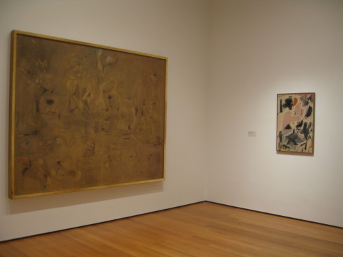
At the opening I felt that de Kooning had been utterly screwed by the show, given neither a room of his own, nor a grouping of work. Woman I (1950-52) is given a wall, but the spot it occupies in the narrative marks the point in the show where the installation becomes confusing, loses concentration,and where large rooms turn into vast halls where even great works seem like orphans (the scale of the David Smith and Franz Kline room does these artists a disservice as the temperature drops and the corporate quality rises although the same works in another context would feel very different).

Considering that de Kooning was one of the dominant figures of the period, he is surprisingly marginalized. His richly surfaced yet austere black and white oil and enamel abstraction Painting (1948) is tucked in next to a great big elegant programmatic Bradley Walker Tomlin. Valentine (1947), a tender small painting is nestled near Arshile Gorki’s large mounted work on paper,  Summation (1947), marking Gorki and the Master, as perhaps he was, leading his younger friends towards serious art practice and abstraction in the early years. Nevertheless…

Arshile Gorki, Summation and Willem de Kooning, Valentine (both, 1947), MoMA installation

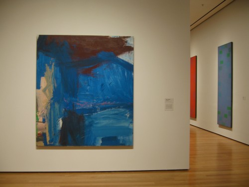
It turns out that MoMA just doesn’t own that many major works by de Kooning –in her New York Times review Roberta Smith refers to “the institutional bias against de Kooning.” They may own the brand: for better or worse, de Kooning’s brand is Woman I more than any other painting. Reams of text will tell you why and MoMA’s imprimatur is part of the story, it creates Brand. But, although it had never occurred to me before, maybe de Kooning doesn’t really have a brand, you can’t say zip, drip, floating colored rectangle, black on black. Sticking a cut-out smile on a semi-figurative expressionist painting is not the same as a brand. What makes de Kooning such a great artist may be something far more subtle, far more interior to painting itself and perhaps expressed best in his earlier works, those that are, again, often described as transitional, from figurative works of the early 40s to even abstractions such as Painting, Attic, or Excavation. But the judgment of the market makes even de Kooning’s biographers, Mark Stevens and Annalyn Swan, seem to subscribe to the idea that de Kooning’s earlier work including his “men” series and his early 40s portraits of women were in some way transitional, therefore, subtly, lesser. Yet that’s what I have always loved about these paintings, that you can see classical representation being wiped away and then, in the early abstractions, expressionism contained by a deeply felt sense of formal discipline. But interiority and brand don’t mix.

In order to see a better representation of de Kooning as a painter, with a greater range from the figurative to the classically abstract, as in Attic (1949) to large scale brushwork abstraction, visit the Metropolitan’s collection: for one thing the Met did not discriminate against de Kooning’s earlier more traditionally representational paintings.

Case history IV: Jackson Pollock
Pollock’s work is perhaps the most famous brand of the Abstract Expressionist movement (here include the whole package: the work itself, so absolutely uniquely recognizable, and so consistent with the ideology of both major critics of the period, and the man–rough-hewn inarticulate Westerner, tormented Orphean drunkard).

Hans Hofmann, Spring (1944-45), oil on wood, 11 1/4 x 14 1/8″, proving that one man’s brand is another’s one-off experiment [see also the work of Janet Sobel

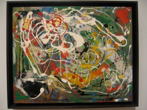
Pollock has his own room with a chronological range of work but something feels wrong with the room: it is too vast, so that One: Number 31, 1950 (1950) is placed to the far right of a very long wall. Its magical and magisterial effect is best achieved if treated like Vir Heroicus Sublimis, on a wall that just accommodates it and places the viewer’s body in direct confrontation and meditation. It’s not that this painting isn’t beautiful no matter what, but even a very large and great painting can turn into a postage stamp in the wrong circumstances. Here it is subtly undermined, seemingly in order to accommodate the sight-line pairing of Pollock’s smaller but bold and rough Number 7, 1950 (1950),  hung unusually high on the wall, with David Smith’s linear steel sculpture Australia (1951). Also in the room are post-“drip” works such as Easter and the Totem(1953) that are generally seen as problematic, the point where Pollock seemed not to know what to do next. Though bold graphic works, they are off-brand.

But so is the first painting you see in the show, Pollock’s She-Wolf (1943), a strong Picasso-influenced painting although Picasso would most likely have defined the animal with a strong black outline which in the Pollock is obscured by a turbulent painterliness which prefigures Pollock’s last works, which are also seen as off-brand (tragically so, instead of, as in She-Wolf, developmentally), although it suggests a move towards materiality, mass, and perhaps even an atavistic need to return to some form of representation, in a way which Guston was able to pursue, when he became dissatisfied with abstraction.

Case History V: Guston
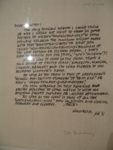
You reach the Guston paintings either by drifting past the truly awful Frankenthaler–it’s so bad I’m beginning to think it might be the most contemporary work in the show! You can also arrive at the group of Gustons just after you’ve hit rock bottom in terms of the loss of concentration of the installation, having passed classic period Ad Reinhardt (he is not rock bottom, don’t get me wrong, but he would spit at being hung without his own space and to have de Kooning’s big, blue splashy, broad-stroked landscape-based abstraction, A Tree in Naples and his own Abstract Painting (Blue), (1952) visible together in a sight-line no doubt chosen for the occurrence of blue in both works. Reinhardt made no secret of his contempt for de Kooning’s expressionism and one of the best bits of ephemera in the MoMA show (see obscure positioning of ephemera on 4th floor stairway landing) is a letter he wrote to MoMA curator Dorothy Miller about how he’s OK with being included in one of her group “Americans” exhibitions so long as “the show is free of Greenberg’s “Heroic-Pop-Artists-Pioneers” of “Abst.Exp.” or Hess’s “Swell-Fellows-&-Old-Masters” and “free of all the “KootzandJanis-Kids” now in their fifties and sixties, seventies and eighties,” i.e. pretty much everybody except himself and especially not de Kooning), and Rothko’s dark end of the soul.

Ad Reinhardt, Letter to Dorothy Miller, 1963

Willem de Kooning, A Tree in Naples (196o) and Ad Reinhard, Abstract Painting (Blue), 1952, MoMA installation sight line

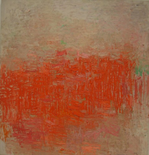
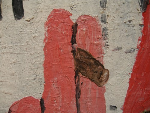
The exhibition includes two beauties from Guston’s Ab Ex period, Painting (1954) with its close knit, highly sculptural web of glowing salmon and pink small strokes, and The Clock 1956-57) where the similar strokes, in darker tones, gathering into a central area, leaving the all-over and beginning to congeal into the suggestion of form. Guston’s Edge of Town 1969) may represent what now is known as the Guston brand, crudely outlined, cartoon-influenced figures and still-life objects, but what makes Guston so meaningful to contemporary painters is that he didn’t throw the baby out with the bathwater. He believed in painting more than he believed in Abstract Expressionism or even than in his own beautiful contributions to that movement. He ditched Brand Guston I, but he held on to paint, reached back to the past of his early interest in political representation to paint in the present of contemporary politics and to apply the meaning that oil paint could create to the humble details of daily life, a nail, a book, a shoe.

Philip Guston, “Painting” (1954), oil on canvas, 63 1/4 x 60 1/8″

Philip Guston, “Painting” (1954), detail: when a guard noticed me taking close-up pictures of this painting he approached me and instead of telling me to step back, he said, “this is the best.”

Philip Guston, Edge of Town (1969), detail (painting: oil on canvas, 6′ 5 1/8″x 9′ 2 1/2″)

The problem with looking at artwork through the fulcrum of Brand, is that you aren’t really looking at the artwork itself. The specificity of an individual artwork holds visual and intellectual information and each such work should define the artist, rather the brand ending up masking the work, stifling the artist’s progress, and potentially killing the artist’s soul as well as the soul of the viewer who is truly looking.

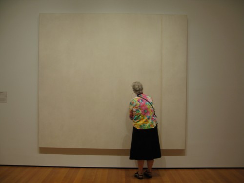
Barnett Newman, The Voice (1950), egg tempera and enamel on canvas, 8′ 1/8″x 8′ 9 1/2,” with viewer, MOMA

FacebooktwittermailFacebooktwittermail