It has been a cold and snowy winter in the North East and there is a sense of a slow down, as people prefer to stay indoors than brave the layers of thick lumpy ice, black slush and garbage strewn black and yellow pitted snow mountains that have graced our streets for weeks. Time seems to have stopped, and not in a good way. But here it comes, any minute, in a marathon week, the Armory Show and other art fair exhibitions joined this year by the opening of the 2014 Whitney Biennial–some people love it, to others it is a professional duty and a physical endurance test, to be survived as best as possible. Let’s hope for decent weather at least. The proximity of this New York artworld spring ritual makes this an interesting moment to catch the last few days of The Armory Show at 100 in 2013 at the New York Historical Society Museum and Library on Central Park West and 77th Street. Incredibly, considering that I live four blocks away, I only just saw the show today. Sunday February 23 is the last day.
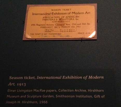
The show presents a historical overview of the exhibition, recreating in a limited manner the experience viewers would have had at the original exhibition, which was open from February 17, 1913 through March 15, 1913, held at the 69th Regiment Armory on Lexington Avenue between 25th and 26th Streets, which in recent years has occasionally housed spill-over exhibitions from the Armory Piers shows. Considering that efforts to interior decorate fairs today are usually confined to VIP lounges and seating areas scattered here and there, and that visitors are usually disoriented by the profusion of booths, merchandise, confusing layouts across miles of space, it is amusing to read this description of the exhibition:
Armory show visitors entered the enormous drill hall of the 69th Regiment Armory and were overwhelmed by a cavernous, light-filled divided into eighteen octagonal galleries with burlap covered panels. It was decorated with greenery, pine tress, flags, and yellow streamers that formed a tent-like cap….The paintings were hung in two frenzied days before show opened, but the lay-out was planned in advance. The galleries were arranged so that visitors could not wander laterally through the space. Rather they had to choose a route and follow it through to the end. The organizers laid out the space according to their vision of modern art: the galleries progressed roughly from American to European art, and from revolutionary movements of the past to the current French avant-garde.
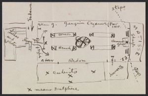
Walt Kuhn, diagram of the Armory exhibition for its display at the Copley Center in Boston
Thus, although the works were for sale and 274 works were sold, mostly prints of European artists, the layout was primarily educational, to tell the story of modernism in a manner that seems to have offered the first draft of Alfred Barr’s instructional layout of the collection of the Museum of Modern Art, which for years functioned as a walk-in text book whose chronology and stylistic connections now are much eroded by more recent fashions in museumology but were very useful to get at least one idea of how the thigh bone connects to the knee bone. The floor plan of the Armory show oriented visitors towards the art in Gallery I, which critics termed “the chamber of horrors,” where one found what the organizers considered the culmination of modern art, Fauvism and Cubism, with Matisse’s Blue Nude and Duchamp’s Nude Descending A Staircase (No.2) attracting the most notoriety. Apparently critics found Cubism easier to deal with because it was fun to make fun of it—the cartoons of the period are wonderful as drawings in themselves!–whereas Matisse was seen as barbaric.
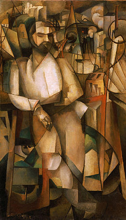
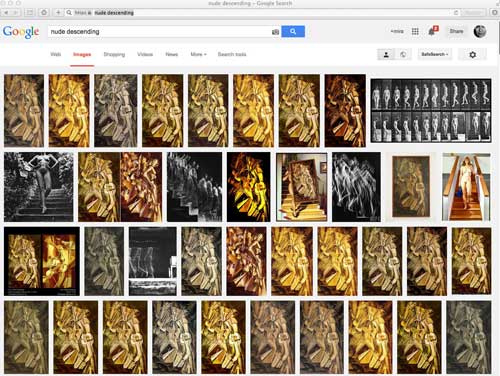
This show is worth seeing, in particular because it is an opportunity to see Nude Descending A Staircase in New York, and hung as it was at the Armory show, next to Albert Gleizes‘ Man on a Balcony (1912), a much larger canvas so that, here in this exhibition perhaps even more than on the larger wall of the Armory, the placement highlights the delicacy of the Duchamp, modest in scale, with a smooth surface and precise yet clearly hand made lines and even a few areas of slightly oilier paint, where there is perhaps some ever so slight impasto (gasp!) or perhaps a bit more oil burbled up to the surface creating a painterly blemish right near the center of the work (gasp!). These painterly incidents are not apparent in reproduction so it is really very useful to see the painting and I recommend the exhibition if only for that opportunity. Comparing it to the Gleizes is also instructive. A big handsome painting, Man on a Balcony is also an illustration of how Cubism, almost immediately after the works of Picasso and Braque done between 1909 and 1911 yet still radical today, could easily be recuperated to traditional representation, becoming a cosmetic device over essentially unchanged notions of representation of objects and space. The figure in the Gleizes painting is basically a recognizable male figure in a contrapposto pose set against a landscape. He has a face, hands, he’s wearing a shirt and pants. The Cubism is just style not performative substance. Duchamp’s Nude is barely figural, there is no facial information, barely any anatomical representation, it is a representation of motion, clinical and scientific. Next to the bold and superficially impressive Gleizes, Duchamp’s Nude is obdurate and inscrutable.
If you see the show don’t miss the separate room of ephemera from the exhibition, letters, loan forms, telegrams. It is possible to miss, because the museum signage is a little confusing and the room is darkened for preservation purposes, but it’s always good to be reminded of the nuts and bolts of events and artworks that have since become iconic or legendary. Nude was purchased for 324 dollars.
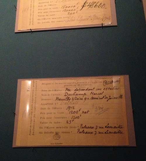
The ephemera also include imaginary telegrams from such luminaries as Gertrude Stein and Roger Fry:
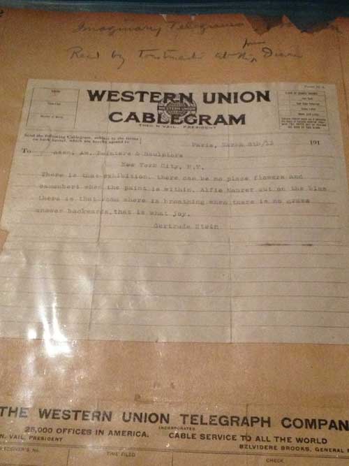
from a scrapbook of the period of “Imaginary Telegrams” (that is what it says at the top of the page of an album with other seemingly more legit cablegrams): There is that exhibition. there can be no place flowers and camembert when the paint is within. Alfie Maurer out on the bias there is that room where is breathing when there is no grass answer backwards. that is what joy. Gertrude Stein
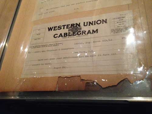
from a scrapbook of the period of “Imaginary Telegrams”, this one *purportedly* from Roger Fry: “I Have not seen your exhibition but am sure it does not amount to much.”
Everyone’s a critic!
The show also includes a luminous painting by Walt Kuhn,one of the organizers of the exhibition, a delightful painting by Maurice Prendergast, Albert Pinkham Ryder‘s Moonlit Cove, whose surface condition is so extreme that the pattern of the craquelure is a textural, sculptural cousin to the large organic abstracted shapes of sky, cove, beach. Matisse’s Blue Nude and Van Gogh’s Mountains at Saint-Rémy still are bold and challenging, and if they no longer have the power to shock, they do retain the ability to awaken your eyes, the Van Gogh in particular benefits from the context of this show: like so many of his paintings, it looks as fresh as if it had been painted yesterday, and the whole future of expressionism through the Twentieth century is in the brushwork/drawing-painting marks .
And if you haven’t seen Nude Descending A Staircase in the, you should pardon the expression, flesh, and don’t know when you will get to Philadelphia Museum of Art where it lives, go see it, it is extremely important to know from your own experience that this strange, infinitely analyzed artwork, is among other things, a painting.
