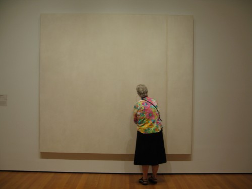
This is the continuation of an earlier piece from July 28th
*St. Francis in the Desert
June 9th of this year was an exceptionally hot day in New York. I don’t have air conditioning yet in my new home so I passed the day cooling off in three of New York’s miraculous caves filled with painted and sculpted images–the Frick Museum, the Metropolitan Museum, and the Natural History Museum.
My triple-decker museum day began when I found myself passing by the Frick Museum: I remembered that Giovanni Bellini‘s 1480 painting St. Francis in the Desert was going on special view so I went in to cool off and to see how the special installation, “In a New Light: Bellini’s St. Francis in the Desert,” might change one’s view of a familiar work.
I had just seen Werner Herzog‘s Cave of Forgotten Dreams about the Paleolithic cave paintings at the Chauvet Cave in France and I had been thinking of the 1946 Russian children’s movie The Stone Flower which made an indelible impression on me when I saw it as a small child, so I had rock faces and caves on my mind and there in the familiar painting was a man standing alone on a stone ledge, in front of a cliff face very similar to the location of the Chauvet Cave. The man’s modest hut, an open lean-to, frames a dark entrance into the rock face. On a rough wooden reading desk there is a book and on a little shelf, which infrared reflectogram analysis now tells us was a last minute addition by the artist, is placed the vanitas of a human skull, not unlike the one bear skull seemingly placed by a human hand on a rock in the Chauvet cave.
This is the the third cave I want to write about, the one that you cannot enter, whose entrance you can barely see, the dark portal into the stone cliff in front of which St. Francis receives the stigmata from an unseen blast of divine light.
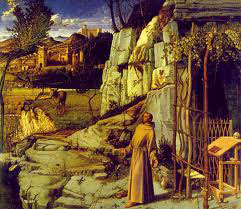
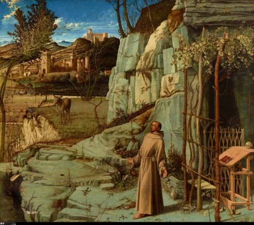
In the museum’s brochure and in the many appreciations of the painting by art critics Holland Cotter (a very thorough and informative article), Peter Schjeldahl, Blake Gopnik, and Jerry Saltz, no mention is made of this cave entrance, everyone refers only to the hut or simple shelter in front of it.
Yet in a painting where every detail is present in order to advance a religious narrative, the cave portal must have significance.
But before I propose what I think might have been Bellini’s meaning for this iconographic element, let me turn to First Impressions, Judith Thurman’s 2008 New Yorker essay about the paleolithic cave paintings in the Chauvet and other Southern European caves, an essay which Herzog credits with inspiring him to make Cave of Forgotten Dreams. Thurman is careful to warn against any contemporary explanation of the meaning of these paintings for the men that did them (though even her own assertions demonstrate how hard it is to escape supposition and speculation), but all her information is suggestive and inspiring. She lays out the time frame of the paintings, noting that based on the geological time frame of mineral deposits on the cave walls, in some cases 5000 years may separate one layer of paintings from another without any significant alteration in style of drawing. This is due to what Thurman refers to a “stable” culture:
A new age in the science of prehistory had begun in 1949, when radiocarbon dating was invented by Willard Libby, a chemist from Chicago. One of Libby’s first experiments was on a piece of charcoal from Lascaux. Breuil had, incorrectly, it turns out, classified the cave as Perigordian. (It is Magdalenian.) He had also made the Darwinian assumption that the most ancient art was the most primitive, and Leroi-Gourhan worked on the same premise. In that respect, Chauvet was a bombshell. It is Aurignacian, and its earliest paintings are at least thirty-two thousand years old, yet they are just as sophisticated as much later compositions. What emerged with that revelation was an image of Paleolithic artists transmitting their techniques from generation to generation for twenty-five millennia with almost no innovation or revolt. A profound conservatism in art, [Gregory] Curtis notes, is one of the hallmarks of a “classical civilization.” For the conventions of cave painting to have endured four times as long as recorded history, the culture it served, he concludes, must have been “deeply satisfying”—and stable to a degree it is hard for modern humans to imagine.
In today’s willfully amnesiac ahistorical media environment, such millennial cultural continuity is indeed unimaginable, which is part of the deep appeal of these works. Notions of continuity and tradition are constantly overridden by the impulse for progress or at least speed, change, and novelty. Forget about 5000 years, even 60 are too much.
In this regard, I began my summer reading with the e-flux journal’s small book, What is Contemporary Art?–an interesting collection of texts whose answer to the title’s question is that actually that the question is Where is Contemporary Art? placing its location beyond the boundaries and histories of Western art more than addressing, for example, what it might look like or consist of, though it is implicit that it does not likely consist of any media associated with modernism, especially painting. My reading however proceeded down the streets of the old art center of New York, as I read a number of books about the New York School, including Philip Guston: Collected Writings, Lectures, and Conversations, David Kaufmann’s Telling Stories: Philip Guston’s Later Works , and Morton Feldman’s wonderful essays collected in Give My Regards to Eighth Street. Not surprisingly, given my upbringing in the New York artworld of that period and tradition, I found much commonality with ideas from that period about painting and about the creative experience itself. In a millennial frame, thinking of the cave painters’ 5000 years or more “stable” culture, it should stand to reason that ideas that go back only 60 years (albeit with a century-long back story) would still have something left in them for a contemporary artist to work out or work from, but I know that there are many contemporary artists and theorists who feel that these ideas are dead or, if they aren’t, should be.
Nevertheless, here I am in front of a painting made 500 years ago, and our culture since its creation has been stable enough that the story of St. Francis of Assisi and the story of Christ remain in our collective history enough that one can put forward a reasonable supposition about Bellini’s incorporation of this topographic detail. Can it be anything else than the cave from which no living man can return, except, that is, for Jesus? The darkened entrance to a tomb set into the natural sepulcher of a cave in a stone cliff, such as the sepulcher of Lazarus, who Jesus raised from the dead, foretelling his own resurrection from the confines of a similar cave wall tomb chamber. In Roman Judea, this was the Jewish burial ritual:
The Jews of Early Roman Palestine had a long tradition of prompt burial of the dead. Most funerals took place as soon as possible after death, and almost always on the same day. As soon as death occurred, preparations began: the eyes of the deceased were closed, the corpse was washed with perfumes and ointments, its bodily orifices were stopped, and strips of cloth were wrapped tightly around the body–binding the jaw closed, holding the hand to the sides, and tying the feet together. Thus prepared, the corpse was placed on a bier or in a coffin and carried out of town in a procession to the family tomb, usually a small rock-cut cave entered through a narrow opening that could be covered with a stone. [source]
There are other ways in which this work reflects cultural stability.
Even though the Renaissance was a period of intense intellectual and technological growth, and even though this painting was produced with the then new technique of oil paint, it was so well crafted that it has endured in excellent physical condition for 500 years: technical manuals from the period, such as Cennino Cennini‘s 15th century The Craftsman’s Handbook, give an idea of the labor and craft involved in every aspect of panel painting, from weathering wood panels for a couple of years to eliminate any chance of warping (St. Francis is painted on three joined poplar wood panels) to purifying gesso “a whole month by being soaked in a bucket.”
One can imagine that the painting may survive 500 more years if given half a chance, and even if found buried under the ruins of the Frick Museum at some future moment of archeological exploration and excavation, it might still be intelligible, so long as there are still men, trees, rocks, and bunny rabbits left on earth [something that cannot be said for the kind of flickering images one sees in contemporary museums, video installations and digital projections that may well be impossible to view in the passage of a single generation, if that–I have plenty of diskettes from the early 2000s, but no reader with which to look at them, how about you?]
The painting reflects a stable culture in another way. Not only was the painting so well made in terms of material support and surface that it has survived in good condition for over 500 years, but it is composed like a tank! This is an astonishingly stable and balanced composition, with an strongly established foreground balanced by a sharply delineated background. The painting is disconcertingly close to, though not exactly, a square, a close ratio that has the effect of locking the viewer into a perspective that recedes into space yet guarantee a frontal focus. It is an unusual ratio, avoiding the Gothic narrow vertical and the wider Renaissance rectangle. The nearly square format divides into roughly four near squares in such a way that each area is imbricated, though at the same time the top left quadrant which represents the distant background of field and hill towns is so sharply etched as a bold overall square shape with a different overall coloration from the rest of the painting, that you could carve it out of the composition like a block of stone.
In one of my Google image searches for jpegs of St. Francis I came upon a bizarre but strangely apt comparison, of Piet Mondrian‘s Broadway Boogie Woogie and Bellini’s St. Francis in the Desert.
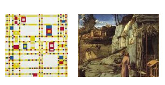
Google Image search result for Bellini's St. Francis in the Desert, July 31, 2011, screen capture
When I tried to refind this unexplained combination to see what the original point of it was, I couldn’t find it but the momentary conjunction made a kind of strange sense to me: the geometry of Bellini’s composition and the odd way in which it undermines the programmatic illusion of spatial depth place it in a line that can be drawn forward to Mondrian’s painting, which, in turn, could stand as a diagrammatic analysis of the earlier work.
Even St. Francis himself is an exceptionally stable figure: not only does his monk’s robe retain the effect of sculptural mass of early figures in the paintings of Giotto, but in doing a number of sketches of him this summer trying to imagine the outline of his body under the robes, I came to the conclusion that he is planted firmly on his feet even if his soul is reeling.
So this is a painting of a man in some state of transcendence, ecstasy, or surrender, it is a landscape painting with an illusionistic representation of deep perspectival space, it is a painting which evinces a profound confidence in a natural order, yet it is also a painting in which a medieval or Northern Renaissance overlay of a carpet of exquisite and endearing vignettes of flowers, rabbits, birds, blades of grass creates a overall field almost like the field of one of the Unicorn tapestries.
Here, in a manner similar to Herzog’s use of 3D to heighten the movie viewer’s experience of the Chauvet cave painting, the intervention of new technological advances in imaging reveals more of the painting than meets the naked eye. As part of its recent hi-tech inspection, the ink underpainting has been studied and documented via infrared analysis and the 500 year old oil on three wood panels painting has been found to be in excellent condition. And, in addition to scanning the physical depth of the painting to reveal the very complete underpainting, its surface has also been scanned. The Frick’s St. Francis in the Desert was recently chosen to be one of the first world masterpieces to be scanned for the Google Art Project and the museum has set up computer viewing screens in a small room off the main conservatory where you can inspect the painting in astounding detail: you can get close enough to see details that you cannot see even if you are right in front of the painting, close enough to see traces of fingerprints of whoever smoothed on the gesso ground by hand, or the single tiny flick of white glaze in St. Francis eye.
The painting combines the newly developed representation of deep space with a more medieval or northern, Flemish, attention to detail, narrative and decorative. The dominant bold elements of the overall composition combined with the carpet effect of flowers, birds, leaves of grass, every thing represented with fine detail and delicate brushstrokes all across the surface of the panel somehow have the effect of making the painting seem astonishingly flat, for all that it has an ambitious spatial program with the theatrical staging of the desert set against a civilization of fields and walled, turreted villages going back miles and miles in to the vanishing blue perspectival space.
But not even the magnifying powers of the Google Art Project can take you inside that flat darkness of the the interior of the cave.
You could just look at all of this online of course, without ever going to the Museum, but the wonderment is in running back and forth between the macro imaging and the painting itself, to find the details you had not seen before, a kind of wonderment of closeness and of distantiation at the same time. If anything, this technological intervention, when, down the hall from the computer screen, the painting is present in front of you with all of its strangeness of proportion and religious faith combined with Renaissance fidelity to perception, its deep perspective but strong sense of compositional and surface unity, gives you an inkling of how hard it is to really see a painting, how complex painting is, especially a painting that in a sense is perfect.
The dark entrance to the cave is a cut into that perfection, not a flaw exactly, but a crucial imperfection in the picture plane, a hole in the surprisingly modernist flatness of the very stable composition, despite the mastery of illusion of deep space. The black door into a flat nothing that we can see or enter both refers back in time to a knowledge from our close millennial past–the two stone Sepulchers of the story of Jesus– and calls up modernist ideas about the essential flatness of painting, because the flatness of the black space of the cave entrance only calls attention to the flatness of the representational painting that frames it.
This black door into the flatness of the painting field appears in other earlier Italian paintings, when representation’s movement towards full spatial verisimilitude pushes up against the vestigial flat gold ground of Byzantine and medieval art, while weirdly prefiguring modernist painting’s declaration of its essence as flatness. In Duccio’s 1308 The Road to Emmaus the figures gesture towards a shorthand for architecture, the door nevertheless still a hole in the flat gold leaf ground, a Hofmannesque floating rectangle, a door to the city, and a door into the unknown.
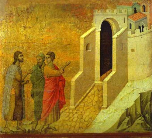
Duccio, The Road to Emmaus, tempera on wood panel, back of the Maesta, 1308-1311, from the Museo dell'Opera del Duomo, Siena
*
Despite Thurman’s cautions against any interpretation of the cave paintings because of the temptation to overlay contemporary concerns and histories on a culture we have no knowledge of except for these visual manifestations and a few artifacts, the temptation is great to project one’s ideas and dreams onto the cave painters and the time they lived in.
Philip Guston spoke often of the cave painter. The cave painter first arose as a theme in a 1965 conversation with art critic Harold Rosenberg.
Philip Guston: It’s a strange thing to be immersed in the culture of painting and to wish to be like the first painter.
Harold Rosenberg: Many an artist today wants to be the last painter.
PG: I imagine wanting to paint like a caveman would, when nothing has existed before. But at the same time one knows a great deal about the culture of painting and one is conscious of that culture.
HR: You know Mallarmé’s formula for the poet? He calls him “un civilisé édénique,” a civilized first man.”
PG: That’s marvelous. Exactly what I mean. I should like to paint like a man who has never seen a painting, but this man, myself, lives in the world museum.”
Guston recalled this conversation many times in later years, the allusion to Mallarmé’s term reappears in talks and interviews up to the last published in the collection, from 1980. In a 1969 talk, he responds to an audience question about what motivated the cave painters:
There are a lot of conflicting theories about that. You’re aware of that? The anthropologists have written many things about it. You make these marks and you do these bulls and bisons, because it had to do with hunting and so on. And that may be true. I don’t know about that so much. But I also think that for man from the beginning, who made the line of this bull, it was a catharsis, a joy, an ecstasy, to make this line. And it had nothing necessarily had to do with hunting, you know? I mean, why, to the scientists, would it be impossible that a man would enjoy making a curved line that became a bull? But he’s an anthropologist, so he has to have a motivation for the guy making the bull. Like you read social art historians who talk about modern art, psychological motivations and endless reasons for it. A psychiatrist, for example, who gets involved with why these men do this funny stuff. But the part they miss is that there’s material, there’s you and there’s this feeling, an inchoate feeling, a raw feeling. And what they miss is that you may want to take up these charred bones or colored mud and make some….I’m not a scholar. You all paint, you know there’s this feeling. So just because I want to be civilisé édénique, why does that exclude my connection to this man in the cave twenty-five thousand years ago? We’re no different. We’re different in other ways; we don’t have to go into that. But on this basis, that impulse is the same.
In a 1980 interview, Guston returned again to his identification with the first painter:
I feel directly in line with a tribal colony, so-called primitives. They are not primitives. Who are the men in that prehistoric cave? The men in the Lascaux caves who didn’t go on the hunt and used charred bones to draw on the cave walls? What kind of a neurotic was he to make these beautiful bulls? I don’t think art has changed very much. it’s a very archaic form.
Recently in “Life Studies,” Adam Gopnik’s June 27, 2011 New Yorker article about drawing from nature, Gopnik turns to the example of the Chauvet and Lascaux cave paintings to buttress the point of view that life drawing is an atavistic human activity,
less an acquired instrument of slow-crawling craft, and more just something back there that we delve deep to find again. This may in turn explain the enduring mystery of why the oldest of all human representations, the cave paintings of Altamira, Lascaux, and Chauvet, are expertly rendered as shaded, three-dimensional life-drawings, full of persuasive highlight and shadow. The caveman in us still draws what he sees, until the Egyptian in us interferes.” To back this up, Gopnik goes even further, referencing “psychologist Nicholas Humphrey…[who] has argued that the existence of the perfectly modulated cave paintings suggests that the people who made them didn’t yet know how to talk.
Humphrey had compared the cave paintings to the drawings of an autistic girl who could not speak but who drew animals in a lively manner reminiscent of the cave painting, in order to suggest that if a contemporary human without language could draw animals so well therefore it was possible or even likely that the humans who had painted the cave paintings also had no language. I can’t comment on the veracity of Humphrey’s example or the logic of his assertion, but it is hard to believe that the level of craft that went into the creation of the cave paintings– including discovering how to process natural materials to making the pigments, bringing in man-made sources of light, building scaffolds, in some cases scrapping the cave wall to get a lighter ground for their images, incising drawn forms, and then rubbing pigments prepared for this purpose to create the final drawing–could be the result of the activities of pre-verbal ape-like creatures, rather of the strapping men that Thurman describes, who were “as tall as the average Southern European of today, and well nourished on the teeming game and fish they hunted with flint weapons. … genetically, our direct ancestors.”
Such preparation would have required the kind of cooperation and transmission of knowledge among human beings and the kind of conceptualization and memory that are all reliant on language. If they had the concept of a horse, they had a word for it too. Guston’s projection of his own angsty image of the neurotic artist onto a kind of Joe Ur-Painter may be fanciful but it is certain that the cave paintings were no more painted by painter UGH and painter UGGH jumping around and grunting than was St. Francis in the Desert.
At the same time, like Guston, I feel that without having any theory or interpretation of what the cave painters thought or rather knew they were doing, without any ability to enter their conceptual universe, I can have some understanding in the body of how the painter felt, or thought/felt, applying charcoal to a ridged line on a prepared ground. I’ve done that, I can feel that, I can trust that something at the level of making is shared underneath the changing languages of meaning and intent.
*
A friend of mine told me last week that he wanted to see how I would pull together the diverse threads of the first two parts of “Wonder and Estrangement: Reflection on Three Caves.” I’m not sure if I’ve now tied up every loose end in a satisfying or logical manner. I do know that the kind of non-polemic, discursive, and associative thinking in these texts takes me time to develop and may not fit into artworld schedules–in this instance I’m the last art writer to weigh in on St. Francis, since the special exhibition closes at the end of next week. I discussed this aspect of writing in my other series of posts this summer, on conditions of contemporary art writing). I’m more likely to have time for this kind of thinking in the summer. But now the summer is ending. The dream is over.
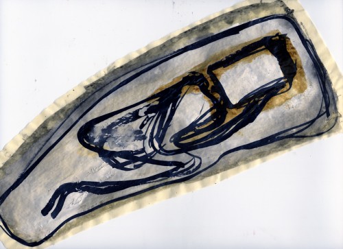
Mira Schor, Drawing fragment: Dreaming Sleeper, ink and gesso on tracing paper, 2011
*
St. Francis in the Desert is usually on view in the collection of the Frick Museum and I assume that within a reasonable amount of time it will be returned to its usual residence, in the back room to the left of the grand hall at the museum, but it is wonderful and interesting to see it as it is currently on display, alone in a centrally located skylit room, set into a huge specially constructed easel which brings it into the present space of a viewer in a new way. If you’re in New York and you haven’t yet done so, go see it. The current special installation closes August 28.

