Tag Archives: painting

Ongoing Upcoming

I really felt that my mother understood me when, at the beginning of one of our many summers together in Provincetown, as I was getting the house and garden ready, I overheard her telling a friend on the phone, “You know, Mira is very busy, she hasn’t started working yet.”

When I say “my work” I always mean painting, next is writing which is part of the constant process of thinking, and the rest is just work work, job work. I always say that I can paint and write at the same time, the two occupations are complementary and mutually generative. I can teach + try to do all the things one must try to do in order to maintain a professional life, that is, all the things that make all of us say and feel that we are so busy that we have no time to think expansively, spend time with our dearest friends, or do much of anything that might be restful, pleasurable, or generative of new ideas–with a modicum of clean clothes and cooked dinners now and then–and also write, maybe, or maybe also paint, maybe. I can’t do all three, my work, writing, and the big busy of work work job work: this winter writing for A Year of Positive Thinking has proved impossible as I have prepared for a show which just opened and a conference to be held this week while teaching intensely absorbing new courses and the rest of the daily stuff that must get done from the never finished “to do” list.

I really miss writing for the blog and hope to return to it very soon. Meanwhile here is what I’ve been working on and some of the ongoing and upcoming events I’m involved with.

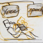
Exhibition: Mira Schor Voice and Speech

I hope you can see my exhibition at Marvelli Gallery in New York City, which just opened and is up until April 28th.

See “The Thing Itself: Mira Schor + Bradley Rubenstein,” a recent interview about the work in the show.

I will do a reading at the gallery April 21 at 6PM to celebrate the 2nd anniversary of A Year of Positive Thinking and will send out more information about that closer to the date.

&

Conference: This week on Thursday, April 5th:

Art Practice, Activism, and Pedagogy: Some Feminist Views

The conference will consider feminist art as a zone of multi-disciplinary art production associated with a radical critique of gendered power relations in society. The women artists participating will speak about their current work, their history within feminism, and the relevance of feminist identification and communities to their creative endeavors. They will discuss what it means to be a feminist artist today within an extended range of diverse political engagement.

Speakers include Susan Bee, A. K. Burns, Audrey Chan, Maureen Connor, Andrea Geyer, Caitlin Rueter & Suzanne Stroebe, Ulrike Müller, and Mira Schor. The conference concludes the first MFA Advanced Practice course in Feminist Art taught by Mira Schor in the Parsons Fine Arts MFA Program.

This event is FREE: no tickets or reservations required; seating is first-come first-served

Parsons The New School for Design Theresa Lang Community and Student Center, Arnhold Hall

55 West 13th Street, 2nd floor, New York, NY

Schedule:

*9AM Brief introductory remarks

*Group 1 (9:15)

A.K. Burns, Andrea Geyer, Maureen Connor

*Group 2 (11am)

Susan Bee, Ulrike Müller, Mira Schor

*Lunch break

*Group 3 (1:45pm)

Caitlin Martin-Rueter & Suzanne Stroebe (collaborative+individual presentation), Audrey Chan

*General discussion

The conference concludes the first MFA Advanced Practice course in Feminist Art taught by Mira Schor and at 4PM there will be a screening of MFA student work from the class at the Fine Arts MFA Program studios at 25 East 13th Street, 5th floor.

&

Also Ongoing & Upcoming:

*I have an essay in Draw it with your eyes closed: the art of the art assignment published by Paper Monument. The book has gotten rave reviews including one by Dwight Gardner on the New York Times artsbeat blog. Take a look, it’s a great resource, serious and entertaining at the same time.

*CB1 Gallery at the Dallas Art Fair–with Alexander Kroll, Chris Oatey & Mira Schor, April 12-April 15

*Take a look at Agape Enterprise‘s Kickstarter Project and support Momenta Art at their upcoming Spring Benefit 2012 on April 25th at 6PM-10PM

*And do take another look at M/E/A/N/I/N/G‘s 25th Anniversary Edition, published in late 2011. Susan Bee and I are immensely proud of it and hope that readers will continue to come to the important texts by the many artists and writers who contributed to this issue. It is also available on Amazon Kindle.


FacebooktwittermailFacebooktwittermail

You put a spell on me

I woke up one morning this week, walked into my studio while still half asleep, looked around and thought, my work is just not enough. This may not seem like a good start to a New Year of positive thinking, but I immediately understood that this thought, surging from the liminal space between sleep and wakefulness, was shaped by the profound spell, there is no other word for it, cast over me by the exhibition I had seen the day before at the Metropolitan Museum of Art, The Renaissance Portrait from Donatello to Bellini.

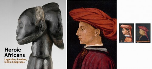
This show is one of two extraordinary exhibitions devoted to portraiture currently up at the Met. The other one is Heroic Africans: Legendary Leaders, Iconic Sculptures, a powerful exhibit somewhat incongruously tucked away off the main hall of Greek statuary. The shows and the works included are totally the same and totally different, it is fascinating to see them together: Heroic Africans is only up through January 29, so to see both one must go in January, it is worth it in so many ways.

Both exhibitions focus on representations of persons of power and prestige, whether princes of the church, mercantile leaders, or tribal chiefs, or, in both cases, their women, wives and marriageable daughters. Figures are both idealized (in the case of portraits of historical figures of the Italian Quattrocento) and yet highly suggestive of specific individuals (in the case of African works where we may not know the exact identity of the subject portrayed). Both include representations with a high degree of verisimilitude and strong symbolic content, which we understand more or less well depending on what prior knowledge, historical or aesthetic, that we bring to them. For how we apprehend the human images in these exhibitions is based on what we recognize and know from our own visual and cultural experience.

In his landmark book of sociologically-oriented art history, Painting and Experience in Fifteenth Century Italy: A Primer in the Social History of Style, Michael Baxandall examined the “economic basis for the cult of pictorial skills,” providing detailed analyses of the contracts entered into by painters and their patrons to examine the criteria brought to bear by both parties to the creation of the works seen in The Renaissance Portrait. We may not have a detailed written history  of how the African portraits came to be done but perhaps the relation of artist to power is not all that different in any culture. Our understanding of both groups of works rely on what we know and how we know it, as Baxandall remarks,  “Our own culture is close enough to the Quattrocento for us to take a lot of the same things for granted and not have a strong sense of misunderstanding the pictures: we are closer to the Quattrocento mind than to the Byzantine, for example.” I’m closer to the Quattrocento mind than to the tribal mind, or am I?

The museum has certainly made some assumptions about our relative knowledge and probably rightly assumed that, relatively speaking only, many of its viewers may be closer to the Quattrocento mind than to the tribal mind so perhaps to mitigate that gap, it has chosen to introduce the African portraits through two devices that they must have felt would anchor the work in our body of knowledge: first, a collection of photographic postcards made for the Western trade during the colonialist era position the culture whose artworks we are about to see into a zone of a safe exoticism, a chief, his four young wives, one of whom holds an umbrella over him, and so forth, and, second, the curators have placed two marble Roman busts at the  threshold of the exhibition, one of these of Octavian, later Emperor Augustus, thus one of “our” heroic figures. No direct connection is made to contextualize the inclusion of these works, for example no claim is made that any tribal artist in equatorial Africa ever saw these busts, which would have been seen in North Africa, or that any influence of Greco-Roman art trickled down the Nile or along other trade routes, these marble busts are just there, seemingly to legitimate the African work, proof, in case we needed reminding, that the white male universal is the referent of choice for the Met’s audience.

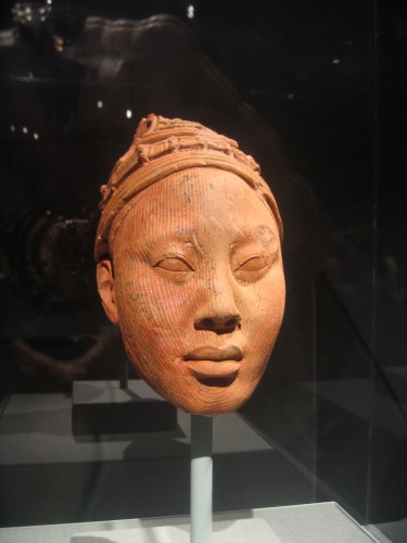
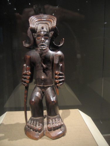
But since the first works we see are terracotta heads of such perfect (read perfect according to Western criteria of figural verisimilitude) quality, such craft and uncanniness of three-dimensional representation accuracy, we don’t really need the Roman bust to orient ourselves. These terracotta heads from the Yoruba peoples, Ife, Nigeria function as full realism in relation to other works from tribal groups like the Chokwe peoples of Angola placed further into the exhibition that become increasingly symbolic, abstracted, increasingly specific to tribal cultures. The floor plan of the show is almost like a cut-away of a snail shell: in the outer cavity is the work closest to the West in terms of representational style, and, by the way, in a fascinating case of chronological synergy these are dated from the 12th to the 15th century thus contemporaneous with the Italian Renaissance, while in the most inner curvature are the most ethnic, the ones most “African” in their style and content, from the 19th and early 20th century, thus contemporaneous with the Western cubist works they inspired. All these works are absolutely astounding sculptures, as exquisitely crafted as the terracotta busts or the Donatello upstairs, but especially in the case of the later works with highly stylized figuration with elements that may seem very abstract. Each work is extremely intense, in the degree of craft in the wood carving, and the characterization of the figure.

Yoruba

Chokwe Peoples, Angola, 19th Century

I’ve gone to see both shows three times this week, and each time I was riveted by one or two figures in Heroic Africans and the experience was too intense to allow me to take in every work in the room. Perhaps it’s a bit easier for me to filter out what I’m not interested in looking at among the Renaissance works because relatively greater exposure and knowledge makes me more confident about my choices. At the same time the bounce-back effect from our knowledge of African art-inspired Cubist sculpture make the figures accessible in a formal way, maybe even more so than the Renaissance paintings, but this may also block their immediate usability to a Western artist, as one struggles to not fall into the traps of “primitivism” or of imitation of Cubist style.

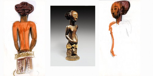
Commemorative Figure, Hemba peoples; Niembo group; Democratic Republic of Congo, 19th-early 20th century. Wood, fibers, fur. Collection Ethnologisches Museum, Staatliche Museum, Berlin (no photography allowed in the exhibition and few images available on line, thus my inadequate sketches, though drawing a sculpture is a great way to experience it)

Detail, Commemorative Figure, Hemba peoples; Niembo group; Democratic Republic of Congo, 19th-early 20th century. Wood. Portraits by Masaccio, Domenico Veneziano (attributed), and Paolo Uccelo (attributed), tempera on wood, mid-1400s.

The transition, if a transition needs to be made between the two exhibitions, can be made through comparison of two hat designs: one a completely abstracted (to us) form on the back of the head of a Commemorative Figure of the Hemba peoples from the Democratic Republic of Congo. It’s a cylindrical form set on the head at an angle so the top creates a flat line jutting back from the crown of the head; the back of each such headdress is a carved bas-relief pattern of crossed or woven thick ribbon-like shapes on a flat ground, like a platter, in other words an utterly modernist cubist shape, like an Ozenfant or Leger, all the more so because that surface is parallel to a pictorial flat field, like a mirror on the wall reflecting a flying saucer. The other is a type of turban-like headdress worn by the men in the first three portraits we see at the entry to Renaissance Portraits–where, by the way, the museum has not seen the need for a classical reference. It is assumed, and, besides, Renaissance art is at the heart of our system of reference. In three paintings, by Masaccio, Paolo Uccello, and Domenico Veneziano, the men wear a wrapped cloth headdress something like a turban but softer, a pile of folds,  as abstract as the headdress in the Hemba figure–the hard edge of cubism in the one versus the deliquescent informe materiality of a Lynda Benglis in the other. But if, because of the more familiar style of representation in these three Renaissance portraits we accept these abstract folds as a hat, then the schematic folds in the wood carving downstairs are surely as transparently representational to anyone who knows the costume of the area.

But perhaps I’ve strayed from my original premise: why did I wake up and feel that my work was not enough? To try to get closer to an answer, I’ll focus on a few works in Renaissance Portraits from Donatello to Bellini which made a particularly deep impression on me.

The order of their appearance in the show makes a certain sense for me too, marking the range of challenge they pose.

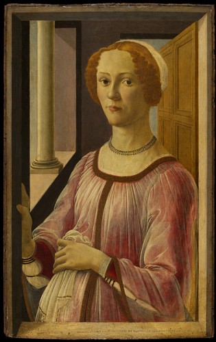
Sandro Botticelli, Portrait of a Lady at a Window ("Smeralda Bandinelli"), c. 1470-75, Tempera on wood, 25 7/8 x 16 1/8 in. Victoria and Albert Museum, London

The first is Sandro Botticelli’s Portrait of a Lady at a Window. As in many of the paintings in the show, the lady occupies a space that hovers between the perspectival or pictorial and the symbolic. She stands at a window, her right hand resting gently on the frame.  The space behind her seems totally credible yet on further examination impossibly narrow and without a clear sense of where the floor might be. Pardon me, but where exactly are her feet? Just as the depiction of the lady herself, the space is beautiful, severe, grave, and imperfect (although it’s possible that the perspective is absolutely correct but the illusion is peculiar).  If you don’t exactly know where the floor is, there is also something off about the woman’s mouth: the part closest to us is smaller than the part that goes back into the three quarter profile. In fact if you think about it, the whole far side of her face is larger than the near, it almost looks like Botticelli reversed the two sides and reassembled them. Along with her strong chin, this makes her seem interesting and handsome rather than pretty or even beautiful though everything about the painting is utterly beautiful: the geometry of the background and the expression of the figure is severe and solid yet also delicate and eerily translucent–many of these portraits are tempera on wood and the effect of translucency achieved with the tempera, often applied in layers of hair thin brush marks, cedes nothing to oil painting. Her curious-shaped mouth also gives her an ineffably wry expression: perhaps she finds the painter and maybe us a bit dubious, even suspect, or just amusing. [Stefan Weppelmann’s catalog entry for this painting notes how unusual a representation of a woman this was for its time, in that the woman establishes eye contact with the viewer, which normally would have an erotic connotation, yet the whole painting, from the space she occupies to the clothes she wears, marks her as a woman of privilege; she is not in the first bloom of youth (she is not a teenager) and she “is not merely being put on view or represented, she is presenting herself.”]

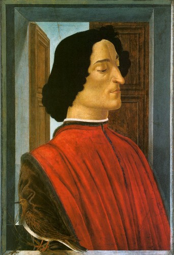
Sandro Botticelli, Giuliano de' Medici, ca.1478. Tempera on wood, 29 3/4 x 20 5/8 in, National Gallery of Art, Washington, D.C.

Second is Sandro Botticelli’s portrait of Giuliano de’ Medici, one of three portraits with the same motif and generally the same composition, two of which are in the show. The National Gallery of Art version, the largest of the three, combines Renaissance styles, early and high, Italian and Flemish, antique and heraldic. Giuliano’s proud profile, so distinctive with its long pointy nose, protruding jaw, downcast eyes with hypnotically curved eye lids, and thin curved lips that it seems like a caricature, is set off against the closed door or window shutter behind him, his black hair against the pale blue of an empty sky. The painting is first commanding because of the proud features of the man and the broad area of his red garment, but most extraordinary is the turtle dove which rests on a branch extending from our space into the painting, crossing the narrow painting ledge which separates us. The dove is exquisitely painted and drawn, its wings and feathers blend and nest into the identical brown of the figure’s brown sleeve, with only its coral colored legs and its startling eye to mark its presence. It is very hard to see it in reproduction, or at least to apprehend its importance to the composition and the meaning.

In fact, even from a distance of four feet, we barely distinguish the turtle dove. However the white line of the bird’s breast focuses our attention on a curiously unreal space in the lower left corner: immediately behind the figure is the deeper sill of the back window, and there is nothing to suggest deep space. The figure is set into a highly compressed space, though the space is posited as a well articulated three-dimensional space. Despite the geometrically and perspectivaly precise detailing of the architectural setting, the figure occupies a space that is not entirely sensible.  It posits itself as a well articulated three-dimensional space but it is more the idea of such a space rather than one that realistically could contain the figure. I think that the spell cast on me by this work and Botticelli’s Portrait of a Lady at a Window is created by these contradictory qualities: exquisite representational detail but odd heraldic flatness, rigorous spatial program that doesn’t stand up to reason. I find that I’m more entranced by this contradictory state of representation than when, in later Italian Renaissance paintings, the figure is rendered with complete three-dimensional verisimilitude within a space where perspectival relations between figures, objects, architecture, and landscape have been fully integrated and naturalized into practice.

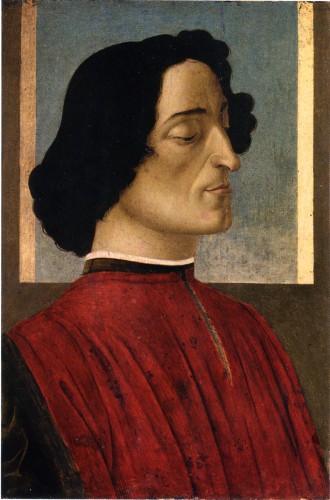
Sandro Botticelli, Giuliano de' Medici, c.1478. Tempera on wood, 23 3/8 x 15 1/2 in. Accademia Carrara, Commune di Bergamo

The National Gallery version of this subject is so splendid that it takes a bit more time to appreciate the version from the Academia Carrara, Commune di Bergamo, seen also in the exhibition. Tucked into a dark corner, this painting is a sleeper: it is smaller than the National Gallery version and with a simpler composition which, when read through Renaissance-inspired surrealist and modernist painting, looks as if Joseph Albers, Alberto Morandi, and Giorgio de Chirico had collaborated on the background, a simple pale blue square framed by bands, indicating a window though the fact that we can see both foreshortened sides of the window frame but not the sill is what makes the background look so abstract. (James Turrell’s Meeting, 1986, at P.S. 1 also came to mind, a slice of pure space, a straight cut into infinity). It takes some time for the simplicity and quietude of the painting to haunt you.

[from the catalog: There is much discussion about the circumstances of this series of paintings, whether they were painted posthumously after Giuliano de’ Medici’s murder in the cathedral–the half closed eyes, the turtledove and the reference to roman tombs in the half open shutters of the rear window all may suggest death and mourning, but other possibilities have been proposed including that at least one of the paintings was commissioned in his lifetime, to mourn a lost love or to support Lorenzo de’ Medici’s efforts to position his younger brother Giuliano to be named a cardinal, with the other paintings perhaps copied later to satisfy the need for commemorative images.]

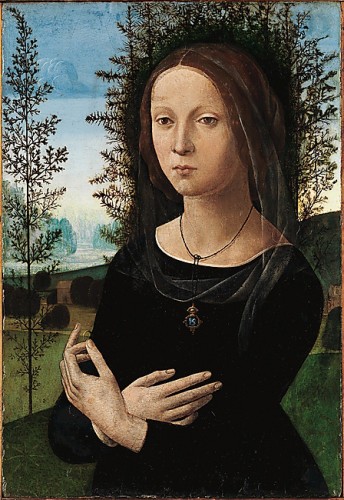
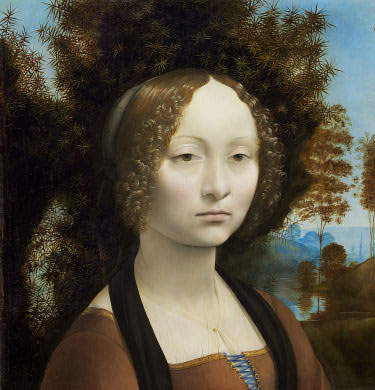
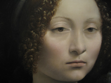
In the same room as these three paintings is another beauty: Lorenzo di Credi’s Portrait of a Young woman (Ginevra de’ Benci?), [1470s, tempera and oil on wood, Collection Metropolitan Museum]. This is a strange and interesting painting, especially if you have seen Leonardo da Vinci’s Ginevra de’ Benci, one of the greatest artworks of any time and certainly one of the greatest artworks in a museum in the United States (she is beautifully installed in a room of her own at the National Gallery of Art in D.C., and the vagaries of celebrity are such that while you have to stand in line in a crowd to get anywhere near the Mona Lisa at the Louvre, in Washington you can stand as long as you like with your nose up against the enclosure for this painting, which is at least as great, if not more so, and in better condition than the Mona Lisa but less fetishized). The surface of the painting by di Credi is said to be damaged, and certainly the painting quality cannot match the absolute unearthly exquisiteness of Leonardo’s surface and translucent details.

But though Lorenzo’s painting is less perfect than Leonardo’s, it is still quite striking: the balletic delicacy of the hands (the Leonardo painting once extended to this gesture but was cropped somewhere along the line), and especially the effect of the black dress and the rougher halo of the dark green juniper trees that circles her head like a dark crown of thorns. The dramatic and eerie effect moves us towards the Romanticism of a later era when this lady could be the severe and composed captive heroine of a dark mysterious hero in an eighteenth century Gothic novel.

These paintings, with their spacial programs, compressed architecture, symbolic landscape, grave subjects, and delicate surface treatment, have a philosophical and metaphysical cast that deeply impresses (and is what made me feel that my work was not enough, though of course that is a foregone conclusion–but more on that in a minute).

In the same room as these paintings and among skillfully crafted marble busts, there is a rare intrusion of the indexical into this exhibition of the representational: the death mask of Lorenzo de’ Medici sticking out of a small painted frame. It is a rough gypsum-based stucco impression of the face of the man himself, unshaven, grizzled, the rough surface closer to some of the terracotta African heads downstairs. Apparently this effigy was once adorned and gilded–that must have been really weird–but as it exists now, its roughness is jarringly contemporary and also instructional on the living material that all these beautifully crafted works were based upon.

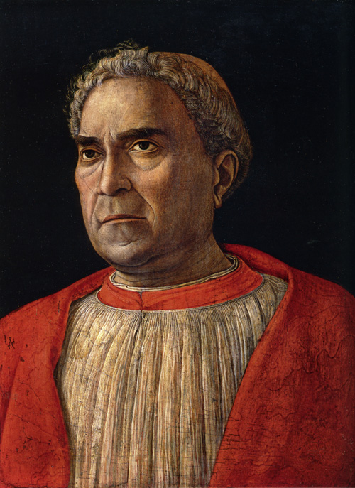
Andrea Mantegna, Cardinal Ludovico Trevisan, ca. 1459-60. Tempera on wood, 17 5/8 x 13 3/8 in, Gemaldegalerie, Staatliche Museum, Berlin

One painting in particular matches the brutality of this object, and that is Andrea Mantegna‘s Cardinal Ludovico Trevisan. According to Keith Christiansen’s catalog entry, Trevisan, a noted cleric, collector of antiquities, and military leader, was a physically unprepossessing man, described by “the Mantuan chronicler Andrea Schivenoglia” as “‘a small man, swarthy, hairy, very proud and stern’ (‘homo pizolo, negro, peloxo, com aìero molto superbo e schuro’),” and Mantegna has sparred nothing in this really quite incredible portrait of a distinctly disquieting figure. There is no idealization of the man despite the classical references of the work. Trevisan looks incredibly impatient with the whole process although he commissioned the portrait. He leans away from the center of the plain dark pictorial space. The effect becomes notably more pronounced as you pull away from the painting: stand across the room and to the right of the painting and he positively seems to be trying to leave the picture plane. Neither the painter not the subject seem to care what we think about them. But on the other hand the bold sculptural form and the strong psychology of the man is built up from the most delicate hair-thin brush strokes. The craft is intense. There is nothing adequate that can be said about the thin white line that animates the subject’s left eye except that it’s a wonderment. The whole thing is. Mantegna has this effect on me: if I sometimes think that I can understand some other artists from the past, that with a little study and based on my own experience of studio practice, I have a sense of what they were thinking when they worked, even Baxandall’s details of the nuts and bolts of the economic and social field in which these paintings came to be made don’t help when it comes to Mantegna. Every time I see a work by Mantegna I think, basically, Who the hell was this guy? “Molto superbo e schuro.”

So not much artwork of any time is going to be “enough” compared to these works, but yet how does one use them? This is a pressing question for me, especially because, as a teacher, I’m interested in how one can use art or artifacts that may seem inaccessible or irrelevant because they were made in ancient or foreign cultures seemingly alien to our own and also because works like these African sculptures or Renaissance paintings seem to have already been digested, for once and for all by our own history, so that our ability to use them appears doubly blocked. How do you use old art? How do you use any great art while not sinking into preciousness?

First, back to my waking thought that my work is just not enough. Well, of course it isn’t. But it’s what I can do, so that is the state of any artist. The trick is to mine older art in order to achieve something else, not nostalgic or paralytically in homage, but taking inspiration from both the materiality and the essence of the past works: something about how the toes of the Chokwe Figures are carved in hard dark wood>the idea of a craft>the expressive capabilities of a medium, or what it means to build a face or a shape from the accumulation of the most ethereal of painting marks>the ethereal>uncompromising honesty. Even just the words that describe a technique can go into an archive of possibilities for future work: an exquisite drawing by Fra Angelico is “metalpoint on prepared ochre surface;” prepared ochre surface>filed for future reference. From these fragments, these resonances, grabbed at intuitively and developed intellectually, you build a sense of your identity, with the recognition that it is always unfixed. The ethereal, the eerie, the sculptural, the uncompromising, any and all of these are a challenge.

Even my writing this post is an example of the dilemma and the process I’m talking about: writing about African art is a hopeless task because I have so little information to go on except some experience over time of seeing, and writing about Renaissance art is a humbling enterprise, practically absurd since there is so much brilliant scholarship and literature devoted to the subject. I can no more write like Baxandall or Panofsky than I can paint like Mantegna. But nevertheless I’ve been driven to try to hack away at something about why I came to be spellbound by a few paintings I thought I knew until I was in front of them. And somehow three visits and writing this piece have served for me to become somewhat dispelled enough to work.


FacebooktwittermailFacebooktwittermail

Biographies of Women Artists: Instinct and Intellect

Reading The New York Times Book Review section today, I was struck by the ironic twist implicit in one sentence of Jed’s Perl’s review, “Freedom of Expression,” of Gail Levin’s Lee Krasner: A Biography and Patricia Albers’ Joan Mitchell-Lady Painter: A Life. Perl writes of Krasner, “by the time Krasner met Pollock she was already extraordinarily self-aware. She had a profound grasp of modern art, deeper though less instinctive than Pollock’s, which she had absorbed through her studies in the 1930s with the great teacher Hans Hofmann.”

That is a bit of an over-simplification of the details of Lee Krasner’s self-chosen path to become a modern artist and an abstract painter–every path is self-chosen of course, but, as Levin’s book makes clear, as do many others about American art in the 1920s and 30s, in this period there was no clear academic or even social path for artists to realize this desire and many of the people who felt the calling of the modern in general and of abstraction in particular pursued every opportunity for enlightenment possible without much of an established guidebook. For Krasner, Hofmann was absolutely key–“I didn’t really get…the full impact of [cubism] until I worked with Hofmann,” & “the most valid thing that came to me from Hofmann was his enthusiasm for painting and his seriousness and commitment to it” (also, more touching, “Hofmann was the first person who said encouraging things to me about my work”) –however she tried several schools and made an effort to know everyone who could teach her something during more than a decade of courageous search.

Perl’s description relates an accepted view of Krasner: that she knew more about and was more articulate about abstract art than Pollock and was therefore able to assist him with theoretical /promotional language for what he instinctively embodied in his painting. Hofmann was a participant in the creation of this mythic image, since Pollock’s most frequently quoted declaration, “I am nature” was in response to Hofmann’s question, upon his first visit to Pollock’s studio (taken there by Krasner),”Do you work from nature?” In Levin’s account, Hofmann’s reply was sadly predictive: “You don’t work from nature, you work by heart. That’s no good. You will repeat yourself.”

Krasner’s knowledge and Pollock’s genius are an established narrative. And although genius always trumps intelligence, even conservative art critic Hilton Kramer was able to suggest a different reading of the same story in his New York Times review of the influential 1981 exhibition,”Krasner/Pollock: A Working Relationship,’‘ organized by Barbara Rose for the Grey Art Gallery at New York University:

“Yet Krasner, through her studies with Hans Hofmann, her interest in Matisse and other modernists who could not be assimilated into the social art movement, and her acquaintance with Gorky and de Kooning, was already launched on a more independent artistic course, and it was largely through her that Pollock was first drawn into the orbit of the modernist esthetic. (Pollock was not the only person to benefit from her guidance, by the way. It was Krasner who introduced Clement Greenberg to Hofmann and his school.) Part of the fascination of this exhibition lies in the account it gives us of the powerful influence that each of these painters exerted on the development of the other.”

Krasner indeed had years of intellectual, personal, and studio involvement with abstraction before she met Pollock. She even danced to boogie-woogie music with Mondrian! According to Levin, “She considered Mondrian one of her most outstanding partners for dancing. ‘I was a fairly good dancer, that is to say I can follow easily, but the complexity of Mondrian’s rhythm was not simple in any sense.’ ‘I nearly went mad trying to follow this man’s rhythm.'”..Well, in a way that story only restates the case of Krasner as the intellectual plodder to Pollock’s intuitive and nearly incomprehensible genius, but it’s a great story nonetheless.

What struck me in Perl’s casual formulation of the valence of self-awareness and knowledge versus that of instinct is how much of a twist this is on the usual gender stereotype of art historical canon formation: woman as instinctive and contingent, without language, man as intellectual and empowered by self-determination and theoretical clarity. “Instinctive” or “intuitive” is usually used to describe, and mark as lesser, work by women. “Women’s intuition” is commonly a trope for something less dependable and scientifically rooted than, presumably, men’s superior reason. Or, if she did it, it was just instinct, natural, unconscious, feminine, if he did it, he was able to productively channel his anima.

The exhibition, ”Krasner/Pollock: A Working Relationship,’‘ changed my view of Krasner’s work. The image, “good artist, but not as great as Pollock,” was challenged by the comparative chronology of abstraction in Krasner and Pollock’s work in the 1940s and particularly by the power and intensity of Krasner “Little Image” paintings.

Or, I should say that if while in general I have shared the commonly held view of Krasner as “good but not great” in the sense that her work doesn’t transform my understanding of what painting can be, the Krasner/Pollock show at the Grey Art Gallery troubled that conformist view in two ways.

First, in a field (Abstract Expressionism) dominated by an obsession with who did what first, Krasner’s so-called cerebral labor supported by her trio of influences– Cézanne/Matisse/Mondrian–seemed to have brought her to all-over abstract mark-making a moment before Pollock was able to fully break from the figurative social realism of Thomas Hart Benton and the surrealism/Picasso-influenced heavy symbolism of his earlier work to arrive at the all-over abstraction of his great works. And the image and the surface of the “Little Image” paintings are really intense, I find them exciting in general as well as the most exciting of Krasner’s work, so what is the role or standing of the category genius, when facing such paintings?

Also, although Krasner’s work was consistently involved with a cubism-based sense of architectonic structure, from the underlying grid of her  “Little Image” paintings to her 1970s works in which she re-used cut up figure drawings from her Hofmann classes, Krasner seems to have changed course in a fairly contingent way. For all the intellectualism she gave to Pollock in support of his work, she seems to have followed unexpected urges for new directions in her own work in an instinctive/intuitive way rather than a structuralist/cerebral one, although the cubist infrastructure of her work  was certainly always a given.

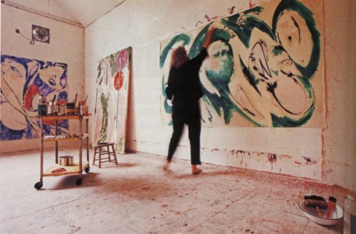
Levin’s book  yields one wonderful image pertinent to this question of the intellectual versus the intuitive: apparently Krasner would jump up to produce marks at the top of her large canvases: “What I don’t want to do is get up on a ladder and hit the top. I want it to be within my body experience. I don’t want assistants working for me. I don’t experience it that way. I want to be in contact with my body and the work.”

Lee Krasner painting "Portrait in Green." Photo taken by Mark Patiky in 1969, from Gail Levin's "Lee Krasner: A Biography"

The images of Pollock in the act of painting are iconic representations which in some ways are as important and perhaps more influential than his work: his actions take us and art off of the field of painting into the performance of daily life and the actual space of the world. But here Krasner gets a moment of contingency and almost child-like joy for her involvement with the field of painting.

The two biographies join a growing bibliography of biographies of women artists. A few books of note:

Baroness Elsa: Gender, Dada, and Everyday Modernity-A Cultural Biography by Irene Gammel is an exemplary biography about the Baroness Elsa Von Freytag-Loringhoven (1874-1927) a fascinating figure of the early vanguard modernist period in Germany and the United States. Essential reading in tandem with this book is Amelia Jones’s Irrational Modernism: A Neurasthenic History of New York Dada.

To Paint Her Life: Charlotte Salomon in the Nazi Era by Mary Lowenthal Felstiner (every book that reproduces Salomon’s great autobiographical series of paintings, Life? Or Theater? is worth collecting. For those who don’t know her work at all, to say that she is painting’s Anne Frank is only the quickest historical placement for a major work by a young but trained and precociously mature artist, Life? Or Theater? is a great artwork, formally inventive, personally moving, historically significant as art and as historical record, a truly heroic work as well. I’ve linked to the most readily available version, but the 1981 Viking book and the 1963 version with an introduction by Paul Tillich mean more to me, the 1963 book, which I found in on the used book section of a small Provincetown bookstore, introduced me to this artist).

Remedios Varo:Unexpected Journeys by Janet Kaplan. A really interesting book about the Spanish-born Mexican artist not well enough known in the United States.

Paula Modersohn-Becker: Her life and Work by Gillian Perry. Another wonderful early-Twentieth century vanguard modernist painter not well enough known in the US.

Frida: A Biography of Frida Kahlo by Hayden Herrera. This is a very good book, well-written and with very good description and analysis of Kahlo’s paintings. Believe it or not, there was a time when there was no Kahlo industry, this book in a way initiated it. The only thing I can’t stand is that the original book cover with a self-portrait by Kahlo on it has been replaced by a photo of  Selma Hayek as Frida Kahlo, from her film portrayal of the artist. The movie was enjoyable but that cover is a travesty. Still, the book is terrific.

FacebooktwittermailFacebooktwittermail

The fault is not in our stars, but in our brand: Abstract Expressionism at MoMA

The necessity of being perceived as having a brand at first glance seems to be specific to our time: in politics you’ll hear that President Obama can’t do such and such because it would go against “The Brand.” Brand Obama or Brand Brad Pitt can’t be altered without entering into a Bermuda triangle of non-recognition by the media. A few years ago the New School University advertised a symposium called “The Brand Called You,” highlighting the current necessity of self-cultivating the contemporary version of the Homeric epithet, the one high concept identity feature which defines you and to which all your actions and products must conform to, since the audience, political and cultural, cannot appreciate contradiction, variety, subtlety or change. [And see where that has gotten us.]

This has always existed, by any other name, for does not Cassius ask in Julius Caesar:

Men at some time are masters of their fates:(145)
The fault, dear Brutus, is not in our stars,
But in ourselves, that we are underlings.
Brutus, and Caesar: what should be in that Caesar?
Why should that name be sounded more than yours?
Write them together, yours is as fair a name;(150)

To have a “fair name” has always involved a recognizable style (+ some kind of compelling persona – being a self-destructive alcoholic or drug-addict is way up there in that department). But “Brand” suggests a more comprehensive and more restrictive commodity, whether applied to a politician or an artist.

Abstract Expressionism/the New York School is a movement whose history and ideologies began to self-consciously and deliberately create a canon to define it in contradiction to European art, and this canon has become canonical and has acquired generations of canonical texts and institutions, of which MoMA is central. Because it was for decades the canon that dominated art discourse and education, it’s also a movement whose beliefs have been seriously challenged from many subsequent ideological positions which, in some parts of the art world and academia today even make referring to this period in teaching seem like contraband (dead white men, America, New York, painting, aura).

But like all canons, it has also proven impervious to major revision, particularly to the reinsertion or reappraisal of artists considered lesser at the time because of gender or certain aesthetic characteristics. Nevertheless established reputations have risen and fallen over time.

Abstract Expressionist New York at MoMA doesn’t do much to alter one’s understanding of the canon, its canon, significantly in terms of including in the master narrative so-called “minor” participants: I’ve just assigned a group of students the transcript of Artists’ Sessions at Studio 35 as the script of a play in which each person will take on the roles of two or three of the artists who attended those historic sessions, and now they must also experience vicariously something they may well experience in their own lives as artists: the vagaries of inclusion and exclusion from a movement of which you are an active participant; the reduction of a vibrant cultural field to a few branded individuals and images; the continuation of critical and institutional favoritisms that extend long past the life of the original participants.

[Note: several of the artists who participated in the Studio 35 sessions are sculptors, including Louise Bourgeois, David Hare, Herbert Ferber, and Richard Lippold, whose work is included in a subsidiary exhibition at MoMA, Abstract Expressionist New York: Rock, Paper, Scissors. This is in itself a curatorial decision that maintains the canon rather than transforming it by recreating the complexity of an art movement: the artists around the table at Studio 35 questioned whether they were in fact part of a community, and there was an uncomfortable silence around the dominance of painting, but sculptors and painters, as well as future stars and so-called “minor artists,” before history had fixed that determination, were around the table. Now they have been separated—on what ground we can’t know, since one sculptor at least, David Smith, is in the main show (though that show significantly is subtitled “The Big Picture”). If one, why not others?

For a much livelier, intimate, and challenging revision of the New York School, look to Action Abstraction: Pollock, de Kooning, and American Art, 1940-1976, the excellent catalogue of an excellent show, held at the Jewish Museum in 2008, curated by Norman Kleeblatt where the aesthetic programs and critical approaches of Clement Greenberg and Harold Rosenberg were used to frame the intellectual and aesthetic ferment of a period and a place. In an appropriately more intimate space were great examples of many of the same artists now in the two MoMA exhibitions, sculpture and painting together, with ephemera presented with greater moment, and critical text, so important to the period, used as the fulcrum]

What the MoMA exhibition does do is engage in some significant acts of what looks like retribution: as I walked through the show I couldn’t help but take notice not just of who was in it, but how each artist was placed and represented.

This led me to think about the work through the lens of the Brand. At first this seems to contradict approaches to art-making that are characteristic of the period, such as the picture plane as the arena of existential search. But of course most of the artists in the first two generations of Abstract Expressionism became known for a particular stylistic brand: drip (Pollock), zip (Newman), stroke (de Kooning), chroma (Rothko).

Here then are some major case histories from the main exhibition.

Case History I: Barnett Newman
The most glorious room in the exhibition devoted to an individual artist contains the paintings of Barnett Newman. At the threshold you are confronted with Vir Heroicus Sublimis (1950-51), a huge painting seen, as I think it should be, on a wall that does not dwarf it but rather allows the viewer to experience her own scale. Newman wrote: “I don’t manipulate or play with space. I declare it,” and “One thing that I am involved in about painting is that the painting should give man a sense of place: that he knows he’s there, so he’s aware of himself. In that sense he relates to me when I made the painting because in that sense I was there. And one of the nicest things that anybody ever said about my work is…that standing in front of my paintings [you] had sense of your own scale.” To enhance this experience the Museum has placed The Wild (1950) on the next wall, to the right of Vir. One isolated vertical paint stroke, only one and half inch wide but the same height as Vir, The Wild is the opposite of all-over painting as espoused by one of Newman’s champions, Clement Greenberg: it is sculptural, it is even theatrical, but the two works create a pincer movement that assert or challenge the viewer’s sense of proportion, dimensionality, and measure just as Newman wished.
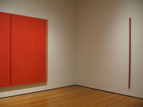
Barnett Newman, Vir Heroicus Sublimis and The Wild, Installation view, MoMA

Newman’s work is well served by the proportions of the room, which are as close to perfect in relation to the scale of the work and the experience of the viewer, not too big, not too small. For Newman’s 1951 show at Betty Parsons Gallery, in which Vir Heroicus Sublimis was first exhibited, Newman tacked the following statement to the wall,

“There is a tendency to look at large paintings from a distance.
The large pictures in this exhibition are intended to be seen from a short distance.”

This statement is significant because as the show progresses, the proportions of the rooms lose cohesion and the viewing experience takes on a more alienating sense of wandering through vast cold halls filled with works with sometimes uncertain, sometimes overdetermined relations to each other, and less authentic or effective relation to the scale of the viewer. But more on that later.
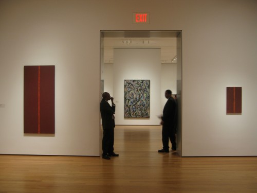
Barnett Newman, Onement III and Onement I (right), MoMA installation view

The best part of the Newman room though is visible when you turn your back to Vir and see Onement III and Onement I (1948) framing the doorway. Newman spoke often of Onement I and much has been written about it, and I highly recommend all of it: Yve-Alain Bois’s essay “Perceiving Newman” in Painting as Model is a terrific account of Newman’s discourse on figure/ground with one paragraph in it in particular one of the best I’ve ever read on a single painting, on how it achieves what the artist wished to achieve, but himself had to take time to understand that he had achieved. And in what turned out to be his last interview, filmed two months before his death, by Emile de Antonio for his essential art documentary, Painters Painting, Newman spoke of the meaning of his first Onement.

“I recall my first painting –that is, where I felt that I had moved into an area for myself that was completely me—I painted on my birthday in 1948 [young artists today take note, Newman was then 43 years old].  It’s a small red painting, and I put a piece of tape in the middle and I put my so called “zip.” Actually it’s not a stripe. Now, the thing that I would like to say about that is that I did not decide, either in ’48 or ’47 or ’46 or whatever it was, “I’m going to paint stripes.” I did not make an arbitrary, abstract decision. … I was filling the canvas in order to make that thing very, very viable. And in that sense I was emptying the painting by assuming the thing empty, and suddenly in this particular painting, Onement, I realized that I had filled the surface, it was full, and from then on those other things looked to me atmosphere. … I feel that my zip does not divide my paintings…it does the exact opposite,: it unites the thing. It creates a totality.” (from Barnett Newman, Selected Writings and Interviews)
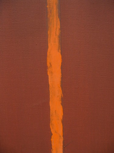
Barnett Newman, Onement I (1948), detail, oil on canvas and oil on masking tape, painting dimensions 27 1/4″x 16 1/4″

Given so much language surrounding it, so many claims for its importance to the history of painting, Onement I offers an important lesson. A work that the artist and art history recognized as a major gesture in the debate over figure/ground is in the flesh a small, intimate, almost touchingly modest work, according to my definition of modest painting (in my essay of the same name in A Decade of Negative Thinking) as not necessarily painting that is small (although Onement I is small) but which is ambitious for painting itself, beyond the ego ambition of the individual artist. By the standard established by Pollock and by Newman in works like Vir, and even in comparison to Onement III, it’s tiny, its surface is fragile, the orange zip dry and crackled with time. It could not be a more contingent work. The work that established the Newman brand itself is itself unbranded, it has the freshness and tenderness of a first dance as much as it is, and was intended to be, an aesthetic manifesto.

I assume Newman would despise the idea that his manifesto, his conceptual and physical gesture in the history of art, embodied in the “zip” might ever be seen as a brand, but the paintings hold together and hold forth. They retain their difficulty yet exude a minimalist beauty they have helped to teach us to appreciate. Brand Newman worked for him as a metaphysical stance and it still works.

Case History II: Mark Rothko
Rothko’s floating rectangles are as identifiable as Newman’s “zips” or Pollock’s “drips.” And in this exhibition the paintings that make up the Rothko brand are given a big room but in it the more familiar “Rothkos” are overwhelmed by a huge, gloriously colored painting, No. 1 (Untitled) (1948), one I had never seen exhibited at MoMA before, an expanse of glowing yellows, salmon, with relational marks in some cases almost like bits of color tape, with a free-flowing composition and less didactically reduced visual program than what we know as “Rothko.” In the light of the dark depressing minimalist black and grey late Rothko hung at the end of one of the later rooms in the show, [Untitled, (1969-1970)] you can begin to get the idea of how having a brand can be a lethal prison for the artist and for the audience too.
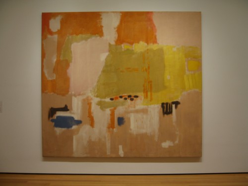
Mark Rothko, No. 1 (Untitled), (1948), oil on canvas, 8′ 10 3/8″x9′ 9 1/4″

Mark Rothko, No.1 (Untitled), (1948), detail

I bet we don’t get to see this lovely off-brand, pre-brand painting again for a long time.

Jack Tworkov (represented in the exhibition by The Wheel, 1953) spoke in an interview about Rothko, for whom he had great respect and personal compassion: “Rothko, in one conversation, said that it was a very great struggle for him to find himself as a painter and that he risked something in developing this new form that he had. And when he had it and finally an identity and it was his, he just couldn’t let it go. And towards the end he admitted tremendous boredom. He was bored and yet did not know how to make a change. And change might have meant a kind of impairment of his identity. And he was going to hold on to that…for the Rothko image. […] He did. In some way, it’s admirable and another it’s kind of tragic.” (from The Extreme of the Middle: Writings of Jack Tworkov)

It’s always dangerous to fall into the biographical fallacy but seeing the last Rothko in the show, it’s hard not to wonder about chicken vs. egg: did Rothko paint depressing, formally and chromatically evacuated paintings because he was suicidally depressed, or was he suicidally depressed because he had painted himself into a dead end for his painting? No.1 (Untitled) (1948) is undoubtedly a “transitional work”  but scrolling back to that work and scrolling forward to the final paintings, you begin to wonder what other stories might have been possible.

Cast History III: Willem de Kooning.
At the opening I felt that de Kooning had been utterly screwed by the show, given neither a room of his own, nor a grouping of work. Woman I (1950-52) is given a wall, but the spot it occupies in the narrative marks the point in the show where the installation becomes confusing, loses concentration,and where large rooms turn into vast halls where even great works seem like orphans (the scale of the David Smith and Franz Kline room does these artists a disservice as the temperature drops and the corporate quality rises although the same works in another context would feel very different).

Considering that de Kooning was one of the dominant figures of the period, he is surprisingly marginalized. His richly surfaced yet austere black and white oil and enamel abstraction Painting (1948) is tucked in next to a great big elegant programmatic Bradley Walker Tomlin. Valentine (1947), a tender small painting is nestled near Arshile Gorki’s large mounted work on paper,  Summation (1947), marking Gorki and the Master, as perhaps he was, leading his younger friends towards serious art practice and abstraction in the early years. Nevertheless…
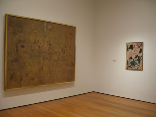
Arshile Gorki, Summation and Willem de Kooning, Valentine (both, 1947), MoMA installation

It turns out that MoMA just doesn’t own that many major works by de Kooning –in her New York Times review Roberta Smith refers to “the institutional bias against de Kooning.” They may own the brand: for better or worse, de Kooning’s brand is Woman I more than any other painting. Reams of text will tell you why and MoMA’s imprimatur is part of the story, it creates Brand. But, although it had never occurred to me before, maybe de Kooning doesn’t really have a brand, you can’t say zip, drip, floating colored rectangle, black on black. Sticking a cut-out smile on a semi-figurative expressionist painting is not the same as a brand. What makes de Kooning such a great artist may be something far more subtle, far more interior to painting itself and perhaps expressed best in his earlier works, those that are, again, often described as transitional, from figurative works of the early 40s to even abstractions such as Painting, Attic, or Excavation. But the judgment of the market makes even de Kooning’s biographers, Mark Stevens and Annalyn Swan, seem to subscribe to the idea that de Kooning’s earlier work including his “men” series and his early 40s portraits of women were in some way transitional, therefore, subtly, lesser. Yet that’s what I have always loved about these paintings, that you can see classical representation being wiped away and then, in the early abstractions, expressionism contained by a deeply felt sense of formal discipline. But interiority and brand don’t mix.

In order to see a better representation of de Kooning as a painter, with a greater range from the figurative to the classically abstract, as in Attic (1949) to large scale brushwork abstraction, visit the Metropolitan’s collection: for one thing the Met did not discriminate against de Kooning’s earlier more traditionally representational paintings.

Case history IV: Jackson Pollock
Pollock’s work is perhaps the most famous brand of the Abstract Expressionist movement (here include the whole package: the work itself, so absolutely uniquely recognizable, and so consistent with the ideology of both major critics of the period, and the man–rough-hewn inarticulate Westerner, tormented Orphean drunkard).
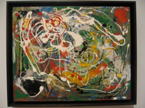
Hans Hofmann, Spring (1944-45), oil on wood, 11 1/4 x 14 1/8″, proving that one man’s brand is another’s one-off experiment [see also the work of Janet Sobel

Pollock has his own room with a chronological range of work but something feels wrong with the room: it is too vast, so that One: Number 31, 1950 (1950) is placed to the far right of a very long wall. Its magical and magisterial effect is best achieved if treated like Vir Heroicus Sublimis, on a wall that just accommodates it and places the viewer’s body in direct confrontation and meditation. It’s not that this painting isn’t beautiful no matter what, but even a very large and great painting can turn into a postage stamp in the wrong circumstances. Here it is subtly undermined, seemingly in order to accommodate the sight-line pairing of Pollock’s smaller but bold and rough Number 7, 1950 (1950),  hung unusually high on the wall, with David Smith’s linear steel sculpture Australia (1951). Also in the room are post-“drip” works such as Easter and the Totem(1953) that are generally seen as problematic, the point where Pollock seemed not to know what to do next. Though bold graphic works, they are off-brand.

But so is the first painting you see in the show, Pollock’s She-Wolf (1943), a strong Picasso-influenced painting although Picasso would most likely have defined the animal with a strong black outline which in the Pollock is obscured by a turbulent painterliness which prefigures Pollock’s last works, which are also seen as off-brand (tragically so, instead of, as in She-Wolf, developmentally), although it suggests a move towards materiality, mass, and perhaps even an atavistic need to return to some form of representation, in a way which Guston was able to pursue, when he became dissatisfied with abstraction.

Case History V: Guston
You reach the Guston paintings either by drifting past the truly awful Frankenthaler–it’s so bad I’m beginning to think it might be the most contemporary work in the show! You can also arrive at the group of Gustons just after you’ve hit rock bottom in terms of the loss of concentration of the installation, having passed classic period Ad Reinhardt (he is not rock bottom, don’t get me wrong, but he would spit at being hung without his own space and to have de Kooning’s big, blue splashy, broad-stroked landscape-based abstraction, A Tree in Naples and his own Abstract Painting (Blue), (1952) visible together in a sight-line no doubt chosen for the occurrence of blue in both works. Reinhardt made no secret of his contempt for de Kooning’s expressionism and one of the best bits of ephemera in the MoMA show (see obscure positioning of ephemera on 4th floor stairway landing) is a letter he wrote to MoMA curator Dorothy Miller about how he’s OK with being included in one of her group “Americans” exhibitions so long as “the show is free of Greenberg’s “Heroic-Pop-Artists-Pioneers” of “Abst.Exp.” or Hess’s “Swell-Fellows-&-Old-Masters” and “free of all the “KootzandJanis-Kids” now in their fifties and sixties, seventies and eighties,” i.e. pretty much everybody except himself and especially not de Kooning), and Rothko’s dark end of the soul.
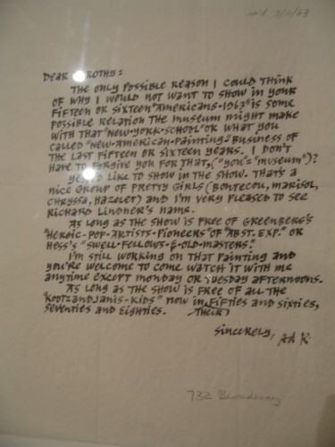
Ad Reinhardt, Letter to Dorothy Miller, 1963
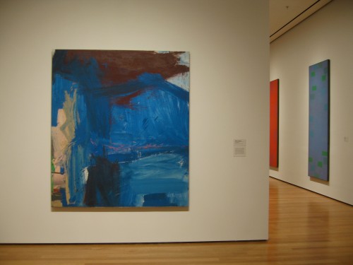
Willem de Kooning, A Tree in Naples (196o) and Ad Reinhard, Abstract Painting (Blue), 1952, MoMA installation sight line

The exhibition includes two beauties from Guston’s Ab Ex period, Painting (1954) with its close knit, highly sculptural web of glowing salmon and pink small strokes, and The Clock 1956-57) where the similar strokes, in darker tones, gathering into a central area, leaving the all-over and beginning to congeal into the suggestion of form. Guston’s Edge of Town 1969) may represent what now is known as the Guston brand, crudely outlined, cartoon-influenced figures and still-life objects, but what makes Guston so meaningful to contemporary painters is that he didn’t throw the baby out with the bathwater. He believed in painting more than he believed in Abstract Expressionism or even than in his own beautiful contributions to that movement. He ditched Brand Guston I, but he held on to paint, reached back to the past of his early interest in political representation to paint in the present of contemporary politics and to apply the meaning that oil paint could create to the humble details of daily life, a nail, a book, a shoe.
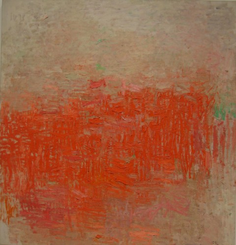
Philip Guston, “Painting” (1954), oil on canvas, 63 1/4 x 60 1/8″
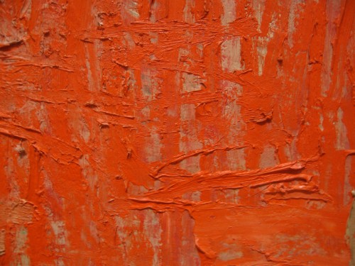
Philip Guston, “Painting” (1954), detail: when a guard noticed me taking close-up pictures of this painting he approached me and instead of telling me to step back, he said, “this is the best.”
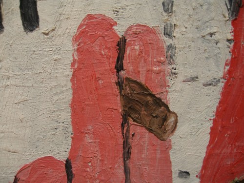
Philip Guston, Edge of Town (1969), detail (painting: oil on canvas, 6′ 5 1/8″x 9′ 2 1/2″)

The problem with looking at artwork through the fulcrum of Brand, is that you aren’t really looking at the artwork itself. The specificity of an individual artwork holds visual and intellectual information and each such work should define the artist, rather the brand ending up masking the work, stifling the artist’s progress, and potentially killing the artist’s soul as well as the soul of the viewer who is truly looking.
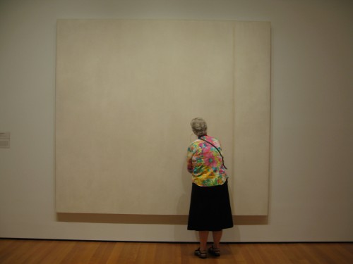
Barnett Newman, The Voice (1950), egg tempera and enamel on canvas, 8′ 1/8″x 8′ 9 1/2,” with viewer, MOMA

FacebooktwittermailFacebooktwittermail

Reality Show: Otto Dix

First, some quick comparisons among two current exhibitions in New York City and an exhibitionistic pop culture event, Otto Dix at the Neue Galerie, Greater New York 2010 at MoMA P.S.1, and Work of Art: The Next Great Artist on Bravo Network.  You can have some fun imagining the portraits Otto Dix might have made of the panelists and jurors on “Work of Art:” after all, he specialized in turning even the most distinguished scientists and artists, including himself, into demonic characters. Take the strapless tight-fitting red satin mini-dress with big bow on the bustier which seems to be the template outfit in terms of style and color for the female hosts of reality shows on Bravo — China Chow on “Work of Art” and Kelly Choi on Top Chef Masters — I’m considering the advisability and semiotics of wearing such an outfit, with stiletto heels, of course, when I meet my new students at my first graduate seminar or core studio class next fall.

China Chow and the "next great artists"

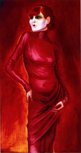
Now look at Otto Dix’s intense, garish scarlet red 1925 portrait of the noted and notorious Weimar-era dancer Anita Berber, note the triumphant sense of sexuality and style in her figure and, written on her mask-like face, sad features hidden under her stylized make-up, and her crisped left hand, the tragic self-awareness underlying this figure’s display:

Otto Dix, Portrait of the Dancer Anita Berber, 1925, oil and tempera on plywood, 47 3/8x 25 1/2 inches, Kunstmuseum, Stuttgart

It is easy to poke fun at a TV reality show. I watch it because it’s there; because it’s a pop phenomenon that may end up infiltrating the expectations of art students and affirming popular misrepresentations of how artists work and think; I want to know what happens next because that’s the nature of narrative; I enjoy Jerry Saltz’s weekly behind the scenes recaps up to that point only; and, all pleasantries and rationalizations aside, does anyone seriously think any one of the participants deserves a $100,000 prize, functionally one of the biggest cash grants to an individual artist in the world? Unreal.

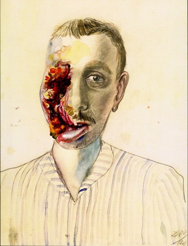
As for reality, here’s reality for you, distilled into a modest drawing of a man horribly injured in World War I: it’s precisely the delicacy and skill of the pencil rendering of the left side of the man’s face and the delicate water colored stripping of his shirt that make the equally delicately rendered watercolor gash that violates the right side of his face so subversive.

Otto Dix, Wounded Veteran, 1922, watercolor and pencil, 19 1/4 x 14 1/2 inches, Private Collection

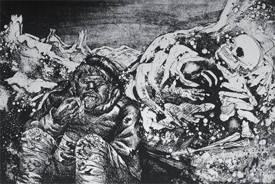
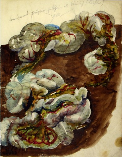
This drawing, along with a few other spare, beautifully executed, matter-of-fact  gory drawings of human intestines and brains, is exhibited in a second floor room at The Neue Galerie  dedicated to Der Krieg (War), a series of 50 prints by Otto Dix originally published in 1924. Don’t miss Der Krieg. There are many relevant art historical comparisons, notably to Goya’s Disasters of War, but it is also important to think of these works in relation to the wars we are currently engaged in, that we barely pay attention to and from whose effects on human bodies we have been shielded.

Otto Dix, Mealtime in the Trench, from Der Krieg (War), 1924, etching and drypoint

In fact don’t miss the Otto Dix exhibition at the Neue Galerie even though some of the work and most of the installation may be problematic.

I was just reading Carroll Dunham’s well-researched, fair assessment of this exhibition in the current Summer 2010 Artforum. He notes that it’s not a complete Dix retrospective since it leaves out all his post WWII production and some Weimar-era masterworks which were not available for loan and that the show is installed in a “garbled and out of focus” manner. It’s true that in a few cases the themes seem mislabeled and it’s a little hard to follow the logic of a very overcrowded installation. Dunham seems to be of two minds about Dix: having seen Dix’s work in “Glitter and Doom: German Portraits from the 1920s” at the Met in 2006-07 he was “convinced that Dix was an enormously important missing piece of the history of early modernism” but the current show leaves him an unclear picture of Dix’s place: “History was both with and against him, in ways far more vivid and direct than many of us ever experience,and the contingencies of fate have made it hard for us to accurately reconstruct his achievement.” In terms of Dix’s place in the history of twentieth century modernist painting, Dunham seems overly concerned with who Dix may have influenced, or, more precisely, with the validation of Dix by the admiration for or Oedipal interest in Dix’s work on the part of artists who Dunham considers important (he gives the example of Baselitz).

There are undoubtedly some issues with Dix’s work: a tendency towards the mannerist, the kitschy, and the misogynistic, maybe even, on the basis of recognized visual tropes at least, the anti-Semitic. But, as I read Dunham’s review, I thought, “Yeah but the place is packed with amazing, ridiculously intense masterpieces, and even the kitschy paintings pack more power than most work we see.”

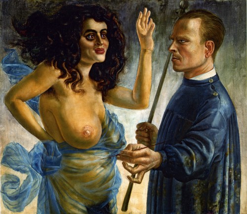
In fact, let me start with the kitschiest painting I can’t ever forget, Self-Portrait with Muse, 1924:

Otto Dix, Self-Portrait with Muse, 1924, oil and tempera on canvas, 31 7/8 x 37 3/8 inches, Osthaus Museum Hagen

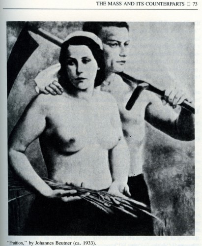
Here the fully clothed, thin-lipped, stern-faced fair-haired male artist encounters an almost comically over-endowed, flamboyantly ethnic — whether Semitic or Latin — woman. He confronts her, he is confronted by her, as she raises her hand in a gesture which can be read as a greeting, a blessing, or a stoppage, a counter-action to the reach of his brush which is in effect creating her. She is hardly the passive creation of a Pygmalion and if you look at some of the depictions of women by fascist-approved artists of the same general period in Germany you immediately get what makes this painting so different and seditious even though it does portray a naked woman and a clothed man, a familiar theme in the history of Western representation.

Dix’s wild muse has an over-ripeness of sensuality and an extreme quality as a representation that more than equals his own and a specificity that makes it hard to think of her as an abject victim of the male gaze. Their meeting ground is the blank space of the painting surface itself, the lack of situational specifics giving this  a mythological implication and, formally, a modernist undertone with a medieval subtext: this is a very flat painting yet closer in its spirit and its use of space to the flatness of Northern Renaissance painting, which is one of the main sources of Dix’s several painterly and graphic styles.

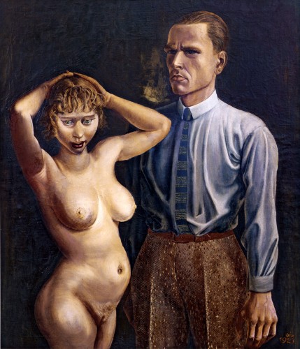
Dix’s Self-Portrait with Nude Model (1923) is less kitschy but perhaps more troubling because of the emphasis of the anatomical sexual representation and the dazed, blurry expression of the woman’s face. Dix is imposing as a figure here, but there is something strangely affecting and not entirely protected in his self-depiction, despite the military bearing under the civilian clothes.

Otto Dix, Self-Portrait with Nude Model, 1923, oil on canvas, 41 3/8 x 35 3/8 inches, Private Collection

Here I think it is useful to think of Dix’s self-portrait, his rigid, soldiery demeanor, in relation to the “soldier male,” the subject of Klaus Theweleit’s fascinating two volume study of the psycho-sexual roots of fascism in turn of the century Prussia,  Male Fantasies  –Volume 1: women, floods, bodies, history (published in German in 1977, University of Minnesota Press, 1987) and Volume 2: male bodies: paralyzing the white terror (published in German in 1977, University of Minnesota Press, 1989). Theweleit studies the memoirs and pulp fiction and films made by and for the officers of the Friekorps, private armies who fought battles of internal repression in Germany between the two world wars and paved the path for Nazism, in particular examining their violent sexual depiction of women, communists, and Jews. This analysis remains of great importance and relevance as a tool for understanding similar manifestations in our time.

I first used Theweleit’s books as a tool in my analysis of the gendered aspects of the critique of painting in my 1989 essay “Figure/Ground.” I would have to reread the books in order to draw out new quotes, which is tempting: I strongly recommend both volumes.

The “soldier male” (according to Theweleit’s term) has never fully developed  “secure sense of external boundaries,” a pleasurable sense of the membrane of skin. He fears the “Red floods” — of the masses, blood, dirt, “morass,” “slime,” “pulp,” woman — which he perceives as constantly threatening to dissolve his “external boundaries.” He also fears the liquid forces insecurely caged within his own body interior and unconscious. The “soldier male resolves these conflictual fears by the construction of a militarized, regimented body, by incorporation into a desexualized phalanx of men, and by the reduction, through killing, of all outer threats back to the red pulp he images everything living to be. “He escapes by mashing others to the pulp he himself threatens to become.” (Mira Schor, “Figure/Ground,” Wet, 149)

[Cross reference this description with the recent fetishization in the press of General Stanley McChrystal’s hard body and self-mortifying spartan habits].

Otto Dix, Human Intestines, 1920, watercolor, 18 1/8 x 15 inches

In the first years after WWI, Dix sometimes provoked his friend “with his detailed description of the pleasurable sensation to be had when bayoneting an enemy to death” (Olaf Peters, Otto Dix, exhibition catalogue, Prestel: 2010, 96) but often spoke of the nightmares he had for years afterwards.

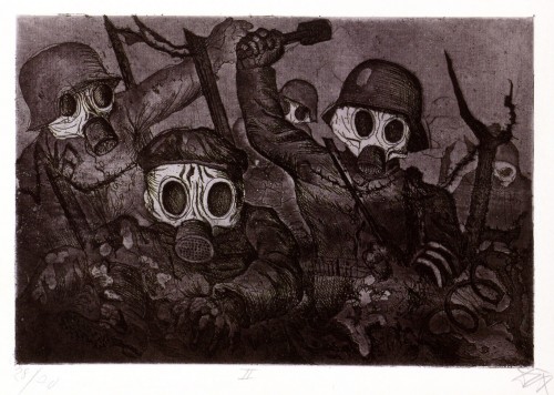
Otto Dix, Shock Troops Advance Under Gas, from Der Krieg (War), 1924, etching, ,

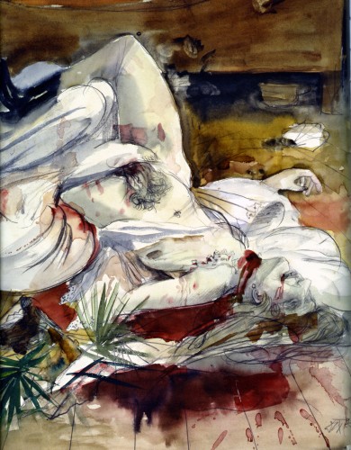
Describing the plot of  one of these examples of Friekorps literature, Theweleit writes: “The central point of the construction of this murder is that the woman castrates the man. There is also the implication that she is a whore; the fact that she is the only woman traveling with six men is clear enough indication. The weapon she uses to castrate him is initially hidden; the pistol is pulled unexpectedly out of her apron, as if it were a concealed … penis? […] “It is a phallic, not a vaginal potency that  is fantasized and feared.” (Vol 1, p. 72). Again, an interesting background to Dix’s many paintings of “lustmord,” sex murders.

,Despite the disturbing violence depicted in these works, I find in many of Dix’s paintings of women something other than misogyny: the humanity of the women is never sugar coated into pneumatic attractiveness in the vein of John Currin, who Dunham mentions in regard to Dix’s sources in Northern Renaissance Germanic and Netherlandish portraiture. To the contrary, Dix adopts the detailed, delicate surface and the often elongated, Gothic form and angular, spiky drawn lines of the Northern manner, to depict the deep drama of the women of all ages and stages of beauty, sexuality, despair and decay. Each is vulnerable, anxious, and mortal rather than only sexually available, and each is a character with an inner life, which to me takes the work away from misogyny.

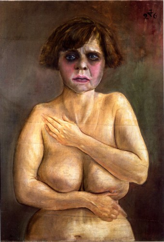
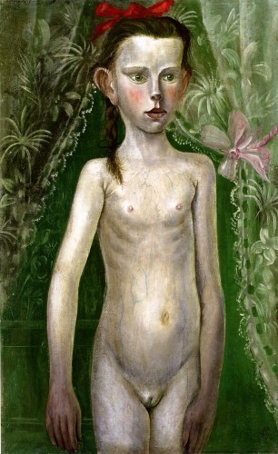
Look at the contrast between the way the anguished face, the imperfect body, and the delicately self-protective hands are depicted in Half-Nude. Look at the strange blue veins under the thin skin of the pre-pubescent girl, her femininity symbolized by the lace curtain and its pink ribbon, her sexuality by the red ribbon in her hair.

Otto Dix, Half-Nude, 1926, oil and tempera on wood, 28 3/4 x 21 5/8 inches, Private Collection

Otto Dix, Little Girl in Front of a Curtain, 1922, oil on canvas, 31 3/4"x20 inches, The Minneapolis Institute of the Arts

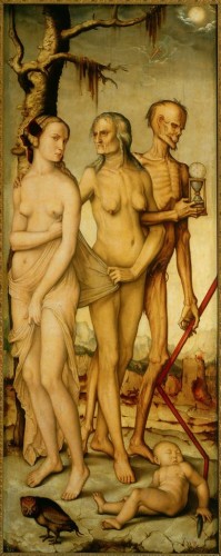
Hans Baldung Grien, The Three Ages and Death, c.1540, oil on panel, 151 x 59 cm, Museo del Prado

Dix represents in his work what the Friekorps’ violent pulp fiction and wan representations of the ideal woman and the “soldier male” sought to repress. Dix’s works were included in the Degenerate Art show organized by Hitler and Goebbels in 1937 [must see documentary about this exhibition]and one of the reasons he refused to leave Germany during the war was that he was sure his work would be destroyed if he left it behind (conversely the Jewish lawyer Hugo Simons took his portrait by Dix with him when he fled Germany with his family, an immensely risky thing since generally even in the mid-30s it was best to leave Germany with only the shirt on your back as if you were coming back the next day. This portrait is included in the current exhibition.)

Earlier I described Dix’s pencil and watercolor drawing of the Wounded Veteran drawing as “modest,” in the way that I have used the word modest in my essay “Modest Painting” to indicate work that does not seek to overpower the viewer by virtue of size or self-aggrandizing gesture but by its ambition for the medium itself and in this case by the subject matter represented, which is devastating, riveting, tragic, epic. I can add the obvious, but like everything in Dix’s work, it’s to the power of ten: Dix believed in drawing as he believed in painting as powerful vehicles for the transmission of meaning.

The most notable characteristic of work in this year’s Greater New York 2010 exhibition at MoMA P.S.1 is that there is little evidence of any trust in the capacity of a singular object or medium to carry meaning. Nothing is allowed to just be: nearly every painter hedges her bets and also hangs some blurry photo-montages or stick a few objects on a table, if there is a painting then there is also a video, and maybe a bench or two.

The most notable characteristic of the works exhibited in the Otto Dix retrospective at the Neue Galerie is that each painting or drawing or etching uses the specificity of each medium to transmit meaning and, boy, is that enough, because nearly every work is an atom bomb. Dix hedges no bets in the wretched human emotion and delicate perception and satire he packs into each work. Certainly some paintings and drawings go headlong into kitsch that is almost alarming, totally over the top, presumably dated in style, although nearly each of these also has something fantastic in it, and no matter what the emotion and the human content and even the handling of the material is 100% committed and fascinating. His work is pitiless, sometimes garish, yet his line is as detailed and delicate as a Flemish masterwork, his surfaces are varied and complex.

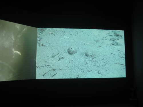
To continue the comparison between these exhibitions a bit longer, there are some tropes in Greater New York that Dix might appreciate — for instance, mud is a recurrent trope in Greater New York: this may reflect ecological concerns although often the mud seems like a metaphor for paint: instead of painting with it, you make a video of it burbling up, plopping down, it’s the original primal slime that no one has the patience to learn to discipline or trust in its expressivity). My notes from Greater New York include: “Alex Hubbard, 2 big paintings, frayed sides, 2001 A Space Odyssey monolith, projection of video of burbling mud, red benches, MUD, paint IS mud, primal goo;” “Gilad Ratman, 2 screen video, more mud.” I counted about 4 other pieces where mud or paint as goo and ooze (but in the disembodied clean form of  video of course) was featured.

Gilad Ratman, The 588 Project, 2009, two screen video, Greater New York exhibition

When Dix painted the works in this exhibition, he too was young and extremely ambitious: even on the battlefield he was not only drawing on anything he could get his hands on, he was also keeping in touch with the artworld of his time and, as soon as he was demobilized if not before, making sure his work was included in the important exhibitions of the day. You can be sure that if he were a young man today, he would be putting his work forward with as much murderous ambitious as anyone but he wouldn’t be a contestant on “Work of Art: The Next Great Artist.” If at all, he would be one of the top chefs on Top Chef Masters: I watched the final episode of this year’s “Top Chef Masters” after the premiere of “Work of Art” and whereas the art “reality” show was interesting only as a manifestation of desperation — think They Shoot Horses, Don’t They? — Top Chef Masters was, relatively speaking, riveting. The judges were articulate and passionate, and, as opposed to some of the art jurors, they seemed to be better able to clarify the aesthetic criteria they were applying to the food — again, relatively speaking — either gnocchi are chewy or they’re not, the fish underdone or overcooked depending on your gustatory ideology — and the chefs were powerful characters, with compelling personal narratives that they had channeled into their work, and each finalist radiated physical and psychic power instead of play-acting self-puffery and abjection. I was particularly impressed by Hong Kong-born, Canadian chef Susur Lee and the winner, Ethiopian-born, Swedish-reared chef Marcus Samuelsson. These men were fearsome, awesome Ninjas, and Dix might have been one of them.

Dix’s inventiveness, his technical skill, and his attention to detail as well as his intensity of characterization and the fury at man’s murderous drives make each work almost ridiculously powerful. The show at the Neue Galerie is packed with one outrageous masterpiece after another, each atom bomb crammed unceremoniously close to the other, against the rules of modernist exhibition practices. While Greater New York takes a long time to get through because artists are given generous amounts of space, and because there are so many time-based works in dark rooms, in the mode of the day, the Otto Dix works are in rooms with dark colored walls that give a kind of old world feel to work that would appear totally contemporary in other circumstances, and his works on paper are in darkened rooms in order to protect them. To do many of the paintings and etching series justice you’d have to spend hours and hours and I hope people will do so. But I would also cast my vote for a Freaky Friday experiment: force the artists exhibiting in Greater New York to contend with a small space in which each work would have to intensely convey powerful meaning without relying on the luxury of excess exhibition space and give Dix’s works the modernist white cube treatment that would allow them to breathe and give them back the contemporaneity they exude, unbeknownst to most young art viewers in New York.

FacebooktwittermailFacebooktwittermail