Tag Archives: painting

“The Ground”

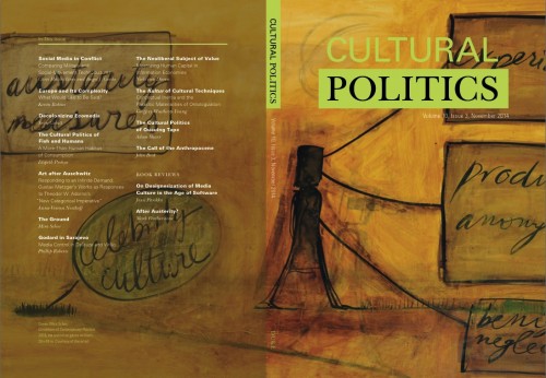
I’m delighted to have “The Ground,” a text about my work, published in the current issue of Cultural Politics, a Duke University Press journal

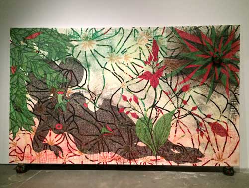
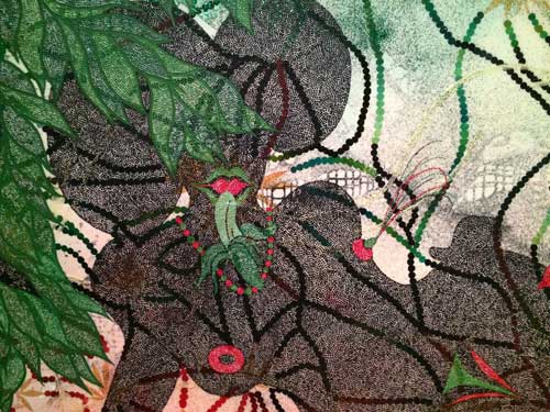
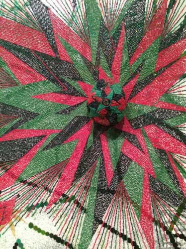
Issue cover, detail of Mira Schor, Conditions of Contemporary Practice, 2013. Ink & oil on gesso on linen, 24 × 45 in.

Issue cover, detail of Mira Schor, Conditions of Contemporary Practice, 2013. Ink & oil on gesso on linen, 24 × 45 in.

The full text online with color reproductions is here (scroll down to “figures” and click on “view larger version” )

The PDF of the text as it appears in the hard copy is here (reproductions in b/w)

Special thanks to the journal’s editors and to Arts Editor Joy Garnett for inviting me to contribute an artist’s project

*
From Joy Garnett: Announcing the arrival of:

Cultural Politics Volume 10.3

Featuring cover art and an essay by Mira Schor, this entire issue is available open access, courtesy of Duke University Press.

Cultural Politics (ISSN: 1743-2197) is an international, refereed journal that explores the global character and effects of contemporary culture and politics. It analyzes how cultural identities, agencies and actors, political issues and conflicts, and global media are linked, characterized, examined and resolved. In doing so, the journal explores precisely what is cultural about politics and what is political about culture. It investigates the marginalized and outer regions of this complex and interdisciplinary subject area.

Edited by:

John Armitage, Winchester School of Art, University of Southampton, UK
Ryan Bishop, Winchester School of Art, University of Southampton, UK
Douglas Kellner, University of California, Los Angeles, USA

Mark Featherstone, Book Reviews Editor

Joy Garnett, Arts Editor

Each issue includes essays and projects by visual artists solicited and edited by New York artist Joy Garnett. Contributing artists include Stephen Andrews, Paul Chan, Christos Dikeakos, Gair Dunlop, Yevgeniy Fiks, Zoe Leonard, David Humphrey, Dominic McGill, Julia Meltzer & David Thorne, Arnold Mesches, Carrie Moyer, Richard Mosse, Steve Mumford, Sarah Peters, Mira Schor, Nancy Spero, and others.

Cultural Politics is published by Duke University Press. Access all articles online. Artist contributions are freely available (pdf and html) courtesy DUP.

Additionally, an archive of artist contributions can be found here


FacebooktwittermailFacebooktwittermail

Nights and Days of Chris Ofili and Benny Andrews

In recent days I have posted on Facebook galleries of photos from recent exhibitions I’ve just seen, with a brief text which I typically write quickly, just enough to give readers a quick sense of the work. Since Facebook’s algorithm is notoriously unreliable, I thought I would republish two such brief reports, about works I saw in the past two days, especially since the works presented here propelled me into the studio, an effect of art work that I particularly noted when I began this blog. As is often the case, happenstance unexpectedly reveals thematics. This is a case in point.

Sunday December 21 * Here are some pictures of my visit to Night and Day, the Chris Ofili exhibition at the New Museum. I should say my first visit because I intend to go again, this is a show it is a pleasure to spend time with and the works make you spend time. I very much wanted to see the show although/because I haven’t seen that much of Ofili’s work, and my attitude was in a sense neutral because on the one hand I am not necessarily a fan of a kind of stylized style of figuration and yet I love cartoon figuration. Same duality about vivid color. So, needle set at neutral but looking forward to and anxious to see.

It’s a great show and by far the best use of the New Museum’s awkward cold space I have ever seen. Each floor tells a story and each room is not just a space to stick some work, but to consider a body of work. Important to go in order, second floor, third floor, fourth floor, and fifth floor for small exhibition of his work for ballet.

YEAR-Night-Day-Ofili-1

YEAR-Night-Day-Ofili-2

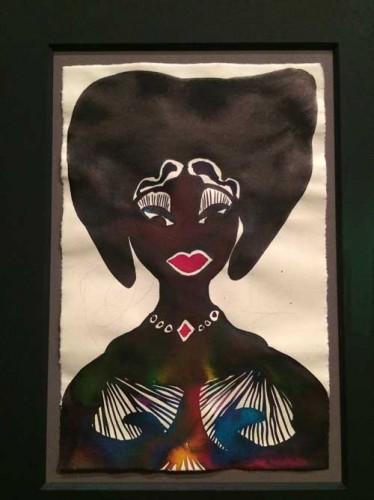
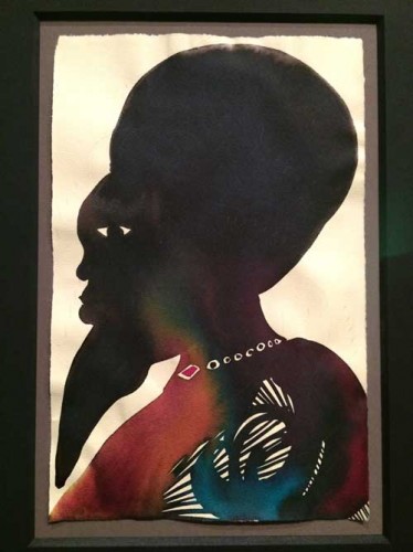
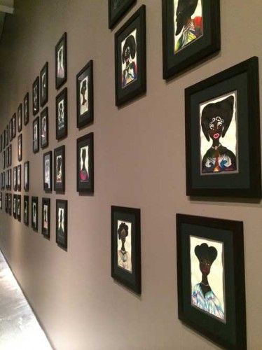
On the second floor, first thing you see coming out of the elevator is an installation of works from Ofili’s series Afromuses, 170 small framed watercolors (looks like watercolor and ink) of silhouetted heads of African women and men, emphasizing the abstract design of hairdos, patterned textiles of clothing and jewelry. These works, a selection of a larger series, emphasizes the importance of drawing–these were works that the artist did every morning for about 10 years for about fifteen minutes as warm ups for painting, and they serve here as a warm up to the rest of the show.

YEAR-Night-Day-Ofili-3

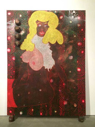
One experiences them twice, as you loop back to them after going around the corner first into a large space with a great group of large paintings from the 90s, including the notorious Holy Virgin Mary of Mayor Giuliani fame.

YEAR-Night-Day-Ofili-4

YEAR-Night-day-Ofili-4detail

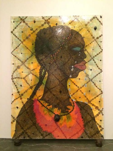
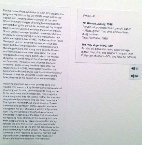
These paintings have a great sense of scale, and the fact that each rests on a ball of elephant dung adorned with the title of the work rather than being hung on a wall keeps them at the level of the viewer’s body. They are intensely surfaced, vividly pigmented, very funny–at one point I started thinking about the Simpsons–and very moving: particularly striking from across the room as well as directly in front of is No Woman, No Cry about the mother of a black teenager killed in a racially motivated assault in London. This painting’s use of the ball of dung is particularly striking, as a piece of jewelry which is also a weight, a scar, a tumor, at the core of the painting.

YEAR-NIght-Day-Ofili-6

YEAR-Night-Day-Ofili-detail-text

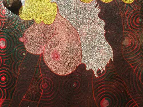
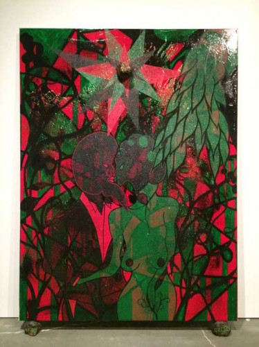
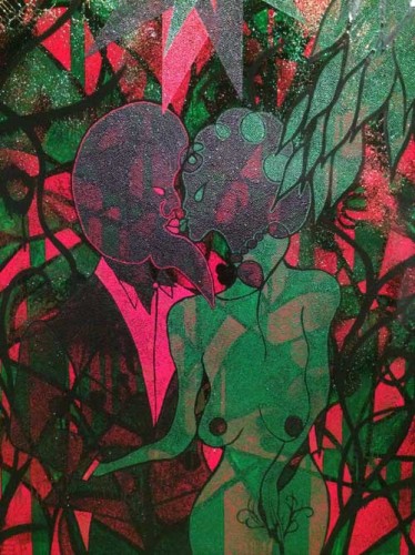
So already two impressive groups of works, but the show really gets impressive when one walks into the next room, lit slightly differently, with large paintings which share a color scheme of green, black, pink, red, and white, and a lush sexuality and sensuality.

YEAR-Night-Day-Ofili-7

YEAR-Night-Day-Ofili-7-detail

At this point in the show looking at these works I also felt strongly that these paintings were made by the artist, that he was engaged in the painting, even though these are not conventional paintings–there is neither brushwork, ton smooth flatness, the surfaces are complex, textural, layered, constructed, but they are convincingly by one person making decisions as he goes along

YEAR-Night-Day-Ofili-8

YEAR-Night-Day-Ofili-8-detail1

YEAR-NIght-Day-Ofili-8-detail2

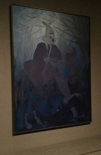
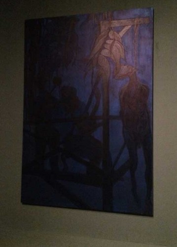
The next floor is dedicated to a darkened room with dark paintings which at first are nearly unreadable, somewhat like figurative Ad Reinhardts. Strangely my iPhone camera was able to pick out forms that my eye could not. The darkness hides dark subject matter including a lynching. It is a room I particularly want to return to, must return to, to see what more I can see.

YEAR-Night-Day-Ofili-9

YEAR-Night-Day-Ofili-10

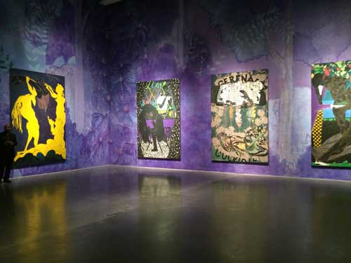
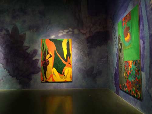
The next floor (4th fl of the museum) is the total opposite, an emotional reversal: a knockout of color and sensuality, yet painted much more flatly than the first large paintings. No more stippling, no more varnish and glitter, no more elephant dung, in some cases figures appear to be drawn on the linen with charcoal. They bring to mind William Blake (an important artist to Ofili) and Nabis and early 20th century Viennese Orientalism, and also a lot of mid-twentieth century European artists, Matisse’s cut outs, late Picabia, Chagall even. The walls of the room are painted a light violet and blue floral pattern (based on images from Powell and Pressburger‘s movie Black Narcissus–a movie about Western sexuality repressed by religiosity and unmoored by its encounter with the exotic eroticism of the Himalayas–and painted on the wall by a team of professional scenic painters, according to the guard we spoke to). This helps transform the scale of the room in a way that is humanizing and welcoming, a large public space that one wants to spend time in, go back to, a vivid Botanical Gardens of painting.

YEAR-Night-Day-Ofili-11YEAR-Night-Day-Ofili-12

The way I’ve described the show here is to give a sense of the experience floor by floor. There are some critical issues, or issues one could have a discussion about: how do these work somehow radiate a sincerity opposite from works from the New Expressionist period that share some of the same references to between the World Wars European stylization of the figure? Is the role and critical reception of stylized figuration, vivid pigmentation of painting, vivid patterning and gaudy surface different when the artist is a person of color with ties to Africa , now living in the Caribbean? How is the reception different if similar images are presented by a male artist or a female artist? The work itself resists these, often unspoken problematics, and this is part of their strength and affirmation.

Monday December 22 *

YEAR-Night-Day-Andrews-No-MOre-Games-2

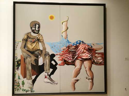
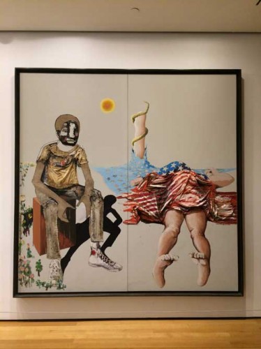
I went to MoMA yesterday and saw this really interesting painting by Benny Andrews: it is large, bold, arresting. Not a perfect painting–what appears to be a mutilated body covered by a crumpled American flag is awkward, not just disturbing, which it is, but awkwardly drawn, with strong foreshortening and the crumpled three dimensional cloth of the flag intruding into our space, and yet the painting, No More Games from 1970–is all the more powerful because of that awkwardness, a smoother painting would not be as effective, would be a contradiction. Each element means something, in the way that everything means something in a Northern Renaissance painting, there is iconography going on here, but iconography that is invented and adapted to speak to a desperate situation, a broken dream, the desperation of rebellion perhaps. Iconography is an important terms because in fact the painting also has a strong biblical reference, the painting is organized around a tree of knowledge and of patriotism that has been ravaged, leaving only the stump and the snake. Eve has been murdered for her sins–not sure about the sexual politics of this painting because its overall politics seem mainly about something other than sexual politics–and Adam sits with the body. Is it his crime?


YEAR-Night-Day-Andrews-detail-4

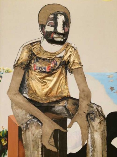
The sun shines bleakly on bare canvas, it has burned the background away to a stark empty apocalyptic desert, and the figure of the man, “Adam” has a shade, a flat black shadow silhouette who springs from the same pair of high tops as the figure. This figure is very inventively painted and very sculptural, both representationally and literally, wearing a real T-shirt stuck on him like clothes on a paper doll.

No More Games. What a title for this moment, what a day to see it, when the senseless massacre of cops in NY arrives to devastate and demonize a budding civil rights movement.

A really strong painting, it would be nice if the museum saw fit to put some more lights on it, though the lower light on the right hand side and the fact that the painting is right off the escalator, in the hallway, means one comes upon it, the way you discover something powerful in the subway or on a street wall. By the way, the hallway seems to be the installation spot of choice for–often figurative (and perhaps not coincidentally often political)–paintings by “others,” Alice Neel, Robert Colescott near the bathroom a few months ago. No More Games is by far the painting that remains with me from all the paintings I’ve seen in the past few days, it is a political essay–a trying something out, as a painting it is trying something out in painting: Rauschenbergian–that is, post-War, use of the real on a flat modernist picture plane, within a Renaissance representational program, to speak to a political history that is rarely faced, especially within painting.

The painting is on the third floor, just outside a really good installation of late 60s/70s painting, sculpture, and video. The painting’s installation outside of the illuminating historical presentation is both insulting and fitting, given its subject matter, which cannot be properly contained within the institution.

YEAR-Night-Day-Andrews-No-MOre-Games

FacebooktwittermailFacebooktwittermail

Interiority and reversibility

A few works on paper that I did in the 1970s are going to be shown for the first time in Four Figures, a group exhibition curated by artist Tom Knechtel at Marc Selwyn Fine Art in Beverly Hills, California, opening  Saturday July 12 through August 23.

These are part of a body of work from the mid-1970s in which the overall subject was interior language, or, coming from a more political, feminist approach, the idea that women are filled with language, rather than being empty vessels whose exterior nubile beauty as a commodity to be traded among men is the principal focus of their value in most societies.

I wanted to approach representation of women, and specifically self-representation as living inside a female body, with a mind, no longer from the point of view of figuration, whether realist or surrealist, which had been my first approach to representing myself as an agent in the world, much as a number of women artists associated with the Surrealist movement had done–I was already on that path even before I first saw works by Florine Stettheimer, Lenore Fini, Leonora Carrington, Frida Kahlo, and Dorothea Tanning, having found cultural permission for narrative and representation in the works of  male Surrealist artists such as Max Ernst and René Magritte as well as from early Italian Renaissance and Flemish painting, Rajput painting, and Japanese emaki–but, now, from the point of view of an interiority of thought, with the image of language as the sign for thought.

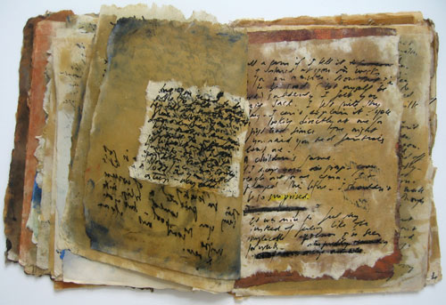
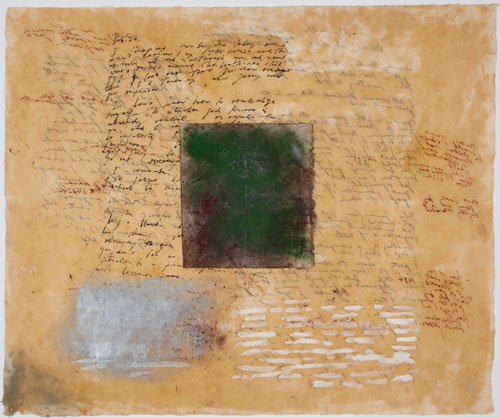
1a.-book-of-pages-editedIMG_9422SM

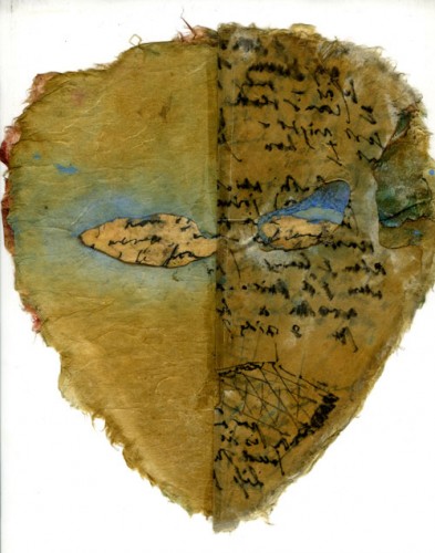
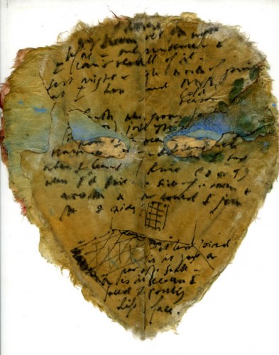
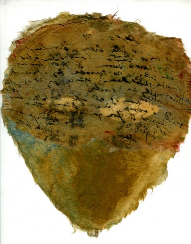
There were five groups of work done between 1976 and 1978: the first were a  group of unfolded or folded fan shapes covered with handwriting, followed by a touchstone, foundational work for me, Book of Pages in 1976, followed by a group of masks many of which kept the idea of the book so that the mask has several layers, as did a series of Dress Book pieces, and finally the Dream series, in which the image was the text of a dream handwritten in black ink, with my interpretation and associations in sepia ink. While the shapes changed accordingly, the “image” on the surfaces was my handwriting recording dreams or diaristic personal writing and in some cases directly addressing a specific person, a much bemused male muse. Some works also incorporated diagrammatic drawings. All works were made from hand-made Japanese rice papers, some diaphanously delicate and made translucent with Japan Gold Size medium which also fixed the dry pigment I used for color used as matter rather than illusion, some other paper richly fibrous and sturdy.

All the works were two-sided: each component or piece of paper was worked from both sides so that the “front” was created by material applied to the “back” in order to create the effects that underlay the writing in the “front” but in the process the brute instrumentality of the work on the “back” often ended up trumping the more intentionally produced “front,” bolder and more abstract. Because the paper was often translucent, text could be doubly difficult to decipher: my handwriting was inherently difficult to read, and  some of the text that was foregrounded was backwards, with the legible face permanently inaccessible to the viewer.

Since many of these works continued to work with the format of a book of pages that could be turned, these works were also layered dimensionally, you could turn the pages of the woman, her dress, or her face (where you might also try to lift a veil) and try to “read” the woman, but I came to writing as image at the moment when I saw that my handwriting had achieved an abstract beauty that was unrelated to easy legibility. Even the Dream pieces, one of which is in the Four Figures exhibition, though flat, were not only reversible, but sometimes contained a shape sandwiched within layers of paper so that what you thought might  be revealed if you turned the piece over never actually surfaced.

Mask-book,-floor-plan-Sept-2,1977-front-SM

Mask-Book,-floor-plan,-Sept-2,1977-open-SM

These works were difficult to categorize: though I thought of myself as a painter, as I had earlier when working with gouache on paper, in defiance of the rules left over from Greenbergian formalism in the New York School that made oil or acrylic on canvas the probative medium, these were not paintings. But though they were objects they were neither conventional sculptures, nor could they be folded into any type of avant-garde sculpture focused on the readymade. The use of ink on paper made them drawings, but aside from the occasional diagrammatic sketch, writing escaped back into the category of actually being writing, not drawing. Because the writing was personal, the private made public yet retaining its illegibility, and because the image was my handwriting as opposed to printed text as many conceptual artists used at the time and rather than being writing that was meta-generic, in the manner of Hanne Darboven‘s (or Cy Twombly’s) scrawls, and because they did not turn their back on visual pleasure, they were not dematerializations according to the interpretation of that term as codified at the time. They were materializations of thought.

Mask-Book,-floor-plan-Sept-2,1977-back-SM

They were things, intensely personal things, that for the fullest understanding and apprehension, had to be experienced not just optically from a respectable spectatorial distance but viewed/experienced by an individual, pages turned, a veil lifted, a work turned over in your hand, with perhaps a grain of pigment or even a trace of the aroma of the medium remaining with you as material traces.

Thus, though they were things, and even quite precious ones, rare and fragile, they were the opposite of art commodities. They were and are still best experienced by hand but practically for their protection they require special handling and framing, thus are hard to exhibit to the fullest extent of their meaning (in Four Figures for clarity of presentation and their protection a number of works from this period are assembled together under Plexiglas and thus only one view of each work is available, other solutions include two-sided frames or the treatment accorded rare manuscripts, in a vitrine, open to a selected page, occasionally turned).

Because of their basis in feminist desire for alternate representations of the experience of being a woman, because of their focus on language as subject and image, because of their interest in scale through accretions of modules (in this case pages), because of their seriality (though this was narrative rather than in relation to mechanical reproduction), and because of their thingness yet impracticality, making them both experiential and notional, they have always seemed to me like archetypal 1970’s art, feminist and otherwise.

Mira-Schor-Dream-Feb-25-26-1978-backIMG_8328


*Works reproduced include a view of Book of Pages, 1976; and from the exhibition Four Figures, three views of Mask Book: Floor Plan, September 2, 1977, ink, dry pigment, Japan Gold Size medium on rice paper, front with page closed, page open, and a view of the back, which will not be visible in the exhibition; and Dreams, February 25-26, 1978, ink, dry pigment, Japan Gold Size on rice paper, c. 18″x29,” image of the side that will not be visible in the installation in the exhibition.

FacebooktwittermailFacebooktwittermail

Craft and Process: Jasper Johns / Regrets

I am interested in the capacity of material experimentation and serial practices to bring an artist to the expression of, the performance of, the actualization of content the artist had intended or desired but might not have arrived at if trust had not been put into process and materiality at some point or another. Such practices at times may seem to be unrelated to language-based theoretical structures, in particular if they involve manual processes and techniques although I am careful here to say “process” rather than “studio practice” because the latter might summon up traditional media and object-based art that in some quarters can be easily dismissed as irrelevant to contemporary issues, whereas material or methodological experimentation and serial practices can take place in any medium, including video, film, and photobased work, as well as in writing and conceptual art.

Because of my interest in process in the broader sense and because of my love of the expressive material qualities of traditional media such as ink, paper, pencil, oil, gouache, linen, wood, wax, stone, lead, copper, bronze, and more, I wanted to see Jasper Johns: Regrets, currently at MoMA even though I had a feeling I might be disappointed, despite my admiration for Johns’ earlier work and for the rigorous and rigorously private studio practice that he maintains at what is considered an advanced age for an artist, 83. Daily studio practice and engagement with craft by older artists was, literally, my matrix, and it’s my hope for my own future.

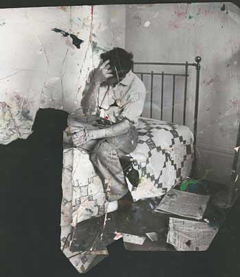
The work exhibited in Jasper Johns: Regrets  is exemplary of work process in which an image is repeated and reworked using a range of techniques and materials. Johns has applied his own, oft-quoted prescription for the empty studio and the blank piece of paper or canvas, “Take an object/Do something to it/ Do something else to it/ [Repeat]” from 1964, to the crumpled, torn print of a photograph of a young Lucian Freud, commissioned by Francis Bacon for his own work process on a portrait of Freud. In the past year Johns has produced an impressive and instructive series of drawings and prints and two paintings on canvas that use this photograph as the initiatory form.

A slight pause to observe the awe-inspiring, nearly absurd monumentality of what it means that an artist can call MoMA and say something to the effect of, “I have some new work in the studio and I want to show it–at MoMA–now,” and they make it so. I had to research whether Johns even has gallery representation in New York; he does (Matthew Marks) but the call to MoMA denotes an artist who is hors combat, beyond value, who has droit de seigneur, and justly so, and it suggests an almost quaint familial intimacy with roots in another time with the institution MoMA.

The drawings are mostly small and they take place within the strict boundary of a smaller rectangular area set on a larger piece of paper, effectively setting each drawing into an optical frame, and giving each drawing a formal quality that goes somewhat against the grain of the theme of material and subjective experimentation: Johns never draws outside the lines and there are no accidental smudges or other stereotypical indications of “work” in progress or changes of mind within an individual, except for notes to himself at the bottom of some works, in a careful, small capital letters only print in pencil: “GOYA? BATS? DREAMS?” There is a quality of carefulness and diligence in each work, with each drawing fulfilling a specific set of material specifications and formal analysis of the image. Each is a finished work, enclosed, specific, and private.

The drawings are done with pencil, acrylic, and water-color, in some cases with a Seurat-like dissolution of the figure created by the pebbly effect of rubbing a pencil over a pebbly-surfaced watercolor paper, in other cases a watery smooth print like effect is achieved through ink on a smooth and water repellent vellum like surface.

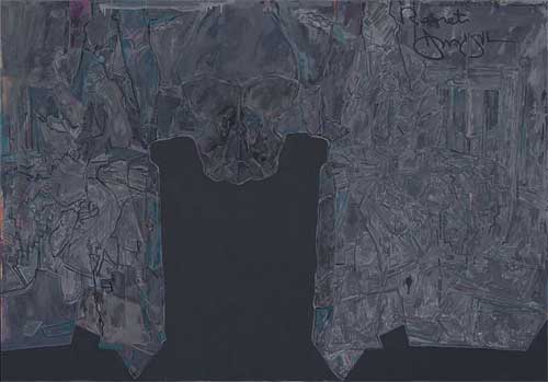
In most of the works, the pathos embodied in the photograph of Freud–a young man, his face obscured by his hand and by falling strands of hair, seated on a bed–is transferred emotively to the shape of the negative space created by the torn off bottom left hand corner of the print.  In the many iterations of the image in which Johns has doubled the picture in a mirror or Rorschach-test format, the human figure is a recessive, barely legible form while the negative shape becomes an important sculptural shape, like a mesa or a tombstone.

The two paintings in the exhibition have a sober, reflective quality with the monumental tombstone form of the negative space in the center framed by intimations of the recalcitrant figure. The group of work as a whole, the whole gift of a limited invitation into his studio functions as a counter-movement to mortality and knowing the age of the artist it is easy to read into the work a reflection on mortality, which is his subject I think.

Yet the work also has a funereally static quality of which the worst effect is a kind of conservatism instead of the sublime monumentality or contingent fragility that one imagines it will contain.

The problem is twofold: it is fascinating to see how the artist has taken an unprepossessing photographic scrap and rung so many changes on it yet the image upon which this edifice of studio practice is based is perhaps not all that resonant, either absolutely, or in the way he has chosen to interpret it by enhancing abstraction and deflecting figuration. Or his pressing of the appropriated image through layers of visual analysis does not actually push experimentation with materials far enough in order to get at the core of the content by his deconstruction of the given picture.

Photograph of Lucian Freud by John Deakin ©Dublin City Gallery The Hugh Lane/The Estate of Francis Bacon

But, now I think, perhaps I am wrong. As I write, in my mind the work becomes more interesting, the fact that the figure is so obscured and the very disciplined and precise thoroughness of the visual analysis of the appropriated image is fascinating in its rigor and in the emotional reticence. Maybe. And yet…

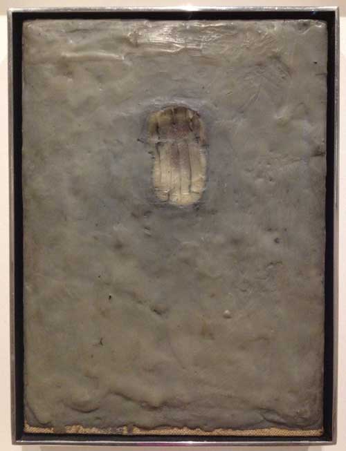
The most important moment for me was while standing to the left of the larger painting, Regrets, trying to get as close as I could to the painting surface, in the area where the seated figure is both represented and camouflaged through a web of paint marks which are neither minimal nor especially sensual: the paint quality is curiously dry with unexpected but frustrating flicks of a more sensual or at least thicker slightly less dry paint. I wish I could photograph that moment of vision, being as close to the painting as one is allowed, looking at it from one side, my vision raking it from a sharp angle to the picture plane, trying to decipher the figure, trying decode the various types of paint strokes and degrees of lubricity or aridity of the paint. It is the crux of the experience of this painting and this series of works, that the most interesting thing, the most complex, is also the least visible and, for some viewers, the most disappointing. If one thinks of this painting in relation to the characteristics of the “old age style” first perceived in late works by artists such as Michelangelo, Titian, Rembrandt, as well in late Cézanne, where the high finish of youth yields to a rougher, often more “unfinished” and therefore more modern to our eyes loose, direct, unvarnished representation, this painting both adheres to some of the characteristics of of that stylistic determination and yet goes against its grain: it is sometimes loose, but also tight, obscure, and recalcitrant. Instead it is in earlier work that one finds the characteristics of what had once been called the old age style, where the artist has no time for the niceties and goes for the gut, as in Painting Bitten by a Man, 1961, from the collection of MoMA, which was in a small but resonant two-person exhibition at Craig F. Starr Gallery last spring,Body Double: Jasper Johns/Bruce Nauman. Here is rich surface, base materialism, a mark that goes beyond indexicality to something like both cannibalism and lovemaking with the matter of paint itself.

Jasper Johns, Painting Bitten by a Man, 1961. Encaustic on canvas mounted on type plate, 9 1/2 x 6 7/8″ (24.1 x 17.5 cm),Gift of Jasper Johns in memory of Kirk Varnedoe, Chief Curator of the Department of Painting and Sculpture, 1989-2001 Copyright:© 2014 Jasper Johns / Licensed by VAGA, New York

Compared to Painting Bitten by a Man, the paintings in Regrets yield their meaning parsimoniously. I know that to compare these new works by Johns to his remarkable earlier work is to commit the unpardonable of holding a great artist to the standard of his greatest works, which came in his youth, all the more so because I respect all the work intensely, I mean not just the great early works, but the way he continues to work and to be in the world, the discipline of work no matter what stage of life’s work he is in. But I have a feeling I’m not the only person who is painting late Johns paintings in my head that are different than the ones he is actually painting.

A hint of what those might be is contained in 0-9, , one other series of works on paper in the MoMA exhibition, also done in 2013 but unrelated to the Regrets series. Nine monoprints on small pieces of rice paper represent the numbers 0 through 9, in the stencil style Johns has used many times addressing this subject. The work is done through a complex process, according to the wall text: “using stencils, rubber stamps, and textured materials–including mesh screens, rags, strings, and coins…Johns assembled each composition on an aluminum plate. He then covered these assemblages in white ink and printed them on sheets of paper. Finally he immersed the prints in a bath of black india ink, which dyed the paper but not the oil based white ink.” If one of the features of work that I love is that I want to turn on my heel and go back to my studio and work, in terms of the inspiration provided by process, he had me at “a bath of black india ink, which dyed the paper but not the oil based white ink.” By that I mean, just reading those words–“bath of black india ink”–made my pupils dilate and set my pulse racing slightly, separate even from the work achieved through that technique. But on top of that, these works themselves are delicate, simple, and there is a resonance between the method and the subject: the numbers 0 to 9 are images and concepts we recognize immediately, we know deeply, a subject that combines familiarity and neutrality so that, like the target or the flag, we can appreciate what it is that Johns is doing to them with his craft, when he takes an object, does something to it, and then does something else to it, and repeats, whereas the wrecked photo of Lucien Freud is foreign to us. Thus, although it is a resonant and mysterious image, it is also an arcane, individual, and private one, so that there is perhaps too great a conceptual and cognitive distance between the appropriated image and the material explorations of the series. I admire the work, the artifice, and even the recalcitrance of the works in Regrets, but, although I really want to, I don’t love them, I regret to say. But I will go back and stick my nose as close to the big canvas as I can and think about it some more.


FacebooktwittermailFacebooktwittermail

Intimacy and Spectacle 1

When a cultural value or quality is lost or altered by time and fashion to such an extent that its first, indeed even its second and third meanings seem un-recuperable, it is hard for anyone who did not experience that value in its prime to even understand what has been lost. Thus it sometimes seems as if today everything, even “intimacy” in relation to artwork, has to be put into scare quotes and that it is always knowingly referential in such a manner that what is referenced is turned on its head. If it were truly intimate could we even perceive it in public situations? What is intimacy without coyness and preciousness? And what was the value of intimacy anyway? After all what is so wrong about spectacle?

This train of thought came to mind in a specific way this past week when the Museum of Modern Art announced that its plans to expand its footprint on 53rd street necessitated the destruction of the Museum of American Folk Art, a small building only ten years old, whose interior lay-out heavy on staircases, light on gallery space made it problematic as a museum space but interesting as an artwork through its dark sculptural facade and importantly different in its scale in a neighborhood of increasingly megalithic skyscrapers. It occurred to me that just as most people born since the mid-70s would have no experience of the 1939 to 1983 version of the museum I grew up in and that artists of my generation mourn as they would a beloved family member, people born since 1980 would hardly remember the 1984 redo. The relationship to art that the earlier museum provided, thus one’s understanding of what art was, and also the art that gets made today or seen today in museums have all so radically changed that I think it would be hard to understand what seems to have been lost and what makes the plans seem so appalling to so many. The old song goes, “You Don’t Miss Your Water (Till Your Well Goes Dry),” but if you never drank water you really wouldn’t know what people are talking about. I will try to address this situation in a number of posts.

In this post I will look at the work of Paul Klee, first by reproducing the entire text of T.J. Clark’s review of The EY Exhibition: Paul Klee-Making Visible, the Paul Klee retrospective currently at the Tate Modern. Clark’s text was published in the London Review of Books yesterday and sent out in this morning’s email from weisslink; second, by quoting from Walter Benjamin’s  “Theses on the Philosophy of History”, inspired by Paul Klee’s etching Angelus Novus; and, third, by including a text I published in 1997, “Mr. Klee goes to Washington,” in which I imagined Klee’s manner and public persona (not the same general type of fellow as he might operate today) if he were to be put in the position of appearing on a cable TV talk show.

As introduction, I should say that when, in my teens, I began to form my idea of myself as an artist and I looked to the art I saw in museums and galleries for models of what I wanted to do (what I was in fact already doing as best I could) the work of Paul Klee was extremely important to me. Only after the emergence of feminist art history and criticism did I come to understand that the models that I found in art history, including Klee, Ernst, and Magritte as well as Flemish painting, early Renaissance Italian painting, Japanese Scroll Painting, Rajput and Mughal painting, contained traits that mainstream art and history associated with the feminine and therefore repressed and condemned, traits such as modest scale, ink and gouache media, detailed representation, narrative and autobiographical content, and imagination or fantasy, all elements which gave me visual methods and diagetic permission to do what I wanted and consider it part of art.
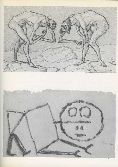
Paul Klee, “Encounter of two men, each believing the other to be of higher status,” (etching, 1903) and “Ein Oberkriecher” (“A Super Sychopant”), 1939.

The point is of course that I sought out these traits that were considered feminine in works by male artists because there were no female artists then readily available to serve as models, something I only became aware of when I finally began to see more works by women artists (Nancy Graves and Eleanor Antin being the first women artists I remember being given a Projects show at MoMA, in 1971 and 1973 respectively, and Frida Kalho and Florine Stettheimer being particularly important models) and, still later, when I read feminist analyses of the gendered development of the discipline of art history itself, as in Rozsika Parker and Griselda Pollock’s Old Mistresses: Women, Art, and Ideology.

I pored over Klee’s highly linear, darkly gnarled early figuration, imitated and copied as best I could the delicate and sometimes unusual surfaces of his small abstractions and abstracted still lifes, in general thinking to myself, well, these are works that reflect my own formal and narrative desires for art at that moment, and they are in the Museum of Modern Art, so there is some official permission there, within the oppressive patriarchal rules about what was or wasn’t art pervasive even in the 1960s.

I loved Klee, early Ernst, and Magritte to death and then turned away from them once I had gotten what I had needed to help me through the pass.

*

AT TATE MODERN by T. J. Clark

from London Review of Books, Vol. 36 No. 1 · 9 January 2014 pages 12-13: here is Clark’s full text

There was a time within living memory when a survey of Klee’s painting like the one at Tate Modern – 17 rooms, 130 works – would have been the event of the season (it’s on until 9 March). I remember even scoffing a little in the 1960s at London’s appetite for shows of the ‘tragic comedian’, antidote to Picasso’s vehemence or Matisse’s fundamental coldness. For good or ill, that moment is past. The galleries at Tate are mostly not crowded, and I had the impression that the respectful visitors, bending over the ropes to get a better look at the artist’s small things, found it hard, ultimately, to understand his cast of mind. ‘Klee is like somebody out of an E.T.A. Hoffmann story about the small-town Germany of the 18th century: comfortable, musical, modest and fantastic,’ Clement Greenberg once wrote. Or later in the same essay:

 Klee is not subversive. He is well content to live in a society and culture that he has robbed of all earnestness; in fact, he likes them all the better for that. They become safer, more gemütlich. Far from being a protest against the world as it is, his art is an attempt to make himself more comfortable in it; first he rejects it, then, when it has been rendered harmless by negation, he takes it fondly back. For notice that Klee’s irony is never bitter.

Rendering the world ‘harmless by negation’ is not what we have been led to expect art, especially modern art, to do. And ‘taking it fondly back’ sounds genial to the point of smugness. Matisse is allowed to say, famously, that his art was intended as ‘a comfortable armchair for the tired businessman’. But that is because his art so often invites us not to believe him.

Klee’s whole attitude to art-making is elusive. Occasionally the poems he jotted down in his diary seem to help. There is one written in 1914, probably soon after war had been declared, which begins:

The big animals: despondent

at table: unsated.

But the small cunning flies

scrambling up slopes of bread

inherit Buttertown.

This seems like the script for a Klee picture, and the mood is almost optimistic; but the poem ends four verses later on a different note. The translation is Anselm Hollo’s:

 The moon

in the railway station: one of the many

lights in the forest; a drop

in the mountain’s beard:

that it doesn’t trickle!

that it is not pierced by the cactus thorn!

that you

do not sneeze, and

burst

this bladder!

The little pictures in the Tate exhibition often seem to be turning towards us – towards the ‘you’ in the poem – and asking us not to sneeze, not to disturb the Klee moonlight. But the year of the poem is not auspicious, and the poem as a whole, although it does not have any other tactic – any other diction – to put in place of the small flies’ cunning, seems aware of what smallness and cleverness are up against in the early 20th century. ‘Man-Animal:/Clock of Blood’, reads the two-line stanza preceding the last one. Klee’s paintings almost always have some such ominousness in the background.
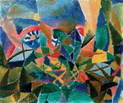
Paul Klee, “Flower Bed,” 1913

There was, we know, far worse to come. On 1 February 1933, two days after the swearing-in of Hitler’s coalition government, the Nazi paper Die Rote Erde carried a full-page article under the headline ‘Art Swamp in Western Germany’. The target was Jewish domination over the Düsseldorf Academy, which had been clinched, so the writer believed, by Klee’s appointment as professor two years before:

And then the great Klee makes his entrance, already famous as a teacher of the Bauhaus at Dessau. He tells everyone that he has pure Arabic blood [apparently Klee had let slip that his mother’s family may have come originally from North Africa], but is a typical Galician Jew. He paints ever more madly, he bluffs and bewilders [er blufft und verblüfft], his students are gaping with wide-open eyes and mouths, a new, unheard-of art makes its entrance in the Rhineland.

Klee himself was catching up fast at the time on the varieties of tyranny. He wrote to his wife, Lily, on 9 February: ‘I am reading (in Mommsen) about Caesar, after having read about Hannibal, and at the same time Stendhal’s Napoleon. Have to be a little while in the company of these kinds of geniuses. Pleasing to note that there are still other formats besides Hitler.’ Pleasing – though not for long. Klee and Lily made a break for Switzerland in December.

‘Bluffs and bewilders’ is the phrase, in the rooms at Tate, that will never entirely go away. It is very hard for us, I have been suggesting, to conjure back the feeling of the circumstances in which, for much of the 20th century, modern art got made. ‘Art Swamp in Western Germany’ may be of use. But even when we have caught a whiff of the savagery, venom and relentlessness that could dog a modernist’s footsteps in Klee’s lifetime, it still needs an immense leap of the imagination if we are to put ourselves in Klee’s shoes – to understand, and maybe to sympathise with, the little creatures scrambling in his labyrinths. Too many adjectives ending in ‘-ical’ – whimsical, mystical, magical, metaphysical – suggest themselves in front of his paintings, and seem to come up as excuses. Maybe because one senses that the ‘-ical’ that matters most to modern art – the physical, the here and now of the painted flat rectangle – is so hard for Klee to hold on to.
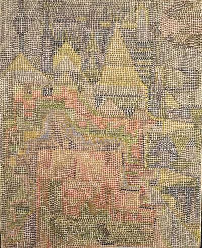
 

Paul Klee, “Castle Garden,” 1933

He knew it was. An artist as gifted and intelligent as Klee was must surely have looked back at his first efforts to be a cubist – to spread forms out additively in a rough geometric grid, to stay close to the surface, to have everything in a painting be solid and resistant – and have seen early on how turgid they were, how academic. (An artist’s ability to come to terms with cubism was, for Klee’s generation, the acid test. Klee’s struggle with the style in 1913 is in contrast to Schwitters’s or Miro’s or Mondrian’s, for whom the new idiom is immediately a liberation.) And Klee’s version of cubism was academic – paintings in the show like Plants in the Mountains and Flower Bed are fair examples – because cubist solidity was so remote from his native perceptual habits. It did not take him long to realise that if his art was to flourish he had to work with his very lack of certainty about where anything was in the world and how intimate with objects a painting ought to claim to be. The big animals would sit up at the cubist table; he’d find another way to Buttertown. The mottled, blotted, bending, backlit fields of colour he soon perfected, and the feeling of the surface in a picture (and space in the world) as essentially penetrable – always about to open or dissolve – were his true sensibility discovering its means.
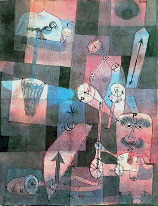
Paul Klee, ‘Analyse verschiedener Perversitäten,’ 1922

Cubism remained a matrix. Klee realised that others had bent it to their purposes: Mondrian’s sensibility, after all, was as remote from Picasso’s as Klee’s own. In and around 1923 Klee found a way to make even the tight cubist grid do the work he wanted – by inserting enough brighter and lighter squares into the chequerboard, each of them beckoning the eye through the foreground into depth, so that the surface came to look as if it were a kind of transparency ‘really’ hung across a glimpsed infinity on the other side. Once he had the basic idea he often returned to it, varying the size of the squares, the regularity of the grid, the translucency of the veil. The series of glittering watercolours and oils done in 1931 and 1932, using stippled dots or tiny oilpaint tesserae – paintings like Castle Garden or Semi-Circle with Angular Features – strikes me as the high point of this kind of space-making. The Whole Is Dimming (Das Ganze Dämmernd), reads the title of one of them, summing up the vision.
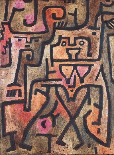
Paul Klee, ‘Forest Witches,’ 1938

The dimming whole is fragile. Whimsy and weakness are deliberately close much of the time in Klee – because the alternative, in the world of Die Rote Erde, is an undimmable grasp of totality. This is the worldview his art wished to refute.

It is not surprising that in the high age of modernism an art of Klee’s kind was written about superbly. Painting for him was intertwined with language. The rebus and hieroglyph were close. Titles regularly half-enter Klee’s picture space, inked in neatly along the bottom edge, and beautiful in themselves. Word and image are out to seduce us; and yet the best criticism of Klee has been not quite willing to fall under his spell. Greenberg was clearly out to resist. The first version of his great Klee essay appeared in Partisan Review in 1941 – a kind of obituary, written in dark times. The second, published nine years later, from which I have quoted, is crafted with extraordinary tact, but nonetheless seems to be trying most of the time to ‘place’ its object without condescending to him. Compare the inexorable Marxist Otto Karl Werckmeister. He spent long years, in the 1970s and 1980s, pursuing Klee down the alleys of compromise and equivocation that accompany the career of art in our time, and gave us our clearest – and in the end, most compassionate – picture of Klee face to face with war and revolution. We all go to Werckmeister – I do just as much as the writers in the Tate catalogue – for those moments at which, in a letter or scribbled sketch, the Man-Animals come crashing through the Castle Garden walls.

I am not sure the present survey, serious and exhaustive as it is, brings us close enough to the Klee (and the century) these writers are concerned with. The choice of paintings at Tate leans heavily on that made by Klee himself – the works he selected for key shows in Germany and Switzerland between the wars. This has its interest, but in practice I feel that it leads to a muffling and flattening of his art’s experimental flavour. There is a sameness and caution to the canvases displayed, almost at times a kind of stodginess. The rooms have too many ‘exhibition items’ and not enough failures, sidetracks, dashed-off drawings, whimsy tilting towards sweetness or nastiness – which were regularly Klee’s ways of trying to escape from his own good taste. Analyse verschiedener Perversitäten, to quote a nervous title from 1922. Klee’s selections (as with anyone’s) have not always stood the test of time. The clusters of works one comes across in collections put together more recently, by single opinionated connoisseurs – I remember a dazzling room at the Sammlung Rosengart in Lucerne – often seem to me to serve the artist better. I missed Berlin’s incomparable A Child’s Play, and MoMA’s Around the Fish, and stark paintings and pastels from towards the end of Klee’s life: Double, Angel of Death, The Last Still Life.

But there are great paintings here. Forest Witches (Wald-Hexen), from 1938, is one of a group of works done in exile where the world left behind, in all its cruel earnestness, is, maybe regretfully, faced head-on. Erd-Hexen from the same year, slightly smaller, moves closer still to the Nazis’ own Brothers Grimm language. Bewitched-Petrified (Verhext-Versteinert), done in 1934, might even be imagining, or hoping for, a Nazism frozen in its mythopoeic tracks. It will continue to be a question, sadly, whether singing fascists their own song in this way ever budged anything (real or ideological) an inch. But Wald-Hexen is a strong work, and makes Klee’s overall attitude to art more comprehensible. The balance he spent a lifetime looking for in his colour and touch, between eerie fragility and just enough decisiveness – insect lightness contending with a half-self-mocking monumentality – was never struck better.

T.J. Clark

****

From what I can tell, not having seen this particular retrospective exhibition, T.J. Clark does not find among much of Klee’s work that is included in this exhibition a contemporary hook or key back to the view of modernism that he represented. It seems that, with the exception of the bolder forms in Klee’s last works done in the immediate shadow of World War II, he agrees with Greenberg, who after all was engaged along with other figures in the New York School in a resituating of modernism in an American Sublime which feminized the sensuality and whimsy of European art, except for the major figures of Picasso and Matisse, and even then. The late works are in fact quite different and, again speaking personally, renewed my interest in Klee’s work,

*

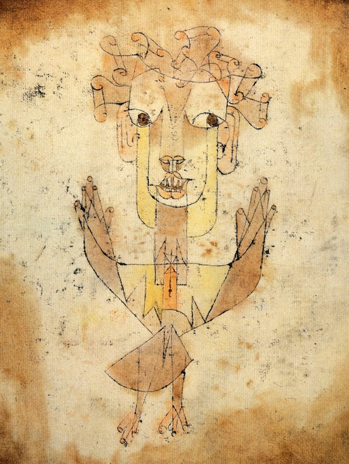
I looked in Clark’s review for some mention of Klee’s 1920 dry point etching Angelus Novus, which is described in Walter Benjamin’s noted 1940 essay “Theses on the Philosophy of History”:

IX

My wing is ready to fly

I would rather turn back

For had I stayed mortal time

I would have had little luck.

– Gerhard Scholem, “Angelic Greetings”

There is a painting by Klee called Angelus Novus. An angel is depicted there who looks as though he were about to distance himself from something which he is staring at. His eyes are opened wide, his mouth stands open and his wings are outstretched. The Angel of History must look just so. His face is turned towards the past. Where we see the appearance of a chain of events, he sees one single catastrophe, which unceasingly piles rubble on top of rubble and hurls it before his feet. He would like to pause for a moment so fair [verweilen: a reference to Goethe’s Faust], to awaken the dead and to piece together what has been smashed. But a storm is blowing from Paradise, it has caught itself up in his wings and is so strong that the Angel can no longer close them. The storm drives him irresistibly into the future, to which his back is turned, while the rubble-heap before him grows sky-high. That which we call progress, is this storm.

It would be interesting to know what Clark’s present thoughts are about this particular Klee work, which would seem to be part of the lost condition of modernism to which Clark says the current exhibition at the Tate does not give us access.
*

I wrote the essay “Mr. Klee Goes to Washington” in 1997 about contradictory cultural developments at the time, when the ripple effects of the culture wars in the 1980s were still felt in institutional censorship of transgressive art and resulting self-censorship by artists of provocative content, at the same time as artists tried to place such content in popular media–for example in 1990 Marilyn Minter bought a 30 second spot on Late Night with David Letterman for her video work “100 Food Porn”–and to place themselves within the celebrity /notoriety culture of antagonistically organized media platforms such as Politically Incorrect with Bill Maher, a comedy show which ran on the Comedy Network from 1993 to 2002: I wrote it after performance artist Karen Finley appeared on the show and I tried to imagine how Paul Klee would have fared in that situation.

Here is my 1997 text, which appeared in New Observations #116:

MR. KLEE GOES TO WASHINGTON

Artists today struggle to work and to survive within an atmosphere permeated by an ongoing and steadily increasing pressure to abandon any type of marginal art practice –– a pressure all the more daunting when, for most, if not, it could be argued, for all artists, some form of marginality, whether economic or cultural, is a persistent condition. The artist who is not represented by a gallery may feel marginal in relation to the artist who exhibits regularly; the artist with a respectable local career may feel marginal in relation to artists represented in international exhibitions, and they, in turn, to the few artists receiving consistent art world wide attention for a number of years. All of these may feel marginal in relation to TV, pop music, and sports stars –– only a relative few want to be like Jasper, but doesn’t “everyone want to be like Mike”? And even such celebrity figures must acknowledge cultural and historical marginality in relation to Bill Gates (beyond that point I won’t speculate!).

The pressure to abandon marginal practice is irrational in the sense that it is not clear to what one should conform, nor that it will help even if you figure it out, because, while success is based on work’s current use value to contemporary discourse, the work must be, in some sense, genuine. Nevertheless, it seeps into the studio, even poisoning the artist’s relationship to her work, like anger at a beloved child who is flunking out of school.

The pressure comes from widely disparate segments of society as a whole and of the cultural world. The destruction of the NEA is only the most visible symptom of mainstream demonizations of what artists do. The control of cultural outlets, from publishing houses to cable TV networks, by mass entertainment conglomerates threatens to police content for purely mass market value. These culture monopolies are all the more dangerous because, unless the consumer is constantly tracking company ownership, sameness and safety of product may seem like cultural fact rather than corporate strategy. Curiously, it seems that it is only the language of the product (literally, in its degree of rawness; aesthetically, in terms of its discursive strategies; situationally, in its predetermined space of “high art” or mass entertainment) rather than its subject matter that determines marginality. For example, successful network TV programs such as Seinfeld or E.R. –– both strongly supported by ratings and advertisers –– often deal with controversial subjects such as masturbation, homosexuality, rape, or AIDS that would be condemned as unsuitable subjects for government funding if mediated by the codes of the art world.

While the consequences of these developments may be dire for individual artists and small artist–run organizations, more insidious to continued art practice are pressures coming from within the art world.

On the one hand, especially since the 1980 election of Ronald Reagan, the government has seen artists as easily dismissible yet dangerous subversives. On the other hand, during the same historical period, postmodernist art theory targeted certain types of artists’ roles as well as certain types of art practice. For example, the romantic image of the artist as alienated rebel –– a familiar and even comforting role for artists compelled to ascribe meaning to their struggle for attention and economic survival –– was unveiled by Marxist–inspired criticism as a complicit or self–deluded pawn and lackey of the bourgeoisie ( As, for example, in Benjamin Buchloh’s analysis of clown imagery in works by early twentieth–century vanguard artists such as Picasso and Beckman, in his essay, “Figures of Authority, Ciphers of Regression,” October 16 (spring 1981): 39–68) . At the same time, critiques of the auratic, hand–touched, unique art object contained an implicit condemnation of private art practice so that the refuge of the studio came to represent cultural escapism rather than a potentially fruitful escape from a market–driven art world.

Further, from the eighties into the nineties, the predominant prescription for a way out of this undialectical position was to recognize one’s role as just another cultural worker within an ideological framework and to attempt the unmasking and subversion of this frame by mimicry of its forms and tropes through appropriation of mass media images and technologies of representation. In the ensuing effort to mimic mass commodity culture, the artist has been drawn down a path of increasingly excessive theatricality and romancing of the abject. Now the cycle is complete and the artist again is self–imaged as a clown within bourgeois culture and proud of it (witness recent fun house installations by Damien Hirst, Paul McCarthy, and the Chapman brothers).

This summer I heard Karen Finley speak on an artists’ panel. She announced that she wants artists to be celebrities just like actors or sports stars. In that pursuit, she had appeared on Bill Maher’s Politically Incorrect but, she admitted, had been frustrated in her efforts to state her point of view. A few weeks later, I channel surfed my insomniac’s way into a rerun of that particular show. Finley, who at her best is a manic and occasionally brilliant stage presence, and at her worst is at least self–indulgently theatrical in a way that you might think would suit the requirements of the Christians v. the lions atmosphere of Maher’s show, seemed tamed by an effort to present herself in a mainstream way –– she was dressed in a relatively conservative black suit and had clearly been made up for TV –– and she was indeed unable to successfully counter Maher’s and some of the other guests’ flat out condemnations of government funding of avant–garde art. She couldn’t condense her views or speak fast enough, she was too nervous to be funny, and she didn’t fight dirty. Given the opportunity to convert notoriety into celebrity by performatively enacting transgressive art practice on network television, she lost her nerve and behaved herself. Or, perhaps, despite herself, that part of her persona that speaks art language and contains real criticality of social injustice could not function in the world of celebrity. Marginality turned out not to be a choice, it is not merely instrumental, not a condition one can shed at will, but a direct outgrowth of moral and aesthetic beliefs fundamentally (even when unintentionally) at odds with the mainstream.

As Finley spoke, I considered what kinds of art works would correlate to success in a superficial and sensationalist forum. It seemed that, as ever, quietude and subtlety were doomed by the requirements of a sound bite culture. I began to imagine various artists of the past appearing on Politically Incorrect: Picasso might have managed it, but can you picture Paul Klee on such a show? Or what kind of pictures he’d have to be making to be able to hold his own in such an arena?

“So, Paul, the Kennedy men, rapists or abused children?” “Vel, hem, Herr Maher, I tzink …”

Note: Significantly, in 1997 my spell–check program recognized Picasso as a word, but stopped at Klee as an error, “not found,” pointing to the way that Picasso is a trademark product: he is the prime exemplar of the commodifiable, Protean rebel, artist persona, popularized in fiction and the public imagination, whereas Klee is, well, just an artist.

*

Today I would surely cite different celebrities as examples–at this point Michael Jordan is a remote figure in relation to Beyoncé–and numerous artists and even art critics have successfully entered a more spectacular realm, though they still don’t always fare as well as their artworks when they personally appear in the media spotlight, they are still more the ineffective Wizard of Oz behind the curtain than OZ the great and powerful–note how off-key Jeff Koons can seem when interviewed on TV, in photographs where he is posed with his works or his family, or even quoted in print.

Some of Paul Klee’s work may be or at least appear now as a bit dated and fey in drawing style. Our ability to understand his work is affected by the amount of works done under his influence, which often fall under the sign of what I’ve called “Trite Tropes, Clichés, or the Persistence of Styles.” In that essay I wrote of one persistent style cliché:

One persistent style that emerges from the continued desire since the advent of the monochromatic flat abstract painting to have your cake and eat it by placing an image of some sort on a flat background is the pictographic painting, popularized by artists such as Stephanie Brody Lederman in the 1970s and more recently artists such as Squeak Carnwath. In works of this style type, the background is usually almost flat: the diagrams, pictograms, (as well as words) are placed on a ground that may be geometrically framed but also painted in an atmospheric, variegated painterly or textural manner. These works owe a great debt to Paul Klee’s introduction of a pictographic vocabulary into cubistically organized flat space. His reference to the childlike and the “primitive” in relation to previous types of representation represents a historically situated philosophical intervention within an aesthetic imaging system, it is not yet a habit without thought. For some reason Klee can get away with it — I am tempted to add, or can he? I ask that mischievous question only because the proliferation of such pictographic paintings throws a poor reflection back onto Klee that only can be eliminated by looking at actual works by Klee, which usually retain their formal rigor and the charm of the lyrical and whimsical pictorial elements.

In other words I too may find it hard to see in the same way as before some of the works that once gave me the permission to be a certain kind of artist. But that one would feel now that Klee’s “whole attitude to art-making is elusive,” according to Clark, may speak as much to our culture of spectacular narcissism and self-commodification of any kind of Otherness as to any weakness in Klee’s oeuvre. When Klee’s work and its presence at MoMA gave me courage, I never thought of his work as being elusive, but, rather, allusive so that it suggested style, methodology, and approach to form or narrative or fantasy for my own explorations. If I can’t always get back to the viewpoint I had when I was 17 it is because I am as much part of 24/7 spectacle culture as anyone else, and must work hard to slow down and look at the delicate and the allusive.
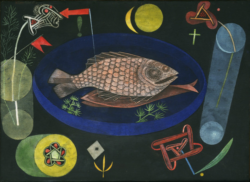
Paul Klee, Around the Fish, 1926. Oil and tempera on canvas mounted on cardboard, 18 3/8 x 25 1/8″, Collection of the Museum of Modern Art.

FacebooktwittermailFacebooktwittermail