Three exhibitions currently on view in New York City–Stuart Davis: In Full Swing, Carmen Herrera: Lines of Sight, and the Hilma af Klint exhibition that is secreted within The Keeper exhibition at the New Museum–provide object lessons on the necessity of seeing “in person” artworks that in reproduction appear flat and graphic in a way that stays fixed at the level of an image with no scale so that when looking at the images most people, particularly those brought up entirely within the regime of Instagram would not see why they should see the works and, further, might not be able to see the work when in front of it because many people now see exclusively through the lens of their smart phone.
The Stuart Davis show and the Hilma af Klint show close this weekend. Sunday September 25th is the last day of each show. I hope that my readers in New York City will make a point of seeing both shows. It would be a shame to miss them.
As usual and in the case of all three exhibitions I will leave it to museum wall text, Wikipedia, and other reviewers to go into the historical background of the artist, and will focus on my experience in front of some of the key works in the exhibitions, beginning with the shows at the Whitney.
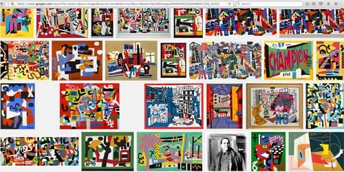
Stuart Davis: In Full Swing is an exuberant and joyful survey of the work of an original American modernist artist whose work demonstrated how an artist can be of his time and yet be original and predictive, anticipatory of works that followed him. I was immediately struck by how different the works are in person than in reproduction, where they appear so flatly graphic. This flatness may diminish their interest for people who see them in pictures as representatives of a style, or for people (like me) who see the works as part of a family of artists from Fernand Leger to Raoul Dufy, Miro and Matisse to Lichtenstein and Warhol–these particular associations actually might not be a positive recommendation because of over-familiarity or dislike in some cases. A Google image search of his work may in fact appear noisy to the point of being nauseating, an impression erased when in the presence of the works and also by examining the works close up so that you can focus on details, each work offering paintings within paintings, and on the way they are painted.
When you see them “in person” their physicality and painterliness as well as their scale creates a different and vivid impression, often more intimate than you might imagine, in some of the early works, such as the Lucky Strike paintings from the early 1920s, which have a tremendous sense of delicacy and intimacy in the details of what seem like works about advertising and commercial signage.
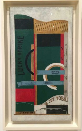
If such early works have a precisionist care in how they are painted that recalls early Renaissance painters like Pietro Lorenzetti or Domenico Veneziano, as much as they do product advertisements and packaging design from the 1920s, later works offer a bolder more sculptural approach, and suggests a whole other range of range of artists who followed Davis, including Elizabeth Murray and Al Held.
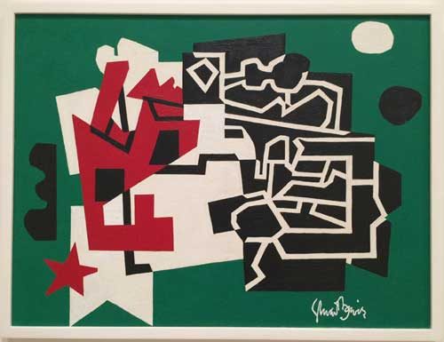
Among these are Memo and Memo#2 from 1956 in which the color is pared down to red, green, white and black, each with a quadrant of the painting a diagrammatic drawing in black and white, in contrast to more brightly hued and often more representational or symbolic areas, with fragments of objects and language on the bottom left of the work. While responding to the boldness, simplicity, and clarity of the composition of these Memo paintings, I was struck by a relation that they suggested to black and white works by Myron Stout such as Number 3, 1954 from 1954 (in the collection of MoMA). Stout’s work is incomprehensible or, rather, radically misunderstood if you see it in reproduction only, since its intensity and action comes from the indecision betrayed in the pentimenti at the edges, the borderlines between black “ground” and white “figure,” a borderline that Stout in some cases may have spent a decade battling over.
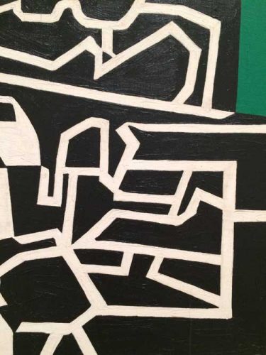
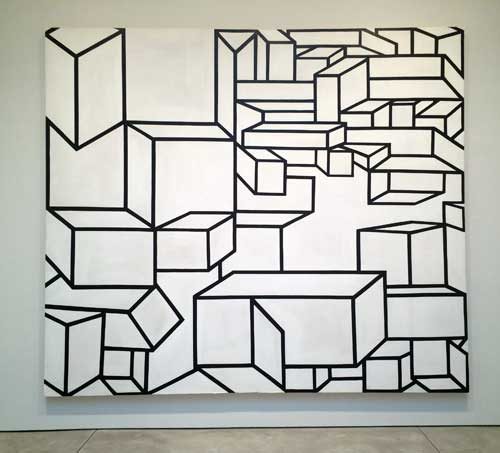
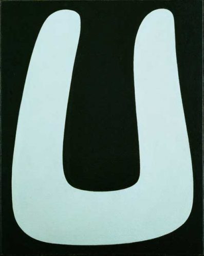
Davis’ paintings betray no such hesitancy yet he did use masking tape to determine shape and placement before deciding on the final configuration and composition. This process is most poignantly evident in his final work, left “unfinished” the night he died. This painting would have made a perfect companion to the unfinished work by Mondrian included in the Met’s recent excellent exhibition Unfinished: Thoughts Left Visible. It was exciting and incredibly contemporary to see the tape and the push pin marks left on and in the surface where Mondrian had perhaps temporarily placed bits of colored paper. To see traces of Mondrian’s process again emphasized the handmade quality of works whose familiarity as images is so ubiquitous that fashion accessories and regularly copied from them.
In Davis’ painting, Fin, dried out strips of tan masking tape create a grid pattern over one section of the work while lines of black tape are used to rehearse placement of black lines to be painted onto the composition. The painting surface is very dry and often sketchy. The medium is casein rather than oil, a dry surfaced medium which it is possible that Davis used for underpainting, to be covered by oil at a later stage of the work. The surface and the bright colors make this look like the first layer for a 1940s movie poster, yet it is completely finished, as Davis perhaps intuited when he wrote the word “fin,” end, which he had just seen on TV at the end of a French movie–he died later that same night. The work is vibrant both in color and in composition, a restless vivacity, and a tremendous sense of optimism.
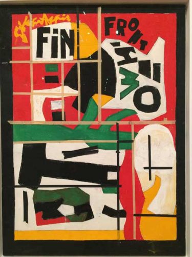
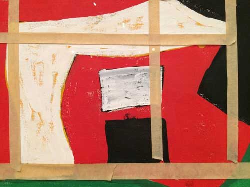
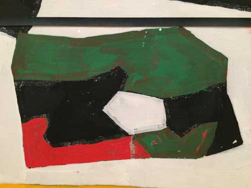
At the bottom of the paining is a green, red, black and white parallelogram that reads like the future of painting: ten years later the character and form of this detail would reappear freshly conceived in works by artist such as David Reed, Mary Heilmann, and Elizabeth Murray, and other artists from the movement that is the focus of the exhibition catalogue High Times, Hard Times: New York Painting 1967-1975. You see in its the beginning of Murray’s work, or Thomas Nozkowski‘s, and the abstractions–paintings and collages–of Richard Tuttle.
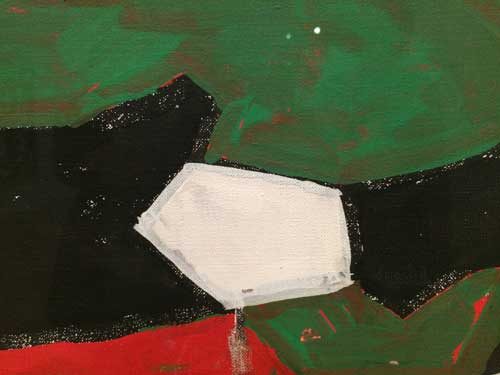
In my notebook at the exhibition I wrote of this last work, “one of the most inspiring paintings I have seen in some time.” While it may seem that I am fetishizing incidents of painterliness rather than focusing on a dryer analysis of the role in which Davis is fixed as a somewhat maverick American modernist addressing commodity culture and language, I am responding to the aliveness of these incidents within the painting and to the expanding family of painters that individually and together give me the sense of optimism about artmaking that is essential to its continued practice.
*
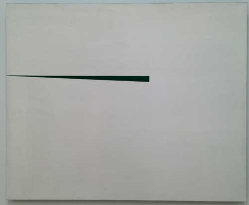
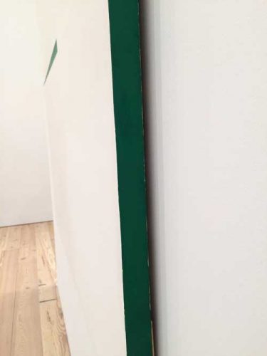
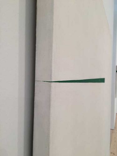
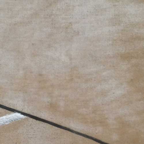
I have in recent months expressed exasperation at the recent phenomenon in the artworld of finally giving old, very old women artists–100 is the new 70–“their due,” with the current exhibition of Carmen Herrera’s work a prime example. I don’t think I am alone in not having heard of Herrera’s work until her work became an instance of this phenomenon and, seeing her work in reproduction with no previous experience of it, the flatness of the work combined with the formal reductiveness did not appeal to me. However “The Blanco Y Verde Series, 1959-1971, a group of nine white and green paintings, handsomely installed in the central room of the show, offers yet another proof of the necessity of seeing in person abstract work which may appear so flat and graphic in reproduction that it does not convey the need to see the actual work. This is one of the works from the series, as reproduced on the museums website. Here are two pictures of it I took, one close up.
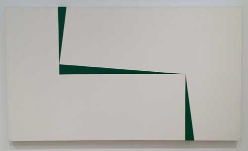
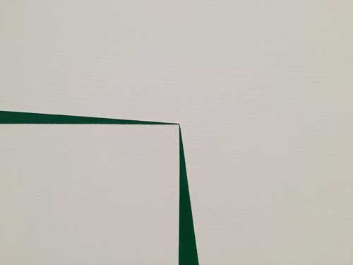
Herrera’s work is indeed extremely flat and for the most part without surface incident that would betray the trace of a hand. Only if, out of professional curiosity, you look very closely you can see in rare instances some traces of how the paint was applied. Yet in some of the work, notably the Blanco Y Verde series, a group of nine large easel size canvases with flat white surfaces crossed by delicate green darts or shards meeting at sharp finally balanced points of tension, there is a weight that comes from the totality of the surface of each work as well as the group of paintings as a sculptural installation. Something happens at the sharp points where green and white intersect and abut that interacts with the viewer’s scale, and the surfaces’ very dryness creates a kind of blank haze that the thin green darts punctuate. As is so often the case with paintings that involve a flatly applied geometric design, reproduction leaves out the objectness of the canvas, something that Herrara has carefully considered: the paintings are not framed or edged with wood as was the convention in that time period, and one painting has one side or edge of the stretcher painted green (the other edges are white).
*
The question of objectness, presence, and facticity is also relevant to the rare and amazing installation of paintings by Swedish early 20th century artist Hilma af Klint now on view as part of The Keeper exhibition. Sunday September 25th is the last day. RUN to see it if you are in New York, otherwise plan a trip to the Moderna Museet in Sweden.
A friend, artist but not painter, warned me that I might be disappointed by Hilma af Klint’s paintings because they were not very well painted. Having seen her work before I wasn’t too concerned. But upon walking into the exhibition my friend’s response was intriguing and important: not well painted in relation to what? according to what standard?
Klint’s surfaces are generally very dry and mostly flat though each painting may have large or small areas that are brushy or have a clearly demarcated section of impasto. I recommend walking around and around the installation, trying to not look at the sculptures by Carol Bove and others that are for some unfathomable reason plopped in front of the continuous row of paintings that are hung on three walls of the fourth floor. Perfectly fine sculptures in a range of materials from steel to plastic, they nevertheless seem placed there to deliberately test the viewer’s ability to not look at them so that they can concentrate on the paintings they obscure. Luckily the paintings sing out and overpower any such artworld interference.
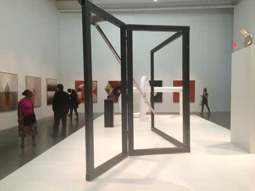
My first round began to the right of the elevators. I stopped at Swann#18, a series of uneven concentric circle of deep black, red, blue and yellow hover on a red earth ground, brushy and uneven. Three dart like shapes pierce through the ovum of the black circle, and while everything is very precise, the edges of the forms and lines are uneven, but the brushy patchy earth red ground and the slight imperfections of the lines don’t give an impression of weakness or failure or lack of interest on the part of the artist. Each surface, each transparency or opacity is considered and is part of the meaning of the work. This is not decorative or about painterliness or figure/ground, they are “about” a space and a theory which is real to her and it then operates effectively to create space. At the same time the contrast between the dense blackness and the light filled thin red ground serves to give the work a very contemporary feeling. In fact it blows out of the water similar works that came after in the conventional timeline of modernism. Look at Swann#18 and think about Kenneth Noland. No difference in surface or scale. [Trigger warning, his website has music, it is kind of hilarious and fun.]
These works were done between 1914-1915. Think of the abstractions being done around Europe at that time, many of them small and even clumsy and half-hearted or half-assed in their approach to pure abstraction–I’m talking about you Robert Delaunay–and I am bringing this up because when MoMA organized their 2012 survey exhibition, Inventing Abstraction: 1910-1925, they included Delaunay, but not Klint, of which exclusion more later.
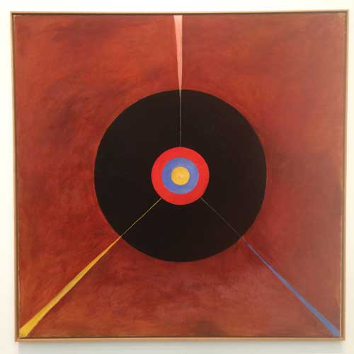
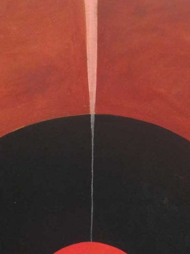
I went round and round the room, focusing on how the works were painted, looking at the whole work, at the room, slowing down my tour, and shifting from a clockwise to a counterclockwise direction so that as many small details and incidents of painting as possible would spring into focus. I looked closely at the surfaces, taking great joy out the myriad shifts of application and scale within the work while enjoying their size: scale plays a great role in the work, because the works themselves are large and they address the viewer’s body as an equal, they have a declarative confidence.
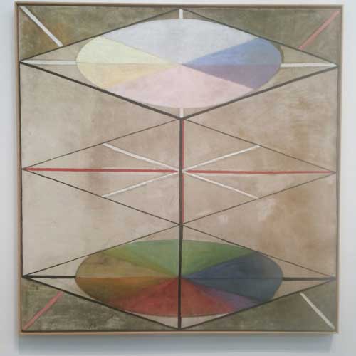
But within the larger field, marks and grounds are painted as needs be, thick and thin, delicate and contingent, abstract and narrative. This makes them so much fun, they are not dour at all, and they are not constrained by Greenbergian rules eliminating the incidental representational vignette or the diagram which flows with the flatness of the painting field while interrupting it and creating some illusion of depth. They do not suffer from dogmatism.
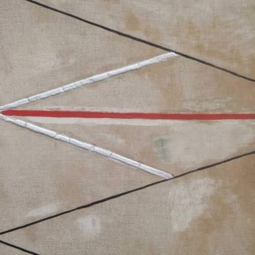
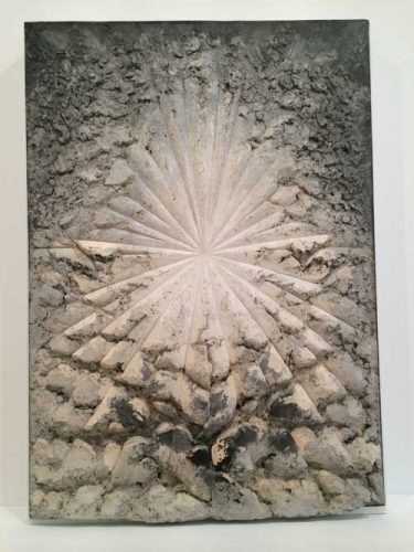
There is a relationship to radiance and to the impact of dry white impasto that af Klint shares with her contemporary Florrine Stettheimer who followed a similar path from traditional academic training and familiarity with a contemporary artistic milieu and an unconventional deeply personal path–Steittheimer is the queen of white and pale pink impasto, creating an uncanny sense of ethereal materiality–as well as with later abstract artists whose work was both of and beyond their time, such as Jay deFeo, whose The Rose is sister to Hilma af Klint’s radiant white orbs.
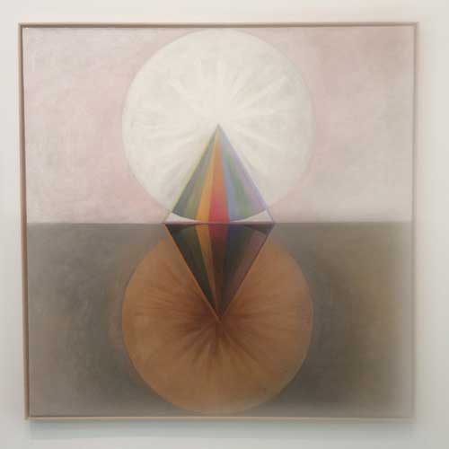
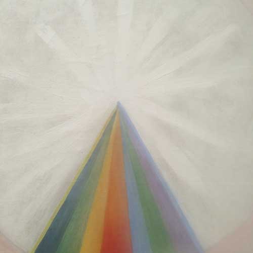
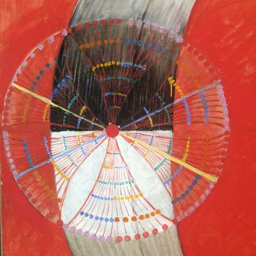
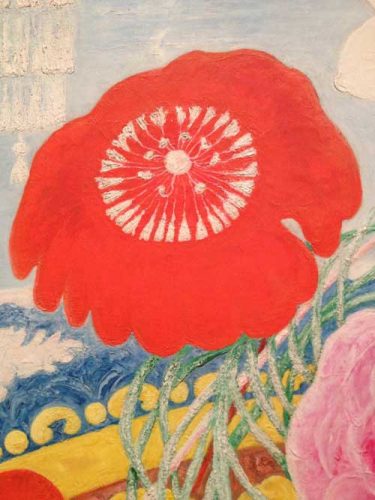
I ran into many friends while at the exhibition and we all seemed to be in a state of joyfulness. Finally I ran into a friend who had her two and half year old daughter in her stroller. Unaccountably instead of napping as planned, the child became electrified by the atmosphere in the room. We took a milk and snacks break downstairs and then returned for one more tour. The break, the false departure, and the temporary return to the presence of the works allowed me to feel more strongly than ever the relationship between the dry surfaces and the relation that the works establish between the ethereal and memory. I took many pictures with my poor little phone camera, but the works’ presence is a necessary ingredient to their further life in my mind.
I thought we would just walk around and around, as in a park, and so the mother might get a bit of a chance to spend some more time with the painting and the child might be soothed by the movement but she sang louder and louder, repeating a sentence that I could not decipher, which was just about the moment when I was able to concentrate on the detail of the origin of these works that most likely caused MoMA to not include her in Inventing Abstraction: 1910-1925, namely that af Klint, although an academically trained and skilled artist in a more conventional representational mode, did these extraordinary works under the influence of spiritual visions–the tour guide at the New Museum said that she painted landscapes during the day, and these glorious abstract paintings at night when perhaps she could communicate with less interference with the otherwordly non-dimensional spirits who dictated her forms to her–that is that, precisely during this key historical period, she claimed to paint as a medium. Like Mondrian, she was interested in Theosophism, but apparently for MoMA and the art historical establishment there was a difference in how Mondrian could be absorbed into the grand narrative of modernist abstraction and how she did. The whiff of the outsider or crazy artist was too much to bear and my own inculcation into the values of high modernism are such that I had been trying to block that aspect of her inspiration until the child sang and I finally read the wall text which included the word “medium.” I decided that the otherwordly force or being directing her painting was a damn good artist that any other modern artist would have wanted on their side, and, anyway,who knows where greatness comes from.
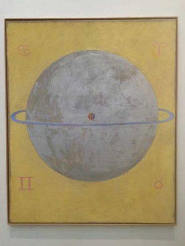
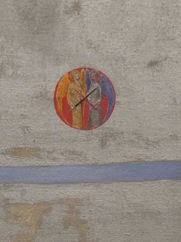
At the center of the central silver sphere of Dove#12 there is a tiny globe within which two angels do battle, black sword and red sword clashing in an X mark at the center of the painting. There is a relationship between the symbolic and the celestial in keeping with a medieval world view, yes, perhaps that doesn’t fit into Alfred Barr Jr.‘s philosophy.
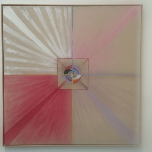
But the uncategorizable is not nevertheless less great, that someone with traditional training having arrived at something so sophisticated with such command of visual language, painterly articulation, and spacial authority is way beyond an outsider artist [casting no criticism on great outsider artists]. She was not by any accounts crazy, just non-conforming. And, wisely, she knew that the category of “101-year old woman artist getting her due,” was not for her should she live. She left instructions that her work should not be exhibited until twenty years after her death, which came in 1944. It has taken another four decades since then for her due to begin to dawn on people, though the doubt and suspicion of Otherness that kept her out of MoMA’s survey of 20th century vanguard abstraction may still linger. But, still, perhaps, according to my view that women artists are trapped between two paradigms, of “still too young” and “not dead enough,” perhaps she is finally dead enough.
Or is she? during the run of this show, which ends tomorrow, you could not find the presence of Hilma af Klint’s work on the Whitney Museum’s website if you ran a search for her name.

Let her have the last word, her heart and her inspired vision of a double helix,
or,
I
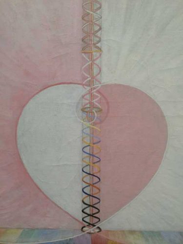
Hilma
**
for more images of and information on Hilma af Klint’s work, here is a good video, from Hilma af Klint: Painting the Unseen, the much more comprehensive exhibition of her work, held at the Serpentine Galleries in London in Spring 2016 (please note that the video will not play in your email program, only on the blog itself viewed on a browser).
