In attempting to capture the impact of one modest artwork, seen in a museum outside a major metropolis, it is first necessary to fight one’s way through the tidal wave of images of art works that circulate daily, on Instagram, Facebook and dozens of major and local websites devoted to art and to the art market. It is overwhelming and impossible to try to come to grips with the sheer volume of works and of images of works, many of which look “good”–at least as images. The fact that many look and may even in actual physical space be “good”–and good here is meant to cover a wide range of possibilities of success, from aesthetically pleasing, formally clever to intelligent, even possibly intellectually challenging, or emotionally charged and weighted–is as disconcerting as the many that are just outright bad, the glittery flotsam seen at fairs, and also the temporal toys and copies, attractive but intellectually and emotionally empty product, what my mother, with the rolling rrs of her rich Eastern European accent, would dismiss with a sniff as “merrrchendise.” This is so partly because aesthetic criteria have gone underground, more a factor of subterranean custom and multiple, group-specific agreements, less the subject of intellectual debate and argument. As an example, this is what the “zombie” in “zombie formalism” is about, the sense that works that at first glance look like mid-twentieth century abstract art, c. 1949-1979, were not arrived at through the aesthetic and existential struggles of the earlier models they resemble but are more emotionally remote, seamless simulacral replicants, merely shifting around signs from those earlier forms of abstract art.
From this phantasmagoric swirl of images, I walk into a room and discover a work, unassuming yet riveting, nearly anonymous in its style and fakture yet unique and uncannily specific.

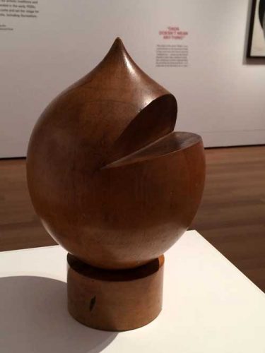
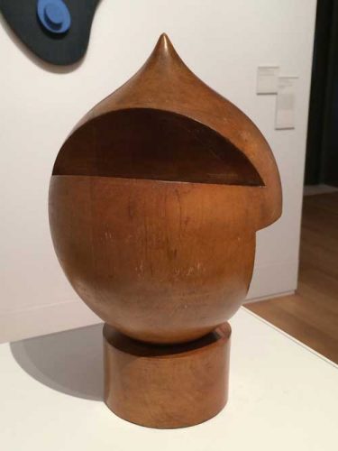
This is an untitled turned wood sculpture by the Swiss-born artist Sophie Taeuber-Arp (1889-1943), included in Everything Is Dada at the Yale University Art Gallery. The exhibition is curated from the Gallery’s collection, notably from the works that were gifts of the Collection Société Anonyme, an art group founded in 1929 by Katherine Dreier, Marcel Duchamp, and Man Ray. Included in the exhibition are works by the most iconic artists of the movement such as Kurt Schwitters, Marcel Duchamp, Man Ray, Max Ernst, Francis Picabia, but also very interesting works by lesser known (or, rather, previously unknown to me or forgotten by me) artists such as Morton Livingston Schamberg, Georges Ribemont-Dessaignes, and John Covert. I came upon Taeuber-Arp’s object in the last room of the exhibition, in the company of works by her husband Jean (Hans) Arp and also a number of works by other women artists from the period including Chef d’oeuvre accordéon, or Accordion Masterpiece, 1921, a bold painting by Suzanne Duchamp that is focused around a silver-leaf oval head-like shape, cut in by collaged elements that relate to aspects of Taeuber-Arp’s work.
Taueber-Arp’s wooden object has a humorous, cartoon-like appearance–a contemporary resemblance may be found to the way the character of the pre-schooler Ike is drawn on South Park, with a slit for a mouth–and, in fact, it is said to be in part based on the peaked cap wearing German puppet-theater character Kasperle, or “Kaspar,” about whom Jean Arp wrote a poem, “Kaspar is Dead” –“oh god our Kaspar is dead/and now there’s no-one to steal away with the burning flag/snap it everyday in the dark cloud’s braided hair.”
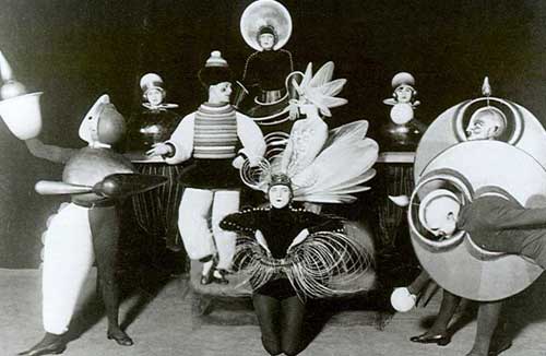
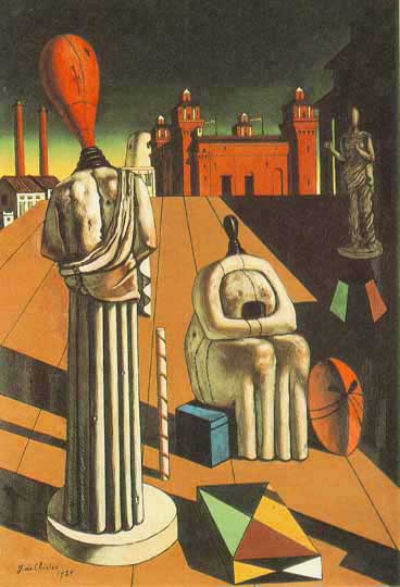
Yet the object has an anonymous aspect to its form, it resembles and I believe it references the shape of nineteenth-century machine tooled hat molds that informed the works of many of the Dada artists who looked to industrial forms and techniques at the same time as they appreciated, in the manner of their contemporary and colleague Walter Benjamin, earlier objects of popular culture and practice from the late 19th century. The use of turned or lathed wood creates a network of connection between early instances of mechanized craft, the colder more mechanized aspects of industrially produced objects in the 20th century, and the Bauhaus interest in linking these two strains together via craft. Other works by Taeuber-Arp also reference machine-tooled mannequins, forms and subjects that appear in works by contemporaries including de Chirico’s The Disquieting Muses (1917) or in dance costumes by fellow Dada artists Oscar Schlemmer.
Taeuber-Arp’s piece raises questions of anonymity versus signature style–a painted wood bas-relief work by her husband that is hung on the wall behind her freestanding piece points to the importance of a signature style in fixing an artist in history: Arp’s plain, flatly colored simple biomorphic forms are instantly recognizable, while Taeuber-Arp’s works are more part of a general stylistic school, with some works similar to works by Annie Albers, others to Oskar Schlemmer, others still to Paul Klee, and so forth, yet all in their way excellently crafted intelligent examples of the genre. I remember being deeply moved by an exhibition of Taeuber-Arp’s work at MoMA in 1981–which according to the catalogue included the Yale turned wood object though I don’t specifically remember seeing it then–in part because it was at the time a very rare almost unique example of an exhibition devoted to a woman artist. I vaguely remember feeling a sense of unfairness, in fact I altered the memory and placed the show in the summer, a fallow time in the museum’s schedule. But that memory was inaccurate and merely symbolized my sense that Taeuber-Arp had been both honored and yet vaguely disrespected. Or perhaps simply I felt the sadness of seeing excellent work by a woman artist who nevertheless did not have a signature style and was not that widely known and and who had died tragically in mid-life. One might here compared her trajectory to that of Sonia Delaunay, a pioneer of abstraction, with a signature style, nevertheless sharing many material interests and formal elements with Taeuber-Arp, and who enjoyed a long, prolific, and successful career that took her so much closer to the feminist art history agenda of the 70s, which then helped maintain her in the mainstream history of twentieth-century modernism.
But the question of anonymity of style is particularly pertinent to a work from the Dada period. In the exhibition there are a number of groupings that seem to address and toy with the viewer’s expectation of uniqueness or signature style. Thus three works in sequence that each appear to be works by Picabia, with the signature appearance of machine tooled forms and text.
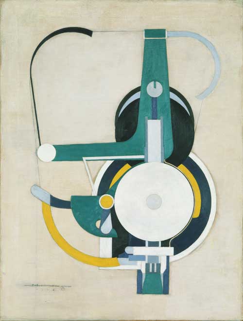
Well, no, perhaps a bit too tame and regular–this is by Painting, formerly Machine, (1916), by Morton Schamberg. So maybe this one is by Picabia,
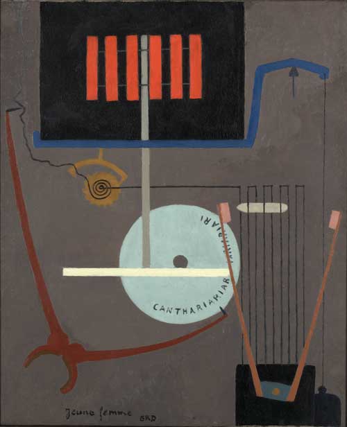
No, this is Young Woman,by Ribemont-Dessainges.
Finally, the sequence of this part of the installation ends with Picabia’s Prostitution Universel, 1916-17.
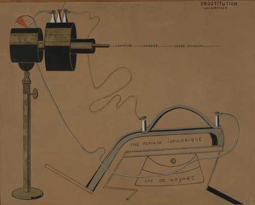
The question of anonymity versus signature style as it is articulated in these works and others in the exhibition is representative of the dual views of technology of that era, where critical awareness of the destructive aspects of modernity and dehumanizing aspects of industrialization in the Post World War I period was matched with a continued fetishization of machine forms and technology innovations.
Returning to Taeuber-Arp’s sculpture: its size and shape are not identical to the functional objects that it recalls and the incisions that Taeuber-Arp has made into the shape serve no discernible human purpose of functionality or representation. Despite its nineteenth-century quaintness, the object has a bit of a science fiction quality to it, a depiction by some being of some being that is not human. The interventions into the form, the cuts at different angles creating completely different identities depending on one’s placement in relation to it, are what send the viewer into orbit around it: it is one of the most totally three dimensional objects I have encountered, because it is not just that it looks interesting from more than one vantage point, but that one is spun around it to try to experience and then re-experience these points of view. Yet, however much you try, you can never find yourself in exactly the same relation to it as you walk around it, so you must go round again.
Having taken the first picture (above) of my first view of the work, I took one other, having moved a few degrees to the east of it. The deeper cut at this longitude alters the cartoon head reference, and the finish of the incised planes of wood appear less golden, their surfaces are rougher as they cut into the grain of the wood.

I decided that I should draw several views from my orbit because I always feel that drawing embeds an aesthetic experience in the body, but my juggling of colored pens and notebook caught the attention of a guard who helpfully brought over one of those ineffectual little pencil stubs that you use to take multiple choice tests.
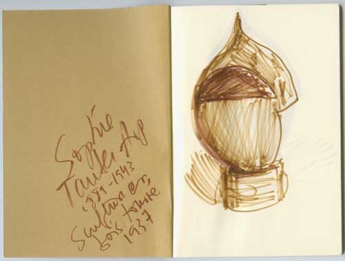
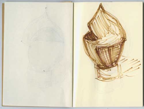
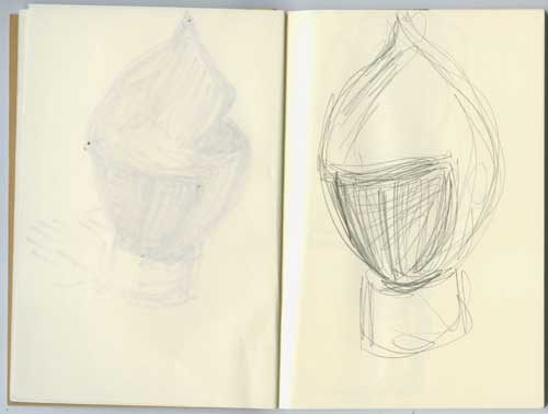
Frustrated in my drawing trajectory, my reluctance at returning to photography seemed to influence my camera which could not return to the correct light but I continued my orbit around the work.
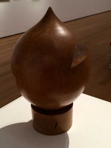
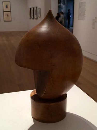
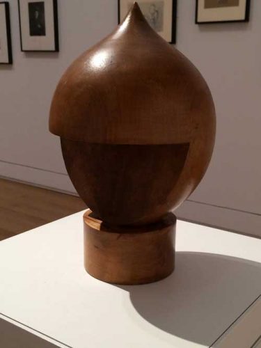
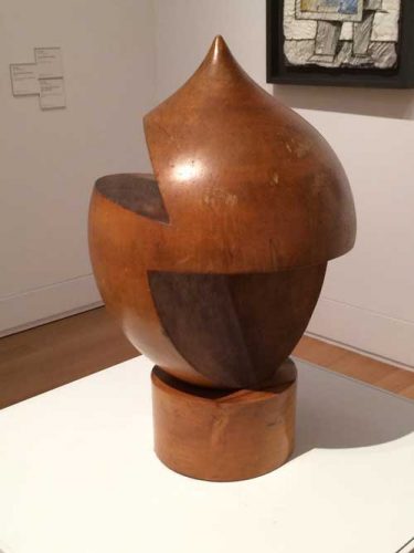
An object that forces another entity into orbit around it has a force of gravity, it has a density of matter and content that can hold its own against the phantasmagoric multiplicity of art objects that swirl around us, it proposes the possibility of an antidote. And that is something to reckon with, even after one must regretfully leave the room.
Now that Kaspar is dead, as Jean Arp concludes his poem, “no-one to teach us monograms in the stairs/his bust will adorn all truly noble firesides but there is/no snuff & comfort for a dead head.”
*
The first post on A Year of Positive Thinking, “Looking for art to love in all the right places,” appeared April 28, 2010. This is a slightly belated anniversary post, after a long hiatus.

