Today the Whitney Museum is ending its 48 years in its Marcel Breuer building on 75th and Madison with a 36 hours marathon. The building was open through the night last night and will close tonight October 19 at 11PM.
I had thought about going at midnight but decided that I had said my goodbyes earlier in the month when I was one of the last people in the New York art world to see the Jeff Koons show.
Perhaps it is an exaggeration to say that every New York artist has a deep relationship of a kind of ownership of the Whitney in that building, which is the only place where most of us knew the Whitney Museum. Perhaps because it felt like family, we often have been angry at it, the Biennials rather like Thanksgiving dinners, something where you’re disappointed by some of the food, you have a lot of resentment about who was there, you feel it’s gone downhill but you’ve learned a lot from it, and you look forward to the next one. There have been so many exhibitions of note in this building and it has been such a quirky idiosyncratic but intimate place to experience art! I have not yet seen the new building, all the way on the west side, huge, filled, we are told, with the requisite large performance spaces for a more spectacular culture, and not near any public transportation, which marks it as another kind of place entirely than the cosmopolitan urban space and the kind of urban life that marked the New York of the modernist era.
On my last visit, ostensibly to see the Jeff Koons show, I also felt I was saying goodbye to the building, even though that is irrational since the building will remain as a space in which contemporary art will be exhibited. The Metropolitan Museum has deep pockets and takes good care of its properties, and also they have a limited multiyear lease only, until 2023, not ownership, but the Met, as much as I dearly love it, also has a tendency to tart things up with little extra luxuries that might be in the wrong taste in Breuer’s austere though warm building, so a lot depends on how much of the building’s interior is landmarked and how much the Met is interested in respecting the building’s interior as a modernist art work. The size and proportion of the rooms, the elegant brut nature of the stone floors and concrete ceilings, the inset lightbulb fixtures, and the relaxed configuration of the small lobby, the quiet of the stairwell, are as much part of the experience as the art seen, and confer dignity to the visitor to the museum. The art’s adaptation to that space, and the fact that the museum was just not that big also contributed to the possibility of an intimate experience, something that is now considered undesirable by most museums because it relies on art and the individual experience of the viewer with the artwork, rather than on a contemporary social network experience writ large and targeted for iPhone documentation rather than contemplation and private thought.
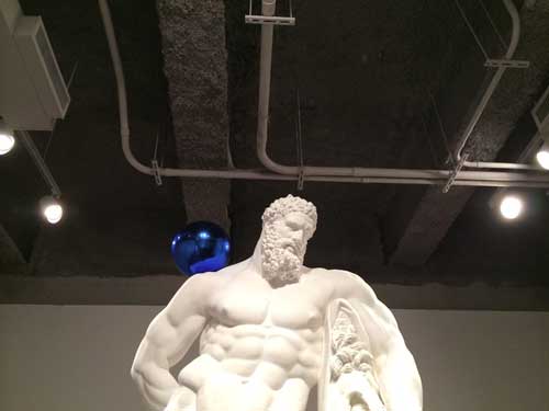
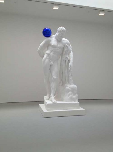
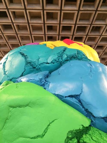
Even the Koons exhibition benefited from its interaction with this space. I had seen the blue balls works at Zwirner a couple of years ago and the chill of the white plaster in the large white space, clean bright white on clean bright white–which I somehow imagine will be the temperature of style of the new Whitney’s interior–was synergistically antipathetic to the human whereas at the Breuer Whitney, the concrete ceiling with its service ducts bare, created a useful counterpoint to the chill of these particular works by Koons, just as the sculptural ceiling of the 4th floor provided a counterpoint of some helpful gravitas to Koons’ Play-Doh sculpture.
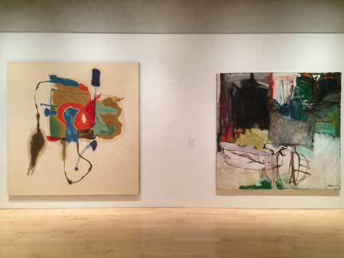
I started my last visit at the top on the 5th floor, where some of the museum’s permanent collection was on view arranged along the theme of gifts to the museum. I was particularly struck and moved by the fortuitous juxtaposition of two large square paintings, one by Helen Frankenthaler, the other by Grace Hartigan. Hartigan has never struck me as the strongest of the three major women artists of the Abstract Expressionist New York School era, the third being Joan Mitchell, and Frankenthaler’s mid-late career works could get very rote and boring, but this was a very strong Frankenthaler and a complex Hartigan which seemed to gain strength from its neighbor’s bold clarity.
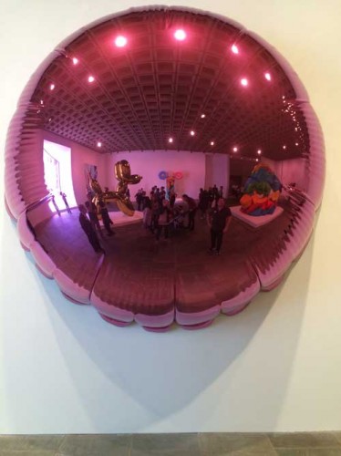
Like everyone else I took lots of pictures of Koons’ shiny objects. I happen to like some of Koons work very much, while despising other works and the show was equally distributed among the ghastly vulgar sexist, and the sublimely mirrored iconic. I particularly enjoyed taking a picture of myself in the purple balloon tondo that reflected the entire room it was exhibited in, including the great asymmetrical window.
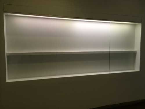
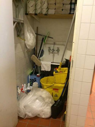
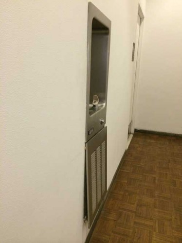
I also noted on a trip to the ladies’ room on the second floor that the Whitney was acting like anyone who is moving out of a place: there were empty shelves where exhibition displays normally would be, the utility closet was gaping open in the bathroom, and why repair loose fixtures, let the next tenant take care of it.
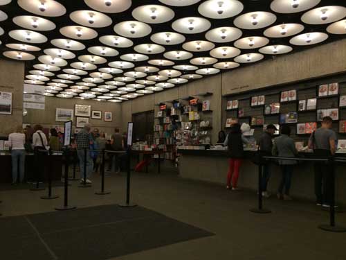
Finally I sat in the lobby. The museum bookstore, in recent days reduced to last bits and pieces, was once one of the really useful art bookstores of New York, it had no special room, just shelving in a smallish area near the coat check–hey guys I know many of your faces and you’ve been nice and I hope you all keep your jobs– and in addition to the requisite museum-branded chatchkes, there was a great selection of art books including art theory and criticism, selected by people who cared about books (I was honored to have my books there, or maybe just Wet, not sure now but anyway, honored because the selection was thoughtful and the space limited). In recent years there were fewer books and a less diverse and critical selection. The Met has a talent for proliferating gift shops, I don’t mind so long as they leave that open casual feeling that made the lobby of the building seem like a living room of a family you knew.
I thought of all the exhibitions I had seen in this building through the years. I decided to look back through the Museum’s website of past exhibitions to recall some great shows but their current website only goes back to 2006. I won’t go hunting through my notes over the years, but will just select a few from over the years that have stayed in my memory.
Starting from the top of my head, some of the memories have not been substantiated by factual research: I distinctly remember a work by Richard Tuttle that was simply a white wall that one gradually realized had inset into its flat surface a rotating disk, white on white. The wall turned. I think I did see such a piece but I don’t think or haven’t been able to prove that it was a Tuttle, so I did see this but now I’m not sure whose work it was (this goes back to the 1970s I think). An early reader of this post tells me it was most likely Rotating Circle by Charles Ray from 1988, must be, and most likely then in a Biennial from that era, interesting how the memory shifts information from one place to another.
In a Biennial before 1974 or 75, or in a group show at any rate, I noticed little oval steelwool-like pads installed in spaces that normally would not contain art–above a red exit sign, outside the building–but that called attention to themselves with a strange intensity that marked them as art. Some time later later Richard Artschwager gave a lecture at the Nova Scotia College of Art and Design and I discovered that these mysterious piece were his blps which also appeared in other media in other exhibition/non-exhibition spaces over the years.
In a Marsden Hartley retrospective at the Museum in 1980 curated by Barbara Haskell, an early Hartley painting of Mount Katahdin in Maine, from the early 20th century, its forms abstracted and the surface painted in a late pointillist Signac-inspired manner, was hung at the beginning of the exhibition in a large room to the right side of the elevator, and as you stood in front of it, you could see from across the floor to the last room, to the left of the elevator, one of his last group of paintings of the same subject, from the early 1940s, the forms even more abstracted with a flatter surface, with bolder, less sugary colors, and a more extreme sense of emotional definition. Thus one could see embodied the meaning of a lifetime of work as an artist.
In a Biennial in the early 1980s, from across a very large space, I spot a very small painting, the first time I recall seeing a painting by Bill Jensen, when his surfaces were thick, scraped, much more intense and dense than his most recent work. In that period I was beginning to consider painting with oil and both Jensen’s scraped, palette knifed surfaces and the surfaces of Hartley’s late works, painterly and sculptural also, even when relatively thin, were both helpful mentors in my transition to this difficult rich medium.
An mid-career retrospective of Elizabeth Murray: at the opening I seem to remember that Elizabeth is carrying one of her young daughters in her arms, a powerful image for people to see. A painting I have never been able to see or find an image of since remains in my memory: a large work though made of relatively small shaped fragmented parts arranged in the shape like a giant abstracted question mark. Did I see this? Have I reshaped it in memory the way I did the Tuttle? Possibly.
More recently, at the 2013 exhibition Jay DeFeo: A Retrospective, sitting alone in a room, trying to outwit the guards by just getting my iPhone enough out of my bag to surreptitiously snap a picture of works by DeFeo from the early eighties which I had never seen and whose greatness left me feeling crushed because I had never seen them before, because they needed to be in the history of American painting from their period, not an addition after the fact.
Some more personal memories: of the night my mother dressed up to go to the opening public reception for the 1966 inauguration of the new Breuer building as the guest of a friend who taught architecture at Harvard and I think was friends with Breuer. She fussed over the right dress and to find the best dress she could afford, and then I remember hearing about the crush of people. The last art exhibition I took her to see was Picasso and American Art, in the fall of 2006, forty years later. The rooms were very crowded, she felt unwell and had to sit down while I looked at the second half of the show. In a further concession to the frailty of her great age, we took a cab home across the park instead of the bus as we once would have done. Nevertheless, sitting in the cab, she said firmly, “it’s the kind of exhibition that makes you want to go home and work.” I should add that my mother Resia Schor was an artist. She was 94 and died a few weeks later, just before her 95th birthday.
Another memory: someone gave me an invitation they couldn’t use, to the opening of Jasper Johns’ retrospective at the Whitney in October 1977. I floated around, young and solitary. At that point in my life, at 27, despite personal ambition, I could look at art world events and careers with a sense of impersonal distance, or rather, I had ambitions certainly but no expectations in that moment, I could watch the scene with interest but not personal jealousy. At one point I found myself in a small room off the main hall, from which I could see Jasper Johns, surrounded by admirers, magnetically elegant in an impeccable tuxedo. I happened to be alone in the room with Richard Serra, who, surly and probably sweltering in the heavy wool brown tweed jacket he was wearing, seemed like a working class character at an upper-class gathering in a 1920s British novel. I didn’t know him of course, but I did know it was him. I was struck by the discomfort of his jacket, and I sensed his fury at being at an event glorifying another artist–Why not him? When him?–and why was that artist such a James Bond like character, damn him, so handsome and so beautifully dressed!
The 2005 exhibition of Edward Ruscha’s series of paintings, Course of Empire, his contribution to the 51st Venice Bienale, was one of the most unusual exhibitions at the museum in recent years and the most strikingly effective uses of the space. This exhibition as I recall was an opportunistic event, arranged in a relatively short time frame, and taking advantage of all the walls from a recent Biennial (or perhaps some other major exhibition) having just been taken down to create an unusually broad open space for a very interesting installation of the paintings in a kind of foreshortened vista, an avenue bordered by paintings with a small room to the side a few versions or the complete cycle of The Course of Empire by the nineteenth century American artist Thomas Cole. The contrast between Ruscha’s flat portrayals of American commercial architecture and Cole’s bizarre imaginings of the rise and fall of ancient Rome was very curious and thought provoking. When I saw this show I was practically alone with the work and the space, one of my favorite experiences.
Many many more memories of so much art, thanks for the memories, and goodbye Whitney Museum of American Art at the Marcel Breuer Building, it’s been swell, and I hope the Whitney comes to regret its decision to leave it, and returns when the Met’s lease is up, to have a second, more intimate and experimental space for its collection and special exhibitions.
