The last art exhibition I saw with my mother was Picasso and American Art, which we went to see what turned out to be just a few weeks before she died. The show was very crowded and after a room or so of looking at the earlier works, which were part of the most meaningful works in her own development as an artist when she was young, she sat down while I looked at the rest of the work. We had to take a taxi back home because even the walk from 75th to 79th to the bus station was too much for her, but as she sat in the taxi she said, “you know a show is good when you want to go home and work.” That’s the way an artist feels, that pressure to run from a wonderful experience with art because you feel the pressure to use the energy towards your own creativity. That’s the way I felt yesterday at the exhibition at the Morgan Library, Josef Albers in America: Painting on Paper.

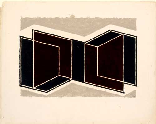
Josef Albers, Study for a Kinetic, ca.1945. Oil and graphite on blotting paper, 48.5 x 61.1cm.
Since the work is mainly in the collection of The Josef & Anni Albers Foundation, this is a unique opportunity, and visits to the Morgan are always a pleasure: right now there ‘s a small but thrilling exhibition of the original score and storyboard of Robert Wilson and Philip Glass’s Einstein on the Beach, an installation that highlights the impact a small group of works can have within an imaginative frame, and a major drawing exhibition , Dürer to de Kooning: 100 Master Drawings from Munich that just opened today–and going through the main rooms of the original Morgan Library is always a wonderfully inspiring experience, with rare volumes, letters, and amazing ancient carved stone cylinder seals just some of the highlights.
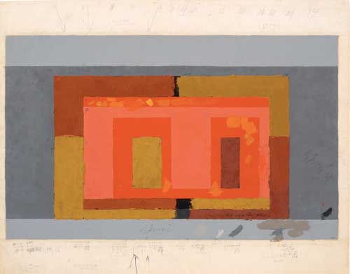
That I would urge anyone to go see this show in its last two days is rather surprising. I’ve always thought of Albers’ work as representative of a didactic approach to color that, in a manner that felt paradoxical or antithetical to what you assumed was their purpose, actually deadened the excitement of color. That is perhaps particularly true if seen in reproduction when the image certainly folds back easily into design and color theory instruction. I’ve always thought of the painting, particularly the Homage do the Square series he worked on for almost three decades and which are the best known works, as being rather dry and fussy, amplifying the didactic approach to color I did not subscribe to. Nevertheless when I read about the exhibition at the Morgan Library I felt that I must see the show. The works in the show looked and sounded vibrant and improvisational. I went yesterday. Sunday is the last day: I urge anyone who is interested in painting, in color, and also in work process, who can get over to the Morgan, to see the show before it closes. These works on paper have a very different feel: there is a presence and a vibrancy to these works, a presence of pigment, applied directly to thick blotting paper, and a vibrancy of hue which I don’t associate with Albers’ more known works, although now I think I should re-investigate those works and perhaps separate them from the didacticism I associate with them. The earliest works in the show, from the early 40s are also more exciting visually because they are more compositional and relational, often directly referential to architecture, as for example his Variant/Adobe series: in these works he uses rich sienas, ochres, oranges, and pinks, against warm and cool greys.

Josef Albers, Variant / Adobe, ca. 1947, Oil on blotting paper, 48.2 x 61.4 cm.
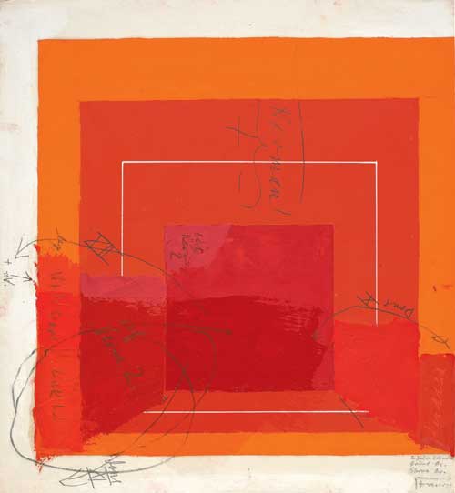
In addition to the Variant / Kinetic Series, and the Variant / Abobe series, the show includes many preliminary studies for Homage to the Square, of which Albers wrote, “I’m not paying ‘Homage to the Square.’ It’s only the dish I serve my craziness about color on.”

Josef Albers, Color Study for White Line Square, undated. Oil on blotting paper (with gouache, pencil, and varnish), 29.53 x 29.66 cm.
All of Albers’ statements quoted on the wall text were rather pithier than I expected, although given his tremendously influential role as a teacher at Black Mountain college and at Yale for many years it shouldn’t be so surprising but historical art figures whose work has an Apollonian cast to begin with can become quite dessicated by time unless great scandal of some personal clings to them and adds lubricity to their image as much as their work.
Many of the works are covered with both tiny notations and bold sgraffito directly into the wet paint, most of these colors notations as to the pigment color and the brand of paint: Albers did not mix most of his colors except some pinks and purples and he tried out similar tube paint colors from many manufacturers, and would note on the sketch and even directly in the paint which color he had used–“chrome ox Shiva” reads one such notation.
I experienced a kind of calm joy from the work while at the same time following another, pedagogical, line of thinking how many art students don’t think twice about getting the newest computer but don’t invest or even investigate good paint, get discouraged at the first bad painting they do and veer towards more technologically seamless media instead of trying out endless “variants” until a personal approach to painting is found. There were 200 of the Variant / Adobe series within a few years, and that doesn’t seem like that much.
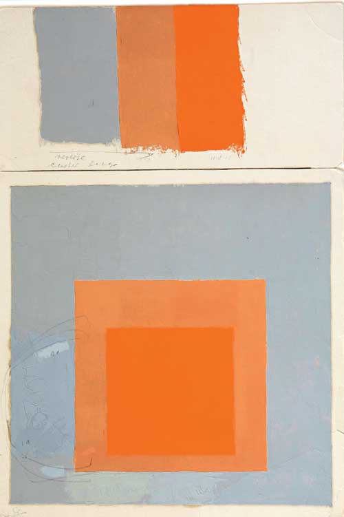
Albers’ direct method of application of paint and the heavy weighty surface of the blotting paper give the color luminosity and materiality, which perhaps the masonite his major works on are on may have diminished, though I feel I have to look at them again after seeing this show. I think of blotting paper as an absorbent felt-like material without particular resonance but here the material is like a very heavy card stock with a newsprint off-white / light gray cast and a very satisfying sturdiness to it, and I made a mental note to look for something like that to try some oil on paper. Albers must have also slightly drained or blotted the excess tube oil from his paints because there is barely any haloing or seepage of oil around the paint areas.

Josef Albers, Study for Homage to the Square with Color Study, not dated. Oil on blotting paper, 44.3 x 30.2 cm.
As I write this late at night, after a day spent at the Creative Time Summit, about which perhaps I will write something tomorrow, I know that for some, perhaps for many young artists looking for contemporary modes of expression, content, and context, painting studies like these must seem even less pertinent to the present than a cave painting might: coming from the seemingly familiar relatively near past, they may seem totally archaic, tired old stuff that can’t help them in their own search. I can well understand that, I can see the distance, and I see the relevance and appeal of newer methodologies of artmaking. Yet the exhibition is exhilarating while at the same time the modest exhibition space itself is like rehab for the overstimulated: no photography allowed, few people, just the work and hushed silence, literally: I happened to run into several friends and as our conversation over the work became more animated, the guard shushed us! Such an unspectacular white cube atmosphere is actually rare these days, and a treat. It was refreshing, inspiring, and thought provoking to see this work.
