It is customary to send postcards to your friends when you’re on vacation.
My “vacation” consists, if I’m lucky, of my working in the studio as intensely as possible in all too short a time frame, like a squirrel madly trying to making sure there are enough nuts to last the long winter during which other aspects of the artist’s life prevail and overwhelm.
I always begin by putting up a group of postcards which I then take down at the end of the summer to help preserve their color and because I value the ritual of annual re-installation with gradual changes to the grouping and the order as part of my work process. Once I covered entire walls with hundreds of postcards, with major sequences of thematics interwoven.
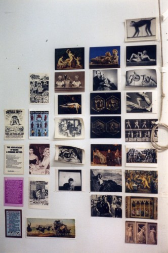
Postcard wall view, Skowhegan studio, 1995
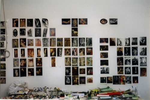
Postcard wall view, Skowhegan Studio, 1995
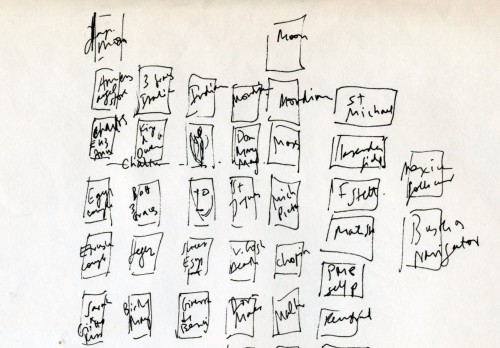
Detail of diagram of postcard wall, 1990s.
Over time I’ve pared down to a small, metonymic grouping of a few postcards taped to an attic door near my painting table. I hardly look at them once I’ve put them up yet each one represents something significant to me and each day in passing I may catch the eye of an image, so to speak, and a familiar connection is reignited.
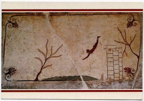
Roof Slab of the "Diver's Tomb" (Tomba el Il Tuffatore), Paestum, c.475 B.C.
At the top is an image of a diver from Paestum. (I have never seen this work in person). I love the schematic simplicity of representational detail, and the strange mixture of the mundane — someone in 475 B.C. doing something that people are doing around the world right now– and the mysterious — what is he diving into and what does it mean that such an image is on a tomb? Again the mundane: maybe the guy buried there liked to dive and swim, and the mysterious: maybe this is symbolic of death itself, the ultimate leap into the unknown oblivion. As the first image at the top of my postcard wall it represents the imperative of leaping into the unknown of intense engagement with my work after a long interruption.
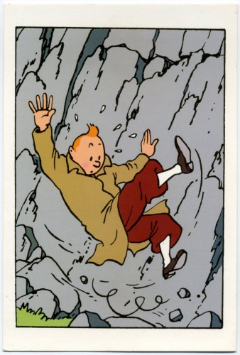
Herge, Tintin, from Le Sceptre d'Ottokar, 1947
Nearby, at the top of another vertical row is the image of Tintin falling. In my childhood I appropriated my older sister’s copies (this in itself already gave the images some of the exoticism of the slightly ancient, an impression fostered by the French hardcover volumes’ patina of well-loved wear and tear, even though they couldn’t have been more than 10 years old ). I pored over them, appreciating the bold outline and color, and the weird plots. I loved le Capitaine Haddock’s amusingly child-friendly and weirdly antiquated swearing, and the dear deaf Professeur Tournesol blissfully unaware of the perils he wandered in and out of. I still treasure them and this postcard image of the unflappable Tintin tumbling down a mountain.
But I hadn’t realized, until I started thinking about this post, to what extent images of figures falling through space was one thematic of my postcard wall arrangement. Towards the bottom of the vertical row of cards below the Diver are two radically different images of women who are in some way toppling through space with abandon,elegance, and terror:
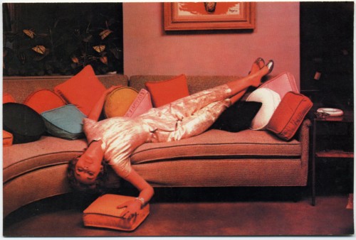
"Lounging," Vintage Chrome Postcard, c. early 1970s
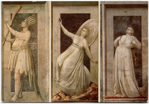
Giotto, Inconstancy, detail from the Scrovegni Chapel, Padova, 1303-1306
Details from Giotto’s fresco cycle in the Scrovegni Chapel (or Arena Chapel) were among my favorite images long before I finally was able to go to Padova to see the frescoes. This turned out to be one of the most terrifying artistic experiences in my life in that finally in the presence of works I adored, I found myself totally disoriented by the totality of the work, the amount of scenes, the location of many important scenes in the narrative cycle well above eye level, and above all by the absolute irreducible flatness of the work: everything that I loved in the reproductions I had pored over and put up on my wall, not just the narrative cycle and the deep emotion of the figures but the sculptural nature of Giotto’s figurative depictions, the magnificent drapery, the miniaturized architecture: all of this was the wall, not on the wall but the wall. Imagine seeing every painting by Picasso, Manet, or Cezanne, all as images on one continuous flat surface without even a trace of impasto to distinguish one from the other.
In the Scrovegni Chapel, the figure of Inconstancy occupies the lowest of four major levels from ceiling to floor and so it ‘s closer to eye level. Thus when I visited it was possible to have a more intimate viewing experience where I could peer closely at the figure instead of jostling with the crowds while wishing I had binoculars to see details of the major painting scenes in the rows above. This figure is such a perfectly balanced depiction of imbalance, so still within the sculptural grisaille while tumbling through air. I identified with the topsy-turvy figure, knocked off her feet by the sin of inconstancy as I was by the aesthetic shock of finally seeing such revered images and finding it nearly impossible to know how to experience them.
On every studio postcard wall I’ve installed are three black and white postcards from the North Portal of Chartres Cathedral.
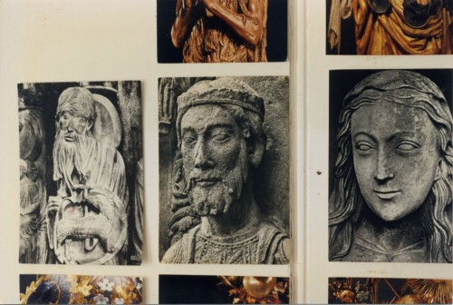
Postcards, detail of portal sculptures at Chartres Cathedral XIIIth Century
In a drawer in my parents’ room when I was a child there was a bundle of postcards from their years in France before the beginning of World War II: among these I believe were black and white postcards of Chartres. When I was 8 years old, they took me to Chartres Cathedral during their first visit back to Europe after they had escaped to America in 1941. I have been back since but that initial experience was formative, even foundational in its resonance for my work. I have a haptic memory of my entrance into the Cathedral, of touching the cold grey stone of a small chamber and my memory of that first experience of being in the main nave combines color, cool temperature, and the thrill of verticality into something that has a smell and even almost a taste that I cannot quite describe. I’m not sure if these black and white postcards are from that original pre-War group, or from our trip in 1958. What I do know is that I so imprinted on these black and white reproductions and they are so imbricated with my physical memory, that I find the more recent color postcards I have of the same figures to be crass and inexpressive. For all intent and purpose, these photographs could be from the Thirteenth Century and in looking at the face of John The Baptist, I feel I am looking upon the face of the sculptor who carved it.
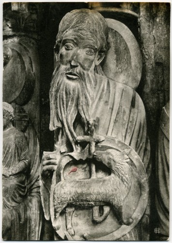
Chartres Cathedral, XIIIth century, North Portal, John the Baptist
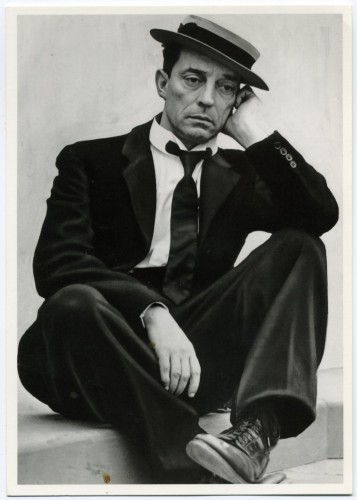
Buster Keaton, 1939 (unidentified photographer)
The face of John the Baptist haunts me, its elongated form, the expression almost too humble and touching to bear. It picks up in the face of Buster Keaton, whose films I saw also in my childhood. I always felt a deep allegiance to Keaton. I am drawn to the spareness of the sets as to the complexity of the sequences of motion and transformation. The General, The Navigator, Sherlock Jr. — a favorite of the Surrealists — The Cameraman, Steamboat Bill Jr. are all wonderful. And above all I am drawn to the impassivity of Keaton the actor’s face, as the world deconstructs around him (a deconstruction that is the result of Keaton the director’s artistry and immense technical imagination, skill, and daring).
The faces of John the Baptist from Chartres and Buster Keaton belong to a category or a quality of many of the images I chose that I would describe as stillness, as a deep seriousness, often profound piety. It is a quality of artwork that is sculptural yet also has a calm clear musical tone which imparts a sense of justness. It is often also, formally speaking, minimalist, at least in the key detail or underlying emotional core, a quality of profound reticence. I find this quality in popular culture as much as in high art:

Spock
My students can attest to the fact that I use Star Trek (all versions except the last prequel series and film) as a major source of wisdom and in all iterations I have always identified with the character whose capacity for emotion is sometimes tragically (Spock), sometimes humorously (Data), and always fascinatingly (Seven of Nine) encased within a rigorous intelligence, and none more so than Spock.
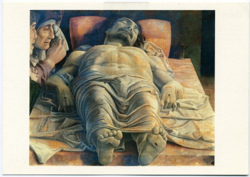
Andrea Mantegna, The Dead Christ in the Sepulchre with Three Mourners, Pinacoteca de Brera, Milan
Below Spock and Inconstancy, at the bottom of the vertical row that begins with the Diver from Paestum is Andrea Mantegna‘s The Dead Christ (c.1500) which I saw at the Brera Museum in Milan in 2001 and wrote about later that summer as a painting I had fallen in love with:
The Dead Christ was painted by Mantegna in about 1500, towards the end of his life and is thought to have been intended for his own tomb in the Church of Sant’ Andrea in Mantua. It hangs in a simple frame, unostentatiously placed among many other paintings in a corridor lit by natural light but it has been positioned so that it is visible from a great distance framed by a series of open doorways of a side set of small galleries. You feel that thrill of “there it is” since it is one of the most famous images in the history of Western painting because its virtuoso use of foreshortening but also because of what it is and how it relates to your own space and body.
Once in front of the painting I was struck by several things all at once:
First of all it is a small painting only about 68x81cm, or about 2 by 3 1/2 feet. So it has a kind of modesty of size but at the same time it is immediately intensely radical, all the more so because it’s small and subdued in color. Christ’s body is indeed dramatically foreshortened but immediately it is obvious that the foreshortening is wrong, the face seems big in proportion to the feet. Mantegna must have been aware of the problem but both the basic premise of the painting and the basic error in its realization are what create the emotional impact of the painting. There is something profoundly uncomfortable about it. The perspectival error in itself creates a sense of discomfort and disquiet and the result of the error is that the viewer’s eye propels directly to Christ’s massive chest and handsome face. You are allowed no emotional distance from what’s going on and the intensity of religious emotion is accentuated by the three mourners whose faces are crammed in the upper left corner of the painting.
This is the most surprising part of the painting, perhaps more than the abrupt foreshortening. At first I thought the painting must be a fragment, a cropped image from a larger original because it is such a strange and in a sense a very modern, photographic type of composition, but the original linen is visible all around the edges of the painting, so this is the original composition, again an incredibly radical aspect of the painting.
Those faces are part of the appeal of the painting for me; they are very much like the limewood sculptures by the German artist Tilman Riemenschneider that preceded this work by only a few years (1494). I generally prefer the mindset of Northern Renaissance painting because I prefer the sense of piety as it is embodied in stylized, sober forms characteristic of Northern Renaissance painting and I prefer the North’s more tormented, less Hellenistic view of the body over the idealism and narcissism of much High Renaissance Italian painting– and in fact what is interesting about the Dead Christ is that it combines elements of both traditions. It’s a mixture of the two value systems: the idealization of the human body and the search for scientific realism, and the Northern non-hierarchic realism, its emotionality and severity, sharpness and starkness of form and painterliness, the combination of large clear sculptural forms, linear elements and careful attention to humble detail.
This is a very sculptural painting and one of the characteristics of many of my favorite paintings are that they are sculptural, even architectural as they are painterly. From the stylized simplified forms in Seurat to the ample folds of clothing and the houses and rooms of Giotto to the piles of stuff in a Guston. They could be turned into a sculpture, they could be built or carved or accumulated, which is not something that one might say of a Rubens, for example, unless the sculpture was made of butter! It is the miracle of paint’s capacity to be a thing in itself and represent a thing or a place, even in an abstract painting, that is so exciting to me.
The material qualities of the painting are as important as the image, utterly uncompromising and not particularly oriented towards sensual pleasure. There are no frills, and everything propels toward the subject, the death of a man who is a God: the size of the painting accentuates the realism: looking at it is exactly like what it might be like to be at eye level with a refrigerated drawer at the morgue.
At first it seems as if he painted it on patterned damask because the pattern of the cloth looks imbedded in the painting but no, the pattern is painted because natural linen is visible at the edges of the painting. You can see the edges of the linen, which makes you more aware of the paint surface resting on the flat surface, which makes it a very modern painting as well: the painting is tempera, very thin and dry. It looks intact and original, with no varnish or restoration evident. The subdued color and tonality, which verges on grisaille in keeping with the sculptural setting it was intended for, emphasizes the death of Christ’s corporeal body. The wounds in his flesh, feet and hands are both very convincing as wounds, they also looked like chipped wood, and like tears in the cloth of the painting, so they are wounds of God, man, and art. There is one drop of blood on his left forearm. Because of the way the paint is applied, flat and plain, this one tiny detail really stands out. The subject of the painting and its thinness, the way the image is so lightly resting on the surface and yet so much part of it that it seems imbedded in it, makes it like a more articulated and consciously done version of the Shroud of Turin, just the most fundamental, bare bones trace of the corporeality of Christ. The dryness too is part of the emotional quality of the painting. Also as a painter I am struck by the fact that the medium of tempera is unforgiving of mistakes. I would be interested to see an x-ray of the painting because it doesn’t seem to have any changes or repainting, and that again hits you in the face, the sense that he conceived it, drew and did it.
Each painting that I love gives me something I can use in my work and something that supports me as an artist. This painting is utterly uncompromising, it is almost brutal, its emotion is as unvarnished and understated as its surface, and it is profoundly serious which is a great gift at a time when the culture at large just wants entertainment.
But on the other hand, on the wall behind me:
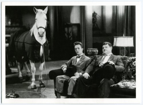
Stan Laurel and Oliver Hardy, film still from "Wrong Again" (1929)
And finally another image of falling, or at least teetering, tottering (just below Tintin):
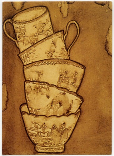
Ida Applebroog
or, this year, the last word:
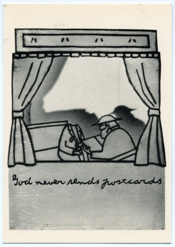
Ida Applebroog, God Never Sends Postcards, 1975. Ink and rhoplex on vellum
Have a great rest of the summer, and I may slip one more post in the mail before I return, I hope with a few nuts and less frayed, to the fray.
