Category Archives: painting

Resisting Pier Pressure

I stuck to my guns and did not give into Pier pressure this year. I had been adamant after last year that I would not go to Armory shows at the piers again. I had gone for about 8 years, and in the mid-2000s I could funnel and process boredom into research for my essays “Trite Tropes, Clichés, and the Persistence of Styles” and “Recipe Art.”  But each of the past three years I would resolve never to go again, because basically it’s out of the way, tiring, and even if you see a few good artworks and run into a few friends, and are seen being part of the artworld in some capacity, if only physical presence, by the time you struggle to re-find the city, via taxi or some of the longest walks to public transportation ever or the little jitney buses to civilization, if you are lucky, you can’t remember a thing. Only your camera remains a record of ever having been there and the sameness of my photo folders from year to year was grating on me. But each year I got drawn back because a group of friends would say, let’s meet, and then you think, well, OK, must see to talk to students about, don’t want to be left out, or don’t want to forgo pleasure of hanging out with friends. I almost got sucked in by that mechanism again this year, but finally I managed to hold tight.

I had not been to Chelsea for several very busy weeks, and shows were piling up that I wanted to see. My compromise with Art Fair culture was to go to the Independent because it was in Chelsea and then see a few shows. It was a beautiful spring-like day which, following upon a grey wintry snowy slushy day, gave me a boost of optimism and my choice of action left me with enough energy to cap the day by going to the ADAA Art Show at the Park Avenue Armory.

Briefly: both of these Fairs seemed disappointing, with a mix of vulgarity on the one hand, and vacant genericity on the other–works that would look tacky in a Nike shop and works that would look blamelessly attractive in a corporate boardroom, this pertaining in particular to the works exhibited at the Independent, with the Park Avenue Armory presenting more blue chip works that had a different kind of blandness with a few really pieces in the mix in a less circus- like and calmer atmosphere. But in each fair, one art work or series of works by one artist stood out and redeemed the whole exercise. As my mother said, on our way home from the last museum exhibition she saw–a 2006  exhibition at the Whitney Museum of the influence of Picasso on American art–it makes you want to go home and make art–she was then 95 years old and could barely stand up at the show and she still felt that inspiration. That is what I look for, that is why I started this blog, to record those moments, when amidst all the dross and worse that forms part of any decade of negative thinking, an artwork cuts through the crap and makes me want to turn on my heels, cover my eyes as I rush out of the building, and try to get home with that sense of inspiration and renewed energy to make art intact.

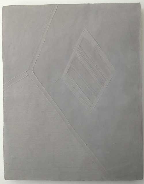
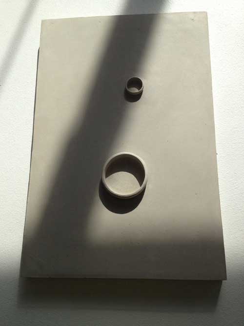
At the Independent, I came up first to two small grey works hung on a wall.

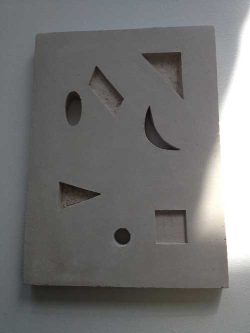
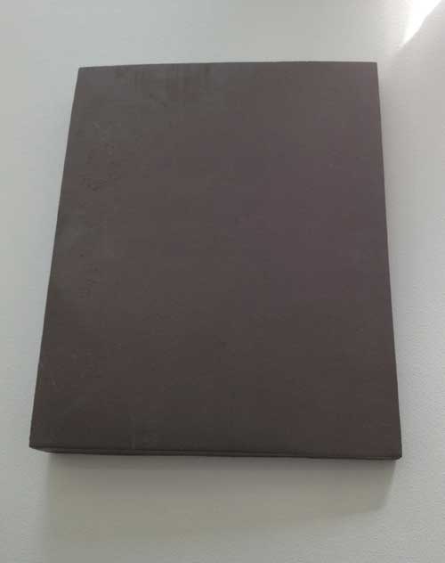
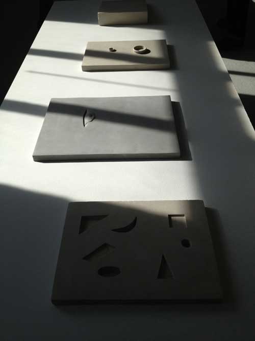
Were they paintings? There was the trace of what might appear to be a raised brushstroke on one, but then I realized that this was not a painting but a clay tablet, of a restrained abstraction in a modernist vein. Many more such tablets were arrayed on four sun-raked tables, lying flat, as much sculpture, installation, and display in the archaeological section of a museum, like cuneiform tablets from ancient Babylonia, or like books presented in a museum setting, with their covers closed, presenting a nearly inscrutable face. Most of the tablets were gray clay, one was the color of yellowish wax. A few were completely plain, blank slates, others had geometric forms cut into them or as raised forms upon them, one had a small face peeking out of a small fold or slit in the clay field.

The works’ use of geometry and other aspects of painterly and well as sculptural abstraction refreshed the possibilities of abstraction developed in the modernist period. The work asserted that one can use a circle or a triangle or a line on an “empty” field and make it have the same interest of a genuine search for form and a belief in formal and composition aesthetic categories as artists from the modernist movement and make it seem newly experienced.

These works exemplified my ideas about modesty as a qualify in art that is not limited to small scale but that engages formal and intellectual rigor and ambition for the art work, rather than punching you in the face with the artist’s ego.

This is work by Anna-Bella Papp, a young Eastern European artist and I can only hope that the visual clarity, intelligence and dignity of these works is something that the artist can hold on to and grow, rather than devolving into production if her works encounters material success.

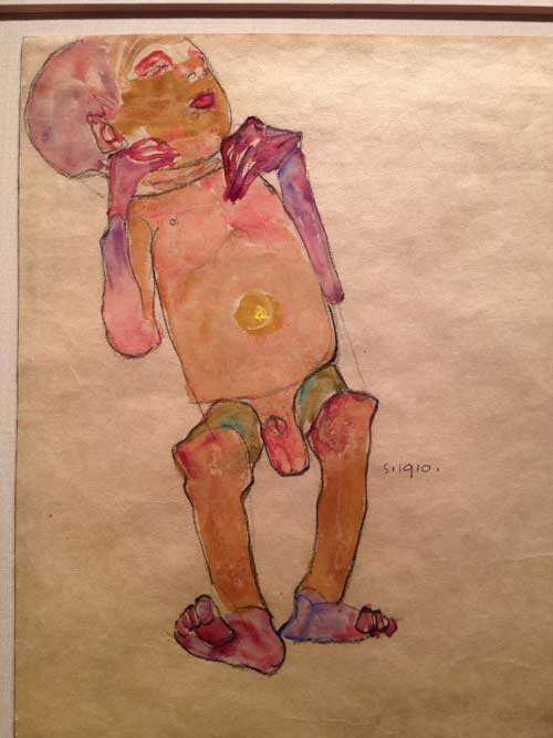
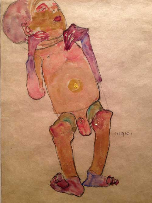
Last year, the Park Avenue Armory exhibition of the ADAA was a relief from the Piers, quieter, more sedate, with greater emphasis on the modern than the contemporary. It was possible to see some art, and that was a gift, so I went back this year. The atmosphere remained more civilized, less like the midway of a county fair, but perhaps familiarity led to feeling a bit less inspired, until on my way out, I passed the booth for Galerie St. Etienne. I stopped, thinking, oh, they may have something worth seeing..and turning a corner into a small enclosure I found myself in front of a small yet vital masterpiece, Egon Schiele‘s watercolor Newborn Baby from 1910.

Egon Schiele, Newborn Baby, 1910. Watercolor and pencil on tan wove paper. Galerie St. Etienne

I suspect that many people value Schiele more for the sexual angst expressed in the synergy between his subjects and his style, than for his aesthetic decisions. This work’s intimate, pitiless yet deeply humanistic focus on a newborn baby, body akimbo and marked by the disproportionality of the neonatal, painted in the vivid colors of birth, pink, purple, and red washes and and impasto yellow belly button marking the last moment of total physical connection to the mother’s body, is another way of considering both Schiele’s artistry and his deep sympathy with the vulnerability and strangeness of human embodiment.

These two valuable experiences with art were worth more than acres of the Piers, and though I can’t say I was able to go home and make art, I left while I was ahead and with these experiences stored in my mind for future support and encouragement.


FacebooktwittermailFacebooktwittermail

On being a “Lady”

I can’t review an exhibition in which my work is included, yet I would like to encourage people to see the exhibition To Be a Lady which has been extended through March 22nd and is particularly conveniently located for people coming to New York for the College Art Association conference next week, as it is installed in a public space a block down Avenue of the Americas from the Hilton Hotel, at 1285 Avenue of the Americas.

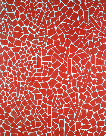
Alma Thomas (1891-1978), Red Scarlet Sage, 1976. Acrylic on canvas
46 x 36 inches, Courtesy of Michael Rosenfeld Gallery LLC, New York

I figure that since the show is divided into two parts, installed along two separate sections of the space, with one side featuring the works of women artists who are deceased, and the other side featuring those of us still among the living, I feel that I can safely recommend the dead without incurring controversy among the other living artists in the show or referring to my own work in it or the ramifications of the word “lady, ” which I know has stirred some controversy. Curator Jason Andrew of Norte Maar has assembled some terrific work in this show, a diverse group of works by notable artists and artists that some may be less familiar with, and in each case has included a very good example of the artist’s work, and in some cases quite a surprising one. Again, I am just talking about the dead. The works are grouped in open bays or booths, creating in effect small mini-exhibitions with some interesting synergies.

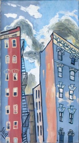
Alice Neel (1900-1984), Sunset in Spanish Harlem, 1958.

The first work in the show is a vibrant abstraction by Alma Thomas, next to an equally vividly hued work by Charmion Von Wiegand, two hard edge abstractions, yet of a very different nature and sense of scale. On the opposite side is a small but intense vertical abstraction by Louise Nevelson, and a cityscape by Alice Neel: I am particularly fond of works by Alice Neel that are not portraits, but still lifes and cityscapes, because one can appreciate her drawing and paint application in a different manner when they are not applied to her strong sense of figuration which may overwhelm a viewer’s ability to fully appreciate her more abstract qualities.

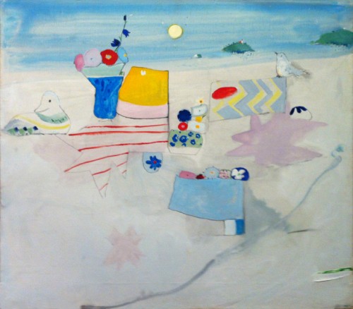
In the next bay is a beautiful work by Irene Rice Pereira. It is interesting for me to see this in particular because I used to hear about her work when I was a child in the 1950s and there was always a dismissive edge of contempt when her name came up, but I didn’t know how much that may have been the result of sexism and cliquishness–the work in the show has a formal clarity and elegance that defies those condescending views. Next to this is a work by an artist who may not be well known, except to a select group of  inside artworld people in New York, the painter and writer Edith Schloss. Schloss had lived in Rome from the early 1960s to her death in 2011 at age 92. Her work is a charming, fantastical abstracted still life in landscape. Recently restored to a wonderful condition, it could easily appear in the show of a up and coming young painter today. In the same bay there is a strong free-standing work by the sculptor May Wilson, and a luminous large painting by Janice Biala.

Edith Schloss (1919-2011), Untitled, 1973. Oil on canvas, 31 5⁄8 x 35 5⁄8 inches, Courtesy of the Estate of Edith Schloss

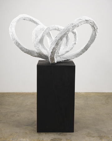
The third grouping is particularly interesting, with Barbara Morgan‘s contact proof photos of Martha Graham performing some of her first signature works, in 1935, next to more abstract works by Morgan, a work by Ruth Asawa. In that bay is also a very strong Louise Bourgeois sculpture, Flower Petal, a large white bronze that is one of the most important works in the show, and one of the most surprising. I thought I knew Bourgeois’s oeuvre really well but I had never seen this work, which is both slightly unusual in terms of imagery and form, and yet has Bourgeois’s characteristic boldness and sureness of form. The white coloration adds to the impact rather than diminishing it. And finally in that grouping there is  a major Lenore Tawney piece, a black thread weaving, in remarkably good condition, a forbidding minimalist work in an ancient tradition of craft.

Louise Bourgeois (1911-2010), Life Flower I, 1960. Bronze, painted white: 22 1/2 x 34 x 23 inches, Bronze base: 27 1/2 x 15 1/4 x 15 1/4 inches, Stamped: LB 5/6 MAF 2010

Other outstanding works in the show are paintings by Pat Passlof and Jay DeFeo, Lee Bontecou, sculptures by Betye Saar and Viola Frey, with the installation of the dead punctuated by a painting by Elizabeth Murray, hung high above a doorway area.

I wish I could tell you more about the works by living artists, those you must see for yourself, though I will say, as a preview, that one very gifted young artist, a former student of mine, told me at the opening that he nearly fainted when he saw the remarkable Nancy Grossman.

This is a rich various group of works, many rarely seen or never seen before and well worth seeing.

FacebooktwittermailFacebooktwittermail

George Bellows’ Entropic Visions

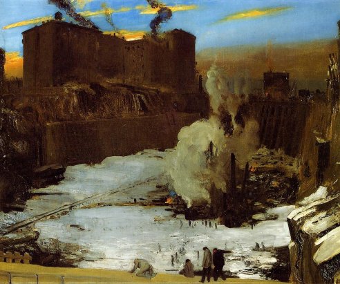
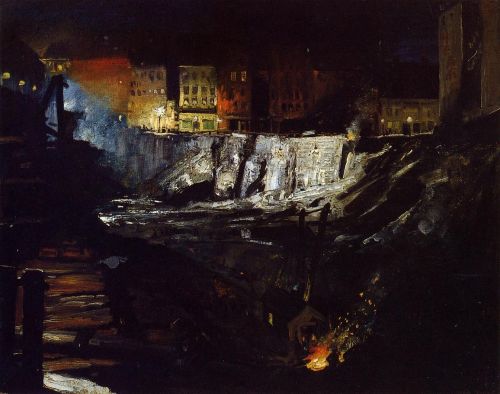
I wanted to make sure to see the George Bellows exhibition at the Metropolitan before it closes February 18, in order to see a few paintings that had been recommended to me by Susan Bee, in particular three paintings done between 1907 and 1909 of the excavation of the site for Pennsylvania Station.

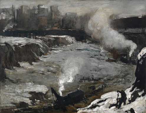
The paintings are easel sized and painted in a loose expressionistic style that is a eerie and awkward combination of Goya, Velasquez, Courbet, with a Brueghel quote in the bottom right corner of a dark worker against a snow white background  but, despite these historical allusions, they are  imbued with a regionalist, Americanist feel. And yet, as one viewer I overheard say, these paintings are ferocious.  In the first, Pennsylvania Excavation, the organized city is a far off dream against the blackened rock, earth, and gravel pit covered by snow and white mist from the steam engine of a work train dwarfed by the scale of site.

George Bellows. Pennsylvania Excavation, 1907. Oil on canvas, 33 7/8 x 44 in. . Smith College Museum of Art, Northampton, Massachusetts.

In the second painting, Pennsylvania Station Excavation (1909) the most hellish part of the dark excavation site is in a concentrated area devoted to the chaotic process of excavation and construction, relieved or at least punctuated visually by a startingly vibrant blue sky shot with peach colored cloud, in that way that cloud formations have of occasionally reminding New Yorkers that we live on a planet, so absorbed as we are in the urban environment that blocks nature and seems like a self-contained universe.

And the third painting in the series Excavation at Night (1908) though unfortunately over-varnished, particularly damaging for a very dark painting, but at the same time the shiny blackness of large areas of the work served to reinforce the connection I made between Bellows’ choice and treatment of this subject and Robert Smithson‘s observations on entropy in his 1967 essay “A Tour of the Monuments of Passaic, New Jersey.” Describing  the “minor monuments” being built along the Passaic River, including

concrete abutments that supported the shoulders of a new highway in the process of being built. River Drive was in part bulldozed and in part intact. It was hard to tell the new highway from the old road; they were both confounded into a unitary chaos. Since it was Saturday, many machines were not working, and this caused them to resemble prehistoric creatures trapped in the mud, or, better, extinct machines–mechanical dinosaurs stripped of their skin….Nearby, on the river bank, was an artificial crater that contained a pale limpid pond of water, and from the side of the crater protruded six large pipes that gushed the water of the pond into the river. This constituted a monumental fountain that suggested six horizontal smokestacks that seemed to be flooding the river with liquid smoke.

Of these chaotic “monuments,” Smithson writes,

That zero panorama seemed to contain ruins in reverse, that is–all the new construction that would eventually be built. This is the opposite of the “romantic ruins” because the buildings don’t fall into ruin after they are built but rather rise into ruin before they are built.

Next to Excavation at Night is a slightly oversize reproduction of a 1915 tinted postcard of the completed Pennsylannia Rail Road Station, so we have a time line of the pit that was, the beauty that was, built to outdo and outlast the Baths of Caracalla but it also ended up having risen into ruin, and then looking back into the pit Bellows has documented in these paintings, we can place ourselves in the hellish chaos of the current Pennsylvania Station, something like a giant airport bathroom built with 1970s cheapness over the tracks of the original station.

These are very good paintings by a painter who was just short of being great–something about the way the figures are done, even his famous boxers where the figures are very dynamic yet too stiffly posed, the paint marks very bold in some cases, in other delicate and almost folk art like–there ‘s a very good portrait of an elderly couple from Woodstock that from 1924 that shifts around in an interestingly uncertain yet touching space between traditional portraiture in the European style, Renoir and Grant Wood. But  he was nevertheless a very interesting artist, and he looked at interesting, important things, that is, the city as it was built, and as it was lived by the poor, and these paintings should be seen, especially as we celebrate the 100th anniversary of Grand Central Terminal, saved from demolition only as short a time ago as 1978, and thus mourn one of the greatest crimes in American culture and the history of New York City, the destruction of Pennsylvania Station, even as we anticipate what is shaping up to be as great a cultural crime, though a slightly less visible one, the demolition of the seven levels of book stacks under the Rose Main Reading Room of the New York Public Library for the construction of yet another airport mall style mediocre-looking space.

FacebooktwittermailFacebooktwittermail

Catching up by playing hooky: Bernini, Shea, Cage, and Picasso

It is a dark irony of my life as an artist living in New York City that going to museums ends up seeming at worst like a job or at best like playing hooky. The holiday season does not lighten my workload–rather it adds to it, it is catching-up-with-paperwork time. Nevertheless I’ve been intent on also systematically catching up with as many of the museum shows that have opened over the past months as I can and have already had some wonderful experiences.

I’ll focus first on the shows that are closing in the next few days so that readers in New York might be reminded and encouraged to see them in this New Year.

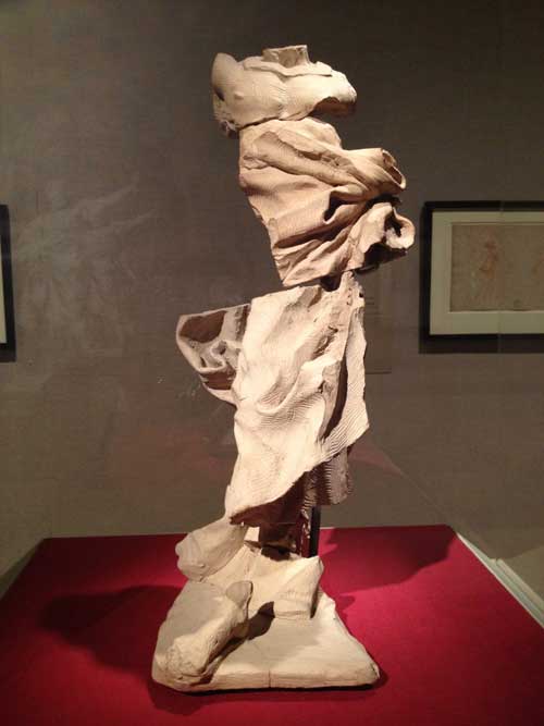
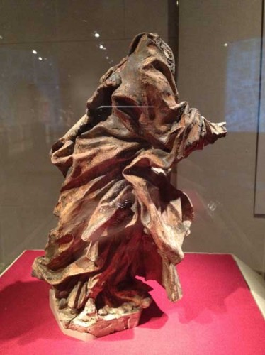
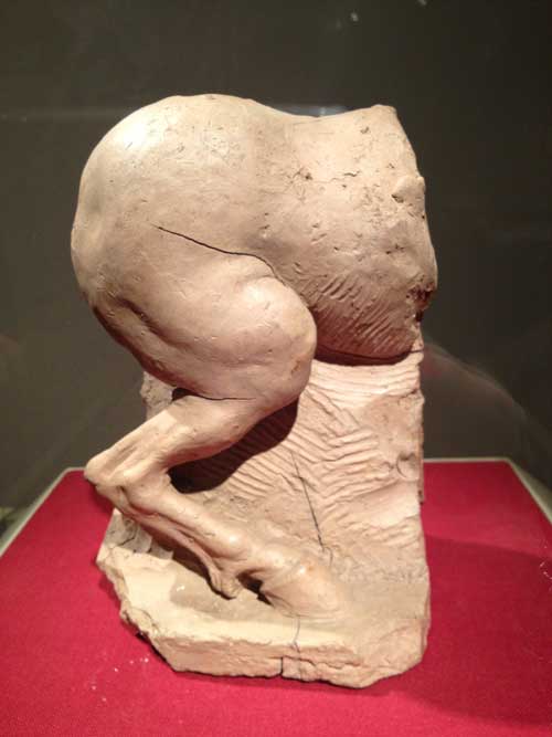
Tucked away in the lower level of the Lehman collection at the Metropolitan, is the wonderful show Bernini: Sculpting in Clay. Bernini worked on small quick studies in fired terracotta for sculptures later to be carved in marble. Sometimes, in these small figures, he’s just trying to figure out the placement of a joint in a fragmentary sculpture of a horse’s rear, or the fall of drapery on a moving figure, sometimes he develops a sketch of the full figure. Quick, expressionistic, fragmentary, marked by sharp engraved and incised lines from special tools, the figures step outside of their historical time: excepting perhaps some details of the faces, these could well have been found in the studio of Rodin or de Kooning.

The show is small but there are a lot of works, beautifully installed and there’s interesting educational material. I was almost as inspired by the illustrated description of the techniques used to create the clay mass Bernini carved into as by the sculptures themselves: the care that went into rolling and packing a clay mass so that it would have no air bubbles that might shatter a piece in the firing process and the combination of the vivid figures and the prospect of such an infinitely malleable, richly colored, and durable material makes you want to make sculpture in that medium. There’s also an animated Renaissance map of Rome highlighting all of Bernini’s public commissions, for which many of the small sculptures are studies, which is immensely impressive as to one single artist’s contribution to the enduring life of a city and the care that went into every expressive detail. Today the equivalent planning for such public commissions would most likely be done on a computer. What a pity. The show is open though January 6. I highly recommend it.

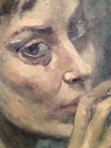
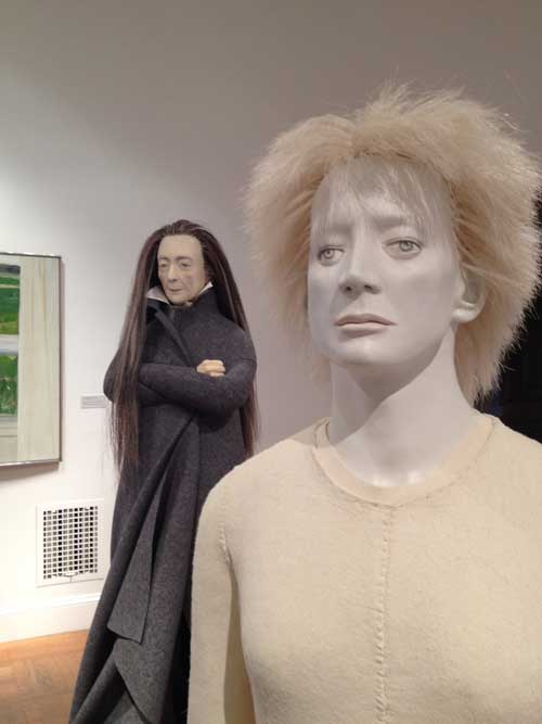
On another day in December, I thought I’d see the Picasso show at the Guggenheim but stopped first at the National Academy to see Her Own Style: An Artist’s Eye With Judith Shea. Invited to curate a show from the collection of the National Academy, sculptor and Academician Judith Shea decided to focus on the self-portraits and in some case portraits by other women artists of women members of the Academy. This is a very carefully crafted, lovingly researched, highly absorbing exhibition, not at all flashy but there are some very interesting and evocative works, among these Shea’s own figurative sculptures. The show sort of sneaks up on you and viewing is enriched by a video which runs in one of the upstairs rooms of the exhibition (you also watch Shea’s informative interview on NYCArts). Shea’s carefully researched comments about each artist opens a view on serious careers and interesting lives of women artists known, such as Alice Neel, and in many cases obscure, or at least many of which I for one was not aware, artists such as Ellen Emmet Rand (1876-1941), who painted three portrait of F.D.R. including his official White House portrait and who I think Shea explained made $75,000 a year from her work during the Depression, a huge sum of money. Rand depicts herself in a loose smock, wearing glasses and a hat, in the act of painting, holding a palette and brushes, as Shea notes, by “minimizing her femininity as a way of maximizing her professionialism.” The women artists’ self-image range from the artist as society beauty (Cecilia Beaux, 1894) to blunt presentation of the woman artist as worker (Louisa Matthiasdottir, c.1985). I was particularly struck with a haunting 1954 self-portrait of Marion Greenwood (1909-1970), a blue gray painting of the artist smoking a cigarette, an expressive painterly surface with one spot of red paint under her right eye.

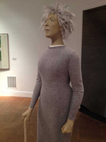
Four of Shea’s own, life size, figurative sculptures, a bronze downstairs, and three other mixed media works grouped in an oval room upstairs are a highlight of the exhibition: these depict Louise Bourgeois, Elizabeth Catlett, and a self-portrait by Shea. Each piece is exquisitely crafted, with an unusual mix of materials, carved and painted wood, clay, foam, paint, each robbed in a warm felt dress. These are figures of great dignity and calm. They are hard and soft at the same time, have the allure of a clothes mannequin, and the calm authority of a classic Kouros figure. Shea is a very interesting artist and here also an intelligent and generous curator.

Judith Shea, Elizabeth Tribute: Portrait of Elizabeth Catlett, 2012. Wood, clay, foam, felt, paint, other, 72x21x21 inches

This show closes runs through January 13, I highly recommend it.

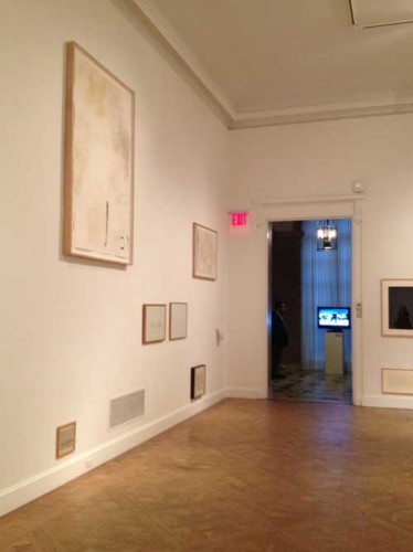
Also at the National Academy and equally wonderful is John Cage: The Sight of Silence, an exhibition of Cage’s watercolors, prints and drawings on paper, accompanied also by Cage’s hand made or natural drawing tools, musical scores, and some wonderful videos of Cage performances. The drawings are mostly loose abstraction, single gestures which at first seem a bit easy and not particularly original, somewhere between traditional Japanese brush painting and spare Abstract Expressionist gestures, but the atmosphere of calm settles over you if you spend some time with the work, the elegance and a quiet that is quite inspiring. The drawings are installed on the wall in an unorthodox manner, based on Cage’s method of chance operations, resulting in a kind of Zen Salon style, with some large drawings way up high, one just above the floor molding, like a little mouse, smaller than the ventilation grate it is next to.

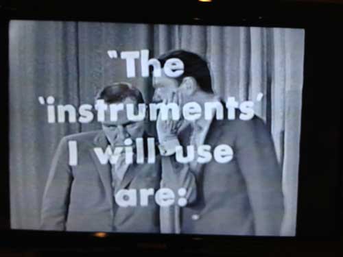
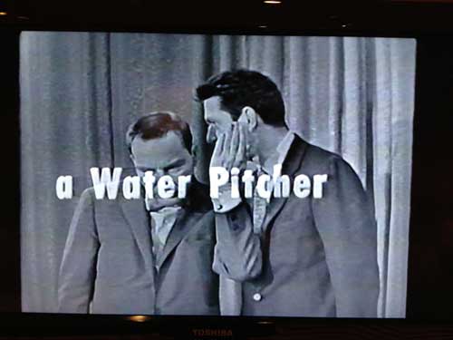
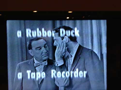
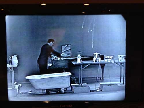
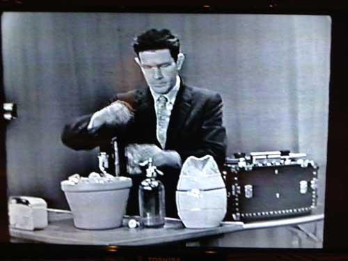
There is a marvelous video of Cage performing Water Walk in 1960, on the ABC game show I’ve Got a Secret, in which the show abandons its usual premise, that panelists have to guess what the guest’s secret is, in favor of presenting a live performance by Cage using all kinds of household appliances and house wares to make sound. It’s great fun, the black and white visuals are beautiful, and if you think about a game show, it is hard to imagine something similar happening with such spontaneity and support.

The show also runs through January 13, don’t miss it!

& I’d like to think that Cage would approve of my pointing out that the building itself is beautiful, a gracious Beaux-Arts mansion, where even the original bathroom fixtures are beautiful:

A block down Fifth Avenue from the National Academy is Picasso Black and White at the Guggenheim.

I like to start viewing exhibitions at the Guggenheim from the top and work my way down, it is less arduous even though it usually means going against chronological order.

When I got out of the elevator at the top, I overheard a woman lecturing to a group of small children, perhaps 6 years old, all scrunched against the ramp with little sketch pads: “every artist has a signature style” she told them, in this case she was referring to Picasso’s distorted profiles of women. This made me think of how, for me, some of the semiotics of Picasso’s work, such as the distorted profiles, are infinitely familiar and not altogether loved oddities, something I grew up with, from my chidlhood they were just there, I knew he was a Protean genius, yet, those profiles, some of the later works…I don’t know. So with that in mind, I have to say that the minute I laid eyes on the works in the show, I realized, this show is going to be Fantastic!!! Not that every work is good, or, rather, not that each work will be to each viewer’s liking, but the vigorous confidence in painting and drawing is palpable and what better vehicle to transmit how painting and drawing are inextricably linked than in black and white and grisaille. Since so many of the works, especially the later works, are dated to a day–for example The Maids of Honor (Las Meninas, after Velasquez) is dated August 17, 1954, and you get the sense that it may have been painted not just in a day, but in an hour or a few hours at most–Picasso doesn’t lose the spontaneity of drawing when he paints. Maids of Honor is huge, the artist looms huge like a giant chimera towering over the room, the whole thing is like a giant crazy sketch, but as I said, fantastic!

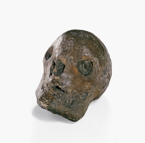
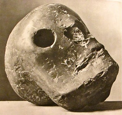
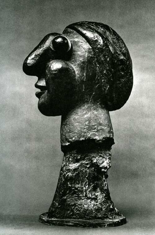
There are at least two powerful images of skulls: a modest size painting  from 1947, where a few lines create the inference of the space of a room, so that the skull shifts from a traditionally scaled memento mori painting to a monumental figure within a small painting surface. Nearby is a bronze sculpture of a skull which is one of the powerful works in the show, the image I found online captures it from a different angle than I experienced it in the exhibition and makes it seem a bit less monumental than it is,

The angle of viewing at the Guggenheim makes the eye sockets seem like bottomless craters.

By the time I got to the middle of the ramp, before I even got to a painted sketch for Guernica of the screaming horse’s head, I wrote in my notes, “I would say, at this point, fuck it, this is a necessary show, don’t tell me you’re a painter or interested in painting and not see this show, forget what you know or think you’ve seen, or think you know about Picasso, and just look.” That I would be so emphatic seems silly given Picasso’s totally accepted status as a genius, but it reflects the fact that for many artists Picasso’s relation to subject, to medium, and to drawing, is as foreign as the back side of the moon, and, while no one else could ever be Picasso, the combination of appropriation, expression, and formal invention could still exist as a fruitful area of art production, if one could resist the grip of excessive intentionality.

If you start at the bottom of the ramp you can first appreciate Picasso’s traditional  academic drawing skills and the delicacy of his drawing line but if you start at the top you get a punch of tremendous force and energy, and many of the works from the early 1930s and late 20s seem somnolent, as if, between The Demoiselles D’Avignon and Guernica, after Cubism certainly, he falls into an academic dream, an Olympian reverie, then BOOM you find yourself a room with large plaster  and bronze busts, mostly from 1931. What always seemed to me like a weird given of art, the “signature” profile that the woman was instructing the children to notice, in sculpture makes complete sense.If you start at the bottom you start with the BOOM pass through Olympian reverie and end with the BOOM of the last works, so it’s up to you.

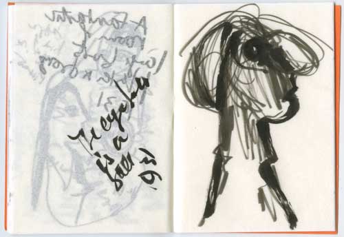
No photography allowed, so I sketched, it seems absurd of course, and presumptuous to present my drawings as any kind of evidence of Picasso’s work, but sketching is also an excellent way of experiencing artwork with your own body. In fact I feel that I  have to go back to sketch some of the paintings that I ran out of time and sketchbook room for, but they sparked some ideas for my own work which is a great gift of a great exhibition, that you want to work, that something stays in your mind as a starting point for a work of your own.

Picasso Black and White runs through January 23 but since it’s a block away from the National Academy, it makes sense to make a great day of it and see it before the Shea and Cage shows close there January 13.

FacebooktwittermailFacebooktwittermail

Three days more to see “Toxic Beauty”

This blog post …what can I say? The stated goal of A Year of Positive Thinking was to write about art I love, and I love Frank Moore’s work, both the later paintings, on view in the exhibition Toxic Beauty: The Art of Frank Moore at Grey Art Gallery through December 8 and the marvelous early film Beehive which is on view at Fales Library at New York University’s Bobst Library, on the South side of Washington Square Park, on view only through Friday at 6. For some reason I was never able to pull together a sensible text about this work, so my apologies to my readers and to the work, but at this very late date, this is just to mark my admiration and urge anyone who can to go see both shows while you can. Moore’s paintings, which if they were paintings by Hieronymous Bosch or Frida Kahlo would be considered treasured masterpieces, are mostly in private collections and thus out of public view, and I hope there are ways of seeing Beehive again, it’s just joyful and great!
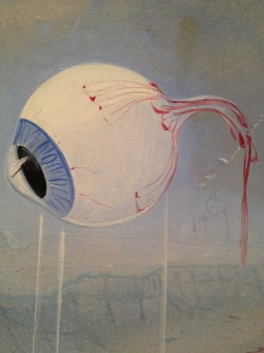
Frank Moore, detail, Wizard

This often seems like it’s a difficult moment in which to theorize painting. Or, rather, in the face of the temptations of and support for other media and methods of being an artist, young artists may still retain a longing for painting, but it is difficult to find material in support of their longing on two crucial fronts: contemporary theorization of painting, which is essential in an era in which linguistic validation is often more important than viewing artworks, and contemporary painting itself. Of course both exist: there have been significant attempts to move painting theory away from ideas still steeped in modernist discourses so that it can be seen as responsive to and participatory in the specificities of contemporary communications and there is a lot of contemporary painting including both work that is extremely successful in the art market and work which is seen to engage with more radical thought. However on any given week in which you can take students around to galleries or museums, there is no guarantee you will come across paintings that successfully enough make the dual case for painting as a practice able to address contemporary cultural issues while addressing its own medium and history.

That the narrative of the death of painting is still ongoing should be evidence at the very least of painting remaining a naggingly persistent ghost, or not even a ghost but a kind of zombie entity, not quite dead enough to go completely unmentioned. It continues to appear if only as a negative, as something that cannot be done—when a student of mine related to me what another student had told her about why painting was no longer a viable medium because it is too burdened by its history etc.. in the spirit of nihilistic humor, I took notes. At one point last spring it occurred to me to write a series of essays on the theme of When Exactly Did Painting Die? Not exactly a murder mystery, you see, not a Whodunit but rather a What Was the Time of Death mystery, or, maybe, When Was the Victim Last Seen Alive? mystery. This avenue of thought, or rather this umpteenth version of the life or death of painting argument first occurred to me as I entered the more sedate and serene uptown branch of the Armory exhibition last year, the one that is actually in the old Park Avenue Armory, and in the calm uncrowded atmosphere, from the doorway I spotted a really good late Philip Guston painting of a big fat head smoking a cigar. Well, I thought, here is evidence that painting was still alive in 1977.

You can bring the date up closer, depending on your individual taste. And of course I paint and I don’t see myself as a necrophiliac.

This is all by way of a long introduction to look at the work of an artist who instead of accepting the narrative of the death of painting, turned from performance/video to painting when the subject turned from life to death.  I would be remiss if I didn’t mark in this blog the very inspiring show of Frank Moore’s work, Toxic Beauty, at the Grey Art Gallery and at the Fales Library at New York University’s Bobst Library, before it closes on December 8. Better to be last to recommend this show than never, but I feel incredibly guilty that I haven’t written about the show since I first saw it in September, and that alas even now I won’t be able to do more than suggest a few ways of thinking about the work in both parts of the show. If A year of Positive Thinking is meant to be the space where I write about artwork I love, then this is the show, I love this work, I also think it is great, so I am mortified that even at this late date just before the show closes, this is still not a polished review or essay, just a few ways of thinking of the work in the two parts of the show and a few comments rather as if I was seeing the show with you and occasionally appearing at your elbow to point to something.

The show’s two locations each present one of these two orientations of Moore’s work. You are most likely to start at the Grey Art Gallery for reasons of accessibility from the street and location venue name, but then you will start at “the end,” with paintings Moore painted from 1985 to his death from AIDS in 2002,  wherein he grapples with the face of fatal illness and the Death that ravaged a community of gay men in the ’80s and ’90s, the death of his lover, his own battle with death. Another theme of the paintings from this period is the death of a Nature ravaged by human intervention. If you start at Fales, with the earlier work, including video performance and dance, you will start with life, a joyful consideration of procreation and life. Yet to reverse the order of viewing is probably not such a good idea. Start with death, with painting as the best medium to express death. Then return to the artist’s earlier work and leave the exhibitions with life. You will be inspired by both and both media are well served by the order.

Frank Moore’s paintings are representational, figurative, with an overall approach of magic realism that places him in the general spectrum of Surrealism in a line from Hieronymous Bosch to Frida Kahlo, with a streak of folk art or regionalist art in some of the structural details including the handmade frames made specifically to develop the theme of each particular painting. Many of the paintings have ambitious narrative programs, addressing complex and highly emotionally charged subjects, in particular the countless painful and dramatic aspects of the personal, cultural and medical struggle to deal with AIDS before the development of relatively successful drug protocols. The paintings are executed mostly in a mixed technique of oil and silkscreen on linen or canvas, mounted on wood or some sort of board, very carefully painted, with extremely smooth surfaces, fine lines, and a great attention to detail. The craft of the execution is essential to point out because it is so important to see these works in person, they yield only a fraction of their impact or meaning when they are experienced only as images.
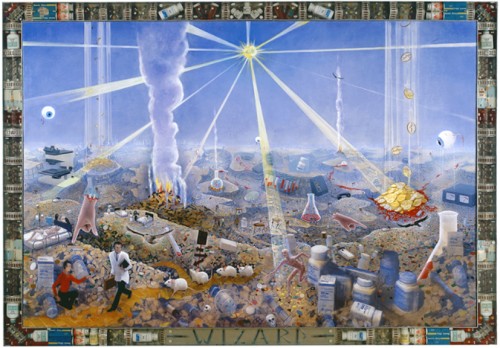
Frank Moore, Wizard, 1994, oil and silkscreen on canvas, mounted on wood, in artist’s frame (pharmaceuticals, resin, and aluminum), 68 x 95 1/2 inches–this is a large painting with exquisite surface and detail, and an awful reproduction here
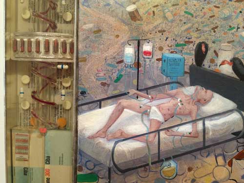
Frank Moore, Wizard, detail of painting and frame

If you look extremely carefully at the surface of one of his paintings, for example, “With this ring…” (200o), a large painting with a dominant flat pink background, you may pick up ever so slight traces of canvas weave, but for the most part the surface Moore has created with great thought and care is smooth so that he can use a horizontal pink stroke with a slight differentiation of dark to light where more pigment falls from the brush. The details, an index finger at the tip of which a tiny bride reaches out to a gold wedding ring dangling from the tip of a single octopus tentacle, a fly, a gigantic grasshopper, climbing the vertical strand of a double helix, are painted with tremendous attention and care for line. So, the evocative, slightly creepy subjects amidst the brilliant color, are not the only important elements of the work. As a painter, you need sable brushes, from large filberts to single hair, good quality paint for the beautifuly surface and color, and you need to have chosen to create the painting surface so that these marks can be created and catch the light and the eye just so. You have chosen this because you love this shine, this color, this level of detail, because they reach towards the uncanny, and because they help you create an homage to notable predecessors and inspirations, Frida Kahlo, Hieronymous Bosch, Dali , who also worked with smooth surface, fine line detail, rendering, and who carry the DNA of hallucinatory magic realist representation in the service of narrativity. I may have gotten the actual materials and tools wrong in my notes before the work, but I’m not wrong in drawing attention to the details of Moore’s craft: here are his comments about this painting’s fakture:

I use a relatively limited ranges of pigments–two blues (ultramarine, phthalo), three reds (alizarin crimson, cadmium red light, phthalo rose red), five yellows (cadmium lemon, medium and dark, hansa and diarylide), two greens (permanent green light and phthalo), dioxanine purple, titanium white and ivory black. NO earth colors–I prefer to start from a point of maximum color saturation. I find the final product is more brilliant and luminous. Occasionally I will use something else like manganese blue or cobalt.

I’m a brush addict. I buy them wherever I find them. I use unorthodox brushes such as masonry and roofing brushes, wire brushes, sticks and other plant material, sponges, textiles and quite often my hands, particularly my thumb, which, for example, is evident in the stippling on the tentacle in “With This Ring…”. The marks made by unconventional tools seem to lend the work a more natural feeling, which contrasts all the more strongly with the photo-mechanical reproduction techniques I also use in the work.
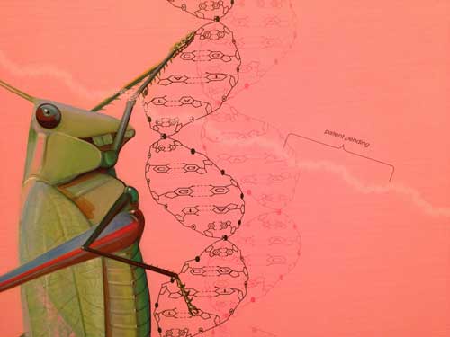
Moore, “With This Ring…”, detail

In the same interview, with Douglas Dreishpoon, reproduced in the show’s excellent catalogue, Moore also writes about the importance of drawing:

Drawing is critical. Drawing is melody. Drawing nurtures the thought, connects the mind to the page. All my images start in my mind as some kind of elusive paradox, oftentimes not even necessarily a visual one, but when I try to give it visual form it is usually with clumsy scribbles no one will ever—pure drawing.

Another thing I would point out if I were standing beside you, is that although the paintings are large in size and have such ambitious, political, narrative programs that are developed in many detailed vignettes best read from very up close up, Moore is masterful in his maneuvering of the viewer so that large abstract compositional elements and beautiful large areas of color draw you in until you are close enough that you begin to perceive the detail and be captured and captivated into an entirely different type of reading. This is the case in Oz for example, a painting I still remember seeing when it was first shown in New York City at Sperone Westwater Gallery. Oz (1999-2000) is a kind of encyclopedic landscape of catastrophic environmental mayhem, a genetically engineered beanstalk shoots up from a pot of gold coins while individual families relax, play golf or the piano, and lie on rubbish piles of their destroyed homes. The painting’s theme makes even more sense to me than when I first saw it when it was originally shown at Sperone and thought about how strange it was to have this intricate painting about genetically engineered corn. Today the damage wrought by genetically programmed agribusiness and the image of destroyed suburban life is much more part of our knowledge and image bank than it was even fifteen years ago, when it was made and when it seemed like a bit of an esoteric though unforgettable direction. Moore might have appreciated, in a dark way, the facts and the imagery of a recent story on NPR about how little natural life exists in an average Iowa cornfield as compared to plots of land in other areas of the world.

Many of the paintings deal directly with the trappings of illness, medications, IV lines, blood, cancerous lesions. In Patient (1997-1998) blood seeps from an open IV line onto a bed, which, painted an icy blue, seems to be a melting pool of ice water instead of a zone of comfort. In one detail you have the smooth blue precision of the sheets, painted bubbles of water or foam and silkscreened white snow fakes (thus actual patterns, not invented ones), there is no direct figuration, not necessary, but there’s as much about mortality and evanescence than if the leaking bleeding body in pain was present.
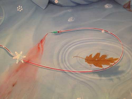
Frank Moore, Patient, 1997-98, oil and silkscreen on canvas mounted on wood, in artist’s frame (red pine) 49 1/2x 65 1/2 x3 1/2 inches, detail
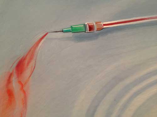
There was one painting of Moore’s that I particularly held in my memory since I first saw it at Sperone years ago, because it was so inventively expressive especially considering the simplicity and economy of its subject in comparison to the impressive larger works like Wizard.

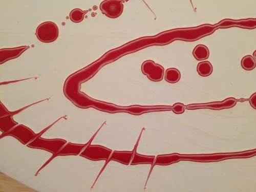
Blood seeps out of two slices into a loaf of bread and into the middle of a puddle of spilled heavy cream which has oozed out from an overturned cartoon. The red paint has been dropped into the pool of white paint to create a very careful Jackson Pollock in the shape of a Crown of Thorns. The Christ reference and the art reference are at the center of a still-life painting with an almost folk art sensibility: the dusting of flour on the loaf of bread is created with a kind of spray effect which is completely different in technical feel than the loaf, or the cream and blood spill. It’s a folk Zurbaran of the AIDS era.
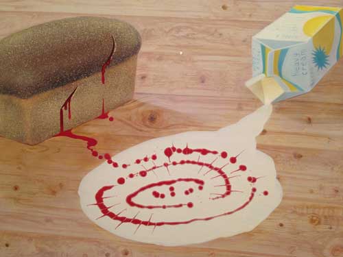
Frank Moore, Easter, 1994. Oil on canvas, 20 1/4 x 27 1/8 inches.
* At the Fales Collection, the works on view include some of Moore’s many sketch books and two filmed collaborative dance and theater and performances, The Miller’s Wife (1987) and Beehive (1985) along with the story board drawings for these. The Fales section of the show is only open on weekdays so there are only three more days to see it, but all I can say is, Beehive, which Moore created with choreographer Jim Self, is one of the most beautiful and joyous works I’ve ever seen. Its subject, procreation of the bumblebee, is entirely oriented towards life, and its style is absolutely the opposite of the paintings: big bold primary colors,  yellow, red, blue, orange, black and white. The forms are also bold, the music is great, lilting, funny, silly, joyful, driving, with sound effects, “dialogue” something like the “uh oh” of the Teletubbies or like funny sound effects from the 1920s and early television but put through an electronic filter and always upbeat and beautiful. Here the artistic resonances are not with Hieronymous Bosch but rather with Diaghilev and Matisse, and with the sets an ’80s Pop version of a German expressionist movie. The angles of the spaces may be related to German Expressionism but the color is more Russian vanguard modernism, or folkloric a la Diaghilev with an overlay of ’60s pop feel.

Beehive is quite addictively magical and gorgeous. Death is not here, it does not shadow this work at all, just beauty, joy and pleasure through sound color, movement.

The one element which is the same in both groups of work–this film and the paintings–is that, even though the overall appearance and style are different, each gesture and frame is exquisitely thought out and executed in detail, even if in the film the details are bold, bright, and joyful, rather than finely detailed and horrific as they are in the paintings. Nothing is amateurish, there is no DIY , no camp, and yet the style is not commercial either.

In Beehive  nature is good, in  paintings like Oz nature is damaged by human intervention, it has beauty but that beauty is toxic.

Frank Moore, Formal Garden, 1985, Oil and felt-tip pen on canvas, in artist’s frame (wood), 26 x 104 1/2 inches
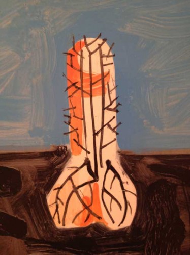

One  of the first paintings you see at Grey Art Gallery, Formal Garden, is, in its forms and spirit, more like Beehive than like any of the other paintings in the show. A  horizontally oriented painting with a rustic wood frame made by the artist, it represents boldly drawn shapes, a  bird,  a phallus, an elephant all seem to burst from roots in dark earth up into blue sky above: the chimeras caused by man’s intervention in nature are still exuberant and slightly folk inspired forms. This painting is from 1985. Moore was diagnosed as HIV Positive in 1987. In a late interview with Robert Atkins on the AIDS-Arts Forum Artist in the Archive series, Moore suggests various artistic and also practical reasons reason for his change of focus from dance and performance to painting,

Theater work is great because it forces you to make instantly comprehensible gestures, there’s not a lot of time to ponder ambiguity or you risk losing the audience. As [artist] Thomas Woodruff says, the problem with subtlety is that nobody notices. I also liked the communal nature of theater, the family value. But there’s also a downside. You are often under a lot of pressure, there are constant deadlines and people are depending on you. Theater is also much more expensive to produce than painting, what with salaries, space rental, and the like. Also, unlike a painting, theater is ephemeral. Another factor that really pushed me out of theater was the long illness of my lover Robert Fulps. I had to be at home.

It is tempting to take that further and see not only the turn towards painting but also the change in the style and narrative direction of the work after 1987, as the best medium for Moore to develop a complex, detailed, crafted visual language for the subject matter he now felt the necessity to address.

Frank Moore is a major artist and yet his name and work are less well known than other artists of his generation who also died of AIDS, including Keith Haring and David Wojnarowitz. There are always many factors in what happens to an artist’s reputation when that artist dies too young, before they can do everything they can for themselves in their life time. Since his estate is represented by an important gallery, Sperone Westwater, it is hard not to presume that his relative obscurity (with passionate admirers and fans of course) is due  to the fact that his work is composed in part of large narrative paintings of formal complexity representing the dark side of American life and death in a painting language that is by turns familiar, seductive, beautiful, but also does always not give us a quick and easy read. And these are paintings that are best seen in person, because their craft and their sculptural presence is so important. And, further, the major paintings are in private collections so not readily available for public view and study. I can only hope that the owners of Oz, Wizard and other major paintings from this particular series see their way to donating these paintings to New York museums, hopefully several of them to the same institution. I vote for their being able to be compared and contrasted with the works of Florine Stettheimer, so, New York museums, the game is on.

Or, anyway, in terms of my murder investigation, Painting, What was the Time of Death? “Toxic Beauty” assures us that painting was still alive in 1994 when Moore painted Wizard, and in 2000 when Moore painted Oz. That’s not that long ago.

Painting: the undeadness continues.


FacebooktwittermailFacebooktwittermail