Category Archives: General

Intimacy and Spectacle 2: answering a questionnaire about contemporary art museums

I like it when someone asks me a question on something I might not ordinarily think about or write about: I can’t help but start to wrap my mind around it and I may even get so involved that I answer at length when brevity might have made more sense. A case in point: last week I received a Facebook message from someone I didn’t know (not even a FB friend at the time) asking me if I would answer some questions about the contemporary art museum. I didn’t know whether he had read my recent blog post Intimacy and Spectacle 1 though his message did come a couple of days after that was published. But I was intrigued because issues raised by MoMA’s recently announced building plans have been on my mind, so I answered his message and I received the following questions under the rubric “Questions about (contemporary) art museums – Dissertation of Cultural Management / Portugal” from Juan Gonçalves who is working on a dissertation developed within the MA in Cultural Management from the University of Madeira, UMa, 2013-2014. Once I started answering his questions I got so carried away that I thought I might as well share the letter on my blog, which Juan agreed to, since he can quote from the blog in his dissertation. I don’t know much about the program he is working and I have not been to Portugal so my response is lacking a sense of his context.

These were his questions:

1.The definition of a contemporary art museum is still valid? Would you suggest another?

2.How to break the barriers that still impose the museums of contemporary art and its audience?

3.How the contemporary museology works in this economic crisis?

4.What is the best architecture for a contemporary art museum?

5.What can you say about contemporary art museums in Portugal? And about the artists?

Here are my answers:

Dear Juan Gonçalves,

Thanks for asking my opinion on questions about the contemporary art museum. I am not an expert in museology so I am speaking primarily as an artist though also as an educator, and art writer. My opinions are principally coming from my own desire to be able to see art so that I can really see it—I was going to say to experience it but that word “experience” already gets into the spectacle or entertainment regime that museums are increasingly obsessed with.

1.The definition of a contemporary art museum is still valid? Would you suggest another?
I don’t think much about it: I’m more concerned with what is in a museum than what its name is but I have accepted the nomenclature of contemporary art museum. I do want to see contemporary art or new art, and a so-called museum of contemporary art is a place in which to see what some people think is going on, but the academic/corporate category contemporary art doesn’t interest me that much, even though I consider myself a contemporary artist.

As it is frequently noted, contemporary art is a contradictory or oxymoronic category. Nothing remains contemporary and even to define what is contemporary art is difficult—the essays in e-flux journal’s 2010 book What Is Contemporary Art? ended up more haunted by modernism than definitive about the character of the contemporary. Is all art made today–thus, literally, contemporary–considered suitable to be shown in museums of contemporary art? No. We know that most art being made today will not be shown in museums of contemporary art because certain determinations have been about what is contemporary: usually new media and technology, theater, spectacle, and participation, as well as a focus on young artists and responsibilities to the global.

One goes to a contemporary art museum to learn about the contemporary moment, what the art selected by a defined international academic/corporate cadre will tell us about the world we live in, for better or worse. Whatever is considered contemporary art by the contemporary art museum is cultural utterance of interest although what the work exhibited actually says about this particular historical moment may not be as evident to us in the present moment as we think, because, as suggested by Walter Benjamin, the artwork contains “unintentional truth” about the present that is so much part of our ideological frame that it is invisible to us but its trace will become transparent over time. Whether it is “truth,” which would sound absolute and unchangeable, is not as relevant as the fact that another truth about the contemporary art work will be visible in it as time passes and the work is no longer contemporary. One problem is that the contemporary art museum is principally meant to define the present to the present but it ends up writing art history, so much from a time period may be lost because a narrow cadre left it out. That is a problem because the pressure of being contemporary allows no time for things to sort themselves out, for the sediment to fall to the bottom of the test tube. I should note that our particular contemporary seems particularly uninterested in time, in history either looking back or looking forward–but maybe people were already saying things like that in 1850! In any case artists, curators, and museum directors can only do what they can do or see what they can see at a moment in time based on knowledge and motives  specific to that time.

Because of the nature of the newness of contemporary art there is the problem of where commercial galleries’ role ends and contemporary art museums’ roles begin. But it is interesting for a museum to try to keep up with and try to define and present the contemporary at any given moment. And it can be useful to the viewer with some experience in art if this kind of investigation takes place in a museum with some sort of institutional history that gives the curatorial choices a context. My memory goes back to some of the early Projects exhibitions and the Information show at MoMA, which had a stronger impact from appearing in the context of canonical modernism. So perhaps the museum of contemporary art is too limited a situation, the contemporary makes more sense and is more exciting if seen in the context of the past.

In terms of a category of museum of contemporary art, the model of the Kunsthalle without permanent collection is a good one also, in addition to the more conventional modern/contemporary museum. I think it is important to have both kinds of institutions. In the United States we don’t seem to have that much of a Kunsthalle culture though the New Museum functions that way here in New York and there are a few other institutions like that around the country. smaller centers of contemporary art often have the freedom to put together more heterodox and imaginative visions of the present because pressures of the market don’t totally penetrate the local. I think it is great to have that kind of institution as well as larger museums with a mix of permanent collection and special exhibitions.

2.How to break the barriers that still impose the museums of contemporary art and its audience?
All museums today, not only specifically museums of contemporary art, are interested in attracting large audiences mostly for commercial, economic reasons. That is true if they are private institutions or supported by the state. On Wikipedia’s entry for museology there is a section on “Tourism as a vehicle for success.” Any art of any time period can be of interest to any audience, I am convinced of it, so long as there is access, financially and through education programs. It is not necessary to pander to “the audience.” But museums and in particular contemporary art museums are now thinking about audience mostly in terms of traffic flow, how many people can be cycled through the galleries to the restaurant and the gift shop. They give that basic commercial desire a theoretical or political gloss by talking about the “audience” the way leftists might speak about “the people.” There is genuine idealism in institutional educational outreach programs, most museums offer fantastic resources for the community although there is still a huge gap between a general audience which might find any art museum an intimidating place but as older museums showing a range of art including but not limited to the contemporary probably do just as well as contemporary museums in attracting culturally and economically diverse audiences. Even if you add all the features that you think will attract a younger audience, you still are dealing primarily with a privileged audience. The museum is still intimidating, it takes more to make less privileged audiences feel welcome and able to take advantage of opportunities for access the museum may offer. This past summer the New York Times published a story about a young woman who hung out in the lobby of the  Brooklyn Museum because it was air conditioned. She became interested in the one art work she could see for free from her vantage point, Kehinde Wiley’s Napoleon Leading the Army Over the Alps. She didn’t venture any further because she couldn’t afford the admission fee until finally a friend told her that it was only a suggested fee.

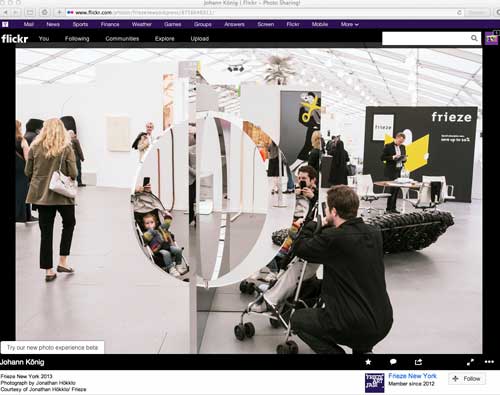
To get the most traffic flow, it seems to be desirable to design museums and curate shows that will function as good backdrops for selfies. The so-called “experience economy” is not only predicated on giving people thrills of some kind, but also and perhaps even more on giving people something which is actually the opposite of what I consider an experience of art, it is the experience of taking pictures of yourself in front of something, the art is a ready made set for your photo-op. Some of those “backdrops” (the art and the architecture) are terrific, and it’s Pavlovian, I get sucked into the selfie regime as quickly as the next person: I have a whole collection of self-portraits taken in contemporary artworks made of shiny reflective material. Maybe that emphasis on self within spectacle is one characteristic of contemporary art.
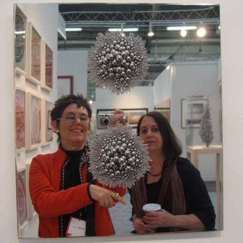
Self-portrait with Susan Bee, Armory Fair, 2010
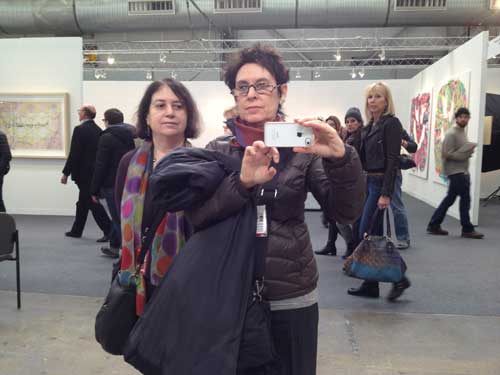
Self-Portrait with Susan Bee, Armory Fair, 2012
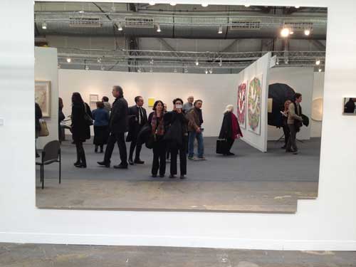
You get the picture. One had gone from a slightly discredited art historical model of the work of art as reflection of society to contemporary art as an actual reflective surface in which the viewer can see herself.
But I am happiest when I can wander through a quiet, elegant, even modest museum that makes it possible for me to have a meaningful interaction with an artwork, even just one real experience of seeing is enough, in a day. I need to hear myself think, even if I am in a crowded space. This may sound old fashioned and art object oriented but in my capacity as a teacher, I have noticed how hard it is for my students to actually see the art in museums — I guess here I do mean painting and sculpture and objects— how hard it is even to really focus on more spectacular video installations, not that they can’t, they may respond more immediately to such installations which are more accessible to them, but they may also just be sitting down so they can check their email. This can lead to cynicism and alienation in a demographic that is paradoxically the presumed principal target of the contemporary museum of contemporary art, under the guise of a fun-house atmosphere aimed at pleasing just that demographic. Everyone feels the loss of human scale, the difference between my generation is that perhaps we can pinpoint the reason we feel a certain way within these new spaces because we did have experiences of human scale within museums of contemporary art: the Pasadena Art Museum in the 70s was such a place, for example, and, of course, the much mourned Museum of Modern Art in NY pre-1983 and pre-2006. Your questions came just at a moment when it occurs to me that most of my students have only experienced the 2006 version and when we (people born before 1980) express our dismay about a type of museum experience and a type of relation to art that we feel is lost, they basically can have no idea what we are talking about.
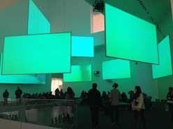
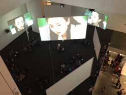
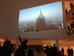
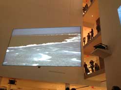
(images above from Isaac Julien, Ten Thousand Waves, MoMA, 2013)

Curiously some of the commercial galleries that represent the apotheosis of the contemporary art industry and market, such as, here in NY, Gagosian and Zwirner, have been able to mount museum quality shows the past few years, including for example excellent Picasso and Frankenthaler exhibitions at Gagosian and the recent exhibition of Ad Reinhardt’s work at Zwirner, in spaces that either are as beautiful as any museum or that are just functional in a good way, with few frills, just good walls and space. Because their financial motivation is on another level than who walks in the door to see the work, they don’t have to try to attract the entertainment-seeking “audience” since the real business is taking place elsewhere. And, although galleries may seem even more elitist than museums, actually these shows are free, there is no admission price at all.

The reverse example might be the international art fair, for example Frieze’s fair on Randall’s Island in New York, a kind of upscale Shangri-La of contemporary art seen from the point of view of the market, which, some might argue, is contemporary art. In fact the Frieze fair model is really a perfect manifestation of a contemporary art museum: it is open about being a function of the art market, works must compete instantaneously with a very wide though certainly not comprehensive selection of contemporary art made around the world, the designers make an effort to give smaller works some space but it is busy and there is a tendency for art which is large, shiny, or in some other way spectacular and photogenic to do particularly well. And the whole thing is not just contemporary but temporary, which really makes it a representative instance of the contemporary.
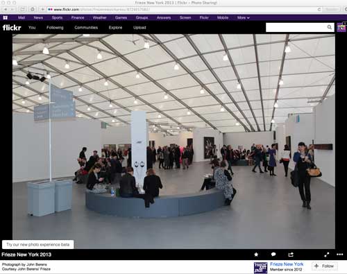
But many of these newly built contemporary art museums are designed so that they will accommodate large installations and events and that scale will then influence the production of future contemporary art that will tend to the large, the spectacular, the entertaining because those are the modes that will function best spatially and as images. Such spaces are less likely to nurture or support more intimate work and also experimental work including art of social engagement which seeks to engage with the world outside the walls of the elite institution.

So, as you can tell, contemporary art museum or any art museum as fun house for the Google iPhone generation is not my favorite, or, it is fine, so long as beautiful museums are not destroyed in order to achieve those goals. As you know, currently New Yorkers are upset about MoMA’s plans to put the last nail in the coffin of what was one of the most meaningful art experiences. The response to their new plan on the part of artists, architects, architectural critics is hatred and contempt, rage and mourning. Most of us already disliked the Taniguchi remake so much we didn’t expect it could get any worse.

3.How does contemporary museology work in this economic crisis?
The current economic crisis of course makes it all the more tempting for museums to try to make themselves desirable to a tourist audience and to people who are interested in the museum as just another glamorous fun place to hang out and take pictures, where art is peripheral and everything leads to the gift shop. It also makes museums more vulnerable to the machinations of their board members.

4.What is the best architecture for a contemporary art museum?

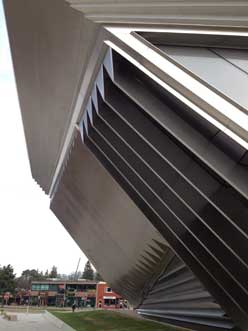
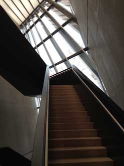
I enjoy museums with spectacular architectural designs, as art objects in themselves. But it is amazing how egotistical these spaces can be when it comes to accommodating the art works they are supposed to present. I recently visited Zaha Hadid’s Eli and Edythe Broad Art Museum in East Lansing, Michigan: it is really beautiful both outside and inside, like a gleaming silver spaceship that happens to have touched down in a college town on the flat plains of the American mid-West. However most of the interior exhibition walls are at an angle, which in some spots induces vertigo, and which makes it a pretty eccentric place to look at painting, drawing and photography, not terrible, in some cases works actually look interesting, but they definitely have to struggle with the situation. Maybe that is part of the point of the design.
On the other hand a recent visit to the new updated Yale University Art Gallery is exemplary of a wonderful museum experience, where you feel like a human being, and can explore wonderful artworks in spaces that are beautiful and functional without being ostentatious and where there are shifts in scale and intimacy between small and eccentric old spaces and larger white cube spaces depending on the needs of the work. It adapts architecture from different eras and styles and I think that is a good model. And it is free which is a fantastic gift to the public.

In general, it seems that older spaces that have some history, including repurposed spaces previously used for industry or commerce, often make good spaces in which to exhibit contemporary art. MoMA Ps1, in a former public school building in Queens, NY is a good example: dimensions and characteristics of the exhibitions spaces vary in eccentric but very useful ways that allow for a variety of types of art, and the initial decision to maintain those basic dimensions spared us from contemporary architectural decisions that might be detrimentally egotistical or trendy in scale or pretension. Significantly in recent years some of the best exhibitions offered under the aegis of MoMA have taken place at PS1 because of the intimacy and character of the rooms. The DIA building in Chelsea was also an effective model of a space that was not new, was fairly simple, had a human scale, and got out of your way so you could concentrate on the work.

I think a museum should offer some moments of visual pleasure, small architectural details or sweeping vistas that are pleasurable, beautiful, with attention to natural light and structural materials, elements that show that thought has been given to offering a sense of pleasure to the human being, thinking has gone into human scale, not just architectural vanity, corporate scale, and entertainment value. As Barnett Newman famously said in Emile de Antonio‘s film Painters Painting, “in the end size doesn’t count…it’s scale that counts, it’s human scale that counts.” He was talking about painting, but the shoe fits for architecture too. Architectural pleasure for the sake of the architecture should be paired with the architecture being able to get out of the way of the artwork in it and let you see the work as if it belonged entirely to you only, for at least a moment in time.

5.What can you say about contemporary art museums in Portugal? And about the artists?

Unfortunately I have not had the pleasure of visiting Portugal so I cannot comment on museums in Portugal.

Sincerely,

Mira Schor

FYI, This post is not a promise that anyone who writes to me should expect a response, short or long, or that I will publish that response on A Year of Positive Thinking.

FacebooktwittermailFacebooktwittermail

Intimacy and Spectacle 1

When a cultural value or quality is lost or altered by time and fashion to such an extent that its first, indeed even its second and third meanings seem un-recuperable, it is hard for anyone who did not experience that value in its prime to even understand what has been lost. Thus it sometimes seems as if today everything, even “intimacy” in relation to artwork, has to be put into scare quotes and that it is always knowingly referential in such a manner that what is referenced is turned on its head. If it were truly intimate could we even perceive it in public situations? What is intimacy without coyness and preciousness? And what was the value of intimacy anyway? After all what is so wrong about spectacle?

This train of thought came to mind in a specific way this past week when the Museum of Modern Art announced that its plans to expand its footprint on 53rd street necessitated the destruction of the Museum of American Folk Art, a small building only ten years old, whose interior lay-out heavy on staircases, light on gallery space made it problematic as a museum space but interesting as an artwork through its dark sculptural facade and importantly different in its scale in a neighborhood of increasingly megalithic skyscrapers. It occurred to me that just as most people born since the mid-70s would have no experience of the 1939 to 1983 version of the museum I grew up in and that artists of my generation mourn as they would a beloved family member, people born since 1980 would hardly remember the 1984 redo. The relationship to art that the earlier museum provided, thus one’s understanding of what art was, and also the art that gets made today or seen today in museums have all so radically changed that I think it would be hard to understand what seems to have been lost and what makes the plans seem so appalling to so many. The old song goes, “You Don’t Miss Your Water (Till Your Well Goes Dry),” but if you never drank water you really wouldn’t know what people are talking about. I will try to address this situation in a number of posts.

In this post I will look at the work of Paul Klee, first by reproducing the entire text of T.J. Clark’s review of The EY Exhibition: Paul Klee-Making Visible, the Paul Klee retrospective currently at the Tate Modern. Clark’s text was published in the London Review of Books yesterday and sent out in this morning’s email from weisslink; second, by quoting from Walter Benjamin’s  “Theses on the Philosophy of History”, inspired by Paul Klee’s etching Angelus Novus; and, third, by including a text I published in 1997, “Mr. Klee goes to Washington,” in which I imagined Klee’s manner and public persona (not the same general type of fellow as he might operate today) if he were to be put in the position of appearing on a cable TV talk show.

As introduction, I should say that when, in my teens, I began to form my idea of myself as an artist and I looked to the art I saw in museums and galleries for models of what I wanted to do (what I was in fact already doing as best I could) the work of Paul Klee was extremely important to me. Only after the emergence of feminist art history and criticism did I come to understand that the models that I found in art history, including Klee, Ernst, and Magritte as well as Flemish painting, early Renaissance Italian painting, Japanese Scroll Painting, Rajput and Mughal painting, contained traits that mainstream art and history associated with the feminine and therefore repressed and condemned, traits such as modest scale, ink and gouache media, detailed representation, narrative and autobiographical content, and imagination or fantasy, all elements which gave me visual methods and diagetic permission to do what I wanted and consider it part of art.

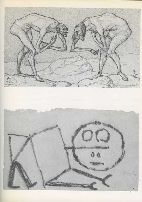
Paul Klee, “Encounter of two men, each believing the other to be of higher status,” (etching, 1903) and “Ein Oberkriecher” (“A Super Sychopant”), 1939.

The point is of course that I sought out these traits that were considered feminine in works by male artists because there were no female artists then readily available to serve as models, something I only became aware of when I finally began to see more works by women artists (Nancy Graves and Eleanor Antin being the first women artists I remember being given a Projects show at MoMA, in 1971 and 1973 respectively, and Frida Kalho and Florine Stettheimer being particularly important models) and, still later, when I read feminist analyses of the gendered development of the discipline of art history itself, as in Rozsika Parker and Griselda Pollock’s Old Mistresses: Women, Art, and Ideology.

I pored over Klee’s highly linear, darkly gnarled early figuration, imitated and copied as best I could the delicate and sometimes unusual surfaces of his small abstractions and abstracted still lifes, in general thinking to myself, well, these are works that reflect my own formal and narrative desires for art at that moment, and they are in the Museum of Modern Art, so there is some official permission there, within the oppressive patriarchal rules about what was or wasn’t art pervasive even in the 1960s.

I loved Klee, early Ernst, and Magritte to death and then turned away from them once I had gotten what I had needed to help me through the pass.

*

AT TATE MODERN by T. J. Clark

from London Review of Books, Vol. 36 No. 1 · 9 January 2014 pages 12-13: here is Clark’s full text

There was a time within living memory when a survey of Klee’s painting like the one at Tate Modern – 17 rooms, 130 works – would have been the event of the season (it’s on until 9 March). I remember even scoffing a little in the 1960s at London’s appetite for shows of the ‘tragic comedian’, antidote to Picasso’s vehemence or Matisse’s fundamental coldness. For good or ill, that moment is past. The galleries at Tate are mostly not crowded, and I had the impression that the respectful visitors, bending over the ropes to get a better look at the artist’s small things, found it hard, ultimately, to understand his cast of mind. ‘Klee is like somebody out of an E.T.A. Hoffmann story about the small-town Germany of the 18th century: comfortable, musical, modest and fantastic,’ Clement Greenberg once wrote. Or later in the same essay:

 Klee is not subversive. He is well content to live in a society and culture that he has robbed of all earnestness; in fact, he likes them all the better for that. They become safer, more gemütlich. Far from being a protest against the world as it is, his art is an attempt to make himself more comfortable in it; first he rejects it, then, when it has been rendered harmless by negation, he takes it fondly back. For notice that Klee’s irony is never bitter.

Rendering the world ‘harmless by negation’ is not what we have been led to expect art, especially modern art, to do. And ‘taking it fondly back’ sounds genial to the point of smugness. Matisse is allowed to say, famously, that his art was intended as ‘a comfortable armchair for the tired businessman’. But that is because his art so often invites us not to believe him.

Klee’s whole attitude to art-making is elusive. Occasionally the poems he jotted down in his diary seem to help. There is one written in 1914, probably soon after war had been declared, which begins:

The big animals: despondent

at table: unsated.

But the small cunning flies

scrambling up slopes of bread

inherit Buttertown.

This seems like the script for a Klee picture, and the mood is almost optimistic; but the poem ends four verses later on a different note. The translation is Anselm Hollo’s:

 The moon

in the railway station: one of the many

lights in the forest; a drop

in the mountain’s beard:

that it doesn’t trickle!

that it is not pierced by the cactus thorn!

that you

do not sneeze, and

burst

this bladder!

The little pictures in the Tate exhibition often seem to be turning towards us – towards the ‘you’ in the poem – and asking us not to sneeze, not to disturb the Klee moonlight. But the year of the poem is not auspicious, and the poem as a whole, although it does not have any other tactic – any other diction – to put in place of the small flies’ cunning, seems aware of what smallness and cleverness are up against in the early 20th century. ‘Man-Animal:/Clock of Blood’, reads the two-line stanza preceding the last one. Klee’s paintings almost always have some such ominousness in the background.

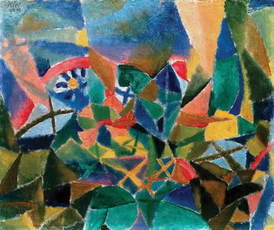
Paul Klee, “Flower Bed,” 1913

There was, we know, far worse to come. On 1 February 1933, two days after the swearing-in of Hitler’s coalition government, the Nazi paper Die Rote Erde carried a full-page article under the headline ‘Art Swamp in Western Germany’. The target was Jewish domination over the Düsseldorf Academy, which had been clinched, so the writer believed, by Klee’s appointment as professor two years before:

And then the great Klee makes his entrance, already famous as a teacher of the Bauhaus at Dessau. He tells everyone that he has pure Arabic blood [apparently Klee had let slip that his mother’s family may have come originally from North Africa], but is a typical Galician Jew. He paints ever more madly, he bluffs and bewilders [er blufft und verblüfft], his students are gaping with wide-open eyes and mouths, a new, unheard-of art makes its entrance in the Rhineland.

Klee himself was catching up fast at the time on the varieties of tyranny. He wrote to his wife, Lily, on 9 February: ‘I am reading (in Mommsen) about Caesar, after having read about Hannibal, and at the same time Stendhal’s Napoleon. Have to be a little while in the company of these kinds of geniuses. Pleasing to note that there are still other formats besides Hitler.’ Pleasing – though not for long. Klee and Lily made a break for Switzerland in December.

‘Bluffs and bewilders’ is the phrase, in the rooms at Tate, that will never entirely go away. It is very hard for us, I have been suggesting, to conjure back the feeling of the circumstances in which, for much of the 20th century, modern art got made. ‘Art Swamp in Western Germany’ may be of use. But even when we have caught a whiff of the savagery, venom and relentlessness that could dog a modernist’s footsteps in Klee’s lifetime, it still needs an immense leap of the imagination if we are to put ourselves in Klee’s shoes – to understand, and maybe to sympathise with, the little creatures scrambling in his labyrinths. Too many adjectives ending in ‘-ical’ – whimsical, mystical, magical, metaphysical – suggest themselves in front of his paintings, and seem to come up as excuses. Maybe because one senses that the ‘-ical’ that matters most to modern art – the physical, the here and now of the painted flat rectangle – is so hard for Klee to hold on to.


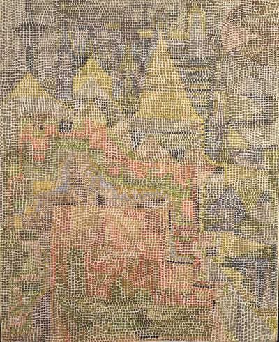
Paul Klee, “Castle Garden,” 1933

He knew it was. An artist as gifted and intelligent as Klee was must surely have looked back at his first efforts to be a cubist – to spread forms out additively in a rough geometric grid, to stay close to the surface, to have everything in a painting be solid and resistant – and have seen early on how turgid they were, how academic. (An artist’s ability to come to terms with cubism was, for Klee’s generation, the acid test. Klee’s struggle with the style in 1913 is in contrast to Schwitters’s or Miro’s or Mondrian’s, for whom the new idiom is immediately a liberation.) And Klee’s version of cubism was academic – paintings in the show like Plants in the Mountains and Flower Bed are fair examples – because cubist solidity was so remote from his native perceptual habits. It did not take him long to realise that if his art was to flourish he had to work with his very lack of certainty about where anything was in the world and how intimate with objects a painting ought to claim to be. The big animals would sit up at the cubist table; he’d find another way to Buttertown. The mottled, blotted, bending, backlit fields of colour he soon perfected, and the feeling of the surface in a picture (and space in the world) as essentially penetrable – always about to open or dissolve – were his true sensibility discovering its means.

Paul Klee, ‘Analyse verschiedener Perversitäten,’ 1922

Cubism remained a matrix. Klee realised that others had bent it to their purposes: Mondrian’s sensibility, after all, was as remote from Picasso’s as Klee’s own. In and around 1923 Klee found a way to make even the tight cubist grid do the work he wanted – by inserting enough brighter and lighter squares into the chequerboard, each of them beckoning the eye through the foreground into depth, so that the surface came to look as if it were a kind of transparency ‘really’ hung across a glimpsed infinity on the other side. Once he had the basic idea he often returned to it, varying the size of the squares, the regularity of the grid, the translucency of the veil. The series of glittering watercolours and oils done in 1931 and 1932, using stippled dots or tiny oilpaint tesserae – paintings like Castle Garden or Semi-Circle with Angular Features – strikes me as the high point of this kind of space-making. The Whole Is Dimming (Das Ganze Dämmernd), reads the title of one of them, summing up the vision.

Paul Klee, ‘Forest Witches,’ 1938

The dimming whole is fragile. Whimsy and weakness are deliberately close much of the time in Klee – because the alternative, in the world of Die Rote Erde, is an undimmable grasp of totality. This is the worldview his art wished to refute.

It is not surprising that in the high age of modernism an art of Klee’s kind was written about superbly. Painting for him was intertwined with language. The rebus and hieroglyph were close. Titles regularly half-enter Klee’s picture space, inked in neatly along the bottom edge, and beautiful in themselves. Word and image are out to seduce us; and yet the best criticism of Klee has been not quite willing to fall under his spell. Greenberg was clearly out to resist. The first version of his great Klee essay appeared in Partisan Review in 1941 – a kind of obituary, written in dark times. The second, published nine years later, from which I have quoted, is crafted with extraordinary tact, but nonetheless seems to be trying most of the time to ‘place’ its object without condescending to him. Compare the inexorable Marxist Otto Karl Werckmeister. He spent long years, in the 1970s and 1980s, pursuing Klee down the alleys of compromise and equivocation that accompany the career of art in our time, and gave us our clearest – and in the end, most compassionate – picture of Klee face to face with war and revolution. We all go to Werckmeister – I do just as much as the writers in the Tate catalogue – for those moments at which, in a letter or scribbled sketch, the Man-Animals come crashing through the Castle Garden walls.

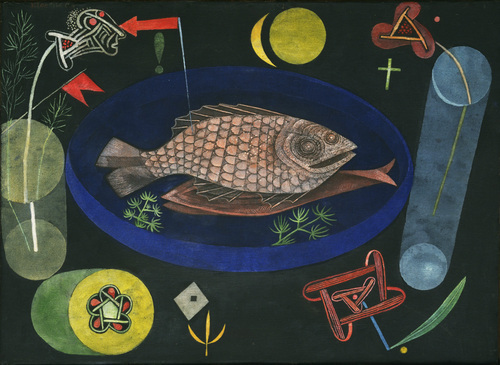
I am not sure the present survey, serious and exhaustive as it is, brings us close enough to the Klee (and the century) these writers are concerned with. The choice of paintings at Tate leans heavily on that made by Klee himself – the works he selected for key shows in Germany and Switzerland between the wars. This has its interest, but in practice I feel that it leads to a muffling and flattening of his art’s experimental flavour. There is a sameness and caution to the canvases displayed, almost at times a kind of stodginess. The rooms have too many ‘exhibition items’ and not enough failures, sidetracks, dashed-off drawings, whimsy tilting towards sweetness or nastiness – which were regularly Klee’s ways of trying to escape from his own good taste. Analyse verschiedener Perversitäten, to quote a nervous title from 1922. Klee’s selections (as with anyone’s) have not always stood the test of time. The clusters of works one comes across in collections put together more recently, by single opinionated connoisseurs – I remember a dazzling room at the Sammlung Rosengart in Lucerne – often seem to me to serve the artist better. I missed Berlin’s incomparable A Child’s Play, and MoMA’s Around the Fish, and stark paintings and pastels from towards the end of Klee’s life: Double, Angel of Death, The Last Still Life.

But there are great paintings here. Forest Witches (Wald-Hexen), from 1938, is one of a group of works done in exile where the world left behind, in all its cruel earnestness, is, maybe regretfully, faced head-on. Erd-Hexen from the same year, slightly smaller, moves closer still to the Nazis’ own Brothers Grimm language. Bewitched-Petrified (Verhext-Versteinert), done in 1934, might even be imagining, or hoping for, a Nazism frozen in its mythopoeic tracks. It will continue to be a question, sadly, whether singing fascists their own song in this way ever budged anything (real or ideological) an inch. But Wald-Hexen is a strong work, and makes Klee’s overall attitude to art more comprehensible. The balance he spent a lifetime looking for in his colour and touch, between eerie fragility and just enough decisiveness – insect lightness contending with a half-self-mocking monumentality – was never struck better.

T.J. Clark

****

From what I can tell, not having seen this particular retrospective exhibition, T.J. Clark does not find among much of Klee’s work that is included in this exhibition a contemporary hook or key back to the view of modernism that he represented. It seems that, with the exception of the bolder forms in Klee’s last works done in the immediate shadow of World War II, he agrees with Greenberg, who after all was engaged along with other figures in the New York School in a resituating of modernism in an American Sublime which feminized the sensuality and whimsy of European art, except for the major figures of Picasso and Matisse, and even then. The late works are in fact quite different and, again speaking personally, renewed my interest in Klee’s work,

*

I looked in Clark’s review for some mention of Klee’s 1920 dry point etching Angelus Novus, which is described in Walter Benjamin’s noted 1940 essay “Theses on the Philosophy of History”:

IX

My wing is ready to fly

I would rather turn back

For had I stayed mortal time

I would have had little luck.

– Gerhard Scholem, “Angelic Greetings”

There is a painting by Klee called Angelus Novus. An angel is depicted there who looks as though he were about to distance himself from something which he is staring at. His eyes are opened wide, his mouth stands open and his wings are outstretched. The Angel of History must look just so. His face is turned towards the past. Where we see the appearance of a chain of events, he sees one single catastrophe, which unceasingly piles rubble on top of rubble and hurls it before his feet. He would like to pause for a moment so fair [verweilen: a reference to Goethe’s Faust], to awaken the dead and to piece together what has been smashed. But a storm is blowing from Paradise, it has caught itself up in his wings and is so strong that the Angel can no longer close them. The storm drives him irresistibly into the future, to which his back is turned, while the rubble-heap before him grows sky-high. That which we call progress, is this storm.

It would be interesting to know what Clark’s present thoughts are about this particular Klee work, which would seem to be part of the lost condition of modernism to which Clark says the current exhibition at the Tate does not give us access.

*

I wrote the essay “Mr. Klee Goes to Washington” in 1997 about contradictory cultural developments at the time, when the ripple effects of the culture wars in the 1980s were still felt in institutional censorship of transgressive art and resulting self-censorship by artists of provocative content, at the same time as artists tried to place such content in popular media–for example in 1990 Marilyn Minter bought a 30 second spot on Late Night with David Letterman for her video work “100 Food Porn”–and to place themselves within the celebrity /notoriety culture of antagonistically organized media platforms such as Politically Incorrect with Bill Maher, a comedy show which ran on the Comedy Network from 1993 to 2002: I wrote it after performance artist Karen Finley appeared on the show and I tried to imagine how Paul Klee would have fared in that situation.

Here is my 1997 text, which appeared in New Observations #116:

MR. KLEE GOES TO WASHINGTON

Artists today struggle to work and to survive within an atmosphere permeated by an ongoing and steadily increasing pressure to abandon any type of marginal art practice –– a pressure all the more daunting when, for most, if not, it could be argued, for all artists, some form of marginality, whether economic or cultural, is a persistent condition. The artist who is not represented by a gallery may feel marginal in relation to the artist who exhibits regularly; the artist with a respectable local career may feel marginal in relation to artists represented in international exhibitions, and they, in turn, to the few artists receiving consistent art world wide attention for a number of years. All of these may feel marginal in relation to TV, pop music, and sports stars –– only a relative few want to be like Jasper, but doesn’t “everyone want to be like Mike”? And even such celebrity figures must acknowledge cultural and historical marginality in relation to Bill Gates (beyond that point I won’t speculate!).

The pressure to abandon marginal practice is irrational in the sense that it is not clear to what one should conform, nor that it will help even if you figure it out, because, while success is based on work’s current use value to contemporary discourse, the work must be, in some sense, genuine. Nevertheless, it seeps into the studio, even poisoning the artist’s relationship to her work, like anger at a beloved child who is flunking out of school.

The pressure comes from widely disparate segments of society as a whole and of the cultural world. The destruction of the NEA is only the most visible symptom of mainstream demonizations of what artists do. The control of cultural outlets, from publishing houses to cable TV networks, by mass entertainment conglomerates threatens to police content for purely mass market value. These culture monopolies are all the more dangerous because, unless the consumer is constantly tracking company ownership, sameness and safety of product may seem like cultural fact rather than corporate strategy. Curiously, it seems that it is only the language of the product (literally, in its degree of rawness; aesthetically, in terms of its discursive strategies; situationally, in its predetermined space of “high art” or mass entertainment) rather than its subject matter that determines marginality. For example, successful network TV programs such as Seinfeld or E.R. –– both strongly supported by ratings and advertisers –– often deal with controversial subjects such as masturbation, homosexuality, rape, or AIDS that would be condemned as unsuitable subjects for government funding if mediated by the codes of the art world.

While the consequences of these developments may be dire for individual artists and small artist–run organizations, more insidious to continued art practice are pressures coming from within the art world.

On the one hand, especially since the 1980 election of Ronald Reagan, the government has seen artists as easily dismissible yet dangerous subversives. On the other hand, during the same historical period, postmodernist art theory targeted certain types of artists’ roles as well as certain types of art practice. For example, the romantic image of the artist as alienated rebel –– a familiar and even comforting role for artists compelled to ascribe meaning to their struggle for attention and economic survival –– was unveiled by Marxist–inspired criticism as a complicit or self–deluded pawn and lackey of the bourgeoisie ( As, for example, in Benjamin Buchloh’s analysis of clown imagery in works by early twentieth–century vanguard artists such as Picasso and Beckman, in his essay, “Figures of Authority, Ciphers of Regression,” October 16 (spring 1981): 39–68) . At the same time, critiques of the auratic, hand–touched, unique art object contained an implicit condemnation of private art practice so that the refuge of the studio came to represent cultural escapism rather than a potentially fruitful escape from a market–driven art world.

Further, from the eighties into the nineties, the predominant prescription for a way out of this undialectical position was to recognize one’s role as just another cultural worker within an ideological framework and to attempt the unmasking and subversion of this frame by mimicry of its forms and tropes through appropriation of mass media images and technologies of representation. In the ensuing effort to mimic mass commodity culture, the artist has been drawn down a path of increasingly excessive theatricality and romancing of the abject. Now the cycle is complete and the artist again is self–imaged as a clown within bourgeois culture and proud of it (witness recent fun house installations by Damien Hirst, Paul McCarthy, and the Chapman brothers).

This summer I heard Karen Finley speak on an artists’ panel. She announced that she wants artists to be celebrities just like actors or sports stars. In that pursuit, she had appeared on Bill Maher’s Politically Incorrect but, she admitted, had been frustrated in her efforts to state her point of view. A few weeks later, I channel surfed my insomniac’s way into a rerun of that particular show. Finley, who at her best is a manic and occasionally brilliant stage presence, and at her worst is at least self–indulgently theatrical in a way that you might think would suit the requirements of the Christians v. the lions atmosphere of Maher’s show, seemed tamed by an effort to present herself in a mainstream way –– she was dressed in a relatively conservative black suit and had clearly been made up for TV –– and she was indeed unable to successfully counter Maher’s and some of the other guests’ flat out condemnations of government funding of avant–garde art. She couldn’t condense her views or speak fast enough, she was too nervous to be funny, and she didn’t fight dirty. Given the opportunity to convert notoriety into celebrity by performatively enacting transgressive art practice on network television, she lost her nerve and behaved herself. Or, perhaps, despite herself, that part of her persona that speaks art language and contains real criticality of social injustice could not function in the world of celebrity. Marginality turned out not to be a choice, it is not merely instrumental, not a condition one can shed at will, but a direct outgrowth of moral and aesthetic beliefs fundamentally (even when unintentionally) at odds with the mainstream.

As Finley spoke, I considered what kinds of art works would correlate to success in a superficial and sensationalist forum. It seemed that, as ever, quietude and subtlety were doomed by the requirements of a sound bite culture. I began to imagine various artists of the past appearing on Politically Incorrect: Picasso might have managed it, but can you picture Paul Klee on such a show? Or what kind of pictures he’d have to be making to be able to hold his own in such an arena?

“So, Paul, the Kennedy men, rapists or abused children?” “Vel, hem, Herr Maher, I tzink …”

Note: Significantly, in 1997 my spell–check program recognized Picasso as a word, but stopped at Klee as an error, “not found,” pointing to the way that Picasso is a trademark product: he is the prime exemplar of the commodifiable, Protean rebel, artist persona, popularized in fiction and the public imagination, whereas Klee is, well, just an artist.

*

Today I would surely cite different celebrities as examples–at this point Michael Jordan is a remote figure in relation to Beyoncé–and numerous artists and even art critics have successfully entered a more spectacular realm, though they still don’t always fare as well as their artworks when they personally appear in the media spotlight, they are still more the ineffective Wizard of Oz behind the curtain than OZ the great and powerful–note how off-key Jeff Koons can seem when interviewed on TV, in photographs where he is posed with his works or his family, or even quoted in print.

Some of Paul Klee’s work may be or at least appear now as a bit dated and fey in drawing style. Our ability to understand his work is affected by the amount of works done under his influence, which often fall under the sign of what I’ve called “Trite Tropes, Clichés, or the Persistence of Styles.” In that essay I wrote of one persistent style cliché:

One persistent style that emerges from the continued desire since the advent of the monochromatic flat abstract painting to have your cake and eat it by placing an image of some sort on a flat background is the pictographic painting, popularized by artists such as Stephanie Brody Lederman in the 1970s and more recently artists such as Squeak Carnwath. In works of this style type, the background is usually almost flat: the diagrams, pictograms, (as well as words) are placed on a ground that may be geometrically framed but also painted in an atmospheric, variegated painterly or textural manner. These works owe a great debt to Paul Klee’s introduction of a pictographic vocabulary into cubistically organized flat space. His reference to the childlike and the “primitive” in relation to previous types of representation represents a historically situated philosophical intervention within an aesthetic imaging system, it is not yet a habit without thought. For some reason Klee can get away with it — I am tempted to add, or can he? I ask that mischievous question only because the proliferation of such pictographic paintings throws a poor reflection back onto Klee that only can be eliminated by looking at actual works by Klee, which usually retain their formal rigor and the charm of the lyrical and whimsical pictorial elements.

In other words I too may find it hard to see in the same way as before some of the works that once gave me the permission to be a certain kind of artist. But that one would feel now that Klee’s “whole attitude to art-making is elusive,” according to Clark, may speak as much to our culture of spectacular narcissism and self-commodification of any kind of Otherness as to any weakness in Klee’s oeuvre. When Klee’s work and its presence at MoMA gave me courage, I never thought of his work as being elusive, but, rather, allusive so that it suggested style, methodology, and approach to form or narrative or fantasy for my own explorations. If I can’t always get back to the viewpoint I had when I was 17 it is because I am as much part of 24/7 spectacle culture as anyone else, and must work hard to slow down and look at the delicate and the allusive.

Paul Klee, Around the Fish, 1926. Oil and tempera on canvas mounted on cardboard, 18 3/8 x 25 1/8″, Collection of the Museum of Modern Art.

FacebooktwittermailFacebooktwittermail

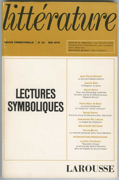
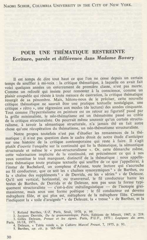
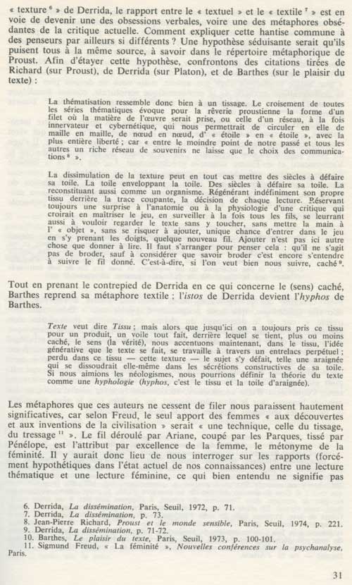
Naomi Schor at 70

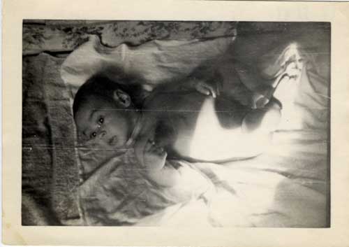
She was born October 10, 1943

in New York City, during World War II, to two refugees in their thirties who had arrived in America barely two years before and who would not become naturalized citizens for another four years.


At first they spoke to her in Polish so that their child would speak their language. But she was the first child born to a circle of friends, all recent refugees, from all over Europe. There was, as my mother put it, a “revolution” among these friends, who protested that they wanted to be able to communicate to this first child. So they spoke to her in French, which they spoke well though with a marked Eastern European accent . I assume that at that time in 1943, 1944, their English was not very good. Her first words were in French: she asked our friend Nadia Temerson, who, while feeding her, was taking little bites of food to encourage her to eat, “c’est bon, Nadia?”


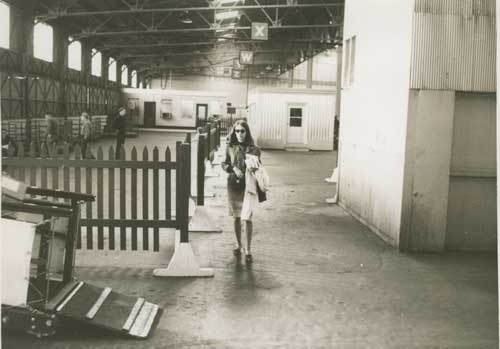
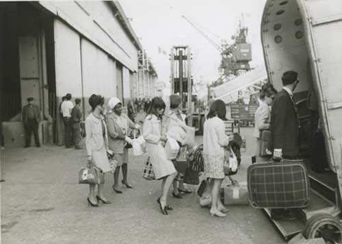
Naomi Schor boarding the SS.United States to begin her first Fulbright Scholarship year in Paris, October 8, 1965.

Naomi Schor, (center, with her foot tipped up) boarding the SS.United States, July 5, 1967, I think returning from her second Fulbright year in France.

*

Here are some of her many books and articles that are of continued interest, both for her original theoretical insights, her perceptive and nuanced writing style, and also, as traces of the theoretical and linguistics styles that mark developments not just in her work but in the fields within which she worked, from French Literature to Feminist Theory to Gender Politics to Aesthetics. Continue reading

FacebooktwittermailFacebooktwittermail

CAA ARTspace Interview with Stuart Horodner February 2013 now online & more

Dear A Year of Positive Thinkers: I’m happy to be able to share some recent and upcoming exhibitions, links, and publications:

Recent:

My interview by Stuart Horodner, Artistic Director, Atlanta Contemporary Art Center, held at ARTspace’s Annual Distinguished Artists’ Interviews at the 2013 Annual College Art Association Conference in New York, can now be viewed online. I hope you will take the time to watch! (you may need to scroll back to 0:00:00 to start at the beginning).

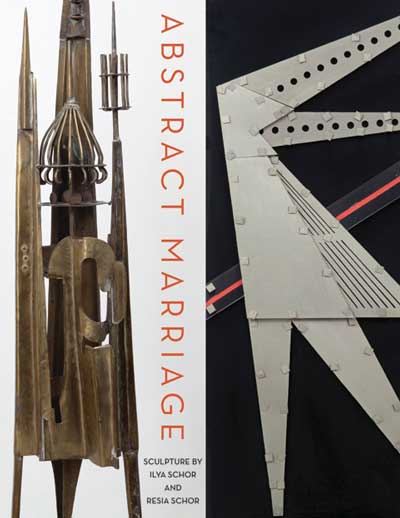
Abstract Marriage: Sculpture by Ilya Schor and Resia Schor, an exhibition of my parents’ work which I curated, was held at the Provincetown Art Association and Museum, August 16-September 29, 2013.For information about the catalogue, which includes essays by Mira Schor, Glenn Adamson, and Margaret Olin, please contact me by email or PAAM.

&

Between July 13, 2013 and August 24, I hijacked A Year of  Positive Thinking to write fourteen posts in a series I called “Day by Day in the Studio.” If you begin with the post of July 13, I hope you will click “newer” to go through the series in the chronological order of a studio diary which I tried to expand to address issues of general interest. The last post led to the title of my show>

Upcoming:

in October

Mira Schor: Chthonic Garden, an exhibition of new paintings, opens at CB1 Gallery in Los Angeles, October 19 through December 8, 2013. There will be an artist’s talk October 19 at 4 P.M. followed by an opening reception 5-7 PM.

in December

CB1 Gallery’s booth at The Miami Project Art Fair, December 3-8, will feature new paintings by Lisa Adams, photos by LA-based Kiki Seror, a selection of past work and new work by Mira Schor (NY) and paintings and sculpture by Craig Taylor (NY).

Also, “Making M/E/A/N/I/N/G in the 21st Century,” by Mira Schor and Susan Bee, will appear in the November/December issue of Art Papers devoted to art magazines and guest edited by artist and Paper Monument editor Dushko Petrovich.

Later this fall, A Year of Positive Thinking returns to its original goal of writing about art that I love, or whatever in the culture suggests critical reflections.

Best regards,

Mira

FacebooktwittermailFacebooktwittermail

Day by Day in the Studio 14: August 24

August 24, 1976

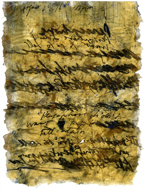
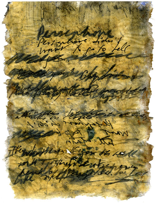
Mira Schor, Persephone, August 24, 1976. Ink and mixed media on rice paper, two sides, c. 12 x 9 in.

This week I have fallen in love with a word, the word Chthonic. I have often seen it and knew its basic meaning as denoting the underworld, but looking it up again in relation to a work I did on August 24, 1976, Persephone, I found it exactly described the psychic, creative, and also the economic spaces my paintings have sought to delineate in the past year. Chthonic. How do we fall in love with words these days? I clicked on the link in the Wikipedia entry for Persephone, and , at 2AM, having finally torn myself away from gazing at the definition on the screen, I jumped out of bed to go and gaze at the Wikipedia page some more…Chthonic, “it typically refers to the interior of the soil, rather than the living surface of the land.”

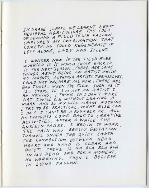
This work from 1976, Persephone  indicates that in those early years of my life as an artist, I already was concerned about the patterns of my productivity in the studio, the summer/winter division in my studio practice, and most particularly the desire and the fear of lying fallow.

Mira Schor, page from exhibition catalogue, “Mira Schor: Paintings,” Dalhousie Art Gallery, Halifax, Nova Scotia, 1975.

Other resemblances to the mythological character were that I lived in the summer with my mother, in the role of the Demeter of myth, who made art downstairs while I worked upstairs, and under her protection I could immerse myself in my work and in the earth and the sea, and in the winter I lived in the city, the academy, the art world, as good a stand in for Hades as any as we use that name to denote the underworld. I need both, neither one nor the other alone would suffice. I get strength from solitude, from the rhythms of the tides and the simple pleasures of my small back yard and one large English oak tree, but I stride out into the crowded streets of New York City with a passion for the cultural richness and pride in the competitive forces packed into such a compact space, my place of birth and my home.

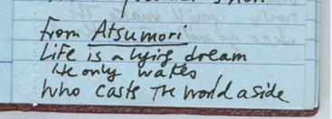
The duality is cast also as that of dream and wakefulness. The summer work in the chthonic space is the dream, the winter existence is one of wakefulness, of “reality.” But as the first line of the Japanese Noh play Atsumori suggests,

I recopied this line by hand in an annual diary every year for over thirty years until the world pulled away that kind of time

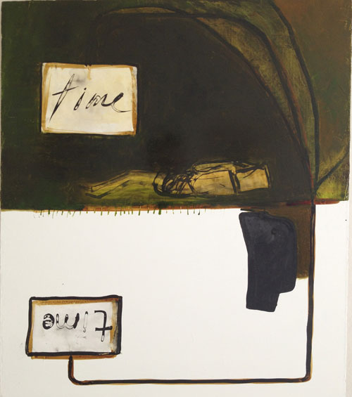
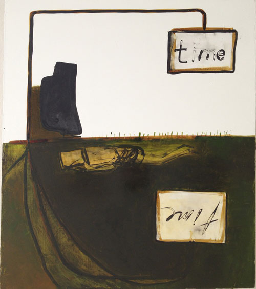
The duality extends to what I want my paintings to contain and express. I would not give up visual pleasure for theory, even this summer when, through this retrospective process of considering works made on specific summer days over decades, I have begun to think of the period during which “theory” most influenced me, from the early 1980s until the turn of this decade, as a period of the sacrifice of one part of my character as an artist, a period that perhaps is over although there is still a professional imperative to “keep up” with wherever the academy wants to apply its methods, language, doxa, and rewards to. But I also know that is ridiculous to claim this was a sacrifice since it was also my character and my desire that drove me. Even in the period I think of now as the dream period, I was involved with a feminist critique of power and the politics of challenging the canon of American modern art. There was never a moment that was not text- and history- based and politically engaged. I have always sought out the artwork and the theory that was seemingly most antithetical to my own practice, because it seemed necessary to keep the work from lapsing into sollipsism and sentimentality. I will not give up the critical and intellectual or the visual and intuitive, so I see that the task ahead is to continue to insist that both ways of being as an artist can and even must exist in the same works and in the same practice. So, like Persephone, I do live in two worlds. Often, as in the 1976 drawing, the duality is born out in the two-sidedness of the drawing, and this summer I have found myself making paintings that are reversible: the space is divided by a horizontal median line where the Chthonic meets the surface of the earth and the air above, but the painting can be viewed with the Chthonic below or above, because, thinking of the opening line of Atsumori, which is the dream world? The country, the ground, the summer? Or the city and winter?

In this case, time is reversible:

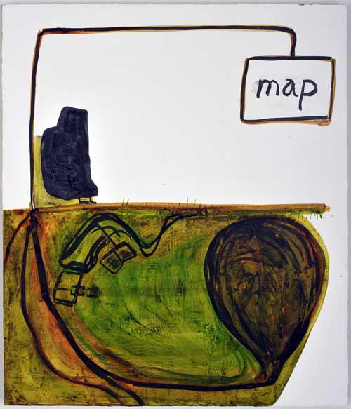
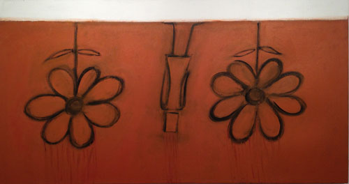
And even a painting whose title is Underground Garden, representing the fertility of the chthonic ground,

can also be viewed “upside down” so that the figure falling into the earth can also appear to rise up into it,

This summer my work has followed the line of the earth as a demarcation between sky and ground, austerity and fertility, public and private. I have focused on reversals and reversibility, where ground, and by that I mean underground, the matter of earth itself, the Chthonic, not the line of demarcation upon which we stand, can also be sky and the sky above can become the ground below.

I had started the summer wanting to address in my work the terms of contemporary economic existence I had sketched in a drawing earlier in the year, as the illustrated version of a short text I wrote for the Brooklyn Rail:

Mira Schor, Austerity Utopia, 2013. Sketchbook scan, c. 12 x 17 in.

While keeping the visual premise of maintaining that line of demarcation between earth and air as the common ground linking painting to painting by that line rather than by any standard installation height, I found myself unexpectedly shifting to what seemed to me a more radiant engagement with nature than I had intended when the central theme would be the difficulty of thriving in a time of radical inequality and austerity, again blurring the distinctions between the dream and the real.

*This is most likely the last of my Day by Day in the Studio posts although, for once in a blue moon, I get to spend a few weeks more in the dream of the summer studio. I thank my subscribers and readers for their patience and I look forward to plunging A Year of Positive Thinking back into the world later this fall.

FacebooktwittermailFacebooktwittermail