Category Archives: art

Stealth Feminism at MoMA

Next Friday May 21, there will be a symposium at MoMA on Art Institutions and Feminist Politics Now (where “an international group of artists, writers, curators, historians and activists discuss the impact of recent debates about art and feminism on exhibitions, collections, pedagogy, and cultural politics.”). This continues a series of major feminism-related events held at the museum including The Feminist Future: Theory in Practice in the Visual Arts, a highly charged two-day symposium  held at MoMA in January 2007. To hear some of the panels and presentations from the 2007 symposium: in addition to the material archived on MoMa’s website of that event, there is a comprehensive  audio archive on ARTonAIR.org (you have to scroll down but will find the entire conference). Next month will see MoMA’s launch of its publication Modern Women: Women Artists at The Museum of Modern Art. In addition to these events at MoMA, what sounds like an interesting, interactive program will take place at the Brooklyn Museum on May 22, Making Ourselves Visible, with participants including Hilton Als, Emily Apter, Johanna Burton, and others.

There are currently several small one-person and group exhibitions of women artists and installations of discrete works by women artists  scattered around MoMA although perhaps secreted might more accurately reflect the stealth approach to the serious engagement with curation, presentation, and acquisition of works by women artists that the museum is currently engaged in. There is a lot of very good work by women artists on view at MoMA right now, although aside from Marina Abramovic: The Artist is Present, you would hardly know about many of these shows from the signage  in the lobby, and certainly would not know to look for or understand the import of some individual installations.
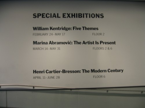
Wall signage, MoMA Lobby, May 6, 2010

The shows include Mind and Matter: Alternative Abstractions, 1940s to Now, Lee Bontecou: All Freedom in Every Sense, Performance 7: Mirage by Joan Jonas, and Pictures by Women: A History of  Modern Photography, (and look for Experimental Women in Flux, opening in August).

The way I became aware of these exhibitions had an Alice in Wonderland Secret Garden feel to it that reflects the stealth approach.

First, during one recent visit, I noticed a large painting previously unknown to me, hanging in one of those out of context, no-man’s land spaces near the escalator bank, on the 3rd or 4th floor.
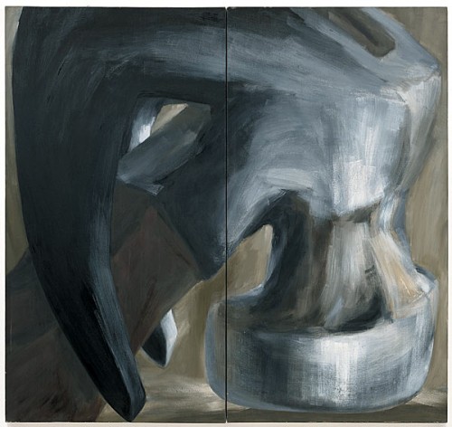
Lee Lozano, Untitled, 1963. Oil on canvas, two panels, 7' 10" x 8' 4," Collection The Museum of Modern Art

There is some ironic justice to the isolated presentation of the Lozano work: her decision to “boycott” women, taken in the late 1960s and maintained for the rest of her life, is legendary so being placed in the context of women artists would be anathema to her. In fact the painting presents an object lesson of why you can’t assume the gender of the artist from an individual work, since it has every sign of what generally would be consider the epitome of masculinity: the subject, the size of the work, the scale of the image, even something boldly un-ingratiating about the dry paint application. But anyway, there was the Lozano painting, and why had I never seen or at least noticed it before, and what was it doing there?

Then, another day at MoMA, as I was making my way to the Cafe on the 2nd floor, I noticed a curator I know slip into an exhibition hall. Curious, I followed her, sort of  like following Alice down the rabbit hole, and I found myself in a large room (where Monet’s Waterlilies were earlier this winter).
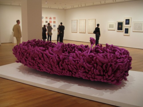
Yayoi Kusama, Violet Obsession, 1994. Sewn & stuffed fabric over a rowboat and oars, 43 1/4" x 12' 6 3/8" x 70 7/8", collection MoMA, in Mind and Matter

In the center was a full size row boat made of purple silk phalluses, unmistakably a Yayoi Kusama, there were elegant minimalist works by Gogo, an embroidered patchwork cloth book by Louise Bourgeois.
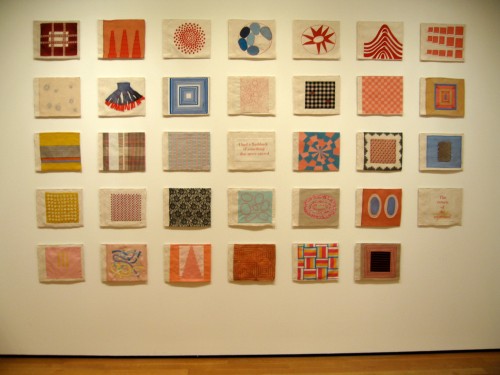
Louise Bourgeois, Ode à l'oubli, (2002). Fabric book with hand-embroidery and lithographed cover, page (ea. approx.): 11 3/4 x 13"
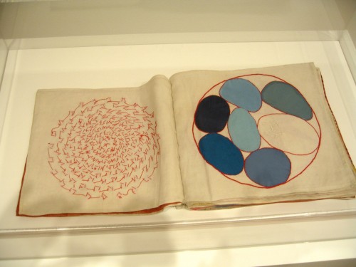
Louise Bourgeois, Ode à l'oubli, (2002) detail
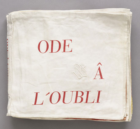
Louise Bourgeois, Ode à l'oubli, cover, (2002). Fabric book with hand-embroidery and lithographed cover, page

The artists were all — women? Where was I? I went outside again to check the title, “Mind and Matter: Alternative Abstractions, 1940s to Now,” but  nowhere in the introductory wall text is there any indication of the fact that all the artists in the show are women although of course it is evident from the list of artists.
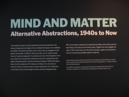
Mind and Matter, Alternative Abstraction, 1940s to Now, MoMA wall text, May 2010

I was particularly struck by a strong artwork in the show by a Polish artist I was unfamiliar with, Alina Szapocznikow (1926-1973). The work, Belly Cushions (1965), made of 5 polyurethane foam pillows molds grouped on a low pedestal, has a strong presence: the dark rich color and leathery patina drew me across the room and then there is something compelling and yet strange about the shapes:  the scale is indexical, yet the torso truncated so that sexual indicators are lacking — the work has the intensity of one of Nancy Grossman‘s torso sculptures from the same period without as overt tropes of sexuality —  and the flat back of each form repels a unitary reading of these as molds from real bodies.
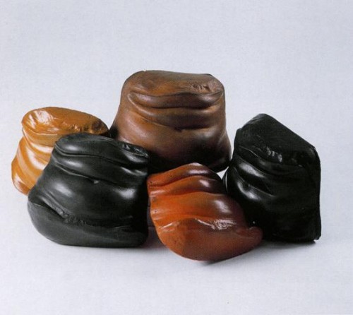
Alina Szapocznikow, Belly Cushions, 1968

Why are these particular abstractions alternative? Because the artists are all women? OK — positive thinking — I won’t go there. For more alternative abstraction, look to Lee Bontecou: All Freedom in Every Sense on the fourth floor, in an open space between an entrance to Painting and Sculpture II and a view of the museum garden.
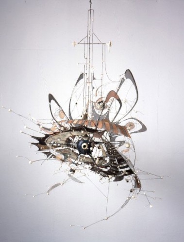
Lee Bontecou. Untitled. 1980–98. Welded steel, porcelain, wire mesh, canvas, wire, and grommets, 7 x 8 x 6'. MoMA © 2010 Lee Bontecou

The centerpiece of the show is an untitled hanging sculpture that Bontecou worked on for nearly twenty years. It has an eerily uncategorizable quality, in addition to being extremely difficult to photograph: it is an ethereal, jewel-like, surrealism-inspired curio — the connection to surrealism links it to many of the works in Mind and Matter: the utility of surrealism as a matrix for work by women artists is an important subject of modernist and feminist art history (though on the other hand the resonance to works by Calder or Tanguy puts into some question the subtitle of Mind and Matter — Alternative Abstractions — in relation to a women artists only grouping).

The most interesting work for me was the least branded. These are beautiful soot drawings. My snapshots could not capture the soft surface, I really recommend spending some time with them: Untitled, 1958, Soot on Paper is a very minimalist exercise in darkness, a black field divided by two central barely lit horizontal lines, one straight across and hard edged, the second curved and soft. Bontecou’s use of soot came from her quick awareness of the aesthetic usefulness of an accident in the mechanics of sculptural process: “While on a Fullbright Fellowship on Rome in the late 50s, Bontecou accidentally made what became one of the most crucial discoveries of her career: she adjusted the oxygen levels in the blowtorch she used to weld sculptures, and  soot poured out. She began to draw with the torch, moving it across paper and canvas. ‘I finally got the black I wanted and a kind of landscape or “worldscape,” she said.”

Untitled ,1963, soot and aniline dye on muslin, is another beauty, much less overdetermined than some of her other more illustrative and instrumental drawings for sculptures. It would be very interesting to see this work next to one of Myron Stout’s works in the collection, such as Number 3, 1954: on a black ground, a series of ochre and white ovals frame a black center, with one very thin black line cutting through the concentric rings but not penetrating the last white band closest to the center. The ochre and white dye appear on the muslin in such a delicate fashion because of the muslin’s fine weave, and the use of dye rather than pigmented matter is such that the surface approaches the uncanny. The black created by the soot is absolute.

Mind and Matter and these other exhibition and incidental installations of individual works are part of an ongoing initiative among women curators at MoMA to delve deeply into the permanent collection in order to find out what works by women artists they already own and then see how gaps in the collection can be filled through acquisitions, with assistance from the Modern Women’s Fund. Mind and Matter is organized by Alexandra Schwartz, Curatorial Assistant, Department of Drawings, and Sarah Suzuki, The Sue and Eugene Mercy, Jr. Assistant Curator of Prints and Illustrated Books; Lee Bontecou: All Freedom in Every Sense is organized by Veronica Roberts, Curatorial Assistant, Department of Painting and Sculpture. Performance 7: Mirage by Joan Jonas is organized by Barbara London, Associate Curator, Department of Media and Performance Art; Pictures by Women: A History of Modern Photography is organized by Roxana Marcoci, Curator; Sarah Meister, Curator; and Eva Respini, Associate Curator, Department of Photography.

The women involved in this ongoing initiative decided not to follow the example of the Centre Pompidou which in the exhibition elles@centrepompidou filled the entire museum with a one-off, blow-out installation of work by all the women artists in their collection. Instead, the group at MoMA is attempting a more gradual, incremental, and infiltrative approach which, in the long-term, may well be potentially more effective at redressing the balance of representation of women artists in the entire museum.

There is a kind of self-effacing anonymity to the whole enterprise that aligns it with Virginia Woolf’s proposition in A Room of One’s Own that “Anonymous was a woman.” But I think it is important to draw attention to the work of the women artists on exhibition due to this initiative and to the women curators whose efforts should be recognized and supported, since I think one can take as a given that their efforts occur in a context of resistance, based on previous histories from all major museums.

In my essay, “Generation 2.5,” in A Decade of Negative Thinking, I go into some detail about the gender distribution of major retrospectives at MoMA since the mid-1980s (the men’s room is very crowded) and I note that in general it has been my experience or at least my supposition based on observation, that most women curators who want to curate a major exhibition of women artists, never mind of feminist artists, are likely to get just one such opportunity in their careers, if their institutions and funders are amenable. If the ongoing MoMA Women’s Project’s incremental, small scale and stealth approach results in their having the opportunity to organize many more, though perhaps often modestly scaled exhibitions, then their strategy is a good one!

I look forward to the conference on Friday, when these issues will be discussed from many practical, professional, and theoretical points of view.

FacebooktwittermailFacebooktwittermail

Magic Tricks in the Dark

An earlier, unfinished version of this post went out to my subscribers by mistake yesterday although I immediately deleted it and it does not appear on the blog itself. Also, for subscribers who receive these posts in their email: this post contains videos that you will not see in the email program, you have to click on the site itself.

I shouldn’t be surprised at what gets media attention: my previous post, about Marina Abramovic’s live performance in “The Artist is Present” went viral, mainly because of the louche interest elicited by my speculations on how she pees. That is to say, I got attention not so much for what else I said about her exhibition at MoMA but just for that one provocative question. Meanwhile I’ve been stymied in my efforts to figure out how to convey the importance to me of a particular moment sitting in the dark in William Kentridge‘s installation of 7 Fragments for Georges Méliès. But since the Kentridge show closes May 17 and I hope that anyone who has not seen the show will go see it, I’ll try to pull out of the darkness a few stray thoughts suggested by my experience of his work, like the floating pages that Kentridge snatches from the air as they float into his hands in several of his recent films. (This is a series of impressions, not a review, Roberta’s Smith’s New York Times review when the show opened offers a fair assessment).

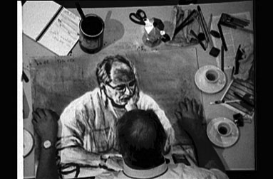
I had set out in New York City last month to look for art works to fall in love with. Of all the categories of falling in love that I identified, the one that mattered the most because it was in some way attainable yet not total, was the category of something, however fragmentary, that would propel me back into my studio with sense of affirmation of creativity and a provocation for honesty and frankness of the gesture. Sitting for the first time facing Tabula Rasa I (2003), one of the 7 Fragments for Georges Méliès, I was thrilled by a particular moment where the dark liquid in a coffee cup is poured out on a sheet of white paper as a cloud of charcoal dust, and the charcoal seems to draws itself, the paper is folded and when the artist reopens it, he gazes on a self-portrait of himself at the table .

William Kentridge, still from Tabula Rasa I, 2003, from 7 Pieces for Georges Melies

Kentridge’s films are interesting in that they are made up of elements that in themselves are not necessarily that interesting. The individual charcoal drawings that make up his films are done in a stodgy, static, outdated academic style, which may be deliberate and strategic but I think is also just the way he draws; in his most recent works, the film tricks he borrows from the early history of film animation, including a consistent use of reverse motion, may seem even more obsolescent; the music in all the films has a slightly nostalgic quality that could be too sentimental. The work doesn’t have an iota of the kind of ironic distance that remains so much a marker of contemporaneity in art. Yet when the drawings are put into constant motion of inventive fluidity, the music lends a driving haunting quality that transcends the nostalgic, and the subject matter whether it is apartheid in South Africa or the private life of the studio artist is literary, personal, generous, and modest, all in the best sense, the totality of the work speaks to a genuine and impressive confidence in the artist’s own creativity, and in creativity in general.

The first time I saw the Kentridge show, I was thinking to myself, “this work makes me want to go home and work,” and, also,  “I have to step up my game.” (Just then, Susan Bee, sitting next to me in the dark room spoke up, “This work is too good, it makes you want to give up.” She said that I had left that category out of my list of types of falling in love with art!) The work opens up the possibility of serious creative play for the artist/viewer precisely because it is made up of so many unpromising or unremarkable components and because Kentridge never uses his confidence in his own work as a weapon, as so many artists do (see the first room on the 6th floor of MoMA of  Marina Abramovic: The Artist is Present in contradistinction).

The recent work’s focus on the artist’s studio practice, the action of making, of reaching for an idea, literally snatching ideas as they float past you, about pigment, matter and its vanishing, is echoed in the quotes used to good effect in the wall text:

“Walking, thinking, stalking the image. Many of the hours spent in the studio are hours spent walking, pacing back and forth across the space, gathering the energy, the clarity to make the first mark …It is as if before the work can begin (the visible finished work of the drawing, film or sculpture) a different invisible work must be done.”

Beyond this invisible or seemingly unproductive preparatory work, which Kentridge literalizes by filming himself pacing in his studio, looking through books, day dreaming about his wife who then appears, touches his shoulder and as quickly disappears from the frame, a naked but unidealized body, Kentridge also comments on the importance of  process even when the results are not immediately evident:

“Everything can be saved. Everything is provisional. A prior action is rescued by that which follows. A drawing abandoned is revised by the next drawing. … The smudges of erasure thicken time in the film, but they also serve as a record of the days and months spent making the fim — a record of thinking in slow motion.”

Kentridge’s commitment to retaining the the trace of process continues in “Double Lines, A ‘Stereo’ Interview about Drawing with William Kentridge” by Michael Auping, in the exhibition catalogue. Auping notes that Kentridge preferred to annotate the transcript of their interview, rather than polishing it into a smooth unified text. Auping writes, “He is not a polisher. He is a questioner. Reflecting the dialectical character  of Kentridge’s art, the interview takes the form of a self-argument. …As with his alter egos Felix and Soho, Kentridge in essence doubles himself in this interview by not only answering my original questions but also questioning his own answers.” In one such internal dialogue, Kentridge speaks about drawing (I’ve put the question of the answer into a lighter font color and, as in the catalogue layout, a further indent):

WK: […] If you have little money, drawing materials are not that difficult to come by. Drawing does not in most cases require special tools. In South Africa that matters in some fundamental ways. There is a democracy to drawing, and a certain kind of work ethic. One of the things that attracts me to drawing, and that in some way relates to its politics, is that it is a demonstration of agency. There is something about the act of drawing that reflect a process of labor. You have a sense of work, at least for me.

There is no work ethic. Or that is not what I am interested in. It is the appearance of work, making visible the hours on the paper. In an era in which the human labor in everything was clear, there was something utopian in making art appear effortless or at least miraculous. Now that we take the impossible for granted — digital animation, Photoshop (the invisible workings of a computer compared to the very visible and audible mechanics of a typewriter) — there seems a place for showing physical process (And through this mental process; this is not clear, but some impulse in this direction sits in my guts — not that they are to be trusted either).

These statements about materiality, process, and failure are ever more important to hear and read and see. So many young artists I know feel so much pressure to produce a marketable product that they never can trust themselves to engage in process, in making and unmaking. So much of Kentridge’s work reflects on process, change, and the constant attempt to make and unmake an image.

There is a characteristic gesture in Tabula Rasa I that caught my attention, one that recurs in a number of these works about studio practice and it is to the point of this emphasis on creativity as the very subject of Kentridge’s work: the hands of the artist as he prepares to draw or sculpt engaged in a ritual gesture of tentative prestidigitation, to conjure up the image or the mark. It is a gesture that is so self-ironizing about the artistic process that Art Carney used it often for classic comic effect in The Honeymooners, as Ed Norton, to preface the most mundane task. This film fragment captures some of these moments:

Unfortunately  it is impossible to provide good quality video links to the works that most relate to Kentridge’s homage to Méliès — such as Méliès’ The Trip to the Moon from 1902 — and to his recent use of live action animation: here it would be great to be able to see Shoot the Moon (1963), Red Grooms’ own tribute to the Méliès film, made with Rudy Burckhardt and Mimi Gross, and his live animation masterpiece, Fat Feet (1966), made with Yvonne Andersen, Dominic Falcone, and Mimi Gross, both of which sadly are not yet available on DVD. These works share Kentridge’s  pleasure in the simple magic of film although the Grooms films are less melancholic and more anarchic than Kentridge.

The degree to which the studio in Kentridge’s films is a construct and a fiction becomes clear when you see a bit of Kentridge working in his actual studio, in a clip of Art21: Kentridge’s “character” The Studio (as much a character as his other alter egos) is an intimate, dimly lit space, in perpetual twilight, seen through the scrim of the kind of greyed out scratches reminiscent of silent film. Thus it comes as a bit of shock when you see that his studio is in fact a brightly lit, state of the art, very clean space practically arranged with the requisite number of assistants.

But it is the very brightness of this actual space that makes some of Kentridge’s most recent work so strong, particularly his live performance of I Am Not Me, the Horse is Not Mine. I wish everyone I know could have shared the excitement of seeing this performance live last fall, followed the next evening by Joan Jonas’ performance of Reading Dante II, both part of performa09. There were some interesting similarities: the combination of new media with the most basic, oldest human means of artistic expression, — the body and drawing — an improvisational humble texture of the piece, the combination of video projection with very simple props and the body and voice of the artist, and literature (Dante and Gogol) as an important source read out loud by the artist. Both together made for a really inspiring and great week to be an artist!

FacebooktwittermailFacebooktwittermail

Looking for art to love, MoMA: A Tale of Two Egos

It’s weird, I wanted to write about a moment of inspiration and instigation I felt in front of one of William Kentridge’s films but for the moment Marina has crowded him out. It’s rare that a woman’s ego trumps a man’s, particularly in the context of one-person retrospectives in a major museum. My title therefore was first intended to highlight the battle for attention between two major artists. But, as this blurred picture suggests, that battle has been won.

Marina and William

But Marina Abramovic: The Artist is Present is itself a tale of two egos: downstairs, that of the individual living woman whose body you can witness and potentially engage with at some level, and, upstairs, the projected ego of the woman who has hijacked curatorial common sense, whose many incarnations are screaming at you in an unpardonably cacophonous, unedited installation, who has created a kind of Disneyworld of the Spanish Inquisition through her use of re-enactors in stressful situations while rewriting the history of performance art so that she exists sui generis, without any historical context.

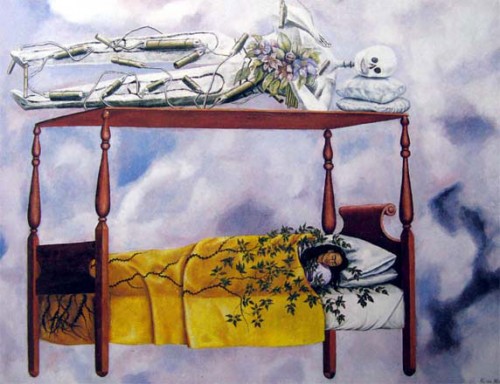
I plan to stay downstairs with the living woman but the wall of noise that hit me at the door of the first room in the upstairs show, the trembling naked re-enactors, and the lack of historical contextualization in the wall text will stay with me as well. I will continue to wonder why the museum has not provided visitors with any information about international performance artworks that would seem to be of immediate relevance to this work, from contemporary women performance artists such as Gina Pane and Valie Export, and Action artists such as Herman Nitsch and Rudolf Schwarzkogler. The tableaux vivant re-enactment of Nude with Skeleton (2002-2005) is for me haunted by Frida Kahlo’s The Dream (or the Bed) (1940). Women artists, nudity, and pain are recurring thematics of feminist art as well as personal obsessions of individual performers. It would be useful to offer that context even if Marina denies it.

Frida Kahlo, The Dream or The Bed, 1940

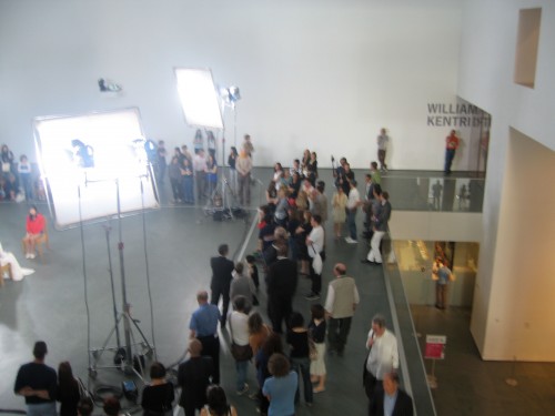
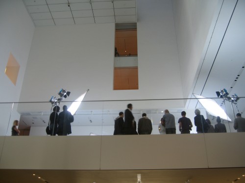
Even before you get up to the level of the spectacle taking place in the square arena marked by a line of the floor, guards, warning signs, and four stands of film lights, the bright white light from the atrium is already beautiful and enticing seen from the lobby below:

Marina Abramovic: The Artist is Present, from the lobby MoMA May 2010

The first time I went to see the show, April 29, there was still a table installed between Abramovic and those sitting opposite her. I was with Susan Bee. We have seen many exhibitions together over many years and I always value her insights. We circled the square, surveying Marina from all sides — oops, I’ve lapsed into something that is against the rules of scholarly writing: you do not refer to artists by their first name, you do not talk about what “Pablo” was doing in Guernica, but I’ve noticed that a lot of women artists and art historians, whether they know — Marina — personally or not, are referring to her by her first name, sort as if it was her only name, like Cher or Madonna.

I found some of the visuals distracting, especially Marina’s red ecclesiastical garment, which one friend has compared to one of those snuggies, the blankets with sleeves advertised on TV. Many women viewers are concerned about how Marina pees: one artist is absolutely persuaded that the (I’m told it’s a Prada) dress is designed like an astronaut’ s suit with special receptacle panels and some catherization going on in there, another is as certain that she pees into the chair (if you visualize this in further detail it would mean there’s a big hole cut out of the back of her dress, which somehow I doubt).

Nevertheless as we circled the scene with interest, Susan’s comment, after a short while, that  “it’s sort of dignified in a way” echoed my own thoughts: perhaps we had come with a bit of snarky attitude about the hype surrounding the show and were surprised at our response once we were standing there (we did not chose to sit and in any case would never have made the effort to get there early enough or pulled enough strings to score a privileged spot at the head of the list to face Marina).

There is something hypnotically appealing about the whole scene, the lights, the square, the faces of both participants,  the strange shift between proximity to and distance from the two seated figures — it may be an optical illusion but you definitely feel closer to the figures and see the details of their faces and skin in better focus from the South side of the square even though the chairs appear to be centered. The hypnotic atmosphere must also emanate from the artist who is presumably present, intent on each viewer — that is after all the premise of the work —  yet undoubtedly self-hypnotized.

I’m not sure she is responding to the viewers any more intimately than Queen Elizabeth on a receiving line — if anything, the Queen may feel more duty bound to work a display of connection. Yet Marina’s face has a melting blankness which is quite fascinating and there must inevitably be a mirroring that takes place when two beings face each other for any length of time in silence.

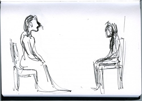
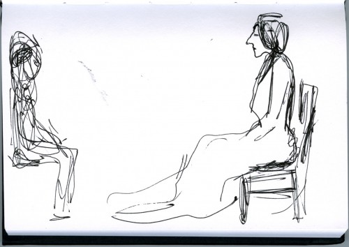
This week the scene was visually reduced: the ecclesiastical garment is white  and the table is gone, which exposed both participants to each other and the audience. Since photography is forbidden despite (or because of) the fact that the whole thing is a photo-shoot set, I did a quick sketch of the scene:

Marina Abramovic: The Artist is Present, seen from the North side of the atrium MoMA May 6, 2010

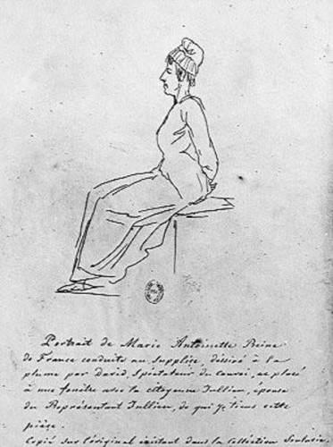
I’m amused that the artist’s effort to control documentation of her work forced me to turn to that old representational technology, drawing. And through the act of drawing, I experienced a strange apprehension of the scene, a perception that I might not have had if I had just held my camera up and waved it in the general direction of the subject. As I drew, I felt that I recognized a familiar form, something about the white dress, the slumping body, the prominent nose:

Jacques-Louis David, sketch of Marie Antoinette on the way to the Guillotine, October 16, 1793

I was not sure of the orientation of Marie-Antoinette’s face in the David drawing until I got home, but meanwhile I walked around the room to draw the scene from the other side.

Mira Schor, sketch of Marina Abramovic: The Artist is Present, from the South of the Atrium, MOMA, May 6, 2010

I draw no meaning from this coincidental resemblance between an exhausted looking Marina and a doomed Marie-Antoinette although there is certainly a generous dose of violent martyrdom on view in the work exhibited upstairs! If, despite the self-hagiographic-monarchical-ecclesiastical set-up of The Artist is Present, there is “something dignified” about Marina’s effort not to fall asleep in her chair and keel over, and something eerily pleasant in wandering around a light flooded public square, I don’t feel there is anything either dignified or interestingly desublimated about the spectacle of a woman pinned high on a spotlit wall, balanced on a bicycle seat, her arms held up in a pose of crucifixion, trembling with pain.

….

Meanwhile in the back room … see my next post about Kentridge and creativity.

FacebooktwittermailFacebooktwittermail

Looking for art to love, day two: uptown

Uptown, at the Met, April 22

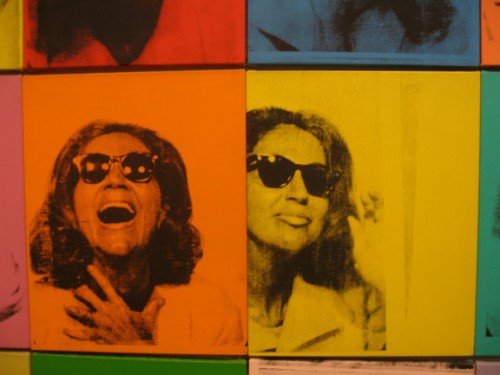
I arrived at the Met late in the afternoon, having stopped first at Acquavella Gallery to see Robert & Ethel Scull: Portrait of a Collection. I feel like I knew the Sculls personally because I show Emile de Antonio’s 1973 great documentary film Painters Painting whenever I teach about the New York School, which means often. The Scull’s appearance is a highlight of a film full of highlights: I love the scene where Ethel, with a vivacious enthusiasm that seems at once genuinely innocent and rapaciously disingenuous, describes Andy Warhol, armed with bags of coins, creating her portrait by taking her to Times Square to have her picture taken in photobooths in a tacky arcade. So it is great to see the painting in the show:

Andy Warhol, detail, "Ethel Scull 36 Times," 1963, acrylic and silkscreen on canvas, 100"x144"

I also feel like I know the Sculls because of Jack Tworkov’s description of them in a diary entry + note scribbled on the back of an American Airlines ticket envelope, returning from a trip to Buffalo for the opening of a new wing at the Albright-Knox Art Gallery:

Friday, January 19, 1962

Took plane with Leo for Buffalo. Sat with Sculls. New People, like cheap bright aluminum pots. For whom is “Avant-Garde” art intended, for them obviously. They never say art without the prefix Avant-Garde.

*Vulgar people—I don’t mean not nice people. They can even be pleasant—nevertheless they can be embarrassing. They are unsure still of their accent, their reading matter, their pleasures, their vacation places. They use all these things for self-improvement which is itself vulgar and I speak as one who has suffered all the self-improvement I can stand. They [are] embarrassed with their own status, eager to acquire through culture what has been denied to them because of family background, race, religion or the unaccustomed uses of recently acquired wealth. Since they are fundamentally embarrassed people they are essentially unaware and make little use of their fundamental strength—what is peculiarly their own (as the elite knows so well how to do) and make a great show of borrowing clothing of what is after all mere social disguises. These people are really new people as new as an aluminum pot. It is for them essentially that avant-art is made. They are the mass market for what chic initiates.

(The Extreme of the Middle: Writings of Jack Tworkov, 130)

All the more amusing then that the show is installed in such elegant upper East side mansion style rooms with ornate moldings, parquet floors, French windows, and gilt-framed mirrors. Nouveau Riche meets Edith Wharton New York. Two excellent early Rosenquist paintings were a nice surprise, both very restrained in color, both working from the photographic but not yet based on commodity or military spectacle: the flat color and use of disappearance and deletion within the appropriated photographic image in Untitled (Blue Sky), 1962, reminded me of much more recent works by John Baldessari . Another surprise: Jasper Johns did paint some bad paintings back in the day! Johns’ Double Flag from 1962 is in my opinion a rare stinker from that period, I’m not sure whether this is because of the particularly pedestrian use of realistic color in this work or the rather slack paint surface quality (the gallery web site perhaps wisely does not include an image of this work).

James Rosenquist, "Untitled (Blue Sky)," oil on canvas, 84"x72," 1962

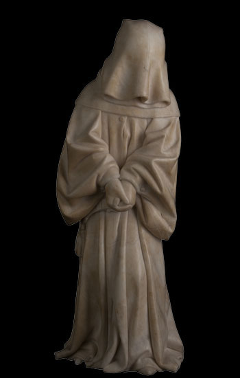
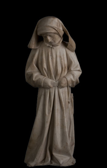
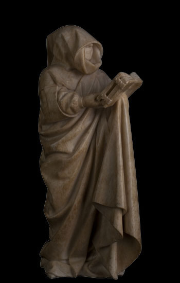
At the Met, with only forty-five minutes before closing time, I decided to just look at the The Art of Illumination: The Limbourg Brothers and the Belles Heures of Jean de France, duc de Berry. An amazing show which required more time than I could give it since each miniature painting necessitates careful examination with one of the magnifying glasses supplied by the museum in order to fully experience its monumentality, but the surprise for me were a group of astounding and curious sculptures I encountered unexpectedly in passing as I was speeding back through the Medieval Sculpture Hall towards The Art of Illumination, which is in the Lehman Wing: in the center of the hall, on a simple platform, stands an eerie procession of thirty-six small alabaster figurines, lined up two by two, led by two even smaller figures. These are The Mourners, Tomb Sculptures carved by Jean de La Huerta and Antoine Le Moiturier between 1443 and 1456 to adorn the tomb of Duke John the Fearless and Margaret of Bavaria. They’re usually set into Gothic architectural niches so this exhibition offers an unusual opportunity to see them in the round.

I have a weakness for representations of drapery in painting and sculpture. Here the style of representation is realistic though with a trace of Gothic elegance, caught in time between the massive sculptural rendering of drapery on many figures in the work of Giotto of the early fourteenth century and that of Zurbaran’s more naturalistic and yet also more dramatic depiction of similarly garbed and hooded monks, from the early to mid-1600s. These figures were once polychrome: this and much more historical context for these figures can be found in a recent book review by Anthony Grafton of The Mourners and the catalogue of The Art of Illumination.

Mourner with drawn hood, alabaster, 16 1/2"x 6 1/8" x 5 1/8," Jean de la Huerta and Antoine Le Moiturier, 1443-1456

There is a weird resemblance to Obi-Wan Kenobi in the exquisitely rendered drapery of the monks’ robes with cowls often completely obscuring their faces (though if one peers into the shadow of the cowl, their features are as delicately carved as the most expensive nineteeth-century porcelain doll): of course the train of influence runs in the other direction but you can’t help but think of Star Wars for a minute, until you experience the specific features and accoutrements of each mourner. Because of the dominance of drapery these sculptures are as abstract as they are figurative, and as monumental as they are doll-like. They are really fascinating little figures, mourners but poker-faced. Despite the drama of their depicted grief, they have a precise kind of calm in their form.

Mourner, Jean de la Huerta and Antoine Le Moiturier, 1443-1456

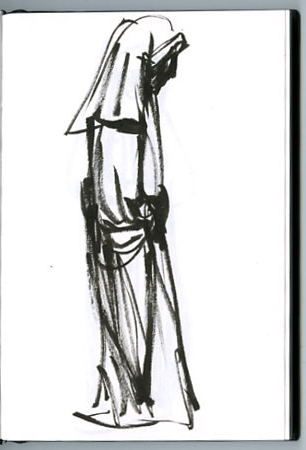
Mira Schor, sketch of what I think is the figure above, seen from the side

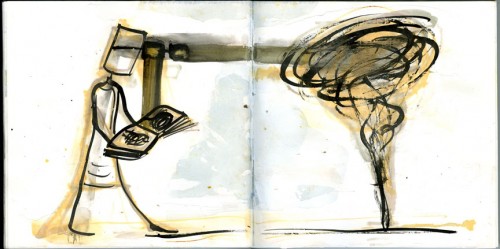
I was particularly interested in the figures holding open books, since this is an image I have recently been working with, a figure — myself — who, among other things, is a mourner reading the book of the past while walking into the future. Despite the fact that I am in fact drawing such figures in my work, I was irritated that photography was not permitted at the Met (and annoyed at the vigor which the guard applied to her enforcement of this rule) so that I had to make do with some quick sketches, which proved particularly ineffective: usually my sketches of artworks recall the work in a more vivid and embodied way for me than any pictures I take at the same time, but even when looking at the special website for this exhibition, which allows you to rotate the figures 360 degrees and look at them from three vantage points (from above, eye level, and from below), I still can’t be sure I recognize one of the figures I drew, attracted by the Gothic elegance of a slightly slouching slim pose.

I feel there is something very useful to me about these sculptures, individually and their grouping, here particularly the idea of the isolation and privacy of individual mourning in relation to the rituals of collective mourning. Because they’re resonant of some aspects of work I am doing, they suggest something about what I might do, as yet unknown to me .

Mourner with drawn hood, reading a book, Jean de la Huerta and Antoine Le Moiturier, 1443-1456

Mira Schor, 38th spread, Grey Summer Notebook, ink and gesso on paper, 9 7/8”x14”, 2009

FacebooktwittermailFacebooktwittermail

Looking for art to love, day one: Chelsea

I started my search for art to love in Chelsea, April 20

(see my first post, immediately below, for some general thoughts about falling in love with artworks)

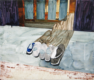
“Talk Show” at Ed Thorp Gallery: is the title a sly way of hinting that the show is all women painters? (talk show > The View > all women???)  A show with many good small paintings, with the slightly funky, folksy, even fey quality that Thorp has favored over the years: representational, slightly surrealist or fantasist. There are aspects of several artists’ work that I like [category: je l’aime bien]: I was interested in Clare Grill’s paintings, particularly Close Our Eyes and Go to Bed, a small painting of a group of shoes at a door way or threshold. The painting surface style is sketchy and relaxed, rich and with small pleasures in some of Grill’s decisions about paint transparency and the trace of an under-drawing, as well as the subject: the shoes suggest a family, but they are not all pairs, which, with the shadow that flows up towards the door, creates a subtle undercurrent of disquiet.

Clare Grill, Close Our Eyes and Go to Bed, 2008, Oil on linen on panel, 20h x 17w in.

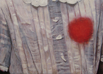
Also I spent some time with E.T., a delicate painting of a girl’s translucent blouse disrupted by a red spot over her left breast.

Clare Grill, E.T., oil on linen over panel, 18"x13", 2010

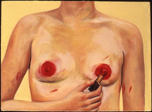
This brought to my mind the first small paintings I saw by Portia Munson when she was still a graduate student at Rutgers. These represented simple yet startlingly potent aspects of a woman’s life in a style of painting that was just as good as it needed to be to get the image across: either totally plain but curious still-lifes, such a pair of cotton panties rolled up from being just taken off and left on the floor, or the body transformed with a feminist perspective, as in Munson’s Lipstick on Tits, a close-up of breasts smeared in red lipstick.

I don’t think that Grill and Munson are working exactly the same corner of gender representation. The oozing red stain on Grill’s delicately painted blouse suggests illness, mutilation, or defilement while Munson’s bold image speaks to the social necessity of duplication of gender identity: having tits is apparently not enough to inscribe a female body as a woman in society, lipstick must be applied. Also, in Munson’s work, the woman painter begins by literally painting herself. Nevertheless I think it’s important to bring these works together: many important artworks from the near past are not as well known as they should be, often because the artist was not positioned properly in relation to the center of the art world, either by circumstance, content, age, or location. These gaps in history are particularly important to address when women artists are concerned, despite the many advances of women in the artworld.

Portia Munson, "Lipstick on Tits," oil on linen, 16"x22", 1986

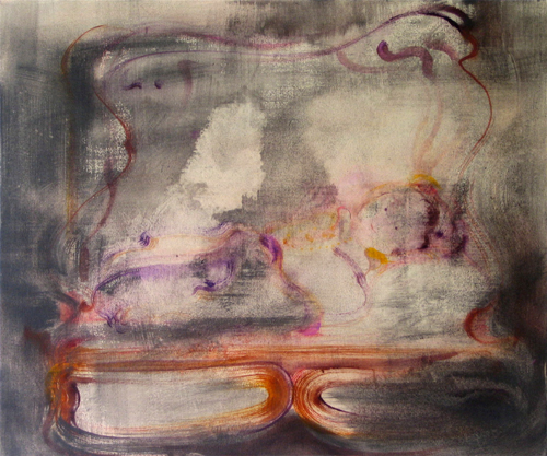
Of all the works in “Talk Show,” one painting has stayed in my mind past the Ninth Avenue barrier of Chelsea: Little Boy in Bed, a watercolor on canvas by Bettina Sellmann. It keeps drifting back into my mind as it drifts in and out of visibility even when you are right in front of it, a sweet little baby in a small ornately carved bed, all limned in a few strokes of watercolor on a scumbled grey stain on canvas. This painting seems old fashioned in a way, in terms of art style, it could be from the 1940s, never mind, it’s a haunting work [perhaps a sub-category: je l’aime bien + bonus points].

Bettina Sellmann, Little Boy in Bed, 2010, Watercolor on canvas, 30h x 36w in.

FacebooktwittermailFacebooktwittermail