Category Archives: art

Stephan von Huene, Feminist Teacher

I wrote this appreciation of Stephan von Huene, the American sculptor later based in Germany, upon the publication of a beautiful catalogue of “Tune the World,” his retrospective exhibition at the Hamburg Kunsthalle, 2002-2003. Living in New York City I could have only the diminished pleasure of reading the catalogue, Stephan von Huene, Resounding Sculptures, rather than the full pleasure of experiencing works whose synaesthetic performances remain fresh and vivid in my memory. However the catalogue with its accompanying CD does a great service in bringing to mind a wonderful and complex artist, human being, and for me, a teacher and mentor of inestimable importance.

Perhaps some of my reflections on his role as my teacher at a particular historical moment may be of some value in deepening the contextualization of his work while giving some personal impressions of the man. He was my mentor at CalArts after I left the Feminist Art Program. There are some people in one’s life who are absolutely irreplaceable, Steph was one of them. He remained a supportive friend and benevolent influence for me until his untimely death from cancer September 5, 2000. At that time, I had hoped to find a publisher for a draft of this text but was not able to do so. Here it is part of a group of posts exploring the theme of “Teaching Contradiction.” In this case the “contradiction” is that Stephan was the most nurturing teacher I had in graduate school and thus as much a Feminist teacher as any other.

I met Stephan von Huene when I came to study painting as an MFA student at CalArts in 1971.If one can set the artistic or more precisely the art academic scene of that moment, the dominant aesthetic philosophy of American art schools and art departments of universities was that of Greenbergian formalism. Painting had to be large, abstract, oil or acrylic on canvas. Period. No figuration, no narrative, no overt personal or political content. Sculpture was not particularly considered, but perhaps it is enough to say that it was often taught in dark and greasy garage-like environments by large, heavily bearded men wielding heavy power tools and acetylene torches (in Canada they called them “tuskers”). Of course, in the wider art world there were movements that contradicted these aesthetic imperatives: pop art provided an enjoyable outlet for younger artists interested in popular culture, there were the Hairy Who artists such as Ed Paschke, based in Chicago, who were practitioners of a kind of cartoon-like, colorful surrealism. Beyond that were the possibilities for time-based performance art and for non-art suggested by Nam June Paik, Charlotte Moorman, by John Cage, Fluxus and other underground art movements. But typically these had not penetrated the art academy.

Finally, any desires that might be specific to a feminist investigation of art and culture were only on the verge of being named. Just as CalArts welcomed the Fluxus movement in the person of Alison Knowles, Emmett Williams, and also artists such as Allan Kaprow and John Baldessari, so it was the first school in North America, indeed anywhere as far as I know, to welcome the new movement of feminism as part of its educational program. This was one of the reasons I chose the school.

The CalArts Feminist Art Program, run by Judy Chicago and Miriam Schapiro, was an exciting and intense experimental aesthetic and political educational program embedded within this already experimental art school. The women who chose to work within it were provided a unique political education and were given the opportunity to be artistic pioneers, as art subject matter, materials, history and theory were reevaluated and re-written. However, because this was a radical experiment that included a critique of gendered systems of power, the atmosphere in the program could become quite charged, as the professors dealt with questions of authority within a political movement dedicated to the critique of authority.

Given the situation I have just described, it may seem strange that I chose Stephan von Huene as my official “mentor” for my second year of study. The retrospective of his works provides a focus for an understanding of why in fact he was such an appropriate “feminist teacher.”

His contribution to my development was first and foremost to treat me with the greatest courtesy as a person and to appreciate the specificity of my work: at the time, I painted small gouaches representing personal narratives in a style related to artists whose work I only came to hear of through the research activities of the feminist program, such as Florine Stettheimer and Frida Kahlo. From a Greenbergian point of view these were “illustrative,” a pejorative description. If the goal of teaching through nurturing rather than through abuse was a primary rhetoric of the feminist art program, I found Stephan to be the most nurturing of the teachers I encountered at CalArts. He respected the criteria by which I wished the work to be judged. Since my principal interest at the time was to tell the story of my development as a young sexual being and at the same time to challenge the limitations set by the dominant formalist aesthetic, a formalist critique of the work seemed irrelevant, although even at CalArts it was the prevailing method, at least when it came to painting. So here was Stephan embracing the delicate role of art therapist at the same time as he prodded me into accepting change, chance and accident as formal and methodological principles, always with gentleness and humor.

He also shared his own searches and discoveries, from his work and life, his readings, and even from the psychotherapy he told me he had been in or perhaps was undergoing at that time. Again this was an unusual teaching method, revealing what might be interpreted as weakness while retaining the authority of knowledge and wisdom.

The few times he intervened in a more traditional, formalist, or simply practical manner were few but therefore memorable: for example, he once told me that he could tell the size of a person’s studio just from looking at the work – this seemed like a magic trick, but it is one that has served me well as a teacher. When the ceiling of my studio was damaged by a major leak, damaging delicate gouache on paper paintings I had lain on the floor, he said with his characteristic humorous exuberance, “This is great, you should put all your work in the shower!”

The  most important studio visit came a year after I had graduated. Stephan visited my studio in New York. He made it clear that he was not pleased with the work I’d done since I left school. He felt that I’d lost my direction, what he had felt was special to my work. I don’t remember exactly what he said, though I can still see him in the room. In fact what happened is that I instantly translated his sparely voiced critique into an interpretation of what I should do next to get back to the core he seemed as committed to as I was (or, rather, in that moment, to which he was more committed than I seemed to him to be). The resolve formed in that moment of translation and erasure of the actual comments set me back on the path that I have followed since. I could only even half hear his criticism because he had been supportive of my work and my criteria of judgement.

Most astonishingly, in relation to my being a painter, he once told me that he hated “pigmentation.” This is so revealing when one thinks of works he did in the mid-70s such as the Glass Pipes, where he seemed to desire a total dematerialization of art — “the sculptural direction toward nothing,” he writes. I felt that this work represented a life and death struggle for freedom from embodiment, and yet took the form of the sound of a scream, one of the most elementally embodied, reflexive human reactions of shock, fear, and existential horror. As a painter, I found his disgust with pigmentation funny but also bracing and it never interfered with his attitude as a teacher.

Stephan did not believe in showing students his own artworks. Or rather, he believed one shouldn’t try to influence students into imitation of the teacher’s work by immediately impressing the students with his style. Could there be any better example of his unwillingness to abuse professorial power than to deny himself that aspect of stylistic influence that appeals to so many who teach? And perhaps something else was at play, a kind of privacy, diffidence, and maybe the sense that his work was unusual and inimitable.
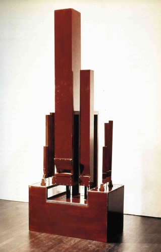
Stephan von Huene, Totem Tone III, 1969-70, wood and mixed media with sound

But finally I did get to see a few of his works, at the end of my first year at school. My memory is a little shaky but I know that I saw one of the Totem Tones at CalArts (see reference & sound link near the end of this post) – a strange, beautiful, uncompromising object emanating weird, funny but also forbidding sounds, yet welcoming through the warmth of the beautifully crafted wooden materials. Beauty and strangeness, science with archaic mechanisms emitting modern atonal sounds, the work seemed perfectly matched to the person, whose aristocratic demeanor commanded a particular respect – and it amazes me now to realize that he was then only 39 years old.
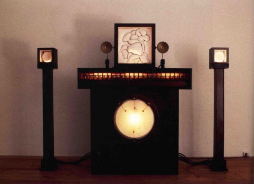
Stephan von Huene, Rosebud Annunciator, 1967-69, wood, leather, computer and mixed media

Around the same time, I believe that I also saw Tap Dancer and Rosebud Annunciator at his home.
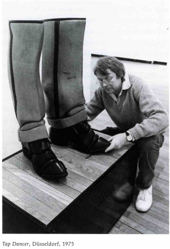
Stephan von Huene, Tap Dancer

These works then and now also suggest why he was such a perfect teacher, though a man, for a feminist female young artist in the context of the then prevalent LA “fetish finish” art movement. The relation to Surrealism perceptible in his work was resonant for many women artists including myself  interested in narrativity and representation of sexuality. The work’s use of dark wood and his variant of fine crafting seemed to have more to do with the California Arts and Crafts movement of the early twentieth century than with the prevalent surfer culture. William Wilson does a good job in his catalogue essay of describing the art world of Los Angeles in the late 60s and the anomalous position of von Huene within that context. His work had some connections with that of Ed Keinholz, as has been noted. But socially he didn’t play the macho game; in fact stories from that scene would cause him to flinch as if recoiling in pain and distaste. He was marked by his early childhood experience of cultural otherness, as the child of German immigrants, and that gave him a sensitivity to similar experiences in others.

In his work, his developing interest in technology somehow had a different feel to it than that evidenced in contemporary work dealing with technology. He didn’t aspire toward the glorification of plastic. There was an increasing formal reductivism to his work in the 1970s, but he exercised an older type of craftsmanship, in much the way that Walter Benjamin noted that new technologies, when first realized in utilitarian objects, retained archaic traces, so that, for example, the first automobiles retained the outward form of the fanciest, hand-crafted horse-driven carriages, before the full impact of mass production streamlined form to function. The early works had a strange quality of surplus and quaintness of materials in order to create rather primitive sounds. And in later works such as The Semiconductor of Chemnitz there are again traces of the archaic: the face of the figure echoes the faces of mannequins in Atget photographs, just as its mechanisms seem caught somewhere between an 18th century automaton and a robot created at MIT.

Many of his works used metonymic representation of gendered body fragments in ways that reflected surrealist roots. Surrealism had been the demonized other of modernism, in the terms of the New York school: this is a recurrent theme as one can see in the writings of Clement Greenberg and Barnett Newman, among others. As feminist art sought visual form for the depiction of female sexual desire, the surrealist movement provided important models. The surrealist movement has continued to exercise an important influence on feminist art and theory because, although the surrealist artists themselves may have been unregenerate in their views about femininity: placing irrationality and madness in the feminine, at least they prized those states of being. Thus their work and that of the theorists surrounding their group, such as Bataille and Lacan, opened the door for later feminist investigation.

Von Huene’s works shared some of the characteristics of a reflection of gender identity as something learned, as a system of signs: as in many later works such as Tischtänzer, gender identity is telegraphed through a reduction of the body to a headless dancing pair of pants or tights, a system of culturally marked codes. The feminist art historian Carol Duncan had written an influential analysis of much representation of the female nude in vanguard modernist painting, “Virility and Domination in Early Twentieth-Century Vanguard Painting,” focusing on the violence done to the subjectivity of the female models, often most blatantly signaled by formal, compositional decapitation. Von Huene returned in many works to the bottom half, the sexed half, but of both men and women, and always with a focus on the signs of gender such as clothing or scale. Also appropriate to a feminist interpretation is the frequent awkwardness of the fragmented body part: the legs and boots of Tap Dancer teeter between a military appearance and the suggestion of a medical condition, transposition of right and left feet, or two left feet perhaps. Certainly his depictions or intimations of women are never exploitative, never deliberately sexually disturbing in the manner of an artist like Hans Bellmer for example.

Fragmentation, figuration, gender, craft, lack, these were all areas of interest that had strong connections to the interests of much feminist art investigation at the time and feminist psychoanalytic theory of later years.

Finally von Huene’s unusual relationship to dominant or dominating systems of power are important components for What’s Wrong with Art and Blaue Büche in which he uses formal elegance to contain his distaste for abuses of power in the art world. From percussion as pure declarative sound, in Drum, for example, he moves in Blaue Büche and Der Mann von Jüterborg to speech as a percussive instrument of power. In Drum the mechanical devices that drive the drumsticks prefigure the robots that run the world in The Matrix, while in Der Mann von Jüterborg the slow pace of an invisible man moves like a marionette, following in a disturbing yet powerful slow motion the drum beat of human speech. These works develop a sophisticated critique of systems in which the spirit of creativity and of phenomenological investigation is frustrated and perverted by market values. In these works he continues to be a valuable teacher as well as a unique artist.
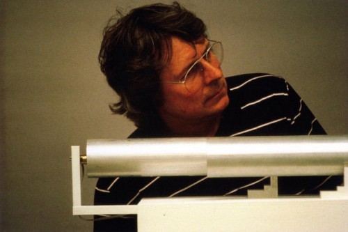
Stephan Von Huene and his piece Text Tone, 1083

Stephan von Huene was born in Los Angeles in 1932 of German-born parents. He studied at the University of California in Los Angeles (UCLA), and then received his BFA from Chouinard Art Institute in Los Angeles in 1959. He received a Master of Arts degree from UCLA in 1965.

In the 1960s, Von Huene exhibited wood and leather sculptures at the Pasadena Art Museum. His early work was noted for its Pop and surrealist sensibility and for his highly refined craft. He taught at Chouinard Art Institute in LA, and California State University, LA. Between 1971 to 1976 he was a teacher and Dean at the California Institute of the Arts (CalArts), along with Alan Kaprow and Paul Brach. He also taught at the Nova Scotia College of Art and Design in 1974 and received a National Endowment for the Arts grant that year. In 1975 he completed Drum, a commission with James Tenney, for the Exploratorium Museum in San Franscisco.

In 1976-77 Von Huene received a DADD grant to work in Berlin. He later moved to Germany where he was based in Hamburg and taught at the Art Academy in Karlsruhe (Staatliche Hochschule für Gestaltung Karlsruhe), as well as at the Fachhochschule fur Gestaltung, Hamburg, Germany. His work was included in Documenta 8.

Von Huene’s acoustic sculptural work Text Tones is one of the major works in the contemporary collection of the Hamburger Bahnhof – Museum für Gegenwart, Hamburger Kunsthalle, Berlin’s Museum for Contemporary Art.

Totem Tone V, (1969-1970), a von Huene sound sculpture is in the collection of the Hirschhorn Museum in Washington, D.C. and was discussed by artist Evan Holloway in a podcast accompanying the 2006-2007 exhibition The Uncertainty of Objects and Ideas: Recent Sculpture, curated by Anne Ellegood. You can hear it play toward the end of the podcast, about 29 minutes in.
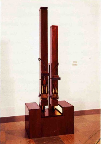
Stephan von Huene, Totem Tone V, 1969-70

Selected Bibliography

Stephan von Huene, The Song of the Line, The Drawing 1950-1999, by Marvin Altner, Petra Oelschlager, Petra Kipphoff, Stephan von Huene, Hatje Cantz Publishers, 2010

Stephan von Huene 1962-2000: Catalogue Raisonée, by H. Bredekamp, Petra Kipphoff, J. La Barbara, F. Michel, Petra Oelschlagel, Martin Warnke, Christoph Brockaus, Olaf Breuning, Stephan von Huene, Hatje Cantz Publishers, 2003.

Stephan von Huene: Klangkorper/Resounding Sculptures, by Stephan von Huene, Martin Wanke, and Christoph Brockhaus. Hatje Cantz Publishers, 2003

For more information:

Stephan von Huene Wikipedia article (German)

Stephan von Huene, official website

“Tune the World: Sound Sculptures, Pictures, Drawings,” at the Haus der Kunst, Munich, review


FacebooktwittermailFacebooktwittermail

Teaching Contradiction: Reality TV and Art School

This is the first of a number of projected posts I hope to weave into A Year of Positive Thinking, on the theme of “Teaching Contradiction.”

Poised as those of us who teach or are students are between the last episode of the reality show “Work of Art: The Next Great Artist” on Bravo Network and the beginning of the academic year, this seems like a good time  to examine how some of the contradictions enacted in the final episode of that show replicate contradictions that exist within the expectations placed on artists studying in MFA programs around the country.

The final show of what is currently being described as the “first season” of “Work of Art” established a contradiction in its own narrative premise: each episode but the last was structured around a “challenge.” The artists were given an assignment and either alone or in collaboration drawn by lot had to produce a work in about 24 hours with sometimes deliberately limited materials (you know something is wrong when A. you get only $100 to spend at Utrecht, whereas many decent old fashioned art supplies such as a tube of good quality of cadmium red oil paint can cost $50 and B. a lot of artists don’t use the kind of materials carried at Utrecht).

This seemed to be an entirely unrealistic depiction of creative work, since that brief time had to include coming up with an idea, shopping for supplies, dealing with all kinds of production demands, and doing the piece. This pace is more suitable to Bravo’s Top Chef series, since every day in a restaurant kitchen is a nearly 24 hour cycle of shopping for fresh produce and preparing dishes on demand under theatrical conditions of intense pressure with due speed whereas the time frame of the “Work of Art” challenges precluded both the kind of contemplation (reflection, research etc) or craft (here understood as refinement or finish) that are generally considered an essential part of artmaking (and since $100,000 –one the biggest individual artist grants in the world– was at stake you’d think that would matter but I digress…only  slightly). The artists who did best had some basic skills –traditional craft skills such as carpentry and mold-making seemed particularly useful–and were quick to come up with a concept, though often these were extremely literal and illustrative, a problem shared with much contemporary art.

However, to the contrary, in the last episode of “Work of Art,” the three finalists were given 3 months and $5000 to produce a body of their “own” work for a show (the fact that anyone would get $100,000 for mostly not doing their “own” work is …again, I digress). For the most part this allowed them to produce more polished work in terms of materials and surface finish though their conceptual apparatus seemed remarkably unchanged by the relatively more expanded time. Strangely the person most gifted in the short time-frame, Miles Mendenhall, who under pressure was quick, slick, and clever, knew how to make things, and how to occupy space convincingly, did not fare as well with more time, losing spatial energy while revealing the weaknesses in his conceptual frame.

Much discussion on Facebook, Jerry Saltz’s much awaited weekly recaps, and various blogs pondered how much this particular reality show with its for the most part silly assignments, awful art, weird costuming, and lack of articulated critical and aesthetic discourse or criteria even when compared to Project Runway and Top Chef  had to do with the “real” artworld. Sorry Jerry, but, perhaps because of editing, the uninformed viewer would get little background on the various contexts and references that make up the aesthetic criteria used by the judges.

In this contradiction between premise #1, pressure to produce art work in a short time within a group situation and premise #2, longer time frame for private production, “Work of Art” did bear some resemblance to one of the basic contradictions operative in two-year MFA Programs: in the equivalently short amount of time given to get an MFA degree, students experience an overwhelming exposure to a bewilderingly vast amount of diverse new artists, ideas, theoretical languages, art styles, aesthetic and political criteria (many of these contradictory), they are given lots of theoretical texts to read and are expected to see exhibitions and go to every art event they are told about, and yet they are expected to produce work regularly for critiques and discussion with teachers and visiting artists, (while, to name another contradiction, often limited to tiny studios with little privacy while implicitly expected to compete with works in museums and galleries produced with enormous yet mysteriously obscured budgets).

As a teacher, I enact the demands of this contradictory situation yet at the same time I am particularly sympathetic to its stresses because in the last 10 years a curious split in my work practice which has its roots in my earliest years as an artist has become acute: my deepest, most meaningful and most productive immersion in studio practice takes place during barely two months of the summer and away from New York City, and the much longer months of the academic year are spent in New York working on jobs (including teaching), working on my work (which may involve working with my works in digital reproduction, archiving + all the editorial, secretarial and social work that goes into even a modest career), and immersing myself in the multiple influences of current thought and art. All that uses up a lot of “bioRAM” as a friend of mine terms it, which in the summer goes entirely to the immersion in studio work and thought. Writing is the only activity that is continuous because it is an extension of thought and is stimulated equally by discourse and debate within the artworld and by time alone inside my mind.

The city mouse/country mouse dichotomy extends to my teaching itself: just as I paint and write, just as I imbricate written language into the language of paint, I approach the development of the artist in the classroom through text and history and in the studio through a variety of more formal and also more intuitive approaches and vice-versa: I’m committed to the artist as a historically produced thus educated to history, culturally contextualized person who should have as much control of theory as possible so it won’t have control of her–but at the same time I love the development of working–call it studio practice even when it isn’t what that used to mean or what I do–and I know that creative work needs to occasionally be unmoored from overdetermination.

In this city/graduate school environment, the upside of constant interaction/confrontation with people, work, and ideas that you have to understand, absorb, react to, sometimes defend yourself against, yet often allow to transform you, is that complacency is hard to come by. The downside is that there may not be time to process everything and all the outside voices can drown out the interior ones or, even, according to certain theoretical outlooks, deny that an inner voice exists inasmuch as it might be associated with autonomous art practices which have been deemed obsolete. And you are constantly having to put yourself forward, which for the MFA student means constantly talking about what your work means leaving little time for either doing it or for doing work whose meaning you might not have a ready explanation for, work that is transitional, even work that is a “failure.” You become all outside speech and less inside voice until you are running on empty.

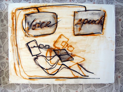
Mira Schor, Voice and Speech, 2010, ink, gesso, and rabbit skin glue on linen, summer studio snapshot

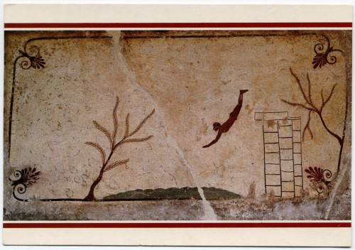
Since I have always reaped tremendous energy for my work and my writing from work that at first and sometimes finally at last, seems antithetical to my own, these encounters produce my work, they are an important part of it. Dealing with the “real” world of “winter” battles is absolutely necessary. Yet so is the uninterrupted and intimate availability to my work that I feel I need in order to really paint. It’s always hard to come by, hard won, and even hard to recognize as it is happening. It relies not just on aloneness but even on loneliness. It can come out of a desperation that makes you take chances –like the Diver on the postcard at the top of my studio wall array of postcards or like the demon of fear of failure that Agnes Martin discusses in her visionary essay about creativity, “On The Perfection Underlying Life.”

In recent years debates have intensified over the the possibility of alternatives to institutionalized graduate school, as degrees proliferate and tuition costs rise disproportionately to the earning power of most artists. Thinking of this split between information and critical discourse on the one hand, and studio/post-studio/post-post-studio practice on the other in relation to the usefulness of graduate school, one could truthfully state that the knowledge one is exposed to in school is available in the world at all times, especially in urban centers: museums, galleries, books, art magazines, internet sources, panel discussions, artists’ lectures all abound, though graduate school intensifies, categorizes, and filters that knowledge through the  interpretive structuring lens of the school’s ideology and its faculty’s strongly held viewpoints while insisting on disciplined and timely engagement and response on the part of the student. But critical responses to your artwork by individual artists and critics is much harder  to come by outside the academic structure, people are just too busy and will certainly not be able to give sustained attention, so if you don’t do the work when you’re in school, you lose out on the unique opportunity to get concentrated and sustained feedback, when you want it and even when you don’t.

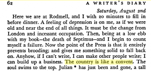
In a couple of diary entries from 1924, Virginia Woolf discussed the duality of work environments in her life –London/discourse/data input/sociality, and the country/solitude/introspection: “the country is like a convent, the soul swims to the top,” (August 2nd, 1924). I read this sentence when I was in my twenties and just beginning my city/country split work life and the sentence stayed with me. I found it just now through a Google search in 30 seconds, since evidently she is the only person who ever expressed that thought in those words:

Virginia Woolf, from A Writer's Diary, August 2nd, 1924, page 62

Yet the isolation and solitary confrontation with her work also brought on depression which the bustle of London dispelled. May 26th, 1924 she had written:

No matter whether it’s a reality TV show, graduate school, or the  everyday life of the working artist, it is always a matter of constant negotiation between world and self, the art itself and the making of it.

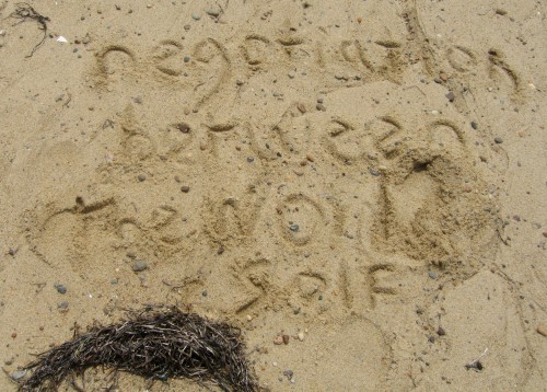
Note in the sand, 2010

FacebooktwittermailFacebooktwittermail

Postcard post

It is customary to send postcards to your friends when you’re on vacation.

My “vacation” consists, if I’m lucky, of my working in the studio as intensely as possible in all too short a time frame, like a squirrel madly trying to making sure there are enough nuts to last the long winter during which other aspects of the artist’s life prevail and overwhelm.

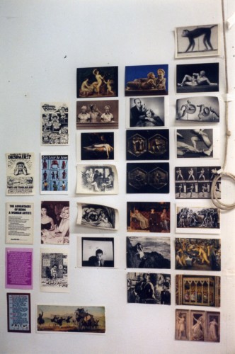
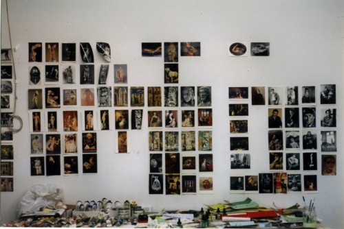
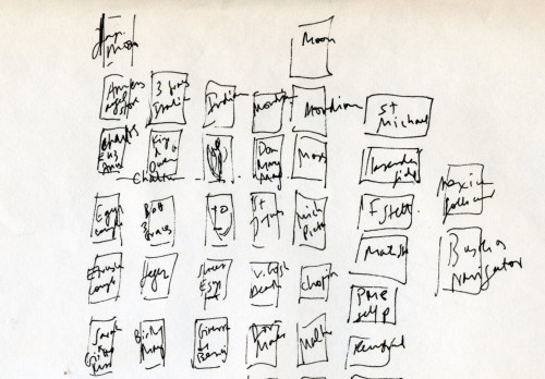
I always begin by putting up a group of postcards which I then take down at the end of the summer to help preserve their color and because I value the ritual of annual re-installation with gradual changes to the grouping and the order as part of my work process. Once I covered entire walls with hundreds of postcards, with major sequences of thematics interwoven.

Postcard wall view, Skowhegan studio, 1995

Postcard wall view, Skowhegan Studio, 1995

Detail of diagram of postcard wall, 1990s.

Over time I’ve pared down to a small, metonymic grouping of a few postcards taped to an attic door near my painting table. I hardly look at them once I’ve put them up yet each one represents something significant to me and each day in passing I may catch the eye of an image, so to speak, and a familiar connection is reignited.

Roof Slab of the "Diver's Tomb" (Tomba el Il Tuffatore), Paestum, c.475 B.C.

At the top is an image of a diver from Paestum.  (I have never seen this work in person). I love the schematic simplicity of representational detail, and the strange mixture of the mundane — someone in 475 B.C. doing something that people are doing around the world right now– and the mysterious — what is he diving into and what does it mean that such an image is on a tomb? Again the mundane: maybe the guy buried there liked to dive and swim, and the mysterious: maybe this is symbolic of death itself, the ultimate leap into the unknown oblivion. As the first image at the top of my postcard wall it represents the imperative of leaping into the unknown of intense engagement with my work after a long interruption.

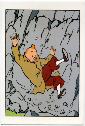
Herge, Tintin, from Le Sceptre d'Ottokar, 1947

Nearby, at the top of another vertical row is the image of Tintin falling. In my childhood I appropriated my older sister’s copies (this in itself already gave the images some of the exoticism of the slightly ancient, an impression fostered by the  French hardcover volumes’ patina of well-loved wear and tear, even though they couldn’t have been more than 10 years old ). I pored over them, appreciating the bold outline and color, and the weird plots. I loved le Capitaine Haddock’s amusingly child-friendly and weirdly antiquated swearing, and the dear deaf Professeur Tournesol blissfully unaware of the perils he wandered in and out of. I still treasure them and this postcard image of the unflappable Tintin tumbling down a mountain.

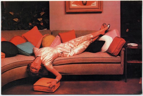
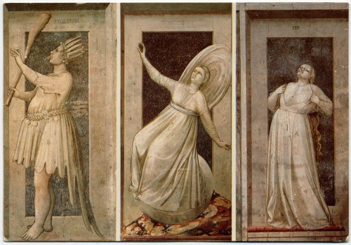
But I hadn’t realized, until I started thinking about this post, to what extent images of figures falling through space was one thematic of my postcard wall arrangement. Towards the bottom of the vertical row of cards below the Diver are two radically different images of women who are in some way toppling through space with abandon,elegance, and terror:

"Lounging," Vintage Chrome Postcard, c. early 1970s

Giotto, Inconstancy, detail from the Scrovegni Chapel, Padova, 1303-1306

Details from Giotto’s fresco cycle in the Scrovegni Chapel (or Arena Chapel) were among my favorite images long before I finally was able to go to Padova to see the frescoes. This turned out to be one of the most terrifying artistic experiences in my life in that finally in the presence of works I adored, I found myself totally disoriented by the totality of the work, the amount of scenes, the location of many important scenes in the narrative cycle well above eye level, and above all by the absolute irreducible flatness of the work: everything that I loved in the reproductions I had pored over and put up on my wall,  not just the narrative cycle and the deep emotion of the figures but the sculptural nature of Giotto’s figurative depictions, the magnificent drapery, the miniaturized architecture: all of this was the wall, not on the wall but the wall. Imagine seeing every painting by Picasso, Manet, or Cezanne, all as images on one continuous flat surface without even a trace of impasto to distinguish one from the other.

In the Scrovegni Chapel, the figure of Inconstancy occupies the lowest of four major levels from ceiling to floor and so it ‘s closer to eye level. Thus when I visited it was possible to have a more intimate viewing experience where I could peer closely at the figure instead of jostling with the crowds while wishing I had binoculars to see details of the major painting scenes in the rows above. This figure is such a perfectly balanced depiction of imbalance, so still within the sculptural grisaille while tumbling through air. I identified with the topsy-turvy figure, knocked off her feet by the sin of inconstancy as I was by the aesthetic shock of finally seeing such revered images and finding it nearly impossible to know how to experience them.

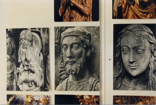
On every studio postcard wall I’ve installed are three black and white postcards from the North Portal of Chartres Cathedral.

Postcards, detail of portal sculptures at Chartres Cathedral XIIIth Century

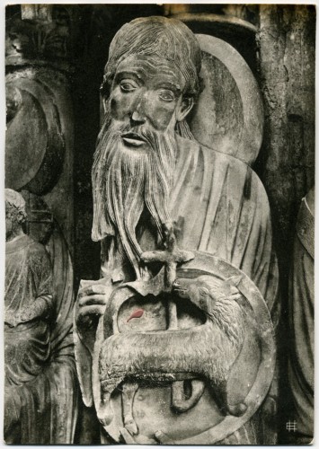
In a drawer in my parents’ room when I was a child there was a bundle of postcards from their years in France before the beginning of World War II: among these I believe were black and white postcards of Chartres. When I was 8 years old, they took me to Chartres Cathedral during their first visit back to Europe after they had escaped to America in 1941. I have been back since but that initial experience was formative, even foundational in its resonance for my work. I have a haptic memory of my entrance into the Cathedral, of touching the cold grey stone of a small chamber and my memory of that first experience of being in the main nave combines color, cool temperature, and the thrill of verticality into something that has a smell and even almost a taste that I cannot quite describe. I’m not sure if these black and white postcards are from that original pre-War group, or from our trip in 1958. What I do know is that I so imprinted on these black and white reproductions and they are so imbricated with my physical memory, that I find the more recent color postcards I have of the same figures to be crass and inexpressive. For all intent and purpose, these photographs could be from the Thirteenth Century and in looking at the face of John The Baptist, I feel I am looking upon the face of the sculptor who carved it.

Chartres Cathedral, XIIIth century, North Portal, John the Baptist

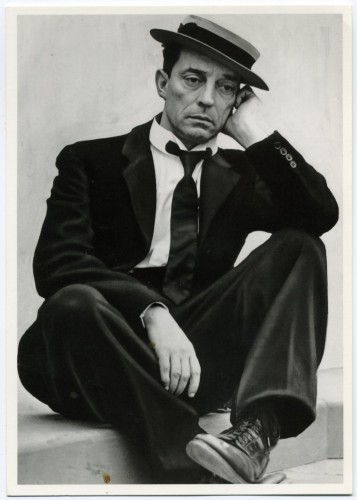
Buster Keaton, 1939 (unidentified photographer)

The face of John the Baptist haunts me, its elongated form, the expression almost too humble and touching to bear. It picks up in the face of Buster Keaton, whose films I saw also in my childhood. I always felt a deep allegiance to Keaton. I am drawn to the spareness of the sets as to the complexity of the sequences of motion and transformation. The General, The Navigator, Sherlock Jr. — a favorite of the Surrealists — The Cameraman, Steamboat Bill Jr. are all wonderful. And above all I am drawn to the impassivity of Keaton the actor’s face, as the world deconstructs around him (a deconstruction that is the result of Keaton the director’s artistry and immense technical imagination, skill, and daring).

The faces of John the Baptist from Chartres and Buster Keaton belong to a category or a quality of many of the images I chose that I would describe as stillness, as a deep seriousness, often profound piety. It is a quality of artwork that is sculptural yet also has a calm clear musical tone which imparts a sense of justness. It is often also, formally speaking, minimalist, at least in the key detail or underlying emotional core, a quality of profound reticence. I find this quality in popular culture as much as in high art:

Spock

My students can attest to the fact that I use Star Trek (all versions except the last prequel series and film) as a major source of wisdom and in all iterations I have always identified with the character whose capacity for emotion is sometimes tragically (Spock), sometimes humorously (Data), and always fascinatingly (Seven of Nine) encased within a rigorous intelligence, and none more so than Spock.

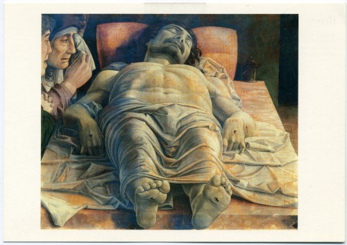
Andrea Mantegna, The Dead Christ in the Sepulchre with Three Mourners, Pinacoteca de Brera, Milan

Below Spock and Inconstancy, at the bottom of the vertical row that begins with the Diver from Paestum is Andrea Mantegna‘s The Dead Christ (c.1500) which I saw at the Brera Museum in Milan in 2001 and wrote about later that summer as a painting I had fallen in love with:

The Dead Christ was painted by Mantegna in about 1500, towards the end of his life and is thought to have been intended for his own tomb in the Church of Sant’ Andrea in Mantua. It hangs in a simple frame, unostentatiously placed among many other paintings in a corridor lit by natural light but it has been positioned so that it is visible from a great distance framed by a series of open doorways of a side set of small galleries. You feel that thrill of “there it is” since it is one of the most famous images in the history of Western painting because its virtuoso use of foreshortening but also because of what it is and how it relates to your own space and body.

Once in front of the painting I was struck by several things all at once:

First of all it is a small painting only about 68x81cm, or about 2 by 3 1/2 feet. So it has a kind of modesty of size but at the same time it is immediately intensely radical, all the more so because it’s small and subdued in color. Christ’s body is indeed dramatically foreshortened but immediately it is obvious that the foreshortening is wrong, the face seems big in proportion to the feet. Mantegna must have been aware of the problem but both the basic premise of the painting and the basic error in its realization are what create the emotional impact of the painting. There is something profoundly uncomfortable about it. The perspectival error in itself creates a sense of discomfort and disquiet and the result of the error is that the viewer’s eye propels directly to Christ’s massive chest and handsome face. You are allowed no emotional distance from what’s going on and the intensity of religious emotion is accentuated by the three mourners whose faces are crammed in the upper left corner of the painting.

This is the most surprising part of the painting, perhaps more than the abrupt foreshortening. At first I thought the painting must be a fragment, a cropped image from a larger original because it is such a strange and in a sense a very modern, photographic type of composition, but the original linen is visible all around the edges of the painting, so this is the original composition, again an incredibly radical aspect of the painting.

Those faces are part of the appeal of the painting for me; they are very much like the limewood sculptures by the German artist Tilman Riemenschneider that preceded this work by only a few years (1494). I generally prefer the mindset of Northern Renaissance painting because I prefer the sense of piety as it is embodied in stylized, sober forms characteristic of Northern Renaissance painting and I prefer the North’s more tormented, less Hellenistic view of the body over the idealism and narcissism of much High Renaissance Italian painting– and in fact what is interesting about the Dead Christ is that it combines elements of both traditions. It’s a mixture of the two value systems: the idealization of the human body and the search for scientific realism, and the Northern non-hierarchic realism, its emotionality and severity, sharpness and starkness of form and painterliness, the combination of large clear sculptural forms, linear elements and careful attention to humble detail.

This is a very sculptural painting and one of the characteristics of many of my favorite paintings are that they are sculptural, even architectural as they are painterly. From the stylized simplified forms in Seurat to the ample folds of clothing and the houses and rooms of Giotto to the piles of stuff in a Guston. They could be turned into a sculpture, they could be built or carved or accumulated, which is not something that one might say of a Rubens, for example, unless the sculpture was made of butter! It is the miracle of paint’s capacity to be a thing in itself and represent a thing or a place, even in an abstract painting, that is so exciting to me.

The material qualities of the painting are as important as the image, utterly uncompromising and not particularly oriented towards sensual pleasure. There are no frills, and everything propels toward the subject, the death of a man who is a God: the size of the painting accentuates the realism: looking at it is exactly like what it might be like to be at eye level with a refrigerated drawer at the morgue.

At first it seems as if he painted it on patterned damask because the pattern of the cloth looks imbedded in the painting but no, the pattern is painted because natural linen is visible at the edges of the painting. You can see the edges of the linen, which makes you more aware of the paint surface resting on the flat surface, which makes it a very modern painting as well: the painting is tempera, very thin and dry. It looks intact and original, with no varnish or restoration evident. The subdued color and tonality, which verges on grisaille in keeping with the sculptural setting it was intended for, emphasizes the death of Christ’s corporeal body. The wounds in his flesh, feet and hands are both very convincing as wounds, they also looked like chipped wood, and like tears in the cloth of the painting, so they are wounds of God, man, and art. There is one drop of blood on his left forearm. Because of the way the paint is applied, flat and plain, this one tiny detail really stands out. The subject of the painting and its thinness, the way the image is so lightly resting on the surface and yet so much part of it that it seems imbedded in it, makes it like a more articulated and consciously done version of the Shroud of Turin, just the most fundamental, bare bones trace of the corporeality of Christ. The dryness too is part of the emotional quality of the painting. Also as a painter I am struck by the fact that the medium of tempera is unforgiving of mistakes. I would be interested to see an x-ray of the painting because it doesn’t seem to have any changes or repainting, and that again hits you in the face, the sense that he conceived it, drew and did it.

Each painting that I love gives me something I can use in my work and something that supports me as an artist. This painting is utterly uncompromising, it is almost brutal, its emotion is as unvarnished and understated as its surface, and it is profoundly serious which is a great gift at a time when the culture at large just wants entertainment.

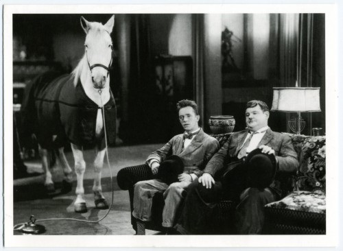
But on the other hand, on the wall behind me:

Stan Laurel and Oliver Hardy, film still from "Wrong Again" (1929)

And finally another image of falling, or at least teetering, tottering (just below Tintin):

Ida Applebroog

or, this year, the last word:

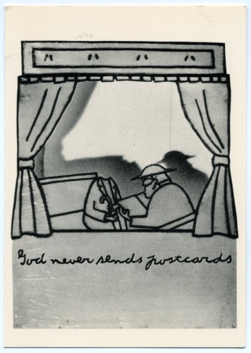
Ida Applebroog, God Never Sends Postcards, 1975. Ink and rhoplex on vellum

Have a great rest of the summer, and I may slip one more post in the mail before I return, I hope with a few nuts and less frayed, to the fray.

FacebooktwittermailFacebooktwittermail

Thinking about Daniel Schorr

The journalist Daniel Schorr died today at age 93. I wish I could claim him as a landsman — the Yiddish term for someone from your hometown or shtetl — and it is within the realm of possibility that there is some distant genotypic relation since my family name was sometimes spelled the same way back in the same general geographical area (Belarus in his case, Galicia/now the Ukraine, in mine). But I note his death on A Year of Positive Thinking because my work as a painter and a writer is not only marked by various art influences but also by the models for political courage that I witnessed and heard about over the years (I do not place myself in the league of such figures but that such models existed helped form my political focus just as such figures today help me get through moments of political despair).

The presence of principled journalists is a necessity for the survival of a democracy. The transmission of political memory through the living presence of such individuals as they remain percipient in our time is a great resource and thus it is sad to lose this particular individual’s political memory and conscience. That all sounds pompous, so let’s just say how interesting it could be to watch TV network news when  a certain weight and trustworthiness attached to TV anchors and reporters in a smaller, more centralized but less polarized media environment (the past). It was fun to watch as some mainstream reporters got a kick out of engaging with political outrage: I think of seeing  Dan Rather being assaulted on the floor of the Democratic Convention in Chicago in 1968 by Mayor Richard Daley’s thugs during CBS News’s live, gavel to gavel, coverage. Despite what was taking place it was a treat, even a moment of a kind of sheer political joy, let me tell you!

[I get that sense of joy from Jon Stewart’s inspired comedic riffs on The Daily Show but there is a dark undercurrent to my pleasure because Stewart’s existence is predicated on the utter failure of much TV “news” media to engage with facts and pursue injustice. Daniel Schorr was part of a generation of journalists with high standards in that regard. Thus, during Watergate for example, our Democracy still seemed fundamentally sound even when the President was undermining the Constitution– as people used to say, “the system worked,” even though paradoxically it had nearly failed. To be fair and not to totally lapse into unquestioning nostalgia for the past, Schorr, his mentor, Edward R. Murrow, and even Dan Rather, eventually lost the support of CBS when corporate fears of political retribution overwhelmed journalistic principles].

So I enjoyed Schorr’s pride  at being on Nixon’s enemies list (here’s a link to Nixon and Colson talking about “putting the screws” to CBS and asking for the network to put pro-Nixon commentators on in order to have a more “balanced” point of view, in December, 1972; also link to the transcript of an interview with Schorr on PBS in which he discuses the “most electrifying moment” of his career, when he got hold of the enemies list and read it out loud on live TV and discovered that he was on it, #17) and admired his courage at risking various jobs on principle as well as his good-natured sense of humor about political ignominy and folly. There was a certain buoyancy to his view of the world that was great to hear. Today we do have people with a passion for justice who take great risks to expose uncomfortable truths that threaten power, and likely such people have always been rare. However, thinking of a recent example of the leaking of key information relevant to recent American history — Julian Assange of Wikileaks— it would seem this is a function of our society that has been globalized but, speaking as a citizen of the United States, one could also say that it appears to have been outsourced.

When I heard today that Schorr had died, the first thing I thought of was a fairly recent broadcast on NPR where he recalled the Great Depression as he has experienced it as a young man. The end of that broadcast, from July 6, 2008, when Schorr was 91 years old, was deeply touching. Asked if he remembered any songs from the period, he sang, a capella, the first few verses of “Brother, Can You Spare a Dime?” I hope you will listen.

FacebooktwittermailFacebooktwittermail

Otto Dix, a brief footnote: drawing and ideational aesthetics

I had a hard time finding decent images of Dix’s work online, starting with the Neue Galerie exhibition site, continuing with the Metropolitan Museum website which only reproduces one work. I assume this is done precisely in order to prevent people like me from lifting the images off the web for their own purposes.

However one web source of images of works by Otto Dix is exceptionally interesting to anyone who appreciates drawing and I think it will make drawing interesting to anyone else:  bildindex der Kunst und Architektur has over 3000 Dix images, some are black and white reproductions of drawings in various collections, including drawings that are currently in the Otto Dix exhibition at the Neue Galerie but many are hi-res images of Dix’s sketchbook drawings which give an insight into the experience and the preparatory work that went into Dix’s paintings, although some patience is involved with seeing any of them beyond a thumbnail. Some are amazing artworks in themselves but all are instructive of a constant lifelong practice. Many are what might seem like academic studies, but that characteristic in itself gives some insight into Dix’s style as well, the style he chose for its expressivity and political subtext (the Gothic or Northern Renaissance elongated, detailed style of figuration) — that is to say the style we most associate with Dix was not only an unconscious signature, it was also a deliberate aesthetic and historical choice built on a base of more traditional or conventional academic skills.  Many of the drawings on this site are from the 1950s and ’60s, a period of Dix’s work that is not well-known, at least in the US.

In an earlier post I spoke of art works that I love because of characteristics that propel me back into my own studio practice. One type of work I seek is a work that makes me want to work, that, no matter how simple, gives me permission or inspiration. It can be as modest as the single stroke of charcoal on a drawing by Guston. Strangely it is among the hundreds of sketchbook drawings by Dix on this website, rather than in the paintings, that I feel I may have found a few such inspiring works for my current work. Perhaps the tide of history had moved past Dix or had only for a brief moment incorporated him, perhaps his later work was more conventional, I don’t know enough, having mainly these sketches to go by. But I feel that there is something of use for me in the simplicity of these sketches, their formal clarity without the earlier Gothic mannerism.

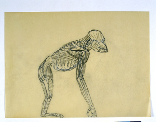
Otto Dix, Anatomischer Affe, sketchbook drawing, 1954

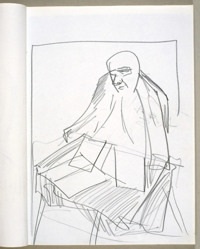
Otto Dix, Drawing of Composer Wolfgang Fortner,1967

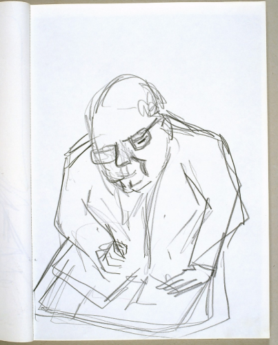
Otto Dix, Drawing, c. 1967

Full disclosure: perhaps it’s not surprising that at the moment I’m drawn to a sketchbook drawing of a person writing or drawing on pages or notebooks because I’ve been drawing in sketchbooks myself drawing in sketchbooks. I include this image not in any way to compare myself with Dix, except that I share a love of drawing and at many times it has been a crucial area of practice, not only preparatory for painting but in itself, for what ink, gouache, various other media and different kinds of paper can do in particular.

Mira Schor, Night Drawing, 2009, ink on paper, 8 1/2" x 11," sketchbook drawing

A few years ago, in the mid-0s, my colleagues and I were treated to a PowerPoint presentation on some changes to the school’s foundation year program, which, it should noted, services many areas, of which fine art is the smallest. At that time PowerPoint was enough of a novelty in itself that we could, unfortunately not for the last time, exclaim with wonder that the speaker actually was MAKING  US  READ  THE  TEXT  he was speaking out loud, keeping the slides of his exact spoken words up interminably, as if we were not college professors with some basic degree of literacy, thereby unconsciously performing one underlying purpose of this talk, which was to signal the institution’s embrace of visual culture’s ahistorical sampling of morphologically-related images (a lively phantasmagoria of everything from Marie Antoinette’s coiffures to Bruce Nauman sculptures to the latest chair design but not a single painting) over any kind of discipline-based art or design practice, which we were collectively thought to be representing in our work and teaching.

Under the circumstances, I was struck by the speaker’s use of the word “ideation” as a substitute for the word drawing. It stuck in my head partly because it is sort of a cool word, with its pseudo-scientific and vaguely military/corporate buzz. On the other hand it’s somewhere between annoying and sinister in its implications to art making. While it places an interesting emphasis on the undeniable conceptual aspects of drawing, the goal of disembodiment implicit in its privileging of the instrumental and utilitarian aspects of drawing — as a space where you could “ideate” something else, a means to another end than itself, rather than conceptualism recognized as part of the process internal to the practice of drawing itself — shifts the emphasis away from the craft or artisanal aspect of drawing as something done by the artist’s body from brain through hand to viewer’s eye, body sense, and mind. And ideation not only replaces the word drawing but also the word thinking. “I’m ideating” is an absurd answer to the question, What are you doing?, whether you are drawing or thinking.

It’s true that I use drawing as a space for ideation of painting and of externalization of otherwise inchoate ideas in my head (mostly for painting but sometimes I start an essay with a diagram while many of my drawings have a diagrammatic aspect and function for me). As many artists and architects have experienced, drawing is a space for experimentation, where failure and error are not so much concerns or fears as they are goals. There is an immediacy and often an intimacy in drawing and like many painters I am often hard put to achieve the same qualities in oil painting because the medium has an imposing presence and history and it is a substance that, although also unusually fluid and sensual, resists, although that is part of the appeal of oil painting for me, its resistance, its unwieldy, stubborn objectness.

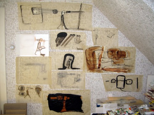
While I was working on this blog entry yesterday, with drawing on my mind, I went through the pile of drawings I’ve just been doing and put them up on my studio wall rather than keeping them floating around the floor and tables. That is, I decided to stop waiting to privilege the ends (“finished” paintings) and took a moment of pleasure in the means (hit and miss drawings). Doing so helped me to perceive that I was in fact working, a recognition that hits an important gear in the process of getting back to studio work after a long interruption, as is the case this year. This was a small moment when doing the project A Year of Positive Thinking yielded a small but welcome positive moment in my work process which is, in a sense, a total ideation across several platforms.

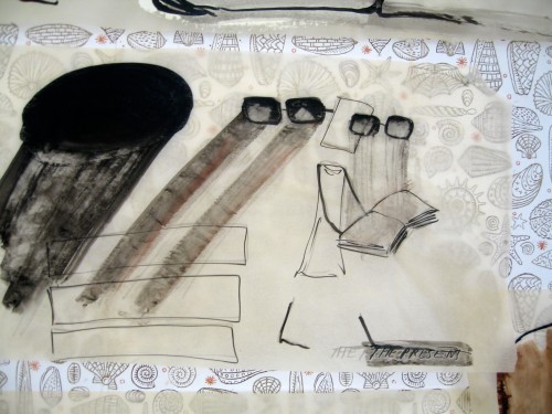
Mira Schor, The Present, 2010, ink on tracing paper, 12″ x 18,” (my studio in Provincetown has a 1950s era shell-theme wallpaper that I’ve grown very attached to).

Mira Schor, Drawings, or should I say Ideations, Studio Wall, July 4, 2010

FacebooktwittermailFacebooktwittermail