I woke up one morning this week, walked into my studio while still half asleep, looked around and thought, my work is just not enough. This may not seem like a good start to a New Year of positive thinking, but I immediately understood that this thought, surging from the liminal space between sleep and wakefulness, was shaped by the profound spell, there is no other word for it, cast over me by the exhibition I had seen the day before at the Metropolitan Museum of Art, The Renaissance Portrait from Donatello to Bellini.
This show is one of two extraordinary exhibitions devoted to portraiture currently up at the Met. The other one is Heroic Africans: Legendary Leaders, Iconic Sculptures, a powerful exhibit somewhat incongruously tucked away off the main hall of Greek statuary. The shows and the works included are totally the same and totally different, it is fascinating to see them together: Heroic Africans is only up through January 29, so to see both one must go in January, it is worth it in so many ways.
Both exhibitions focus on representations of persons of power and prestige, whether princes of the church, mercantile leaders, or tribal chiefs, or, in both cases, their women, wives and marriageable daughters. Figures are both idealized (in the case of portraits of historical figures of the Italian Quattrocento) and yet highly suggestive of specific individuals (in the case of African works where we may not know the exact identity of the subject portrayed). Both include representations with a high degree of verisimilitude and strong symbolic content, which we understand more or less well depending on what prior knowledge, historical or aesthetic, that we bring to them. For how we apprehend the human images in these exhibitions is based on what we recognize and know from our own visual and cultural experience.
In his landmark book of sociologically-oriented art history, Painting and Experience in Fifteenth Century Italy: A Primer in the Social History of Style, Michael Baxandall examined the “economic basis for the cult of pictorial skills,” providing detailed analyses of the contracts entered into by painters and their patrons to examine the criteria brought to bear by both parties to the creation of the works seen in The Renaissance Portrait. We may not have a detailed written history of how the African portraits came to be done but perhaps the relation of artist to power is not all that different in any culture. Our understanding of both groups of works rely on what we know and how we know it, as Baxandall remarks, “Our own culture is close enough to the Quattrocento for us to take a lot of the same things for granted and not have a strong sense of misunderstanding the pictures: we are closer to the Quattrocento mind than to the Byzantine, for example.” I’m closer to the Quattrocento mind than to the tribal mind, or am I?
The museum has certainly made some assumptions about our relative knowledge and probably rightly assumed that, relatively speaking only, many of its viewers may be closer to the Quattrocento mind than to the tribal mind so perhaps to mitigate that gap, it has chosen to introduce the African portraits through two devices that they must have felt would anchor the work in our body of knowledge: first, a collection of photographic postcards made for the Western trade during the colonialist era position the culture whose artworks we are about to see into a zone of a safe exoticism, a chief, his four young wives, one of whom holds an umbrella over him, and so forth, and, second, the curators have placed two marble Roman busts at the threshold of the exhibition, one of these of Octavian, later Emperor Augustus, thus one of “our” heroic figures. No direct connection is made to contextualize the inclusion of these works, for example no claim is made that any tribal artist in equatorial Africa ever saw these busts, which would have been seen in North Africa, or that any influence of Greco-Roman art trickled down the Nile or along other trade routes, these marble busts are just there, seemingly to legitimate the African work, proof, in case we needed reminding, that the white male universal is the referent of choice for the Met’s audience.
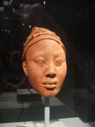
But since the first works we see are terracotta heads of such perfect (read perfect according to Western criteria of figural verisimilitude) quality, such craft and uncanniness of three-dimensional representation accuracy, we don’t really need the Roman bust to orient ourselves. These terracotta heads from the Yoruba peoples, Ife, Nigeria function as full realism in relation to other works from tribal groups like the Chokwe peoples of Angola placed further into the exhibition that become increasingly symbolic, abstracted, increasingly specific to tribal cultures. The floor plan of the show is almost like a cut-away of a snail shell: in the outer cavity is the work closest to the West in terms of representational style, and, by the way, in a fascinating case of chronological synergy these are dated from the 12th to the 15th century thus contemporaneous with the Italian Renaissance, while in the most inner curvature are the most ethnic, the ones most “African” in their style and content, from the 19th and early 20th century, thus contemporaneous with the Western cubist works they inspired. All these works are absolutely astounding sculptures, as exquisitely crafted as the terracotta busts or the Donatello upstairs, but especially in the case of the later works with highly stylized figuration with elements that may seem very abstract. Each work is extremely intense, in the degree of craft in the wood carving, and the characterization of the figure.

Yoruba

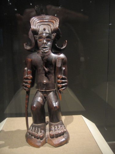
Chokwe Peoples, Angola, 19th Century
I’ve gone to see both shows three times this week, and each time I was riveted by one or two figures in Heroic Africans and the experience was too intense to allow me to take in every work in the room. Perhaps it’s a bit easier for me to filter out what I’m not interested in looking at among the Renaissance works because relatively greater exposure and knowledge makes me more confident about my choices. At the same time the bounce-back effect from our knowledge of African art-inspired Cubist sculpture make the figures accessible in a formal way, maybe even more so than the Renaissance paintings, but this may also block their immediate usability to a Western artist, as one struggles to not fall into the traps of “primitivism” or of imitation of Cubist style.

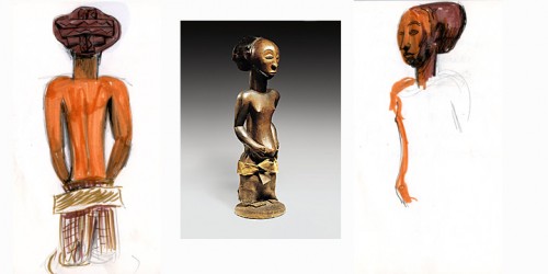
Commemorative Figure, Hemba peoples; Niembo group; Democratic Republic of Congo, 19th-early 20th century. Wood, fibers, fur. Collection Ethnologisches Museum, Staatliche Museum, Berlin (no photography allowed in the exhibition and few images available on line, thus my inadequate sketches, though drawing a sculpture is a great way to experience it)

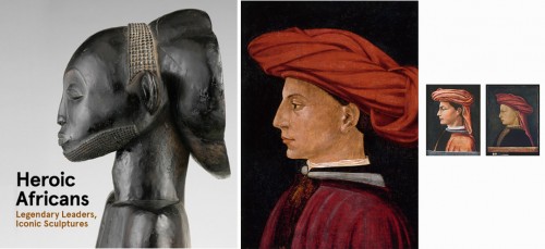
Detail, Commemorative Figure, Hemba peoples; Niembo group; Democratic Republic of Congo, 19th-early 20th century. Wood. Portraits by Masaccio, Domenico Veneziano (attributed), and Paolo Uccelo (attributed), tempera on wood, mid-1400s.
The transition, if a transition needs to be made between the two exhibitions, can be made through comparison of two hat designs: one a completely abstracted (to us) form on the back of the head of a Commemorative Figure of the Hemba peoples from the Democratic Republic of Congo. It’s a cylindrical form set on the head at an angle so the top creates a flat line jutting back from the crown of the head; the back of each such headdress is a carved bas-relief pattern of crossed or woven thick ribbon-like shapes on a flat ground, like a platter, in other words an utterly modernist cubist shape, like an Ozenfant or Leger, all the more so because that surface is parallel to a pictorial flat field, like a mirror on the wall reflecting a flying saucer. The other is a type of turban-like headdress worn by the men in the first three portraits we see at the entry to Renaissance Portraits–where, by the way, the museum has not seen the need for a classical reference. It is assumed, and, besides, Renaissance art is at the heart of our system of reference. In three paintings, by Masaccio, Paolo Uccello, and Domenico Veneziano, the men wear a wrapped cloth headdress something like a turban but softer, a pile of folds, as abstract as the headdress in the Hemba figure–the hard edge of cubism in the one versus the deliquescent informe materiality of a Lynda Benglis in the other. But if, because of the more familiar style of representation in these three Renaissance portraits we accept these abstract folds as a hat, then the schematic folds in the wood carving downstairs are surely as transparently representational to anyone who knows the costume of the area.
But perhaps I’ve strayed from my original premise: why did I wake up and feel that my work was not enough? To try to get closer to an answer, I’ll focus on a few works in Renaissance Portraits from Donatello to Bellini which made a particularly deep impression on me.
The order of their appearance in the show makes a certain sense for me too, marking the range of challenge they pose.

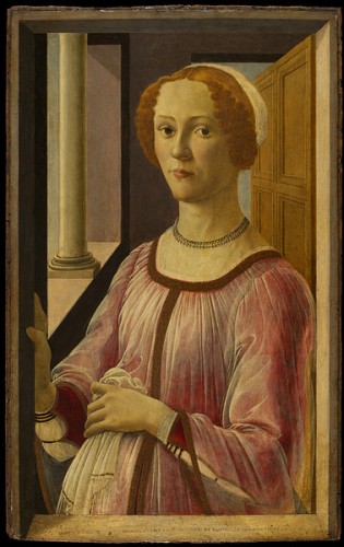
Sandro Botticelli, Portrait of a Lady at a Window ("Smeralda Bandinelli"), c. 1470-75, Tempera on wood, 25 7/8 x 16 1/8 in. Victoria and Albert Museum, London
The first is Sandro Botticelli’s Portrait of a Lady at a Window. As in many of the paintings in the show, the lady occupies a space that hovers between the perspectival or pictorial and the symbolic. She stands at a window, her right hand resting gently on the frame. The space behind her seems totally credible yet on further examination impossibly narrow and without a clear sense of where the floor might be. Pardon me, but where exactly are her feet? Just as the depiction of the lady herself, the space is beautiful, severe, grave, and imperfect (although it’s possible that the perspective is absolutely correct but the illusion is peculiar). If you don’t exactly know where the floor is, there is also something off about the woman’s mouth: the part closest to us is smaller than the part that goes back into the three quarter profile. In fact if you think about it, the whole far side of her face is larger than the near, it almost looks like Botticelli reversed the two sides and reassembled them. Along with her strong chin, this makes her seem interesting and handsome rather than pretty or even beautiful though everything about the painting is utterly beautiful: the geometry of the background and the expression of the figure is severe and solid yet also delicate and eerily translucent–many of these portraits are tempera on wood and the effect of translucency achieved with the tempera, often applied in layers of hair thin brush marks, cedes nothing to oil painting. Her curious-shaped mouth also gives her an ineffably wry expression: perhaps she finds the painter and maybe us a bit dubious, even suspect, or just amusing. [Stefan Weppelmann’s catalog entry for this painting notes how unusual a representation of a woman this was for its time, in that the woman establishes eye contact with the viewer, which normally would have an erotic connotation, yet the whole painting, from the space she occupies to the clothes she wears, marks her as a woman of privilege; she is not in the first bloom of youth (she is not a teenager) and she “is not merely being put on view or represented, she is presenting herself.”]

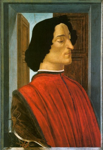
Sandro Botticelli, Giuliano de' Medici, ca.1478. Tempera on wood, 29 3/4 x 20 5/8 in, National Gallery of Art, Washington, D.C.
Second is Sandro Botticelli’s portrait of Giuliano de’ Medici, one of three portraits with the same motif and generally the same composition, two of which are in the show. The National Gallery of Art version, the largest of the three, combines Renaissance styles, early and high, Italian and Flemish, antique and heraldic. Giuliano’s proud profile, so distinctive with its long pointy nose, protruding jaw, downcast eyes with hypnotically curved eye lids, and thin curved lips that it seems like a caricature, is set off against the closed door or window shutter behind him, his black hair against the pale blue of an empty sky. The painting is first commanding because of the proud features of the man and the broad area of his red garment, but most extraordinary is the turtle dove which rests on a branch extending from our space into the painting, crossing the narrow painting ledge which separates us. The dove is exquisitely painted and drawn, its wings and feathers blend and nest into the identical brown of the figure’s brown sleeve, with only its coral colored legs and its startling eye to mark its presence. It is very hard to see it in reproduction, or at least to apprehend its importance to the composition and the meaning.
In fact, even from a distance of four feet, we barely distinguish the turtle dove. However the white line of the bird’s breast focuses our attention on a curiously unreal space in the lower left corner: immediately behind the figure is the deeper sill of the back window, and there is nothing to suggest deep space. The figure is set into a highly compressed space, though the space is posited as a well articulated three-dimensional space. Despite the geometrically and perspectivaly precise detailing of the architectural setting, the figure occupies a space that is not entirely sensible. It posits itself as a well articulated three-dimensional space but it is more the idea of such a space rather than one that realistically could contain the figure. I think that the spell cast on me by this work and Botticelli’s Portrait of a Lady at a Window is created by these contradictory qualities: exquisite representational detail but odd heraldic flatness, rigorous spatial program that doesn’t stand up to reason. I find that I’m more entranced by this contradictory state of representation than when, in later Italian Renaissance paintings, the figure is rendered with complete three-dimensional verisimilitude within a space where perspectival relations between figures, objects, architecture, and landscape have been fully integrated and naturalized into practice.

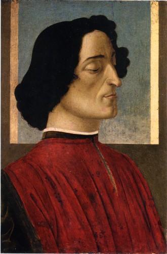
Sandro Botticelli, Giuliano de' Medici, c.1478. Tempera on wood, 23 3/8 x 15 1/2 in. Accademia Carrara, Commune di Bergamo
The National Gallery version of this subject is so splendid that it takes a bit more time to appreciate the version from the Academia Carrara, Commune di Bergamo, seen also in the exhibition. Tucked into a dark corner, this painting is a sleeper: it is smaller than the National Gallery version and with a simpler composition which, when read through Renaissance-inspired surrealist and modernist painting, looks as if Joseph Albers, Alberto Morandi, and Giorgio de Chirico had collaborated on the background, a simple pale blue square framed by bands, indicating a window though the fact that we can see both foreshortened sides of the window frame but not the sill is what makes the background look so abstract. (James Turrell’s Meeting, 1986, at P.S. 1 also came to mind, a slice of pure space, a straight cut into infinity). It takes some time for the simplicity and quietude of the painting to haunt you.
[from the catalog: There is much discussion about the circumstances of this series of paintings, whether they were painted posthumously after Giuliano de’ Medici’s murder in the cathedral–the half closed eyes, the turtledove and the reference to roman tombs in the half open shutters of the rear window all may suggest death and mourning, but other possibilities have been proposed including that at least one of the paintings was commissioned in his lifetime, to mourn a lost love or to support Lorenzo de’ Medici’s efforts to position his younger brother Giuliano to be named a cardinal, with the other paintings perhaps copied later to satisfy the need for commemorative images.]


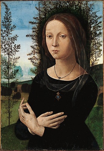
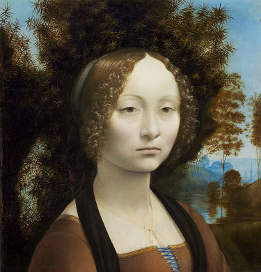
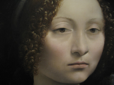
In the same room as these three paintings is another beauty: Lorenzo di Credi’s Portrait of a Young woman (Ginevra de’ Benci?), [1470s, tempera and oil on wood, Collection Metropolitan Museum]. This is a strange and interesting painting, especially if you have seen Leonardo da Vinci’s Ginevra de’ Benci, one of the greatest artworks of any time and certainly one of the greatest artworks in a museum in the United States (she is beautifully installed in a room of her own at the National Gallery of Art in D.C., and the vagaries of celebrity are such that while you have to stand in line in a crowd to get anywhere near the Mona Lisa at the Louvre, in Washington you can stand as long as you like with your nose up against the enclosure for this painting, which is at least as great, if not more so, and in better condition than the Mona Lisa but less fetishized). The surface of the painting by di Credi is said to be damaged, and certainly the painting quality cannot match the absolute unearthly exquisiteness of Leonardo’s surface and translucent details.

But though Lorenzo’s painting is less perfect than Leonardo’s, it is still quite striking: the balletic delicacy of the hands (the Leonardo painting once extended to this gesture but was cropped somewhere along the line), and especially the effect of the black dress and the rougher halo of the dark green juniper trees that circles her head like a dark crown of thorns. The dramatic and eerie effect moves us towards the Romanticism of a later era when this lady could be the severe and composed captive heroine of a dark mysterious hero in an eighteenth century Gothic novel.
These paintings, with their spacial programs, compressed architecture, symbolic landscape, grave subjects, and delicate surface treatment, have a philosophical and metaphysical cast that deeply impresses (and is what made me feel that my work was not enough, though of course that is a foregone conclusion–but more on that in a minute).
In the same room as these paintings and among skillfully crafted marble busts, there is a rare intrusion of the indexical into this exhibition of the representational: the death mask of Lorenzo de’ Medici sticking out of a small painted frame. It is a rough gypsum-based stucco impression of the face of the man himself, unshaven, grizzled, the rough surface closer to some of the terracotta African heads downstairs. Apparently this effigy was once adorned and gilded–that must have been really weird–but as it exists now, its roughness is jarringly contemporary and also instructional on the living material that all these beautifully crafted works were based upon.

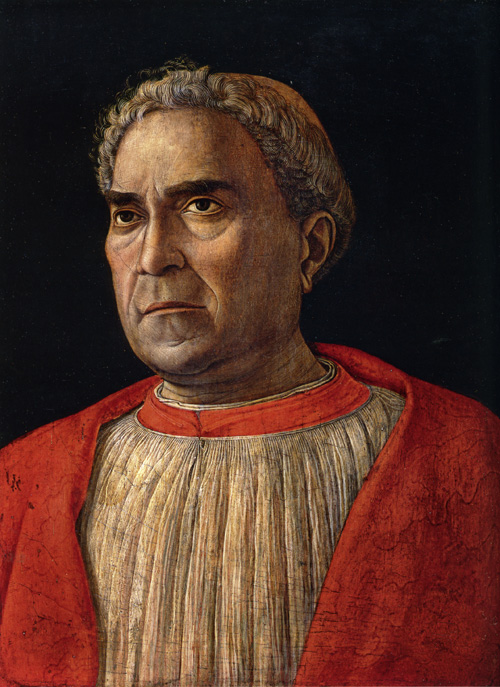
Andrea Mantegna, Cardinal Ludovico Trevisan, ca. 1459-60. Tempera on wood, 17 5/8 x 13 3/8 in, Gemaldegalerie, Staatliche Museum, Berlin
One painting in particular matches the brutality of this object, and that is Andrea Mantegna‘s Cardinal Ludovico Trevisan. According to Keith Christiansen’s catalog entry, Trevisan, a noted cleric, collector of antiquities, and military leader, was a physically unprepossessing man, described by “the Mantuan chronicler Andrea Schivenoglia” as “‘a small man, swarthy, hairy, very proud and stern’ (‘homo pizolo, negro, peloxo, com aìero molto superbo e schuro’),” and Mantegna has sparred nothing in this really quite incredible portrait of a distinctly disquieting figure. There is no idealization of the man despite the classical references of the work. Trevisan looks incredibly impatient with the whole process although he commissioned the portrait. He leans away from the center of the plain dark pictorial space. The effect becomes notably more pronounced as you pull away from the painting: stand across the room and to the right of the painting and he positively seems to be trying to leave the picture plane. Neither the painter not the subject seem to care what we think about them. But on the other hand the bold sculptural form and the strong psychology of the man is built up from the most delicate hair-thin brush strokes. The craft is intense. There is nothing adequate that can be said about the thin white line that animates the subject’s left eye except that it’s a wonderment. The whole thing is. Mantegna has this effect on me: if I sometimes think that I can understand some other artists from the past, that with a little study and based on my own experience of studio practice, I have a sense of what they were thinking when they worked, even Baxandall’s details of the nuts and bolts of the economic and social field in which these paintings came to be made don’t help when it comes to Mantegna. Every time I see a work by Mantegna I think, basically, Who the hell was this guy? “Molto superbo e schuro.”
So not much artwork of any time is going to be “enough” compared to these works, but yet how does one use them? This is a pressing question for me, especially because, as a teacher, I’m interested in how one can use art or artifacts that may seem inaccessible or irrelevant because they were made in ancient or foreign cultures seemingly alien to our own and also because works like these African sculptures or Renaissance paintings seem to have already been digested, for once and for all by our own history, so that our ability to use them appears doubly blocked. How do you use old art? How do you use any great art while not sinking into preciousness?
First, back to my waking thought that my work is just not enough. Well, of course it isn’t. But it’s what I can do, so that is the state of any artist. The trick is to mine older art in order to achieve something else, not nostalgic or paralytically in homage, but taking inspiration from both the materiality and the essence of the past works: something about how the toes of the Chokwe Figures are carved in hard dark wood>the idea of a craft>the expressive capabilities of a medium, or what it means to build a face or a shape from the accumulation of the most ethereal of painting marks>the ethereal>uncompromising honesty. Even just the words that describe a technique can go into an archive of possibilities for future work: an exquisite drawing by Fra Angelico is “metalpoint on prepared ochre surface;” prepared ochre surface>filed for future reference. From these fragments, these resonances, grabbed at intuitively and developed intellectually, you build a sense of your identity, with the recognition that it is always unfixed. The ethereal, the eerie, the sculptural, the uncompromising, any and all of these are a challenge.
Even my writing this post is an example of the dilemma and the process I’m talking about: writing about African art is a hopeless task because I have so little information to go on except some experience over time of seeing, and writing about Renaissance art is a humbling enterprise, practically absurd since there is so much brilliant scholarship and literature devoted to the subject. I can no more write like Baxandall or Panofsky than I can paint like Mantegna. But nevertheless I’ve been driven to try to hack away at something about why I came to be spellbound by a few paintings I thought I knew until I was in front of them. And somehow three visits and writing this piece have served for me to become somewhat dispelled enough to work.


