Category Archives: art

A drawing

I bring to my life as a teacher of art aspects of my own education as an artist. Some elements of that education are part of the history of post war American art and education, for example the shift from formalism in the modernist era to the experiential, experimental, and political tendencies of my graduate education at CalArts in the early 70s. I can sift these experiences through a critical analysis shaped by subsequent developments in art and art education and bring that layered knowledge to my teaching at any moment with a confidence that these experiences are part of a history that can be discussed and shared as part of a legitimated common heritage within the arts.

But there are parts of my experience and of my development as an artist that I realize cannot be extrapolated as easily to anyone else’s use: the most irreducible of such experiences is the fact that my parents were artists and that I watched them work from an early age, as they worked at home.

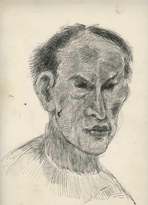
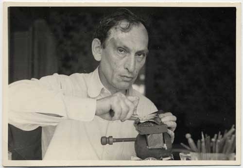
I was reminded of this today when I was putting something back into a closet where I keep most of the works on paper by my father Ilya Schor and noticed some sheets of stiff paper that were just stuck under something else. This closet has a cabinet of Ali Baba character to it: I reach into a dark corner and out comes some wonderful drawing or painting or engraving, on some scrap of paper I hadn’t seen before, and today was no exception to this seemingly magical uncovering of random treasures–at least to me. It is an experience which can be as daunting as it is wondrous, since I am responsible for somehow cataloging, preserving, and determining the fate of the works that I discover. Among the sheets of paper  I discovered today was a self-portrait drawing. Judging from the thinness of his face, I would guess it was done in the late 1940s or early 1950s. He worked with India ink and used a small steel-nibbed dip pen, like this one, used by my mother, still in their studio:

Before he went to art school in Warsaw, he had, as a teenager, been trained as an engraver, in Eastern Europe, in around 1920.

What strikes me today looking at this newly discovered self-portrait drawing is the effortless complexity of drawing marks that go into delineating his cheek bones, forehead, eyes, these last never actually outlined, just suggested by an intense deepening flurry of sharp little marks. I am also struck by how the lines of ink seem to go against the grain of form: they do not operate in an academic version of rendering, and yet the convex and concave lines somehow add up to an accurate suggestion of volume and contour.
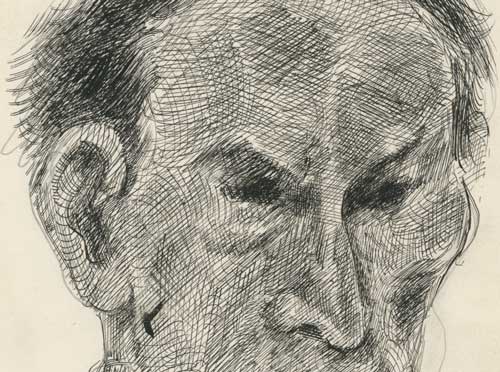
I share this drawing today because it is just one example of the combination of skill in a traditional art practice–representational drawing–and visual intelligence in action that I could watch up close as a child: the image I always come back to in my memory is of being just tall enough that my eyes were level with my father’s hands as he sat and worked at his table in the workshop off of our kitchen. He was happy to let me watch and to show me a few tricks or flourishes. To watch him summon representation out of such abstraction, out of a flurry of gestures of the hand, with deft skill, speed, focus, and pleasure, was a total pleasure, it was very absorbing, and as good as any magic act a child could watch, and it was a daily practical lesson in art making of a kind that now unfortunately either comes trapped in outdated academic tropes or is simply not part of what a contemporary artist might think was useful or necessary to representing contemporary media culture. Children today are being described as “Generation Swipe,” so the trend away from the steel-nibbed dip pen will continue, as art will continue, but such  absorption in an embodied effort to bridge the gap between the real and representation still carries meaning.

 

FacebooktwittermailFacebooktwittermail

Resisting Pier Pressure

I stuck to my guns and did not give into Pier pressure this year. I had been adamant after last year that I would not go to Armory shows at the piers again. I had gone for about 8 years, and in the mid-2000s I could funnel and process boredom into research for my essays “Trite Tropes, Clichés, and the Persistence of Styles” and “Recipe Art.”  But each of the past three years I would resolve never to go again, because basically it’s out of the way, tiring, and even if you see a few good artworks and run into a few friends, and are seen being part of the artworld in some capacity, if only physical presence, by the time you struggle to re-find the city, via taxi or some of the longest walks to public transportation ever or the little jitney buses to civilization, if you are lucky, you can’t remember a thing. Only your camera remains a record of ever having been there and the sameness of my photo folders from year to year was grating on me. But each year I got drawn back because a group of friends would say, let’s meet, and then you think, well, OK, must see to talk to students about, don’t want to be left out, or don’t want to forgo pleasure of hanging out with friends. I almost got sucked in by that mechanism again this year, but finally I managed to hold tight.

I had not been to Chelsea for several very busy weeks, and shows were piling up that I wanted to see. My compromise with Art Fair culture was to go to the Independent because it was in Chelsea and then see a few shows. It was a beautiful spring-like day which, following upon a grey wintry snowy slushy day, gave me a boost of optimism and my choice of action left me with enough energy to cap the day by going to the ADAA Art Show at the Park Avenue Armory.

Briefly: both of these Fairs seemed disappointing, with a mix of vulgarity on the one hand, and vacant genericity on the other–works that would look tacky in a Nike shop and works that would look blamelessly attractive in a corporate boardroom, this pertaining in particular to the works exhibited at the Independent, with the Park Avenue Armory presenting more blue chip works that had a different kind of blandness with a few really pieces in the mix in a less circus- like and calmer atmosphere. But in each fair, one art work or series of works by one artist stood out and redeemed the whole exercise. As my mother said, on our way home from the last museum exhibition she saw–a 2006  exhibition at the Whitney Museum of the influence of Picasso on American art–it makes you want to go home and make art–she was then 95 years old and could barely stand up at the show and she still felt that inspiration. That is what I look for, that is why I started this blog, to record those moments, when amidst all the dross and worse that forms part of any decade of negative thinking, an artwork cuts through the crap and makes me want to turn on my heels, cover my eyes as I rush out of the building, and try to get home with that sense of inspiration and renewed energy to make art intact.

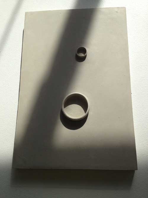
At the Independent, I came up first to two small grey works hung on a wall.

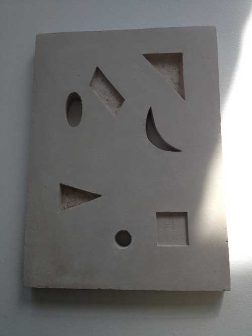
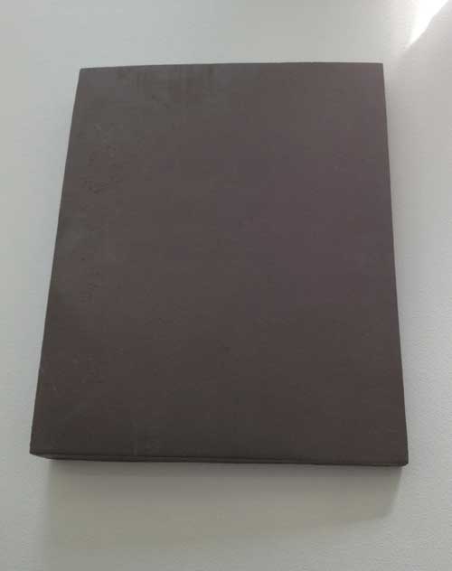
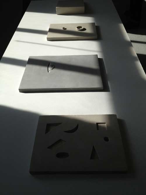
Were they paintings? There was the trace of what might appear to be a raised brushstroke on one, but then I realized that this was not a painting but a clay tablet, of a restrained abstraction in a modernist vein. Many more such tablets were arrayed on four sun-raked tables, lying flat, as much sculpture, installation, and display in the archaeological section of a museum, like cuneiform tablets from ancient Babylonia, or like books presented in a museum setting, with their covers closed, presenting a nearly inscrutable face. Most of the tablets were gray clay, one was the color of yellowish wax. A few were completely plain, blank slates, others had geometric forms cut into them or as raised forms upon them, one had a small face peeking out of a small fold or slit in the clay field.

The works’ use of geometry and other aspects of painterly and well as sculptural abstraction refreshed the possibilities of abstraction developed in the modernist period. The work asserted that one can use a circle or a triangle or a line on an “empty” field and make it have the same interest of a genuine search for form and a belief in formal and composition aesthetic categories as artists from the modernist movement and make it seem newly experienced.

These works exemplified my ideas about modesty as a qualify in art that is not limited to small scale but that engages formal and intellectual rigor and ambition for the art work, rather than punching you in the face with the artist’s ego.

This is work by Anna-Bella Papp, a young Eastern European artist and I can only hope that the visual clarity, intelligence and dignity of these works is something that the artist can hold on to and grow, rather than devolving into production if her works encounters material success.

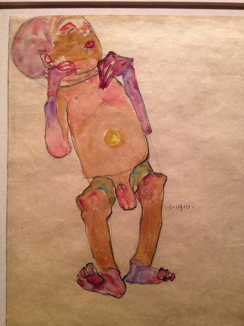
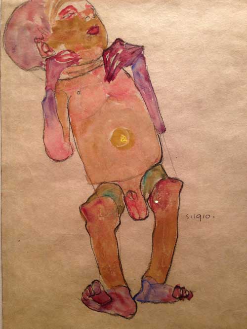
Last year, the Park Avenue Armory exhibition of the ADAA was a relief from the Piers, quieter, more sedate, with greater emphasis on the modern than the contemporary. It was possible to see some art, and that was a gift, so I went back this year. The atmosphere remained more civilized, less like the midway of a county fair, but perhaps familiarity led to feeling a bit less inspired, until on my way out, I passed the booth for Galerie St. Etienne. I stopped, thinking, oh, they may have something worth seeing..and turning a corner into a small enclosure I found myself in front of a small yet vital masterpiece, Egon Schiele‘s watercolor Newborn Baby from 1910.

Egon Schiele, Newborn Baby, 1910. Watercolor and pencil on tan wove paper. Galerie St. Etienne

I suspect that many people value Schiele more for the sexual angst expressed in the synergy between his subjects and his style, than for his aesthetic decisions. This work’s intimate, pitiless yet deeply humanistic focus on a newborn baby, body akimbo and marked by the disproportionality of the neonatal, painted in the vivid colors of birth, pink, purple, and red washes and and impasto yellow belly button marking the last moment of total physical connection to the mother’s body, is another way of considering both Schiele’s artistry and his deep sympathy with the vulnerability and strangeness of human embodiment.

These two valuable experiences with art were worth more than acres of the Piers, and though I can’t say I was able to go home and make art, I left while I was ahead and with these experiences stored in my mind for future support and encouragement.


FacebooktwittermailFacebooktwittermail

On being a “Lady”

I can’t review an exhibition in which my work is included, yet I would like to encourage people to see the exhibition To Be a Lady which has been extended through March 22nd and is particularly conveniently located for people coming to New York for the College Art Association conference next week, as it is installed in a public space a block down Avenue of the Americas from the Hilton Hotel, at 1285 Avenue of the Americas.

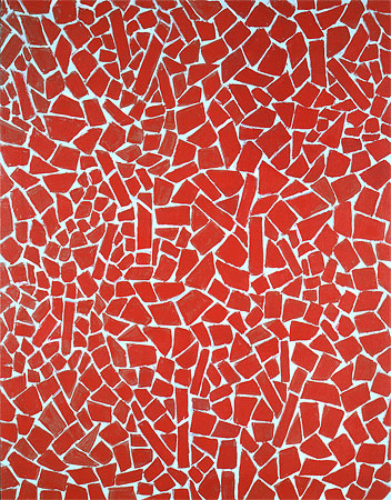
Alma Thomas (1891-1978), Red Scarlet Sage, 1976. Acrylic on canvas
46 x 36 inches, Courtesy of Michael Rosenfeld Gallery LLC, New York

I figure that since the show is divided into two parts, installed along two separate sections of the space, with one side featuring the works of women artists who are deceased, and the other side featuring those of us still among the living, I feel that I can safely recommend the dead without incurring controversy among the other living artists in the show or referring to my own work in it or the ramifications of the word “lady, ” which I know has stirred some controversy. Curator Jason Andrew of Norte Maar has assembled some terrific work in this show, a diverse group of works by notable artists and artists that some may be less familiar with, and in each case has included a very good example of the artist’s work, and in some cases quite a surprising one. Again, I am just talking about the dead. The works are grouped in open bays or booths, creating in effect small mini-exhibitions with some interesting synergies.

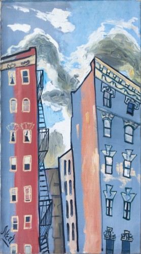
Alice Neel (1900-1984), Sunset in Spanish Harlem, 1958.

The first work in the show is a vibrant abstraction by Alma Thomas, next to an equally vividly hued work by Charmion Von Wiegand, two hard edge abstractions, yet of a very different nature and sense of scale. On the opposite side is a small but intense vertical abstraction by Louise Nevelson, and a cityscape by Alice Neel: I am particularly fond of works by Alice Neel that are not portraits, but still lifes and cityscapes, because one can appreciate her drawing and paint application in a different manner when they are not applied to her strong sense of figuration which may overwhelm a viewer’s ability to fully appreciate her more abstract qualities.

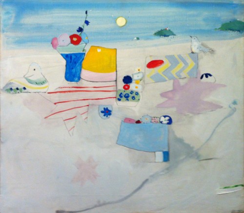
In the next bay is a beautiful work by Irene Rice Pereira. It is interesting for me to see this in particular because I used to hear about her work when I was a child in the 1950s and there was always a dismissive edge of contempt when her name came up, but I didn’t know how much that may have been the result of sexism and cliquishness–the work in the show has a formal clarity and elegance that defies those condescending views. Next to this is a work by an artist who may not be well known, except to a select group of  inside artworld people in New York, the painter and writer Edith Schloss. Schloss had lived in Rome from the early 1960s to her death in 2011 at age 92. Her work is a charming, fantastical abstracted still life in landscape. Recently restored to a wonderful condition, it could easily appear in the show of a up and coming young painter today. In the same bay there is a strong free-standing work by the sculptor May Wilson, and a luminous large painting by Janice Biala.

Edith Schloss (1919-2011), Untitled, 1973. Oil on canvas, 31 5⁄8 x 35 5⁄8 inches, Courtesy of the Estate of Edith Schloss

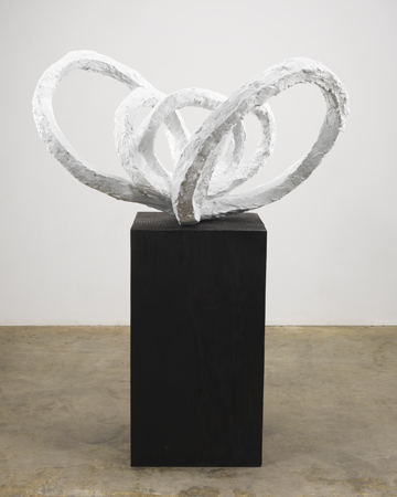
The third grouping is particularly interesting, with Barbara Morgan‘s contact proof photos of Martha Graham performing some of her first signature works, in 1935, next to more abstract works by Morgan, a work by Ruth Asawa. In that bay is also a very strong Louise Bourgeois sculpture, Flower Petal, a large white bronze that is one of the most important works in the show, and one of the most surprising. I thought I knew Bourgeois’s oeuvre really well but I had never seen this work, which is both slightly unusual in terms of imagery and form, and yet has Bourgeois’s characteristic boldness and sureness of form. The white coloration adds to the impact rather than diminishing it. And finally in that grouping there is  a major Lenore Tawney piece, a black thread weaving, in remarkably good condition, a forbidding minimalist work in an ancient tradition of craft.

Louise Bourgeois (1911-2010), Life Flower I, 1960. Bronze, painted white: 22 1/2 x 34 x 23 inches, Bronze base: 27 1/2 x 15 1/4 x 15 1/4 inches, Stamped: LB 5/6 MAF 2010

Other outstanding works in the show are paintings by Pat Passlof and Jay DeFeo, Lee Bontecou, sculptures by Betye Saar and Viola Frey, with the installation of the dead punctuated by a painting by Elizabeth Murray, hung high above a doorway area.

I wish I could tell you more about the works by living artists, those you must see for yourself, though I will say, as a preview, that one very gifted young artist, a former student of mine, told me at the opening that he nearly fainted when he saw the remarkable Nancy Grossman.

This is a rich various group of works, many rarely seen or never seen before and well worth seeing.

FacebooktwittermailFacebooktwittermail

Hurtling through life at a deliberate pace: an appreciation of Richard Artschwager (1923-February 9, 2013)

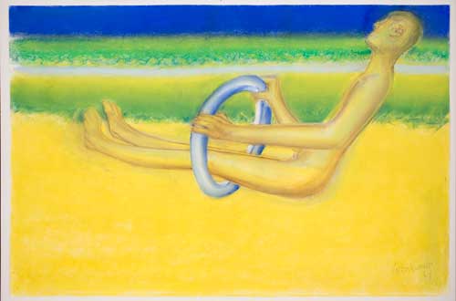
The last work in the chronological installation at Richard Artschwager‘s 2012 retrospective at the Whitney Museum was a large pastel on paper drawing representing the figure of a man, simplified and streamlined, something like a crash test dummy, his legs half through a pneumatic blue steering wheel that his hands rest upon though with a firm grip, as he drives alongside a blue band of sky, a green band of landscape along a brilliant yellow road. There is no car, just a steering wheel and the figure “in the driver’s seat” moving forward along an empty but glorious colored road, his body ageless yet his feet gnarled by age, his head tilted pensively, slightly away from us, the viewers, and toward the view, empty but glorious and endless.

Richard Artschwager, In the Driver’s Seat, 2008. Pastel on paper, 25 x 38 inches. Courtesy of David Nolan Gallery, New York.

I have often thought of this work since I saw it last fall. One evening I was thinking about my own life and particularly of how I wished that I could slow down enough to be able to invest greater time and kindness in other people because that is such a richly important part of one’s life but in the same instant visualizing myself as hurtling through my life like an early astronaut with little control of my spacecraft, just launched out into an unknown but speeding trajectory of my work as an artist. I thought of the Artschwager piece, In the Driver’s Seat, which I felt profoundly addressed that image I felt so viscerally of the forward motion of a life hurtling toward the unknown. Yet it radiated a supreme calm and a joy that altered the darker side of my own vision.

I learned just now that Richard Artschwager died today, at the age of 89. He was a unique and a great American artist, whose work was marked throughout by a calm, philosophical and deliberative quality, sharp intelligence, utter formal clarity, and a cool, sometimes even remote yet mischievous nature.

I first saw his work in a Whitney Biennial in the mid 1970s, only I didn’t know who had made the objects I noticed–in fact I wasn’t totally sure the strange objects were artworks in the exhibition–strange steel wool like oblong discrete objects placed in unusual locations, inside the building, but not exactly where an art work might be located–near a fire alarm, above an exit door, and, as I recall, outside the building as well. A couple of years later he visited the Nova Scotia College of Art & Design where I then taught and thus I discovered the identity of the artist who had created those strange “blps,” and I had the opportunity to get to spend some time with him.

I was just talking about his lecture this past week, thinking of the way that artists spoke in the ’70s: at worst, you got male artists presenting one work after another in a monotonous “and then I did this and then I did this” stream of aggressive and oppressive non-revelation, or, on the more positive side, an artist would visit who spoke as he or she wished (though in those days still most often a he), from whatever starting point, and at whatever length was necessary to get across the thoughts in their work: and the talks were about works but those good talks were always about thoughts, ideas, desires for art, not about exhibitions or market. Artschwager’s was such a talk, marked by a particular characteristic that had some in the audience puzzled–he would stop and you could see his mind working through something, and when he began to speak again, he was at the next point, having left out that step. You had to keep up with him, get used to the way his mind worked, and that deliberative, thorough, yet elliptical method was a perfect equivalent for the way that his works appeared to address space and the viewer.

Last year, I wrote about his work, some of it also late work in a similar vein to In the Driver’s Seat, in a beautiful exhibition at David Nolan Gallery, in the blog post, Youthfulness in Old Age. Please take a look and I will expand on this post at a later date.

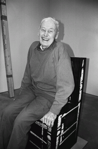
His gallery has just posted a notice with a marvelous picture:

Richard Artschwager, Photo: Rachel Chandler, Courtesy David Nolan Gallery

An interview with Richard Artschwager by John Yau and Eve Ascheim from 2008 can be read here.

FacebooktwittermailFacebooktwittermail

George Bellows’ Entropic Visions

I wanted to make sure to see the George Bellows exhibition at the Metropolitan before it closes February 18, in order to see a few paintings that had been recommended to me by Susan Bee, in particular three paintings done between 1907 and 1909 of the excavation of the site for Pennsylvania Station.

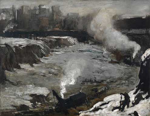
The paintings are easel sized and painted in a loose expressionistic style that is a eerie and awkward combination of Goya, Velasquez, Courbet, with a Brueghel quote in the bottom right corner of a dark worker against a snow white background  but, despite these historical allusions, they are  imbued with a regionalist, Americanist feel. And yet, as one viewer I overheard say, these paintings are ferocious.  In the first, Pennsylvania Excavation, the organized city is a far off dream against the blackened rock, earth, and gravel pit covered by snow and white mist from the steam engine of a work train dwarfed by the scale of site.

George Bellows. Pennsylvania Excavation, 1907. Oil on canvas, 33 7/8 x 44 in. . Smith College Museum of Art, Northampton, Massachusetts.

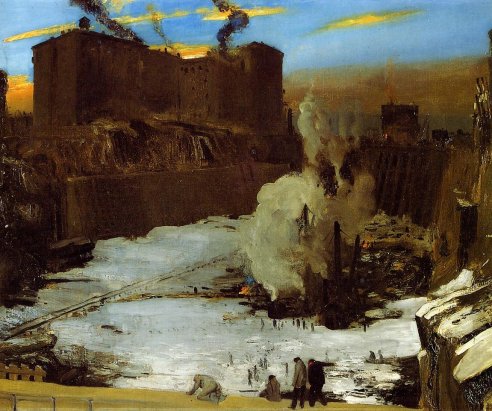
In the second painting, Pennsylvania Station Excavation (1909) the most hellish part of the dark excavation site is in a concentrated area devoted to the chaotic process of excavation and construction, relieved or at least punctuated visually by a startingly vibrant blue sky shot with peach colored cloud, in that way that cloud formations have of occasionally reminding New Yorkers that we live on a planet, so absorbed as we are in the urban environment that blocks nature and seems like a self-contained universe.

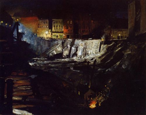
And the third painting in the series Excavation at Night (1908) though unfortunately over-varnished, particularly damaging for a very dark painting, but at the same time the shiny blackness of large areas of the work served to reinforce the connection I made between Bellows’ choice and treatment of this subject and Robert Smithson‘s observations on entropy in his 1967 essay “A Tour of the Monuments of Passaic, New Jersey.” Describing  the “minor monuments” being built along the Passaic River, including

concrete abutments that supported the shoulders of a new highway in the process of being built. River Drive was in part bulldozed and in part intact. It was hard to tell the new highway from the old road; they were both confounded into a unitary chaos. Since it was Saturday, many machines were not working, and this caused them to resemble prehistoric creatures trapped in the mud, or, better, extinct machines–mechanical dinosaurs stripped of their skin….Nearby, on the river bank, was an artificial crater that contained a pale limpid pond of water, and from the side of the crater protruded six large pipes that gushed the water of the pond into the river. This constituted a monumental fountain that suggested six horizontal smokestacks that seemed to be flooding the river with liquid smoke.

Of these chaotic “monuments,” Smithson writes,

That zero panorama seemed to contain ruins in reverse, that is–all the new construction that would eventually be built. This is the opposite of the “romantic ruins” because the buildings don’t fall into ruin after they are built but rather rise into ruin before they are built.

Next to Excavation at Night is a slightly oversize reproduction of a 1915 tinted postcard of the completed Pennsylannia Rail Road Station, so we have a time line of the pit that was, the beauty that was, built to outdo and outlast the Baths of Caracalla but it also ended up having risen into ruin, and then looking back into the pit Bellows has documented in these paintings, we can place ourselves in the hellish chaos of the current Pennsylvania Station, something like a giant airport bathroom built with 1970s cheapness over the tracks of the original station.

These are very good paintings by a painter who was just short of being great–something about the way the figures are done, even his famous boxers where the figures are very dynamic yet too stiffly posed, the paint marks very bold in some cases, in other delicate and almost folk art like–there ‘s a very good portrait of an elderly couple from Woodstock that from 1924 that shifts around in an interestingly uncertain yet touching space between traditional portraiture in the European style, Renoir and Grant Wood. But  he was nevertheless a very interesting artist, and he looked at interesting, important things, that is, the city as it was built, and as it was lived by the poor, and these paintings should be seen, especially as we celebrate the 100th anniversary of Grand Central Terminal, saved from demolition only as short a time ago as 1978, and thus mourn one of the greatest crimes in American culture and the history of New York City, the destruction of Pennsylvania Station, even as we anticipate what is shaping up to be as great a cultural crime, though a slightly less visible one, the demolition of the seven levels of book stacks under the Rose Main Reading Room of the New York Public Library for the construction of yet another airport mall style mediocre-looking space.

FacebooktwittermailFacebooktwittermail