Category Archives: art

Nice news about A Year of Positive Thinking

I’m delighted and honored to be selected for one of the awards from AICA-USA for best blog, for my writings on A Year of Positive Thinking. This is the first year for this new category of art criticism:

This year AICA-USA expands its commitment to the promotion of excellence in art criticism by introducing awards for outstanding writing in the categories of criticism, blogging, and arts reporting. Winners selected from over 30 nationwide nominations span the gamut of art writing, from Holland Cotter’s highly personal story of the influences that led him to become an art critic, to the scrappy journalism of the Brooklyn Rail, to the online journalism of Tyler Green and the spirited observations of artist, blogger, and critic Mira Schor.

Coincidentally, on May 1, I will be speaking on a panel at the Brooklyn Museum about the growth of art criticism online: Panel Discussion: “The Art of Feeling: Contemporary Arts Writing and the Internet”Thursday, May 1, 2014 at 7 p.m. Iris and B. Gerald Cantor Auditorium, 3rd Floor

 Much has been said about the death of arts criticism as newspapers and print magazines lay off staff writers and cut pages. Less has been said about the unique kinds of writing growing out of the web. Over the past decade, the Internet has helped to increase and nurture arts writing that is personal, approachable, politically engaged, and full of emotion and commentary that would rarely be encouraged or allowed in print. Hosted by the Elizabeth A. Sackler Center for Feminist Art, this panel examines how feminism and feelings intersect with Internet-based writing about the arts. Writer Alexis Clements moderates a discussion among writers Gabby Bess, Kareem Estefan, Mira Schor, and An Xiao. [Free with Museum admission].

Thank you to my readers, and particularly to my subscribers, for your ongoing support for this project!

FacebooktwittermailFacebooktwittermail

Craft and Process: “Mingei: Are You Here?” and other ghost stories

All I want to do in this post is recommend Mingei: Are You Here?, an exhibition at Pace Gallery in Chelsea which runs through this Saturday April 5. But detours of thought, details of multiple projects, and ulterior motives have complicated the matter: the following is whatever of these threads of thought could be ordered and researched sufficiently and fit into a relatively sensible text against a short deadline.

I’ve been thinking a lot about craft recently. Not from the point of view of a personal practice in crafts such as pottery, weaving, or more contemporary ventures into 3-D printing, not because I want to claim crafts associated with femininity for any kind of  identity politics. I’m concerned more generally about an approach to art making that acknowledges the equal importance of making and thinking and I’m committed to the idea that there is a richness of intellectual content inherent in materiality and process.

I find that the direction of my thought is in sync with others in the art world, including the just released April 2014 issue of the Brooklyn Rail which contains a section on craft guest edited by Lowery Stokes Sims whose introductory essay “Beyond The Horizons of Craft: Diversity in the Global Art Market” notes some of the class and gender issues raised by the question of craft or handicraft, as well as the inclusion of ceramic and wood carved sculptures in the Whitney Biennial, as well as the success of recent exhibitions of works in clay and porcelain by artist such as Lynda Benglis and Kathy Butterly.

My train of thought has deep roots in the art works produced by my parents Ilya Schor and Resia Schor, who often worked in areas that had been delimited by high art as being part of the second class of “applied arts,” that is to say craft, such as jewelry and the creation of objects of Judaica. [My introduction to a recent exhibition I curated of some of their work is available on Academia.edu] Although I did not follow their path exactly in terms of the type of artwork I produce, I appreciated from my earliest moments of consciousness the pleasure of working ably with materials and the visual as well as conceptual intelligence of the marks and objects they made and those they collected. My current train of thought about the role of craft, process, and materiality is part of the ongoing negotiation I have engaged in since my earliest moments as an artist, between “wet” (embodiment, materiality, pigmentation, fakture, form) and “dry” (the precession of language, theory, and the concomitant privileging of photographic and digital media), where I have rejected the necessity imposed by the adherents of both sides to chose either one over the other, instead finding a way to step back and forth across the line, or, at best, work within the line of demarcation. My thoughts on craft and process is also the result of stress occasioned by the contrast between the richness of art that exists as living history and as presently available languages and the poverty of visual means and materials that I see some young artists disposing of when the emphasis of their environment is on theory preceding practice and on dematerialized practices rather than ones in any way connected to base materiality or the disciplines of painting and sculpture and their histories.

Here is some of what I’ve done in the past few weeks: I spent hours rubbing a decade of oxydation off of a group of twenty small silver and gold objects by my mother; I’ve compared the ornate form of an early twentieth century office chair in the studio of Chaim Gross with the modernist whiteness of office furnishings as represented in the New Museum’s recently announced plan for New Inc; I’ve worked on a series of reversible paintings where I seek to destabilize the hierarchy between the archaic, material, emotive, and the contemporary, digital, cool; I’ve tried to cram readings and rereadings of several books I have on the issue of craft in contemporary culture, including Glenn Adamson’s Thinking Through Craft, Richard Sennett’s The Craftsman, and I’ve trawled Michel de Certeau’s The Practice of Everyday Life for instrumental quotes explaining the way that, at least since the Enlightenment, in Western culture, theory has absorbed the intelligence of crafted objects while arrogating superiority over these practices. I’ve even wasted some time trying to prove that the etymology of the French word métier is the primordial Greek mythological figure of the Titan generation, Metis: although metis means “wisdom,” “skill,” or “craft,”  etymology could not take me where I wanted it to go. Instead Sennett posits Pandora as the provocative goddess for his investigation of craft and material culture. I always disliked the myth of Pandora, that a woman’s curiosity would be held accountable for human kind’s ingenuity in crafting destruction.

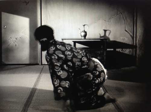
But for today, all I can do is recommend  Mingei: Are You Here?  which runs through this Saturday April 5, and view it principally through the lens of the beautiful and heart-wrenching movie it brought to mind, Kenji Mizoguchi’s 1953 film masterpiece Ugetsu.

In Ugetsu, the main protagonist is Genjurō, a poor farmer and potter who lives in a humble hut at the outskirts of a small village where he works against time, dreaming of the money he can make by selling his wares at the market. He is not a bad person, but he is crass, materialistic, and selfish: he browbeats his devoted wife and risks their lives to tend to his kiln during the pillaging of their village during a civil war time raid, so that he can complete and take his wares to a larger market town, profiteering during a time of instability. Genjurō, his wife, their young son, and their neighbors attempt to evade bands of marauding soldiers by rowing across a lake to the town rather than walking over land. When, in an eerie foreboding fog, time slows and he and his other companions come upon floating ghostly omens of disaster, he insists on turning back to leave his wife and child alone on the shore, presumably to spare them the dangers that may lie ahead, but effectively abandoning them to cruel fate.

Each scene up to this point in the film is short, the action and the settings are rough. In general the film is very theatrical in its precise and economic use of each scene to advance the narrative as boldly and also as simply as possible, organized like a play where something happens and then the actor leaves the stage and the next diagetic moment can take place, as well as in the way sets, though representing the outdoors, often appear to be shot on an interior stage so that naturalism and artifice are in constant interplay. The efficiency and roughness of plot-furthering scenes only highlights the longer episodes when the film slows and the characters are plunged into beauty, mystery, and terror.

In the bustling market Genjurō is approached by a noblewoman and her elderly maid. These mysterious ladies buy many things and lead him to the noblewoman’s dwelling. There, through the most subtle process of transformation of mise en scene, filmed from above like the survey of a foreign planet, out of what at first seems like an inchoate weed-covered wilderness, an abode of the greatest refinement slowly emerges and he finds himself welcomed into a place of the most exquisite beauty.
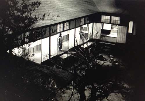
His beautiful and aristocratic hostess, Lady Wakasa, dressed in sumptuous heavy brocades and ethereally diaphanous garments plies him with compliments for his craft such as he has never heard and seduces him into a marriage demanded by the spirit of her dead father, a Hamlet like ghost speaking from an empty warrior’s mask. The intense mixture of aesthetic refinement and boundless physical passion are like a dream. He has passed through a portal into a space so marvelous he cannot fully understand what is going on. Throwing himself on a perfectly groomed lawn by the now sparkling lake on a sunny day after a night of sexual passion, he exclaims ecstatically, “‘I’ve never dreamed such pleasure existed. This is exquisite! It’s paradise.”

Incredibly, and without the overt drama of the narrative of Ugetsu, that is somewhat the sensation I had when I walked from Kiki Smith’s exhibition at Pace Gallery in Chelsea, through a narrow passage way into a new smaller wing that Pace has built under the High Line and found myself, without preparation or expectation, in an exquisite, thrilling, soul-soothing, museum quality exhibition of craft objects and artworks, arranged in an inventive, harmonious, and instructive manner for contemplation. In a modest sized rectangular white walled exhibition space, objects of daily use, artifacts ancient and new, paintings and pots, quilts, and kimonos were arrayed on two tiers, hung from the ceiling, against works hung on wall that were subtly dematerialized by natural light coming from unseen skylights along the edges of the dropped ceiling. So-called high art, priceless antique jars, futon covers from the late nineteenth century made from distressed scraps of indigo colored material, all co-existing in an atmosphere of great calm, dignity, and beauty.
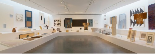
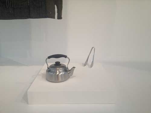
The sense of wonderment and confusion came first from the overall sensation of light and the unusual arrangement of objects, and from the immediate sense of displacement: in a gallery in Chelsea, an ancient Japanese garment and a teapot from the 1970s very much like one I own and use.
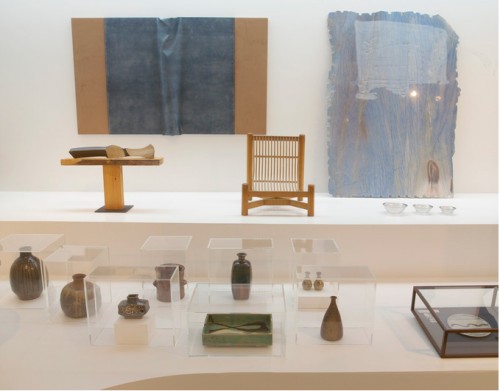
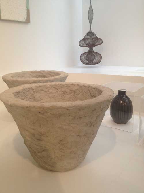
Filtered light, multiplicity of diverse objects, a kimono here, a teapot there, a painting there. Where was I?

I went back out to look at the wall text: the exhibition is Mingei Are You Here? an exhibition curated by Nick Tremley, originating at Pace London, focusing on works done in the spirit of Mingei, or “people’s art,” folk art, a Japanese philosophical and aesthetic movement conceptualized in the 1920s by Japanese theorist Sōetsu Yanagi. Mingei is a philosophy which “assigned value to and saw beauty in simple, anonymously produced utilitarian objects, signifying a revaluation of popular crafts in the midst of the industrial revolution.” (Nick Trembley, catalogue essay). Mingei was an influential part of an international Arts and Crafts movement that responded to the mechanization of industrial production with a complex respect for low culture, folk produced utilitarian objects of daily usage, and mass produced objects of simple and beautiful design. Yanagi and others rescued from obscurity and destruction humble folk ceramics from earlier centuries from Korea and Japan.

Excursus #1.

*It is of some significance that I had passed from Kiki Smith’s show to this exhibition. The narrow front desk area between the two gallery space had served as much as a portal between worlds as the foggy lake in Ugetsu. Before I happened upon the second, magical gallery space, Smith’s current exhibition had struck me as occupying a great deal of real estate with very little concept or substance, with no sense of a search or a theme, just various objects for purchase, some shiny wares for market, some beautiful (tapestries made from pleasing but not stylistically individuated images created or assembled by Smith), some just merchandise. As I passed through her show, a chronology of mental snapshots of Smith’s shows came to my mind, from the first work I saw of hers in the 1980s at the old Fawbush Gallery on Broadway, which included human figures made of rice paper hanging from hooks, utterly contingent shells of fragile skin that seemed to emerge from the AIDS crisis that Smith was deeply connected to, to a show in about 1993 at Fawbush in his next space in Soho that later became the smaller of Deitch Project’s spaces, the one on Grand Street, where a life-size wax figure of a woman on all fours trailing a chain of entrails seemed to herald a return to a type of essentialist representation of woman that would have been unthinkable a few years earlier, to exhibitions a bit later at Pace Wildenstein in Soho where a kind of nineteenth century fairy tale illustration style of representation and narrative began to slowly erode the criticality and urgency of meaning which had been inherent in Smith’s use of materials and her approach to the human figure in the years she made her reputation, in favor of a more popularly accessible visual language and reference field.

This is only one of several instances of a contemporary artist with a large profile in the market whose early work’s vitality and criticality is long forgotten and often hard to find examples of online: when a young artist is faced with this vacuity within the work of a famous artist without the benefit of a deeper knowledge of the work that created the artist’s reputation in the first place, the disjuncture between name, brand, and artistic depth can only add one more bit of cynicism about the contemporary art market and world.

Excursus #2

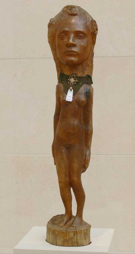
*One work in Smith’s exhibition opens my excursus up to another extraordinary exhibition centered on explorations of materials associated with craft, Gauguin: Metamorphoses at MoMA. In this exhibition two three-dimensional figures of women are outstanding: Oviri (Savage) from 1894, a partly enameled stoneware figure of a young woman whose voluptuous earthy beauty is emphasized by the earthen burnt siena colored surface of her skin yet undermined by the resemblance of her pose to that of a deposition of Christ–Gauguin thought so highly of this work that he wanted it placed as his gravestone–and Tahiti Girl (c. 1896), a figurative sculpture that Gauguin  crafted in wood, adorned with felt, silk, seashell and mother of pearl jewelry and amulets. Tahiti Girl‘s head is huge in relation to the rest of her body, nearly life size in relation to the half-sized body, with her legs tapering down like those of an elfin creature in a child’s fairy story. The work is exhibited three-dimensionally so that the process of crafting is made fully visible: what appears from the front view to be a continuous figure, with the head and body part of the same piece of wood, in the back is revealed to be a separate piece of wood, bolted to the body, a huge ghost-like bulbous shape left in an unfinished state, hewn with rough chisel marks, unlike the uncannily smooth burnished surface of the front. The necklace veils the juncture. She is as much as a spirit figure of exotic female beauty as the Lady Wakasa. And in Gauguin’s Noa Noa: The Tahitian Journal, Gauguin writes of sensual intoxication similar to the rapture expressed by Genjurō:  “Plein silence. Mais quelles  harmonies violents dans les parfums naturels qui grisent l’artiste voyajeur? Que de beaux fruits dans l’eclat polychrome des feuilles, des fruits, des fleurs!” Total silence. But what violents harmonies in the natural perfumes which intoxicate the artist voyager? What beautiful fruits in the brilliant multicolored leaves, fruits, flowers!”
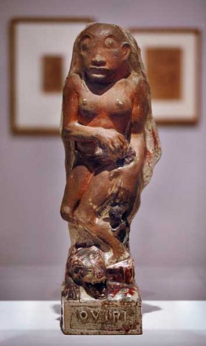
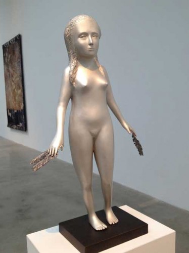


In sum, aesthetic responses are always set in a context: here the emptiness of much that appears as central in the art market is contrasted with the inspiration that can come from transformative works by an artist that you don’t even particularly love. The Smith show, empty of concept, composed of  a few shiny wares for market, Gauguin’s transported responses to inchoate and incomprehensible beauty of another civilization both set the stage for my response to the calm beauty of the objects in Mingei are you here?

*

It is revealed to Genjurō that the Lady Wakasa is a ghost whose soul has wandered in search of the  the full experience  of a woman’s sexual life and true love, which her murder during the Civil War had preempted. Recalling his wife and child, he manages to flee her desperate embrace, waving her father’s sword at her, he throws himself into the dark night. When he awakens he finds that her exquisite home is a burned-out ruin, the impeccable lawn by the lake a tangled field of brambles and weeds.
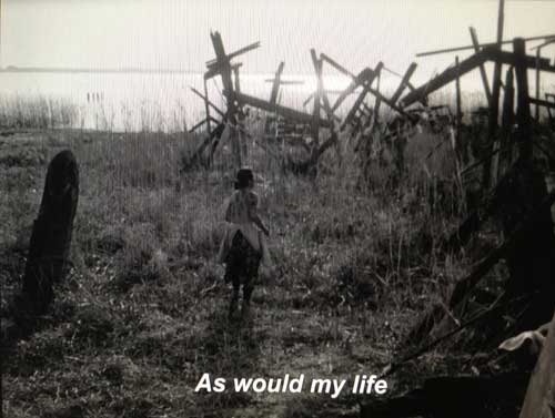
I returned to see the exhibition Mingei Are You Here?  two weeks later and had a more complex and nuanced experience. While I did not suffer so dramatic a transformation of my aesthetic experience as Genjurō, discovering that his beautiful love is a cursed phantom trying to take him to the spirit world forever, nevertheless I began to distinguish differences in what was arrayed so artfully that at first I had been so overwhelmed with wonderment, while my pleasure in the exhibition catalogue’s intriguingly Mingei-style design, with its modest brown paper cover and shoji-screen like fold out inserts, was slightly undermined by some of the historical complexities of the Mingei movement, including its uses to xenophobic assertions of Japanese nationalism in the pre-World War II period.
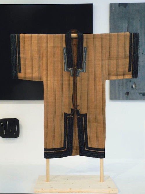
Unknown maker, Ainu Attush robe, late 19th c.
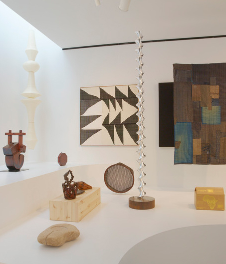
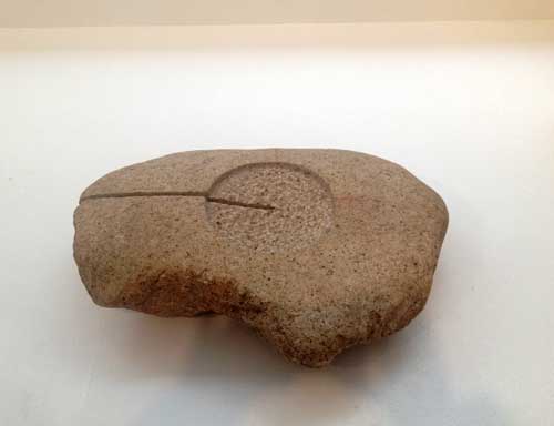
I realized that I experienced a hierarchy  of fascination, with the most ancient artifacts and the most modest and simple of the contemporary mass produced objects at the top. Among my favorite works are a wooden kettle hook hanger from the Edo-Meiji period (nineteenth century) whose utility is not clear to a contemporary Western viewer, so that the experience is principally aesthetic or material: the dark reddish-brown patina of the wood and the curvature of the shape, a curved form that is also a box; a conical shaped object of bamboo and bronze that is a Falcon basket from the Edo period; a beech plywood and brass Butterfly stool manufactured by Tendo Mokko from 1954; and a brushed stainless steel kettle designed by Sori Yanagi in 1994 and still in current manufacture–I have one just like it. Of the modern art works, small granite sculptures by Isamu Noguchi seemed particularly powerful when placed next to these anonymous folk objects: in one work in particular, Untitled (Small Torso), the stone is allowed to be itself and the effort necessary to inscribe any mark into it, even one or two incisions, is a powerful trace within the work.
Each of these objects has an absolute tangibility as well as an ineffable quality that cannot be captured or fixed, although daily usage and absent-minded but constant concentration and contemplation can bring it close. Thus the beauty of the humble mass produced kettle from the 1970s:
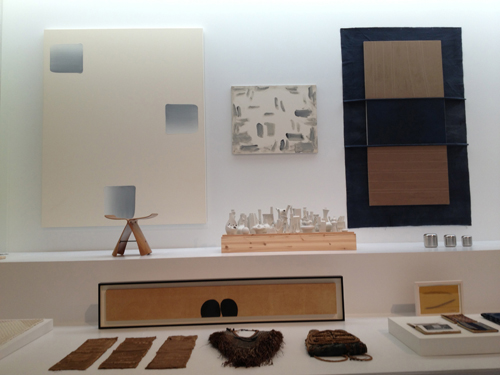
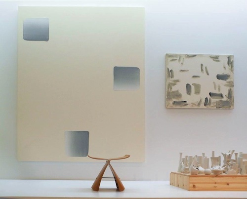
On the wall, 2 oil paintings on canvas by Lee Ufan: Dialogue, 2007 and With Winds, 1989; Butterfly Stool by Sori Yanagi, 1954; Sgrafo Modern porcelain, designed by Peter Müller, c. 1960-80.

In the context of the old and often the anonymous, some contemporary works looked much better to me than they might have in other contexts: thus, a painting by Lee Ufan suddenly made a different kind of sense as the backdrop for a series of small curiously shaped white porcelain shapes of the Sgrafo Modern-Korallen Series (design by Peter Müller, c. 1960-1980) and for some ancient Japanese folk rain gear and a backpack made of indigo dyed cotton and layers of fiber than it does as just one more work in the current surfeit of contemporary “casualist” or “provisional” abstraction.

There were also a number of large contemporary hangings, sculpture, and paintings that I realized that I was simply blotting out: works such as Mai-Thu Perret’s enameled ceramic gold glazed slab, When I look I do not see, when I listen there is no sound (2011), Trisha Donnelly’s large Untitled slab of Stone Azul Macaubas, a mauve stone whose high polish reminded me all too much of what one might find in a deluxe bathroom of a new four-star hotel in Dubai, and even Steven Prina’s brightly painted Blinds. Their optic effect felt jarringly vulgar in the context of Mingei’s embrace of the modest, which parallels the aesthetic principles expressed by Jun’ichiro Tanizaki in his 1933 artistic and ethnological manifesto, In Praise of Shadows. They were gaudy ghosts of the market but, luckily, irrelevant to the impact of the exhibition as a whole.
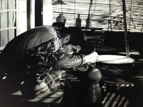
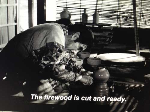
At the end of Ugetsu, Genjaro is again working at his potter’s wheel. He has been transformed by everything that he has experienced, by the spectral encounter with aesthetic perfection in the person of the Lady Wakasa , and by the spectral reminder of the warm intimacy of family life which he had taken for granted when he had it, of which one precious reminder is given to him in a final ghostly encounter. In contrast to the rushed sloppy way he churned out as many pots as he could for the market when we first saw him, now he lovingly crafts a single pot, light catching the gleam of the wet clay as it turns and as the ghostly voice of his wife expresses her joy and admiration for his work, which at last fulfills her hopes for him. The film ends. We see him fire his kiln but we never see the completed work. Yet the intimation is that it will be beautiful, that all the suffering will be expressed in the beauty of a common object, crafted with love.
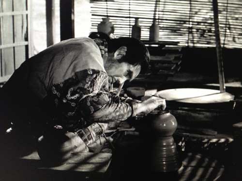
Strangely the texts I have read on Ugetsu don’t focus on the film as an allegory of art making. But I see it that way. I also can see that the moral of the story, that great art is not arrived at through crass commercialism and personal ambition for riches, but through the infusion of suffering and loss into a work done within a process of craft (and I use that term in the most expanded manner possible including so-called deskilled processes) is for some an outdated idea of who the artist is and what art is in contemporary culture. The quaint notions of objecthood, craft, sacrifice for art, aura–for what could be more auratic than a single pot which has been wrought–with humility and selflessness–over the souls of two dead women?–surely these are not characteristics directly applicable to contemporary practice.
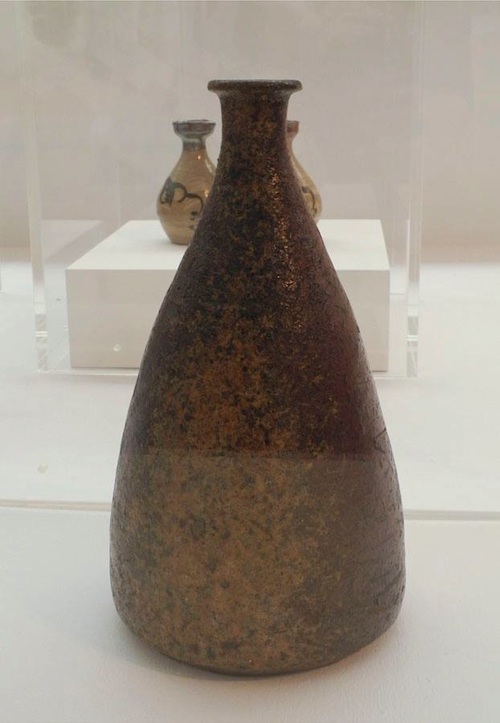
Unknown maker, Sake Bottle, 17th century

So how does one get from the empty studio in which a young artist may be sitting on his tuffett like Little Miss Muffett, trying to bridge the gap between theory/ intentionality/ideation and artwork which may have some materiality or emotive weight? How does one get from the merely illustrative to the internally performative?

One answer is offered by one of the contemporary works in Mingei: Are You Here?, Simon Fujiwara’s Like Father, Like Son (2013): within glass vitrines there are two plates, one whole, one shattered, and four photos with typed text on cards such as one might find in a small local ethnographic museum of a slightly earlier era. The text relates what appears to be a personal narrative by the artist, about his absent Japanese father, pottery lessons, and the work of Bernard Leach, a British man who was a recognized master of Japanese traditional pottery in the early twentieth century. Yet, despite the first person voice, the stylistic signifiers and subtly shifting pronouns signal that this is an unreliable narrative even if some or even all of it is based on autobiography. In contrast to many of the other works of craft and art in the exhibition, this is clearly a contemporary conceptual artwork, with all the irony and distantiation than comes with that designation, rather than a straightforward work of craft. Nevertheless something about how one might proceed in this moment of imbedded disbelief in the kind of authenticity of the more historical works in the exhibition is implicit in the conclusion of the piece:
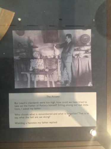
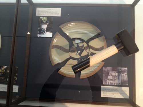
To make something you have to break something, to have something to break you have to make something–it does not have to be a plate, or a painting, but it has to be something you can see clearly enough to wield the hammer.

*

Further reading on Mingei: Are You Here?

“Mingei: Tradition and Craft; Simplicity and the Everyday” by Altoon Sultan

“‘Mokujiki Fever’ Endures” by Alice Rawsthorn

“Mingei: Are You Here?” by Michael Straus

Further reading on Ugetsu:

Ugetsu: From the Other Shore” by Phillip Lopate

Ugetsu” By Keiko McDonald

Ugetsu monogatari, 1953, complete film, my description of the film and the stills in no way convey the profound impact of the cinematic whole which by the end of the film will have efficiently reached into your heart and ripped it out  [this link may not last]

FacebooktwittermailFacebooktwittermail

Craft and Process: Jasper Johns / Regrets

I am interested in the capacity of material experimentation and serial practices to bring an artist to the expression of, the performance of, the actualization of content the artist had intended or desired but might not have arrived at if trust had not been put into process and materiality at some point or another. Such practices at times may seem to be unrelated to language-based theoretical structures, in particular if they involve manual processes and techniques although I am careful here to say “process” rather than “studio practice” because the latter might summon up traditional media and object-based art that in some quarters can be easily dismissed as irrelevant to contemporary issues, whereas material or methodological experimentation and serial practices can take place in any medium, including video, film, and photobased work, as well as in writing and conceptual art.

Because of my interest in process in the broader sense and because of my love of the expressive material qualities of traditional media such as ink, paper, pencil, oil, gouache, linen, wood, wax, stone, lead, copper, bronze, and more, I wanted to see Jasper Johns: Regrets, currently at MoMA even though I had a feeling I might be disappointed, despite my admiration for Johns’ earlier work and for the rigorous and rigorously private studio practice that he maintains at what is considered an advanced age for an artist, 83. Daily studio practice and engagement with craft by older artists was, literally, my matrix, and it’s my hope for my own future.

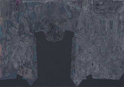
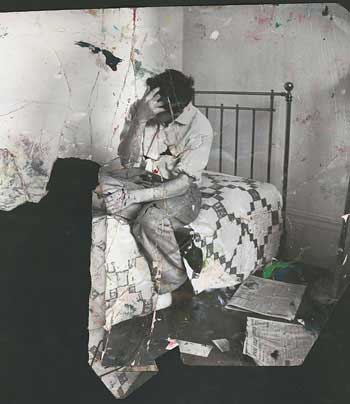
The work exhibited in Jasper Johns: Regrets  is exemplary of work process in which an image is repeated and reworked using a range of techniques and materials. Johns has applied his own, oft-quoted prescription for the empty studio and the blank piece of paper or canvas, “Take an object/Do something to it/ Do something else to it/ [Repeat]” from 1964, to the crumpled, torn print of a photograph of a young Lucian Freud, commissioned by Francis Bacon for his own work process on a portrait of Freud. In the past year Johns has produced an impressive and instructive series of drawings and prints and two paintings on canvas that use this photograph as the initiatory form.

A slight pause to observe the awe-inspiring, nearly absurd monumentality of what it means that an artist can call MoMA and say something to the effect of, “I have some new work in the studio and I want to show it–at MoMA–now,” and they make it so. I had to research whether Johns even has gallery representation in New York; he does (Matthew Marks) but the call to MoMA denotes an artist who is hors combat, beyond value, who has droit de seigneur, and justly so, and it suggests an almost quaint familial intimacy with roots in another time with the institution MoMA.

The drawings are mostly small and they take place within the strict boundary of a smaller rectangular area set on a larger piece of paper, effectively setting each drawing into an optical frame, and giving each drawing a formal quality that goes somewhat against the grain of the theme of material and subjective experimentation: Johns never draws outside the lines and there are no accidental smudges or other stereotypical indications of “work” in progress or changes of mind within an individual, except for notes to himself at the bottom of some works, in a careful, small capital letters only print in pencil: “GOYA? BATS? DREAMS?” There is a quality of carefulness and diligence in each work, with each drawing fulfilling a specific set of material specifications and formal analysis of the image. Each is a finished work, enclosed, specific, and private.

The drawings are done with pencil, acrylic, and water-color, in some cases with a Seurat-like dissolution of the figure created by the pebbly effect of rubbing a pencil over a pebbly-surfaced watercolor paper, in other cases a watery smooth print like effect is achieved through ink on a smooth and water repellent vellum like surface.

In most of the works, the pathos embodied in the photograph of Freud–a young man, his face obscured by his hand and by falling strands of hair, seated on a bed–is transferred emotively to the shape of the negative space created by the torn off bottom left hand corner of the print.  In the many iterations of the image in which Johns has doubled the picture in a mirror or Rorschach-test format, the human figure is a recessive, barely legible form while the negative shape becomes an important sculptural shape, like a mesa or a tombstone.

The two paintings in the exhibition have a sober, reflective quality with the monumental tombstone form of the negative space in the center framed by intimations of the recalcitrant figure. The group of work as a whole, the whole gift of a limited invitation into his studio functions as a counter-movement to mortality and knowing the age of the artist it is easy to read into the work a reflection on mortality, which is his subject I think.

Yet the work also has a funereally static quality of which the worst effect is a kind of conservatism instead of the sublime monumentality or contingent fragility that one imagines it will contain.

The problem is twofold: it is fascinating to see how the artist has taken an unprepossessing photographic scrap and rung so many changes on it yet the image upon which this edifice of studio practice is based is perhaps not all that resonant, either absolutely, or in the way he has chosen to interpret it by enhancing abstraction and deflecting figuration. Or his pressing of the appropriated image through layers of visual analysis does not actually push experimentation with materials far enough in order to get at the core of the content by his deconstruction of the given picture.

Photograph of Lucian Freud by John Deakin ©Dublin City Gallery The Hugh Lane/The Estate of Francis Bacon

But, now I think, perhaps I am wrong. As I write, in my mind the work becomes more interesting, the fact that the figure is so obscured and the very disciplined and precise thoroughness of the visual analysis of the appropriated image is fascinating in its rigor and in the emotional reticence. Maybe. And yet…

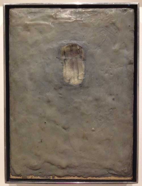
The most important moment for me was while standing to the left of the larger painting, Regrets, trying to get as close as I could to the painting surface, in the area where the seated figure is both represented and camouflaged through a web of paint marks which are neither minimal nor especially sensual: the paint quality is curiously dry with unexpected but frustrating flicks of a more sensual or at least thicker slightly less dry paint. I wish I could photograph that moment of vision, being as close to the painting as one is allowed, looking at it from one side, my vision raking it from a sharp angle to the picture plane, trying to decipher the figure, trying decode the various types of paint strokes and degrees of lubricity or aridity of the paint. It is the crux of the experience of this painting and this series of works, that the most interesting thing, the most complex, is also the least visible and, for some viewers, the most disappointing. If one thinks of this painting in relation to the characteristics of the “old age style” first perceived in late works by artists such as Michelangelo, Titian, Rembrandt, as well in late Cézanne, where the high finish of youth yields to a rougher, often more “unfinished” and therefore more modern to our eyes loose, direct, unvarnished representation, this painting both adheres to some of the characteristics of of that stylistic determination and yet goes against its grain: it is sometimes loose, but also tight, obscure, and recalcitrant. Instead it is in earlier work that one finds the characteristics of what had once been called the old age style, where the artist has no time for the niceties and goes for the gut, as in Painting Bitten by a Man, 1961, from the collection of MoMA, which was in a small but resonant two-person exhibition at Craig F. Starr Gallery last spring,Body Double: Jasper Johns/Bruce Nauman. Here is rich surface, base materialism, a mark that goes beyond indexicality to something like both cannibalism and lovemaking with the matter of paint itself.

Jasper Johns, Painting Bitten by a Man, 1961. Encaustic on canvas mounted on type plate, 9 1/2 x 6 7/8″ (24.1 x 17.5 cm),Gift of Jasper Johns in memory of Kirk Varnedoe, Chief Curator of the Department of Painting and Sculpture, 1989-2001 Copyright:© 2014 Jasper Johns / Licensed by VAGA, New York

Compared to Painting Bitten by a Man, the paintings in Regrets yield their meaning parsimoniously. I know that to compare these new works by Johns to his remarkable earlier work is to commit the unpardonable of holding a great artist to the standard of his greatest works, which came in his youth, all the more so because I respect all the work intensely, I mean not just the great early works, but the way he continues to work and to be in the world, the discipline of work no matter what stage of life’s work he is in. But I have a feeling I’m not the only person who is painting late Johns paintings in my head that are different than the ones he is actually painting.

A hint of what those might be is contained in 0-9, , one other series of works on paper in the MoMA exhibition, also done in 2013 but unrelated to the Regrets series. Nine monoprints on small pieces of rice paper represent the numbers 0 through 9, in the stencil style Johns has used many times addressing this subject. The work is done through a complex process, according to the wall text: “using stencils, rubber stamps, and textured materials–including mesh screens, rags, strings, and coins…Johns assembled each composition on an aluminum plate. He then covered these assemblages in white ink and printed them on sheets of paper. Finally he immersed the prints in a bath of black india ink, which dyed the paper but not the oil based white ink.” If one of the features of work that I love is that I want to turn on my heel and go back to my studio and work, in terms of the inspiration provided by process, he had me at “a bath of black india ink, which dyed the paper but not the oil based white ink.” By that I mean, just reading those words–“bath of black india ink”–made my pupils dilate and set my pulse racing slightly, separate even from the work achieved through that technique. But on top of that, these works themselves are delicate, simple, and there is a resonance between the method and the subject: the numbers 0 to 9 are images and concepts we recognize immediately, we know deeply, a subject that combines familiarity and neutrality so that, like the target or the flag, we can appreciate what it is that Johns is doing to them with his craft, when he takes an object, does something to it, and then does something else to it, and repeats, whereas the wrecked photo of Lucien Freud is foreign to us. Thus, although it is a resonant and mysterious image, it is also an arcane, individual, and private one, so that there is perhaps too great a conceptual and cognitive distance between the appropriated image and the material explorations of the series. I admire the work, the artifice, and even the recalcitrance of the works in Regrets, but, although I really want to, I don’t love them, I regret to say. But I will go back and stick my nose as close to the big canvas as I can and think about it some more.


FacebooktwittermailFacebooktwittermail

Preparing for the Armory Show

It has been a cold and snowy winter in the North East and there is a sense of a slow down, as people prefer to stay indoors than brave the layers of thick lumpy ice, black slush and garbage strewn black and yellow pitted snow mountains that have graced our streets for weeks. Time seems to have stopped, and not in a good way. But here it comes, any minute, in a marathon week, the Armory Show and other art fair exhibitions joined this year by the opening of the 2014 Whitney Biennial–some people love it, to others it is a professional duty and a physical endurance test, to be survived as best as possible. Let’s hope for decent weather at least. The proximity of this New York artworld spring ritual makes this an interesting moment to catch the last few days of The Armory Show at 100 in 2013 at the New York Historical Society Museum and Library on Central Park West and 77th Street. Incredibly, considering that I live four blocks away, I only just saw the show today. Sunday February 23 is the last day.

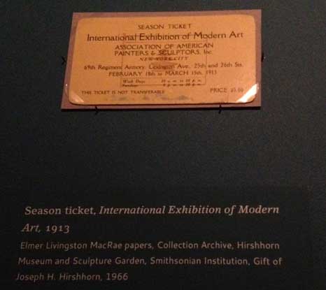
The show presents a historical overview of the exhibition, recreating in a limited manner the experience viewers would have had at the original exhibition, which was open from February 17, 1913 through March 15, 1913, held at the 69th Regiment Armory on Lexington Avenue between 25th and 26th Streets, which in recent years has occasionally housed spill-over exhibitions from the Armory Piers shows. Considering that efforts to interior decorate fairs today are usually confined to VIP lounges and seating areas scattered here and there, and that visitors are usually disoriented by the profusion of booths, merchandise, confusing layouts across miles of space, it is amusing to read this description of the exhibition:

Armory show visitors entered the enormous drill hall of the 69th Regiment Armory and were overwhelmed by a cavernous, light-filled divided into eighteen octagonal galleries with burlap covered panels. It was decorated with greenery, pine tress, flags, and yellow streamers that formed a tent-like cap….The paintings were hung in two frenzied days before show opened, but the lay-out was planned in advance. The galleries were arranged so that visitors could not wander laterally through the space. Rather they had to choose a route and follow it through to the end. The organizers laid out the space according to their vision of modern art: the galleries progressed roughly from American to European art, and from revolutionary movements of the past to the current French avant-garde.

Walt Kuhn, diagram of the Armory exhibition for its display at the Copley Center in Boston

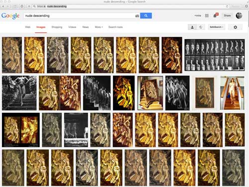
Thus, although the works were for sale and 274 works were sold, mostly prints of European artists, the layout was primarily educational, to tell the story of modernism in a manner that seems to have offered the first draft of Alfred Barr’s instructional layout of the collection of the Museum of Modern Art, which for years functioned as a walk-in text book whose chronology and stylistic connections now are much eroded by more recent fashions in museumology but were very useful to get at least one idea of how the thigh bone connects to the knee bone. The floor plan of the Armory show oriented visitors towards the art in Gallery I, which critics termed “the chamber of horrors,” where one found what the organizers considered the culmination of modern art, Fauvism and Cubism, with Matisse’s Blue Nude and Duchamp’s Nude Descending A Staircase (No.2) attracting the most notoriety. Apparently critics found Cubism easier to deal with because it was fun to make fun of itthe cartoons of the period are wonderful as drawings in themselves!–whereas Matisse was seen as barbaric.

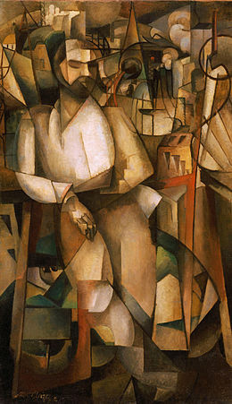
This show is worth seeing, in particular because it is an opportunity to see Nude Descending A Staircase in New York, and hung as it was at the Armory show, next to Albert GleizesMan on a Balcony (1912), a much larger canvas so that, here in this exhibition perhaps even more than on the larger wall of the Armory, the placement highlights the delicacy of the Duchamp, modest in scale, with a smooth surface and precise yet clearly hand made lines and even a few areas of slightly oilier paint, where there is perhaps some ever so slight impasto (gasp!) or perhaps a bit more oil burbled up to the surface creating a painterly blemish right near the center of the work (gasp!). These painterly incidents are not apparent in reproduction so it is really very useful to see the painting and I recommend the exhibition if only for that opportunity. Comparing it to the Gleizes is also instructive. A big handsome painting, Man on a Balcony is also an illustration of how Cubism, almost immediately after the works of Picasso and Braque done between 1909 and 1911 yet still radical today, could easily be recuperated to traditional representation, becoming a cosmetic device over essentially unchanged notions of representation of objects and space. The figure in the Gleizes painting is basically a recognizable male figure in a contrapposto pose set against a landscape. He has a face, hands, he’s wearing a shirt and pants. The Cubism is just style not performative substance. Duchamp’s Nude is barely figural, there is no facial information, barely any anatomical representation, it is a representation of motion, clinical and scientific. Next to the bold and superficially impressive Gleizes, Duchamp’s Nude is obdurate and inscrutable.

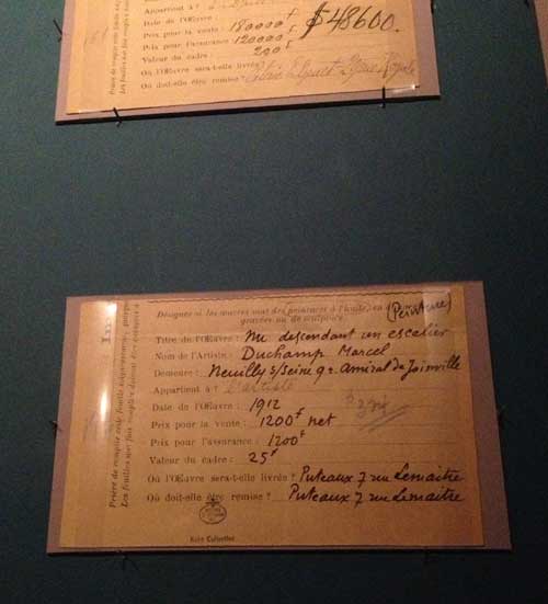
If you see the show don’t miss the separate room of ephemera from the exhibition, letters, loan forms, telegrams. It is possible to miss, because the museum signage is a little confusing and the room is darkened for preservation purposes, but it’s always good to be reminded of the nuts and bolts of events and artworks that have since become iconic or legendary. Nude was purchased for 324 dollars.

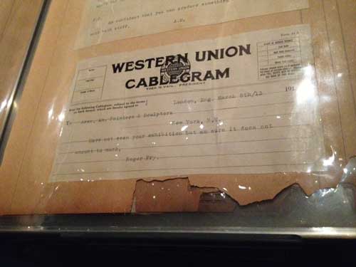
The ephemera also include imaginary telegrams from such luminaries as Gertrude Stein and Roger Fry:

from a scrapbook of the period of “Imaginary Telegrams” (that is what it says at the top of the page of an album with other seemingly more legit cablegrams): There is that exhibition. there can be no place flowers and camembert when the paint is within. Alfie Maurer out on the bias there is that room where is breathing when there is no grass answer backwards. that is what joy. Gertrude Stein

from a scrapbook of the period of “Imaginary Telegrams”, this one *purportedly* from Roger Fry: “I Have not seen your exhibition but am sure it does not amount to much.”

Everyone’s a critic!

The show also includes a luminous painting by Walt Kuhn,one of the organizers of the exhibition, a delightful painting by  Maurice Prendergast, Albert Pinkham Ryder‘s Moonlit Cove, whose surface condition is so extreme that the pattern of the craquelure is a textural, sculptural cousin to the large organic abstracted shapes of sky, cove, beach. Matisse’s Blue Nude and Van Gogh’s Mountains at Saint-Rémy still are bold and challenging, and if they no longer have the power to shock, they do retain the ability to awaken your eyes, the Van Gogh in particular benefits from the context of this show: like so many of his paintings, it looks as fresh as if it had been painted yesterday, and the whole future of expressionism through the Twentieth century is in the brushwork/drawing-painting marks .

And if you haven’t seen Nude Descending A Staircase in the, you should pardon the expression, flesh, and don’t know when you will get to Philadelphia Museum of Art where it lives, go see it, it is extremely important to know from your own experience that this strange, infinitely analyzed artwork, is among other things, a painting.


FacebooktwittermailFacebooktwittermail

Intimacy and Spectacle 2: answering a questionnaire about contemporary art museums

I like it when someone asks me a question on something I might not ordinarily think about or write about: I can’t help but start to wrap my mind around it and I may even get so involved that I answer at length when brevity might have made more sense. A case in point: last week I received a Facebook message from someone I didn’t know (not even a FB friend at the time) asking me if I would answer some questions about the contemporary art museum. I didn’t know whether he had read my recent blog post Intimacy and Spectacle 1 though his message did come a couple of days after that was published. But I was intrigued because issues raised by MoMA’s recently announced building plans have been on my mind, so I answered his message and I received the following questions under the rubric “Questions about (contemporary) art museums – Dissertation of Cultural Management / Portugal” from Juan Gonçalves who is working on a dissertation developed within the MA in Cultural Management from the University of Madeira, UMa, 2013-2014. Once I started answering his questions I got so carried away that I thought I might as well share the letter on my blog, which Juan agreed to, since he can quote from the blog in his dissertation. I don’t know much about the program he is working and I have not been to Portugal so my response is lacking a sense of his context.

These were his questions:

1.The definition of a contemporary art museum is still valid? Would you suggest another?

2.How to break the barriers that still impose the museums of contemporary art and its audience?

3.How the contemporary museology works in this economic crisis?

4.What is the best architecture for a contemporary art museum?

5.What can you say about contemporary art museums in Portugal? And about the artists?

Here are my answers:

Dear Juan Gonçalves,

Thanks for asking my opinion on questions about the contemporary art museum. I am not an expert in museology so I am speaking primarily as an artist though also as an educator, and art writer. My opinions are principally coming from my own desire to be able to see art so that I can really see it—I was going to say to experience it but that word “experience” already gets into the spectacle or entertainment regime that museums are increasingly obsessed with.

1.The definition of a contemporary art museum is still valid? Would you suggest another?
I don’t think much about it: I’m more concerned with what is in a museum than what its name is but I have accepted the nomenclature of contemporary art museum. I do want to see contemporary art or new art, and a so-called museum of contemporary art is a place in which to see what some people think is going on, but the academic/corporate category contemporary art doesn’t interest me that much, even though I consider myself a contemporary artist.

As it is frequently noted, contemporary art is a contradictory or oxymoronic category. Nothing remains contemporary and even to define what is contemporary art is difficult—the essays in e-flux journal’s 2010 book What Is Contemporary Art? ended up more haunted by modernism than definitive about the character of the contemporary. Is all art made today–thus, literally, contemporary–considered suitable to be shown in museums of contemporary art? No. We know that most art being made today will not be shown in museums of contemporary art because certain determinations have been about what is contemporary: usually new media and technology, theater, spectacle, and participation, as well as a focus on young artists and responsibilities to the global.

One goes to a contemporary art museum to learn about the contemporary moment, what the art selected by a defined international academic/corporate cadre will tell us about the world we live in, for better or worse. Whatever is considered contemporary art by the contemporary art museum is cultural utterance of interest although what the work exhibited actually says about this particular historical moment may not be as evident to us in the present moment as we think, because, as suggested by Walter Benjamin, the artwork contains “unintentional truth” about the present that is so much part of our ideological frame that it is invisible to us but its trace will become transparent over time. Whether it is “truth,” which would sound absolute and unchangeable, is not as relevant as the fact that another truth about the contemporary art work will be visible in it as time passes and the work is no longer contemporary. One problem is that the contemporary art museum is principally meant to define the present to the present but it ends up writing art history, so much from a time period may be lost because a narrow cadre left it out. That is a problem because the pressure of being contemporary allows no time for things to sort themselves out, for the sediment to fall to the bottom of the test tube. I should note that our particular contemporary seems particularly uninterested in time, in history either looking back or looking forward–but maybe people were already saying things like that in 1850! In any case artists, curators, and museum directors can only do what they can do or see what they can see at a moment in time based on knowledge and motives  specific to that time.

Because of the nature of the newness of contemporary art there is the problem of where commercial galleries’ role ends and contemporary art museums’ roles begin. But it is interesting for a museum to try to keep up with and try to define and present the contemporary at any given moment. And it can be useful to the viewer with some experience in art if this kind of investigation takes place in a museum with some sort of institutional history that gives the curatorial choices a context. My memory goes back to some of the early Projects exhibitions and the Information show at MoMA, which had a stronger impact from appearing in the context of canonical modernism. So perhaps the museum of contemporary art is too limited a situation, the contemporary makes more sense and is more exciting if seen in the context of the past.

In terms of a category of museum of contemporary art, the model of the Kunsthalle without permanent collection is a good one also, in addition to the more conventional modern/contemporary museum. I think it is important to have both kinds of institutions. In the United States we don’t seem to have that much of a Kunsthalle culture though the New Museum functions that way here in New York and there are a few other institutions like that around the country. smaller centers of contemporary art often have the freedom to put together more heterodox and imaginative visions of the present because pressures of the market don’t totally penetrate the local. I think it is great to have that kind of institution as well as larger museums with a mix of permanent collection and special exhibitions.

2.How to break the barriers that still impose the museums of contemporary art and its audience?
All museums today, not only specifically museums of contemporary art, are interested in attracting large audiences mostly for commercial, economic reasons. That is true if they are private institutions or supported by the state. On Wikipedia’s entry for museology there is a section on “Tourism as a vehicle for success.” Any art of any time period can be of interest to any audience, I am convinced of it, so long as there is access, financially and through education programs. It is not necessary to pander to “the audience.” But museums and in particular contemporary art museums are now thinking about audience mostly in terms of traffic flow, how many people can be cycled through the galleries to the restaurant and the gift shop. They give that basic commercial desire a theoretical or political gloss by talking about the “audience” the way leftists might speak about “the people.” There is genuine idealism in institutional educational outreach programs, most museums offer fantastic resources for the community although there is still a huge gap between a general audience which might find any art museum an intimidating place but as older museums showing a range of art including but not limited to the contemporary probably do just as well as contemporary museums in attracting culturally and economically diverse audiences. Even if you add all the features that you think will attract a younger audience, you still are dealing primarily with a privileged audience. The museum is still intimidating, it takes more to make less privileged audiences feel welcome and able to take advantage of opportunities for access the museum may offer. This past summer the New York Times published a story about a young woman who hung out in the lobby of the  Brooklyn Museum because it was air conditioned. She became interested in the one art work she could see for free from her vantage point, Kehinde Wiley’s Napoleon Leading the Army Over the Alps. She didn’t venture any further because she couldn’t afford the admission fee until finally a friend told her that it was only a suggested fee.

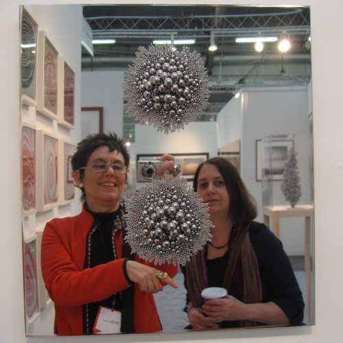
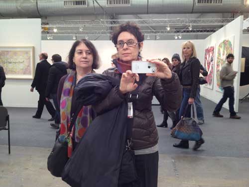
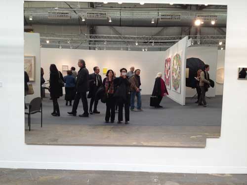
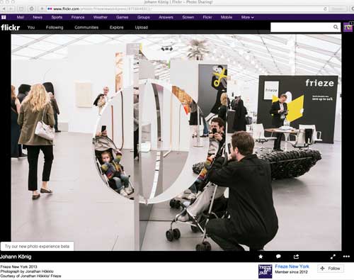
To get the most traffic flow, it seems to be desirable to design museums and curate shows that will function as good backdrops for selfies. The so-called “experience economy” is not only predicated on giving people thrills of some kind, but also and perhaps even more on giving people something which is actually the opposite of what I consider an experience of art, it is the experience of taking pictures of yourself in front of something, the art is a ready made set for your photo-op. Some of those “backdrops” (the art and the architecture) are terrific, and it’s Pavlovian, I get sucked into the selfie regime as quickly as the next person: I have a whole collection of self-portraits taken in contemporary artworks made of shiny reflective material. Maybe that emphasis on self within spectacle is one characteristic of contemporary art.

Self-portrait with Susan Bee, Armory Fair, 2010

Self-Portrait with Susan Bee, Armory Fair, 2012

You get the picture. One had gone from a slightly discredited art historical model of the work of art as reflection of society to contemporary art as an actual reflective surface in which the viewer can see herself.

But I am happiest when I can wander through a quiet, elegant, even modest museum that makes it possible for me to have a meaningful interaction with an artwork, even just one real experience of seeing is enough, in a day. I need to hear myself think, even if I am in a crowded space. This may sound old fashioned and art object oriented but in my capacity as a teacher, I have noticed how hard it is for my students to actually see the art in museums — I guess here I do mean painting and sculpture and objects— how hard it is even to really focus on more spectacular video installations, not that they can’t, they may respond more immediately to such installations which are more accessible to them, but they may also just be sitting down so they can check their email. This can lead to cynicism and alienation in a demographic that is paradoxically the presumed principal target of the contemporary museum of contemporary art, under the guise of a fun-house atmosphere aimed at pleasing just that demographic. Everyone feels the loss of human scale, the difference between my generation is that perhaps we can pinpoint the reason we feel a certain way within these new spaces because we did have experiences of human scale within museums of contemporary art: the Pasadena Art Museum in the 70s was such a place, for example, and, of course, the much mourned Museum of Modern Art in NY pre-1983 and pre-2006. Your questions came just at a moment when it occurs to me that most of my students have only experienced the 2006 version and when we (people born before 1980) express our dismay about a type of museum experience and a type of relation to art that we feel is lost, they basically can have no idea what we are talking about.

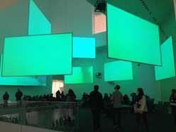
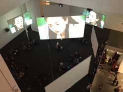
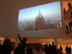
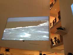
(images above from Isaac Julien, Ten Thousand Waves, MoMA, 2013)

Curiously some of the commercial galleries that represent the apotheosis of the contemporary art industry and market, such as, here in NY, Gagosian and Zwirner, have been able to mount museum quality shows the past few years, including for example excellent Picasso and Frankenthaler exhibitions at Gagosian and the recent exhibition of Ad Reinhardt’s work at Zwirner, in spaces that either are as beautiful as any museum or that are just functional in a good way, with few frills, just good walls and space. Because their financial motivation is on another level than who walks in the door to see the work, they don’t have to try to attract the entertainment-seeking “audience” since the real business is taking place elsewhere. And, although galleries may seem even more elitist than museums, actually these shows are free, there is no admission price at all.

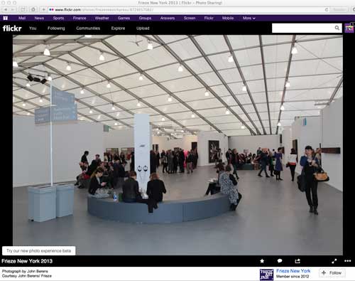
The reverse example might be the international art fair, for example Frieze’s fair on Randall’s Island in New York, a kind of upscale Shangri-La of contemporary art seen from the point of view of the market, which, some might argue, is contemporary art. In fact the Frieze fair model is really a perfect manifestation of a contemporary art museum: it is open about being a function of the art market, works must compete instantaneously with a very wide though certainly not comprehensive selection of contemporary art made around the world, the designers make an effort to give smaller works some space but it is busy and there is a tendency for art which is large, shiny, or in some other way spectacular and photogenic to do particularly well. And the whole thing is not just contemporary but temporary, which really makes it a representative instance of the contemporary.

But many of these newly built contemporary art museums are designed so that they will accommodate large installations and events and that scale will then influence the production of future contemporary art that will tend to the large, the spectacular, the entertaining because those are the modes that will function best spatially and as images. Such spaces are less likely to nurture or support more intimate work and also experimental work including art of social engagement which seeks to engage with the world outside the walls of the elite institution.

So, as you can tell, contemporary art museum or any art museum as fun house for the Google iPhone generation is not my favorite, or, it is fine, so long as beautiful museums are not destroyed in order to achieve those goals. As you know, currently New Yorkers are upset about MoMA’s plans to put the last nail in the coffin of what was one of the most meaningful art experiences. The response to their new plan on the part of artists, architects, architectural critics is hatred and contempt, rage and mourning. Most of us already disliked the Taniguchi remake so much we didn’t expect it could get any worse.

3.How does contemporary museology work in this economic crisis?
The current economic crisis of course makes it all the more tempting for museums to try to make themselves desirable to a tourist audience and to people who are interested in the museum as just another glamorous fun place to hang out and take pictures, where art is peripheral and everything leads to the gift shop. It also makes museums more vulnerable to the machinations of their board members.

4.What is the best architecture for a contemporary art museum?

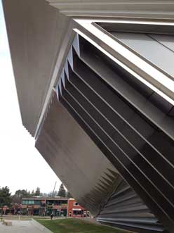
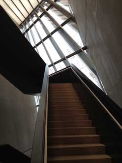
I enjoy museums with spectacular architectural designs, as art objects in themselves. But it is amazing how egotistical these spaces can be when it comes to accommodating the art works they are supposed to present. I recently visited Zaha Hadid’s Eli and Edythe Broad Art Museum in East Lansing, Michigan: it is really beautiful both outside and inside, like a gleaming silver spaceship that happens to have touched down in a college town on the flat plains of the American mid-West. However most of the interior exhibition walls are at an angle, which in some spots induces vertigo, and which makes it a pretty eccentric place to look at painting, drawing and photography, not terrible, in some cases works actually look interesting, but they definitely have to struggle with the situation. Maybe that is part of the point of the design.

On the other hand a recent visit to the new updated Yale University Art Gallery is exemplary of a wonderful museum experience, where you feel like a human being, and can explore wonderful artworks in spaces that are beautiful and functional without being ostentatious and where there are shifts in scale and intimacy between small and eccentric old spaces and larger white cube spaces depending on the needs of the work. It adapts architecture from different eras and styles and I think that is a good model. And it is free which is a fantastic gift to the public.

In general, it seems that older spaces that have some history, including repurposed spaces previously used for industry or commerce, often make good spaces in which to exhibit contemporary art. MoMA Ps1, in a former public school building in Queens, NY is a good example: dimensions and characteristics of the exhibitions spaces vary in eccentric but very useful ways that allow for a variety of types of art, and the initial decision to maintain those basic dimensions spared us from contemporary architectural decisions that might be detrimentally egotistical or trendy in scale or pretension. Significantly in recent years some of the best exhibitions offered under the aegis of MoMA have taken place at PS1 because of the intimacy and character of the rooms. The DIA building in Chelsea was also an effective model of a space that was not new, was fairly simple, had a human scale, and got out of your way so you could concentrate on the work.

I think a museum should offer some moments of visual pleasure, small architectural details or sweeping vistas that are pleasurable, beautiful, with attention to natural light and structural materials, elements that show that thought has been given to offering a sense of pleasure to the human being, thinking has gone into human scale, not just architectural vanity, corporate scale, and entertainment value. As Barnett Newman famously said in Emile de Antonio‘s film Painters Painting, “in the end size doesn’t count…it’s scale that counts, it’s human scale that counts.” He was talking about painting, but the shoe fits for architecture too. Architectural pleasure for the sake of the architecture should be paired with the architecture being able to get out of the way of the artwork in it and let you see the work as if it belonged entirely to you only, for at least a moment in time.

5.What can you say about contemporary art museums in Portugal? And about the artists?

Unfortunately I have not had the pleasure of visiting Portugal so I cannot comment on museums in Portugal.

Sincerely,

Mira Schor

FYI, This post is not a promise that anyone who writes to me should expect a response, short or long, or that I will publish that response on A Year of Positive Thinking.

FacebooktwittermailFacebooktwittermail