Category Archives: art

Normalizing inequity

I just saw a repost of “The Problem of the Overlooked Female Artist: An Argument for Enlivening a Stale Model of Discussion,” an article by Ashton Cooper published on Hyperallergic over a year ago in January 2015 and am discussing it here because it is a subject that is all too close to my own experience and also to what some of my recent work was “about”–my drawings in which a half cadaverous but still living bleeding woman artist is confronted by the two polarities or scenarios of what one might call terminal inclusion, “still too young” and “not dead enough.” I also wrote about this whole finally giving very old women artists a bit of greater visibility and recognition–100 is the new 70–phenomenon recently in fashion in the art world, on A Year of Positive Thinking in posts such as “Just a short message from Venus” from June 24, 2015 and https://ayearofpositivethinking.com/2015/06/01/miss-piggy-and-madame-de-beauvoir-a-new-fable-of-la-fontaine-cochon-et-castor/ from June 1 2015.

In her text Cooper examines the phenomenon and particularly examines the language used to promote it, a method that is useful in the effort to denormalize an inequity that has become second nature,

As a onetime writer and editor for a company that owns two art magazines and an art-centric website, I can attest that art journalism is in no way immune from conventions that ostensibly champion women artists, but in fact perpetuate problematic narratives about them — tropes so prevalent, even I have operated within them. In particular, I’m thinking of the widespread myth of the “overlooked,” “forgotten,” and/or “rediscovered” female artist.

I also found very significant one of Cooper’s conclusions which is the importance of looking at the actual socio-economic and aesthetic conditions of the women artists’ lives and careers in those years they mysteriously were not “discovered” enough…in fact when they were doing really interesting work, were part of interesting communities, while young men of their circle were getting mid career retrospectives at major museums before they reached the age of 40.” Cooper continues,

So instead of focusing on the moment when these women were finally “found” — and by extension, on the institution that was gracious enough to do so — I propose we talk more about that period where she was toiling away in obscurity. What was she doing then? Where was she showing? Who was she in community with? How did her practice change? What forces of exclusion did she face? Instead of the tired story where a masculinist force deigns to discover, find, or recognize female artists, what if we tried to also understand the material realities of these women’s lives? Ultimately, we would not be so dependent on the recognition of the art world’s skewed mainstream if we used these histories as case studies to define different kinds of success.

Parenthetically, I have also in the past noted that the time period when artists produce the work that later has the greatest monetary value is the period when they are working in relative obscurity but in a lively artistic community. There is something to be said for privacy and even for the productive nature of being forced to clarify and intensify your work in the effort of making yourself seen, heard, understood. Success right out of graduate school, for example, means the ideology of the work is never tested against lack of response or changing fashions. This is a paradox, of how the market alters artistic production–without some recognition and market success an artist’s struggle to produce work can be too great, if you add to this general reality the inequities created by gender, which are well established and studied, you have a much greater difficulty factor enhanced by the fact that women who are in between, neither young and sexy or very old with their transgressiveness now innocuously “cute” are of no interest to the journalistic narrative Cooper discusses, and yet achieving market success young can put stresses on work that turn interesting challenges and private intensities to public–“merchandise” as I quoted my mother recently. Too early recognition can be a trap, but too late can be a tragedy of sorts, when the artist is no longer able to use the success and the financial security to grow new work and realize long held dreams for their work because they are simply too old and tired or ill..or dead. Louise Bourgeois is the one of the few if not the only example of a woman artist who began to get some real material and critical success in her 70s but then was able to have two more decades to use that success to finance ambitious new projects–that is so so rare.

In terms of language, I would think in terms of replacing “rediscovered” with “hidden in plain sight,” to mark the fact that many of the women artists who eventually may be lucky enough to be “rediscovered,” as Cooper points out, have in fact been visible all along, if you bothered to look, close to the center, exhibiting, lecturing, writing, respected even, but always with the sense of auditioning for a part they already have. And whenever an older woman artist is “rediscovered,” there a lot of, mostly women, artists and art historians, shrugging their shoulders because they have been teaching and writing about and been inspired by that artist’s work for years. The in plain sight part is obvious, the hidden is in the blindness that gender bias and ageism bring to the situation.

As I have tried to explain recently to someone, it is Not Normal that an artist like June Leaf has to wait until she is in her mid 80s to get a show at the Whitney, not a true retrospective mind you, but a drawing show with some sculpture in it, in the small gallery off the lobby. It’s not cute or great, though of course it is wonderful and much deserved and well past due, but there is nothing normal about it in the wider view of young male artists having museum retrospectives at barely the 10 year mark in their careers.

While we should celebrate these late moments of more public recognition for some older women artists and be grateful to have the opportunity to see some of their work, we should not normalize the inequity and abnormality of the phenomenon that Cooper discusses.

FacebooktwittermailFacebooktwittermail

One Art Work in a Spinning World

In attempting to capture the impact of one modest artwork, seen in a museum outside a major metropolis, it is first necessary to fight one’s way through the tidal wave of images of art works that circulate daily, on Instagram, Facebook and dozens of major and local websites devoted to art and to the art market. It is overwhelming and impossible to try to come to grips with the sheer volume of works and of images of works, many of which look “good”–at least as images. The fact that many look and may even in actual physical space be “good”–and good here is meant to cover a wide range of possibilities of success, from aesthetically pleasing, formally clever to intelligent, even possibly intellectually challenging, or emotionally charged and weighted–is as disconcerting as the many that are just outright bad, the glittery flotsam seen at fairs, and also the temporal toys and copies, attractive but intellectually and emotionally empty product, what my mother, with the rolling rrs of her rich Eastern European accent, would dismiss with a sniff as “merrrchendise.” This is so partly because aesthetic criteria have gone underground, more a factor of subterranean custom and multiple, group-specific agreements, less the subject of intellectual debate and argument. As an example, this is what the “zombie” in “zombie formalism” is about, the sense that works that at first glance look like mid-twentieth century abstract art, c. 1949-1979, were not arrived at through the aesthetic and existential struggles of the earlier models they resemble but are more emotionally remote, seamless simulacral replicants, merely shifting around signs from those earlier forms of abstract art.

From this phantasmagoric swirl of images, I walk into a room and discover a work, unassuming yet riveting, nearly anonymous in its style and fakture yet unique and uncannily specific.

YEAR-TAUBER-ARP-IMG_6436

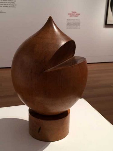
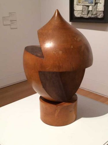
This is an untitled turned wood sculpture by the Swiss-born artist Sophie Taeuber-Arp (1889-1943), included in Everything Is Dada at the Yale University Art Gallery. The exhibition is curated from the Gallery’s collection, notably from the works that were gifts of the Collection Société Anonyme, an art group founded in 1929 by Katherine Dreier, Marcel Duchamp, and Man Ray. Included in the exhibition are works by the most iconic artists of the movement such as Kurt Schwitters, Marcel Duchamp, Man Ray, Max Ernst, Francis Picabia, but also very interesting works by lesser known (or, rather, previously unknown to me or forgotten by me) artists such as Morton Livingston Schamberg, Georges Ribemont-Dessaignes, and John Covert.  I came upon Taeuber-Arp’s object in the last room of the exhibition, in the company of works by her husband Jean (Hans) Arp and also a number of works by other women artists from the period including Chef d’oeuvre accordéon, or Accordion Masterpiece, 1921, a bold painting by Suzanne Duchamp that is focused around a silver-leaf oval head-like shape, cut in by collaged elements that relate to aspects of Taeuber-Arp’s work.

Taueber-Arp’s wooden object has a humorous, cartoon-like appearance–a contemporary resemblance may be found to the way the character of the pre-schooler Ike is drawn on South Park, with a slit for a mouth–and, in fact, it is said to be in part based on the peaked cap wearing German puppet-theater character Kasperle, or “Kaspar,” about whom Jean Arp wrote a poem, “Kaspar is Dead” –“oh god our Kaspar is dead/and now there’s no-one to steal away with the burning flag/snap it everyday in the dark cloud’s braided hair.”

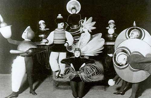
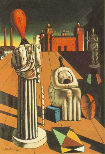
Yet the object has an anonymous aspect to its form, it resembles and I believe it references the shape of nineteenth-century machine tooled hat molds that informed the works of many of the Dada artists who looked to industrial forms and techniques at the same time as they appreciated, in the manner of their contemporary and colleague Walter Benjamin, earlier objects of popular culture and practice from the late 19th century. The use of turned or lathed wood creates a network of connection between early instances of mechanized craft, the colder more mechanized aspects of industrially produced objects in the 20th century, and the Bauhaus interest in linking these two strains together via craft. Other works by Taeuber-Arp also reference machine-tooled mannequins, forms and subjects that appear in works by contemporaries including de Chirico’s The Disquieting Muses (1917) or in dance costumes by fellow Dada artists Oscar Schlemmer.

YEAR-Tauber-Arp-Schlemmer-1919-bauhaus4

YEAR-TAUBER-ARP-DE-CHIRICO-The_Disquieting_Muses

Taeuber-Arp’s piece raises questions of anonymity versus signature style–a painted wood bas-relief work by her husband that is hung on the wall behind her freestanding piece points to the importance of a signature style in fixing an artist in history: Arp’s plain, flatly colored simple biomorphic forms are instantly recognizable, while Taeuber-Arp’s works are more part of a general stylistic school, with some works similar to works by Annie Albers, others to Oskar Schlemmer, others still to Paul Klee, and so forth, yet all in their way excellently crafted intelligent examples of the genre. I remember being deeply moved by an exhibition of Taeuber-Arp’s work at MoMA in 1981–which according to the catalogue included the Yale turned wood object though I don’t specifically remember seeing it then–in part because it was at the time a very rare almost unique example of an exhibition devoted to a woman artist. I vaguely remember feeling a sense of unfairness, in fact I altered the memory and placed the show in the summer, a fallow time in the museum’s schedule. But that memory was inaccurate and merely symbolized my sense that Taeuber-Arp had been both honored and yet vaguely disrespected. Or perhaps simply I felt the sadness of seeing excellent work by a woman artist who nevertheless did not have a signature style and was not that widely known and and who had died tragically in mid-life. One might here compared her trajectory to that of Sonia Delaunay, a pioneer of abstraction, with a signature style, nevertheless sharing many material interests and formal elements with Taeuber-Arp, and who enjoyed a long, prolific, and successful career that took her so much closer to the feminist art history agenda of the 70s, which then helped maintain her in the mainstream history of twentieth-century modernism.

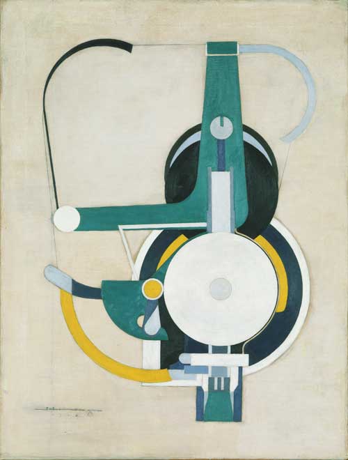
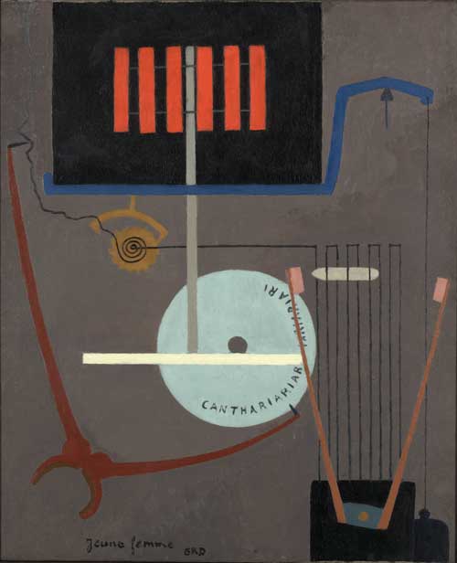
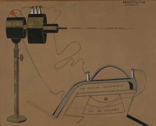
But the question of anonymity of style is particularly pertinent to a work from the Dada period. In the exhibition there are a number of groupings that seem to address and toy with the viewer’s expectation of uniqueness or signature style. Thus three works in sequence that each appear to be works by Picabia, with the signature appearance of machine tooled forms and text.

YEAR-TAUBER-ARP-SCHAMBURG 1916

Well, no, perhaps a bit too tame and regular–this is by Painting, formerly Machine, (1916), by Morton Schamberg. So maybe this one is by Picabia,

YEAR-TAUBER-ARP-RIBEMONT-DESSAIGNES-1919

No, this is Young Woman,by Ribemont-Dessainges.

Finally, the sequence of this part of the installation ends with Picabia’s Prostitution Universel, 1916-17.

YEAR-TAUBER-ARP-PICABIA-1916-17

The question of anonymity versus signature style as it is articulated in these works and others in the exhibition is representative of the dual views of technology of that era, where critical awareness of the destructive aspects of modernity and dehumanizing aspects of industrialization in the Post World War I period was matched with a continued fetishization of machine forms and technology innovations.

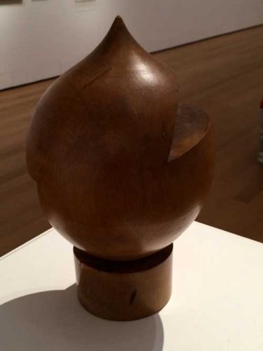
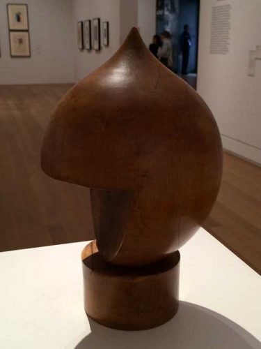
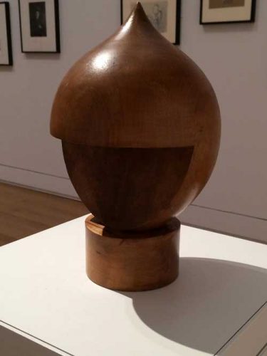
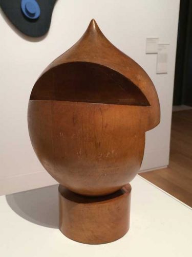
Returning to Taeuber-Arp’s sculpture: its size and shape are not identical to the functional objects that it recalls and the incisions that Taeuber-Arp has made into the shape serve no discernible human purpose of functionality or representation. Despite its nineteenth-century quaintness, the object has a bit of a science fiction quality to it, a depiction by some being of some being that is not human. The interventions into the form, the cuts at different angles creating completely different identities depending on one’s placement in relation to it, are what send the viewer into orbit around it: it is one of the most totally three dimensional objects I have encountered, because it is not just that it looks interesting from more than one vantage point, but that one is spun around it to try to experience and then re-experience these points of view. Yet, however much you try, you can never find yourself in exactly the same relation to it as you walk around it, so you must go round again.

Having taken the first picture (above) of my first view of the work, I took one other, having moved a few degrees to the east of it. The deeper cut at this longitude alters the cartoon head reference, and the finish of the incised planes of wood appear less golden, their surfaces are rougher as they cut into the grain of the wood.

YEAR-Tauber-Arp-IMG_6437

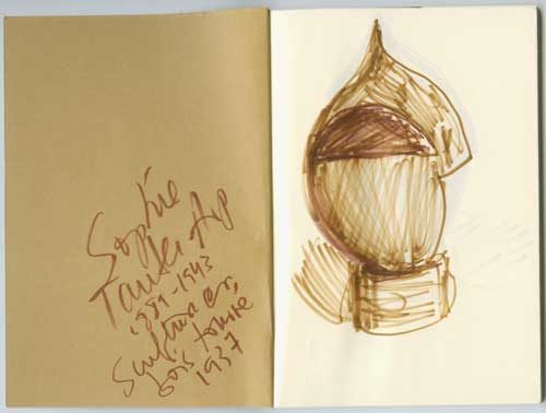
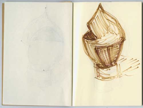
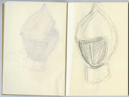
I decided that I should draw several views from my orbit because I always feel that drawing embeds an aesthetic experience in the body, but my juggling of colored pens and notebook caught the attention of a guard who helpfully brought over one of those ineffectual little pencil stubs that you use to take multiple choice tests.

YEAR-Tauber-Arp-Mira-sketch-1

YEAR-Tauber-Arp-Mira-sketch-2

YEAR-Tauber-Arp-Mira-sketch-3

Frustrated in my drawing trajectory, my reluctance at returning to photography seemed to influence my camera which could not return to the correct light but I continued my orbit around the work.

YEAR-Tauber-Arp-IMG_6442

YEAR-Tauber-Arp-IMG_6441

YEAR-Tauber-Arp-IMG_6440

YEAR-Tauber-Arp-IMG_6439

YEAR-Tauber-Arp-IMG_6437

YEAR-TAUBER-ARP-IMG_6436

An object that forces another entity into orbit around it has a force of gravity, it has a density of matter and content that can hold its own against the phantasmagoric multiplicity of art objects that swirl around us, it proposes the possibility of an antidote. And that is something to reckon with, even after one must regretfully leave the room.

Now that Kaspar is dead, as Jean Arp concludes his poem, “no-one to teach us monograms in the stairs/his bust will adorn all truly noble firesides but there is/no snuff & comfort for a dead head.”

*

The first post on A Year of Positive Thinking, “Looking for art to love in all the right places,” appeared April 28, 2010. This is a slightly belated anniversary post, after a long hiatus.

FacebooktwittermailFacebooktwittermail

Quick Responses, then and now

Hello again. A Year of Positive Thinking continues but the facts of everyday life are such that it has been impossible to find time to see much art or sit down for a day to address for this site any issues of concern to me. That is a condition of everyday life which I suspect is shared by many in one way or another. But here are a couple of image/text pieces, one from 1994, the other a drawing done this week after the most recent school massacre and the public reactions to it on the part of some politicians.

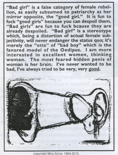
Hyperallergic included the following text and image in its Sunday October 4 Required Reading section . They picked it up from a October 3 post of this statement and image on Facebook:

With regards to there being bad boy, bad-ass women artists, I created this image in 1994 for How many ‘bad’ feminists does it take to change a lightbulb? a publication by Laura Cottingham (the back of the magazine has text in a small triangle: “It’s not funny”). I continue to be interested in the category of excellent women.

EXCELLENT WOMEN 1994-2015

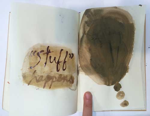
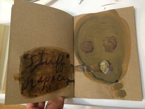
Then yesterday, struggling with the first cold of the season, directly caused by my work schedule’s interaction with the Achilles heel of my immune system (evidently I can’t get up early two days in a row much less also tromp around the city in a freezing cold rain storm without getting sick), I nevertheless had to do some drawings to express my rage at Jeb Bush’s response to the most recent mass shooting–“stuff happens.” Indeed his family has inflicted a lot of …”stuff”… on this country and the world.

I started with this sketch, held down for the picture with my middle finger for emphasis:

YEAR-STUFF-HAPPENS-IMG_1405

But it wasn’t quite “stuffy” enough if you know what I mean.

Luckily I have a “stuff” colored sketchbook I got in Berlin last spring:

YEAR-STUFF-HAPPENS-IMG_1407

I loved the response of a friend to this second notebook drawing: “like you pulled it out of your guts – told a friend it looks like the walking dead jeb vomited up his own shit for the world to see.”

That’s about right, but did the world see it?

FacebooktwittermailFacebooktwittermail

Orson and Edwin and other pleasures

As we enter the dog days of August here’s a little recap of some pleasures from the past few months that have stuck with me and that I’d love to share.

1.

This year is Orson Welles‘ centenary and in May Turner Classic Movies ran a weekly festival of Welles’ films. I have seen almost all of them, multiple times in most cases, benefiting in my youth from the proximity of the New Yorker Cinema on the Upper West Side. Peter Bogdanovich ran a festival of Welles there sometimes in the late 60s I think, with interesting mimeographed handouts for each film: Welles’ repertory theater, the Mercury Theatre players, the crazy plots and over the top or sloppy acting of films like Mr. Arkadin, the exaggerated post-War middle European displaced persons camp atmosphere, the camera shots and pacing, all of it is part of my artistic bedrock. So I was intrigued when late at night, May 27 after midnight I think, TCM ran the restored footage of Welles’ first venture into film, Too Much Johnson, a silent movie meant to be used as vignette interludes within a play, a film project I had never heard of. In typical Welles fashion, the 10 reels of 35mm film disappeared and were said by Welles to have burned in a fire until they were rediscovered in a film warehouse in Italy  a few years ago and now have been restored. An introductory text by film historian Scott Simon can be found here; a long informative text on this film by Welles scholar Joseph McBride can be found here, and there are a number of versions of the film available online including the total footage here, and a reconstruction based on archival research of how the footage was intended to be used as part of a theater production here.

The minute the film started I knew I was a goner in terms of anything like a semi-reasonable bedtime since it ran into the middle of the night but I was captivated by the film and drawn into it also by the dreamy contemporary film score. Since the film is already anachronistic in its homage to silent film, it is interesting to have it also be anachronistic forward with a Philip Glass/Steve Reich like repetitive score. Unfortunately the versions available online have a piano based film score that is very much a pastiche of silent movie music accompaniment one is familiar with, which is serviceable but not distinctive. However one film clip on TCM does have the new score and is also an excellent glimpse of what makes the film so captivating: here is a link to the clip.

The film is a pastiche of the silent movies that Welles saw as a child, Buster Keaton, Harold Lloyd, Charlie Chaplin, with a deadpan hero contrasted by exaggerated stock theater pantomime acting (among many registers of acting in the ensemble cast), brisk and often surrealistic narratives, and palpably fake sets. It happens that I saw these movies as a child too, since my mother often took me to see silent comedies at MoMA.

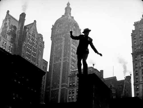
In the early part of the film the lead character “Johnson” played by a debonair and fearlessly acrobatic Joseph Cotten is pursued through the streets and across the rooftops of Lower Manhattan by a jealous husband. At first the locations seem somehow staged, fake, but gradually you realize you’re looking at the Woolworth Building and at the Meatpacking district and around the Highline, when it was a functional entity (it was built in 1934), sometimes completely empty, other times populated by regular people watching the goings on with amusement.

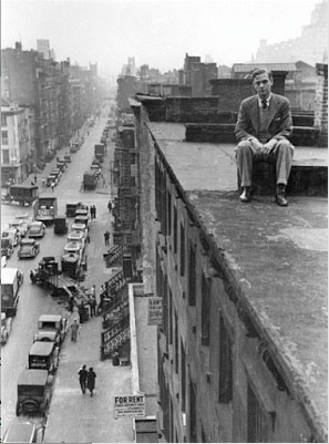
Minutes into the film I was struck, in fact I was kind of thunderstruck by the resemblance between the settings and the plain yet daring black and white cinematography in the film and the photographs from the same time period by Rudy Burckhardt, who had arrived in New York in 1935.

Too Much Johnson, film still

Too Much Johnson, film still

EDWIN-DENBY

In fact I was so thunderstruck by the connection I felt between this film and Burckhardt’s work that I abandoned the film to rush to my computer to research the relationship. The time frame and location was identical, and the New York avant-garde art, film, and theater worlds were relatively small compared to now so it was entirely plausible that Orson Welles and Rudy Burckhardt knew each other. They were very close in age and very young in the late 1930s, Burckhardt born April 6, 1914, Welles May 6, 1915. Not that every very talented person around the same age knows each other even in the smallest community. Still, there was something.

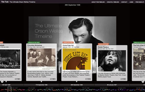
But instinctively I made a leap from the idea of Googling “Orson Welles Rudy Burckhardt” to instead Googling “Orson Welles Edwin Denby,” that is, Burckhardt’s close friend, the poet and dance critic Edwin Denby, and bingo!!: in 1936 Welles and Denby  collaborated on the Federal Theater Project production of “Horse Eats Hat,”(see here the picture of Edwin Denby as either the front or back end of the horse), a farce by French writer Eugene Labiche, staring Joseph Cotten. “Too Much Johnson” was a 1894 play by actor director William Gillette, based on another late 19th century French farce.

Orson-and-Edwin-timeline

from the absolutely awe inspiring timeline of Welles’ incredible career http://www.tiki-toki.com/timeline/entry/307013/The-Ultimate-Orson-Welles-Timeline/#vars!date=1912-05-14_22:05:02! just the first decade of his work is protean, fascinating, and important historically and artistically

Too Much Johnson includes wonderful set pieces such as a rooftop chase seen in the clip above, a chase through a maze of fruit packing cases, and a subsequent sequence with Magrittean bowler hats that shares the anarchic energy of Surrealist films such as Louis Buñuel’s 1930 film, L’Age d’Or. The acting is both parodic of early silent film and late 19th century theatrical melodrama, and ineffably hip and of the moment not just in the specific sense of the late 1930s but beyond that the kind of permanent “of the momentness” of any good work done with a youthful carefree improvisational spirit that remains young throughout time. The acting and directorial style at times veer into a stylized version of amateurish verve, when you get talented people who are game to do anything including things not in their area of expertise, harkening back to domestic amateur theatrical productions as described in Jane Austen and Louisa May Alcott novels among others, and yet a highly developed artistic instinct and discipline of composition, timing, and order prevail at the same time. In this, Too Much Johnson again reminded me of Edwin Denby and Rudy Buckhardt, in such film collaborations as Money, a 1968 film by Rudy Burckhardt (which I wrote about here).

Postscript August 2: All along I could have called Rudy Burckhardt’s wife Yvonne Jacquette or his son Jacob Burckhardt to ask about the Orson/Rudy connection. When Jacob saw this post last night he wrote me that around the same time as Welles was making Too Much Johnson, Rudy made a movie called Seeing the World Part One: a visit to New York N.Y., in which Virginia Welles appears, with a now lost film score by composer and author Paul Bowles (I forgot to mention that originally Too Much Johnson was to have a score by Bowles, also now lost). In it, according to Jacob, “There is also a scene in a dark saloon, where two gangsters sit across the table from each other. One of them, played by Edwin, pulls a gun on the other. The other played by Joseph Cotten, pushes the gun aside and knocks him down (Cotten had recently had his first starring role in Welles and Denby’s “Horse Eats Hat”). Rudy told me that the scene was originally supposed to be between Orson and Joseph, but since Orson didn’t show up, Edwin stood in.” Which answers more than the limited question of whether Orson knew Rudy and his work: they did know each other. More, it turns out that for at least a brief moment they were both in their early twenties and very talented in New York at the same time, with shared friends and shared collaborators, interested and cross-influenced by similar histories–a vivid example of how art comes out of fertile communities where worldly success may arrive for different figures at different times in different ways, or not at all, but where everyone is essential to the mix in an unmarked way which is hard to replicate and which is obscured by celebrity culture.

2.

In working in the mode of silent film, Welles was looking back to his own childhood experiences with silent film as film, that is, as what film was when he was a child and he was emulating the sui generis pioneer actor/director geniuses of that time period, Harold Lloyd, to whom the rooftop chase scene is indebted, Buster Keaton, and Charlie Chaplin.

Which leads me to another wonderful film viewing experience from earlier this winter which I highly recommend: The Chaplin Puzzle, a 1992 documentary film which follows Charlie Chaplin’s early development, his artistic evolution during his first two years in Hollywood, in his Keystone and Essanay period, from 1914 to 1916. It is a fascinating view of how an artist creates himself and refines his craft. I was particularly interested in relation to my experience of young artists today working in video who often do one simple thing and then ponder it for months, or young filmmakers who struggle with fundraising even for small projects they film on iPhones and produce themselves: during this period Chaplin turned out about one film a week and was able to gauge the success of his character from audience reaction while learning for himself what worked in film formally and technically.

3.

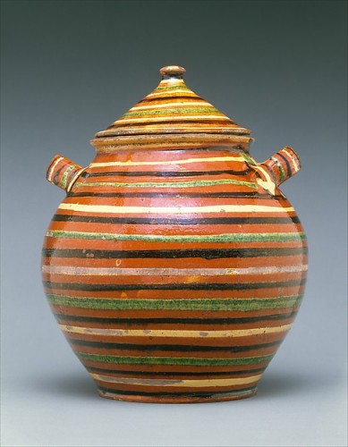
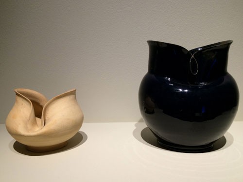
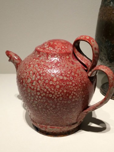
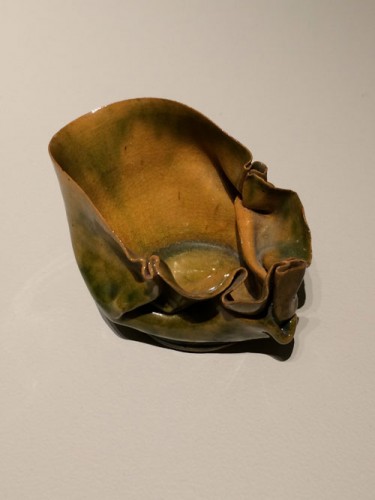
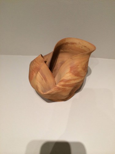
Finally I want to encourage anyone who’s in New York this summer to see George Ohr Pottery: “No Two Alike,” which is at Craig F. Starr Gallery through August 14. I have a particular soft spot for pottery, it brings together materiality and color, qualities I appreciate in painting: that something is a thing and yet  can glow with color. I often visit the American Wing at the Metropolitan to look at their installation of early American pottery; just give me an early American earthware pot pot with slip decorated in earth tones and it’s like a ray of sunshine.

Sugar Pot, American, c. 1820-1840, earthenware with slip decoration, Coll. Metropolitan Museum, American Wing

Sugar Pot, American, c. 1820-1840, earthenware with slip decoration, Coll. Metropolitan Museum, American Wing

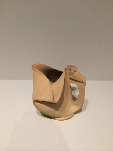
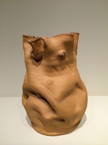
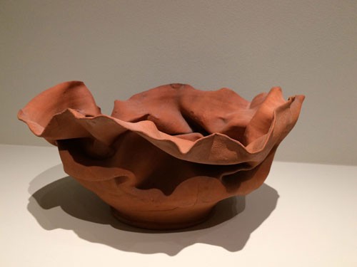
The George Ohr exhibition is a wonderfully curated show, which contrasts unglazed works by the American ceramic artist of the post Civil War / early 20th century period with some of his more finished glazed works, the front room containing the raw clay works, the back room with a spectacular installation of glazed works, with one juxtaposition of each kind in the middle office space creating a bridge between the two parts of the exhibition. The pieces range from works that fit into established forms of art pottery of the period to works that are experimental, immediate, delicate, modern in their formlessness.

Ohr-1

Ohr-5

Ohr-6

Ohr-7

Except for these two pieces juxtaposed on a little shelf in the middle room, to compare the effect of the unglazed and the glazed you have to run back and forth between the rooms, or, rather, walk quietly given the fragility of the objects, and it hard to chose–a contemporary aesthetic tips one towards the unglazed, but for me the gleam of a colored glaze is kind of divine, pleasurable and unknowable at the time.

Ohr-10

Ohr-9

Ohr-11

*

On another positive note, I was recently interviewed by Berlin-based curator, art critic, and educator An Paenhuysen about A Year of Positive Thinking. I responded to four questions, about the art scene I might belong to, about the blog itself, about my background, and about money–whether or how I monetize the blog, directly or indirectly–always an important question. The interview appears here.

FacebooktwittermailFacebooktwittermail

“Creatives”–A Facebook conversation

A word enters the culture and as its usage widens, its ideological meaning become clearer. The usage of the terms “creative” retroactively applied to a 1970s situation made me post a statement on Facebook which clearly struck a chord in my Facebook community. The conversation this provoked I think is worth sharing here, something I have done a couple of times on A Year of Positive Thinking. I have edited the thread but not the comments. The conversation is ongoing.

I’m concerned that the term creative, used sometimes as a noun, “creatives,” is seeping out of trendy promotional text about young “creatives” moving into new neighborhoods etc and into mainstream art text. Instead of artists, you have “creatives”–it’s similar to the distinction between being considered “artistic” in high school and actually being an artist but now transformed into a marketing category of dubious character.

Carl Ostendarp: I feel the same way, Mira– I’m not sure this is at all helpful or fully thought through, but I’ve been thinking that this new usage is predicated on the notion of creativity as a problem-solving activity, (maybe somewhere between design and the expanded definition of curating)–and I think of art-making as problem finding.–come to think of it, I think this may relate in some way to your earlier post with the Joan Brown interview about distinctions between art as research and as a process involving praxis.

MS: Carl, that is a very good way of describing the distinction between terms and identities. It’s a word used to create a marketing demographic and there is a techno design curating orientation, with a debased concept of curating.

Millie Wilson: and what a phony word! creatives are “trending” which is another word that functions similarly.

MS: My post was prompted by the retrofitting of the term in a description of the downtown art world of the 70s as the “1970s downtown creative scene.”

Michael Waugh: Not only that but the blurring has the effect of subsuming all creative activity into a corporate rubric. The critical stance that distinguishes art is effectively negated by the category “creatives.”

Stefany Benson: I’ve heard the term “makers” used also to be inclusive of all the people who pursue creative endeavors like inventors and even product designers. ??

MS: exactly Michael! that’s why it grates so much. Yeah and “makers”–that’s more complex for me because “making” , in scare quotes, denotes the kind of art that is thought to be less intellectually valid than certain types of art associated with research as an institutional art type, but too long to go into that, I mentioned in another post today a book I’m reading called Troubling Research which is is quite interesting in that regard. So “makers” is in scare quotes in the art world, but fits in with “creatives” as a corporate trending group.

Dm Simons: It is about marketing, advertising, a straddling trigger that encompasses market strategies—similar to the use of “properties”, as a ball-of-wax term for artists and art work.

Cassandra Langer: Not sure exactly what disturbs you about the term. Many 50 something and under use it to distinguish themselves and their activities as other than a 9 to 5 job(although now that designation seems obsolete). Like the term queer it may take a little getting use to and refining. To be an artist and live that life is something specific that could fall under creatives in their minds if not an older generations. Mira are we dating ourselves as language grows changes and adapts?

Eric T. Banks: Cassandra, The term “creatives” tends to lump in all artistic enterprise whether done for true artistic purposes (i.e. search for meaning) or any other thing from set design to interior decorating. I very much see Mira’s point here and am irked by it as well. If it is a “generational” thing as you infer than it should be a learning moment for one older and wiser to illuminate those younger and hipper to the distinction. Soon they’ll go back to “artsy.”

Andrei Molotiu: “Creatives” is a term to flatter TEDx attendees

Carol Bruns: “creatives” is used by business to borrow prestige from artists. if artwriters call artists “creatives” they are lumping them with advertising people and commercial enterprises.

Edward Winkleman: I’ve taken to using it when discussing people who want to pursue a career for which the paying jobs are extremely rare (writers, dancers, actors, artists [which for me always connotes visual artist], musicians, etc.). I see your point, but would welcome an alternative.

Tom Knechtel: I’ve felt that it has a disturbing undertow of Alphas versus Deltas. Besides, it’s just sloppy. Some of the people using the term are the least creative people imaginable.

MS: Edward I think your question answers itself: being a writer, a dancer, an actor, a visual artist, a musician, a designer, are designations of what a person does well and is committed to, whether or not they get paying jobs for these practices. Those are the alternative terms: I’m a painter, an artist, a writer, an actor, a playwright. People sometimes engage in more than one type of art practice, but that’s different. “Creatives” suggests a conformist, marketable type of pseudo-nonconformism. It replaces dilettantism, which was generally derogatory and wasn’t as much of a commodity. Of course some people who might be lumped in this new category are actually serious artists in a specific field and will outlast this terminology.

Tom I was thinking of Brave New World just this morning, if not exactly on this track. I was thinking of my mother’s politically prescient and astute statement to me, in her 90s, watching the nightly news: “so in America soon it will be the corporations and the slaves.” Maybe “creatives” are the attractive end of the wedge.

Joanne Mattera: Shiver

Nancy Evans: creativity is not confined to artists, but artists do have special problems and needs that make it irresponsible to group all “creatives” together … plus I think they mean by “creatives” smart computer programmers.

Heide Fasnacht: It is indeed a marketing category but not dubious. In Detroit, for example, it is used to describe young entrepreneurs coming in to “rescue” the city. They are misguided in believing in “solutionism”. Typically, they are not artists. I believe they are very cynical.

Henry Bogle: I have no problem with the term. ‘Artist’ also has issues with presumption, generalization, and contextualization in the postindustrial/digital era.

Kristina Newhouse: Imagine how we curators feel now that everyone is a curator. The circular game of patting oneself on the back is now made complete. Everybody is a creative AND a curator.

Lori Ortiz: Creative (noun) used to be the term for those in advertising responsible for writing ad copy, coming up with the campaign ideas ( think Don Draper) as well as those who penned or penciled the accompanying ‘art.’

Sam Erenberg: Mira, you use the term “practice,” which bothers me as much as the term “creatives” bothers you. Twenty years ago, we ascribed the former to law and medicine. “Practicing” the violin does not make one a “creative” musician.

MS: Sam it’s true! Yet another case of terminology creep. I do use “practice” and probably other words I used to find annoying, and I will probably use “creatives” but I think always in scare quotes.

Scott Davis: Last year someone on Facebook pointed me to the origin of “Creative” as a demographic designation. …I was shocked to see that “Creatives” did not necessarily refer to artists at all. “The creative class includes people who work in science and technology, business and management, arts, culture, media and entertainment, law, and healthcare professions.”

Eve Andrée Laramée: To my way of thinking and observing, the term “creatives” connotes gentrification and marketing of objects and space (consumer products and real estate.) It can also suggest a luxury class of those who have the leisure time (and possibly family money) to “be creative” rather than be a laborer and/or wage-earner. Sometimes it is used to describe opportunistic “entrepreneurs” or “developers” that can be parasitical to the artists and makers of culture. The term “maker” may be a an updated version for “inventor” – to replace terms such as crafts-person, or tinkerer (in the best sense of tinkering…I consider tinkerers geniuses!)

Steve Locke: …It’s the language of neo-liberalism slithering into art.

Jenny Dubnau: Oh god do I ever agree. It is also the coded language of gentrification: “creatives” always pay more rent than artists.

Julian Jackson: Plus it turns everyone else into non creatives? Enough divisiveness as there is.

Noah Becker: it’s a term used in real estate to describe artists during the gentrification of neighborhoods.

Dooley La Capellaine: I worked as a “New Media”consultant on Wall Street and was really nauseated by this term of expression. They blew the bubble and Ihave survived the “creatives” nonsense.

Susan Silton: I think “creatives” originally derives mainly from advertising, i.e., the distinction made between those responsible for coming up with campaigns (copywriters, art directors) and account managers. There have always been simultaneous artworlds, but now cultural production has proliferated because of the ease of technology, and art has increasingly been packagedlike advertising (not to mention commodified.

Richard Kooyman: Like many neoliberal constructs the use of the word appears genuine and practical but has an underlying political purpose. It wasn’t Richard Florida who originally thought up the concept but actually Charles Leadbetter who wrote much of the neoliberal ideas behind Tony Blair’s New Labor Policies. They invented a way for government to be held less socially responsible by declaring everyone a creative individual and everything a potential market. The problem isn’t just that it’s a lazy term. The problem is that it turns the intrinsic value of Art into just another market.

Camille Eskell: The thrust in education now is being a “problem-solver” to think in creative ways because they do not know what the job situation is going to look like in the years to come for young people now. Students are to tackle “read – world problems” in the classroom so they can be better equipped for the future. Ironically, the push is for STEM (science, technology, engineering and math) in stead of STEAM which includes the arts. Interesting that the progenitors of this idea of being creative left out those who are essentially creative. Art is still very much misunderstood by the linear – thinkers in education (and the outer world); most think it is child’s play and do not have the foggiest notion that a true thinker and creative person uses all of themselves, sequential and holistic approaches and applies the practical and the sensory, the intellectual and the emotional in one fell swoop. Plus I think the term “creatives” is appealing to the young who will soon become the work force and ever greater consumers.

Nancy Buchanan: I recommend looking at Martha Rosler’s analysis of Florida’s ideology. The transformation of almost everything into a commodity, and everyone into an entrepreneur seems to be related to the softening or substitution of many terms. Like “gallerist” for “dealer” (dealer being, in my opinion, the more honest descriptor). And–who is happy about being part of the problem (e.g., the “Creative Class” speeding gentrification & displacement)?

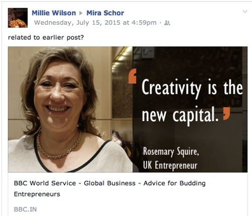
Creatives-screen-grab

And capital for Capital, not necessarily for  “creatives.”

Thanks to Millie Wilson for posting this image (and link). Thanks to all of those who participated in this conversation thread and did not object when I asked if I could transfer it here.


FacebooktwittermailFacebooktwittermail