We live in a world where emojis are shortcuts that represent things, places, events, and emotions, but where only a limited range of emojis are available to users of mainstream social media who are invited to respond to posts on whatever the platform. When I started writing this piece about the political and psychological meaning of emojis available for reaction to Facebook posts, I discovered that, as I use Microsoft Word, which I get through my academic employer, as such I’m not allowed such add-ins in my text. As someone who teaches an MFA Thesis writing class, I can see how emojis would be seen as frivolous (and not worth paying extra for—I assume) when you require students to write clear, expository, discursive, professional text. Even as visual artists they are asked to write in a manner which, if individualized and hybrid (academic /non-academic) retains adherence to some professional standards even though such standards may be in increasing contrast to the way most young people communicate with each other, via texts, memes, and Tik Tok videos relying on ironic use of music clips and fanciful use of emojis for accent.
Since trump first began his occupation of the Oval Office in January 2017–I have never capitalized his last name and I never referred to him as President of the United States, nor even as the (now former) occupant of the White House but as the occupier, given that his share of the popular vote was so significantly lower than that of his opponent and that he was impeachable at the Oath, because as we incontrovertively know after January 6 and in the era of the Big Lie, he never had any intention of preserving, protecting or defending the Constitution of the United States—anyway…since 2017, I have been determined to never use the “Crying Face” emoji which is one of the seven reaction emojis provided by Facebook. Other social media platforms like Twitter and Instagram offer even less choice, it is “heart” or nothing.
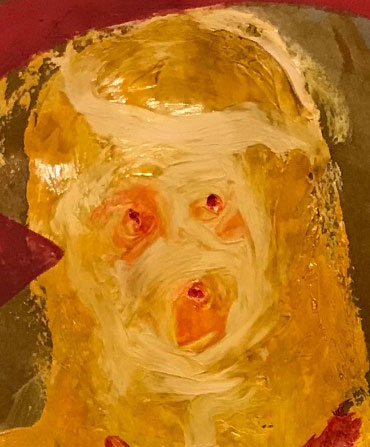
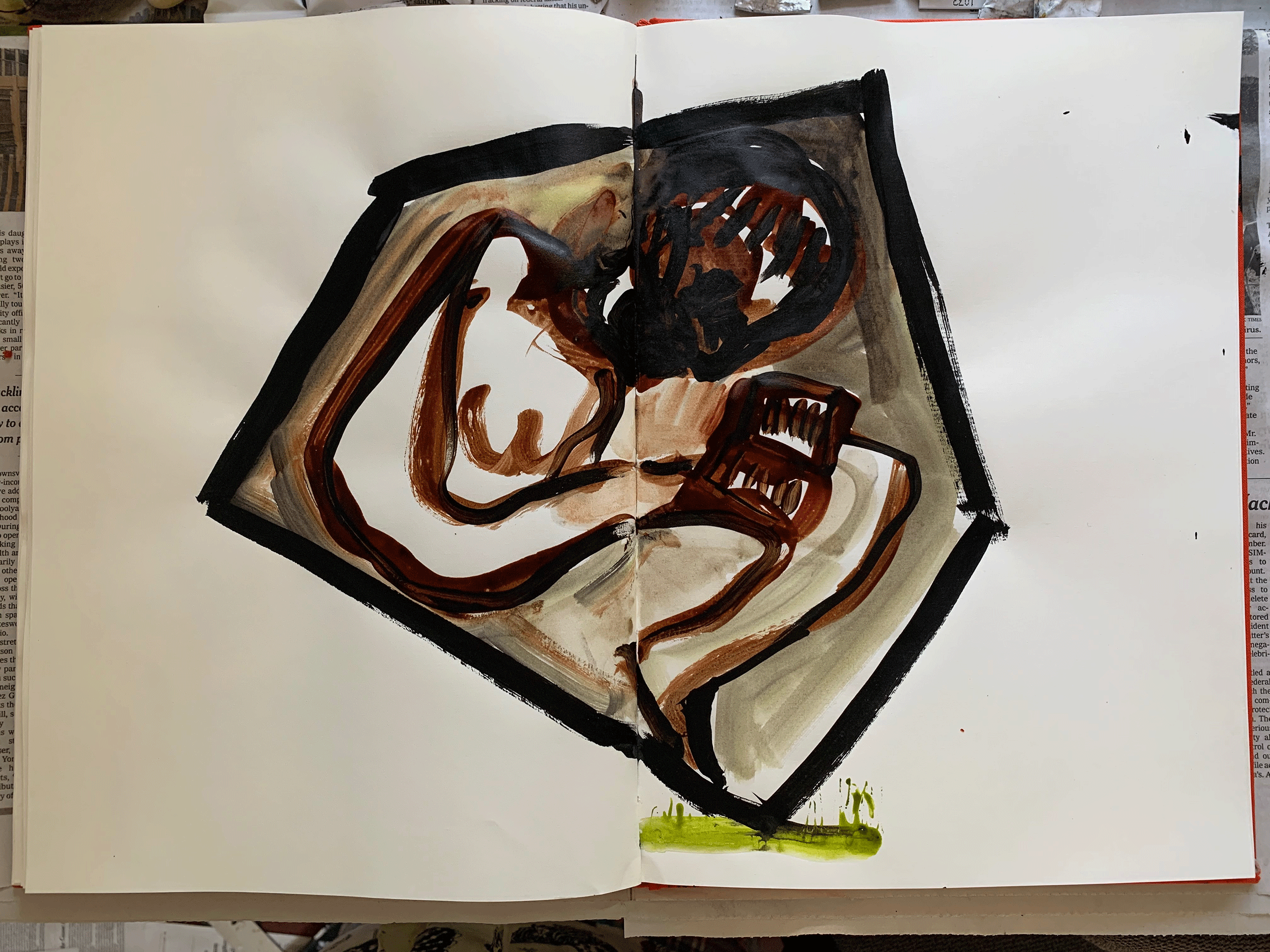
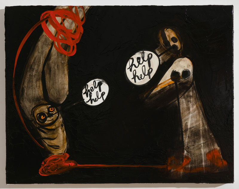
as in emoji of dictator’s face melting into a rotting puddle of suet
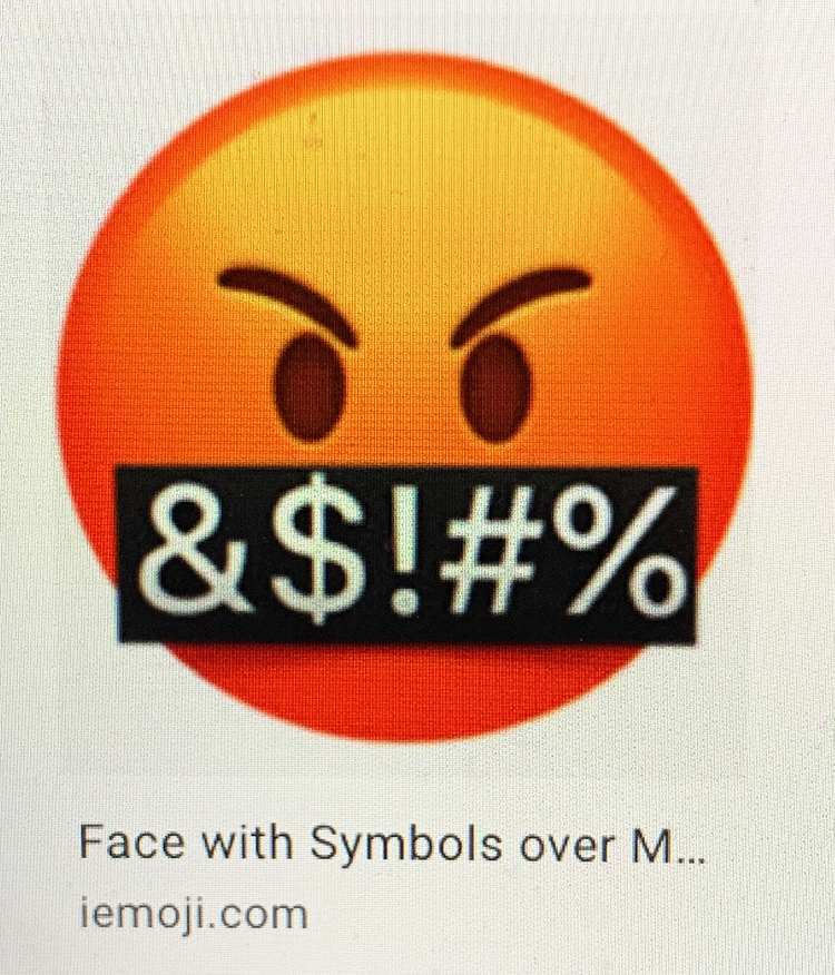
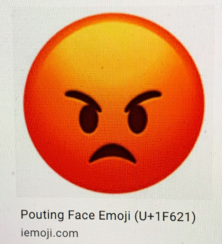
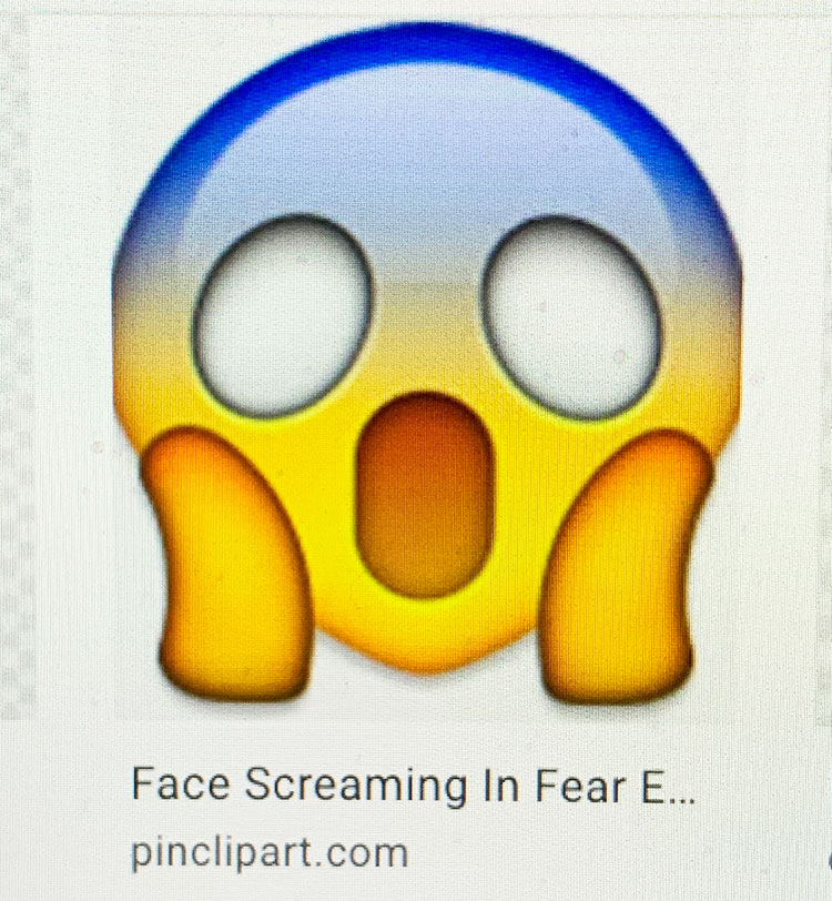
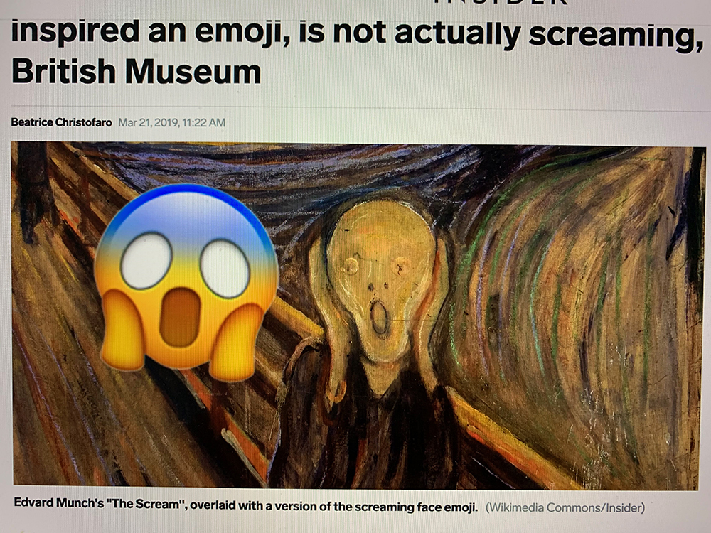
I have forced myself to always opt for “pouting face” because it is angry and orange but I would prefer “face with symbols over Mouth” which also is orange but has unprintable language across the mouth or, if Facebook offered it, and colored it orange, the emoji color of anger and rage, and by the way the color of trump’s face, I might use the hands framing the face Munch Scream-inspired “face screaming in fear” emoji.
The main thing is I was resolved to never use the “Crying Face” emoji as a response to the totalitarian actions of trump or to the actions his regime took that constitute crimes against humanity or to the more and more brutal evidence that a new breed of fascist storm-troopers are taking over not just this country but much of the world—because it seemed so defeatist. As the most tiny and utterly inconsequential of political gestures, I refused to enact or figure or symbolize defeat and when people respond to my frequently angry and also alarmists posts by clicking the “Crying Face,” I am annoyed. No, no. Be outraged, be angry.
Recently friends and I were jokingly comparing notes on which one of us was more of a pessimist. Apparently I fell in the middle of the three of us, with one friend maintaining that in being a pessimist you are most often proved right. In a conversation with a younger artist the spring of 2020, just a couple of weeks before the pandemic shut down the city, as we discussed all the terrible things we are living with and looking forward to, he said he was trying to be an optimist. No, no, I said, be a pessimist–and an activist: pessimist because in a crisis it seems better to be mentally prepared for what the worst might be and the fact that the worst may likely happen, but also activist because one has to try to fight back, there is no other option.
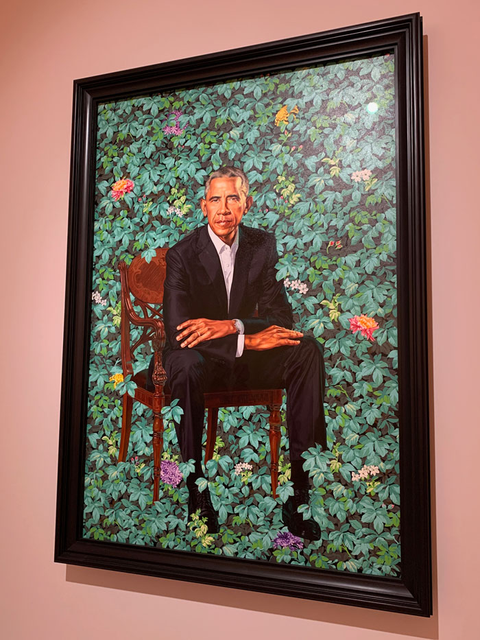
It is true that there is a kind of optimist who can visualize the worst, face it, refuse to submit to it, and also see and believe in activism and a better future. Rep. John Lewis was that kind of man, he seems to have been deeply optimistic, though also deeply realistic. Or was he deeply realistic but stubbornly and actively optimistic? At his funeral, his Chief of Staff Jamila Thompson said of him, “he was both human and divine.” I’ve NEVER heard that said about anyone in public life in America, except perhaps Abraham Lincoln. Most of us are just human and at best struggle to be a good person and a good citizen.
But my tiny bit of symbolic resistance is not much evidence of good citizenship, in fact it epitomizes the apolitical isolation of our era, but given the limited choices of response on Facebook, my tiny bit of resistance has been to choose anger as at least a limited symbolic visualization of non-acceptance of the status quo. I didn’t know the name for this frowning orange face is “pouting face,” that name is condescending. If you are bright orange with rage you are not pouting. Trump pouts, he’s a baby. I’m enraged and I’m terrified. We need a combination of “face screaming with fear” and “face with symbols on mouth.”
Since the pandemic altered socialized life on earth placing us in the weird purgatory we are now in, masked so we can’t even express emotion, project empathy, or solicit sympathy via our faces, my ability to hold the fort on symbolic anger is increasingly eroded. This week of December 2021 we saw proof positive that the long long carefully waged battle against a country that would at least try to represent something more than the rights of the very few and privileged, as voting rights and women’s rights to the autonomy of their own bodies are nearly erased in many states and white supremacists oligarchical minority party rule is upon us, I feel my internal wall of outrage weakening further under the flood of tears of mourning and of fear. I hover over “Crying face.” But I can still stop and think, NO. Must fight back.

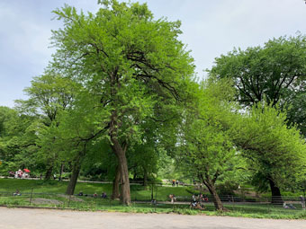
And yet. Sometime during the second part of the pandemic I was shopping in a big supermarket outside of NY. Though everyone was still wearing masks as required, some of the store’s messaging from earlier in the pandemic, about mask wearing and limits on store capacity, has been toned down, while shelves still were empty here and there of basic products. The parking lot was empty relative to the beforetimes. At what would normally been the busiest part of the vacation destination community’s year, there was a sense of desertion. An emotion overtook me which took some time to name—it was, I finally recognized, mourning, a deep deep sense of mourning.
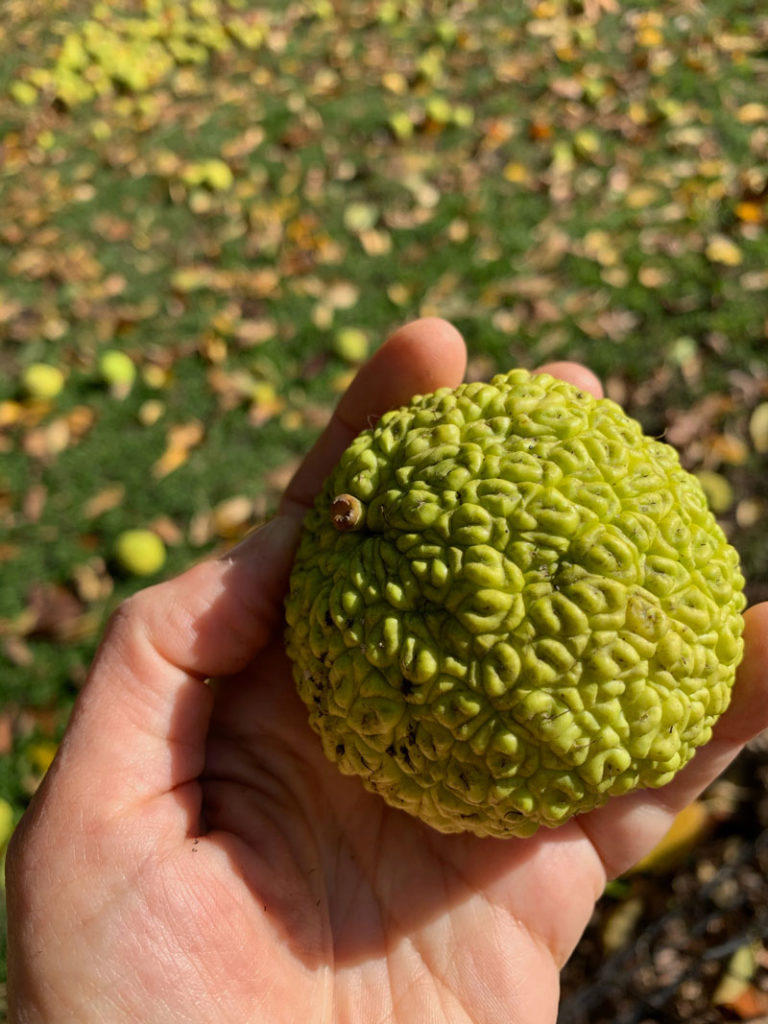
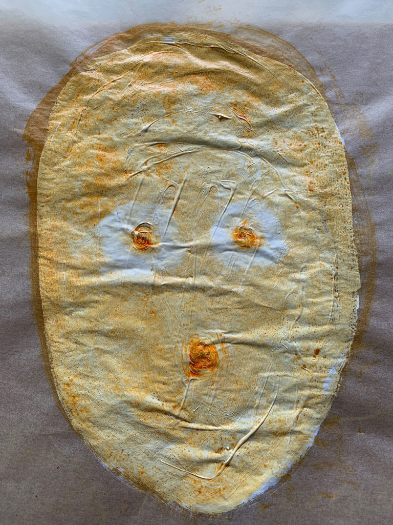
Weeping face emoji.
One day last summer, I thought, maybe it’s a privilege to have lived long enough to witness the beginning of the end of life on earth.
Weeping Face emoji
Must fight back.
*
ps. I wrote much of this text and created most of the images in August 2020, but today felt like the day to finalize and publish it, and only after I had hit publish and sat down belatedly to read today’s Sunday New York Times, did I see this short piece about the most popular emojis of 2021. Apparently “tears of rage tears of grief” are not at the top.