There are lots of surprises in life:
Best wishes to my readers for a surprisingly Positive and Happy New Year!
& Look forward to some new posts in a new Year of Positive Thinking
Warm wishes,
Mira Schor
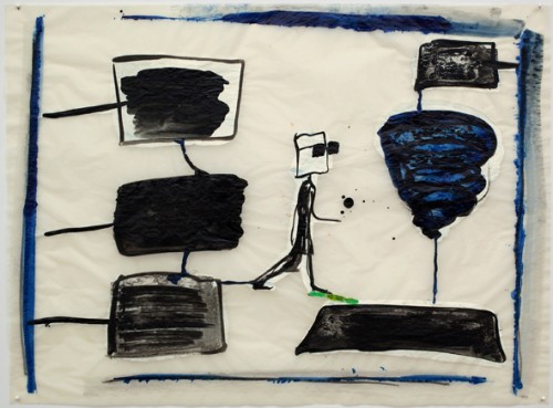
Mira Schor, drawing, 2009

There are lots of surprises in life:

Best wishes to my readers for a surprisingly Positive and Happy New Year!
& Look forward to some new posts in a new Year of Positive Thinking
Warm wishes,
Mira Schor
Mira Schor, drawing, 2009
This blog post …what can I say? The stated goal of A Year of Positive Thinking was to write about art I love, and I love Frank Moore’s work, both the later paintings, on view in the exhibition Toxic Beauty: The Art of Frank Moore at Grey Art Gallery through December 8 and the marvelous early film Beehive which is on view at Fales Library at New York University’s Bobst Library, on the South side of Washington Square Park, on view only through Friday at 6. For some reason I was never able to pull together a sensible text about this work, so my apologies to my readers and to the work, but at this very late date, this is just to mark my admiration and urge anyone who can to go see both shows while you can. Moore’s paintings, which if they were paintings by Hieronymous Bosch or Frida Kahlo would be considered treasured masterpieces, are mostly in private collections and thus out of public view, and I hope there are ways of seeing Beehive again, it’s just joyful and great!
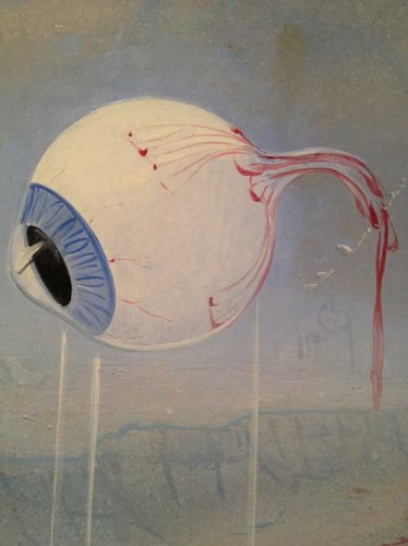
Frank Moore, detail, Wizard
This often seems like it’s a difficult moment in which to theorize painting. Or, rather, in the face of the temptations of and support for other media and methods of being an artist, young artists may still retain a longing for painting, but it is difficult to find material in support of their longing on two crucial fronts: contemporary theorization of painting, which is essential in an era in which linguistic validation is often more important than viewing artworks, and contemporary painting itself. Of course both exist: there have been significant attempts to move painting theory away from ideas still steeped in modernist discourses so that it can be seen as responsive to and participatory in the specificities of contemporary communications and there is a lot of contemporary painting including both work that is extremely successful in the art market and work which is seen to engage with more radical thought. However on any given week in which you can take students around to galleries or museums, there is no guarantee you will come across paintings that successfully enough make the dual case for painting as a practice able to address contemporary cultural issues while addressing its own medium and history.
That the narrative of the death of painting is still ongoing should be evidence at the very least of painting remaining a naggingly persistent ghost, or not even a ghost but a kind of zombie entity, not quite dead enough to go completely unmentioned. It continues to appear if only as a negative, as something that cannot be done—when a student of mine related to me what another student had told her about why painting was no longer a viable medium because it is too burdened by its history etc.. in the spirit of nihilistic humor, I took notes. At one point last spring it occurred to me to write a series of essays on the theme of When Exactly Did Painting Die? Not exactly a murder mystery, you see, not a Whodunit but rather a What Was the Time of Death mystery, or, maybe, When Was the Victim Last Seen Alive? mystery. This avenue of thought, or rather this umpteenth version of the life or death of painting argument first occurred to me as I entered the more sedate and serene uptown branch of the Armory exhibition last year, the one that is actually in the old Park Avenue Armory, and in the calm uncrowded atmosphere, from the doorway I spotted a really good late Philip Guston painting of a big fat head smoking a cigar. Well, I thought, here is evidence that painting was still alive in 1977.
You can bring the date up closer, depending on your individual taste. And of course I paint and I don’t see myself as a necrophiliac.
This is all by way of a long introduction to look at the work of an artist who instead of accepting the narrative of the death of painting, turned from performance/video to painting when the subject turned from life to death. I would be remiss if I didn’t mark in this blog the very inspiring show of Frank Moore’s work, Toxic Beauty, at the Grey Art Gallery and at the Fales Library at New York University’s Bobst Library, before it closes on December 8. Better to be last to recommend this show than never, but I feel incredibly guilty that I haven’t written about the show since I first saw it in September, and that alas even now I won’t be able to do more than suggest a few ways of thinking about the work in both parts of the show. If A year of Positive Thinking is meant to be the space where I write about artwork I love, then this is the show, I love this work, I also think it is great, so I am mortified that even at this late date just before the show closes, this is still not a polished review or essay, just a few ways of thinking of the work in the two parts of the show and a few comments rather as if I was seeing the show with you and occasionally appearing at your elbow to point to something.
The show’s two locations each present one of these two orientations of Moore’s work. You are most likely to start at the Grey Art Gallery for reasons of accessibility from the street and location venue name, but then you will start at “the end,” with paintings Moore painted from 1985 to his death from AIDS in 2002, wherein he grapples with the face of fatal illness and the Death that ravaged a community of gay men in the ’80s and ’90s, the death of his lover, his own battle with death. Another theme of the paintings from this period is the death of a Nature ravaged by human intervention. If you start at Fales, with the earlier work, including video performance and dance, you will start with life, a joyful consideration of procreation and life. Yet to reverse the order of viewing is probably not such a good idea. Start with death, with painting as the best medium to express death. Then return to the artist’s earlier work and leave the exhibitions with life. You will be inspired by both and both media are well served by the order.
Frank Moore’s paintings are representational, figurative, with an overall approach of magic realism that places him in the general spectrum of Surrealism in a line from Hieronymous Bosch to Frida Kahlo, with a streak of folk art or regionalist art in some of the structural details including the handmade frames made specifically to develop the theme of each particular painting. Many of the paintings have ambitious narrative programs, addressing complex and highly emotionally charged subjects, in particular the countless painful and dramatic aspects of the personal, cultural and medical struggle to deal with AIDS before the development of relatively successful drug protocols. The paintings are executed mostly in a mixed technique of oil and silkscreen on linen or canvas, mounted on wood or some sort of board, very carefully painted, with extremely smooth surfaces, fine lines, and a great attention to detail. The craft of the execution is essential to point out because it is so important to see these works in person, they yield only a fraction of their impact or meaning when they are experienced only as images.
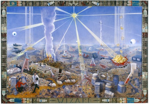
Frank Moore, Wizard, 1994, oil and silkscreen on canvas, mounted on wood, in artist’s frame (pharmaceuticals, resin, and aluminum), 68 x 95 1/2 inches–this is a large painting with exquisite surface and detail, and an awful reproduction here
If you look extremely carefully at the surface of one of his paintings, for example, “With this ring…” (200o), a large painting with a dominant flat pink background, you may pick up ever so slight traces of canvas weave, but for the most part the surface Moore has created with great thought and care is smooth so that he can use a horizontal pink stroke with a slight differentiation of dark to light where more pigment falls from the brush. The details, an index finger at the tip of which a tiny bride reaches out to a gold wedding ring dangling from the tip of a single octopus tentacle, a fly, a gigantic grasshopper, climbing the vertical strand of a double helix, are painted with tremendous attention and care for line. So, the evocative, slightly creepy subjects amidst the brilliant color, are not the only important elements of the work. As a painter, you need sable brushes, from large filberts to single hair, good quality paint for the beautifuly surface and color, and you need to have chosen to create the painting surface so that these marks can be created and catch the light and the eye just so. You have chosen this because you love this shine, this color, this level of detail, because they reach towards the uncanny, and because they help you create an homage to notable predecessors and inspirations, Frida Kahlo, Hieronymous Bosch, Dali , who also worked with smooth surface, fine line detail, rendering, and who carry the DNA of hallucinatory magic realist representation in the service of narrativity. I may have gotten the actual materials and tools wrong in my notes before the work, but I’m not wrong in drawing attention to the details of Moore’s craft: here are his comments about this painting’s fakture:
I use a relatively limited ranges of pigments–two blues (ultramarine, phthalo), three reds (alizarin crimson, cadmium red light, phthalo rose red), five yellows (cadmium lemon, medium and dark, hansa and diarylide), two greens (permanent green light and phthalo), dioxanine purple, titanium white and ivory black. NO earth colors–I prefer to start from a point of maximum color saturation. I find the final product is more brilliant and luminous. Occasionally I will use something else like manganese blue or cobalt.
I’m a brush addict. I buy them wherever I find them. I use unorthodox brushes such as masonry and roofing brushes, wire brushes, sticks and other plant material, sponges, textiles and quite often my hands, particularly my thumb, which, for example, is evident in the stippling on the tentacle in “With This Ring…”. The marks made by unconventional tools seem to lend the work a more natural feeling, which contrasts all the more strongly with the photo-mechanical reproduction techniques I also use in the work.

Moore, “With This Ring…”, detail
In the same interview, with Douglas Dreishpoon, reproduced in the show’s excellent catalogue, Moore also writes about the importance of drawing:
Drawing is critical. Drawing is melody. Drawing nurtures the thought, connects the mind to the page. All my images start in my mind as some kind of elusive paradox, oftentimes not even necessarily a visual one, but when I try to give it visual form it is usually with clumsy scribbles no one will ever—pure drawing.
Another thing I would point out if I were standing beside you, is that although the paintings are large in size and have such ambitious, political, narrative programs that are developed in many detailed vignettes best read from very up close up, Moore is masterful in his maneuvering of the viewer so that large abstract compositional elements and beautiful large areas of color draw you in until you are close enough that you begin to perceive the detail and be captured and captivated into an entirely different type of reading. This is the case in Oz for example, a painting I still remember seeing when it was first shown in New York City at Sperone Westwater Gallery. Oz (1999-2000) is a kind of encyclopedic landscape of catastrophic environmental mayhem, a genetically engineered beanstalk shoots up from a pot of gold coins while individual families relax, play golf or the piano, and lie on rubbish piles of their destroyed homes. The painting’s theme makes even more sense to me than when I first saw it when it was originally shown at Sperone and thought about how strange it was to have this intricate painting about genetically engineered corn. Today the damage wrought by genetically programmed agribusiness and the image of destroyed suburban life is much more part of our knowledge and image bank than it was even fifteen years ago, when it was made and when it seemed like a bit of an esoteric though unforgettable direction. Moore might have appreciated, in a dark way, the facts and the imagery of a recent story on NPR about how little natural life exists in an average Iowa cornfield as compared to plots of land in other areas of the world.
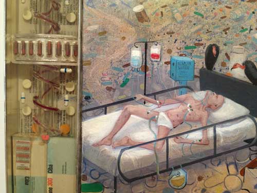
Many of the paintings deal directly with the trappings of illness, medications, IV lines, blood, cancerous lesions. In Patient (1997-1998) blood seeps from an open IV line onto a bed, which, painted an icy blue, seems to be a melting pool of ice water instead of a zone of comfort. In one detail you have the smooth blue precision of the sheets, painted bubbles of water or foam and silkscreened white snow fakes (thus actual patterns, not invented ones), there is no direct figuration, not necessary, but there’s as much about mortality and evanescence than if the leaking bleeding body in pain was present.

Frank Moore, Patient, 1997-98, oil and silkscreen on canvas mounted on wood, in artist’s frame (red pine) 49 1/2x 65 1/2 x3 1/2 inches, detail
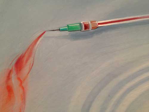
There was one painting of Moore’s that I particularly held in my memory since I first saw it at Sperone years ago, because it was so inventively expressive especially considering the simplicity and economy of its subject in comparison to the impressive larger works like Wizard.
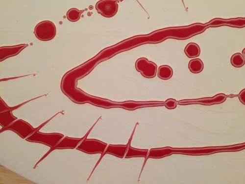
Blood seeps out of two slices into a loaf of bread and into the middle of a puddle of spilled heavy cream which has oozed out from an overturned cartoon. The red paint has been dropped into the pool of white paint to create a very careful Jackson Pollock in the shape of a Crown of Thorns. The Christ reference and the art reference are at the center of a still-life painting with an almost folk art sensibility: the dusting of flour on the loaf of bread is created with a kind of spray effect which is completely different in technical feel than the loaf, or the cream and blood spill. It’s a folk Zurbaran of the AIDS era.
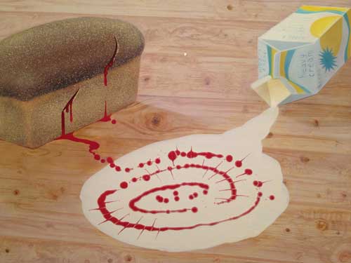
Frank Moore, Easter, 1994. Oil on canvas, 20 1/4 x 27 1/8 inches.
* At the Fales Collection, the works on view include some of Moore’s many sketch books and two filmed collaborative dance and theater and performances, The Miller’s Wife (1987) and Beehive (1985) along with the story board drawings for these. The Fales section of the show is only open on weekdays so there are only three more days to see it, but all I can say is, Beehive, which Moore created with choreographer Jim Self, is one of the most beautiful and joyous works I’ve ever seen. Its subject, procreation of the bumblebee, is entirely oriented towards life, and its style is absolutely the opposite of the paintings: big bold primary colors, yellow, red, blue, orange, black and white. The forms are also bold, the music is great, lilting, funny, silly, joyful, driving, with sound effects, “dialogue” something like the “uh oh” of the Teletubbies or like funny sound effects from the 1920s and early television but put through an electronic filter and always upbeat and beautiful. Here the artistic resonances are not with Hieronymous Bosch but rather with Diaghilev and Matisse, and with the sets an ’80s Pop version of a German expressionist movie. The angles of the spaces may be related to German Expressionism but the color is more Russian vanguard modernism, or folkloric a la Diaghilev with an overlay of ’60s pop feel.
Beehive is quite addictively magical and gorgeous. Death is not here, it does not shadow this work at all, just beauty, joy and pleasure through sound color, movement.

The one element which is the same in both groups of work–this film and the paintings–is that, even though the overall appearance and style are different, each gesture and frame is exquisitely thought out and executed in detail, even if in the film the details are bold, bright, and joyful, rather than finely detailed and horrific as they are in the paintings. Nothing is amateurish, there is no DIY , no camp, and yet the style is not commercial either.
In Beehive nature is good, in paintings like Oz nature is damaged by human intervention, it has beauty but that beauty is toxic.

Frank Moore, Formal Garden, 1985, Oil and felt-tip pen on canvas, in artist’s frame (wood), 26 x 104 1/2 inches
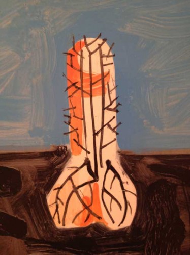
One of the first paintings you see at Grey Art Gallery, Formal Garden, is, in its forms and spirit, more like Beehive than like any of the other paintings in the show. A horizontally oriented painting with a rustic wood frame made by the artist, it represents boldly drawn shapes, a bird, a phallus, an elephant all seem to burst from roots in dark earth up into blue sky above: the chimeras caused by man’s intervention in nature are still exuberant and slightly folk inspired forms. This painting is from 1985. Moore was diagnosed as HIV Positive in 1987. In a late interview with Robert Atkins on the AIDS-Arts Forum Artist in the Archive series, Moore suggests various artistic and also practical reasons reason for his change of focus from dance and performance to painting,
Theater work is great because it forces you to make instantly comprehensible gestures, there’s not a lot of time to ponder ambiguity or you risk losing the audience. As [artist] Thomas Woodruff says, the problem with subtlety is that nobody notices. I also liked the communal nature of theater, the family value. But there’s also a downside. You are often under a lot of pressure, there are constant deadlines and people are depending on you. Theater is also much more expensive to produce than painting, what with salaries, space rental, and the like. Also, unlike a painting, theater is ephemeral. Another factor that really pushed me out of theater was the long illness of my lover Robert Fulps. I had to be at home.
It is tempting to take that further and see not only the turn towards painting but also the change in the style and narrative direction of the work after 1987, as the best medium for Moore to develop a complex, detailed, crafted visual language for the subject matter he now felt the necessity to address.
Frank Moore is a major artist and yet his name and work are less well known than other artists of his generation who also died of AIDS, including Keith Haring and David Wojnarowitz. There are always many factors in what happens to an artist’s reputation when that artist dies too young, before they can do everything they can for themselves in their life time. Since his estate is represented by an important gallery, Sperone Westwater, it is hard not to presume that his relative obscurity (with passionate admirers and fans of course) is due to the fact that his work is composed in part of large narrative paintings of formal complexity representing the dark side of American life and death in a painting language that is by turns familiar, seductive, beautiful, but also does always not give us a quick and easy read. And these are paintings that are best seen in person, because their craft and their sculptural presence is so important. And, further, the major paintings are in private collections so not readily available for public view and study. I can only hope that the owners of Oz, Wizard and other major paintings from this particular series see their way to donating these paintings to New York museums, hopefully several of them to the same institution. I vote for their being able to be compared and contrasted with the works of Florine Stettheimer, so, New York museums, the game is on.
Or, anyway, in terms of my murder investigation, Painting, What was the Time of Death? “Toxic Beauty” assures us that painting was still alive in 1994 when Moore painted Wizard, and in 2000 when Moore painted Oz. That’s not that long ago.
Painting: the undeadness continues.
During his excellent and self-confessedly pessimistic lecture at yesterday’s 2012 Creative Time Summit, held at the NYU Skirball Center for the Performing Arts, Slavoj Žižek urged the audience to see The Act of Killing, a recent documentary about atrocities committed during the 1965 anti-communist purge in Indonesia, and how some of the men responsible for the killing, imprisonment, and torture of perhaps as many as two and half million people (the figure I think given by Žižek) have not only never been prosecuted for war crimes or crimes against humanity, but are in fact celebrated and successful public figures. In a telling example from the film, as related by Žižek, some of the men are seen appearing on a talk show in which they openly boast about what they did to a young woman moderator who asks one of them, “When you had to torture the prisoners what approaches did you take?” He relates in detail how they figured out the best way to torture someone was by raping his female relatives in front of him, going into great detail on the most effective methods they devised to restrain, torture, and rape these women. The young lady moderator then says, “Amazing, let’s give Mr. (Anwar?) a round of applause.”
“Amazing,” an obscenity! However this anecdote was also amusing–squeeze some lemon on that word and salt it as well, of course–because the Creative Time Summit’s first day was marked by a relentless positivism embodied in its chosen style of presentation, a style derived from the equally relentlessly positivistic and corporatized TED Talks: in this format speakers are expected to be able to condense their work into a short and inspiring talk preferably not speaking from any notes and delivered through a wireless mike so that you can move freely and energetically around the stage. The word “amazing” was used liberally, notably by the organizers. Many of the speakers were indeed AMAZING but it is a crucial semiotic point that this style and format, enabled and dictated by the available technology, comes to the university and art world from the corporate world, in the Steve Jobs super salesmanship genre, thus they carry political DNA from these sources while other methods of presentation and thus of knowledge and political valence are suppressed. It makes one quake in one’s boots to think about Derrida, Foucault, or Lacan, under the Darwinian imperative to adapt, learning how to package their message in such a manner though maybe, clever fellows all, they too would have gotten with the program.
So the current cultural imperative is that you have to speak within the corporate salespitch format about some “amazing” thing you have done to prove that the world can be made a better place, unlike Žižek who introduced his talk by saying “You won’t get good news from me.”
Creative Time Director Nato Thompson cast himself in the part of Jimmy Fallon or perhaps a rather more 1960s style of exuberant game show host, and the audience was relentlessly encouraged to use social media and tweet the hell out of the event, which was being livestreamed and followed on Twitter, in fact after two of the short breaks in the proceedings a young woman (wirelessly miked of course) came out to read some of the tweets, which apparently were mostly commentary on what Nato was wearing. Only one fellow from Armenia was quoted as Tweeting that the conference was taking place and was being live-streamed. The AMAZINGness of instant interconnectedness was somehow muted for me since though a fairly indefatigable Facebooker, as so often happens at events that cruise on their technological sophistication, in the auditorium my iPhone could not get onto any of the so called free wi-fi networks labelled NYU this or that, my 3G connection was crappy, and my battery began to run low: the very elegant new auditorium should really have electrical outlets next to every seat, even the Peter Pan, Bolt, and other bus lines offers better wi-fi and plugs to their patrons these days. Why not just acknowledge that everyone these days is paying at least 50% attention to their iPhones while they are studying or teaching, working, walking, mothering, or at the theater, since doing everything private in public, thereby losing the true meaning of the public realm, was one of Žižek’s primary themes, aborted by the walk-off drumming that people started booing>OK some people are bores, time has to be controlled when there are multiple speakers, but this time around Žižek had promised us a semi-positive ending, which we never really got, and maybe that’s really the whole point, despite the predominance of the word AMAZING used by many of the presenters, not the artists I hasten to add, but by the Creative Time team.
The tone of the affair and the style of presentation was in significant contradistinction to a numbers of important presentations and events. First and let’s get it out of the way, two presenters, Hip hop artist Rebel Diaz and Cairo-based art collective Mosireen, had pulled out of the event at the last minute to protest that an Israeli organization was listed as one of the affiliated supporters of the event. The audience listened to reports and some commentary from presenters about these cancellations mostly in a silence that I could not possibly interpret other than my own reasons for it–a silence I must maintain because it is such a painful subject in which political realism of one kind, Israeli policies towards the Palestinians that I along with many Israelis find hard to countenance, meets political realism of another kind, which is the much more complex political history of the area and the real threats to Israel that cannot be denied, meets political realism of yet another kind, which is my own preternaturally calibrated sensitivity to any burgeoning under-any-other- name of antisemitism, meets political realism of yet another kind, which is that peer pressure is enormous to agree with the boycott, as yesterday, among many, artist Michael Rakowitz began his presentation by saying, “I’m a Jew, from Great Neck [Long Island], and I support the boycott of Israel and Israeli institutions.” A number of bloggers immediately got on the case–I can’t write or think that fast so here is Hyperallergic editor Hrag Vartanian’s report from yesterday thus in actual time on some of the details, and some artists including eco-artist Aviva Rahmani on Facebook commented on the group think and the lack of serious discussion around this announcement.
Today @ the Creative Time Summit, there was a lot of attention to a couple artists & their supporters who absented themselves in protest because they are endorsing the cultural boycott against Israel and an Israeli cultural group has been a CT partner. The boycott pre-empted, for me, attention to some wonderful artists doing wonderful work, such as Fernando Garcia-Dory, or the pleasure of visiting with old presenting friends, like Martha Rosler, Suzanne Lacy or John Malpedes. I just wrote Nato a protest letter about the lack of framing for this critical discussion and my concern that this would take over events planned for tomorrow. Personally, I profoundly deplore targeting artists because their governments have adopted unacceptable policies. If that were carried to the ultimate conclusion, no artists could ever speak to any other artists. But there is also the issue of conflating policies and peoples and how that invites, in this case, anti-semitism and ultimately, legitimizes Neo-Nazi behavior. Despite many wonderful presentations, such as Tom Finkelpearl or Laura Poitras, it was a disappointing experience of social justice practice.
According to Rahmani, in response to the protest, Creative Time “deleted the Israeli partner and took down the page of their supporters from their website. The streaming map deleted Israel.”
Afternoon keynote address speaker Tom Finkerpearl’s comments were as troubling as the cancellations, the boycott, and Creative Time’s scrubbing of Israel off the live-stream map. He said that though he admired these artists’ having the cohones (my words, not his) to cancel at the last minute, it was “bad for their career” (or did he say, “even if it was bad for their career”) and that “if you boycott Creative Time, where can you go?” I’m afraid I said out loud, “that’s ridiculous,” though I regret to say not out loud enough to be heard across the hall. Why ridiculous? Well, first because speaking both cynically but realistically, I can’t think of a better career move than to get some notoriety by taking a widely held political position favored by the elite of the hippest part of the global artworld as represented by Creative Time, without actually showing up to show your work and espouse your protest publicly with some accountability, not to mention that for the Cairo-based group, it is also not only a matter of belief but of political safety. But most ridiculous because the world of political activism that Creative Time and Nato Thompson specifically embrace is the world in which Occupy Wall Street and other groups internationally, including some represented at the event, such as artist/activist Leonidas Martin, are trying to critique the global corporate culture we all live in and are subject to. Such a critique might include a critique of the elitism that is intrinsic to any such meeting at the heart of the artworld, and one held at an educational institution, New York University (my Alma Mater, at a time when, by the way, it wasn’t that big or fancy or RICH a place) which has seen its share of criticism for its enthusiastic embrace of global capital, including its recent plans for the destruction of the very neighborhood it exists in. Are we holding a gun to political artists’ heads and saying, hey, bud, it’s Creative Time, or a one way ticket to Palookaville? That viewpoint sort of seems a bit neo-liberally arrogant.
The Creative Time Summit cost $65 including online fee for the one day I signed up for, and in a moment of cheapness brought about by the immediate effect of sticker shock at that $65, I had decided to skip the lunch offered, to be held at Judson memorial church–little realizing it was also an artwork,a sort of pedagogic political meal created by Conflict Kitchen, a take-out restaurant that only serves cuisine from countries with which the United States is in conflict–with the temporary result that as all my friends streamed into Judson Memorial Church, great refuge of the needy, I found myself standing outside temporarily nearly in tears at the economic (self-) exclusion, while painfully and belatedly aware that of course I would have to spend as much on any lunch in the neighborhood. [Personal note, lest anyone worry too much, all’s well that ends well, I did spend the same amount, but in the company of some really nice and interesting young people I ran into and was glad to talk to.]
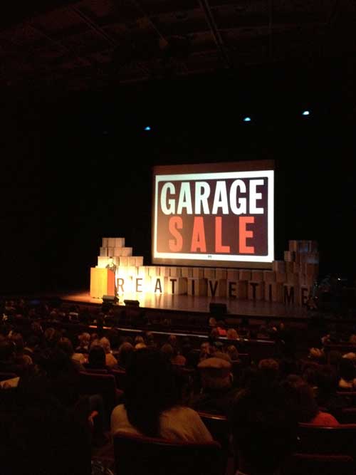
Martha Rosler’s talk also raised, or rather did and didn’t raise, the question of the Summit’s relation to capital: she noted the irony that admission to the next incarnation of her on-going project, Garage Sale, forthcoming at MoMA, would cost up to $25 for those visitors to the museum who are not members. Since there were no audience questions at the Summit, one could only wonder why Rosler, who would have the cultural clout to do so, did not insist that admission be free to the museum during the time of her show, or, for example, since that would affect too high a percent of the museum’s admission fee income for two weeks, that anyone who participated in the Garage Sale by purchasing anything would get their admission refunded. How’s about that?
It’s not that alternatives to these situations aren’t happening all over the city and the world, small meetings in donated spaces that are happening probably every day here in New York City, where conversation follows the Occupy model or the standard panel model + audience participation–this event had no mikes set up in the aisles for audience response or questions, although a second day, today, allowed one to participate in smaller groups with some of the same participants–events where no one is paid and you fork over your dollar or so to help defray the cost of the beer. The point is, the 99%, the 47%, the struggling Occupy movement, and also the poverty of imagination of what could be the alternative to contemporary global capitalism that was addressed by Žižek, all seemed like fashionable shadows within the viewpoint of Creative Time as presented by some of its leaders and by the corporate-influenced presentational model it espoused.
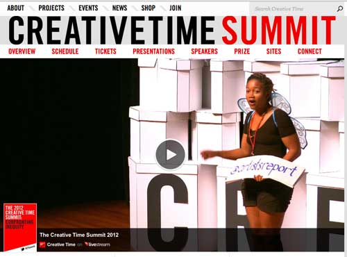
Given all of these issues, having Tweets about Nato’s pants read out loud to us was one huge insult to our intelligence and situation.
In fact all this positivistic cheerleading was in significant contradistinction to the very interesting social subject matter brought into the space by many of the speakers and I would be remiss if I did not report on some of the highlights.
Going down my program in order, I was immensely impressed by the speakers who formed part of the first group, “Inequities,” including Malkia Cyril of the Center for Media Justice, a very forceful public speaker; the work of the Belgrade-based collective Škart organizing choirs composed of anyone who responded to the call for an audition even if they had never sung in their life, the project’s focus on small communities made me think of the deeply moving power of close group folk singing, as one hears on archival recordings from the American South and as I once witnessed at a fest-noz in a small town in Brittany in the early 80s. Hito Steyerl gave an elegantly resonant talk, “Is the Museum a Battlefield,” tracking her research for a work about the debris of war found in a museum back to where they were made and produced, finding herself in various corporate headquarters that all seemed to be designed by Frank Ghery, and eventually, in a circular process (literally making a circle with her hands for the feedback loop), finding that her research into the source of a General Dynamics bullet led to a corporate headquarters housing her own art work.
There were a number of feminist interventions: Jodie Evans of CODEPINK and artist and activist Suzanne Lacy brought important examples of the recent feminist history of artwork about rape and called attention to the very important Women Under Siege Project. It was great to get to see a bit more footage of Pussy Riot, presented by artist and activist A.L. Steiner, dressed only in a transparent neon orange plastic jumpsuit, her body in revelatory bright lighting, her face in shadow. On the feminist email list-serve Faces there had been a certain amount of criticism of the feminism of Pussy Riot by some Eastern European feminist artists, on the other hand there has been a lot of publicity about them without necessarily more detailed awareness of their political views and I found myself very moved by being able to see some more of what they did, by the images of them performing in the church and on the wall of a snow covered redoubt in a huge square near the Kremlin. Steiner’s presentation echoed the daring and the vulnerability of Pussy Riot, pointing to what individual women face when they try to project their bodies and voices into a huge and mostly unreceptive to downright hostile world, here embodied in the artist’s presence, strongly confrontational yet riskily exposed, and in the way her mic check style call and response of feminist statements was absorbed and dampened by the hall’s acoustic environment, highlighting its deficit in terms of the spatial and auditory intimacy required for shared political purpose.
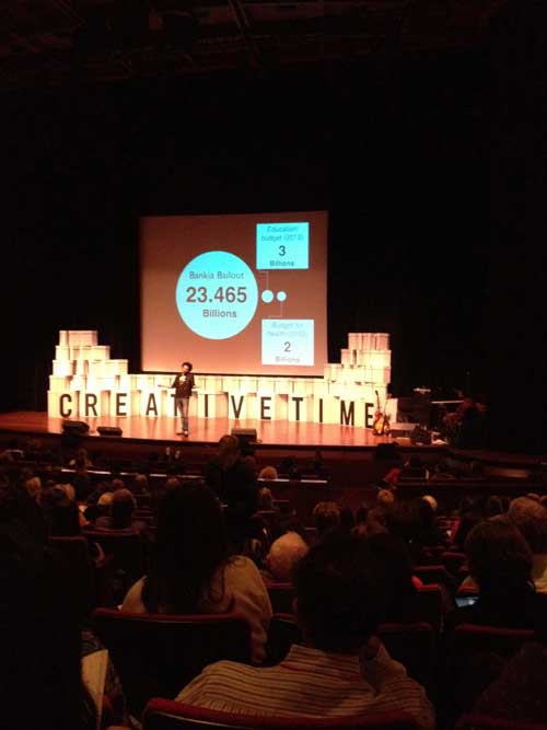
On the other hand the raucous humor of the various projects depicted by Barcelona based artist and activist Leonidas Martin was quite wonderful and contagiously funny although one of the best pieces was video of a bank occupation, when in a kind of flash mob event, people closed their accounts at a branch of a major bank and a huge crowd of revelers suddenly materialized, eventually even making an initially stunned woman banker burst out laughing. Humor is one of the most powerful and effective political weapons, so, one wondered, why couldn’t we do that here: unfortunately when that tactic was tried last year in New York at a Citibank branch a block down from NYU’s Skirball Center, the police arrived and arrested a bunch of activists as well as possibly innocent by-standers although the Occupy activists had purposefully dressed in business attire so it was a little hard to tell, but the hilarity of the Spanish scene was preemptively aborted.
However, if I close my eyes and think of the most interesting artwork I saw, without question one work stands out, and, perhaps significantly the artist was not there, only the artwork. This was Shooting Images, (or was the title Double Shooting? I wrote both down) a video presentation by Lebanese stage and film actor, playwright, and visual artist Rabih Mroué, taking as its premise the phenomenon recently noted in Syria of citizen journalists shooting their own deaths, often on their smart phone cameras. The video is extremely simple in its means, starting with its means of address: the artist uses white on black titles with the text in relatively small type to address us, speaking in the first person. Mroué established the double shooting: the double shooters: the gun and the camera. The photographer is always “hors champs” a film term for off camera, but I believe based on a military related term for off the field of battle, like “hors combat.” Mroué first presents the scene in such a way that it appears to be real footage, the sniper and the man with the camera, whose end is nearly identical with actual documentary footage from the past few months. Then he clarifies very specifically and intimately that this is a re-enactment he created with a friend and neighbor–the insistence on this at the end of the video I think is a commentary on the tragedy of a civil war where friends and neighbors may shoot one another. The video asks if there is a way to bring the victim into the frame, in the killer’s eyes? In a fascinatingly medium specific way he magnifies the sniper’s image until, within one pixel, is the image of the cameraman/victim, upside-down in the retina of his killer. Then the bond of the reciprocal homicidal gaze bounces back and forth between the two protagonists. The discovery of the victim’s face in a single pixel detail of the killer’s eye reverses a recurring theme of murder mystery novels and movies, the idea that what the murder victim last saw would be fixed upon his retina, a reverse image of the murderer, like an internal still CCTV image capture. This was a memorable work.
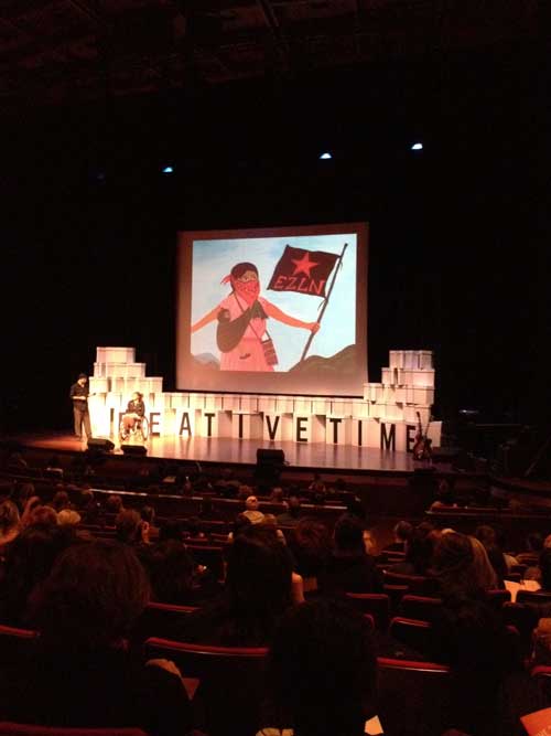
The question of medium specificity is important to me partly because my own visual medium, painting, typically does not appear at such events dedicated to art of social engagement except in the guise of third world or inner city folk art, for example in the presentation by the Indonesian activist group Taring Padi and in some images that were shown by Mexican art and social activists EDELO, among many very intriguing and suggestive works including theater pieces and contingent folk sculpture. The politics of this double standard is rarely discussed.
I left at 5 because I wanted to get home to write about the exhibition of Josef Albers Paintings on Paper, an exhibition at the Morgan Library closing this weekend–in that decision were multiple ironies, that I was leaving a fashionable art event inimical to painting in order to write about an artist who in fact I had always seen as didactic in a way that could be seen as part of the repressive politics of high modernism which contributed to my move towards feminism as a young artist. It’s probably not a good political move to have your feet planted in two arenas, the powers that be that have a stake in each may not appreciate the dual vision, but to me it is a more total and enriched position.
There is political art and there are also art politics, and by politics I mean not just specific political histories and narratives but in general hierarchies and systems of power and privilege. Part of any political practice is to understand a field of action and to be able to hold in your head at least two things at the same time, that something can be very interesting, important, AMAZING even, and also occasionally problematic, with its internal power structures, which are often obscured. One always has to keep this in mind, which by the way is very different than dismissing it outright, and this is the purpose of this small intervention on my part into what was a very interesting and instructive event.
*
The presentations I’ve discussed above are now online (scroll down the site for individual presentations mentioned here) although it is important to point out that what you see online spatially and relationally to the original audience in the Skirball Center is the TV show view, with speakers seen in close up as well as occasionally in long shot, rather the audience’s theatrical experience of the speakers as small and less distinct figures on a large and, for many there, distant, stage. In lieu of a comments section here, see the contentious, interesting discussion which took place over a three day period on my original Facebook posting of this piece.
The last art exhibition I saw with my mother was Picasso and American Art, which we went to see what turned out to be just a few weeks before she died. The show was very crowded and after a room or so of looking at the earlier works, which were part of the most meaningful works in her own development as an artist when she was young, she sat down while I looked at the rest of the work. We had to take a taxi back home because even the walk from 75th to 79th to the bus station was too much for her, but as she sat in the taxi she said, “you know a show is good when you want to go home and work.” That’s the way an artist feels, that pressure to run from a wonderful experience with art because you feel the pressure to use the energy towards your own creativity. That’s the way I felt yesterday at the exhibition at the Morgan Library, Josef Albers in America: Painting on Paper.
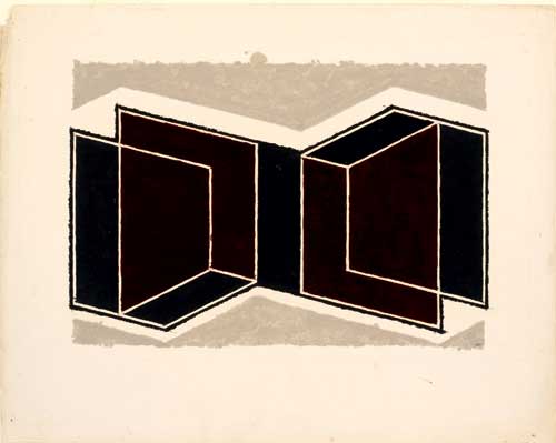
Josef Albers, Study for a Kinetic, ca.1945. Oil and graphite on blotting paper, 48.5 x 61.1cm.
Since the work is mainly in the collection of The Josef & Anni Albers Foundation, this is a unique opportunity, and visits to the Morgan are always a pleasure: right now there ‘s a small but thrilling exhibition of the original score and storyboard of Robert Wilson and Philip Glass’s Einstein on the Beach, an installation that highlights the impact a small group of works can have within an imaginative frame, and a major drawing exhibition , Dürer to de Kooning: 100 Master Drawings from Munich that just opened today–and going through the main rooms of the original Morgan Library is always a wonderfully inspiring experience, with rare volumes, letters, and amazing ancient carved stone cylinder seals just some of the highlights.
That I would urge anyone to go see this show in its last two days is rather surprising. I’ve always thought of Albers’ work as representative of a didactic approach to color that, in a manner that felt paradoxical or antithetical to what you assumed was their purpose, actually deadened the excitement of color. That is perhaps particularly true if seen in reproduction when the image certainly folds back easily into design and color theory instruction. I’ve always thought of the painting, particularly the Homage do the Square series he worked on for almost three decades and which are the best known works, as being rather dry and fussy, amplifying the didactic approach to color I did not subscribe to. Nevertheless when I read about the exhibition at the Morgan Library I felt that I must see the show. The works in the show looked and sounded vibrant and improvisational. I went yesterday. Sunday is the last day: I urge anyone who is interested in painting, in color, and also in work process, who can get over to the Morgan, to see the show before it closes. These works on paper have a very different feel: there is a presence and a vibrancy to these works, a presence of pigment, applied directly to thick blotting paper, and a vibrancy of hue which I don’t associate with Albers’ more known works, although now I think I should re-investigate those works and perhaps separate them from the didacticism I associate with them. The earliest works in the show, from the early 40s are also more exciting visually because they are more compositional and relational, often directly referential to architecture, as for example his Variant/Adobe series: in these works he uses rich sienas, ochres, oranges, and pinks, against warm and cool greys.
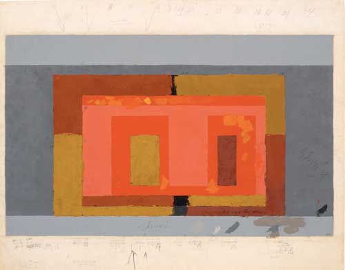
Josef Albers, Variant / Adobe, ca. 1947, Oil on blotting paper, 48.2 x 61.4 cm.
In addition to the Variant / Kinetic Series, and the Variant / Abobe series, the show includes many preliminary studies for Homage to the Square, of which Albers wrote, “I’m not paying ‘Homage to the Square.’ It’s only the dish I serve my craziness about color on.”
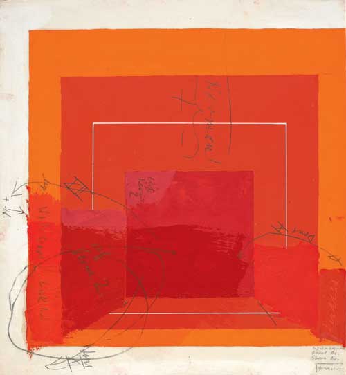
Josef Albers, Color Study for White Line Square, undated. Oil on blotting paper (with gouache, pencil, and varnish), 29.53 x 29.66 cm.
All of Albers’ statements quoted on the wall text were rather pithier than I expected, although given his tremendously influential role as a teacher at Black Mountain college and at Yale for many years it shouldn’t be so surprising but historical art figures whose work has an Apollonian cast to begin with can become quite dessicated by time unless great scandal of some personal clings to them and adds lubricity to their image as much as their work.
Many of the works are covered with both tiny notations and bold sgraffito directly into the wet paint, most of these colors notations as to the pigment color and the brand of paint: Albers did not mix most of his colors except some pinks and purples and he tried out similar tube paint colors from many manufacturers, and would note on the sketch and even directly in the paint which color he had used–“chrome ox Shiva” reads one such notation.
I experienced a kind of calm joy from the work while at the same time following another, pedagogical, line of thinking how many art students don’t think twice about getting the newest computer but don’t invest or even investigate good paint, get discouraged at the first bad painting they do and veer towards more technologically seamless media instead of trying out endless “variants” until a personal approach to painting is found. There were 200 of the Variant / Adobe series within a few years, and that doesn’t seem like that much.
Albers’ direct method of application of paint and the heavy weighty surface of the blotting paper give the color luminosity and materiality, which perhaps the masonite his major works on are on may have diminished, though I feel I have to look at them again after seeing this show. I think of blotting paper as an absorbent felt-like material without particular resonance but here the material is like a very heavy card stock with a newsprint off-white / light gray cast and a very satisfying sturdiness to it, and I made a mental note to look for something like that to try some oil on paper. Albers must have also slightly drained or blotted the excess tube oil from his paints because there is barely any haloing or seepage of oil around the paint areas.
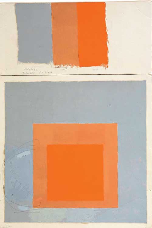
Josef Albers, Study for Homage to the Square with Color Study, not dated. Oil on blotting paper, 44.3 x 30.2 cm.
As I write this late at night, after a day spent at the Creative Time Summit, about which perhaps I will write something tomorrow, I know that for some, perhaps for many young artists looking for contemporary modes of expression, content, and context, painting studies like these must seem even less pertinent to the present than a cave painting might: coming from the seemingly familiar relatively near past, they may seem totally archaic, tired old stuff that can’t help them in their own search. I can well understand that, I can see the distance, and I see the relevance and appeal of newer methodologies of artmaking. Yet the exhibition is exhilarating while at the same time the modest exhibition space itself is like rehab for the overstimulated: no photography allowed, few people, just the work and hushed silence, literally: I happened to run into several friends and as our conversation over the work became more animated, the guard shushed us! Such an unspectacular white cube atmosphere is actually rare these days, and a treat. It was refreshing, inspiring, and thought provoking to see this work.
Today October 10, 2012 would be my sister Naomi Schor‘s sixty-ninth birthday.
I always like to mark her birthday in some way. This year, my birthday remembrance is about politics and newspapers. We shared a passionate, anxious, and affective relationship to politics, something we had both inherited, I believe, from our parents, whose lives had been affected by major political catastrophes and who had an interest in history and politics. One of the interests we shared was in the American electoral process. We enjoyed the theater of it, shared what we felt were the high points and agonized over the darker moments in the years we experienced them together. I know she would be completely wrapped up in the current election, as I am, and perhaps prey to the same moments of deep anxiety about the future.
Last week I went through a box of newspapers and magazines she had saved over the years and had taken the trouble to pack up and take with her for each of the several moves of her distinguished professional life. I too save copies of the paper and in some cases I suspect I have exactly the same material packed away in some box of my own. I photographed each publication in the box so that I would have some record of even those I was able to force myself to throw out, saving a few as possible research material for an approach to writing about her, part of my larger and still very germinal project of writing a cultural autobiography that, at this point, is more focused on keeping the life and work of my parents and my sister alive as long I can, not just for myself, but for what I think they can mean for anyone else.
The contents of the box I went through included several example of coverage of Watergate.
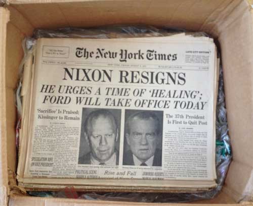
The date on this newspaper is August 8, 1974, though the Wikipedia timeline states that Nixon resigned on August 9th. The resignation was announced on the 8th, and was official on the 9th when President Ford was sworn in.
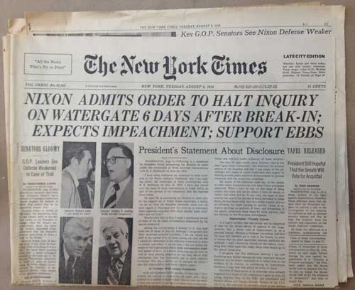
Here are two other editions of the New York Times, from Wednesday, July 31, 1974 and Tuesday, August 6, 1974, as the final stages of the Watergate scandal played out across the print press and television coverage that had gripped much of the country. For myself, I had been at graduate school at CalArts in the early stages of the scandal, and I think this may have been the one point in my life I was not reading the Times regularly or particularly focused on anything except my own life: I was absorbed in new friendships, in the first class I ever taught, and was preparing my MFA show. The Senate Watergate hearings had begun May 17. When I got back to New York around the 3rd of June, 1973, Watergate was all anyone could talk about, I found that my mother and sister were obsessed with every development so I got up to speed and I watched every minute of the Senate hearings from that point on.
The first of the two copies of the Times that I had set aside, in a kind of hoarder’s purgatory, not safely back in the box for further research, not in the bunch I actually did throw out, is from two days before Nixon resigned:
The other edition I selected is from a few days before that, July 31: I was about to throw both of these copies out and just hold on to “Nixon Resigns” but when I put a current paper on top, also to be discarded, I was struck by the physical difference in size between the paper then and now:
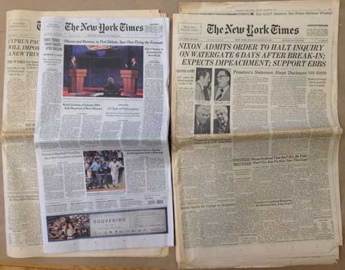
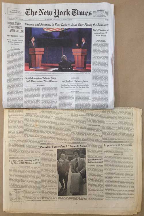
The first thing that one notes in handling the historical copies and the paper today is that it has shrunk considerably, I believe the size has been diminished twice in the past twenty years. The 1974 paper was 23″x14½,” the current one is 22″x12″–not a huge difference but a less imposing artifact to be sure and it appears much narrower when placed next to or on top of the old version. When the newspaper last shrunk, I recall that readers were assured that the percentage of news coverage would not diminish: I remember counting the news stories in pre- and post- shrinkage editions–can’t be sure but I think that I found that, contrary to that claim, there were in fact slightly fewer news stories.
Most people would agree that this more modest scale is ecologically sound, and at this point I am just grateful I can still begin my day reading the New York Times in hard copy though diminished not just in dimensions but in amount of pages, and perhaps also in amount of news covered of a non-entertainment nature. It’s not perfect, but it is still the newspaper. One of my sister’s friends says that the one reason she doesn’t mind getting older is that she may possibly not outlive the hard copy publication of the New York Times! Nevertheless, to hold the 1974 issue is an experience with some gravitas that is perhaps lacking today. OK, already you can see the disjunction here: gravitas and news!!! I just watched The Daily Show tonight. Like a lot of people I count on Jon Stewart, a comedian, to do the job mainstream media reporters as well as sitting presidents should be doing in mano a mano combat with Republican bullshit, so that portentous experience of holding open in your hands that 46 inch full spread of 8 columns a page of news is a long long time ago.
Looking at the paper from last week’s coverage of the first Presidential debate between President Obama and Mitt Romney, the situation seems more depressing and more dire than the situation in 1974, because the peculiar thing about the Watergate scandal is that at the same time as it uncovered a plot by the President of the United States to subvert major branches of government and that it made us acquainted with some horrible people, including a close-up view of the dark soul of Richard Nixon, it also introduced us to some politicians one felt one could respect and admire, and revealed courage, integrity, and what could still seem like authentic authenticity at many levels of American culture from the press to the government. There were as many heroes as villains in the story and as I recall there was some level of continued trust in America despite everything that was revealed during the process. “The system worked,” or so people said at the time.
But things were happening in that very moment of the seeming triumph of justice and democracy that have a bearing on our own time. The stories are more linked that one might think. The 30+ year reign of increasingly right wing social politics and corporation friendly laws and Supreme Court decisions we have endured since the election of Ronald Reagan in 1980 actually began during the same period as the most vivid moments of political fervor and transformation of the 1960s, and a return to order was already being formulated during the Nixon administration. For example, the so-called “Powell Memo” or Powell Manifesto was first published in August 1971, as “Confidential Memorandum: Attack of American Free Enterprise System.” In it, then corporate lawyer Lewis F. Powell laid out most of the political goals and tactics for the right wing, calling for the creation of many of the institutions that have brought us to decisions like Citizens United and organizations like ALEC. Powell was named to the Supreme Court by Nixon two months after the publication of this document. In another example of the links between then and now, one of the few figures who did not show backbone and political heroism in the events known at the “Saturday Night Massacre,” when Nixon called for the dismissal of Watergate independent prosecutor Archibald Cox by executive order was then Solicitor General Robert Bork. Later rejected by the Senate when he was nominated to the Supreme Court by Ronald Reagan, Bork set the model for Justices like Antonin Scalia and is said to be advising the Romney campaign on Supreme Court nominations should Romney be elected.
Yesterday I spit into the wind and wrote to President Obama at “Letters to Obama:”
Dear President Obama: I hope you will fight back and fight for this election, against lies and to prevent what I think would be an incredibly dangerous President and Vice President, with Republican majority. Is this the country and the world that you want for your daughters to live in? This election is not about you indeed, it is about us, we can vote, yes, your loyal though often frustrated base will vote for you, but you are the only person on the stage who can fight back against Romney’s shape shifting lies, we can’t. So, at long last, do it..you don’t have to overact at the next debates, you just have to defend your record, your beliefs, your policies, and the truth. The country’s fate is at stake, not just your career.
Sincerely,
Mira Schor
Utterly futile and a lot more polite than what I really want to say but perhaps just a little birthday card to my sister, who would have despaired of a Romney Presidency, as do I.
*
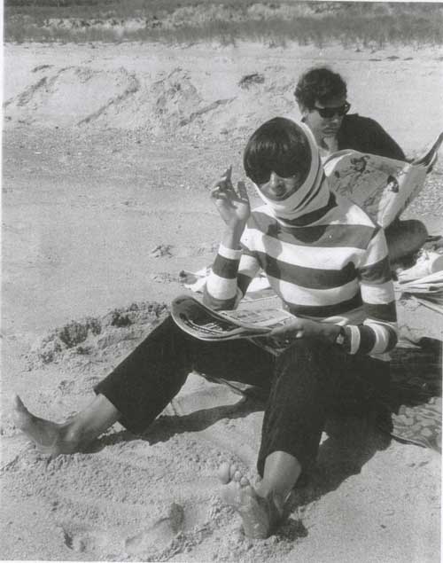
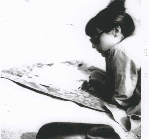
My sister and a friend, reading the newspaper on the beach, late 60s or early 70s.